2023 Study Architecture Student Showcase - Part III
This week the 2023 Student Showcase takes a broad look at buildings and parks on university campuses. We look at a couple of design build projects completed by architecture students as well as adaptive reuse designs and new builds that aim to evolve architectural education curriculum through wellness and sustainability. Shifting gears slightly we also feature a video game that inspires architecture learning, after all campus should be a space that encourages enjoyment while learning.
We hope you enjoy this week’s collection of student work and come back next week for a new installment.
Commensalis by Dakota Witte and Dylan Moyano, B.Arch ’23
Washington State University | Advisor: Vahid Vahdat
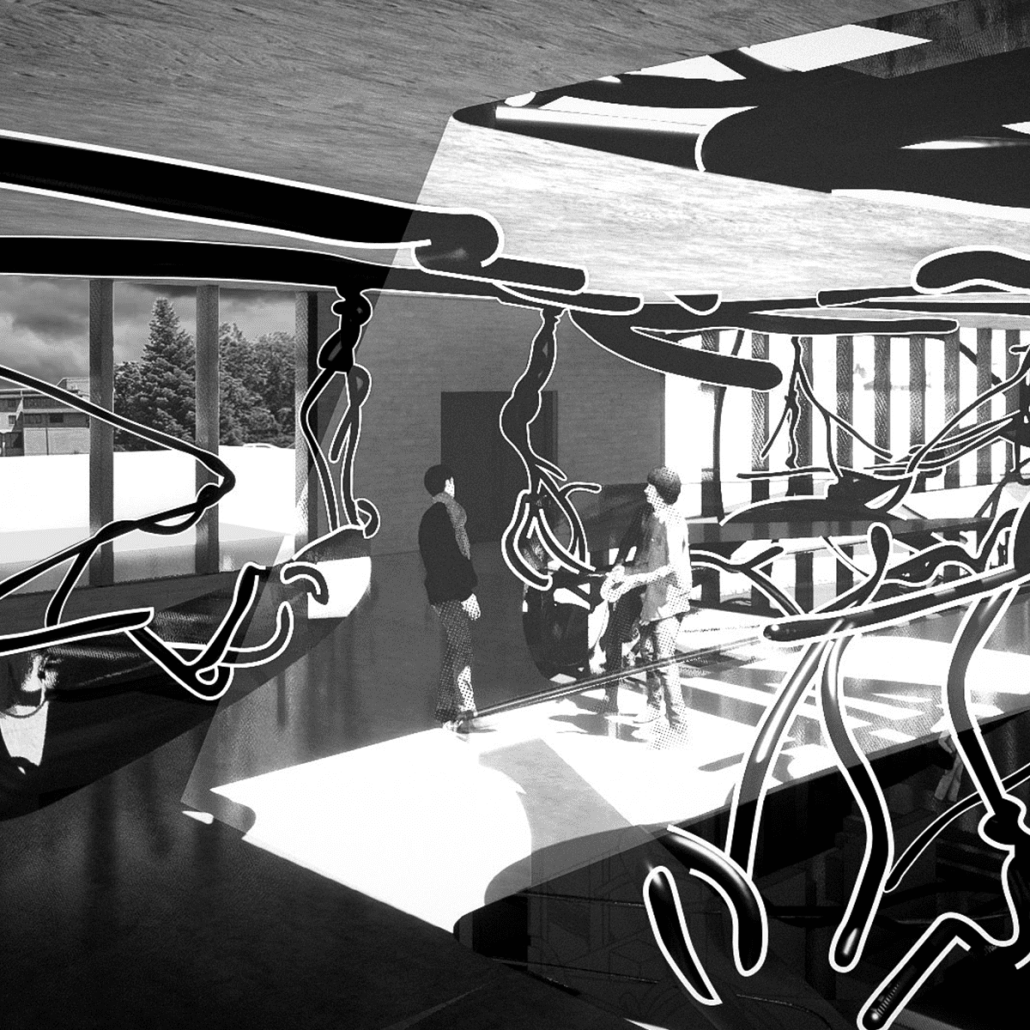
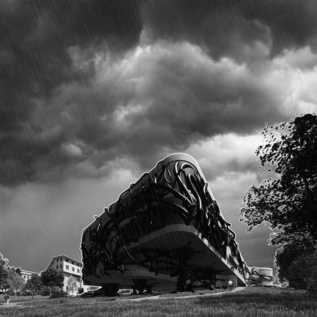
Commensalism is a biological relationship between two organisms in which one benefits while the other derives neither a benefit nor harm. Here at Washington State University, creating relationships amongst the design disciplines is challenging at the very least. Students are expected to become masters of their own curriculum, however in design, we are also expected to share knowledge with our cousin disciplines. This ideology has become a greater necessity as miscommunications between designers and builders create complications in the design process. The origin of these obstacles can be attributed to our academic backgrounds. A lack of communication can be attributed to the traditional academic architecture practiced amongst universities.
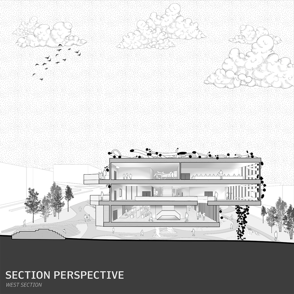
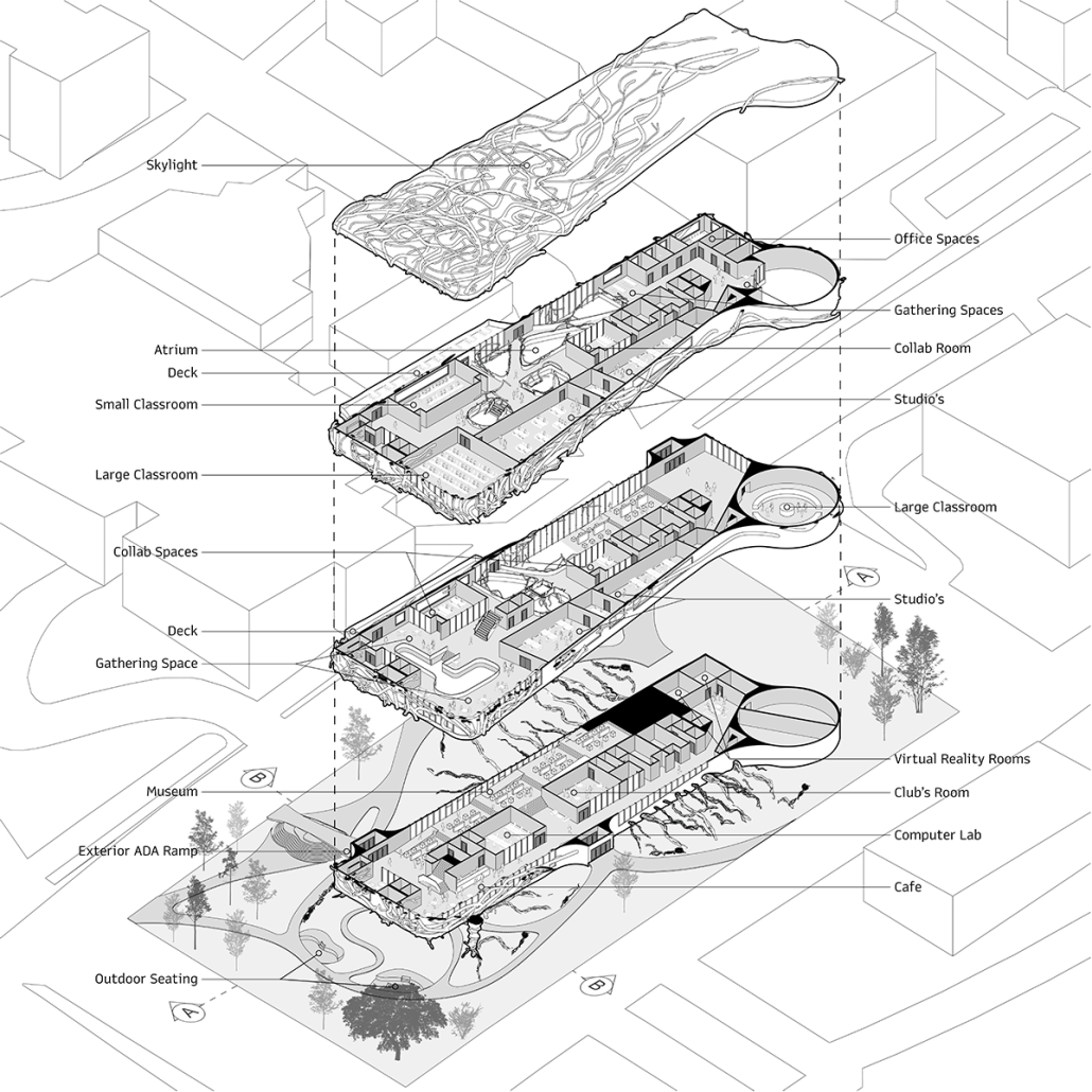
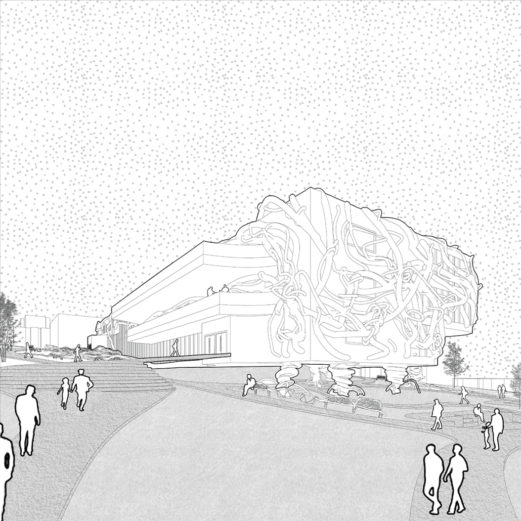
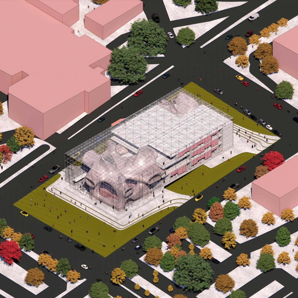
Our goal in this project was to innovate this narrative and create both a physical and psychologically alternative to the educational practice of design. We set out to create a commensalism between design disciplines and the academic system. Our site was located on the South end of WSU’s campus. As a prime location, we began creating an academic building for both engineers and architects. The unfamiliar organism’s veins stretch and pull through the natural scenery. Initially seeming like something out of the Twilight Zone, further innovation within our environment gives a drastic alternative to the organism as it begins to create flower beds and public benches that surround the structure. Exterior cladding of our structure uses traditional red brick to pay respect to the surrounding architecture of campus.
We felt it was important to iterate that our intentions are not to change higher education itself, but rather change the systems we have been using for hundreds of years. To show this, the organism has begun to encompass the exterior of the structure changing its shape as it begins spreading throughout campus. The interior of Commensalis creates a mix of both public and private spaces with a heavy emphasis on interdisciplinary collaboration. This first level is home to a large museum space meant to display the projects of various students. The second and third levels of the structure also hold multiple public and private seating areas to encourage a variety of study methods.
Instagram: @dakota.witte, @dgm.design2022, @3rdscript
ArchiLounge by Neroly Mora, Daniel Gribben, Michael Anzalone, Kayla Dawson, Kianna Ladue, Julia Dorr, Abby Lumpkin, Nate Simpson, Lauren Trippiedi, Charles Vasas, Joe Walsh, Serene Martens, M.Arch ’23 and B.S. Arch ’23
Norwich University | Advisor: Tolya Stonorov
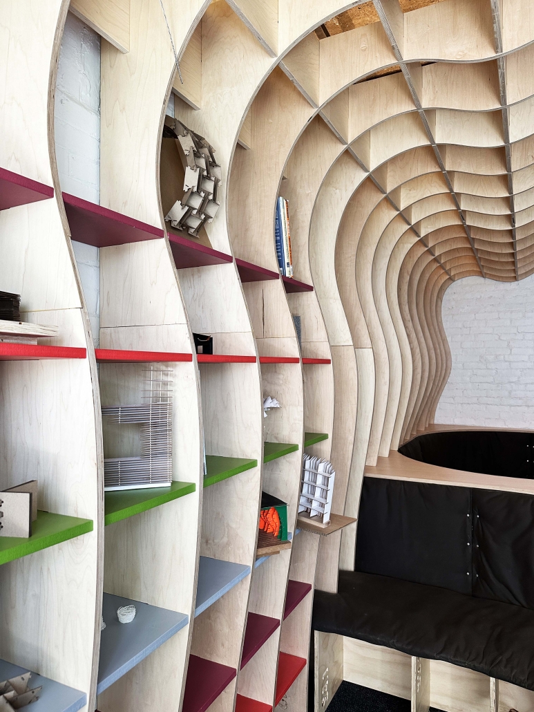
Our typical SoA+A design build program has an outward, community focus – this is based on our belief that architecture can help people through providing solutions to society’s problems. This year, however, I was able to teach a design build studio that had a special opportunity to look inwards and focus on our own SoA+A community.
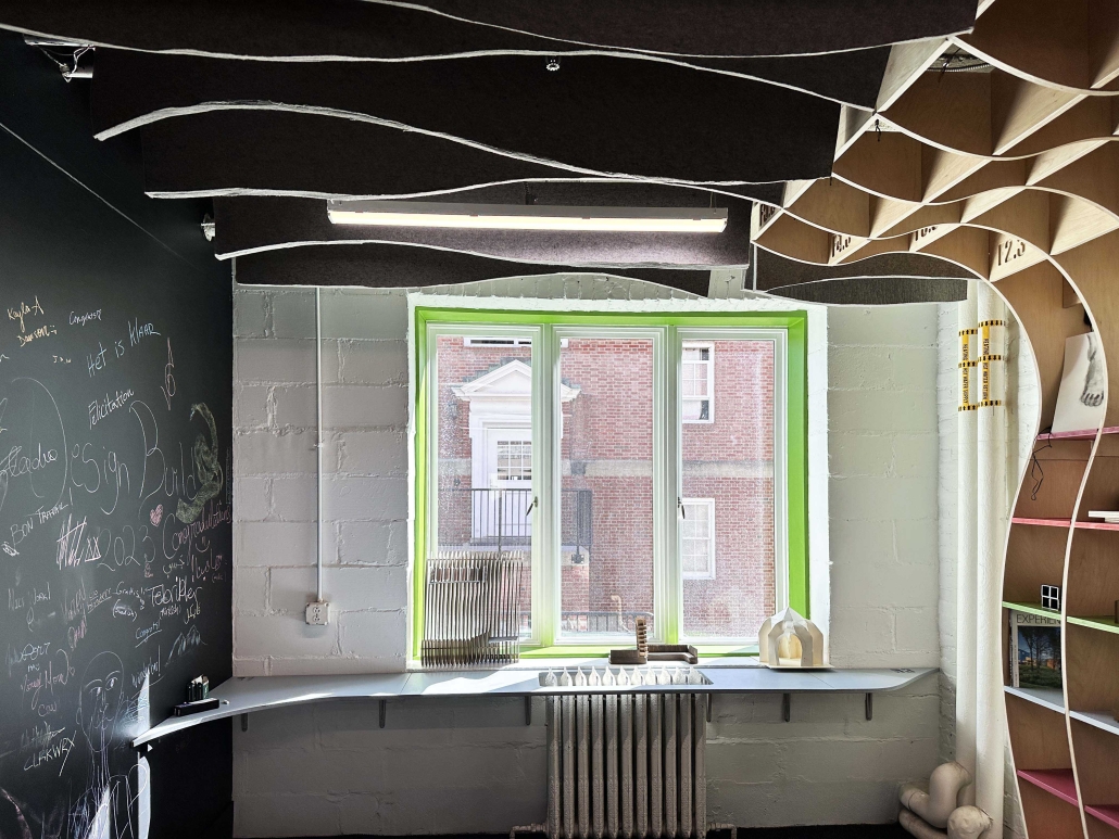
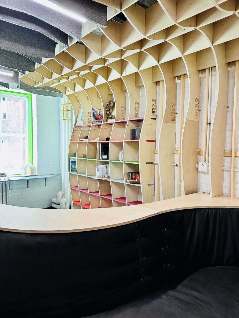
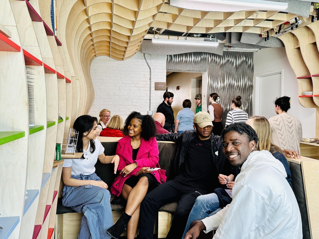
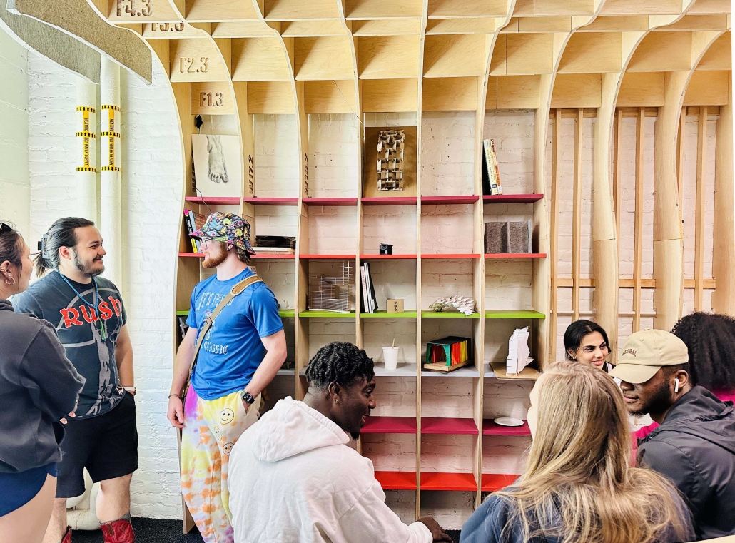
The ArchiLounge design build studio focused on the design and fabrication of the student lounge in Chaplin Hall as well as an overall look on how we could bring our current branding into the building. The studio reimagined and redefined what was needed and proposed an innovative, material rich, dynamic solution. This began with an outreach effort to the entire SoA+A community to determine what program the space should encompass. As part of the lounge, the studio incorporated a memorial to Donovan Kurt, a beloved architecture student who tragically passed in 2022.
The studio’s main focus was on investigating and redesigning the student lounge in Chaplin. This began by understanding how to draw as builts, a tool used in most architecture offices. We conducted a model-focused precedent study and a Surface + Joint study with an emphasis on digital fabrication, both in terms of the joint and overall spaces. We worked with our digital fabrication tools: 3D Printers, CNC router and laser cutters and a CNC router workshop was taught after our initial research. The bulk of the studio involved a heavy investigation into materiality and making. We poured concrete, worked with fabric, wood and metal. While each student had an area of study and is developing expertise, it was my intention that each student contribute to all aspects of the project through group discussions. In order for these group discussions to be successful it was imperative that the studio have an atmosphere of open dialogue. While we discussed and critiqued ideas, we made sure that we were not excluding people from contributing to this process. Working across the table was also an opportunity for all of the studio to learn more about how we all solve problems. I worked many hours outside of studio to try to ensure a successful group environment. This studio had the most cohesive group dynamic that I have experienced in my 11 years of teaching.
The design build process is a ground breaking pedagogy that encourages students to problem solve, think together, and make real design innovations in the field. Students learned that their drawings had real meaning and tangible implications. The studio had extensive community engagement as we worked with the SoA+A students, faculty and staff. Community-focused work in design build studios consistently demonstrates that holding community activism as a goal, yields a rich student experience as a result. I believe that this impact is two-fold: 1) students gain confidence because they are entrusted to design and build a real project and thereby achieve results outside of their comfort zone and 2) they are able to see concretely how their own work can help the community.
Through the design build experience, students shape a personal, more inclusive, definition of the architectural process and its tangible social and economic impacts. Working with the team of 12 architecture students was fantastic, but also challenging. The students were consistently motivated and worked cohesively to produce a beautiful building. Students repeatedly described these design build courses as some of the most valuable of their architecture education.
Instagram: @eaglewolf_14, @_juliadorr_, @abbylmpkn, @stonorovworkshoparchitects, @norwichdesignbuild
Voiland College Student Center by Chenlu Zhang and Luke Nye, B.S. Arch ’23
Washington State University | Advisor: Vahid Vahdat
In this project, we used a variety of software to build a workflow (rhino, revit, enscape, photoshop, to ensure a high level of finished product quality in a limited time.
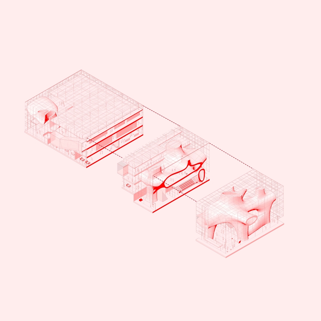
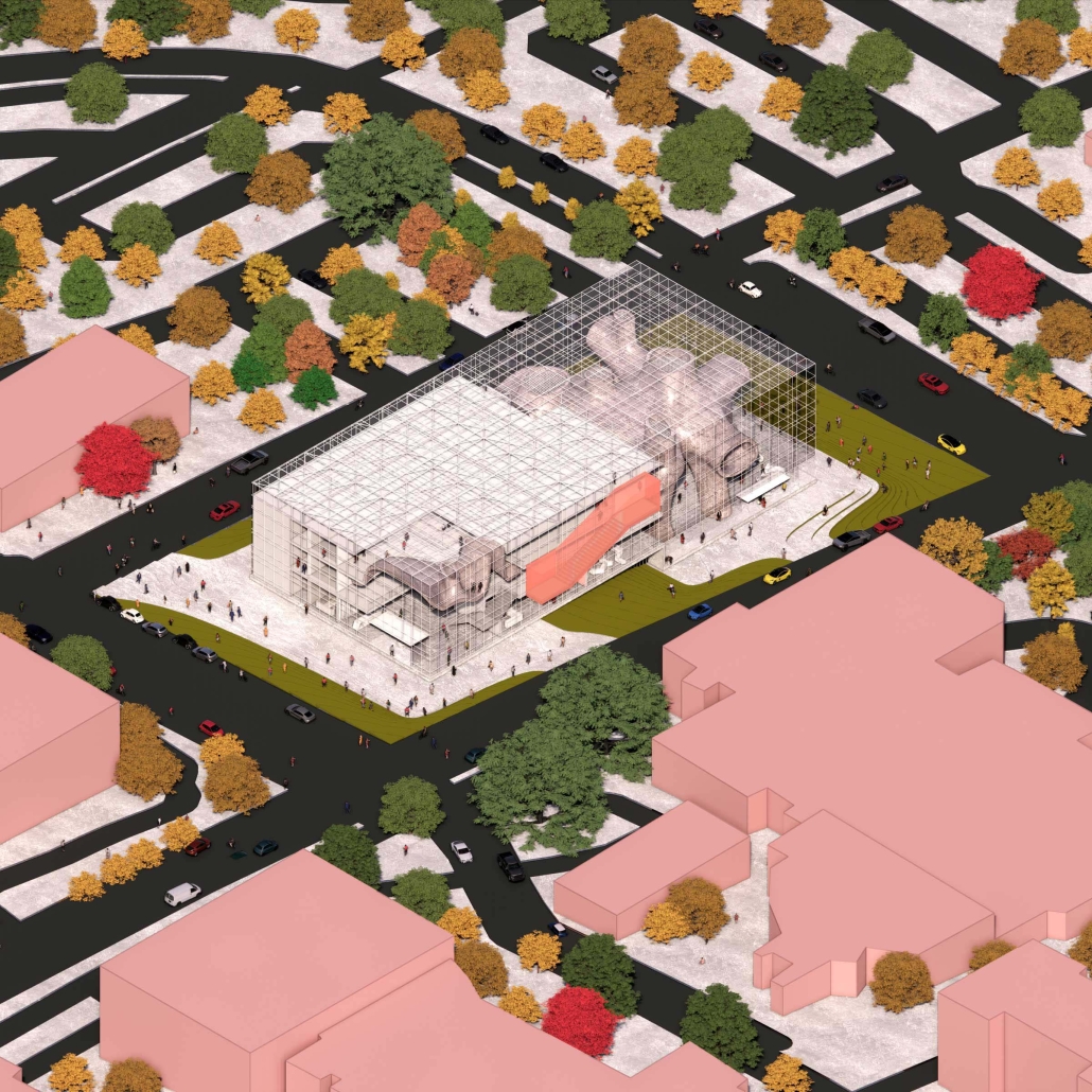
The link between creativity and schooling has always been a difficult relationship to explain. In the fields of architecture, engineering, and creation, a heavy amount of creativity is required. Creativity requires boundaries to be broken and order not to interfere, which is a direct counter to that of modern education. As a result of the inherit divide between these elements of education and creativity, “Discrete Rectagular” replicates this relationship in the physical structure.
A cavity-shaped, complex organic structure is present next to solid traditional interior rooms. This cavity shape represents creativity as the solid routine structures represent the order that is required in education. For the spaces to work well together, we decided that the organic shape should hold most of the lounging area required in this site while the traditional rooms should be responsible for the more practical uses of the building. This division of labor further defines the relationship between creativity and order. To not disrupt the shape of the entire site, we modified the existing architectural topologies which in turn influence the structure giving it it’s shape. The loadbearing columns at the base of the organic structure are connected to the structure which displaces the overall weight. A lightweight steel was used for the skin (scaffolding with curtain wall glass) of the building which increases the sense of breathing.
The conventional practice of introducing the outdoor environment is not adopted, but the shell through its transparency is used to release the interior space of the whole building giving a spectacle to engage with. Furthermore, the main entrance is equipped with a similar organic shape to continue this spectacle and desire to be inside. The whole building is made of white light material and metallic material so that its square volume floats in place and disappears. The organic structure is heavily used for lounging as we want to challenge the existing academic architecture typology but not change it completely. Hence we chose to use this alternative style.
Instagram: @clzpurplem, @3rdscript
KCAI DoARC by Jessie Grieser, Kendall Hartley, Halima Moore and Abriana Wilson, B.S. Design, ’23
University of Nebraska-Lincoln | Advisor: Peter Olshavsky, Ph.D.
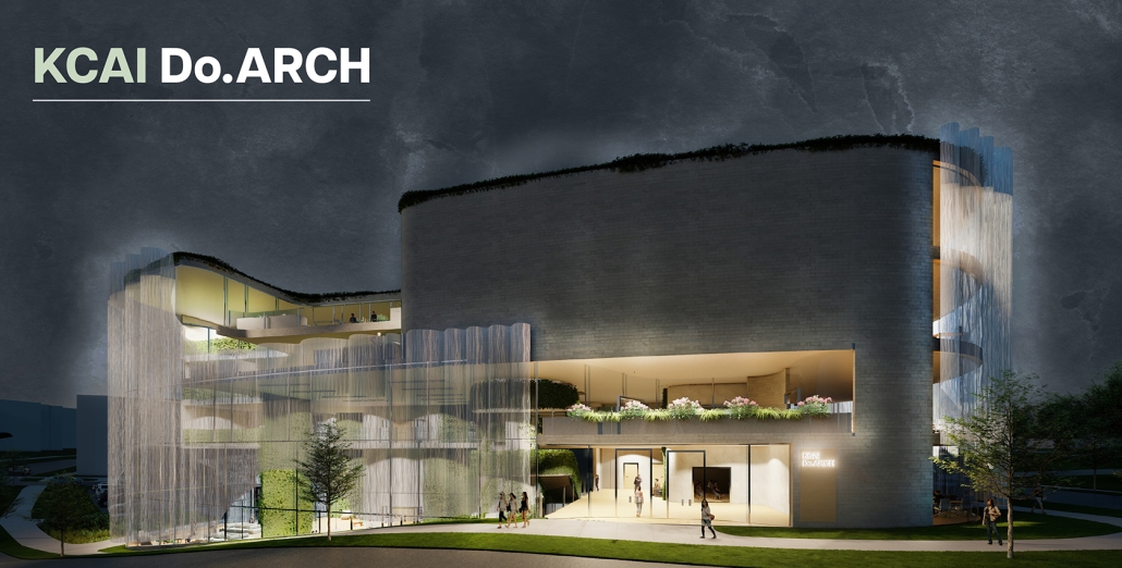
If education involves “values made flesh,” then what values will be incarnate by the year 2050? To think through the entanglements of this question, third year architecture students were asked to design of a Department of Architecture (DoARC) building on the Kansas City Art Institute campus in Kansas City, MO. This effort started from the basis that design education is changing. Our architectural lives, and the education that prepares us to live them well, should aim at our being someone and not just acting professionally.
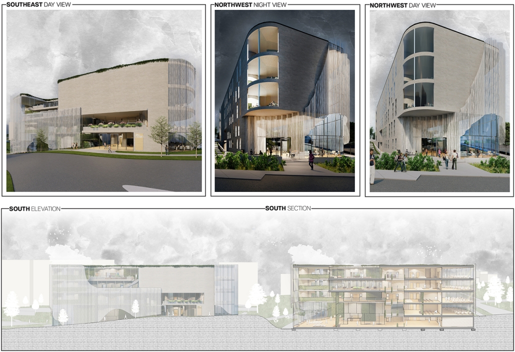
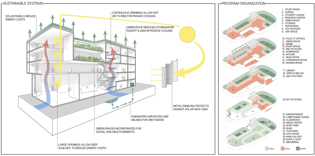
This 30,000 sq. ft. project, rethought architectural education through curriculum, pedagogy, and the agency of architecture. This new project on the famed arts campus was approached through wellness in connection with sustainable systems. The department was divided into four and one-half levels to support the programmatic needs of its social life. The east and west edges of the building were rounded to create unique campus spatial conditions and maximize view across the Kansas City arts district. The layering of program enables students, faculty and staff to have quality light and in views on three sides. Subtractive gestures on the building’s face to create exterior green spaces and sheltered entrance conditions. Entrances were placed on campus side (facing the quad) and public side (facing Nelson-Atkins Museum) on two different levels to respond to the existing site’s ten foot east-west slope. The facade was develop with white brick to connect to the existing masonry on campus, while the long southern face used glazing and metal paneling to control atmospheric lighting, prevailing winds for natural ventilation, and manage solar heat gain to reduce energy consumption. The external landscape was developed to establish a new social place on a campus that was lacking quality outdoor spaces. Permeable pavers, bio-swales, and native plantings helped managed run-off from the sloped quad while creating a quality natural environment in which student could occupy on the southern end of the intimate arts campus.
Instagram: @jess_grieser, @kendallhartley_, @polshavsky
Cultural Kitchen by Emily Pressprich, Austin Bass, Brandon Garza, Caitlin Truong, David Alvarez, Ian Green, Taylor Sanville, Ivan Cherniske, Kana Takagi, Maddie Crane, Marianne Fitzwilliam, Morocco Branting, Pamela Aymar, Patrick Norton, Radha Iyer and Yessenia Islas, M. Arch ’23
University of Washington | Advisor: Steve Badanes, Jake LaBarre and Miriam Gee
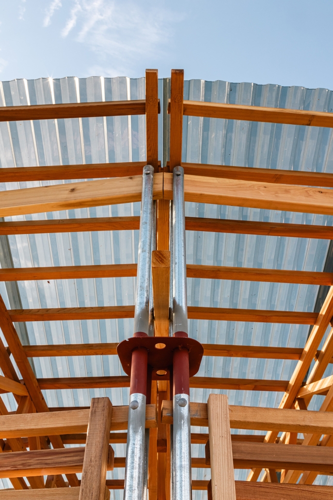
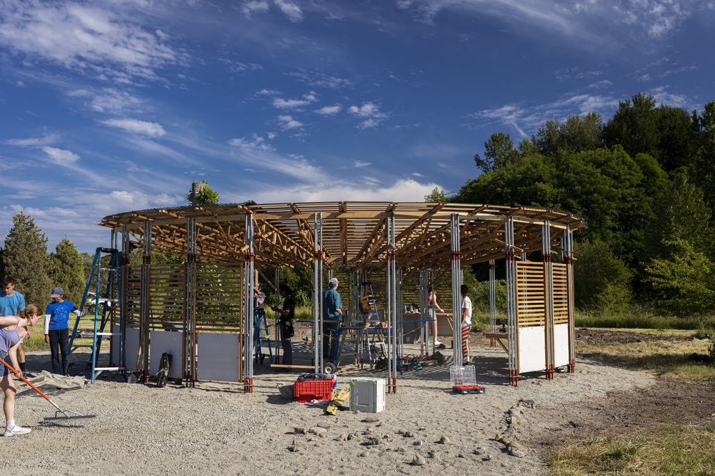
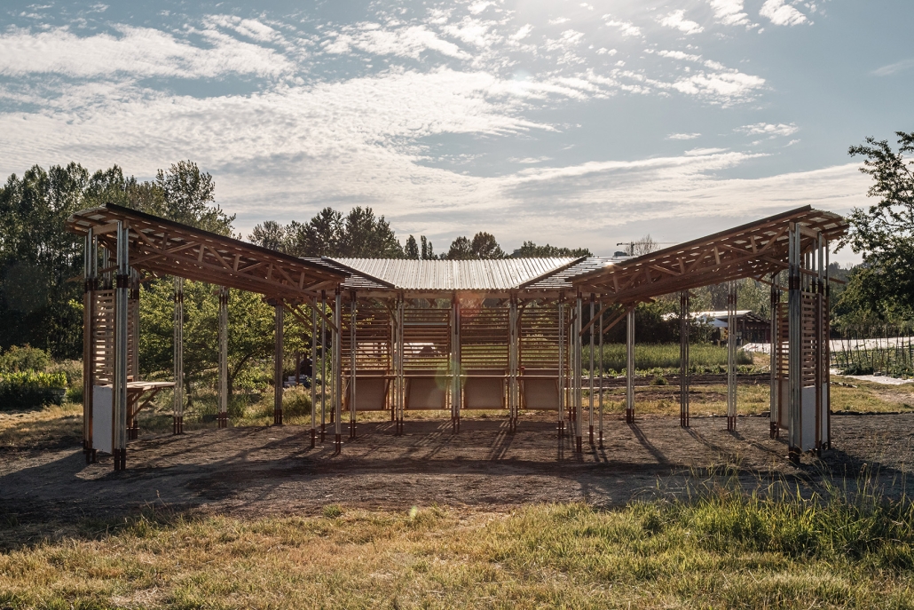
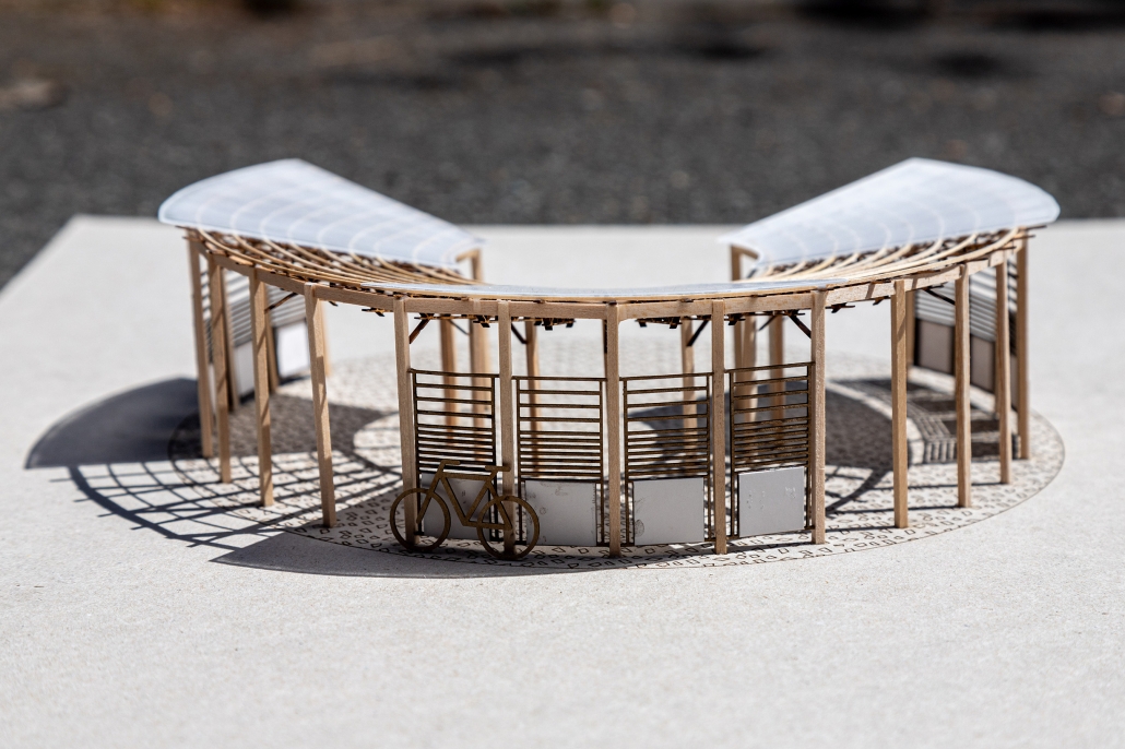
Designed and built by 16 students in the spring quarter of 2023, the World Cultural Kitchen is a gathering and cooking space for visitors, volunteers, and student workers at the UW farm, a 1.5 acre urban farm and educational center on the University of Washington campus. The Cultural Kitchen will be used for cooking and farming demos by the UW Farm, celebrations that are hosted at the adjacent Center for Urban Horticulture, and as a unique meeting place for visitors to the nearby walking trails of the Union Bay Nature area.
The design is a consensus-based group project, working with both graduate and undergraduate architecture students (2 of which are construction management double majors) to create a beautiful and durable structure to meet the needs of the client within an 11 week quarter. After refining a loose program, the class presents their schematic design to the client and then works to develop a construction document set which incorporates client feedback that is appropriate for a tight budget and even tighter construction schedule. By week five, they are building and testing project elements, developing their construction skills, and refining details to preassemble the project elements in studio. The final weeks of the studio involve project layout, site prep, reassembly, and finally a celebratory ribbon cutting as the project gets turned over to the client.
Instagram: @emilypressprich, @aust1n_bass, @caitlinche, @ivancherniske, @crane_maddie, @morocco.branting, @pameaymar, @patrick_norton, @jacoblabarre, @build_lightly, @co.everything, @NeighborhoodDesignBuildStudio
Bubble Rumble by Kathy Bi, Clytie Mak, Tien Pham and Yuzhou Wang, M.Arch ’23
University of California, Los Angeles | Advisor: Feghali Yara
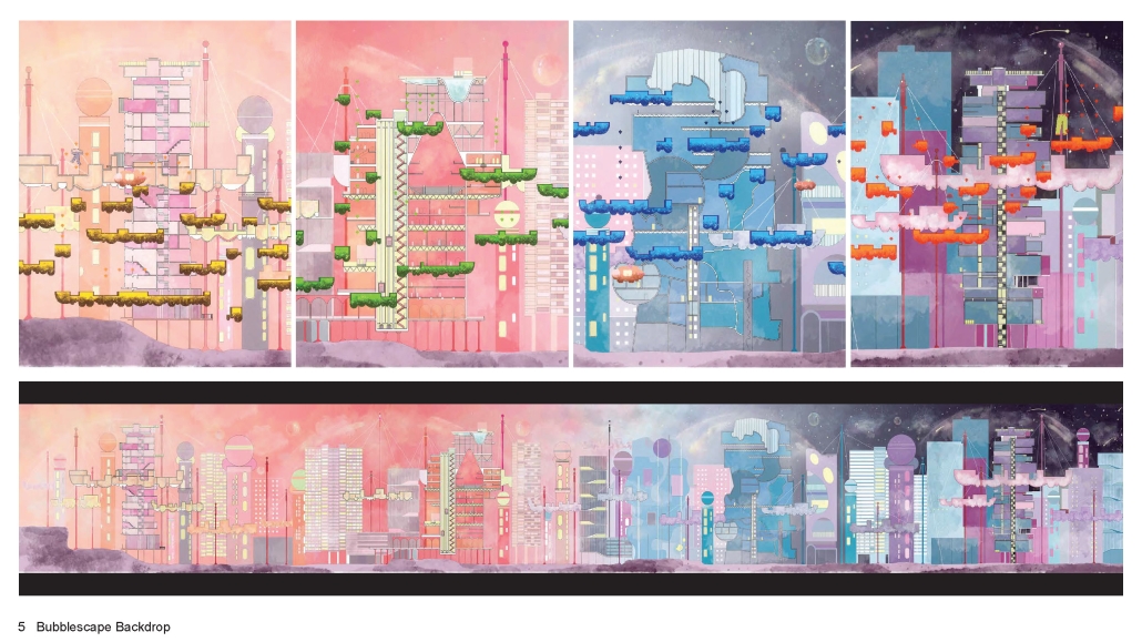
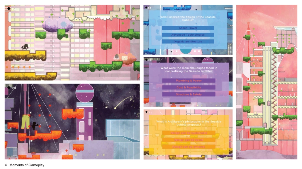
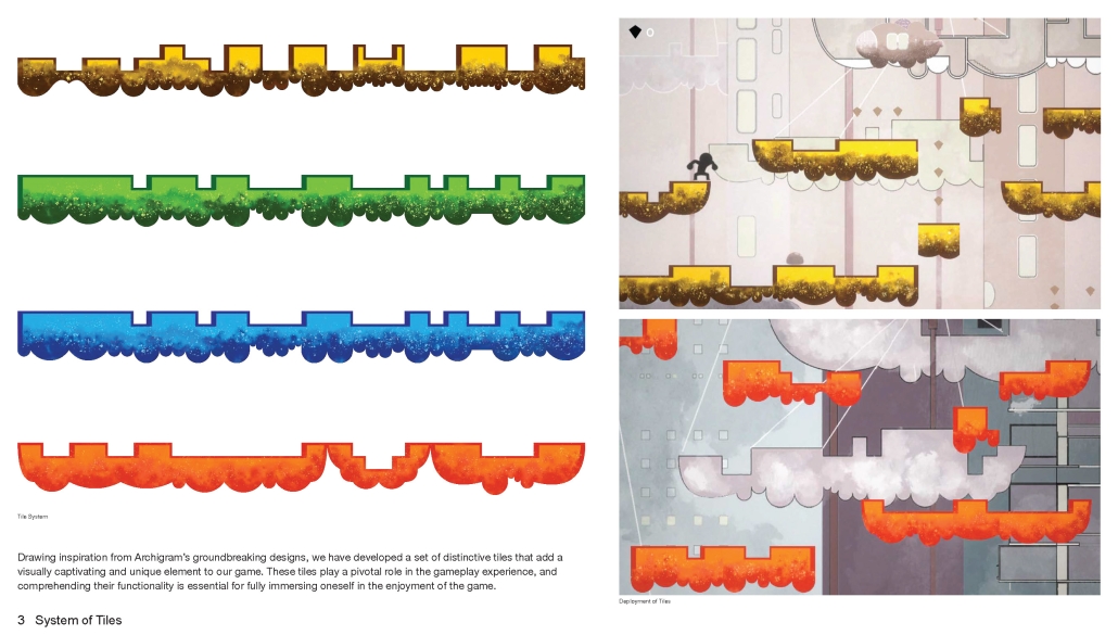
Bubble Rumble is an educational platform-game that draws inspiration from Archigram’s Seaside Bubbles and City Pop aesthetics. Players ascend platforms, progressing from daytime to nighttime, encountering architectural and artistic moments. Trigger questions provide architectural knowledge, emphasizing learning through play. Bespoke tiles, derived from Archigram’s iconic imagery, give Bubble Rumble a distinctive visual language.
Drawing inspiration from Archigram’s groundbreaking designs, we have developed a set of distinctive tiles that add a visually captivating and unique element to our game. These tiles play a pivotal role in the gameplay experience, and comprehending their functionality is essential for fully immersing oneself in the enjoyment of the game.
Instagram: @feghali.yara
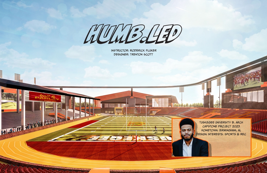
Humb.LED by Trenton Scott, B.Arch ’23
Tuskegee University | Advisor: Roderick Fluker and Dr. Carla Jackson Bell
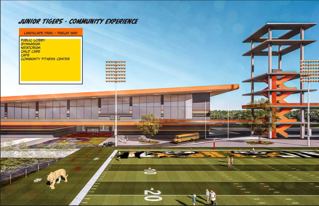
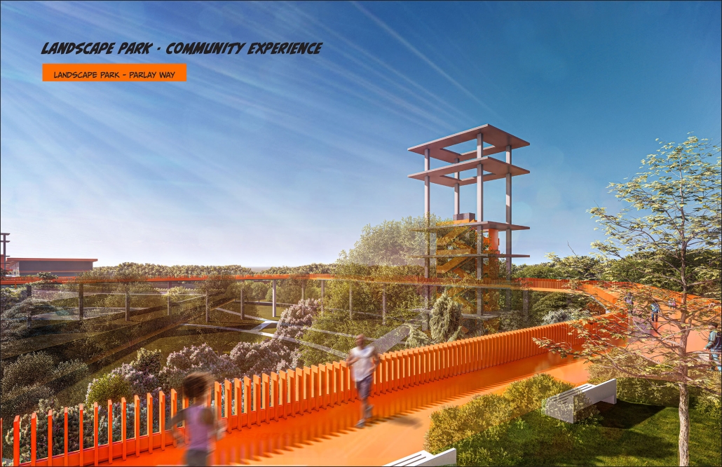
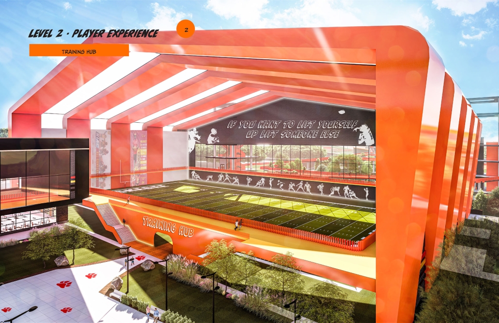
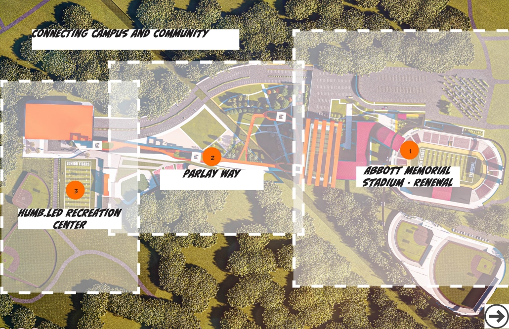
The design proposal seeks to strengthen community-university relations by developing a public park which links two existing sites significant to each: Tuskegee University campus stadium and a Tuskegee community park and recreational center. Both facilities are enhanced and expanded architecturally and promote sports participation and fitness in bringing together members of each community. The shared spatial programming also provides opportunities for the university to strengthen its recruitment pipeline locally and community engagement for students and faculty.
Instagram: @carla_jackson_bell
Head Heart Hands by Tyler Littes, B.Arch ’23
Tuskegee University | Advisor: Roderick Fluker and Dr. Carla Jackson Bell
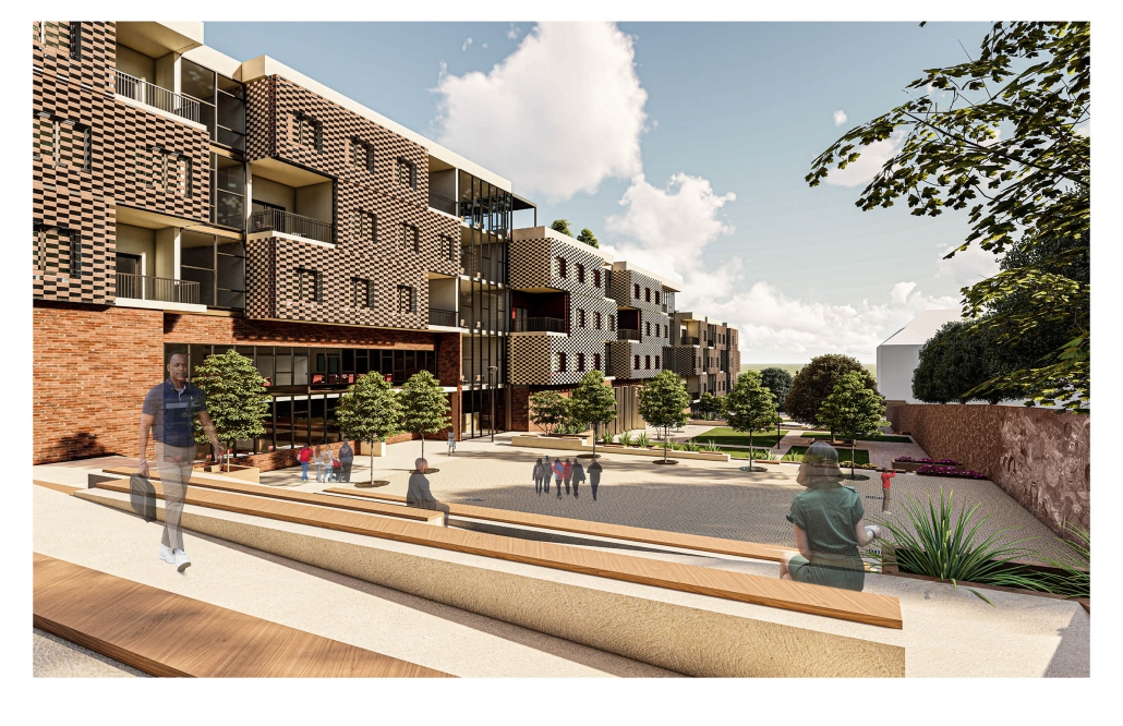
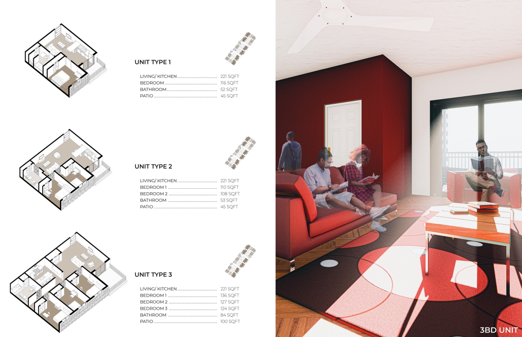
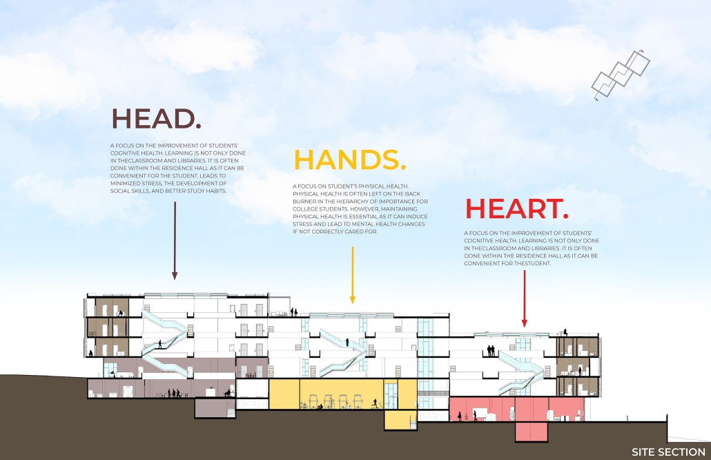
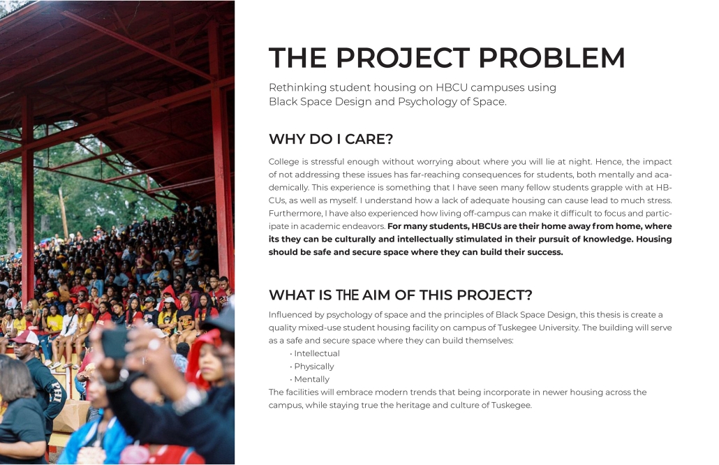
The project explores the aesthetic implications for a new campus living learning center in the context of the existing historic district of Tuskegee University. Space, program, and material use combine to form an inviting and comforting living environment for students – allowing them to feel empowered to achieve their full educational potential. Symbolically the project employs the themes of head, heart, and hand in addressing student needs, and linking to Tuskegee’s founding, the campus, and the teaching philosophy of Booker T. Washington.
Instagram: @carla_jackson_bell
PASSAGE by Gabriel Valdez, B.Arch ’23
The University of Texas at Austin | Advisor: Nichole Wiedemann
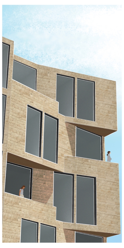
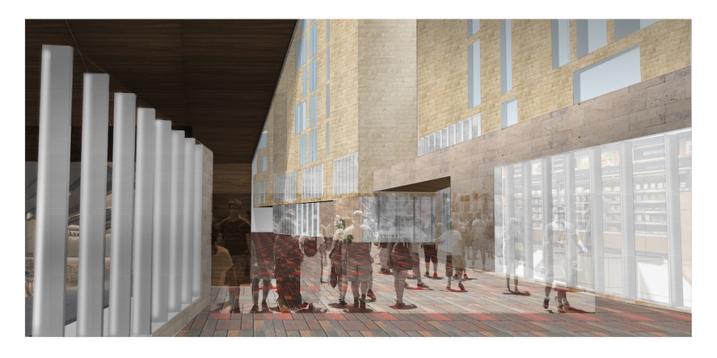
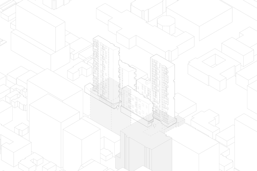
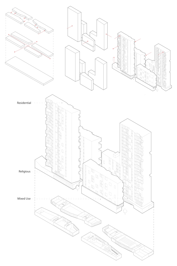
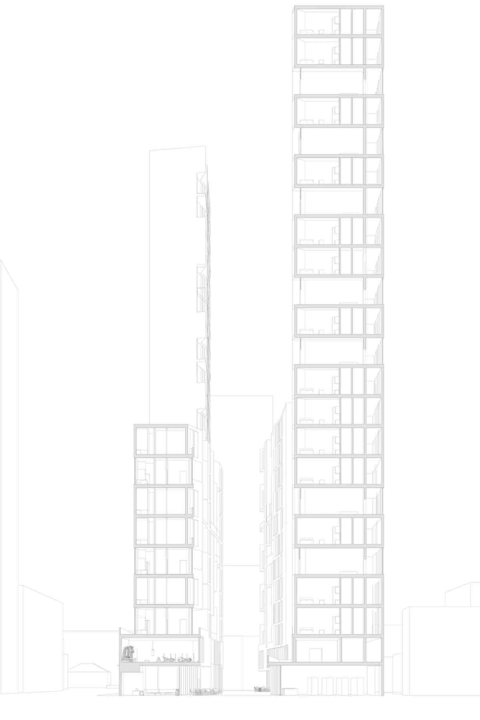
Inspired by the latent potential of old alleys throughout the increasingly dense West Campus, the design introduces another alley, an informal and lively pedestrian passage, that unites a range of people and programs. The strategy helps to resituate a longstanding religious institution, who owns the property, and introduce student living and services. While the base is shaped by mixed-use and church functions creating a public sphere, the residential towers are shaped by views and light. Suggestive of the larger pedestrian network in the neighborhood, the PASSAGE creates a social landscape through intermingling and movement.
Instagram: @nicholewiedemann
Lighthouse Christian Study Center by Alyssa Lee, M.Arch ’23
California Baptist University | Advisor: Dr. Matthew Niermann
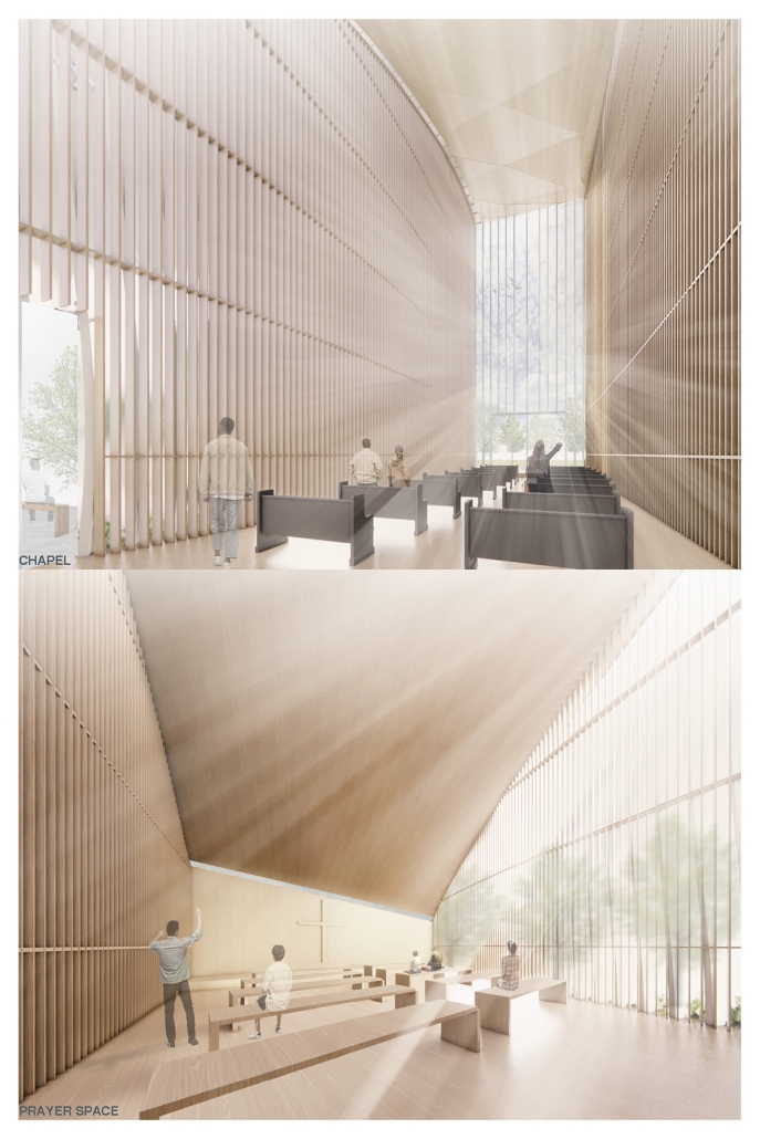
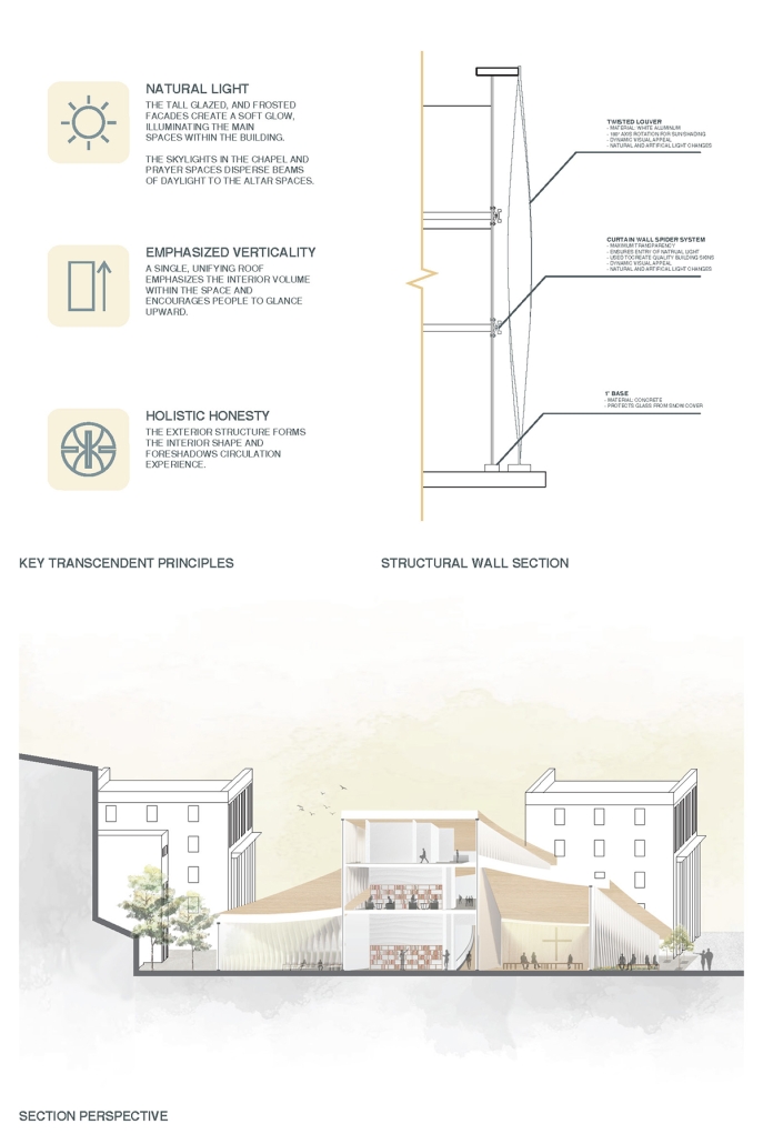
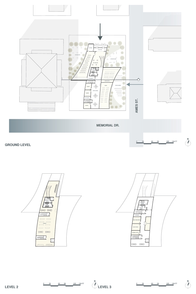
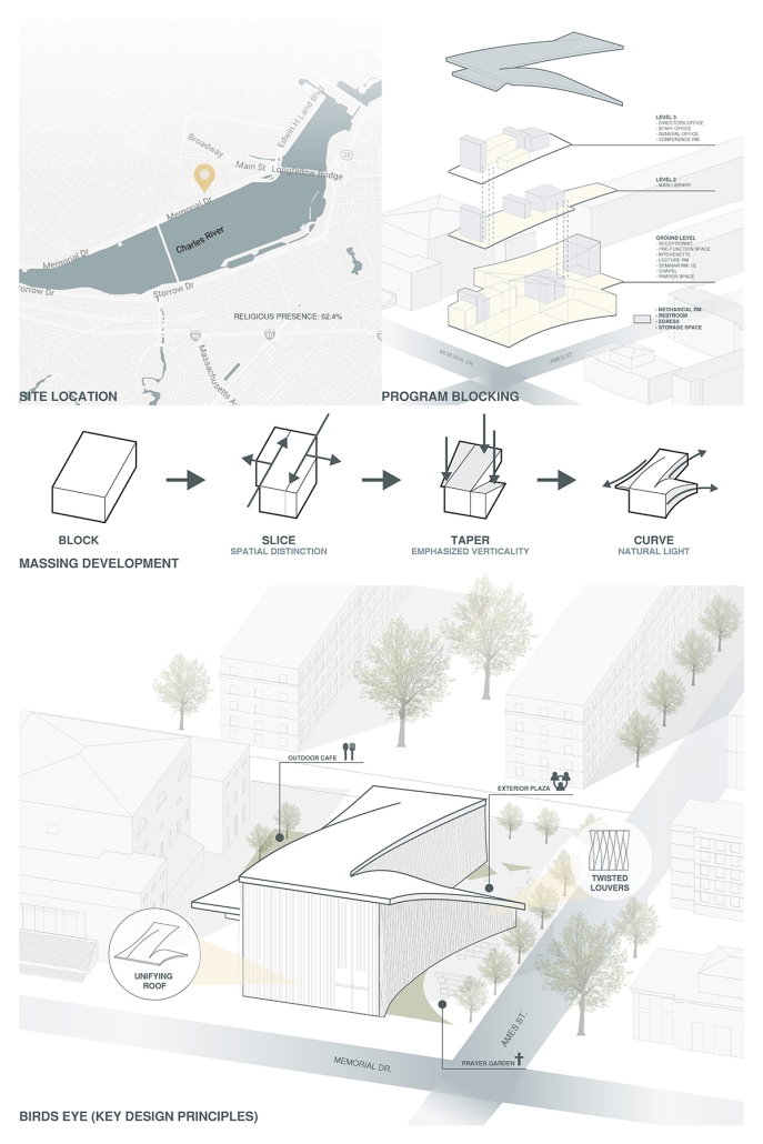
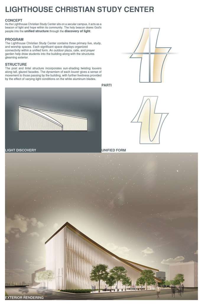
The Lighthouse Christian Study Center is on a college campus acting as a beacon of light and hope within its community. The beacon draws faithful people into the unified structure to experience transcendence through the use of light. The Center contains three primary live, study, and worship spaces.
Each significant space displays organized connectivity within a unified form. The gleaming exterior is complemented by an outdoor plaza, cafe, and prayer garden support student life and vibrancy. The post and lintel structure incorporates sun-shading twisting vertically oriented louvers along tall glazed facades. The dynamism of each aluminum louver gives a sense of movement to those passing by and through the building, with further liveliness provided by the varying effect of daylight through the vertical strokes of the facade.
Instagram: @cbuarch
Stay tuned for the next installment of 2023 Student Showcase!

