2025 Study Architecture Student Showcase - Part IX
Sprouting Market by Ryn Blackburn, B.S. in Architecture ’25
University of Illinois at Urbana-Champaign | Advisor: Wei Zhao
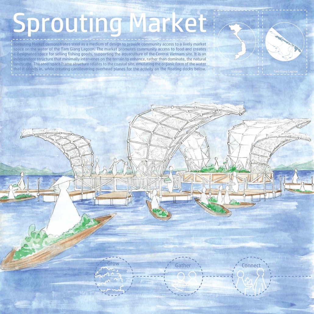
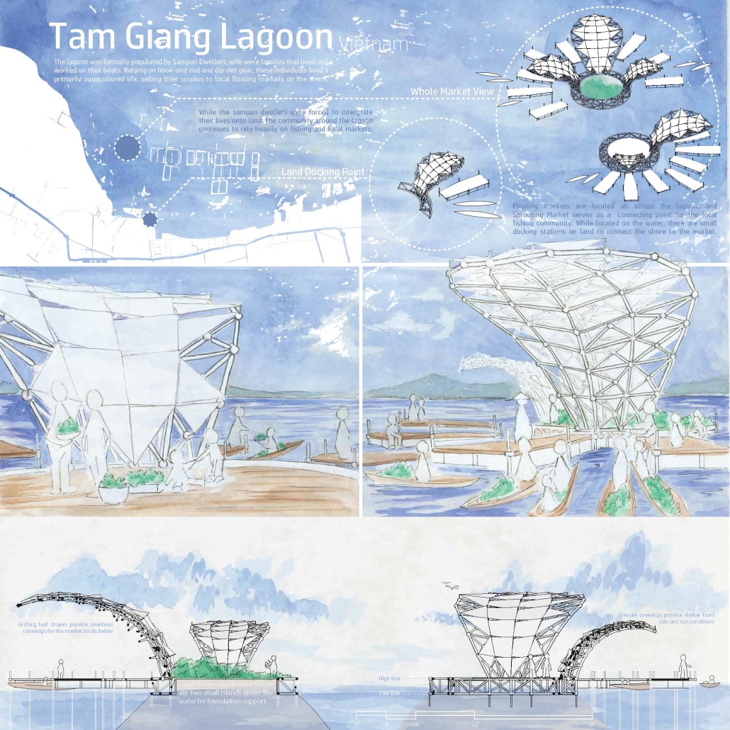
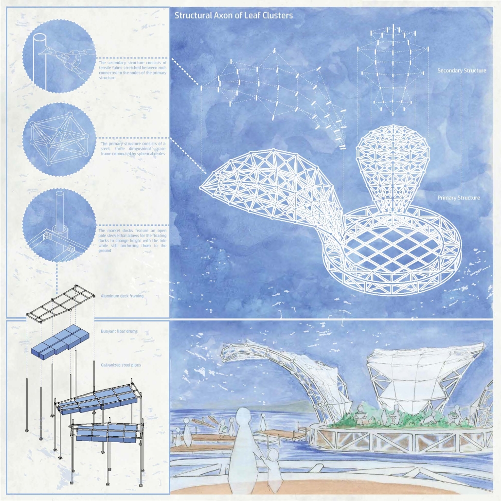
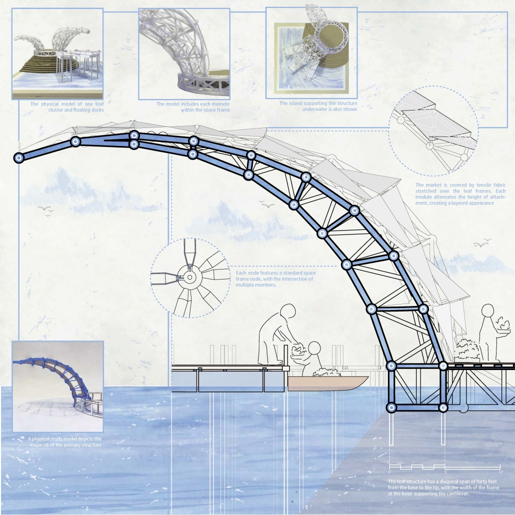
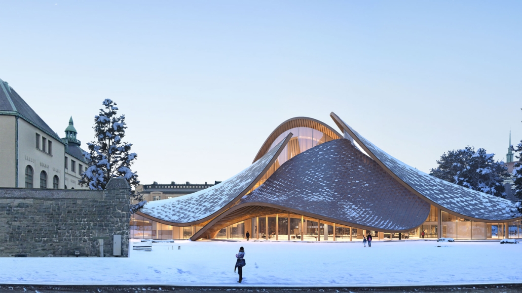
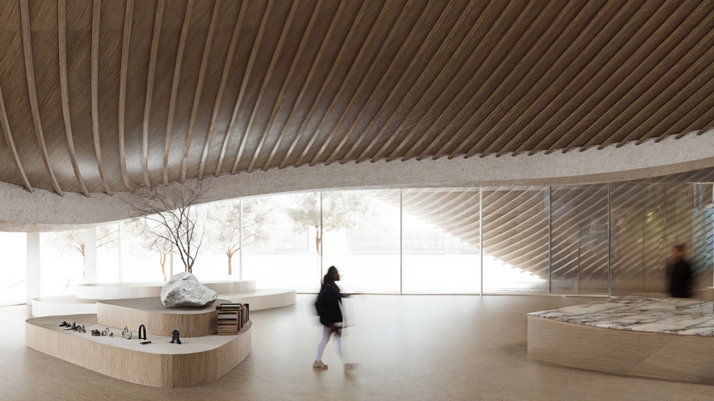
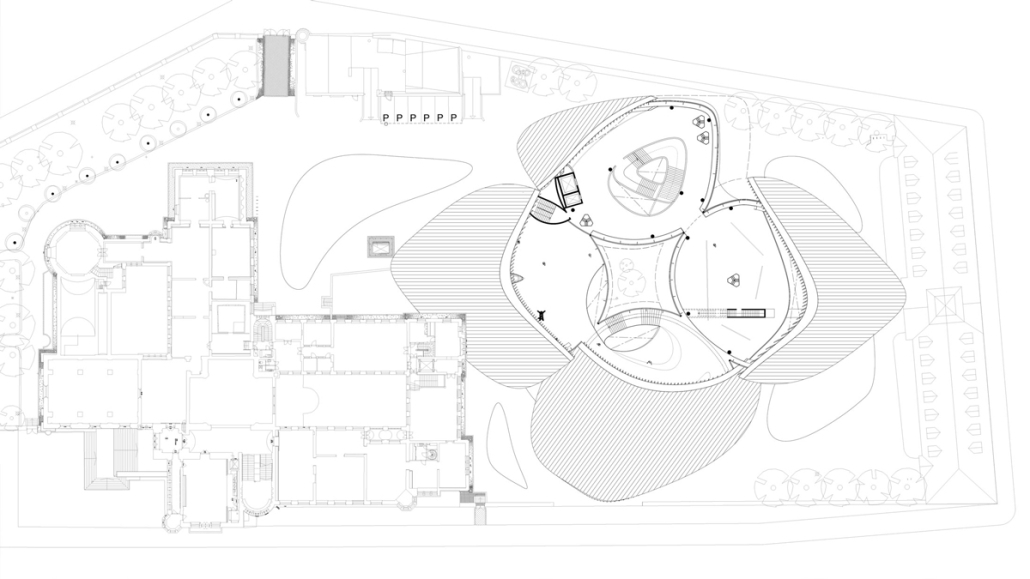
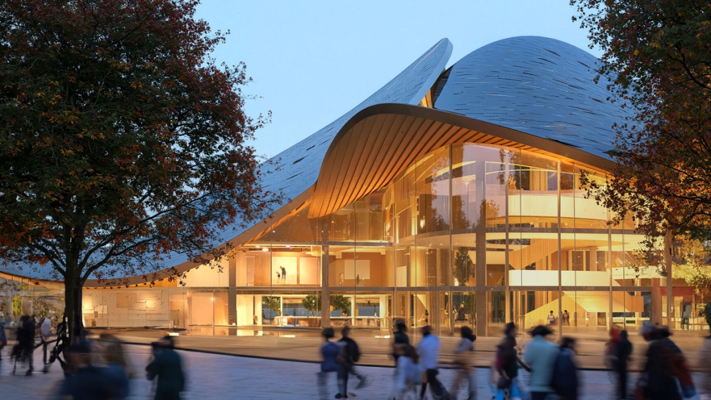
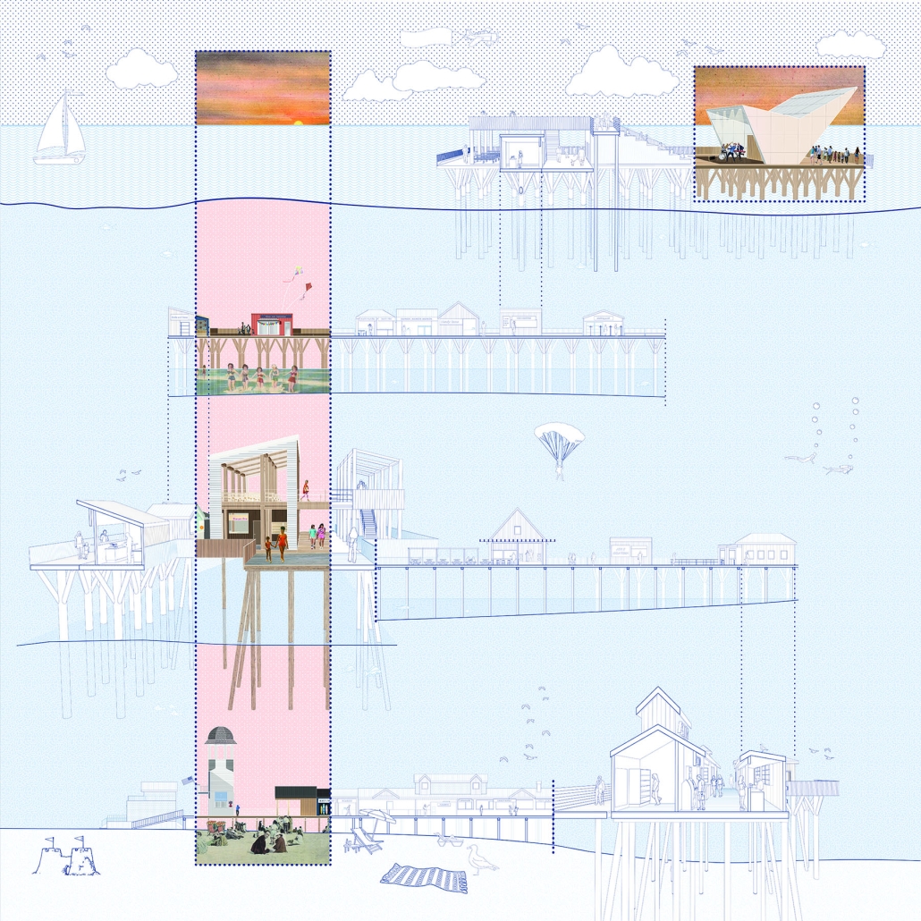
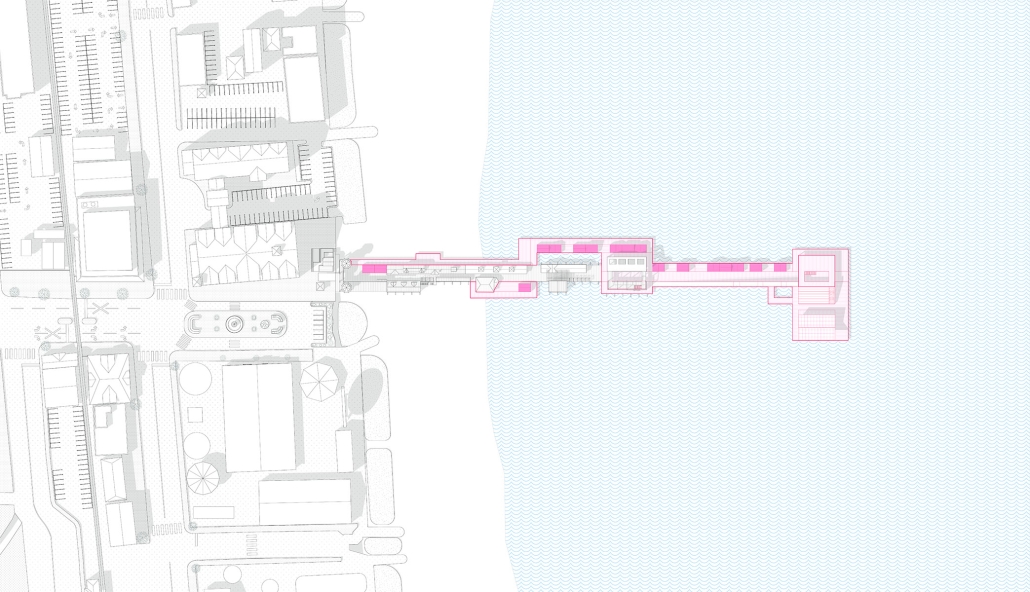
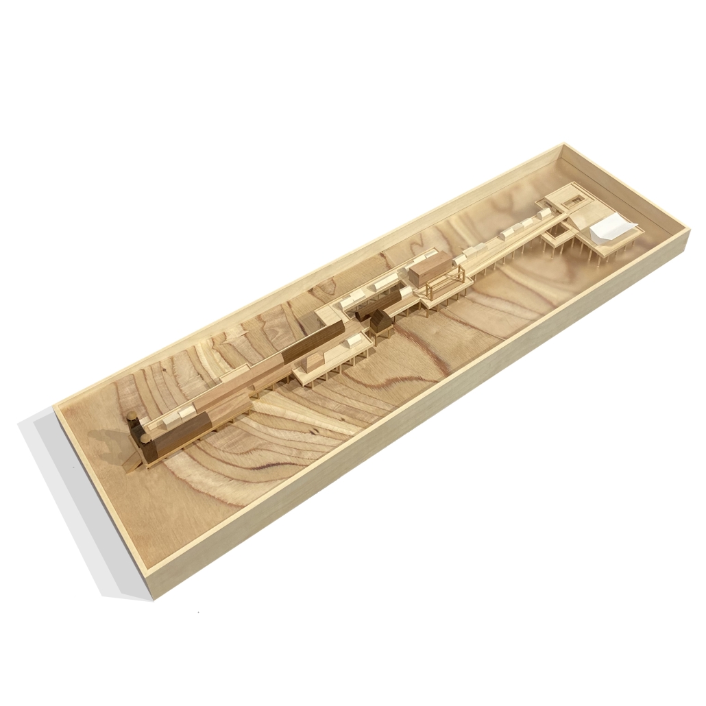
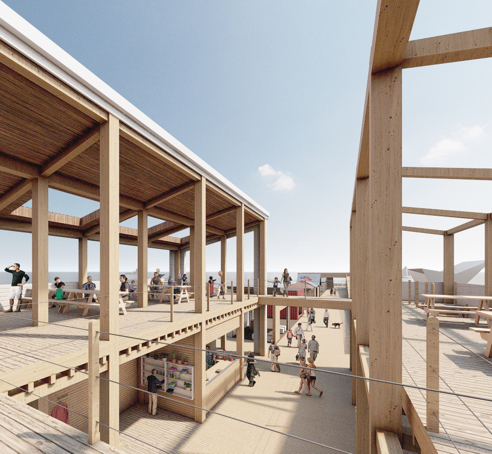
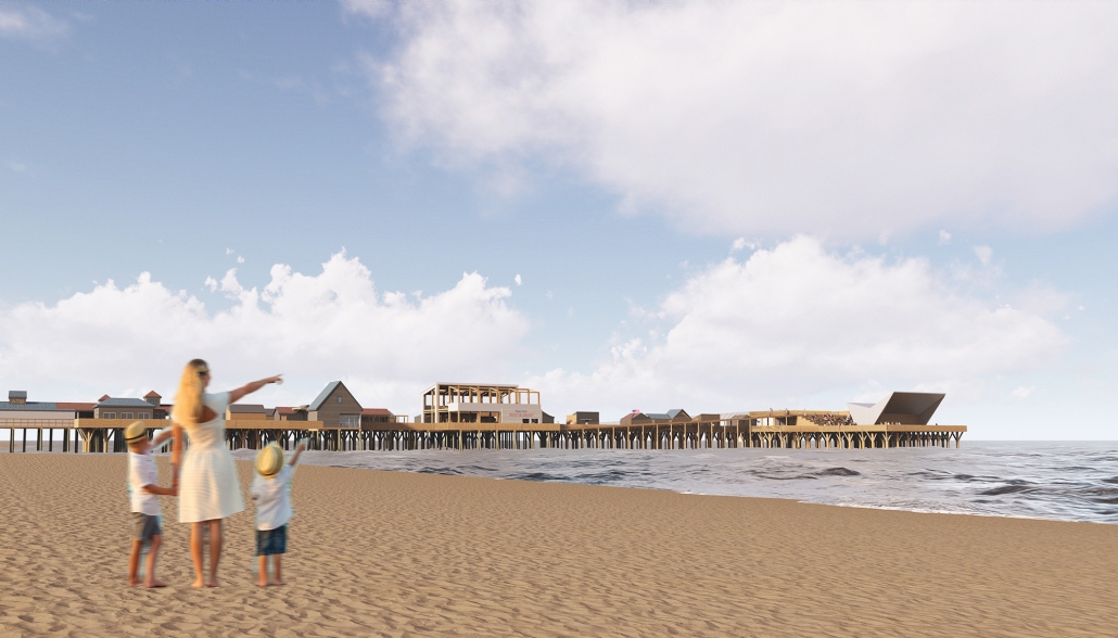
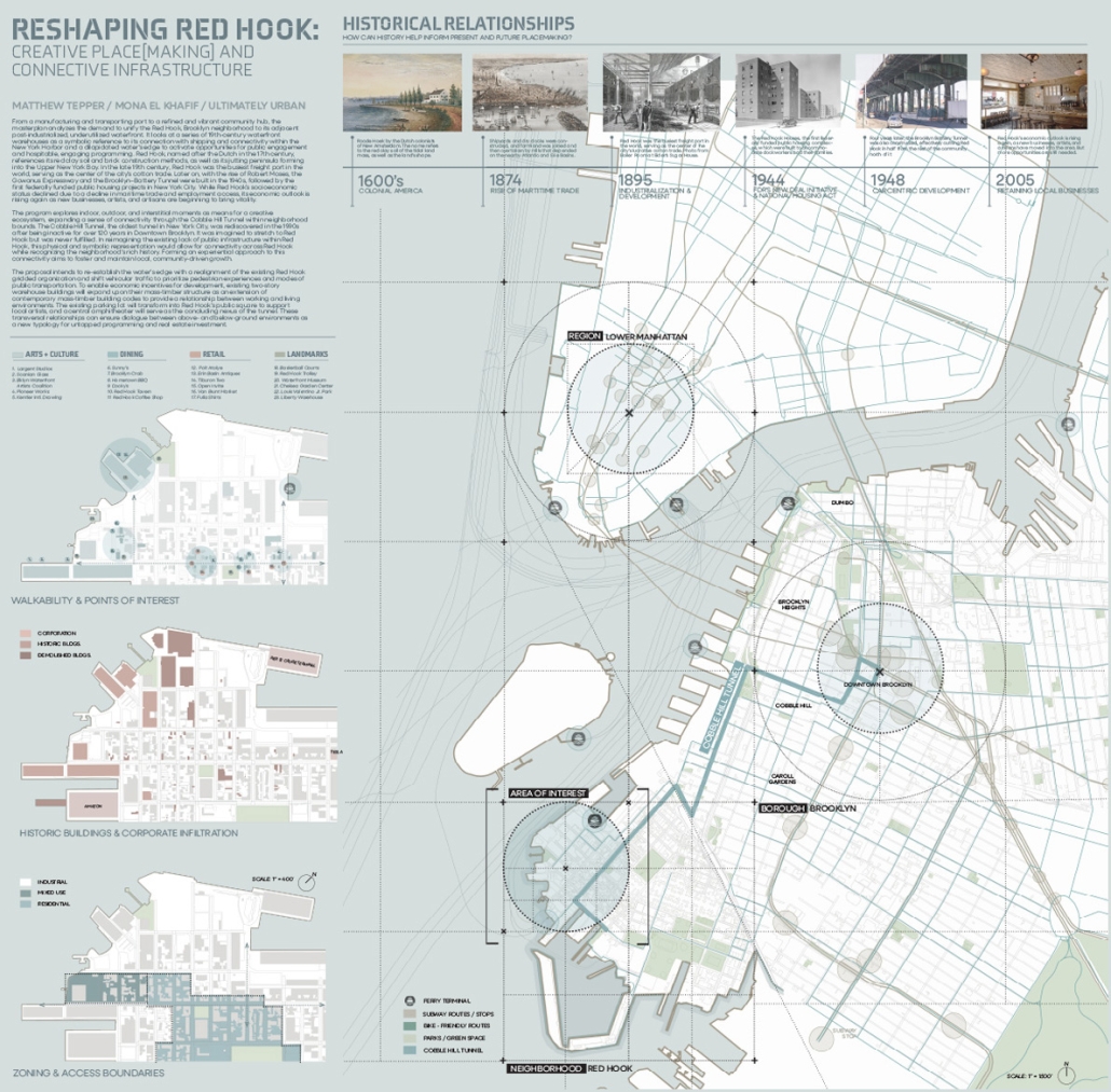
“Sprouting Market” offers the local community access to a vibrant market space set on the waters of the Tam Giang Lagoon, where many residents live on boats. Utilizing a steel space-frame structure with tensile fabric for shading, the design minimizes contact with the terrain to preserve the region’s delicate aquaculture. Fully open to its surroundings, the market allows boats and people to pass through freely or gather beneath an organically shaped roof where commercial activities and social exchanges unfold. Inspired by the traditional floating markets of the lagoon’s coast, the design reinterprets this tradition while introducing programmed and programmable spaces for both locals and visitors.
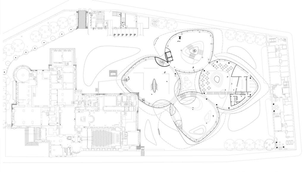
At the heart of one leaf-like cluster is a community garden that supports food security; the opposing cluster accommodates flexible spaces for social gatherings and cultural performances. A smaller canopy structure marks the dock along the shoreline, creating both a visual and functional link between the new market and the existing onshore one. The structure is thoughtfully designed to accommodate the lagoon’s fluctuating water levels throughout the day. While portions of the central circular platform may be partially submerged, the docks are built to float, adapting seamlessly to the changing tides. More than just a marketplace, Sprouting Market is a place of connection, community, and collective growth.
The Museum of Water and Sustainability in Querétaro by Fabricio Guerra Hernández, B.Arch ‘25
Universidad Anáhuac Querétaro | Advisors: Guillermo Márquez, Patricia Cutiño & Jorge Javier
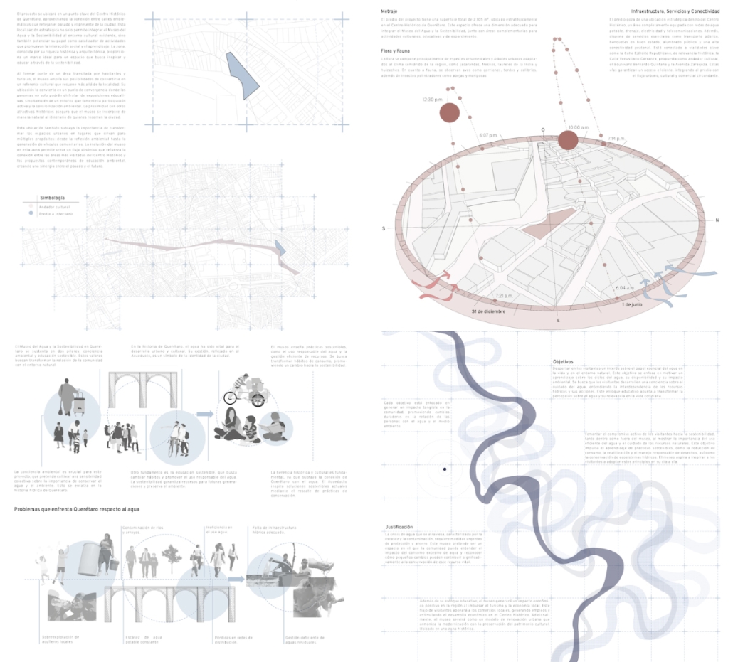
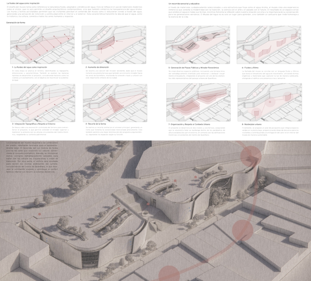
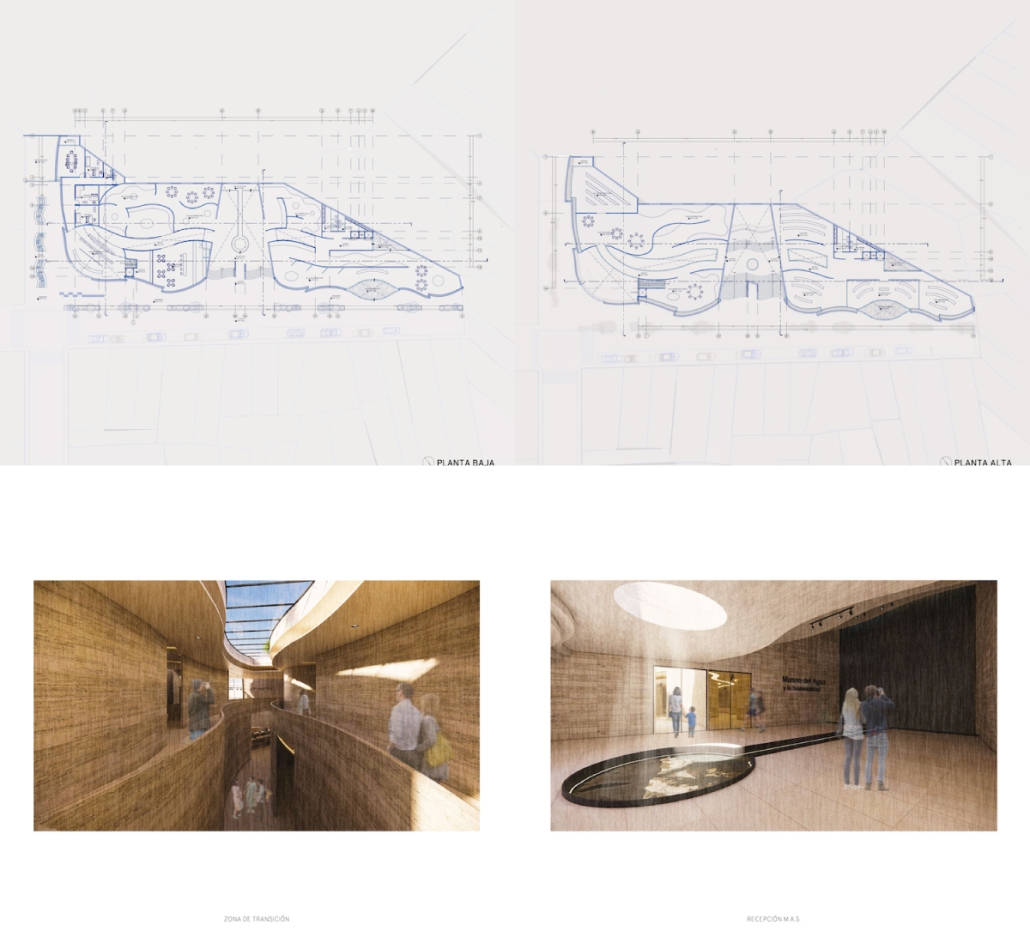
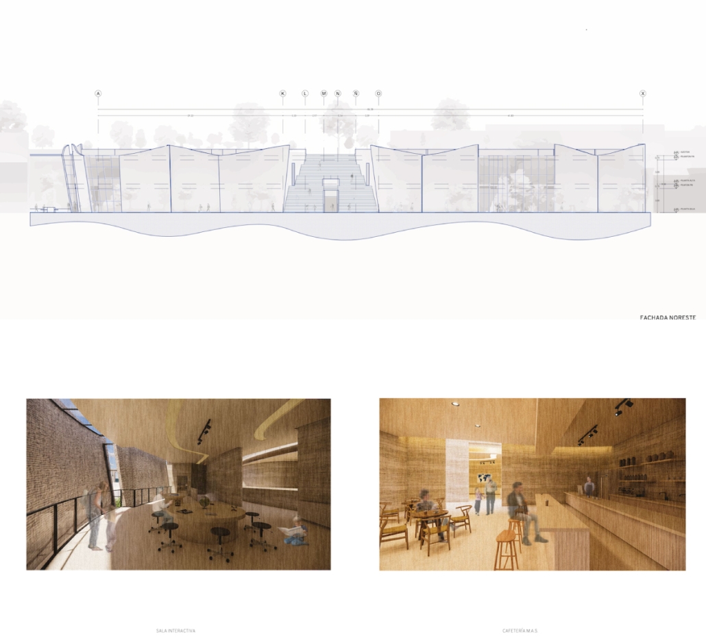
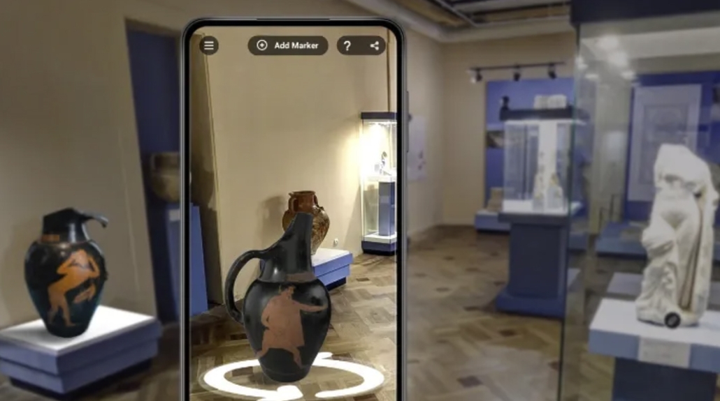
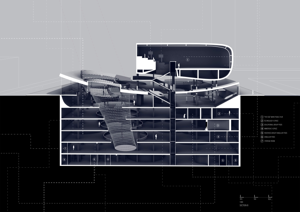
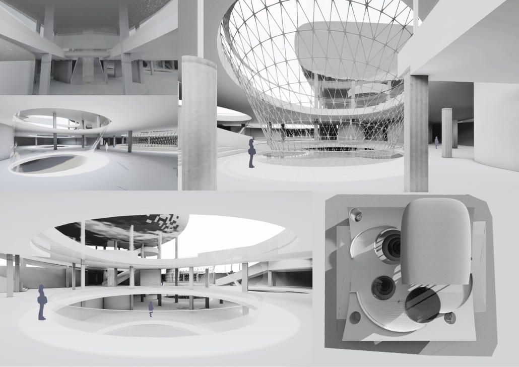
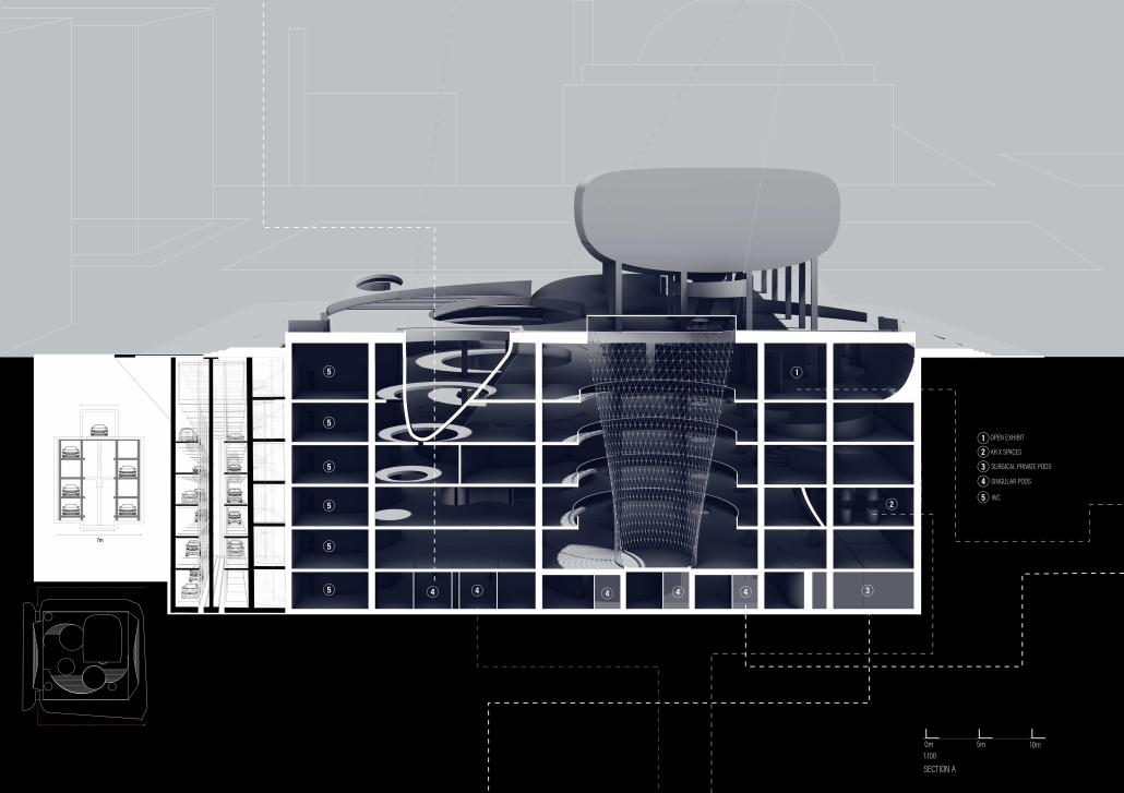
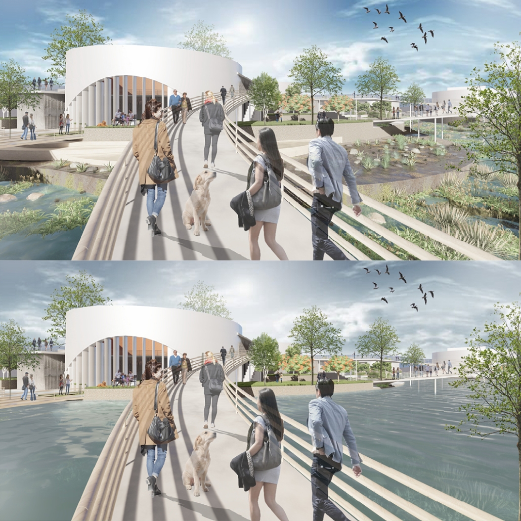
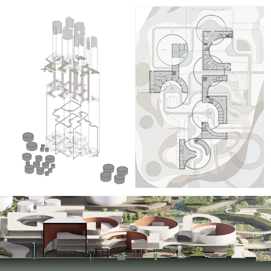
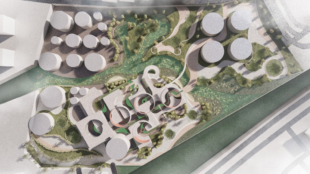
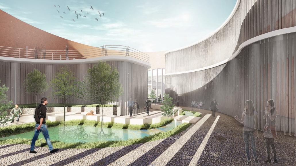
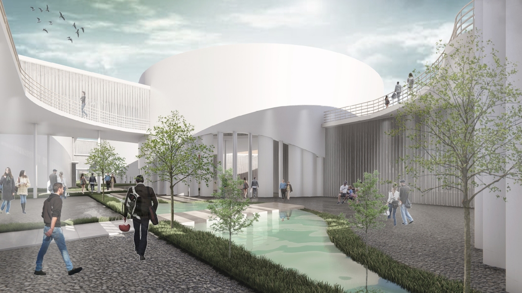
The museum is an educational and cultural initiative aimed at raising awareness about the importance of water and sustainable practices in a region increasingly impacted by water scarcity. Located in the Historic Center of Querétaro, the museum serves as a dynamic space where community members can engage with environmental issues through interactive exhibits, educational programs, and sustainable architectural design.
The mission of the museum is to promote knowledge, reflection, and active participation in water conservation and sustainable living. It integrates the historical narrative of water management in Querétaro with current global and local strategies for sustainability, creating a powerful bridge between past practices and future solutions. Through immersive experiences, the museum seeks to foster a culture of environmental responsibility, particularly among younger generations.
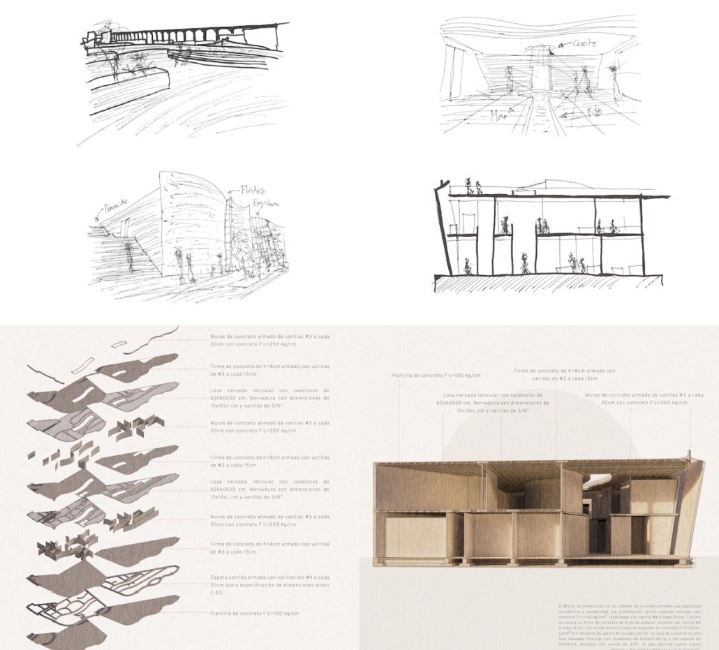
The design of the museum emphasizes green building principles, using renewable energy systems, rainwater harvesting, and eco-efficient materials, positioning it as a model of sustainable urban regeneration. It also functions as a research and innovation center for water-related issues, collaborating with local institutions, scientists, and environmentalists.
By addressing the complex challenges of water management and climate change, the Museum of Water and Sustainability aims to become a reference point for other regions facing similar issues. It offers not only an informative journey but also a call to action—highlighting the urgent need for collective awareness and efforts toward environmental stewardship. Ultimately, the museum stands as a beacon of hope, education, and community empowerment, contributing to the long-term resilience and sustainability of Querétaro and beyond.
Instagram: @fabriciog17, @arquitectura_anahuac, @arqwave
Folding Seoul: Reframing the Capital’s Central Station by Jungbin Sheen, B.Arch ’25
Myongji University | Advisor: Junsuk Lee
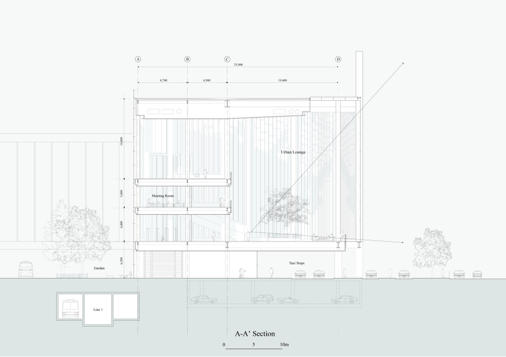
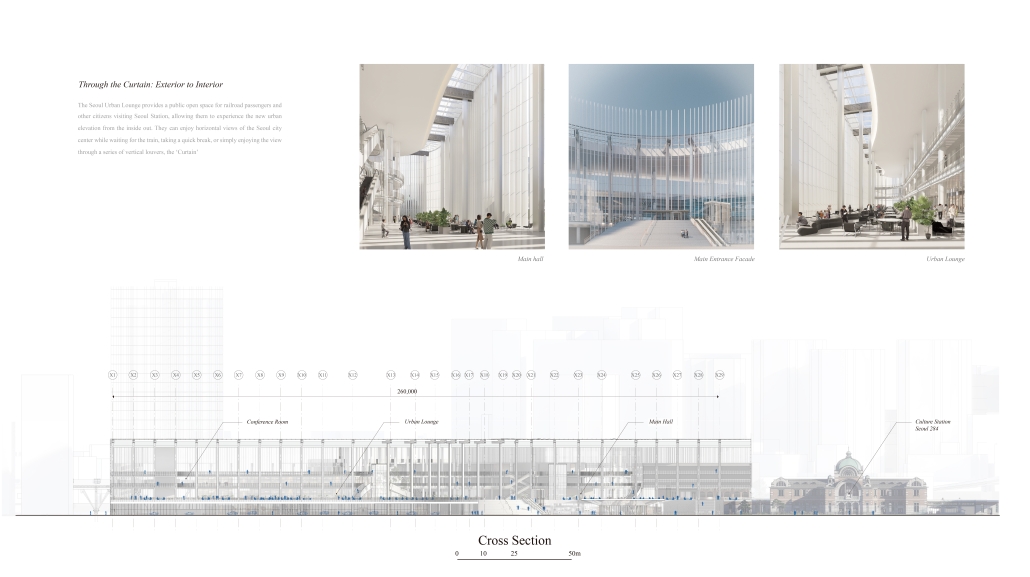
The Seoul Station is the central station of the national capital, including public buildings and plazas that are essential urban elements, and is close to several national symbols such as Sungnyemun Gate and Seoul Plaza in the former Hanyang Fortress, and serves as a node that is easily accessible from various directions using various transportation systems such as taxis, buses, and pedestrian traffic. The integrated history of Seoul Station has not fulfilled its status as the central station of the national capital, with large commercial facilities occupying most of the area, a pedestrian plaza narrowed by the horizontal expansion of the transportation system, and a lack of frontality due to the logic of civilian development. The spatial experience of the existing Seoul Station, and its circulation system, provides a sense of passing through large commercial facilities or wandering through the corridor space of the exterior staircase plaza, which we considered as a lack of symbolism in the experience of the capital’s central station. What kind of symbolism could represent ‘Seoul Station’?
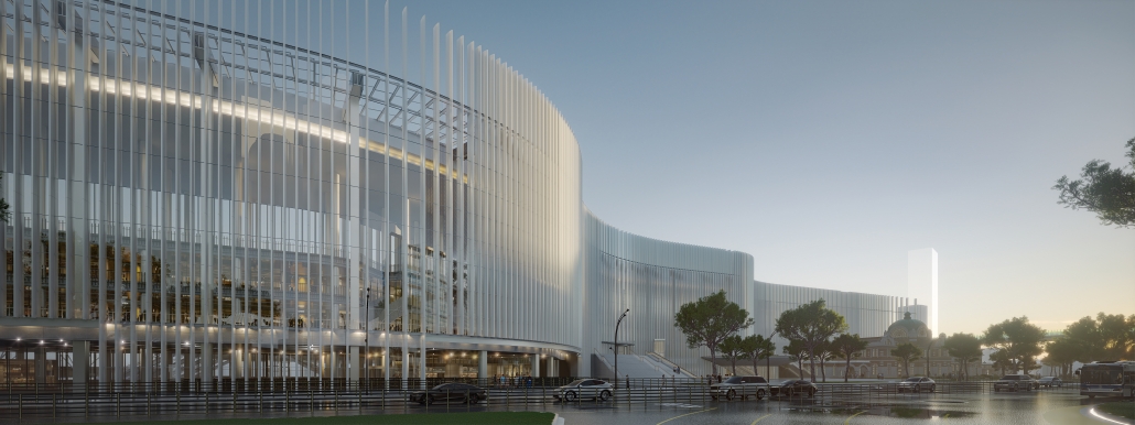
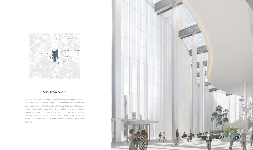
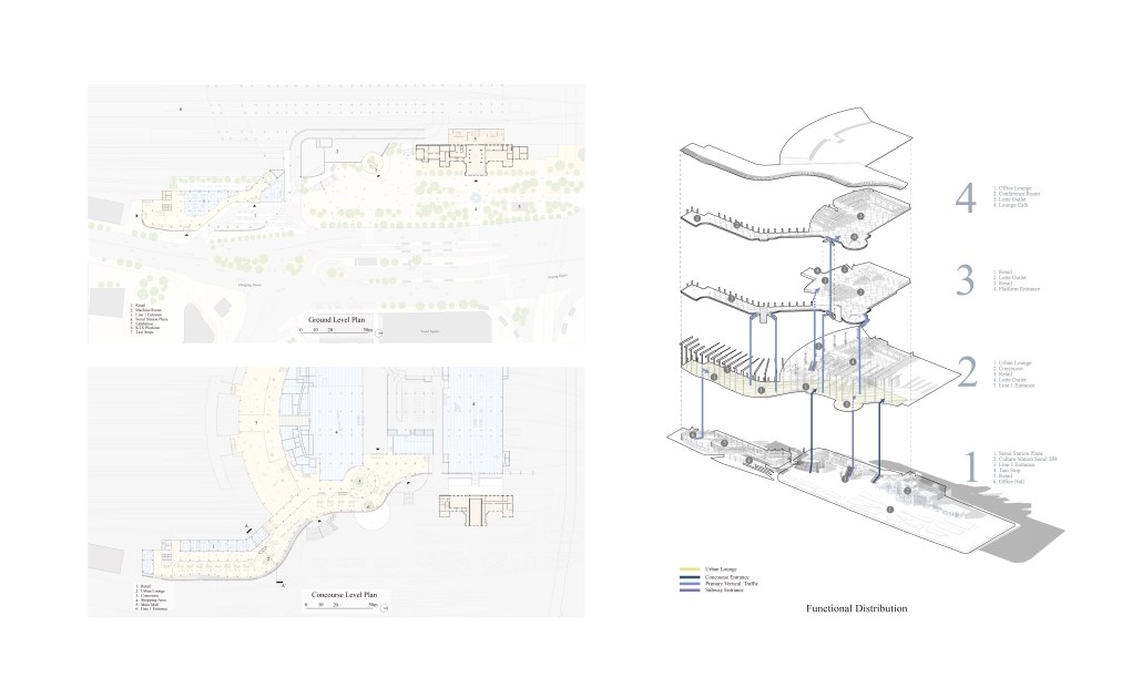
The project begins with the discovery of a linear piece of land on the southeast side of Seoul Station with an odd shape. The site is privately owned and is lined with a narrow row of dilapidated neighborhood facilities, making it a place with dull development potential and a challenge in securing the symbolism and frontage of Seoul Station. Recognizing the development potential of the site, the project considers the place of ‘Seoul Station’ as a central station and proposes symbolic exterior materials and structures that encompass the spatial experience of rail passengers in the space of Seoul Station. [It also considers] the need for an urban open space where citizens who do not come to Seoul Station for the purpose of using the railroad can come and rest and spend time, through a method of expansion that demolishes only a small part of the existing structure. The Seoul Station pedestrian plaza, which was expanded by the relocation of the taxi stand, and the urban lounge, which is open to anyone regardless of their purpose of use, are separated by a curved louvered curtain derived from the form of the existing Seoul Station. It presents a white backdrop that juxtaposes the existing marginalized cultural station, Seoul 284, and the behavior of rail passengers using the interior space becomes transparent through the thin vertical structure. Depending on the inflection point of the curve and the position of the visitor, the frontality of the plaza and Seoul Station is received by the viewer as a coexistence of the white folding screen with the exterior reflection of the urban lounge.
Instagram: @bin__cong, @myongji_univ
Place-Reclaiming Chinatown: Repairing the Urban Landscape of Manhattan Chinatown by Katherine Shi, B.S. in Architecture ’25
University of Virginia | Advisor: Mona El Khafif
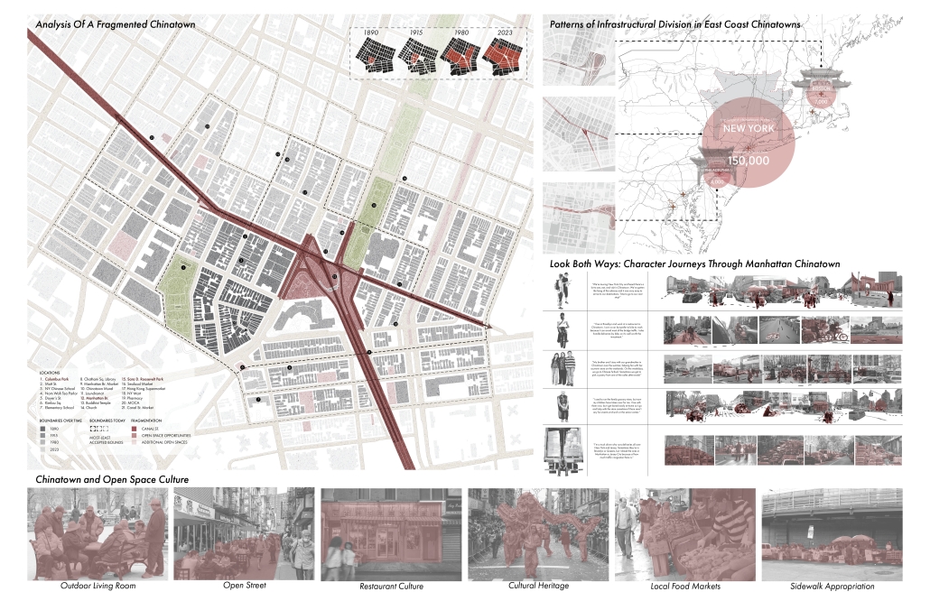
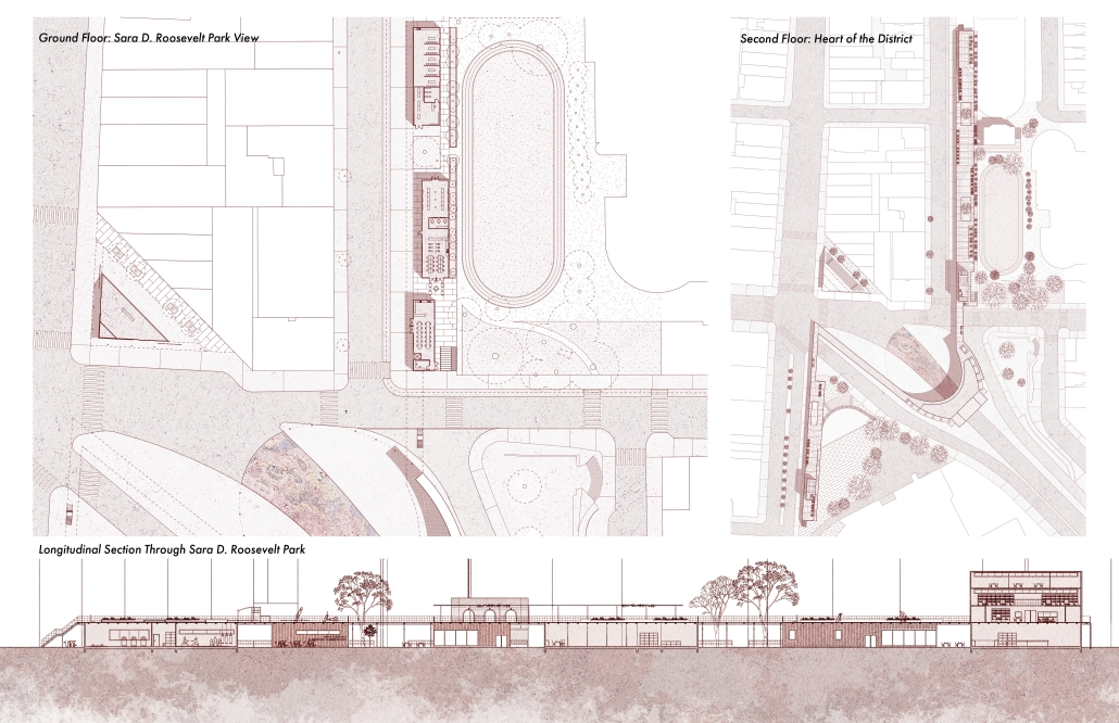
Chinatowns exist worldwide, and in nearly every major American city. Historically formed as ethnic enclaves of Chinese immigrants facing persecution from legislation such as the Chinese Exclusion Act, they have evolved into important socio-economic centers of activity and community hubs within their respective cities. New York City is home to nine Chinatowns, making it the largest center of Chinese Americans in the Western Hemisphere. However, many Chinatowns are shrinking due to urban development and gentrification, and Manhattan’s Chinatown, one of the first Chinatowns established in the US, is no exception. Asian residents and local businesses have been pushed out, resulting in closed storefronts, land loss, and displaced community members, especially following COVID-19. More significantly, there is the risk of cultural erasure as a result of these changes.
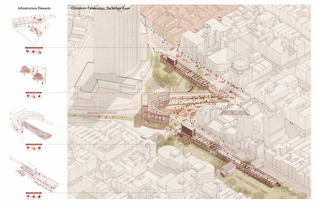
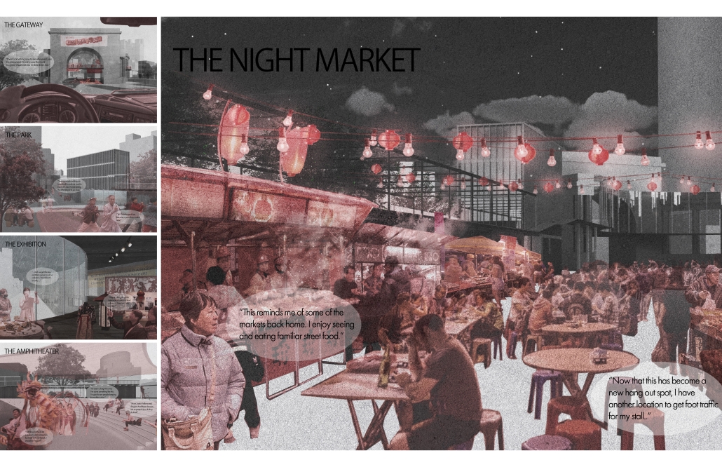
An important part of local identity, for example, is Chinatown’s distinctive use of public space, as seen in its culture of street vending and sidewalk appropriation. Columbus Park and Sara D. Roosevelt Park are some of the most important public spaces in the district. This is where residents socialize, play mahjong, exercise, and greet each other in their native tongue. However, large roadway infrastructure creates a significant and dangerous disconnect at the heart of Chinatown.
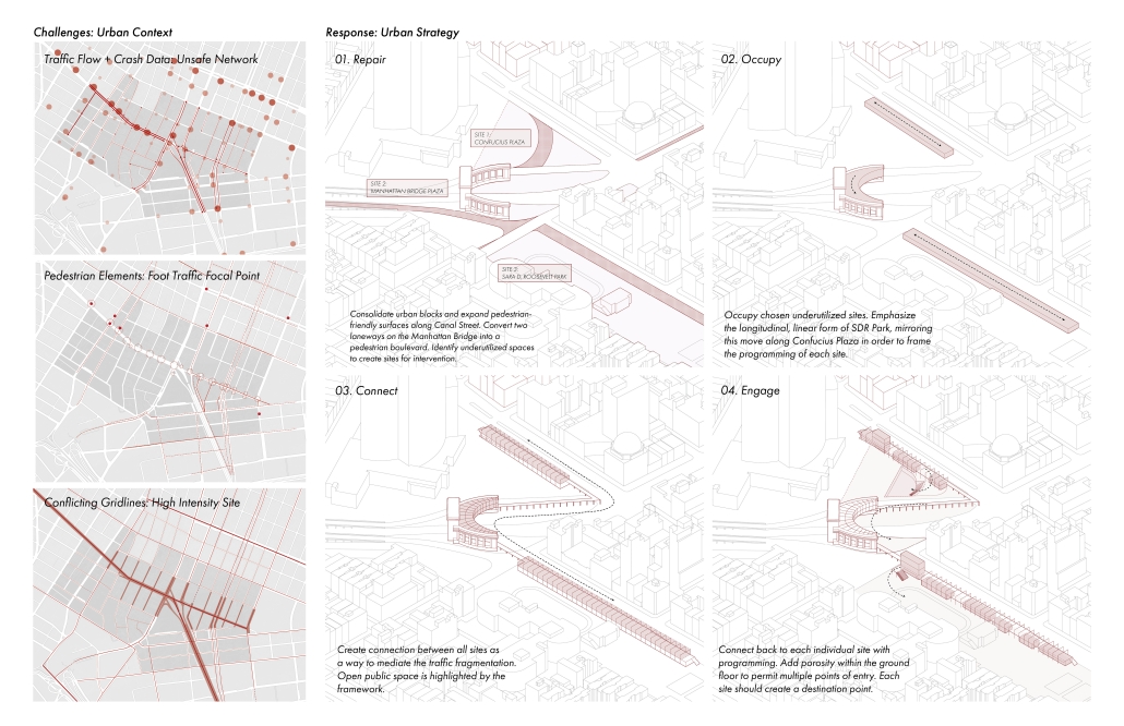
This thesis, therefore, proposes an urban design approach for Manhattan Chinatown that seeks to reconnect green spaces in a traffic-torn cultural district, provide needed social infrastructure support, and reclaim the identity of the Manhattan Bridge Plaza as a Chinatown gateway. The intention is to bring vibrancy to underutilized sites at the heart of the community, not only by preserving and celebrating Chinatown culture and history, but also by supporting residents’ way of life within a transforming district.
Instagram: @pro_kat_stinator, @monaelkhafif
2-in-1, CULINARY CENTER AND RESEARCH HOSTEL by Julius Lin, M.Arch ’25
University of California, Berkeley | Advisor: Rene Davids
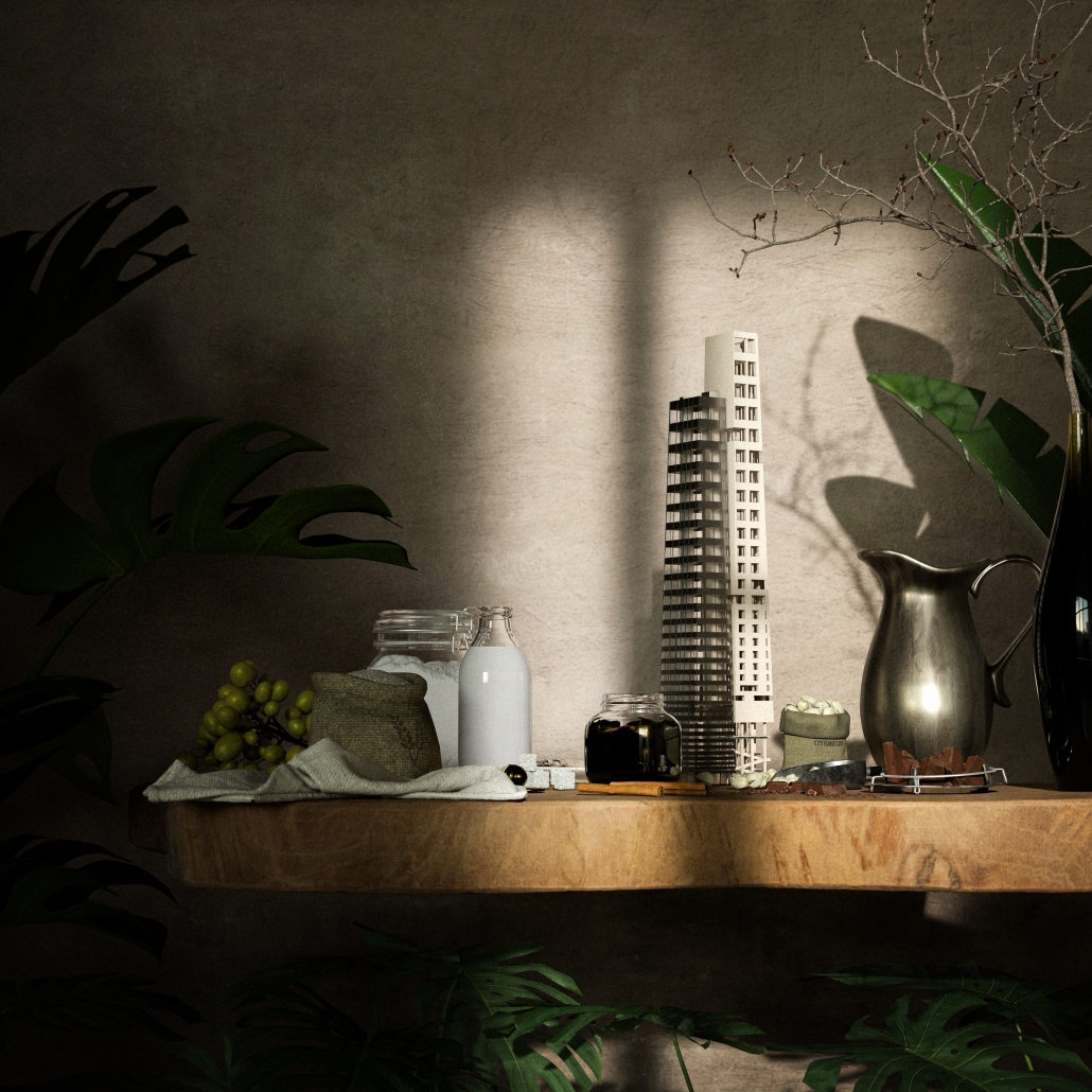
Madrid’s Plaza de España, where a culinary center and residential hostel are planned, reveals a confluence of “dry” and “wet” areas; the former is associated with buildings, while the latter is linked to a network of green spaces that connect several key areas including the Sabatini Gardens and Plaza de Oriente to the south, Casa de Campo, Campo del Moro, and Madrid Río to the west, as well as Parque del Oeste to the north. As a result, Plaza de España can be envisioned as a green gateway to a transversal network that extends from the Manzanares River into the heart of the city.
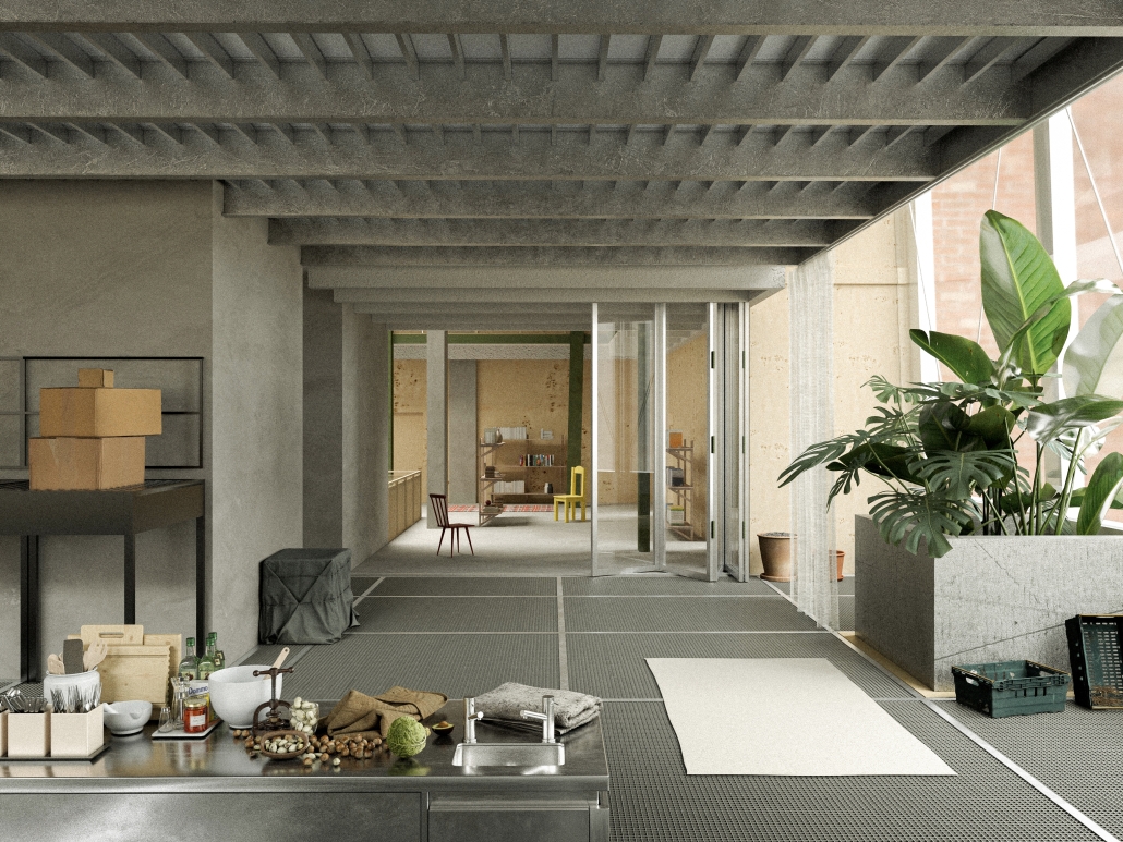
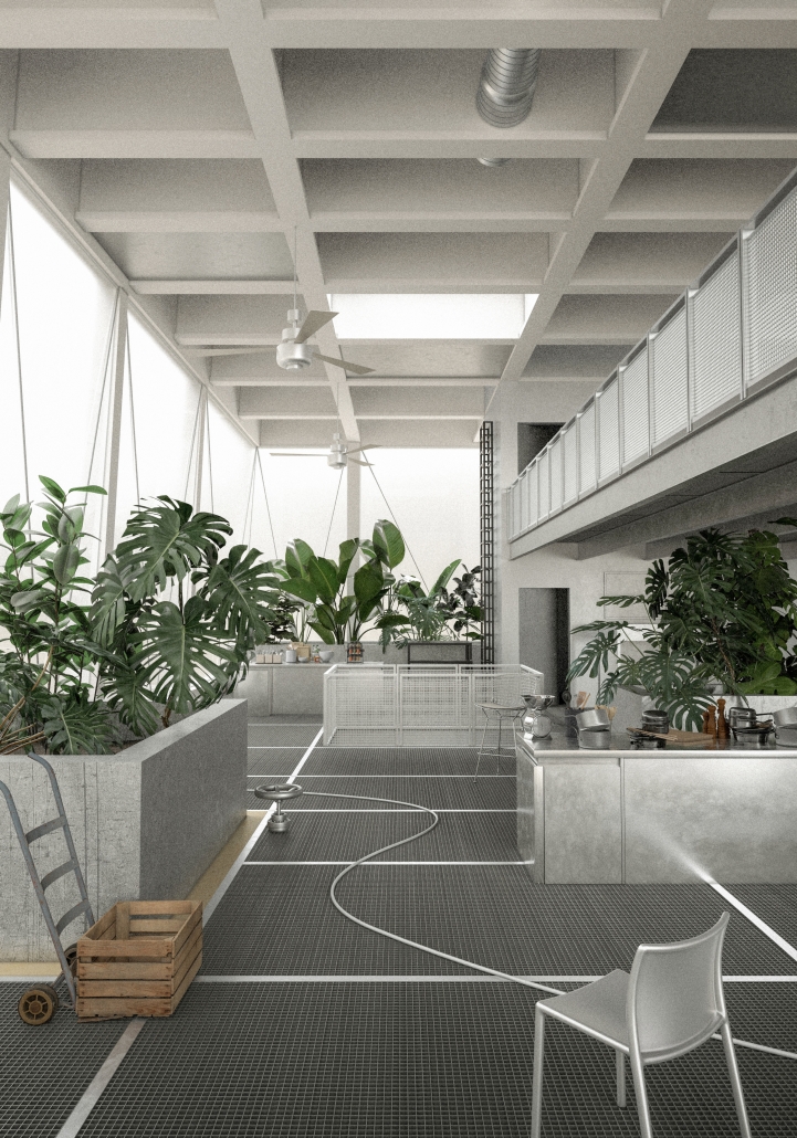
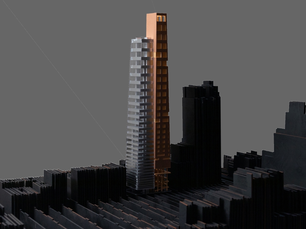
The project translated these observations into an architectural form consisting of twin towers: one transparent (wet) and the other solid (dry). The transparent building was designed for growing food and hosting public programs. In contrast, the more opaque and solid tower was intended to house a more private and enclosed hostel.
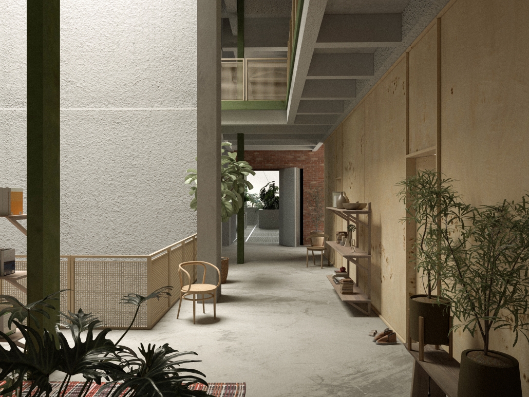
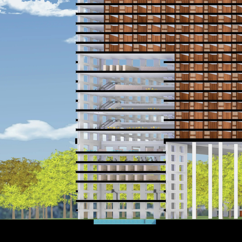
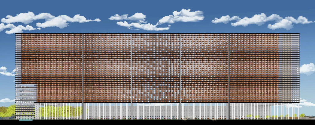
Each tower features a unique structural system. The transparent tower employs a core-based structure that maximizes openness, utilizing lightweight materials such as metal grating for the floors and an exposed I-beam grid to enhance transparency. Planters are integrated into the grid system, allowing users to harvest ingredients for educational or culinary purposes. When looking up, the ceiling reveals that these plants extend to the upper floors. Inspired by the subtle flavor of rice pudding, one of Spain’s favorite desserts —a dish with a subtle profile that features layers of flavor —the façade of the transparent tower evolved into a delicate glass curtain wall with a gradual gradient rhythm, influenced by the varying root depth that houses the rich, sensuous interior. The opaque tower, by contrast, utilizes a regular column grid with a secondary system inspired by tree trunks that organizes the space inside, combining concrete structure, wooden partitions, and a brick façade to create a grounded and inviting atmosphere.
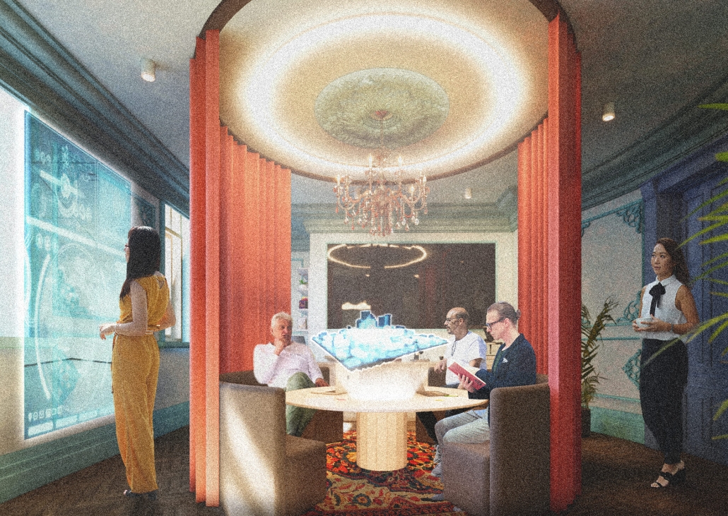
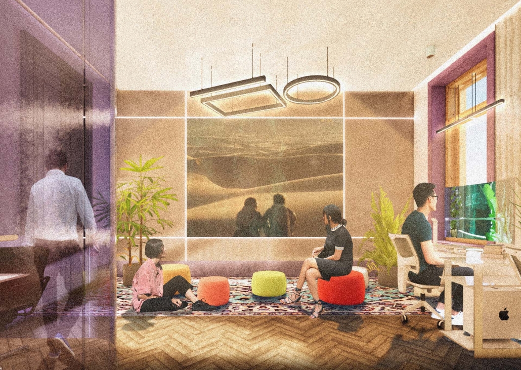
The pair of renderings illustrates the visual connections between the two towers. Despite their differing materials and structures, there is an intentional ambiguity at the threshold, providing glimpses, overlaps, and shared experiences between the two.
This project was a finalist for the UC Berkeley Design Excellence Awards.
Instagram: @julius___007, @r.davids
Vessel of Light: A Spiritual Descent into Earth by Aarsh Dipak Nandani, M.Arch ’25
New York Institute of Technology | Advisors: Marcella Del Signore & Evan Shieh
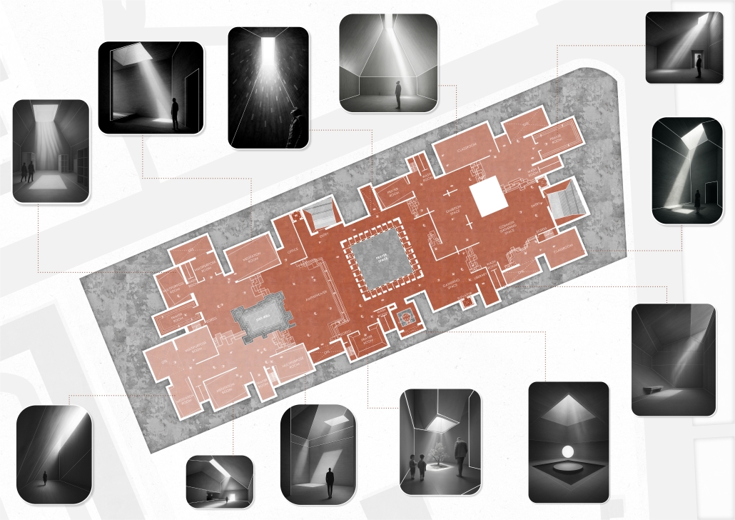
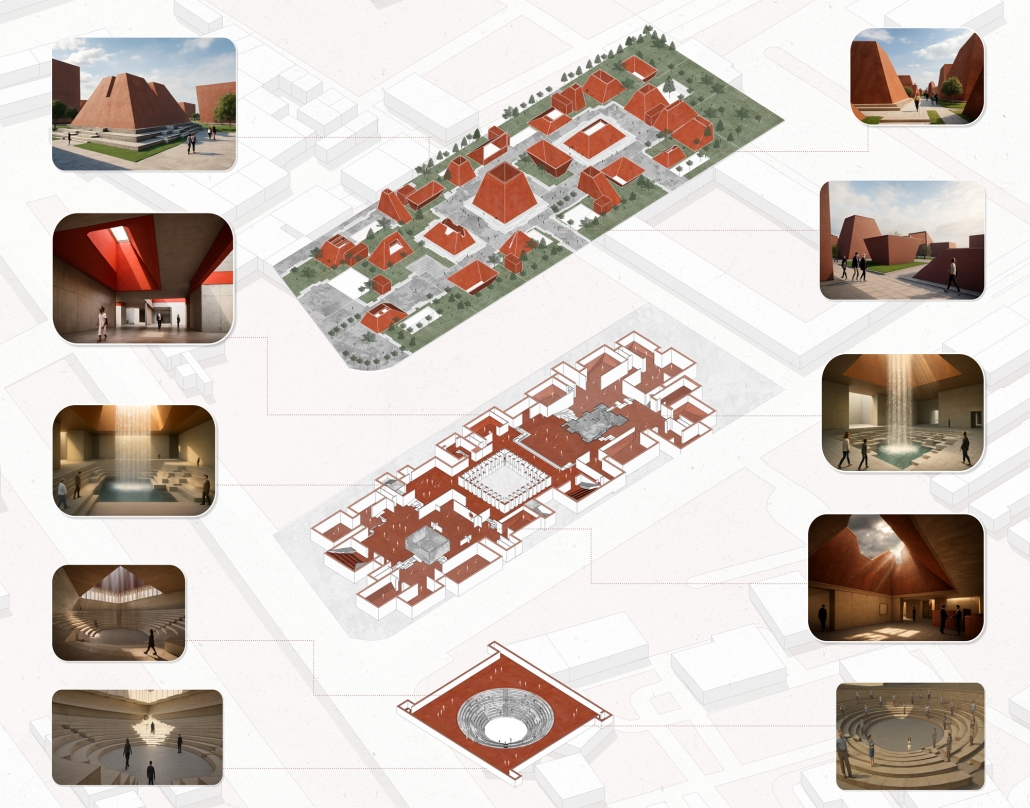
Located in São Cristóvão, a culturally diverse neighborhood in Rio de Janeiro, “Vessel of Light” is a thesis project that reimagines sacred space as an inclusive, contemplative landscape rooted in the elemental and experiential. The proposal responds to the city’s layered history of religion, culture, and infrastructure, revealed through analytical mappings of population density, cultural institutions, open spaces, public services, and mobility networks.
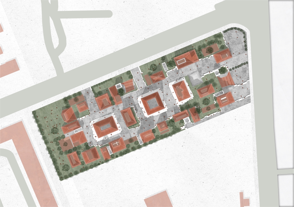
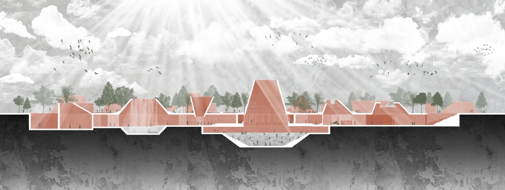
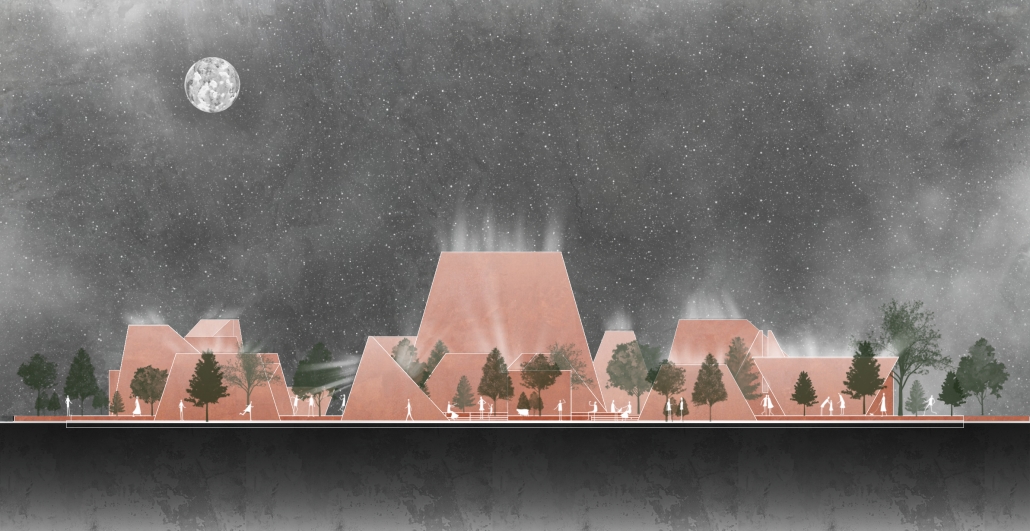
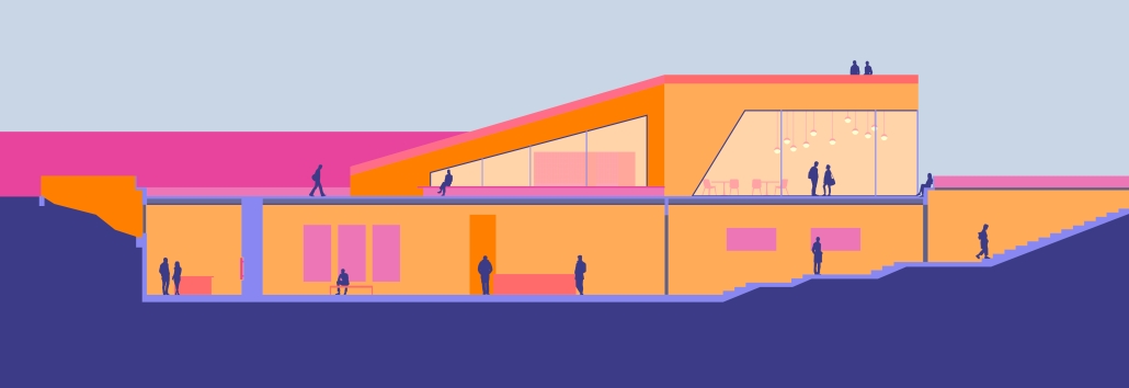
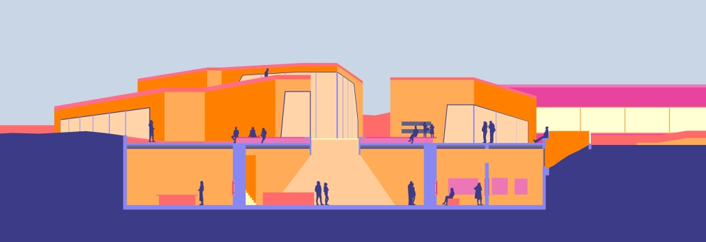
The design expresses spirituality not through religious symbolism, but through sensory experience, shaped by the four fundamental elements: earth, air, water, and light. The entire building is embedded below ground, allowing the site’s surface to function as a fully public park, accessible to all regardless of intent to enter the space. Above ground, only skylight turrets punctuate the landscape, sculptural forms that channel daylight and natural ventilation into the interior, while symbolizing moments of vertical spiritual connection.
The single-floor subterranean structure includes spaces for prayer, meditation, ritual ceremonies, and collective gatherings. A cultural zone features classrooms, a library, workshops, an exhibition gallery, and an amphitheater, programs that serve both children and adults throughout the day. The spatial arrangement varies in scale, lighting quality, and degree of openness, allowing the building to support both individual reflection and collective activity.
The sequencing of spaces is informed by principles of centrality, progression, and spatial hierarchy, guiding visitors from more public, active areas toward increasingly quiet, inward, and sacred spaces. A matrix of geometric explorations, rooted in historical forms associated with spirituality, led to a language of hybridized shapes generated through addition and subtraction.
Materiality reinforces the elemental narrative: terracotta surfaces evoke earth; open skylights bring air and light into the heart of the structure; and two stepwells, one publicly accessible in the park, and one interior, honor water as both sacred and shared.
“Vessel of Light: A Spiritual Descent into Earth” offers a space of reflection, communion, and return, embedding sacred experience directly into the everyday life of the city.
Instagram: @aarsh_nandani, @marcelladelsi, @ev07
THE INTERLACE: CREATING SUBURBAN CONNECTIONS by Annikka Fairfield, B.Arch ’25
Kennesaw State University | Advisor: Robin Puttock
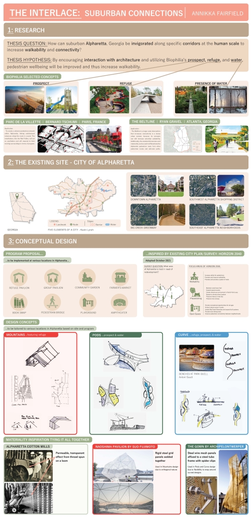
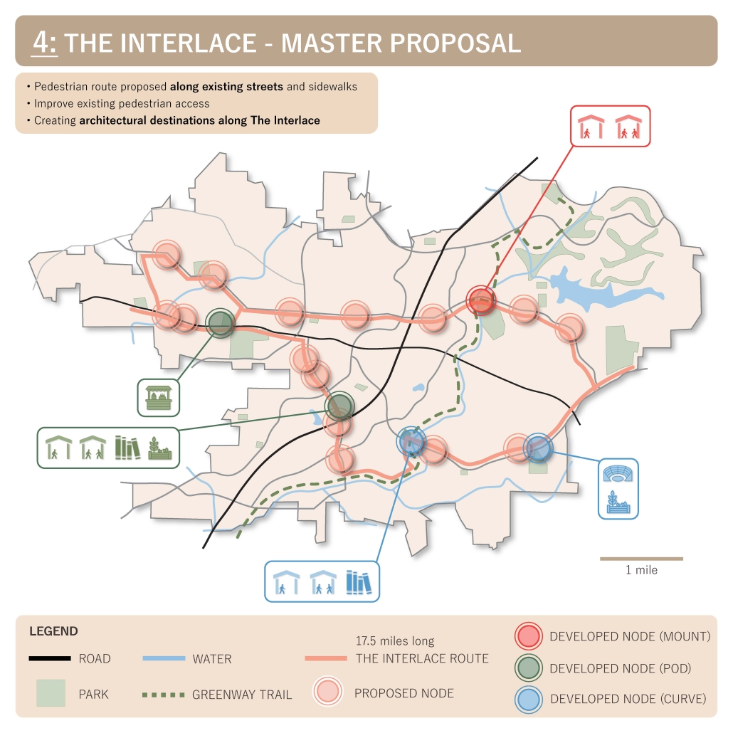
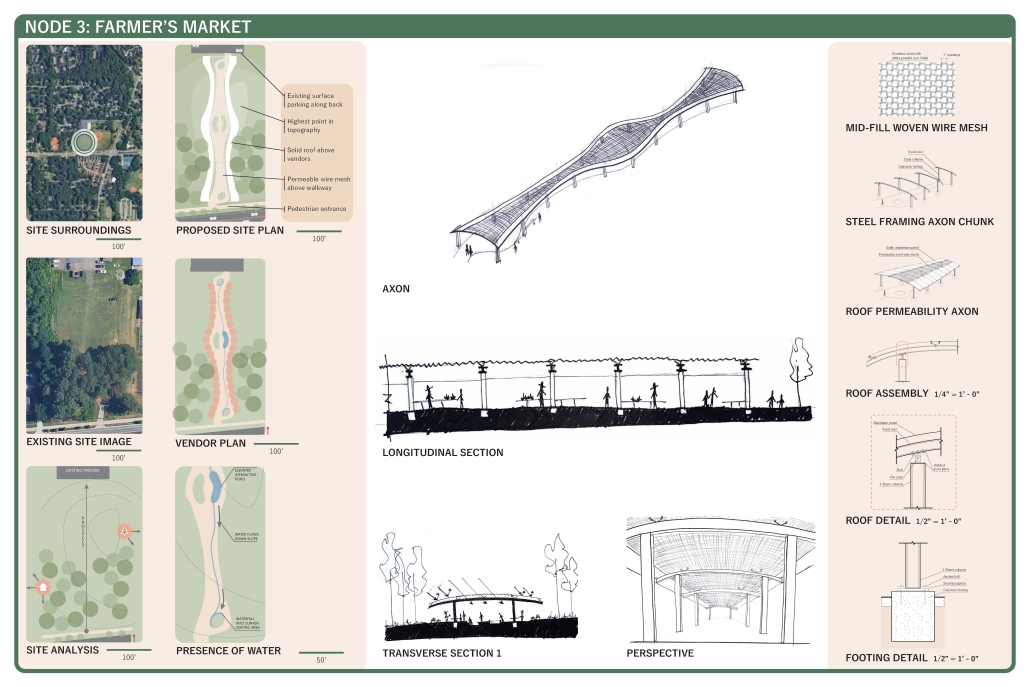
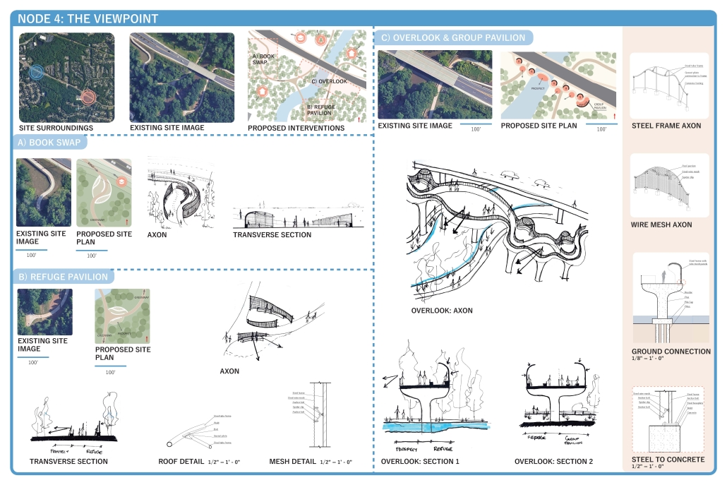
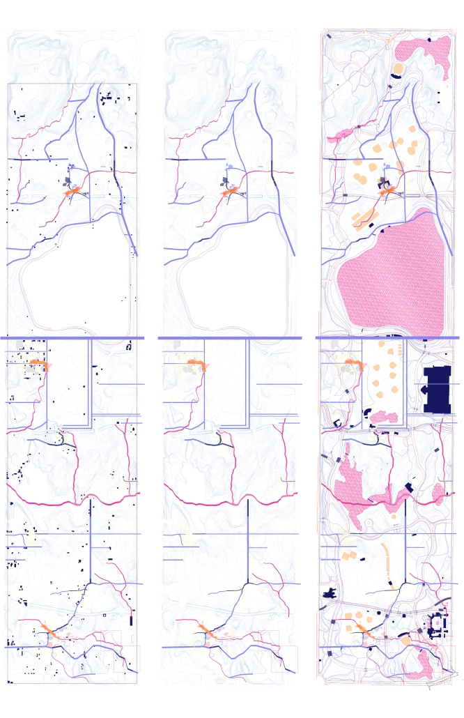
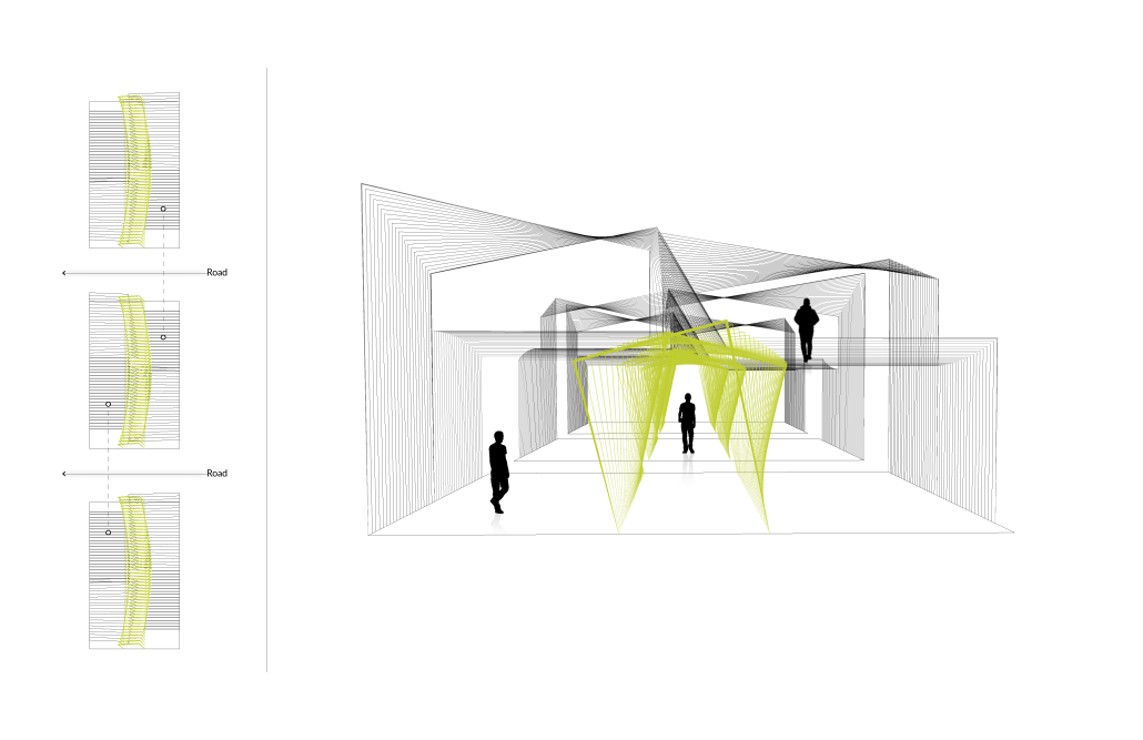
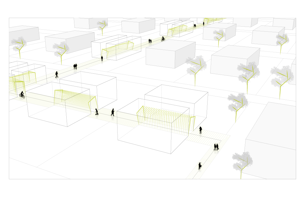
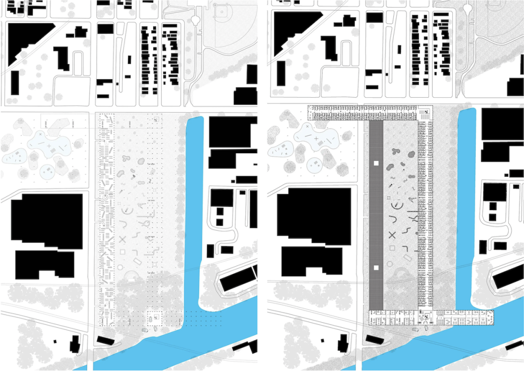
Many cities in the United States are designed based on suburban sprawl, which contributes to excessive automobile-dependency and unwelcoming streets for pedestrians, and metro Atlanta is no exception. Alpharetta, Georgia, is a growing city with the potential to become a more walkable suburban city. Alpharetta can be invigorated along specific corridors at the human scale to increase both walkability and connectivity by focusing on pedestrian wellbeing. Research shows that Biophilia’s various facets have the power to improve human wellbeing. Prospect, refuge, and presence of water were selected to guide the thesis design. Urban-scale precedents like the Beltline in Atlanta, Georgia, and the Emerald Necklace in Boston, Massachusetts, inspired The Interlace, a 17.5-mile pedestrian loop that expands upon the existing Greenway Trail and connects multiple nodes across the city.
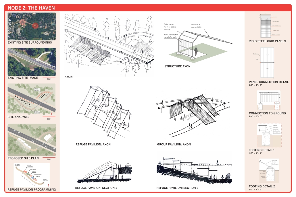
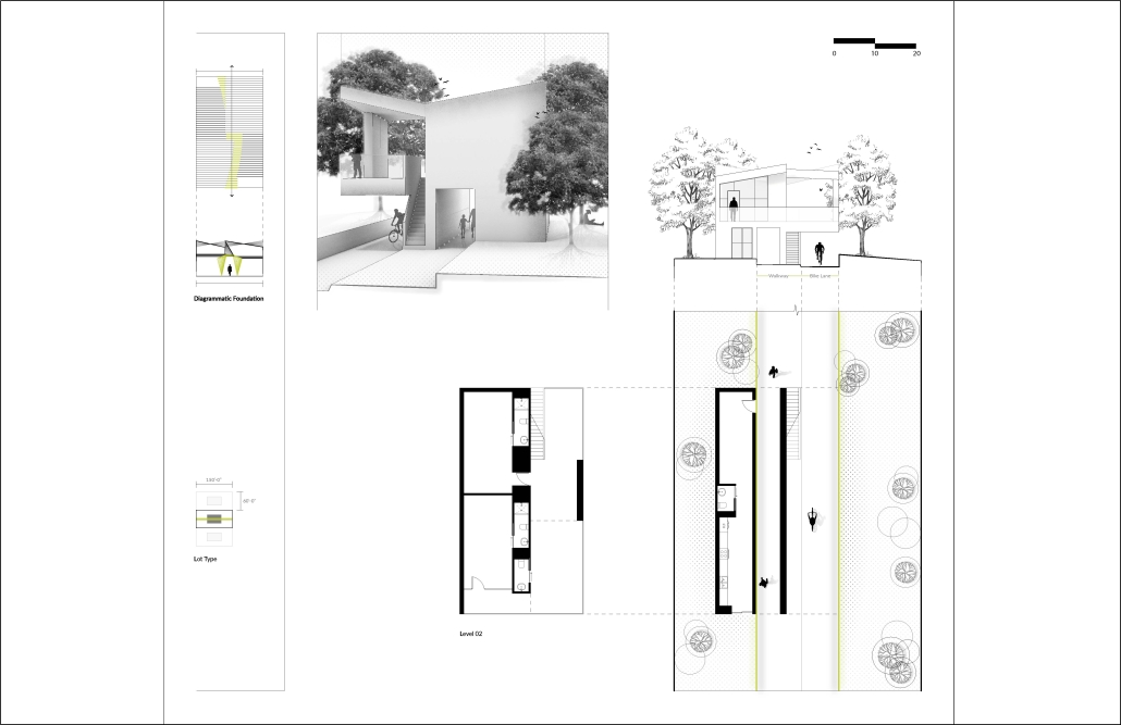
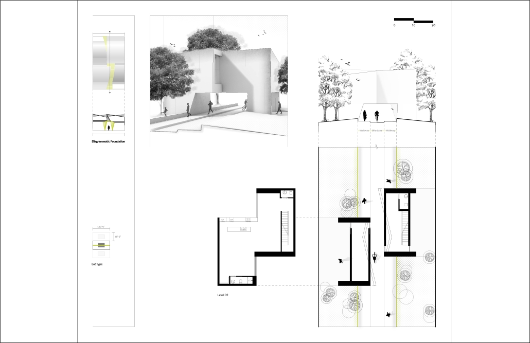
“The Interlace” is designed along specific corridors to significantly improve pedestrian access along roads that are currently car-oriented. Research suggested that improved pedestrian access alone will not increase walkability; destinations must also be created to encourage walking. Inspired by the Parc de la Villette in Paris, France, twenty different proposed architectural installations, also called nodes, are strategically designed along The Interlace to create destinations. Different combinations of programs are implemented in each node to support each surrounding community. The nodes are all designed with a similar materiality, inspired by Alpharetta’s history, which ties the architecture together and facilitates placemaking by creating a new identity. Five of the twenty nodes are more fully developed, featuring how prospect, refuge, and presence of water can be implemented at the architectural scale to improve pedestrian wellbeing and thus increase walkability and connectivity at the broader urban scale.
This project was a finalist for the ARCC King Student Medal.
Instagram: @annikkafairfield, @robinzputtock
Wellness Activity Center by Angel Niemczyk, AA in Architecture ’25
Community College of Philadelphia | Advisor: Elizabeth Master
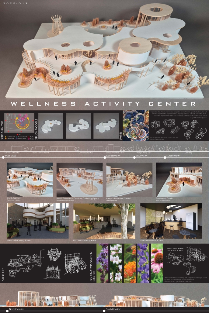
The project site was selected in central Oregon, at 45°N latitude, and within the 6a climate zone, which influences key factors such as wind directions and local flora.
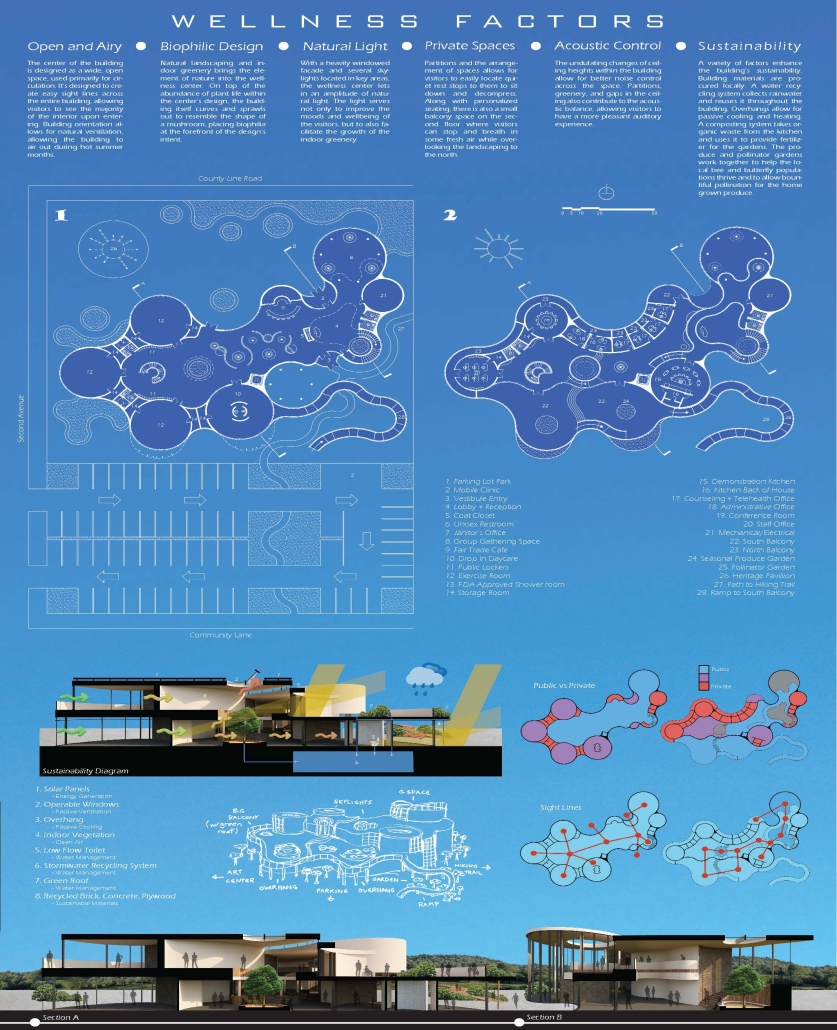
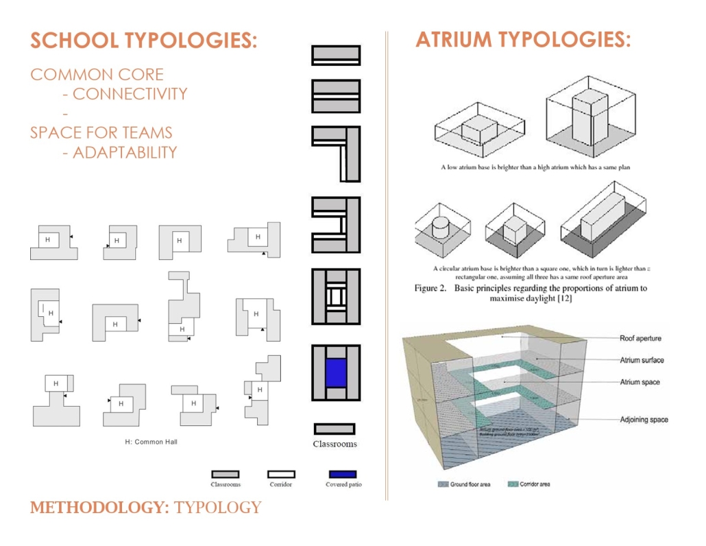
The design draws inspiration from the turkey tail mushroom, featuring organic, curving shapes that promote a calming atmosphere. This architecture integrates ample natural light through large windows and skylights, enhancing well-being and reducing energy costs.
To foster a strong connection with nature, the design incorporates mushroom-inspired forms and features abundant live vegetation throughout the building and in the surrounding gardens. A park has been added to the adjacent parking lot, featuring a pathway that leads to a nearby forested trail.
Other enhancements include:
– A café with fair trade coffee and healthy snacks.
– Separate mechanical and electrical rooms on each floor for improved energy management.
– Four additional restrooms for increased capacity.
– A fire escape near the north entrance.
– A “Heritage Pavilion” inspired by Native American architecture.
– An organic produce garden and a pollinator garden to support biodiversity and collaborate with the kitchen.
The pollinator garden attracts bees and butterflies, enriching the local environment and enhancing visitors’ experiences, while the produce garden fosters growth through natural cycles, utilizing kitchen waste as fertilizer.
This project won the second-place CCCAP 2025 Student Award.
Instagram: @ADC_CCP
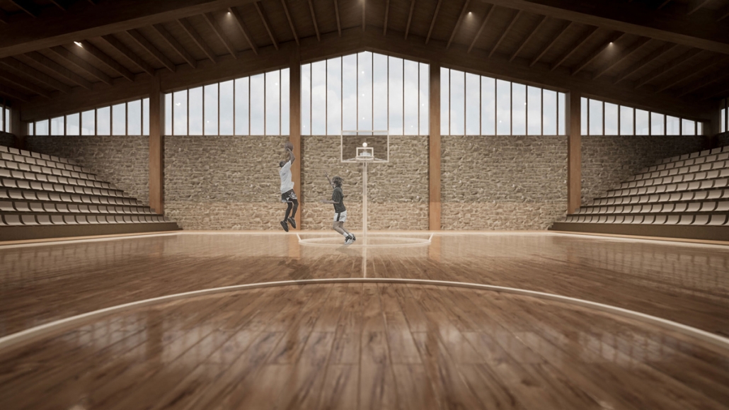
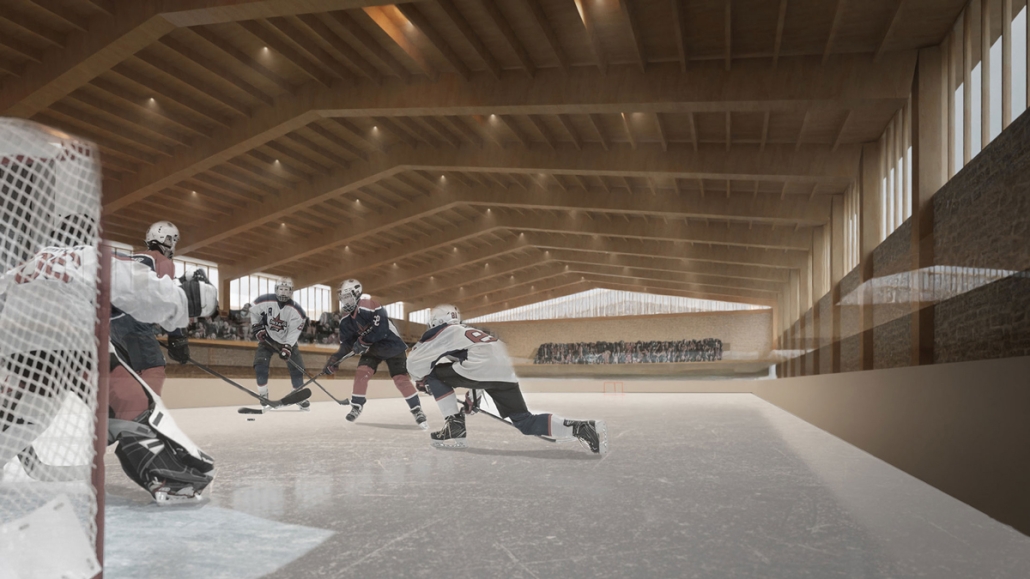
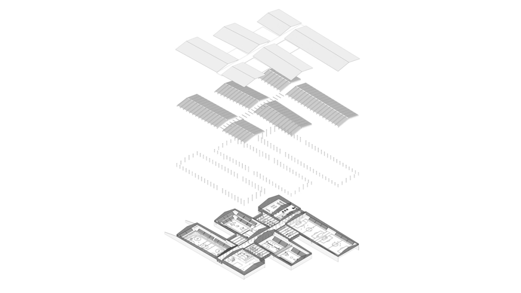
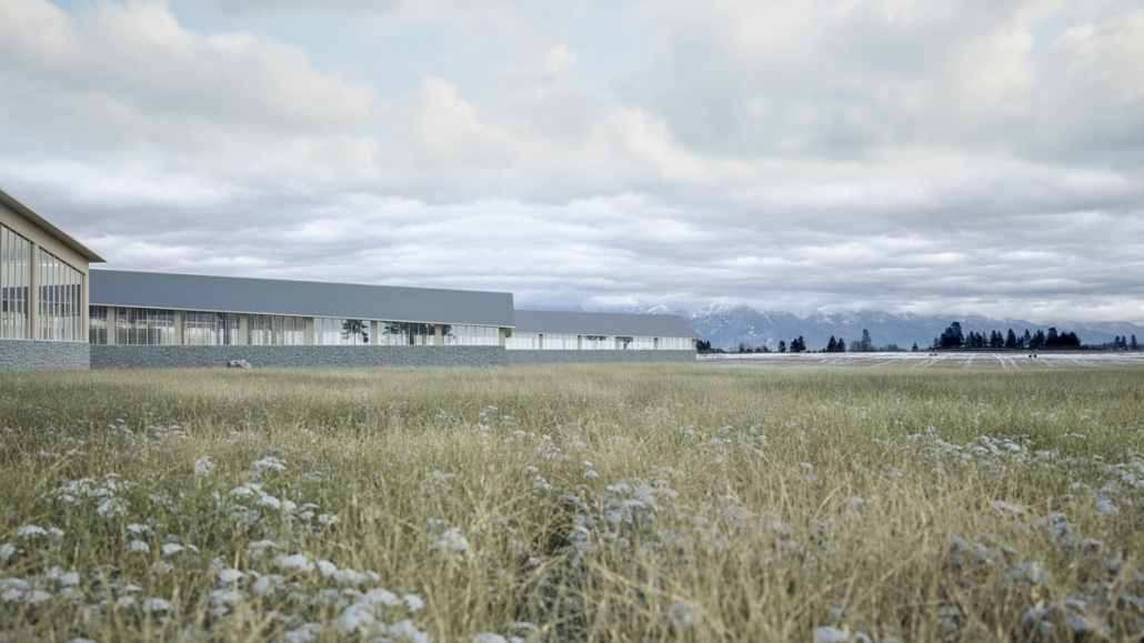
Valley Sports Complex: Sports, Recreation, and Fitness Opportunities for Every Season by Blake Douglas, M.Arch ’25
Academy of Art University | Advisor: Aurgho Jyoti
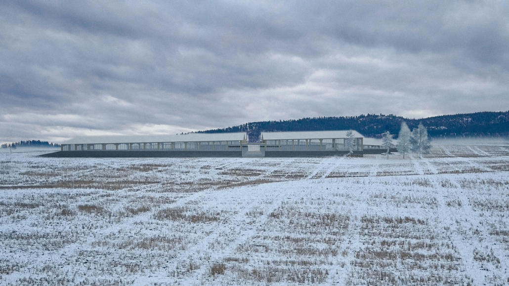
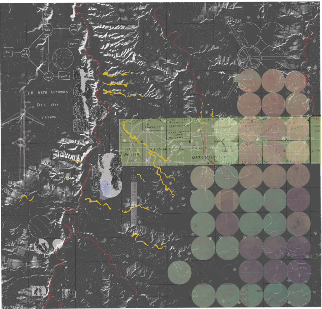
The community of Flathead County, Montana, requires an indoor recreation space. Long winters with short daylight hours significantly impact the community’s ability to be active and recreate through winter months and shoulder seasons. Snow is on the ground for up to eight months of the year, limiting available outdoor recreation opportunities. The winter climate also has an impact on mental wellness, as seasonal depression due to a lack of sunlight is common. Combined with a lack of recreation opportunities, the community would be well served to have a place to commune and interact throughout the winter season. Montana is known for its rugged and beautiful landscape; the built environment should respect and respond to that. The structure of the building will be locally sourced mass timber, and the overall form will be respectful to the context in which it sits. A sports center that will respect the landscape, enhance a sense of community, and provide recreation.
This project received the M.Arch Thesis Award.
Instagram: @b_doug_arch, @aur.architecture
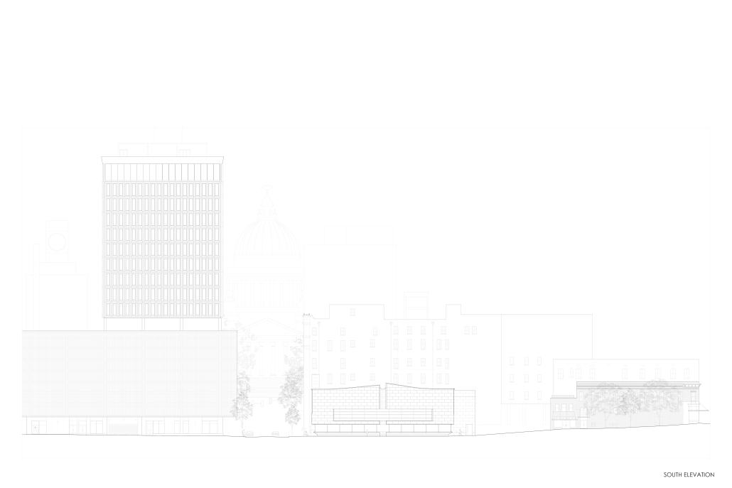
The Capitol Collective: A Community Centered Creator’s Hub that Enhances the Pedestrian Experience by Ashley Miller, M.Arch ’25
Virginia Tech | Advisors: Andrew Linn, Susan Piedmont-Palladino, Paul Kelsch
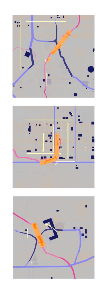
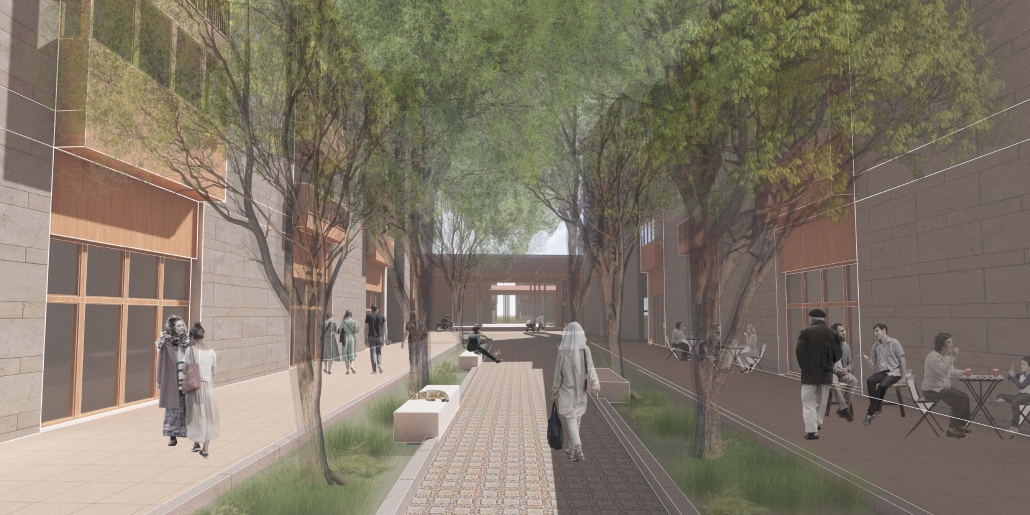
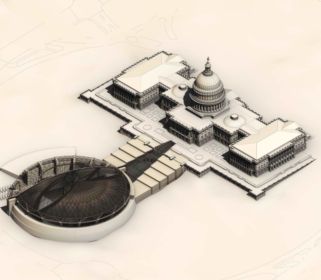
“The Capitol Collective” is a community-centered creator’s hub that anchors the proposed Capitol Hill Art Trail – an alley network programmed to enhance local beauty and promote community pride. Located in one of the most walkable cities in the United States, Washington, D.C., this thesis explores pedestrian environments that are deemed ‘the best’ according to the District’s Pedestrian Friendliness Index (PFI), with a focus on the Capitol Hill neighborhood. While dozens of blocks in the area are ranked within the top 1,000 of the District, several others are deemed less desirable. This begs the question: what constitutes an ideal pedestrian environment, and how can we as designers contribute to creating architecture that thoughtfully integrates with, and improves upon, the pedestrian experience?
Observing and documenting street conditions of both higher and lower-ranked blocks demonstrated that blocks with higher rankings embraced the walker’s experience by incorporating programs such as sidewalk cafes and restaurants, inviting transit plazas, playgrounds, outdoor markets, and more. Through this initial research, a scope of roughly twenty-seven blocks was identified as an area that could be improved upon. The existing area has the foundation for a flourishing, walkable hub for the community, but it currently lacks the inviting qualities that its neighboring blocks have. This thesis proposes to fill these gaps through the built environment by creating a programmed art trail that is anchored through a community workshop and residence.
The Capitol Collective’s mission is to build community through creation. At the heart of the project are the wood shop and metal fabrication lab, which are open to all community members. There are also classrooms where individuals can learn from one another, a tool library where locals can rent out items, and studio spaces for local recurring artists. The ground floor of the newly constructed building also boasts a cafe and warehouse-like spaces for local artists to set up and sell their goods. Levels two through three of the new construction building are programmed with affordable housing that prioritizes individuals who are committed to improving and supporting the local community.
This project received the WAAC Thesis Award.
Instagram: @ashley.miller15, @VT_WAAC
The Voids of the Forgotten: Stories Layered in Unmaking by Sophie Hutton, BFA in Architecture’25
James Madison University | Advisor: Dylan Krueger
This thesis begins not with the act of making, but with the act of unmaking—a journey into the forgotten, the overlooked, and the lost.
Architecture is often thought of as something permanent—something that stands tall against time. But what if the first gesture in design was not to assert, but to dissolve? What if architecture could listen, rather than impose? What if the act of unmaking could be the beginning of creation?
Unmaking is a meditation on impermanence. It is about architecture that dissolves instead of dominates, about creating spaces that listen to the land rather than claim it. To unmake is not destruction. It is revelation. It is peeling back the layers of time to expose what has been buried. To make visible the hidden histories, the suppressed memories, and the erasures that still resonate beneath the soil. Architecture, in this sense, is not a monument to permanence but a vessel for memory, decay, and regeneration.
This exploration centers on a forgotten history, one hidden beneath the surface of Central Park, New York, where Seneca Village once stood—a thriving minority community in the 19th century, full of life, resilience, and faith. But it was erased, displaced under the guise of progress. Beneath the park’s manicured lawns lies a history that has yet to be remembered.
The design is centered around three areas in the park, each a meditation on memory, erasure, and reclamation. These speculative site plans visualize futures shaped by absence: nature overtaking roads, forgotten street grids returning, memory lines resisting imposed order. Each is an act of unmaking—a gesture toward revealing what has been hidden and allowing the land to speak again.
Unmaking is not failure, but resistance and revelation. It asks us to design with the rhythm of life. To unmake is to remember.
This project won the James Madison University Thesis Prize.
Instagram: @sopharcd, @dylan.things
DESIGNING FOR THE SENSES: HARNESSING LIGHT, TRANSPARENCY, AND VISUAL CONNECTIVITY TO CREATE RESPONSIVE ARCHITECTURE FOR THE DEAF COMMUNITY by Jennifer Pennington, M.Arch ’25
Florida A&M University | Advisors: George Epolito, Andrew Chin
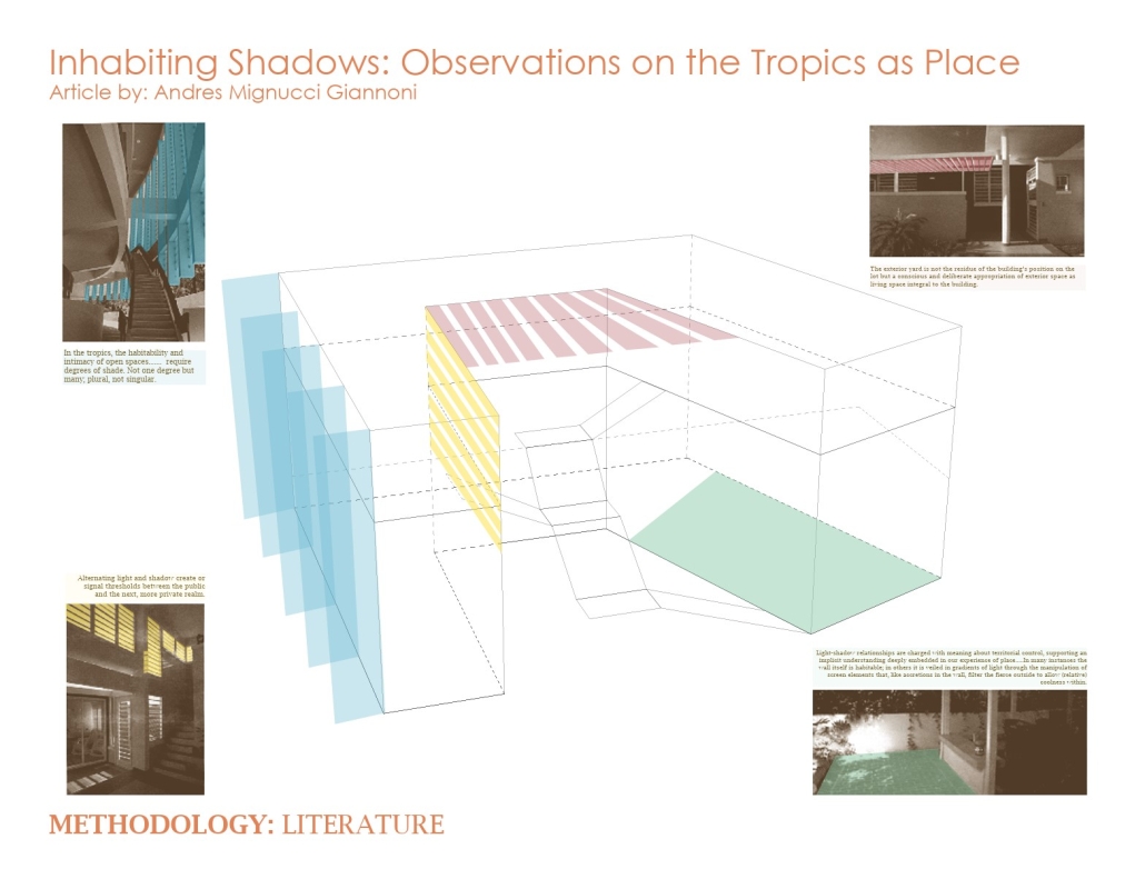
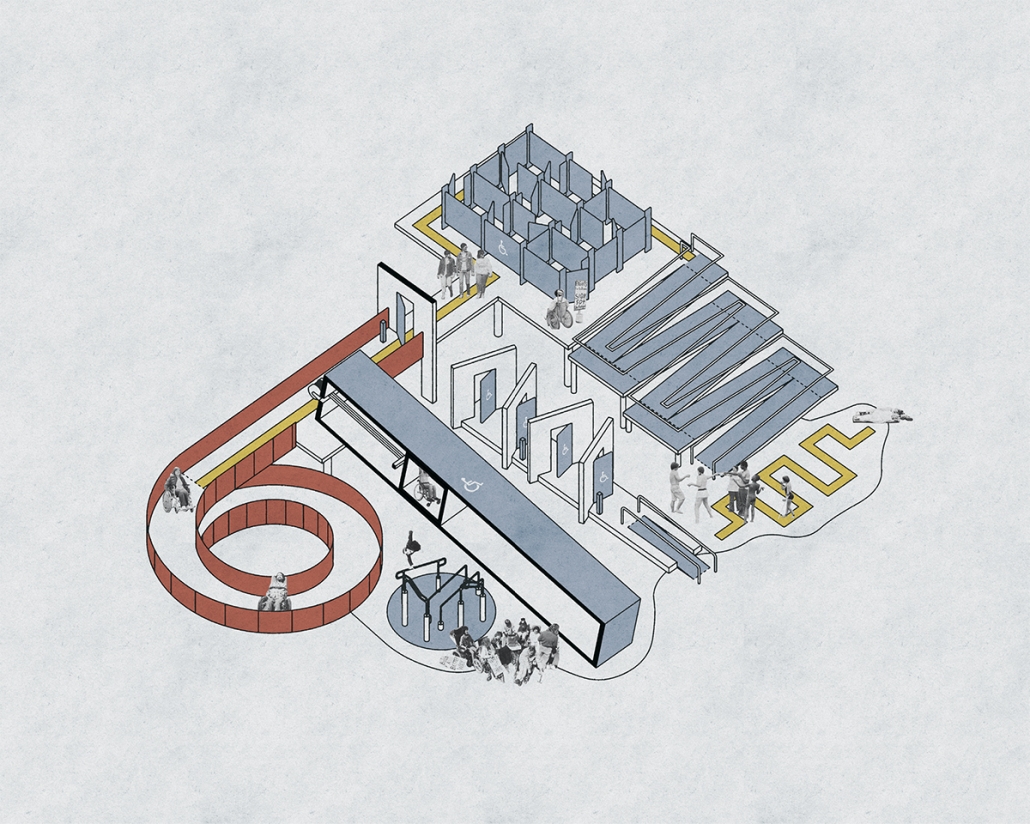
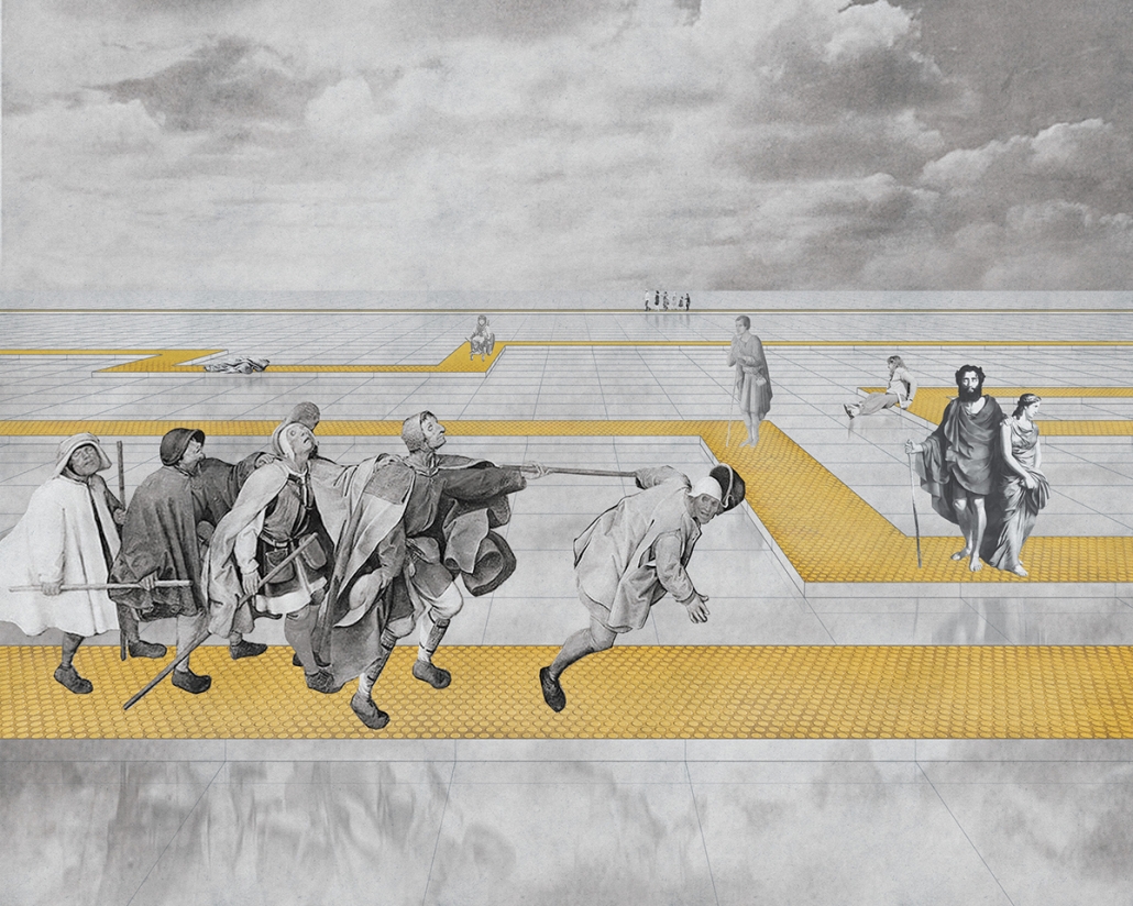
This thesis explores how architectural design can be thoughtfully informed by Deaf space principles to create environments that enhance navigation, communication, and inclusivity for the Deaf community. Centered on the strategic application of light, transparency, and visual porosity, the project seeks to dismantle spatial and sensory barriers that often leave Deaf individuals navigating spaces that fail to support their lived experiences.
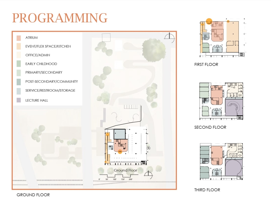
The research focuses on designing a community hub in Tallahassee, Florida—an inclusive space that promotes visibility, intuitive movement, and social connection. Current architectural practices frequently neglect Deaf users, resulting in spaces that are visually fragmented or lack necessary cues for spatial awareness. This study responds by investigating design strategies that prioritize visual access, clear sightlines, and unobstructed circulation.
Using Deaf space design theory as a foundation, the project integrates spatial transparency and natural light to support non-verbal communication, while employing visual rhythm and layered spatial relationships to guide users organically through the environment. Through case studies, spatial analysis, and architectural modeling, the research establishes a set of principles for creating spaces that do not merely accommodate but actively empower Deaf individuals.
The resulting design envisions a community hub that is both functionally accessible and emotionally enriching—encouraging interaction within the Deaf community while also inviting greater engagement with the broader public. In doing so, the thesis advocates for a more holistic and humane architectural practice, one that values sensory diversity as a driver for innovation and social equity.
Instagram: @famu_masterofarch, @famusaet
The Last Lookout by Keaton Bruce, M.Arch ’25
Temple University | Advisors: Sally Harrison, Jeffrey Nesbit & Kate Wingert-Playdon
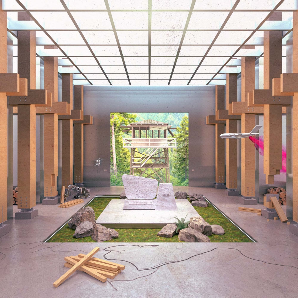
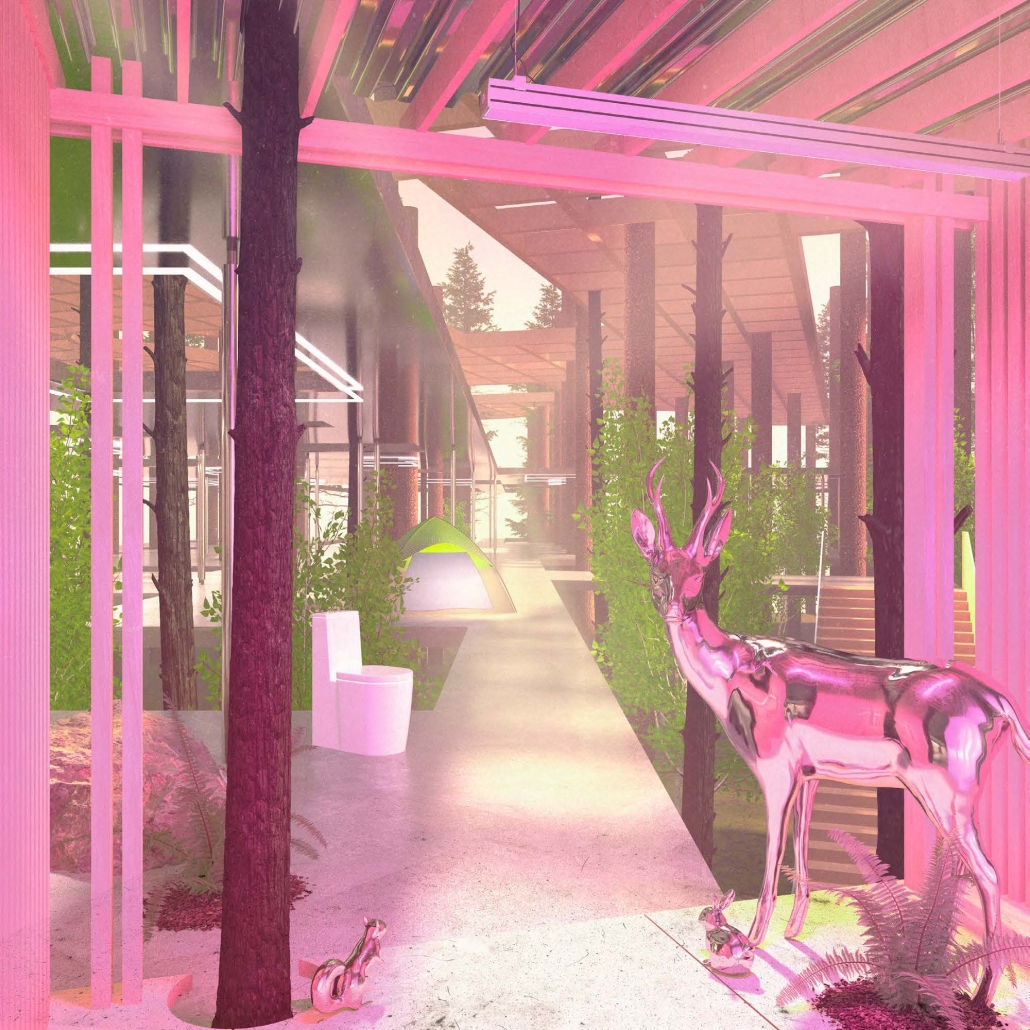
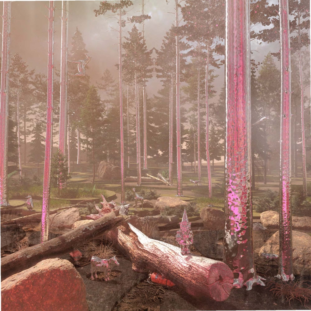
Our forest has been completely designed.
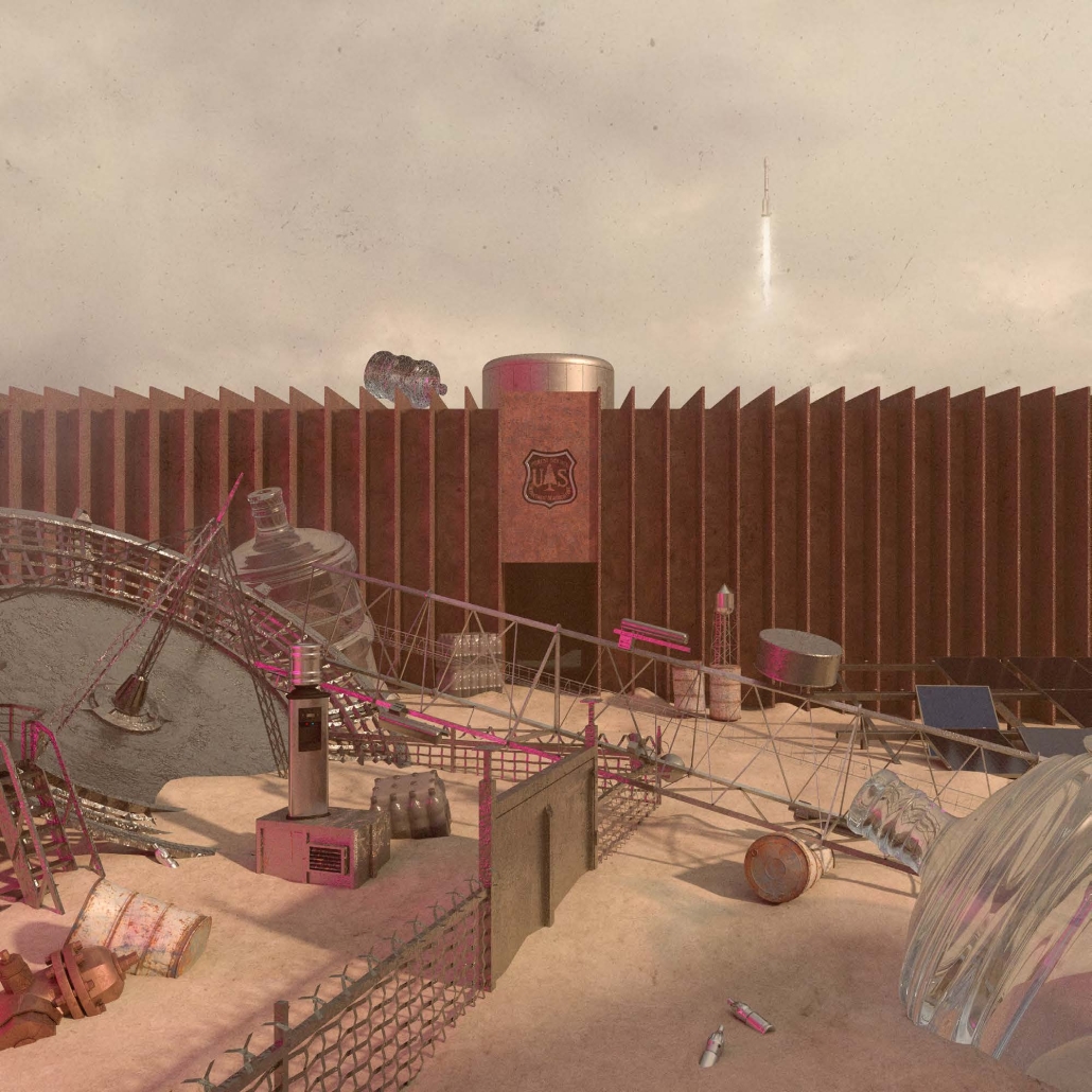
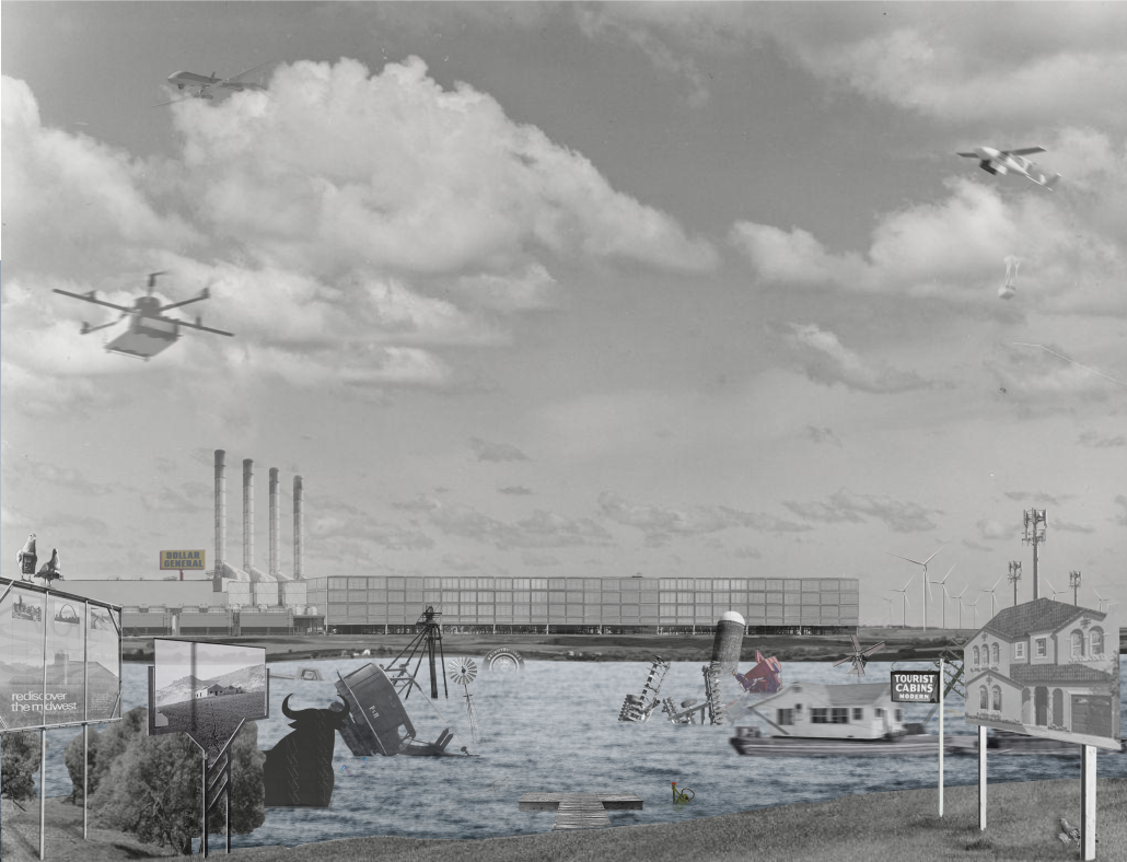
The production of artificial boundaries, unassuming objects, and pervasive cultural imaginaries, the United States Forest Service constructs American forests in the image of a naturalized occupying state. Contemporary architecture, in its reliance on this manufactured forest, sustains violent neoliberal fantasies of displacements disguised as world-saving visions of productivity and progress.
So how might we imagine the future of architecture, of our forest, of resistance? If the National Forest Service is a tool of an occupying state, a new vision of the forest is delayed until the current system of commodification and nationalization is dismantled. The project speculates on a final form – the last lookout – and asks how this end can be just as valuable as a beginning in realizing a new future – an architecture after the Forest Service.
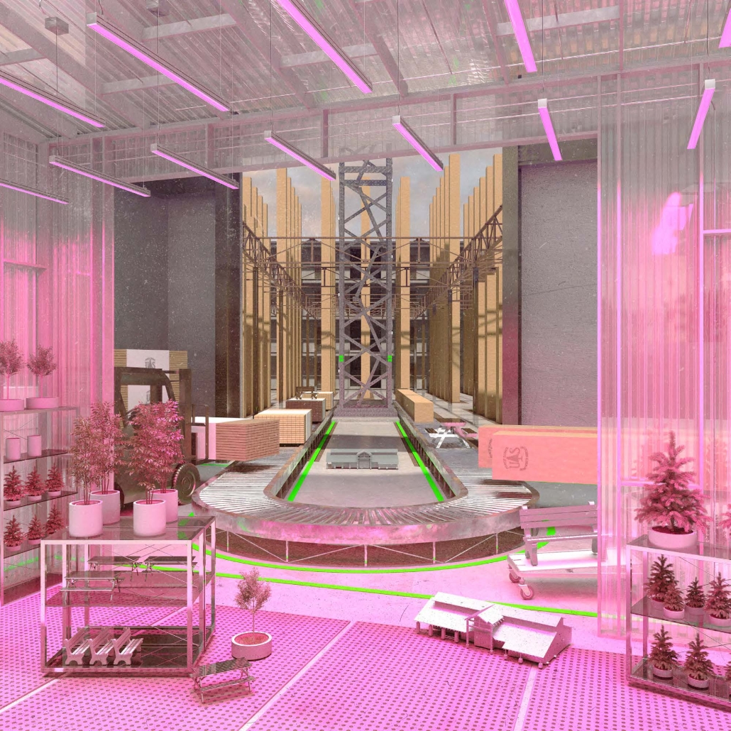
Based on the Multi-Use Sustained-Yield Act of 1960, which set forth five productivity mandates for USFS-managed lands (watershed, logging, recreation, range, and wildlife), the project satirizes five architectural endings of the forest: the MAUSOLEUM, the PENITENTARY, the MUSEUM, the COMMONS, and the AFTERLIFE. Each forest rendered in plan, perspective, and physical model investigates the symbiotic relationship between forest imaginary, architectural vessel, urban form, and political agency in an acontextual superimposition on the Oregon State Capitol Complex.
The forest we inherit need not be the forest we leave behind, but the forest we ultimately construct must be the forest we imagine.
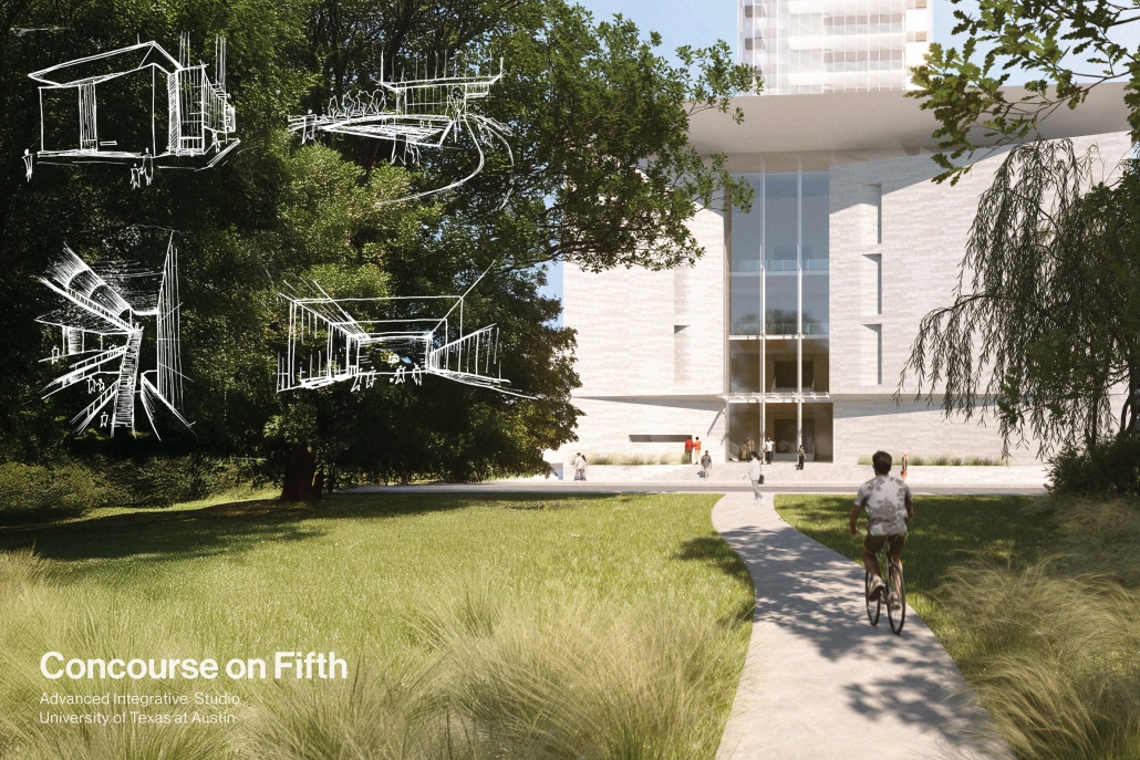
Concourse on 5th by Maverick Santos & Luke Slay, M.Arch ’25
University of Texas at Austin | Advisor: Matt Fajkus
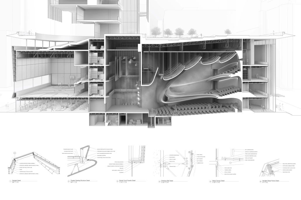
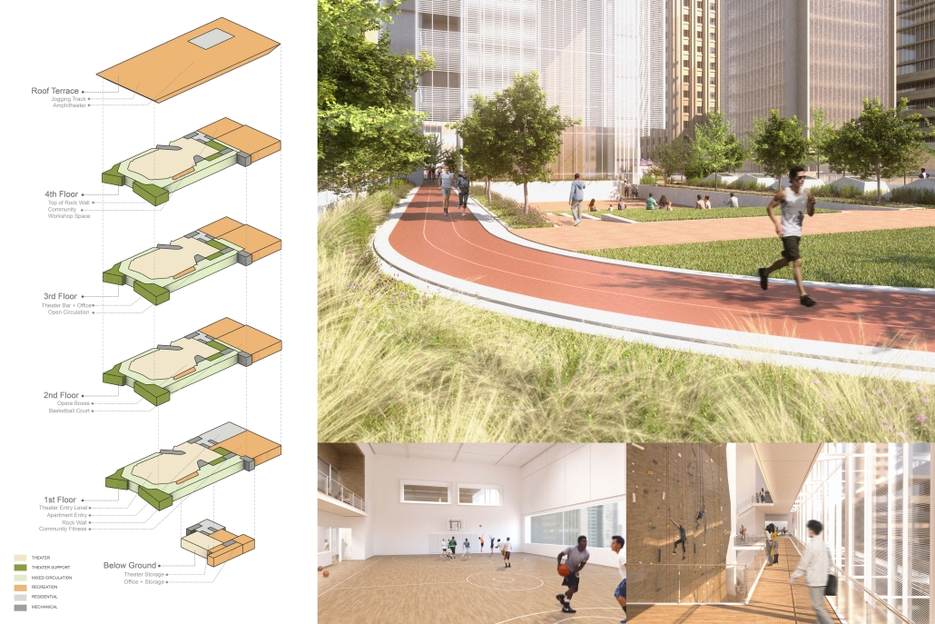
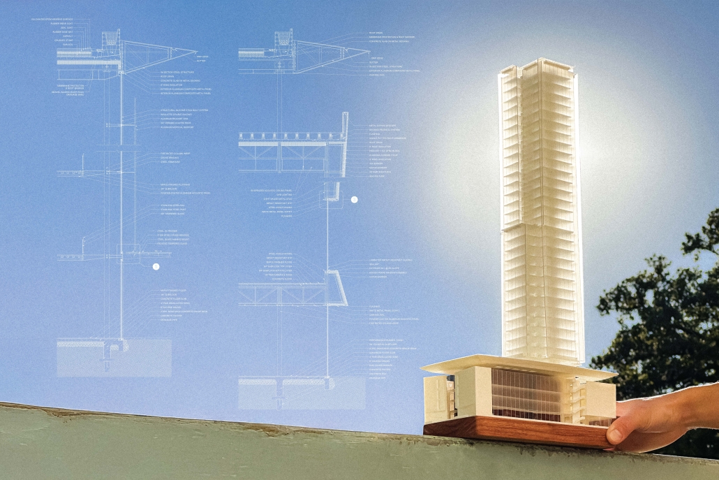
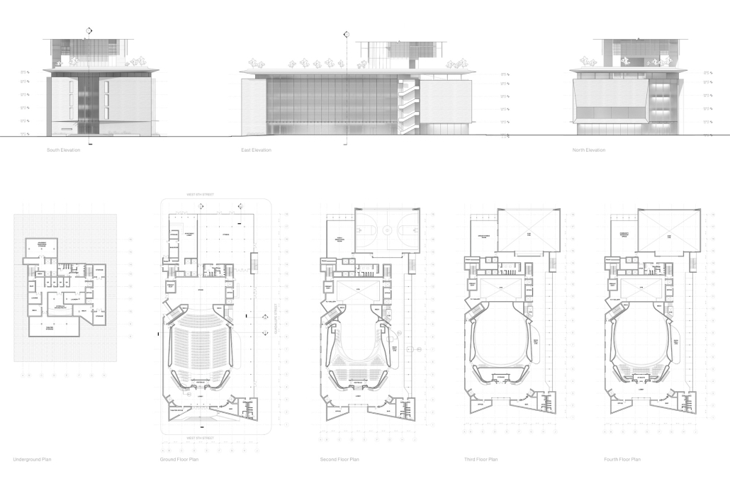
“Concourse on 5th” is a bold reimagining of downtown Austin’s civic landscape, designed to facilitate the city’s cultural vibrancy and active urban lifestyle. Strategically placed at the intersection of 5th Street and Guadalupe, the project redefines the role of circulation by transforming it into an “activated concourse” — a connective public platform that links a performance theater, community recreation spaces, and residences within a single cohesive building. By layering programs that operate on varied cycles, the building sustains continuous activity, becoming a dynamic place that serves diverse users throughout the day and night.
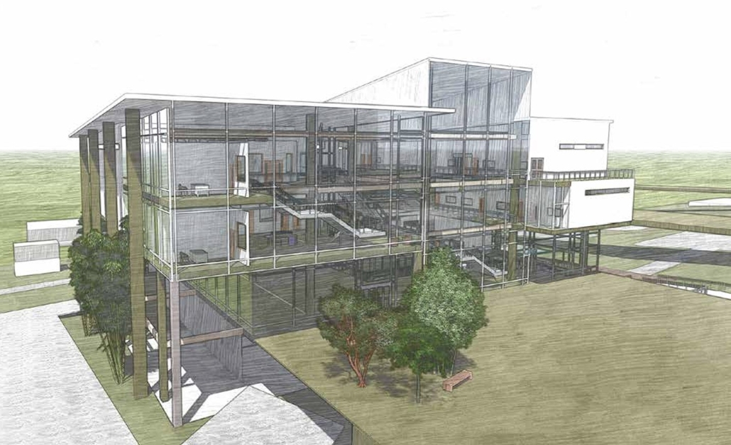
Located adjacent to Republic Square, the site capitalizes on its proximity to green space to prioritize the pedestrian experience. The theater’s monumental entry sequence, directly facing the park, establishes a strong civic presence and a sense of arrival. Along Guadalupe Street, the entrance to the community center is activated by an exterior stair that ascends to the elevated podium, where a running track and green spaces extend the square, promoting public engagement and visual transparency. The lightly articulated facade along this edge offers curated glimpses into the building’s interior, where warm wood finishes and the vertical ascent of a rock-climbing wall become visible markers of internal activity. On the 6th Street edge, the residential tower entrance is discreetly integrated alongside a highly visible sports court, reinforcing the project’s active interface with the city.
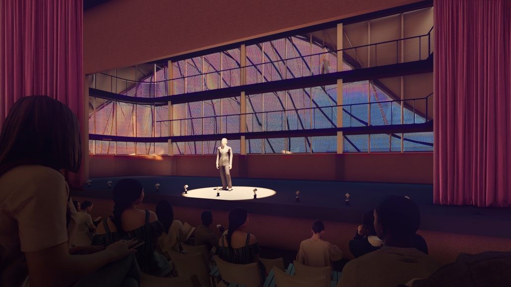
Internally, the theater is defined by sweeping, sculptural wood forms that foster a close and immersive relationship between audience and performance. The contrast between the refined urban exterior and the expressive, tactile interior enhances the experience within the project. The recreation program complements the performance spaces through its strategic integration, featuring moments where the climbing wall ascends along the theater’s edge, connecting multiple floors and drawing visual continuity between arts and athletics.
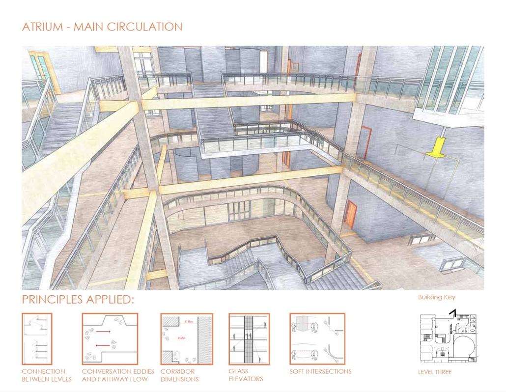
The project challenges conventional typologies of event venues, which often remain unoccupied outside of peak hours. Instead, Concourse on 5th activates its circulation zones as multifunctional social spaces. Vertical and horizontal circulation paths double as areas for spontaneous interaction, bridging programs and communities. In the atrium, patrons exiting a performance might encounter climbers in motion or glimpse a yoga class underway; a choreography of simultaneous experience. This overlap fosters moments of connection and shared occupation, elevating the concourse from mere infrastructure to an essential part of the building’s public life.
Ultimately, Concourse on 5th functions as a hybrid space, serving as a platform for art, recreation, and everyday life. It reclaims space in downtown Austin for collective use through a design rooted in transparency, spatial porosity, and programmatic overlap. The project reimagines how architecture can enable continuous activation, creating a vibrant and inclusive environment that adapts to the city it serves.
This project was a finalist for the UT Design Excellence Award.
Instagram: @mikhail.maverick, @luke_slay01, @mf.architecture
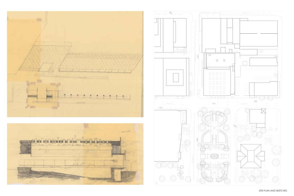
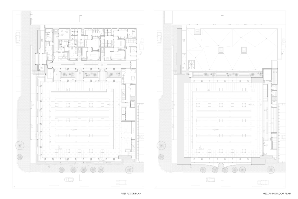
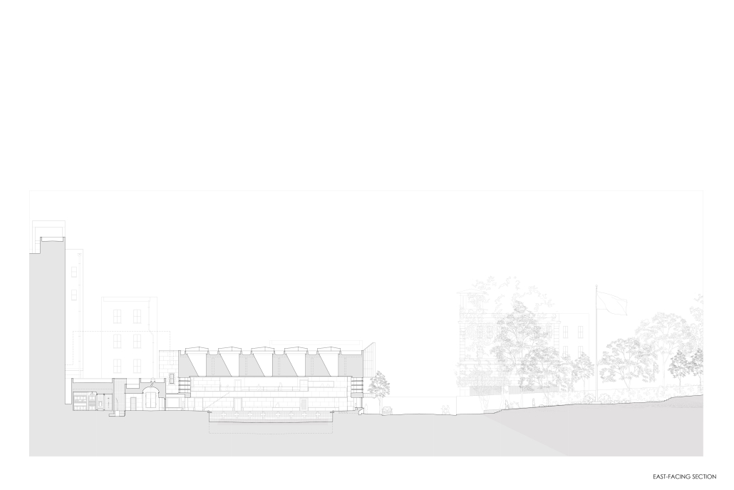
The Natatorium and the Wall by Grace Kotomi Owens, B.Arch ’25
Mississippi State University | Advisors: Jassen Callender, David Buege, Mark Vaughan, Aaron White & David Perkes
Pools are about floating and swimming; they are about feeling the water, feeling its temperature, its resistance to our movements, its weight, and our weightlessness. They are undoubtedly experiential destinations. In our increasingly digital world, I began this project hoping a natatorium in downtown Jackson, MS, would simultaneously bring people together and provide a place for people to be present, a place of focus and sanctuary.
As the semester progressed, my project became about many things.
My initial explorations were about void space. I find it insufficient to say that architecture creates space — it instead divides and thereby gives identity to and further defines the “empty” space that is already there.
There was one question that I consistently asked myself in designing the natatorium: how close do two surfaces have to be for people to feel the space between them? Voids became a bit of an obsession: the implied void of ribbon of windows wrapping the west and south facades, the unusual entry sequence in the void of the west elevation, the void behind the square window, the unoccupiable spaces of light wells and sculpture pockets seen in plan, the conical void of the south elevation, and of course, the void of the pool… negative space – present tangibly and intangibly throughout.
This project also led me to explore architecture’s contribution to the city. Designing a natatorium – a fairly suburban building in its standard form – for an urban context… This became an incredible challenge.
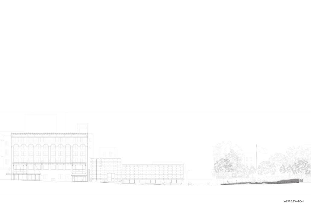
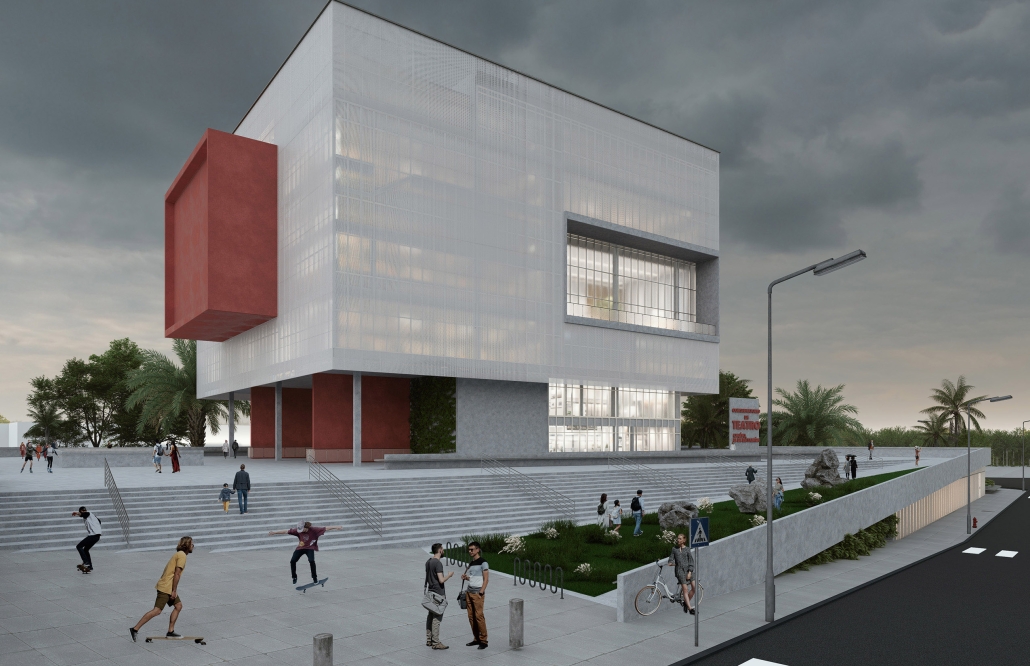
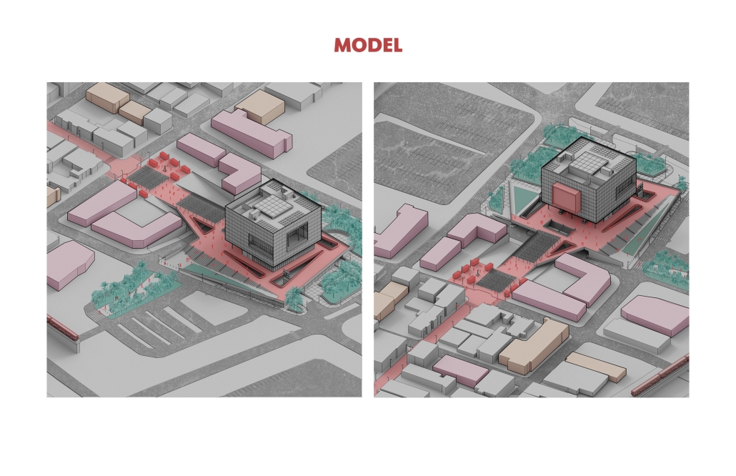
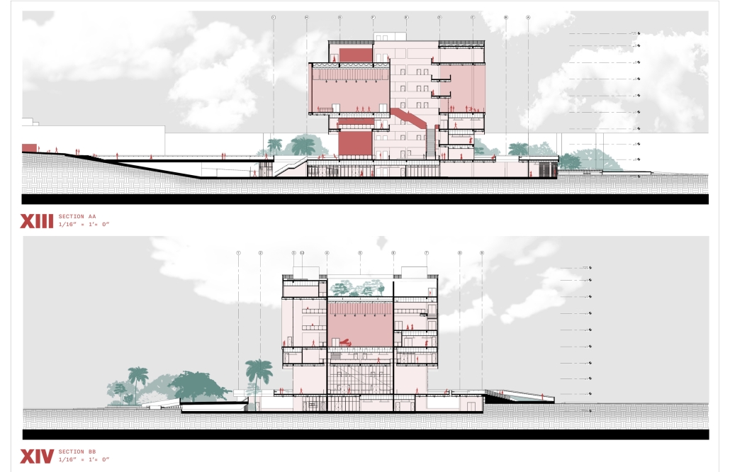
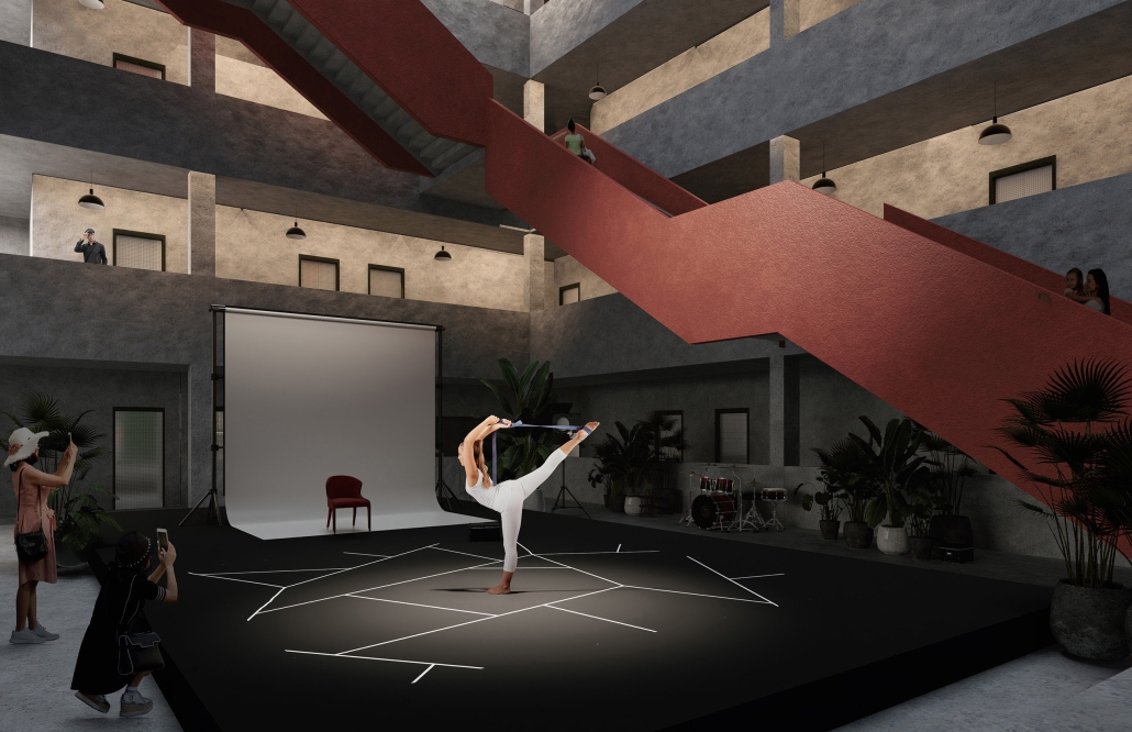
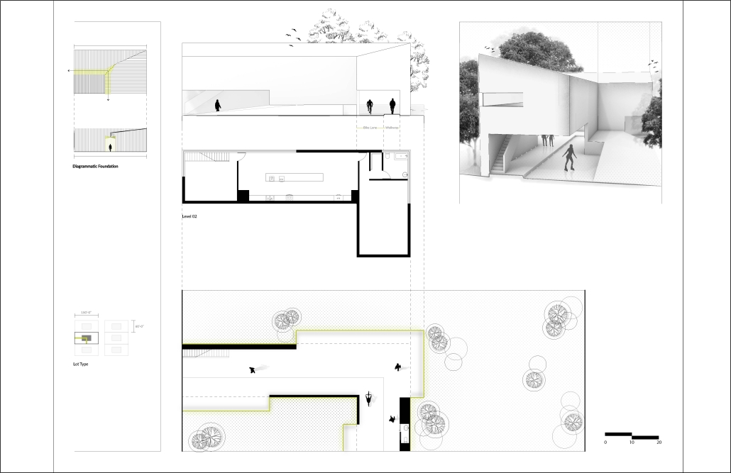
My desire to meaningfully contribute to the city manifested itself in the design of “The Wall,” which can be seen in my West elevation. The Wall is almost totally detached from the rest of the natatorium, joined only by the cuboidal space protruding from the wall as a square window. The Wall serves to acknowledge the suburban scale of the program it conceals: locker rooms, restrooms, and small offices. Without such an acknowledgement, the natatorium would be dwarfed by the surrounding context.
In the end, I designed the natatorium and its wall as a monument to the city of Jackson.
This project was chosen for display in the McNeel Architecture Gallery.
Instagram: @grace.kotomi, @jassencallender
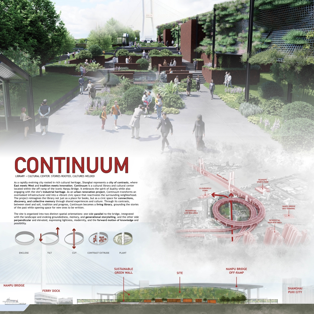
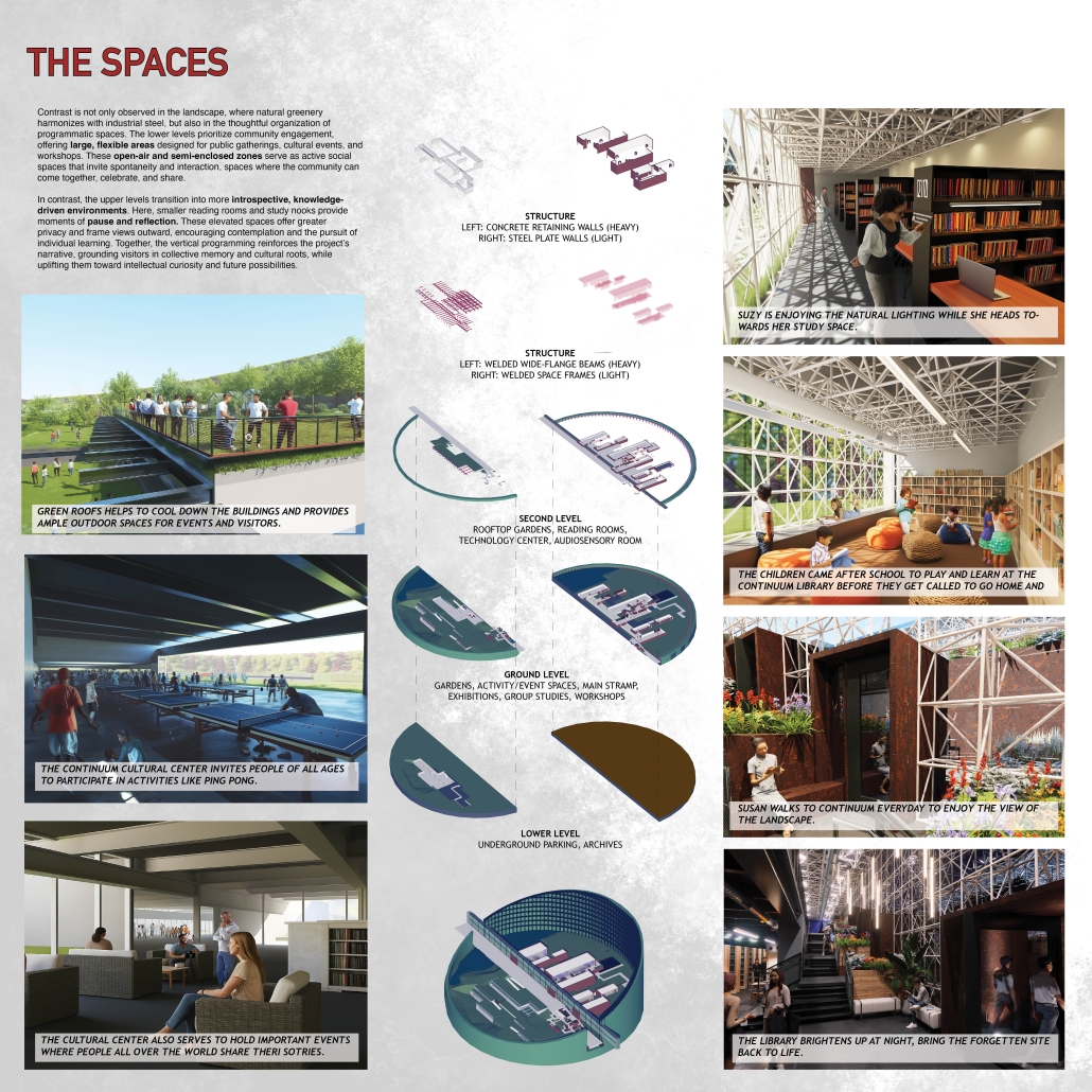
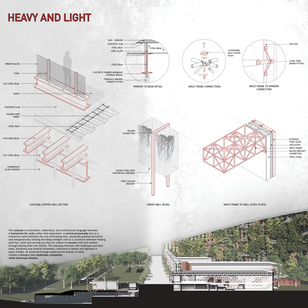
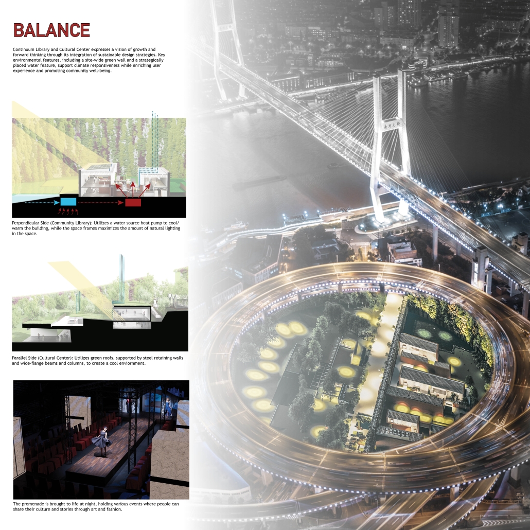
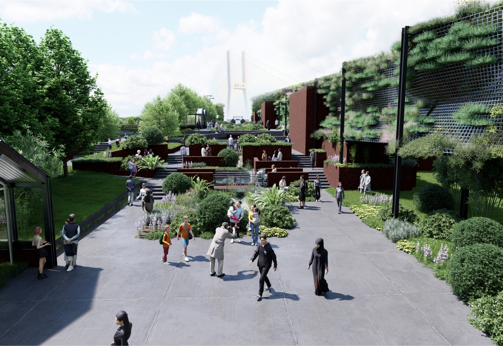
Continuum Library by Joyce Lin, Ronny Nowland, Ashlyn Okazaki, Natalie Ou & Ran Shen, D.Arch ’25
University of Hawaiʻi at Mānoa | Advisors: Clark Llewellyn & Ferdinand Johns
In the bustling Chinese city of Shanghai, “Continuum” reimagines a forgotten infrastructural void beneath the historic Nanpu Bridge’s spiraling access ramps as a dynamic art and fashion-focused library and cultural center. Rooted in the city’s identity as a place of contrasts, where historic tradition interweaves with global innovation, Continuum explores the concept of duality through architecture, program, and materiality.
The design embraces Shanghai’s industrial heritage by preserving and exposing the structural steel elements of the site while layering contemporary interventions that reflect the city’s evolving creative identity. A long-span steel canopy nestled under the undulating descending slope of the site’s green park bridges the old and new, creating an iconic gesture that anchors the site and provides shelter for public gatherings, exhibitions, and performances.
Continuum’s program is split between traditional library services and a “+” space dedicated to fashion archives, design workshops, maker labs, and rotating gallery exhibitions. This not only supports education and creative exchange but also activates local industries and emerging designers. Public spaces flow seamlessly from interior to exterior, with open reading terraces, pop-up markets, and interactive art installations drawing pedestrians and cyclists into the space.
The project’s strategy of adaptive reuse reduces environmental impact while celebrating the poetic tension between heavy infrastructure and light cultural use. By stitching together circulation paths, layered programming, and expressive steel structure, Continuum becomes a new node in Shanghai’s civic network, a platform for exchange, creativity, and community resilience.
In a city of constant flux, Continuum offers a space for pause, reflection, and cultural production, anchored in history, yet always looking forward.
Instagram: @as.h_l.and, @joyce.lyx, @artravelersr, @natalie.xy.ou, @archawaii, @global_track_architecture
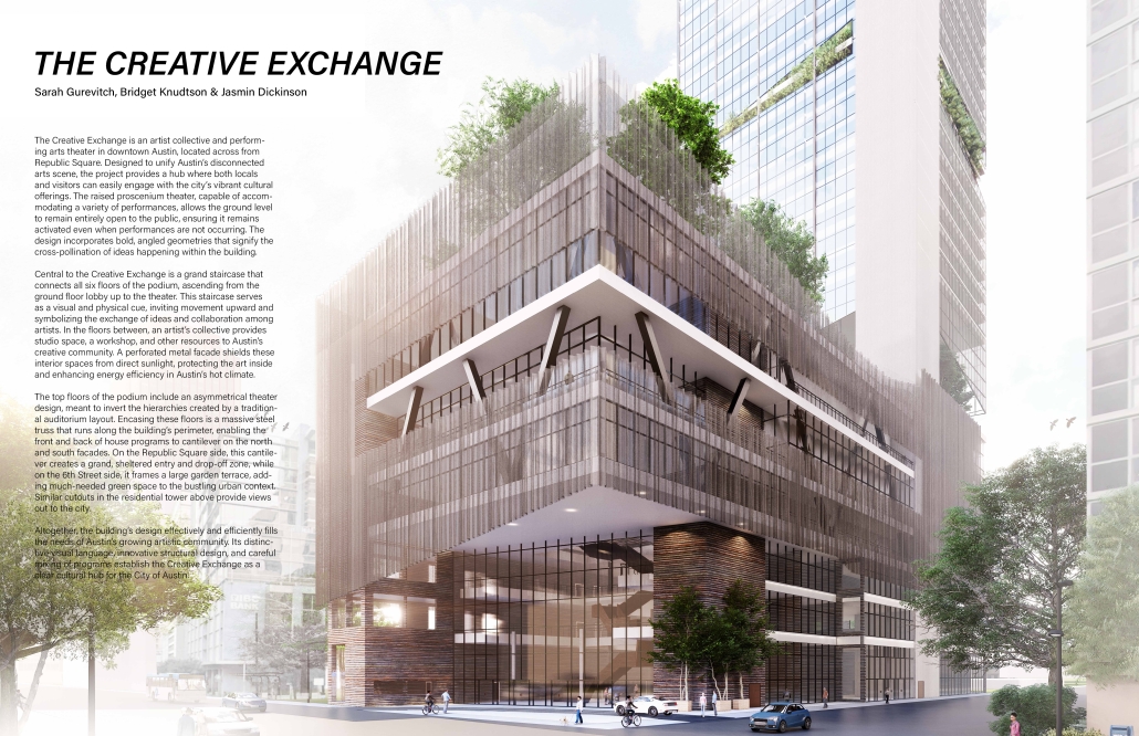
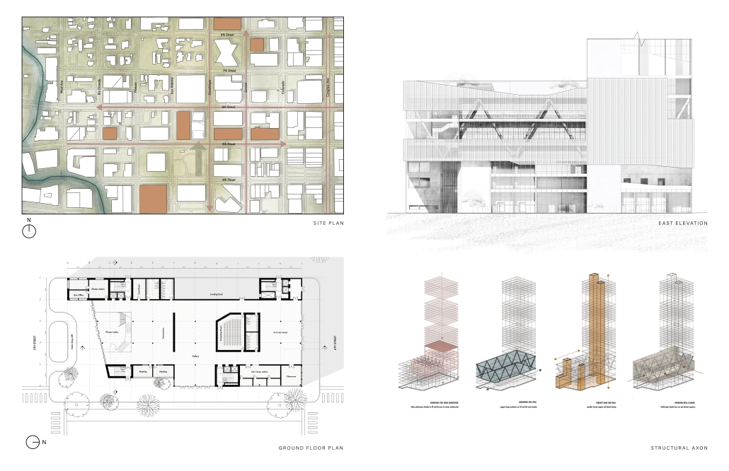
The Creative Exchange by Bridget Knudtson, Sarah Gurevitch & Jasmin Dickinson, M.Arch ’25
University of Texas at Austin | Advisor: Matt Fajkus
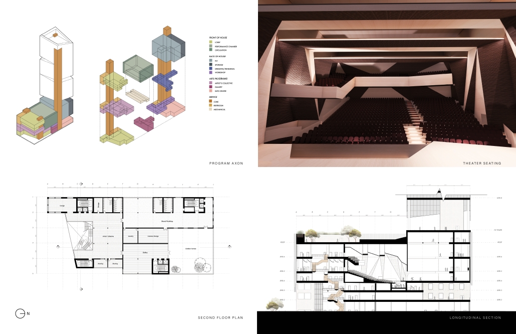
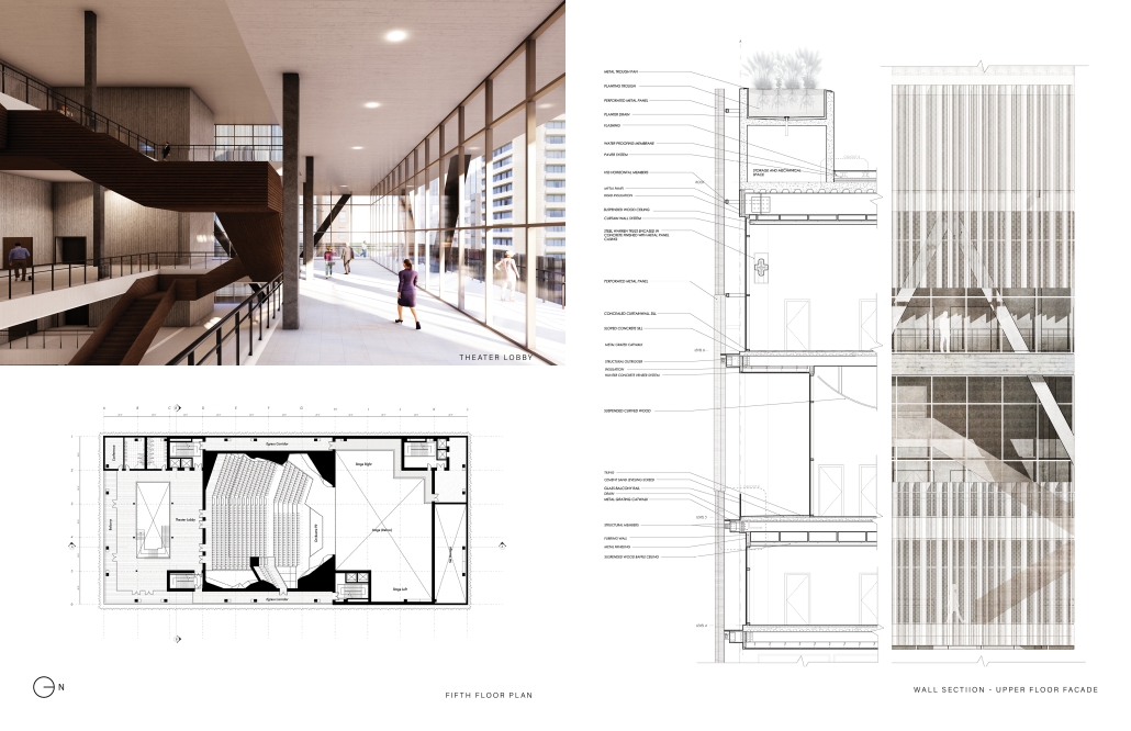
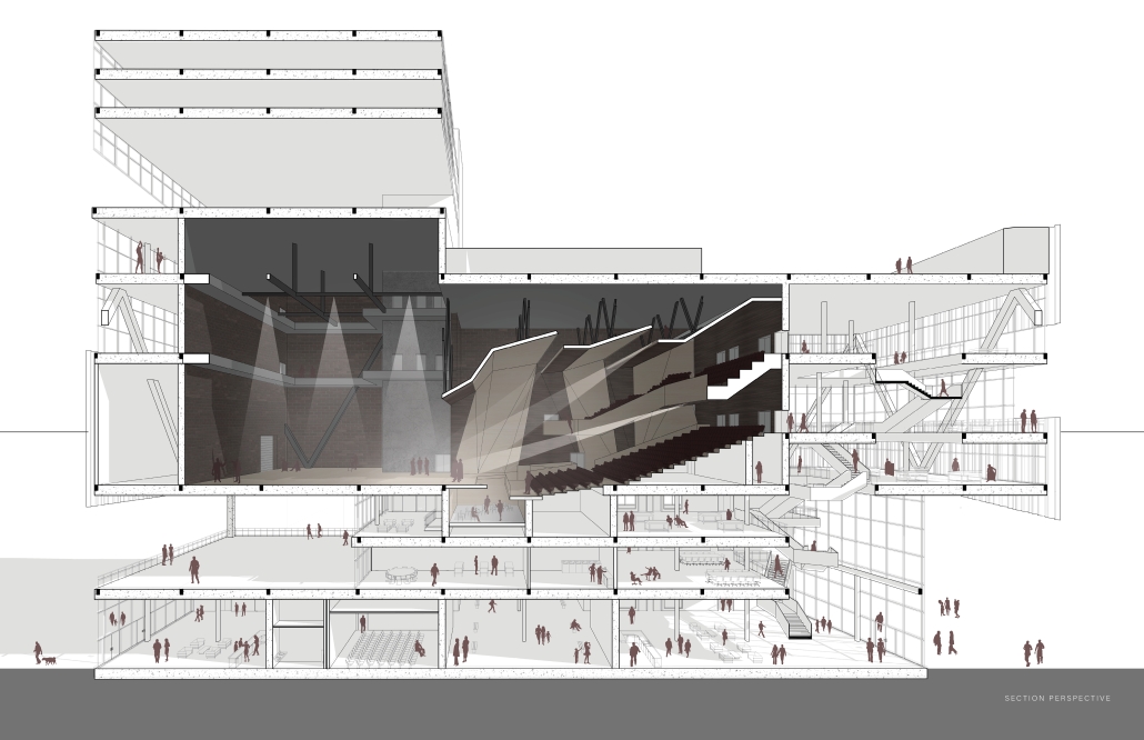
“The Creative Exchange” is an artist collective and performing arts theater in downtown Austin, located across from Republic Square. Designed to unify Austin’s disconnected arts scene, the project provides a hub where both locals and visitors can easily engage with the city’s vibrant cultural offerings. The raised proscenium theater, capable of accommodating a variety of performances, allows the ground level to remain entirely open to the public, ensuring it remains activated even when performances are not occurring. The design incorporates bold, angled geometries that signify the cross-pollination of ideas happening within the building.
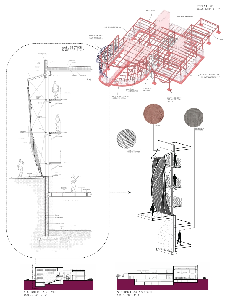
Central to the Creative Exchange is a grand staircase that connects all six floors of the podium, ascending from the ground floor lobby up to the theater. This staircase serves as a visual and physical cue, inviting movement upward and symbolizing the exchange of ideas and collaboration among artists. In the floors between, an artist’s collective provides studio space, a workshop, and other resources to Austin’s creative community. A perforated metal facade shields these interior spaces from direct sunlight, protecting the art inside and enhancing energy efficiency in Austin’s hot climate.
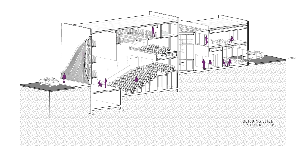
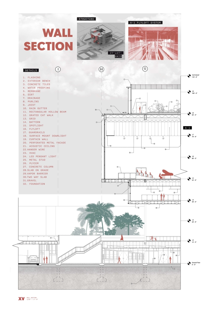
The top floors of the podium include an asymmetrical theater design, meant to invert the hierarchies created by a traditional auditorium layout. Encasing these floors is a massive steel truss that runs along the building’s perimeter, enabling the front and back of house programs to cantilever on the north and south facades. On the Republic Square side, this cantilever creates a grand, sheltered entry and drop-off zone, while on the 6th Street side, it frames a large garden terrace, adding much-needed green space to the bustling urban context. Similar cutouts in the residential tower above provide views out to the city.
Altogether, the building’s design effectively and efficiently fills the needs of Austin’s growing artistic community. Its distinctive visual language, innovative structural design, and careful mixing of programs establish the Creative Exchange as a clear cultural hub for the City of Austin.
This project was nominated for a Design Excellence Award at the UT School of Architecture and was a finalist among award selections.
Instagram: @bridgetthetwin, @sarah_gurevitch, @jazzy_colors, @mf.architecture
(IN) ORDINATIO by Luis Leonardo Flores Hernández, B.Arch ’25
Tecnológico de Monterrey | Advisors: Guillermo Nieto Ross & Jorge Santos Quiroz
“Ordinatio” is an innovative architectural and urban masterplan strategically designed to transform the community of Ocoyucan in Puebla, México, by directly addressing socio-spatial segregation and fostering inclusive community integration. Positioned at the intersection of diverse socio-economic contexts, the project elegantly blends traditional urban patterns from Santa Clara Ocoyucan with the contemporary residential fabric of Lomas de Angelópolis, creating dynamic spaces for equitable interaction and communal growth.
The project’s central feature is a vibrant marketplace comprising agricultural and culinary sectors, complemented by advanced aeroponic greenhouses, significantly reducing resource consumption while directly benefiting approximately 65% of local families dependent on small-scale farming. This strategic economic and cultural hub acts as a catalyst for communal exchange, revitalizing the local economy and nurturing social cohesion.
Architecturally, Ordinatio reinterprets traditional forms through contemporary lenses, utilizing locally sourced materials and visible structural elements to promote a sense of identity and ownership among residents. The community plaza and ephemeral market spaces—framed by elegantly detailed corridors—create essential social nodes that encourage diverse community interactions and cultural activities, reactivating collective memories and traditions.
Integral to the project’s vision is the thoughtful inclusion of a multimodal mobility node, which connects public transport and cycling routes, ensuring everyday urban mobility becomes an enriching communal experience. Additionally, environmental sustainability is woven into the design through ecological restoration along the adjacent Atoyac River, creating essential green corridors and public parks that enhance biodiversity and offer restorative communal spaces.
Ordinatio exemplifies architecture’s potential as a regenerative tool, mitigating socio-economic disparities, avoiding social resentment, and promoting harmonious urban coexistence. This holistic approach not only revitalizes the urban landscape but positions Ocoyucan as a compelling model of equitable, sustainable, and community-driven urban development.
This project was exhibited at ITESM University’s national architecture festival, “How Space Can?” It was also selected to be presented at EXPO EAAD.
Instagram: @luish_137, @arq.pue.tec
Vortex Theater by Joshua Jolly, M.Arch ’25
Pennsylvania State University | Advisor: Ute Poerschke
The project task was to design a theatre in-the-round as an addition to the Walnut Street Theatre in Philadelphia.
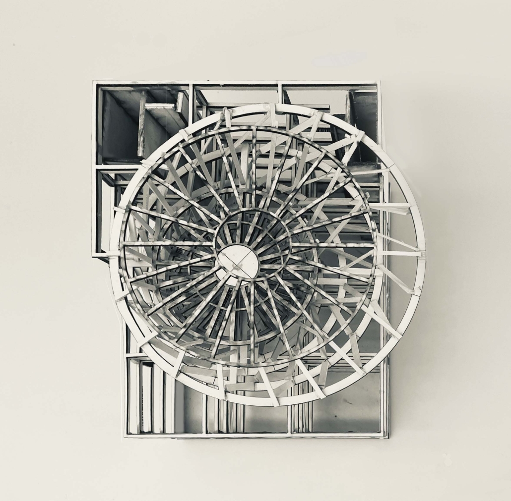
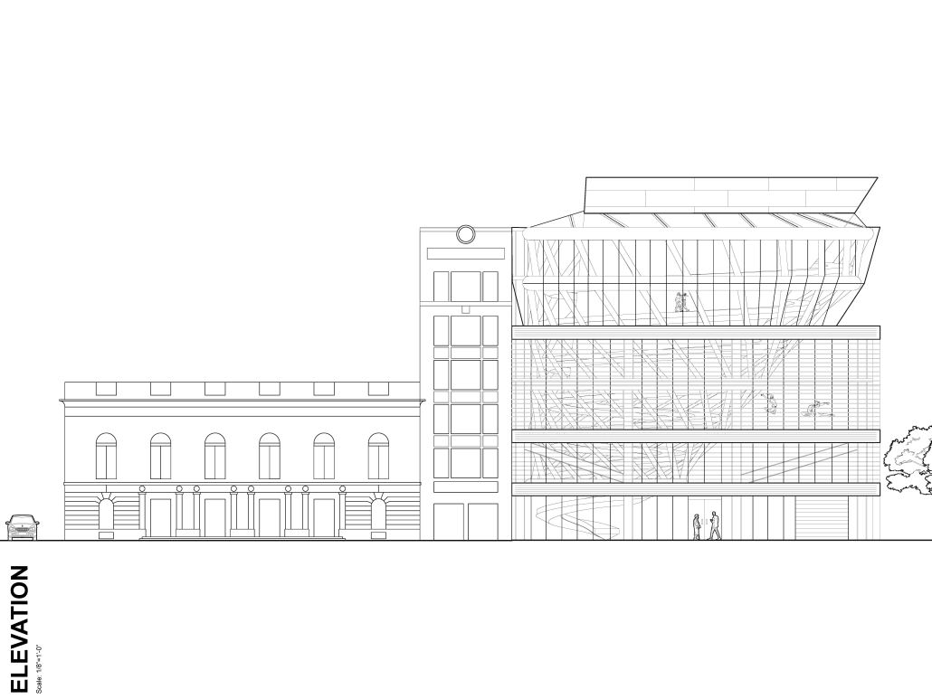
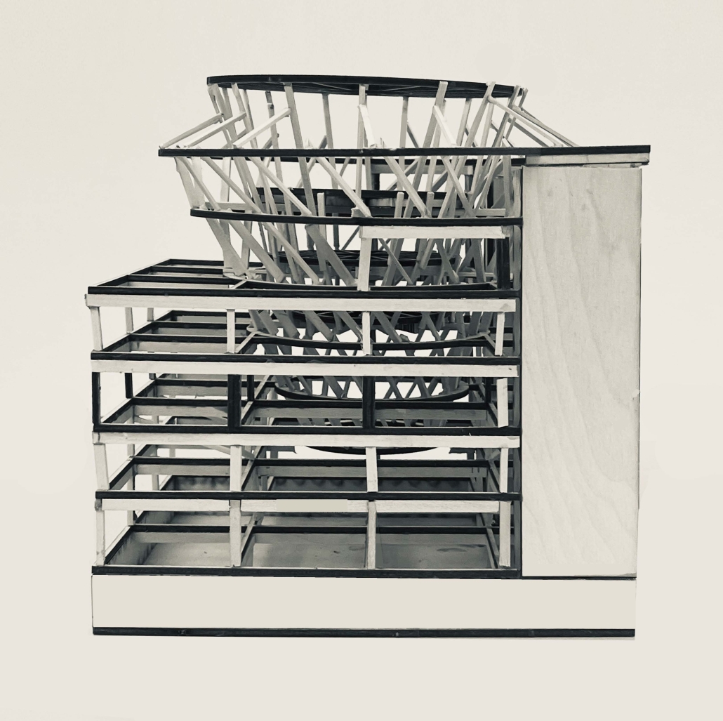
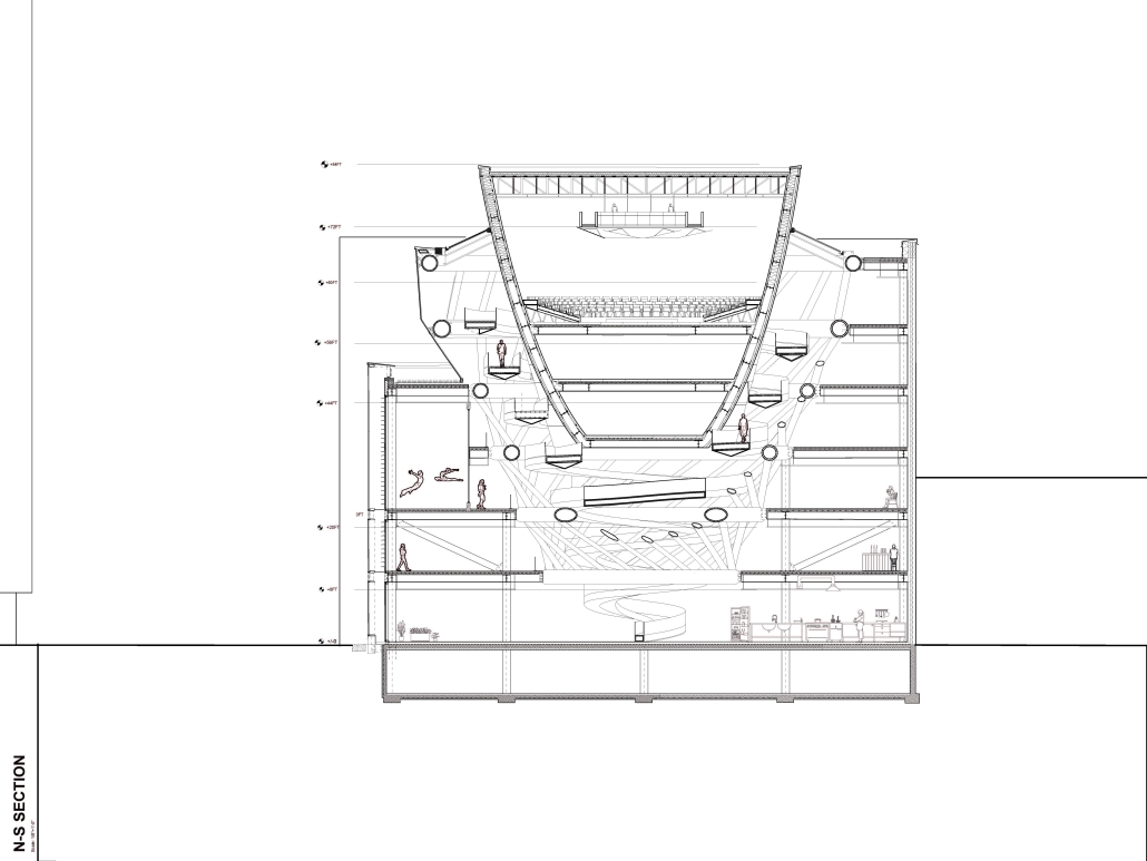
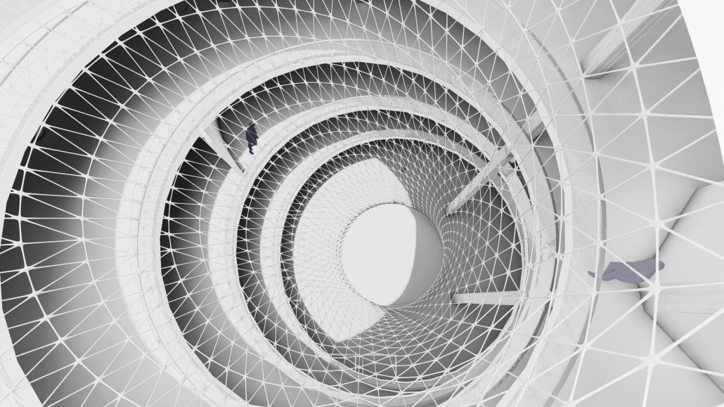
“Vortex Theater” — This design places the theatre as the eye of the storm, a tornado’s core. The central ramp becomes the force around which people, spaces, and artifacts spiral. Its continuous motion reinforces the vertical energy, pulling people into the experiences that the theater has to offer. The surrounding spaces (lobbies, rehearsal halls) act as the rotating winds, positioned in a way that reacts to the ramp’s motion. Due to the ramp’s centrality, each level has a visual sight between programs, enhancing the sense of being caught in a swirling motion and thrown out of the winds. The concept is amplified through the structure and surrounding programs. The ramp isn’t just a means of circulation; it’s the driving force of the architectural experience, pulling everything and everyone into its swirling grasp.
This project won the Design Excellence Award.
Instagram: @_jollyj
Stay tuned for Part X!

