Posts

2024 Study Architecture Student Showcase - Part XIV

Architecture plays a large role in the restoration and preservation of buildings. The projects featured in Part XIV of the 2024 Study Architecture Student Showcase focus on revitalizing spaces. 

Today, we look at various sites, including areas impacted by natural disasters, former industrial zones, federal buildings, and more. Each project blends old and new, demonstrating the ability to recover and reclaim using architecture and design.

Reclaiming Antakya: Post Disaster Community Recovery for Resilient Futures by Zeynep Dila Demircan, M. Arch ‘24
University of Maryland | Advisor: Ken Filler

The earthquakes that struck Southwestern Turkey and Northern Syria in February 2023 caused extensive damage, ranking among Turkey’s worst disasters in its history. The city of Antakya, especially, suffered severe destruction in its center, resulting in significant losses of lives, culture, and history.

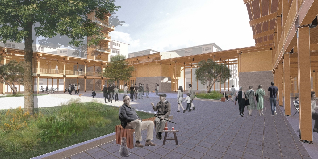
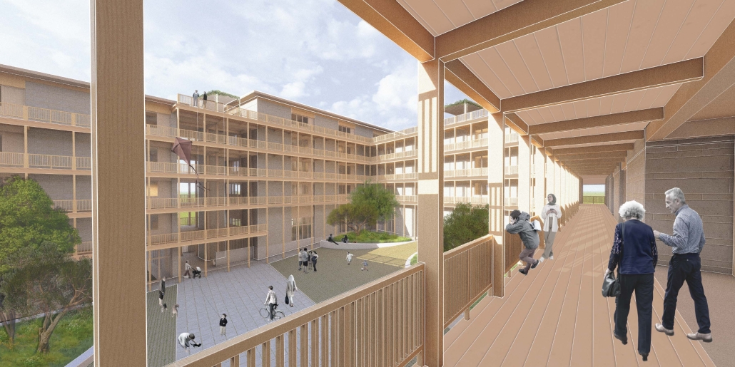
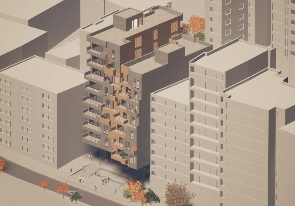
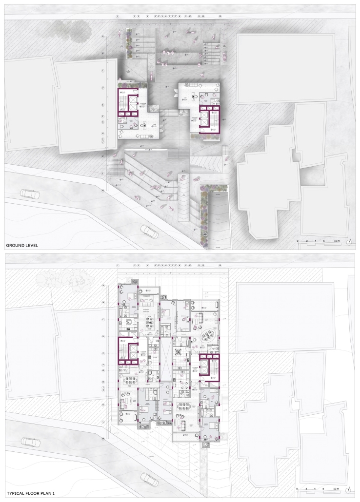
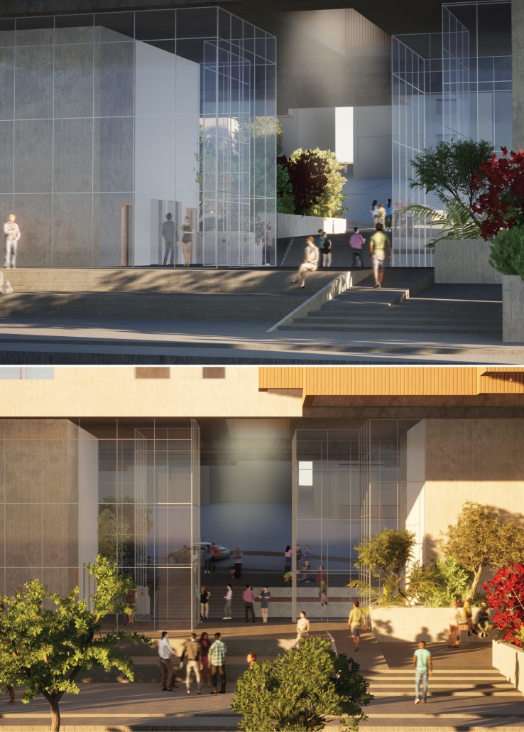
This thesis presents a comprehensive plan to recover and reclaim Antakya’s center, enhancing community resilience through proactive design strategies. It focuses on a specific urban block, a key commercial, residential, and administrative hub across the Asi River and the historical district. The proposal outlines a multi-phased approach to transform this urban block, starting from the post-disaster period and concluding with its complete redevelopment. The phases include recovery, reclamation, reconstruction, and reconnection.

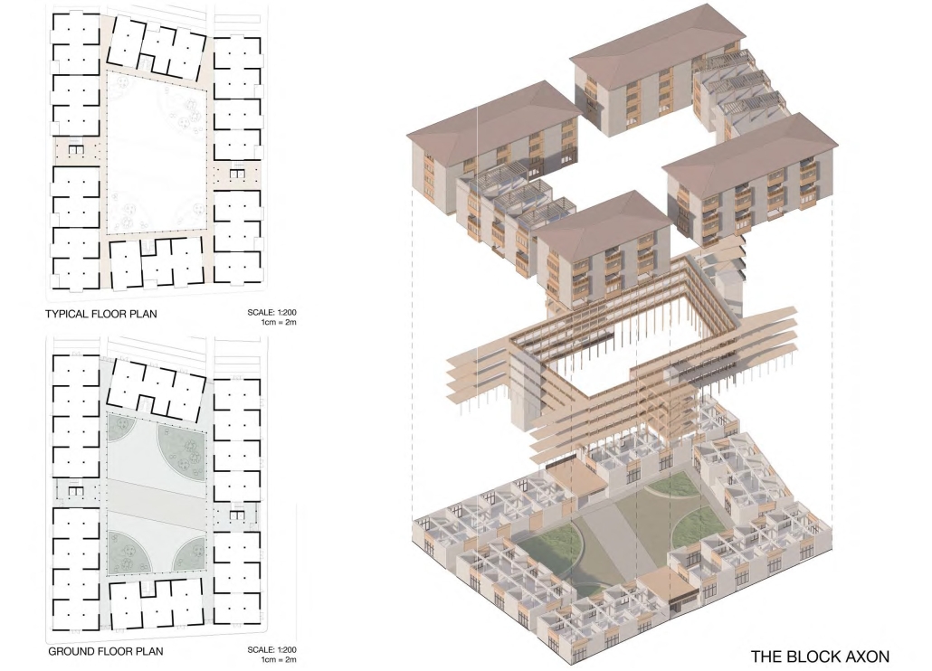
For the recovery phase, temporary shelter and gathering spaces are provided for residents within the grove area existing on the site, while efforts to engage stakeholders in the recovery process begin. Reclamation involves reforming the cleared area based on existing and new street systems, integrating new public streets and courtyards that make up the green infrastructure. Reconstruction involves rebuilding the site in smaller blocks, starting from the middle section and expanding to the upper and lower sections. The reconnection phase focuses on finalizing building blocks and reintegrating them into the larger context. 

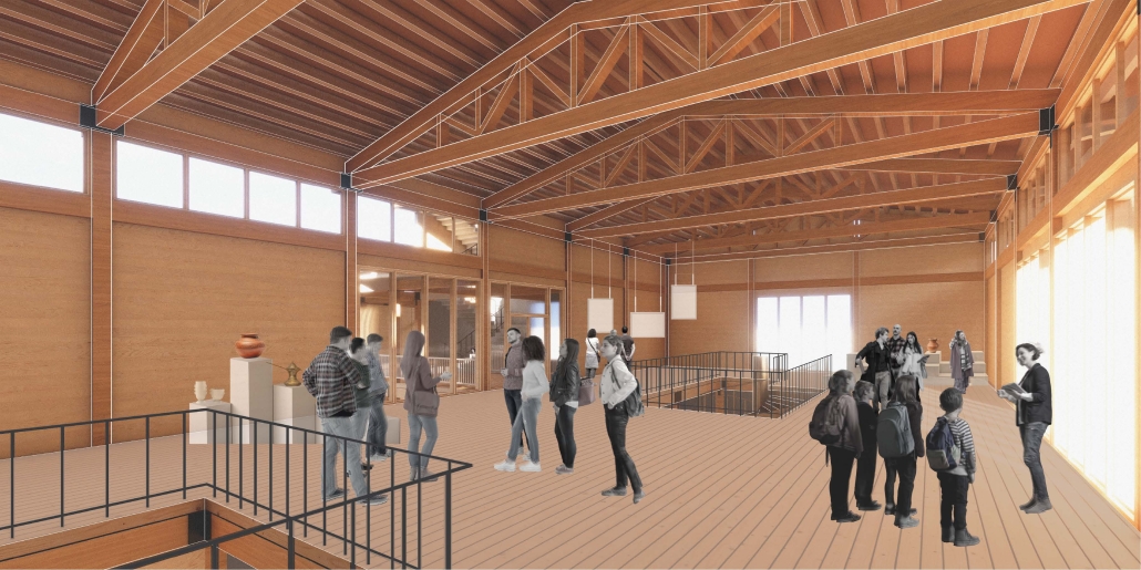
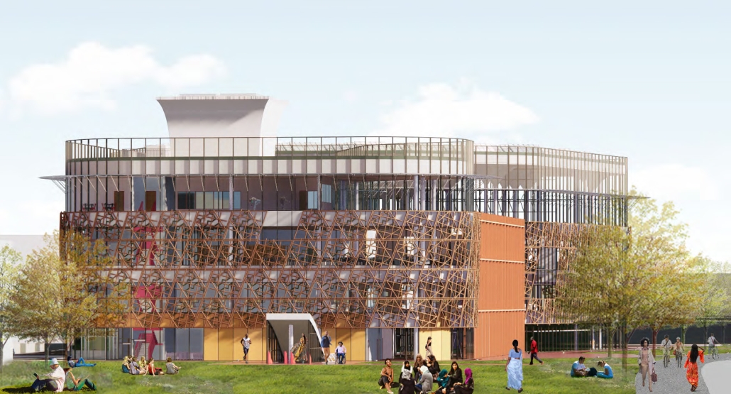
This includes the creation of a new urban plaza and the introduction of programs aimed at fostering cultural and social resilience, as well as commemorating the earthquake through a memorial space within a community center. The proposal introduces two main building types: The Block, a mixed-use structure with a courtyard for residents, and The Hub, a community center featuring public spaces, a museum, gathering areas, and studios for local crafts practices.

In essence, this thesis aims to not only reconstruct Antakya’s physical infrastructure but also to cultivate resilient communities through place-making strategies. It endeavors to revitalize cultural and social life while fostering trust and collaboration, ultimately laying the groundwork for a robust and resilient future.

This project won the UMD Architecture Thesis – Director’s Award and the ARCC 2023-2024 King Student Medal for Excellence in Architectural + Environmental Design Research.

The Topographical Reactivation by Yanbo Zhu, M. Arch ’24
University of Waterloo | Advisors: Mohamad Araji & Shiyu Wei

Community Center Design at Kitchener

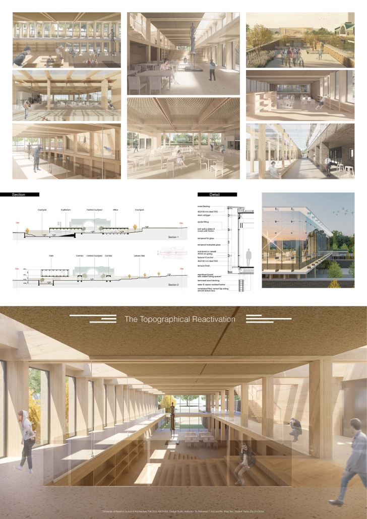
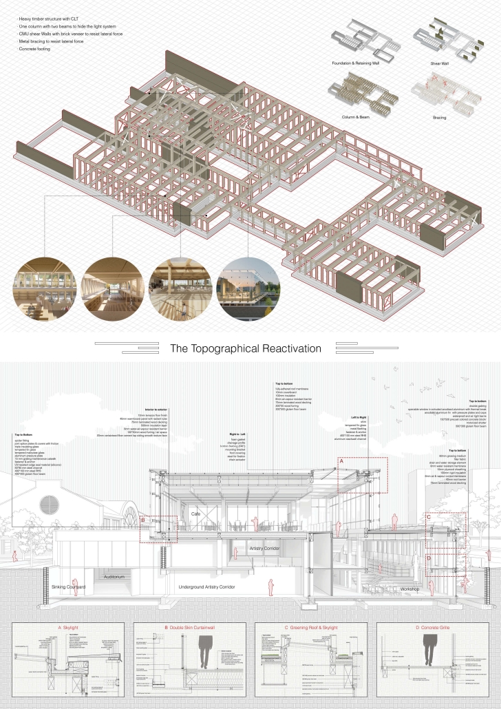
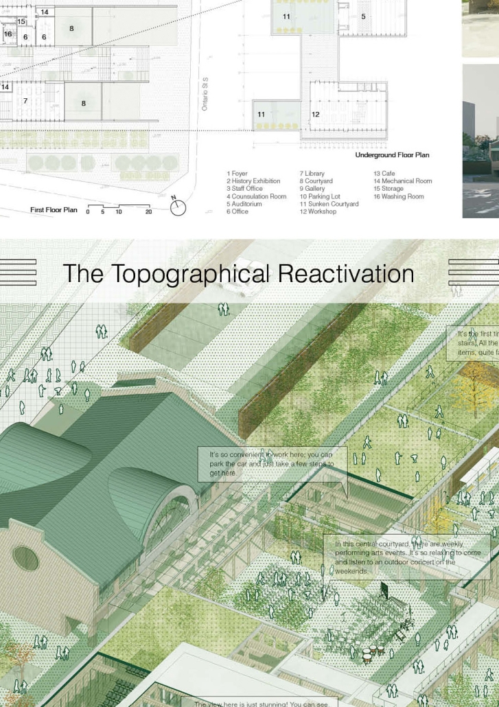
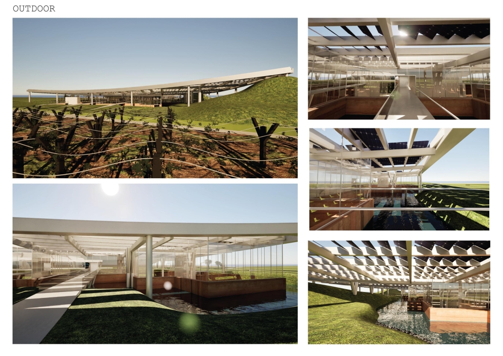
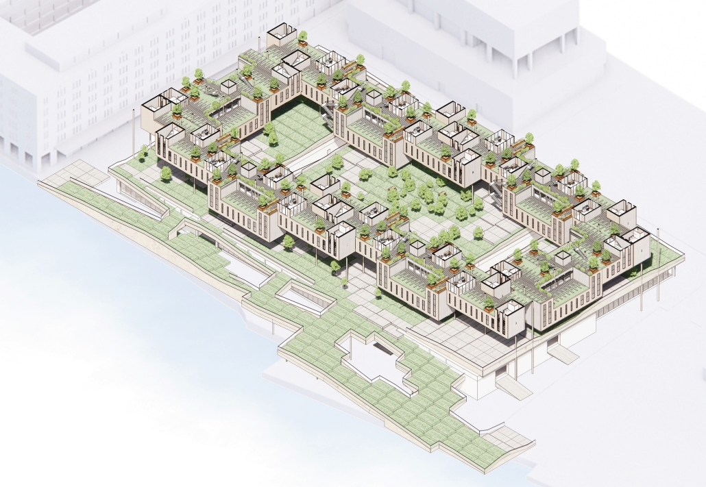
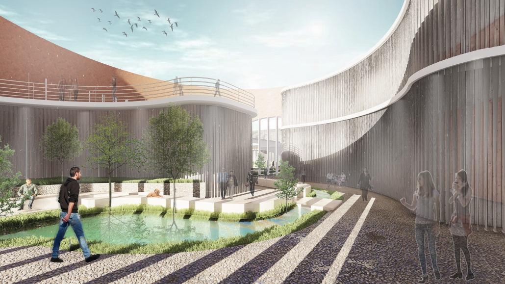
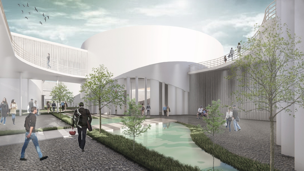
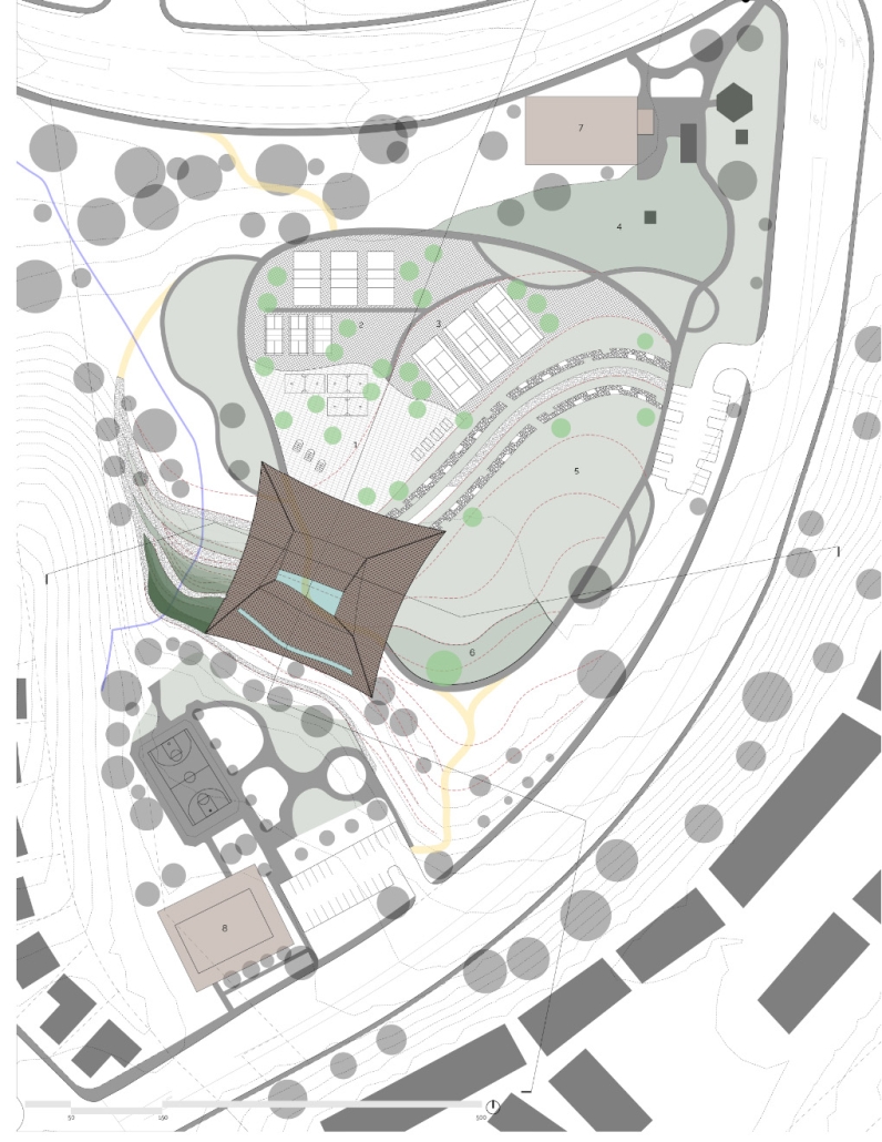
This design features three keywords: nature, history, and topography.

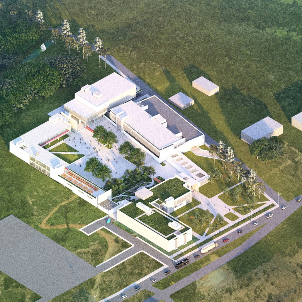
  1. NATURE: The site is located in the center of Kitchener, with the expansive Victoria Park to the south. However, due to roadways and parking areas interrupting the flow, it’s challenging for this landscape to permeate the site effectively. Simultaneously, with a site area of 15,000 square meters and a required building area of only 1,500 square meters according to the project brief, the strategy involves integrating small-scale structures with the landscape to address the issue of the site’s excessive scale.
  2. HISTORY: Within the site, there is an abandoned Charles bus terminal, with its main hall building well-preserved, but the historical elements of its platforms, bus lanes, and connecting corridors are poorly maintained. In the design, preserving the original waiting hall while removing other elements yet continuing its multi-linear spatial configuration is a critical historical stance.
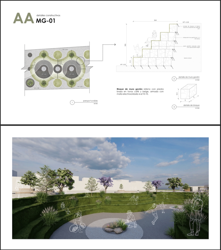
  3. TOPOGRAPHY: On the eastern side of the site, there is an elevation difference of nearly four meters. In the design, a planted roof is utilized to seamlessly connect, allowing individuals to enter the building from the roof. Simultaneously, the height difference is employed to create outdoor stepped activity areas or sloped gardens. Additionally, to respect historical architecture, a partial sunken approach is employed in spaces like the art gallery and lecture hall, forming various topographical experiences.

This project won the Edward Allen BTES Award and the Second Prize SOPREMA Award. 

Instagram: @yanbo_zhu

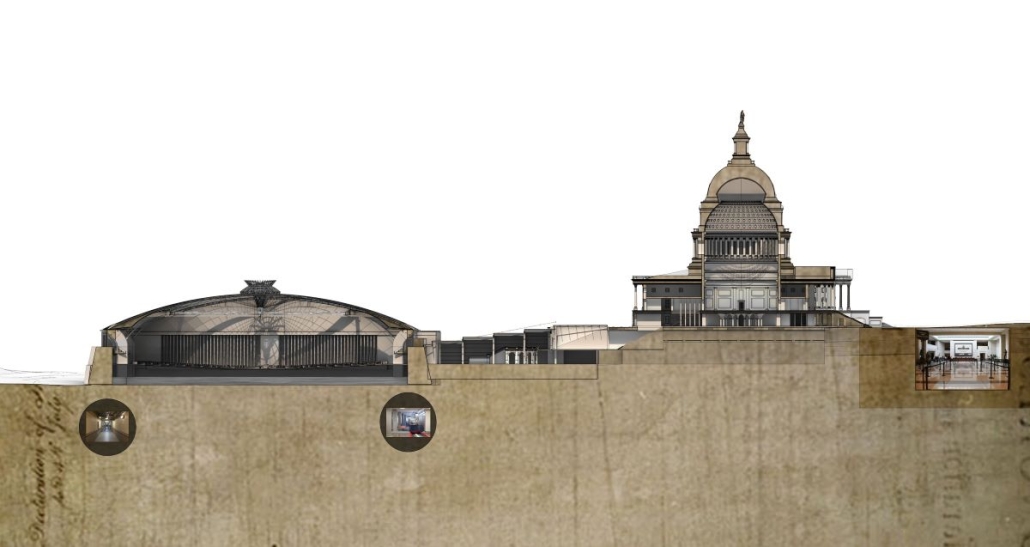
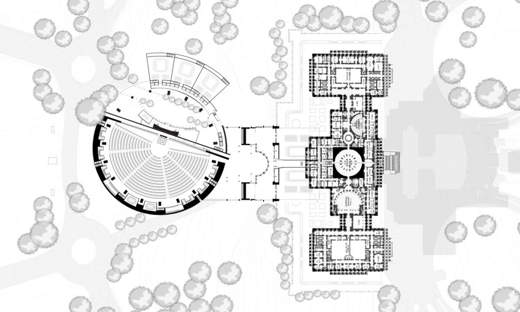
Amending the Capitol by Garrett Krueger, M. Arch ‘24
Virginia Tech | Advisors: Susan Piedmont-Palladino, Paul Emmons & Scott Archer

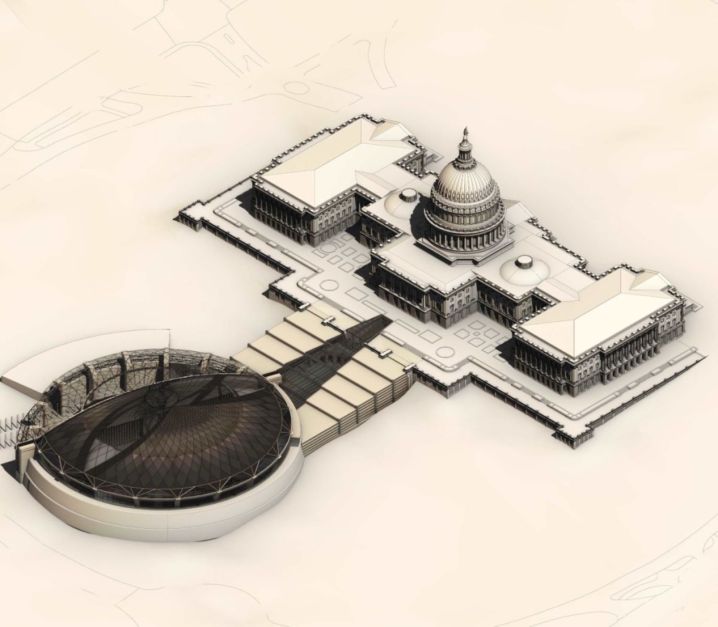
The United States Capitol Building has long been an iconic symbol of the American government and democracy worldwide. Despite this, the United States has had many major events since 1892, and the Capitol has not had any representation of those events.

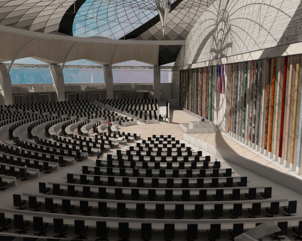
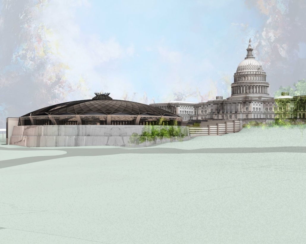
One example of stalled symbols of change is the number of representatives in the House. Since 1913, the House of Representatives in Congress has had 435 representatives, despite the population more than tripling since then. Many have had the idea to increase this number and expand the House. This idea gives an opportunity to design a new, larger chamber for the House to meet in. This thesis proposes a new chamber to redefine the architecture of the Capitol Building and symbolize the century of history that has yet to be represented in the Capitol.

The idea of making a new expansion to the iconic Capitol Building comes with challenges. This thesis was done amid historic turmoil and record lows in productivity in the House. This thesis also begs the question of whether the building that Congress meets in can be part of the solution. The House Chamber, when completed, had no electric lighting, let alone C-SPAN cameras and smartphones in every lawmaker’s pocket. This new extension aims to provide Congress with a workplace designed to address the difficulties it faces in keeping itself in order. As a whole, this thesis is about the idea of representing change. The nature of a democratic government is one of changing ideas and laws, and this project seeks to have the Capitol Building embody that aspect. Thomas Jefferson himself is known for saying rejecting change is like “requiring a man to wear still the coat which fitted him when he was a boy.” Congress needs a new coat. 

This project won the WAAC Crystal Award. 

Instagram: @vt_waac

Life, Death, and the Eternal Recurrence of Architecture by Geri Roa Kim & Kelvin Hu, B. Arch ’24
Pratt Institute | Advisors: Adam Elstein, Frank Gesualdi & Ashley Simone

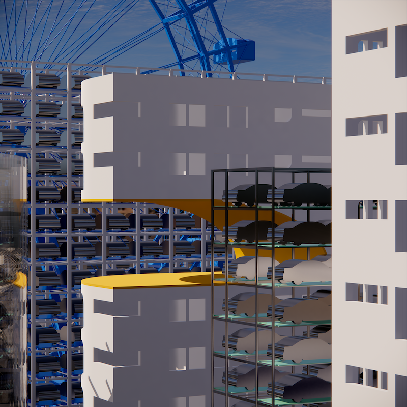
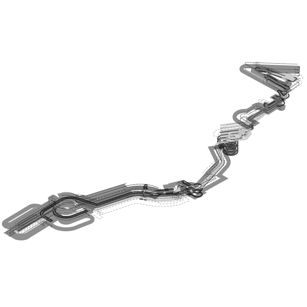
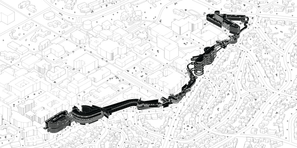
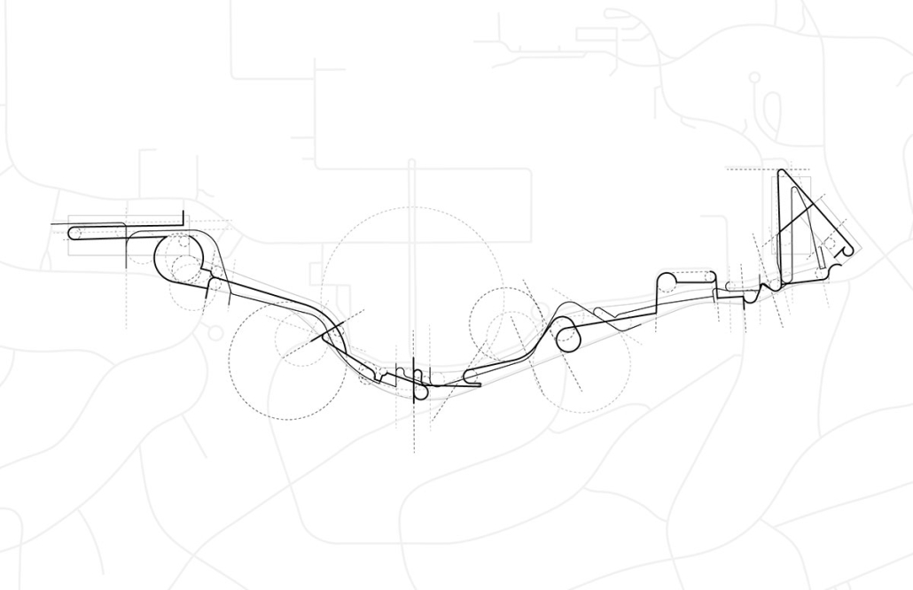
Life, Death, and the Eternal Recurrence of Architecture proposes building anew as a form of preservation. Situated along the Arakawa River Island in Tokyo, this project is a story of a building that has grown over time since 1946. The building undergoes successive replication and revision every few years, each edition is built next to its predecessor, eventually becoming an endless, linear, horizontal skyscraper that constantly reinvents itself through time. 

This architectural approach, rooted in preservation, provides a tangible way to experience changes that normally unfold over centuries. Architecture, then, becomes a device to register time.

This project won the Best Degree Project of 2023/2024.

Instagram: @g.eroaii, @kelv.hu

Unbound Beirut: Reimagining Boundaries & Transforming Realities by Sima Fayad, B. Arch ’24
American University of Beirut | Advisor: Makram Al Kadi

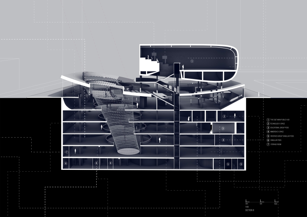
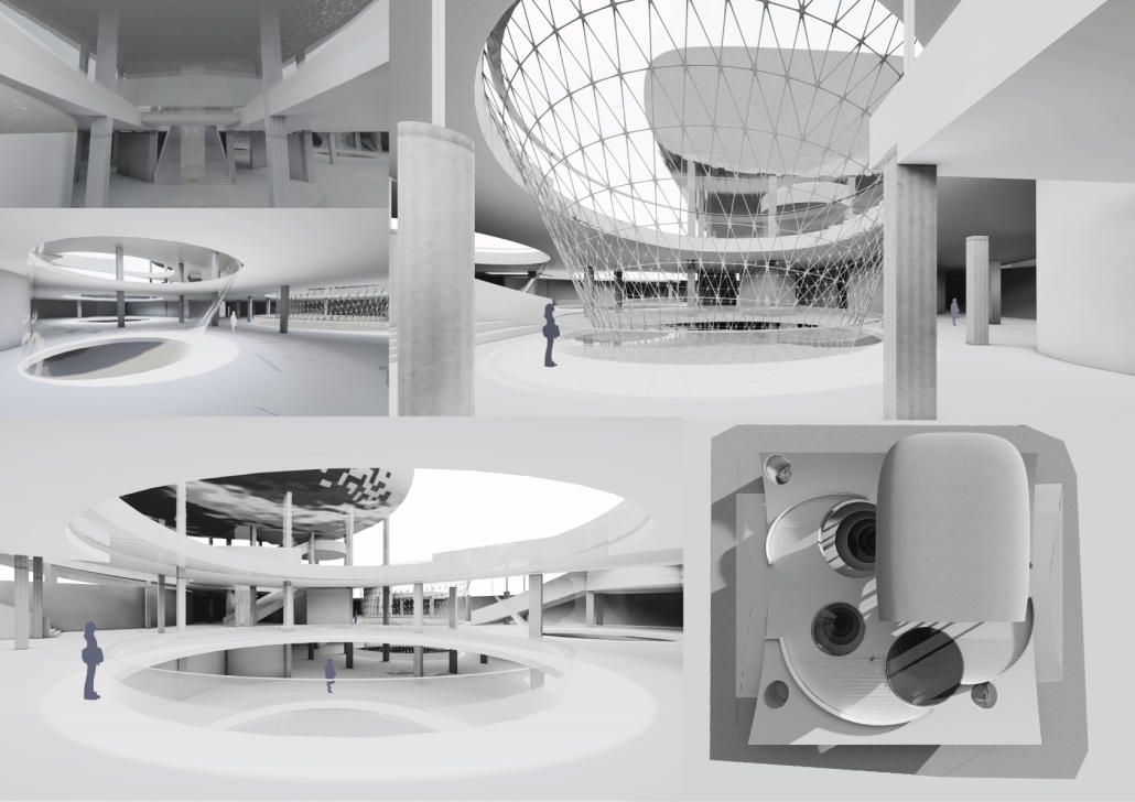
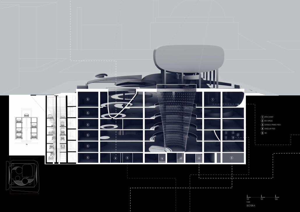
This architectural thesis culminates in transforming Beirut’s iconic dome, The Egg, located in Solidere, into a multifaceted public space. It seamlessly integrates medical, educational, and cultural uses through a harmonious fusion of virtual and physical elements. This design transcends Solidere’s boundaries, fostering interaction among diverse user groups within a dynamic environment. Symbolizing Beirut’s resilience and revival, The Egg blends history with a vibrant future, redefining spatial inhabitation by bridging physical and virtual realms.

At its core, this thesis explores the intersection of physical and virtual spaces, emphasizing the enduring significance of tangible structures while delving into the growing realm of digital environments. It investigates how architects can utilize digital technology to craft emotionally and socially resonant spaces that transcend traditional boundaries. Envisioning a future where architecture integrates seamlessly with digital elements, the study challenges architects to reimagine spatial design.

The introduction lays the foundation by recognizing the pivotal role of physical spaces in our spatial understanding, positioning the thesis at the confluence of the tangible and intangible. As digital technologies increasingly influence our physical reality, this thesis calls on architects to incorporate digital elements such as virtual reality and internet connectivity into their designs. It highlights how these once futuristic concepts are now essential tools for creating visually striking, functional, and socially impactful architectural spaces. 

The thesis examines the redevelopment of Beirut’s downtown area, specifically focusing on The Egg, a striking dome in the Solidere district. This site symbolizes Beirut’s resilience and revival post-war, embodying the city’s enduring spirit while highlighting the economic barriers that modern urban landscapes can create. The Egg stands as a testament to Beirut’s cultural heritage, illustrating how architecture can blend the past with a vibrant future, bridging physical and virtual realms to redefine our concept of inhabiting space.

Instagram: @ard_aub

PENINSULAR PAPER CO. by Chase Dietrich, B.S. Arch ’24
Lawrence Technological University | Advisor: Masataka Yoshikawa

The project, PENINSULAR PAPER CO., began with an in-depth site analysis. The design was initially inspired by the natural gathering spots surrounding the existing building. This project aims to renovate and expand the existing structure, guided by the logic of these natural gathering points and the acute angles they form. The contemporary vision for the building’s renovation leverages these convergent points, ensuring the new design seamlessly integrates with the environment while enhancing functionality and aesthetic appeal. By focusing on these natural elements, the project promises a harmonious blend of old and new, creating a revitalized space that respects its historical context and serves modern needs.

This project won the Lawrence Technological University Chair’s Award.

Instagram: @chase.a.dietrich, @masataka.yoshikawa

Steamtown Revival by Mason Ramsey, James Gentilesco & Dalton Metzger, B. Arch ’24
Marywood University | Advisors: Jodi La Coe & James Eckler

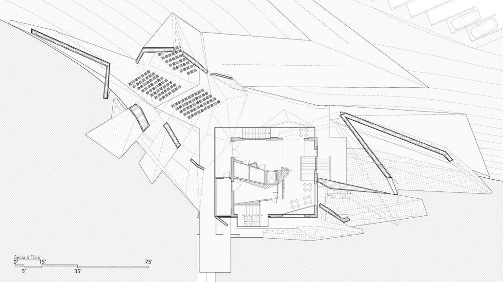
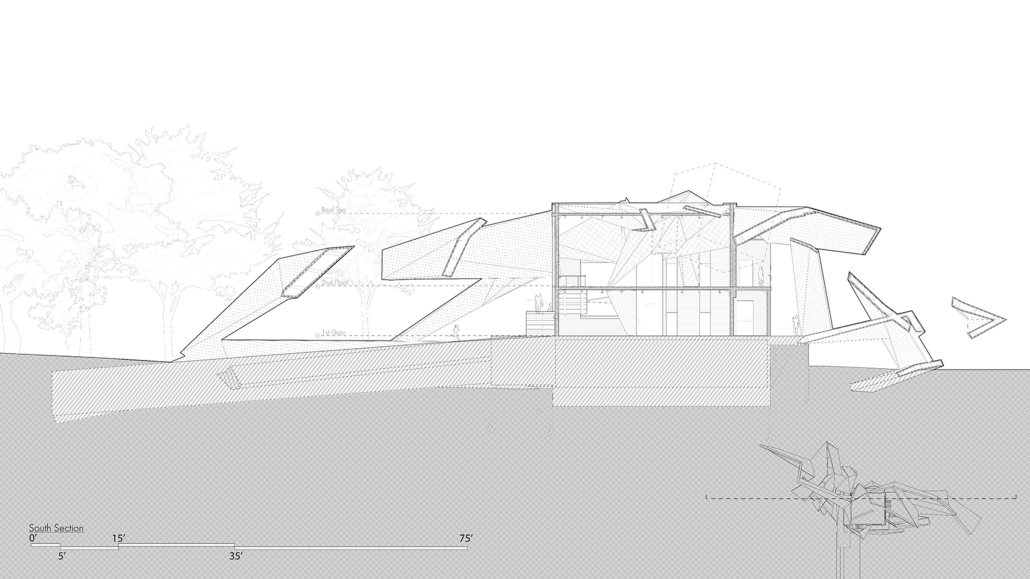
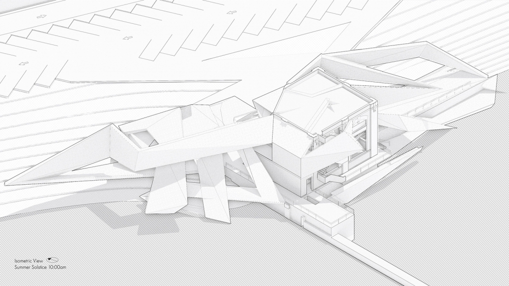
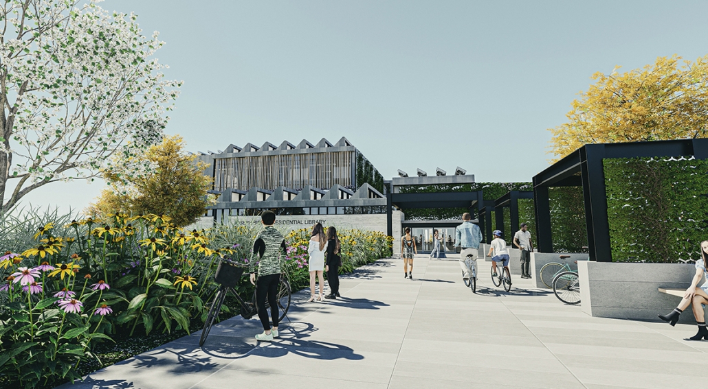
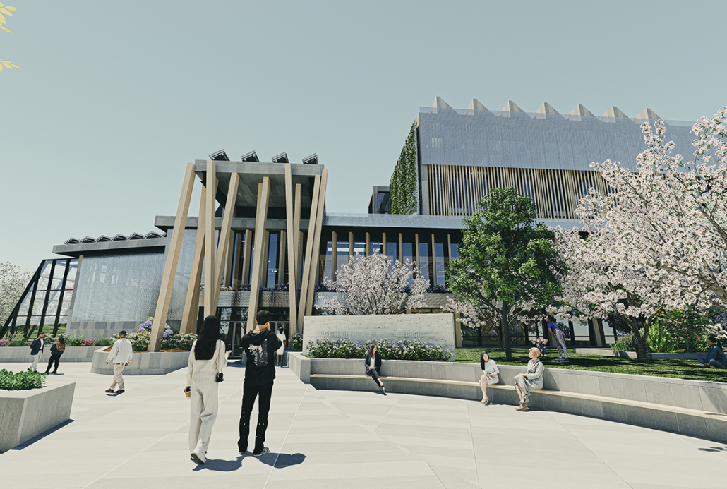
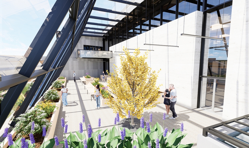
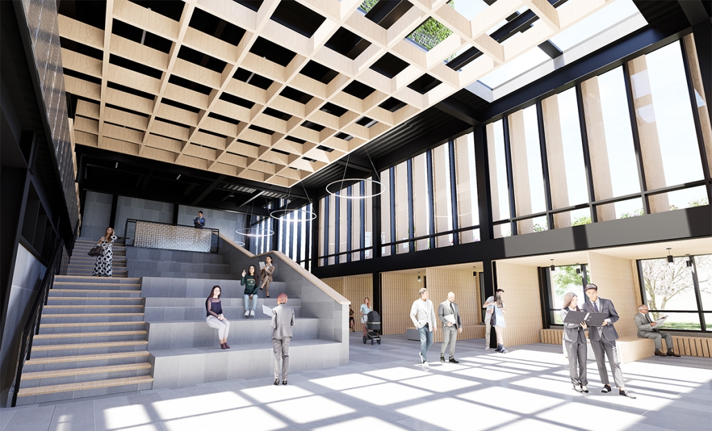
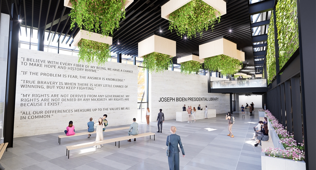
The Joseph Biden Presidential Library uses various design concepts to best represent our president’s values. Green walls, aquaponics, water reuse, and bioswales all work together to visually demonstrate President Biden’s environmental priorities. These are new concepts for the proposed site in Scranton, Pennsylvania, currently occupied by the Steamtown Mall, a development that only hurt the economy and environment of the city, as Jane Jacobs argued. The entire site is to be replaced with biking and walking trails to best integrate the cityscape with nature. Inside this presidential library, one may visit Biden’s museum collection, browse through his personal selection of books, and even request access to presidential archives in this new landmark in a regrowing city.

Instagram: @ramsey_architecture, @gentilesco_architecture, @jodilacoe

“Navigating Uncertainty” in Lebanon by Karly Abou Dib, B. Arch ’24
American University of Beirut | Advisors: Trevor Ryan Patt & Rana Haddad

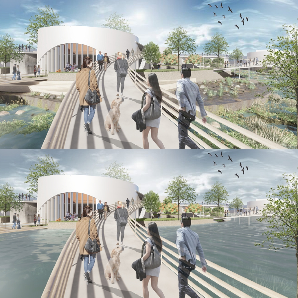
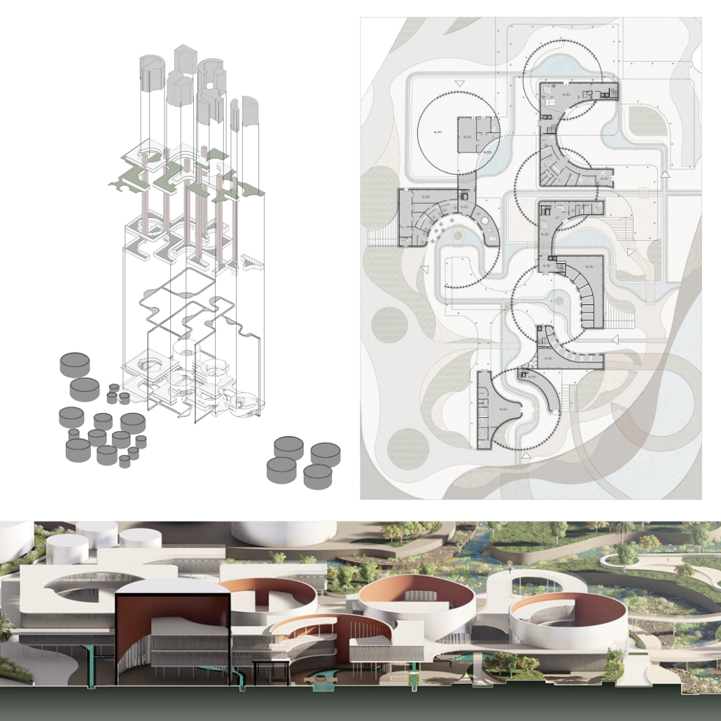
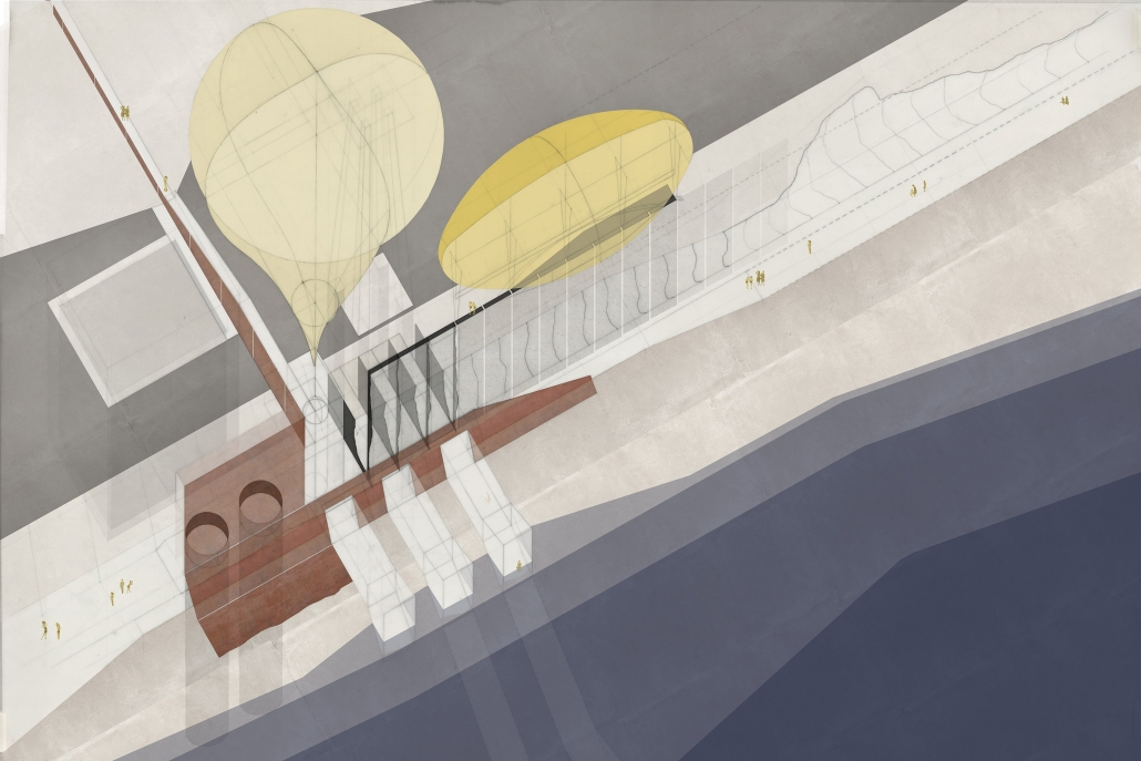
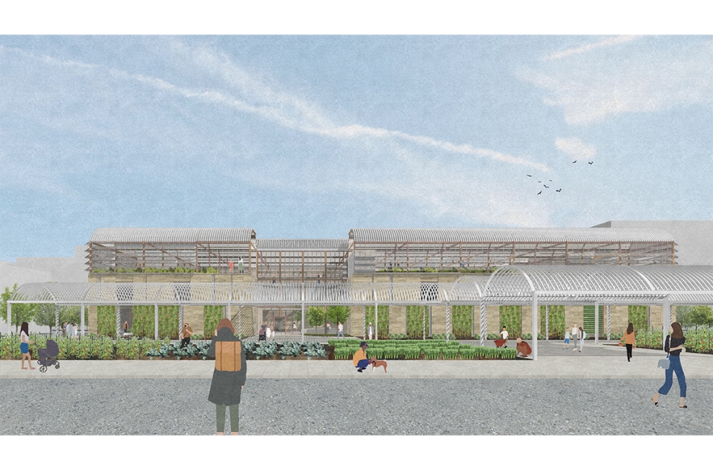
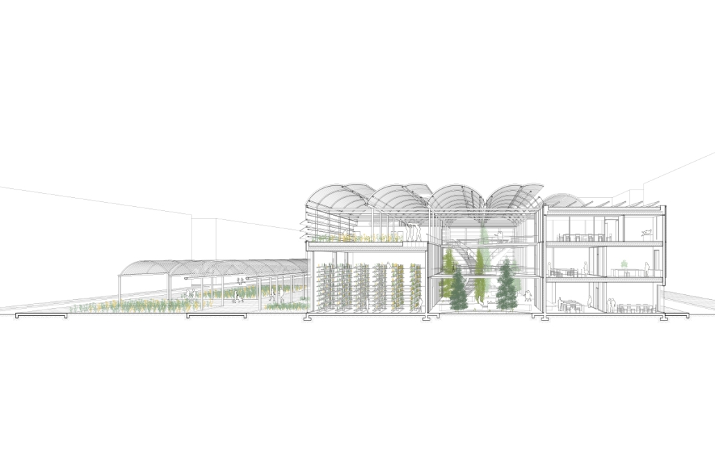
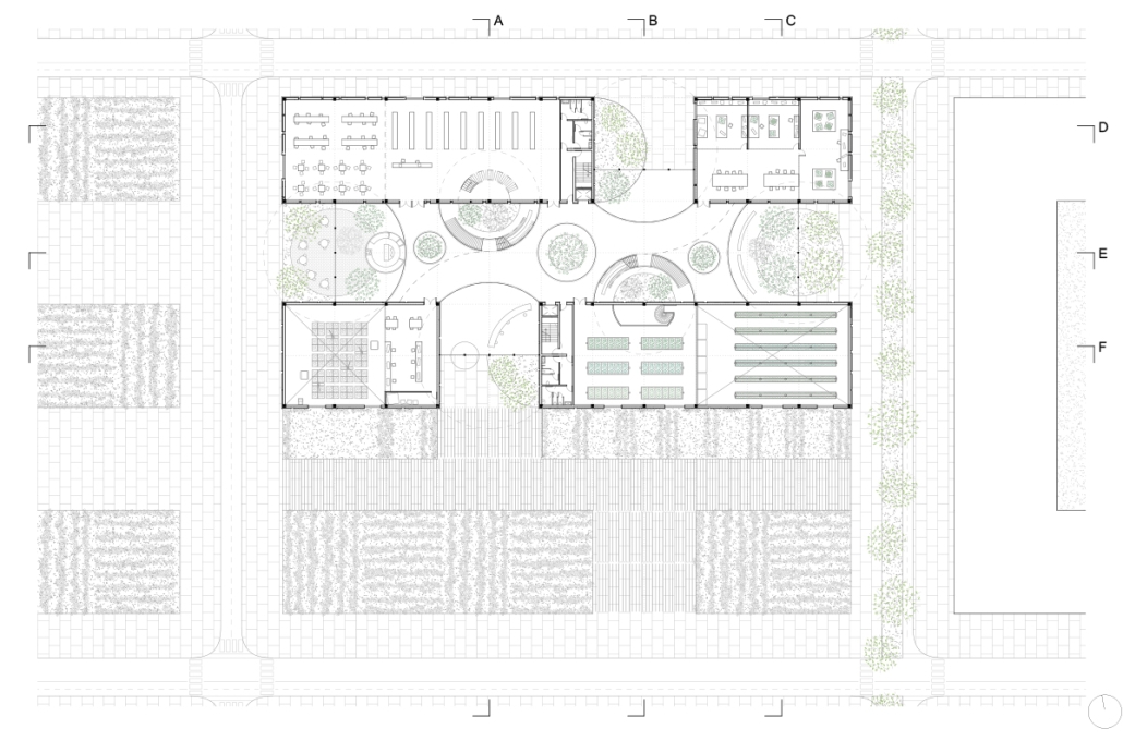
“Navigating Uncertainty” embarks on a detailed exploration of oil terminals, delving into their structural intricacies and temporal dimensions. By examining the historical significance, contemporary functionalities, and future uncertainties of these terminals, the study unfolds a narrative that seeks to craft a transformative blueprint for their decommissioning and sustainable future.

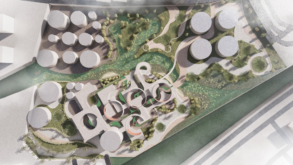
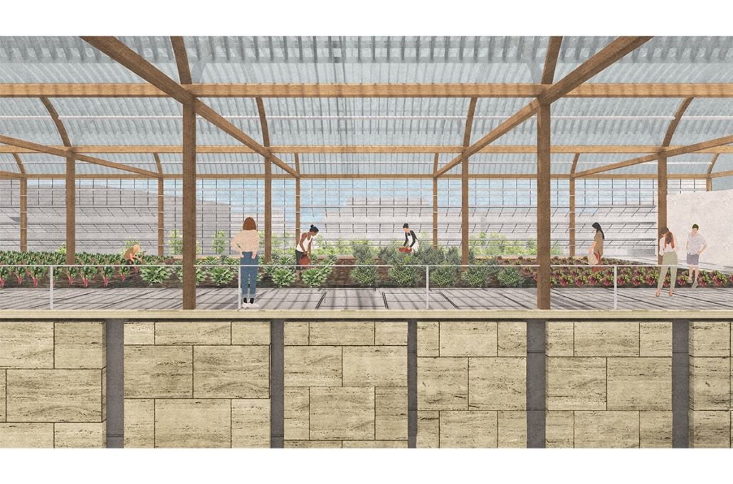
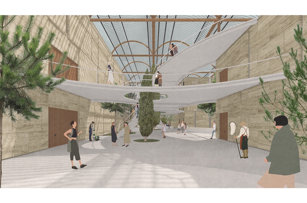
At the heart of this exploration is the concept of transforming challenges into opportunities for innovation through human collaboration. The uncertainty surrounding oil terminals is reimagined as a productive force, driving the evolution of a resilient and environmentally conscious infrastructure. The study proposes a shift from impermeable industrial containers to porous courtyards or “voids” that invite nature to reclaim and transform these spaces. This transformation symbolizes a transition from industrial to ecological, where past structures are enveloped by greenery and become communal spaces that foster biodiversity and community interaction.

Strategically designed “solids” are introduced within these voids, serving as eco-friendly program holders that benefit the environment. These solids house activities such as labs and workshops, green markets, and human energy-powered gyms, directly engage with and enhance their natural surroundings. The design and proportion of these solids vary based on their environmental impact, with programs that have a significant positive effect on nature occupying more prominent spaces.

The interface between the new solids and the voids is filled with community engagement opportunities and pathways that foster educational and cultural experiences. Visitors navigate through these transformed spaces, engaging with layers of information and activity that promote a deeper understanding of sustainability and its impact. This dynamic environment educates and inspires, cultivating a greener mindset among its visitors.

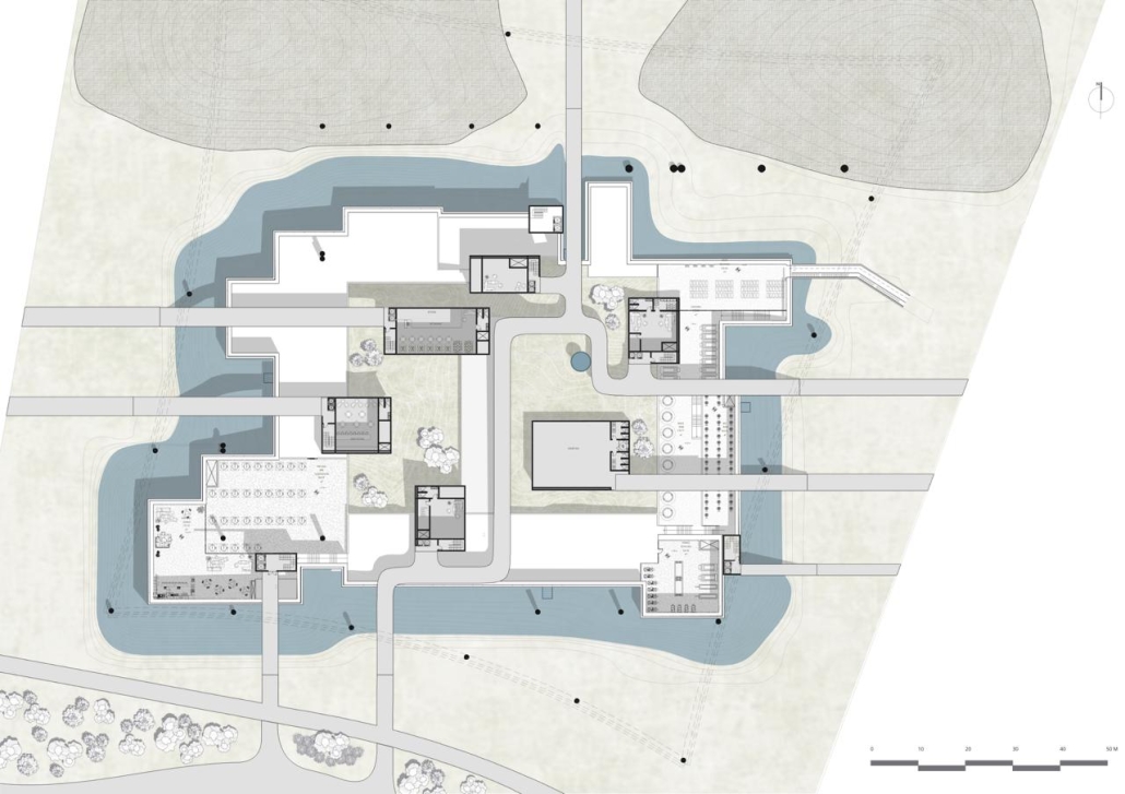
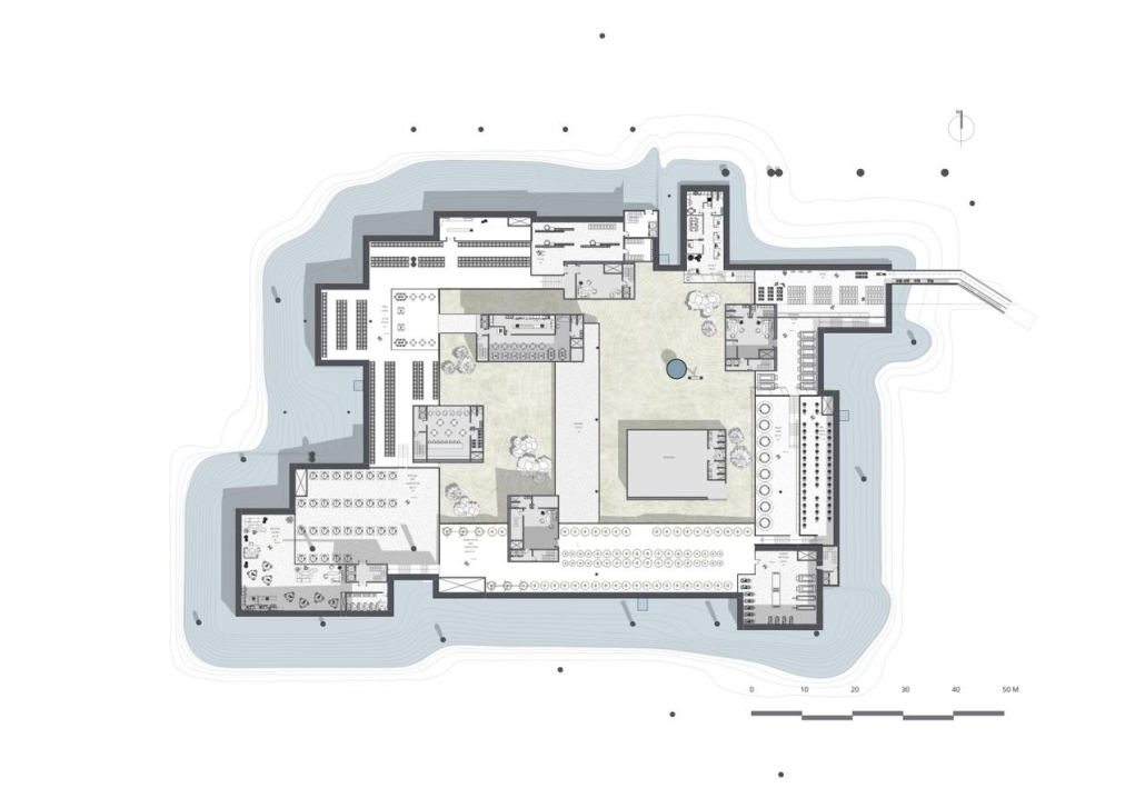
The project transforms an industrial site into a vibrant green space through the development of a porous wetland. This wetland enhances social well-being, supports biodiversity, and aids in natural water treatment and flood mitigation. It serves as an educational hub promoting environmental sustainability and highlights the role of wetlands in urban ecosystems. By integrating water into the site, the wetland mitigates flood risks and improves urban microclimates, showcasing how industrial areas can be reclaimed by nature

Instagram: @ard_aub

Global Educational Center for IT Specialists and Migrants in Istanbul by Anatolii Savoskin, Diploma in Strategic Interior Design / Private Master Degree ’24
IE University | Advisor: Elvira Munoz

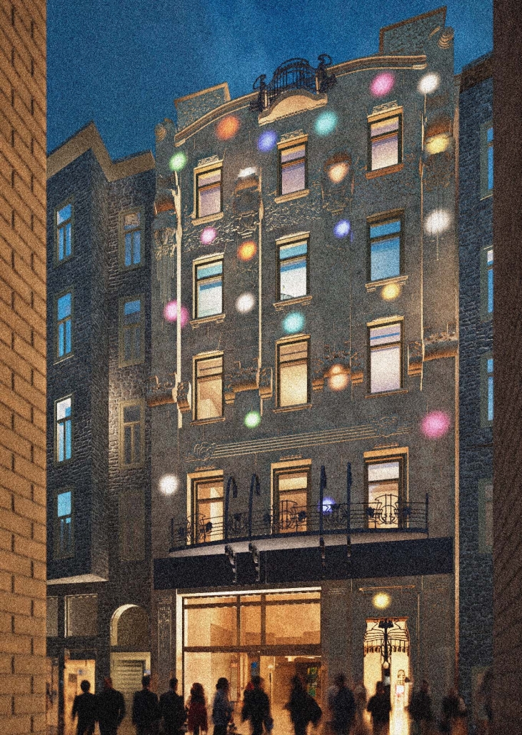
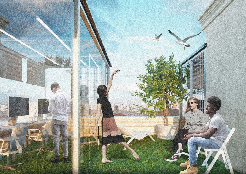
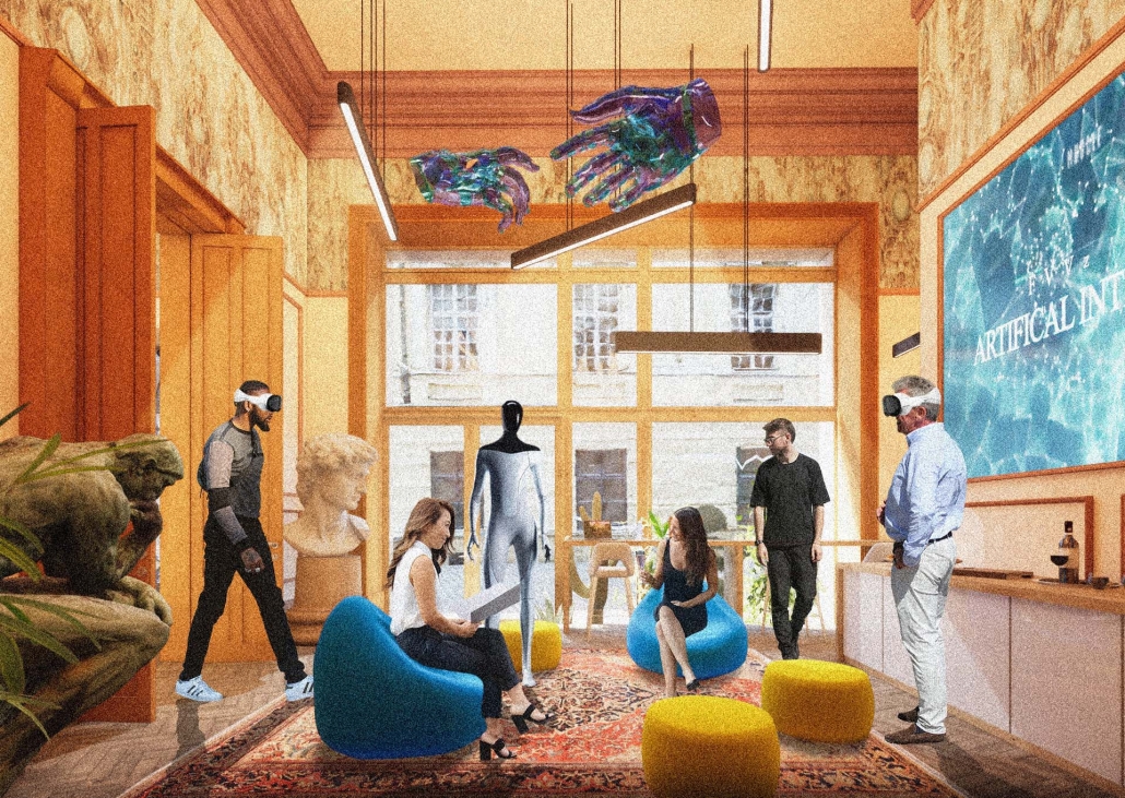
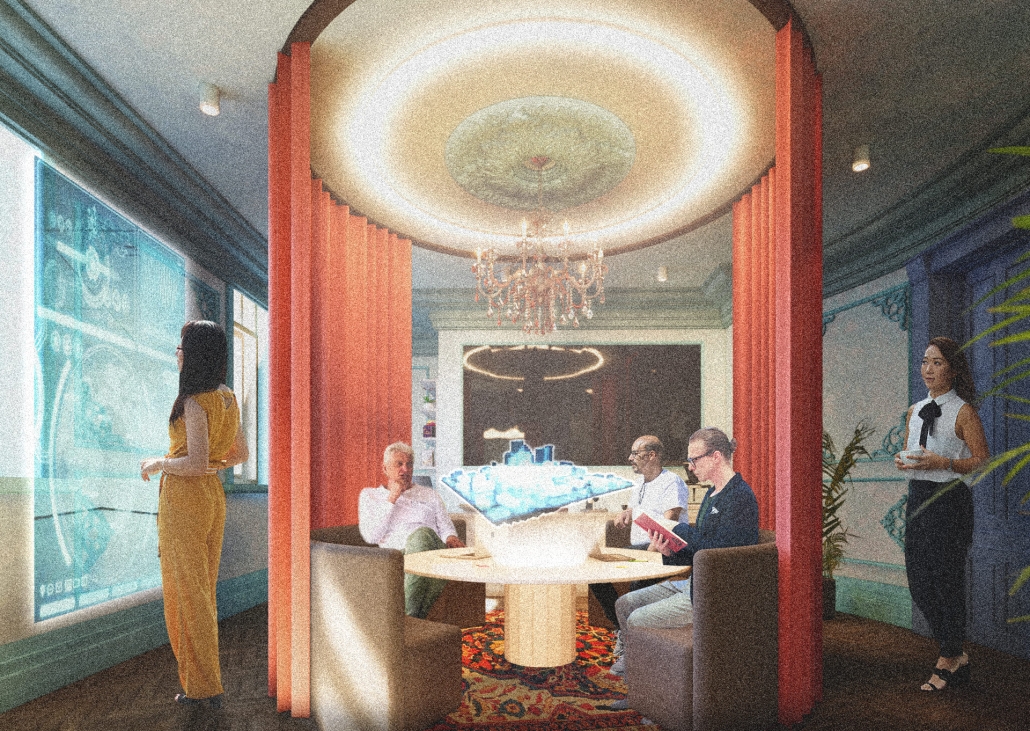
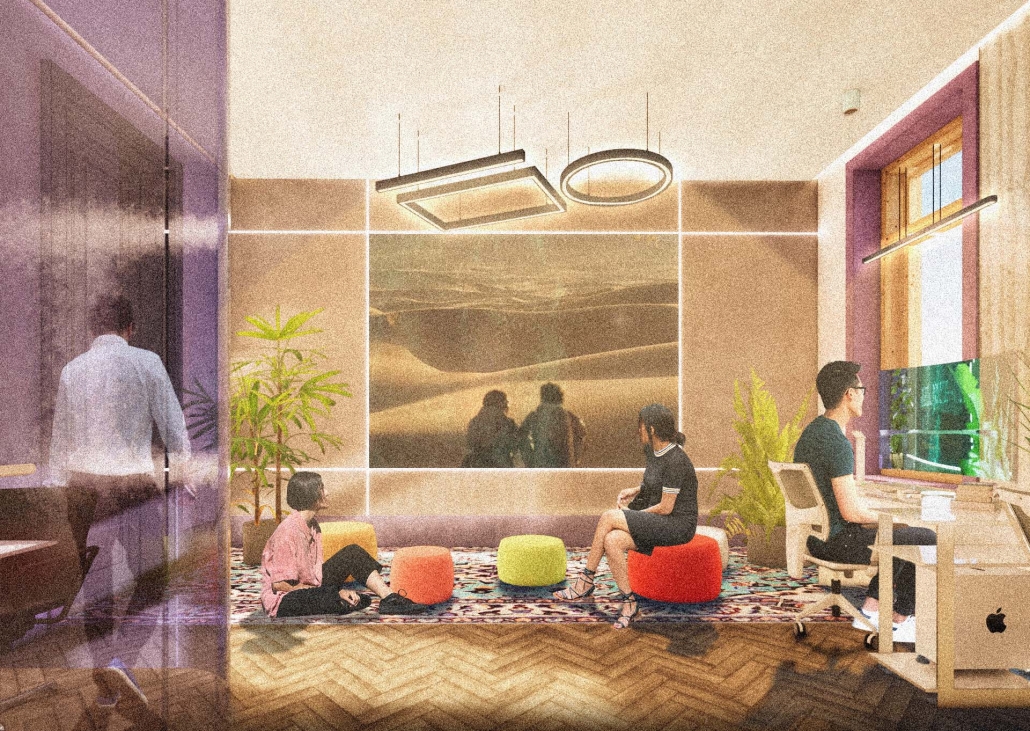
For my graduate project, I tackled the challenges faced by skilled migrants, drawing from my own experience and that of friends worldwide. Using design tools, I aimed to provide solutions by identifying a real client in crisis and repurposing an underused building. Researching the client’s needs and challenges was pivotal in shaping our design strategy. We chose a historic building in central European Istanbul, strategically located near public amenities and transportation hubs to cater to our target audience: migrants with IT backgrounds. Detailed user mapping helped to understand their expectations and needs. My design concept focused on four key elements: an Al educational center, a rebranding campaign for Blackberry, integration of multicultural design elements reflecting migrants’ cultures, and a transition from classical to modern styles throughout the building’s floors.
Instagram: @iearchdesign, @anatolii_savoskin

Extending The Patchwork | The Pier by Jillian Sproul & Olivia Nunn, M. Arch ’24
Toronto Metropolitan University | Advisors: Joey Giaimo & Julia Jamrozik

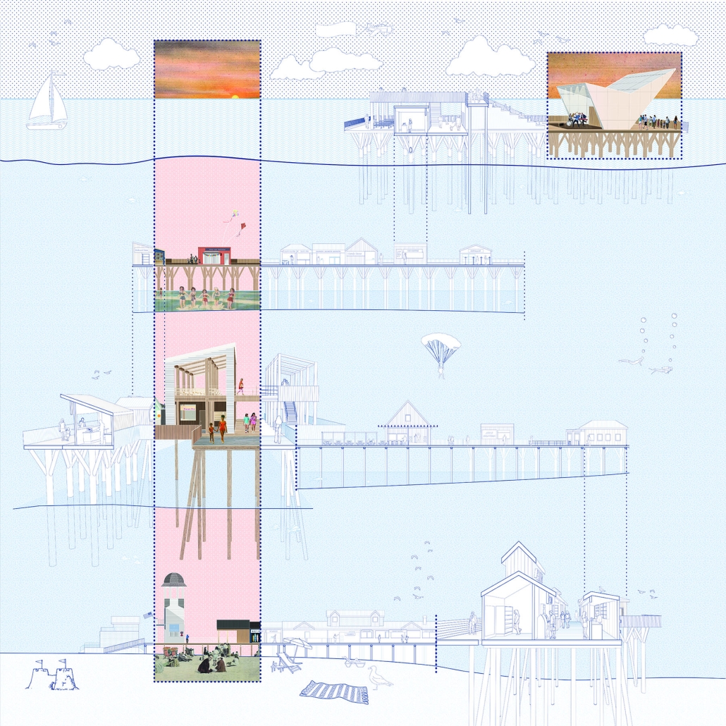
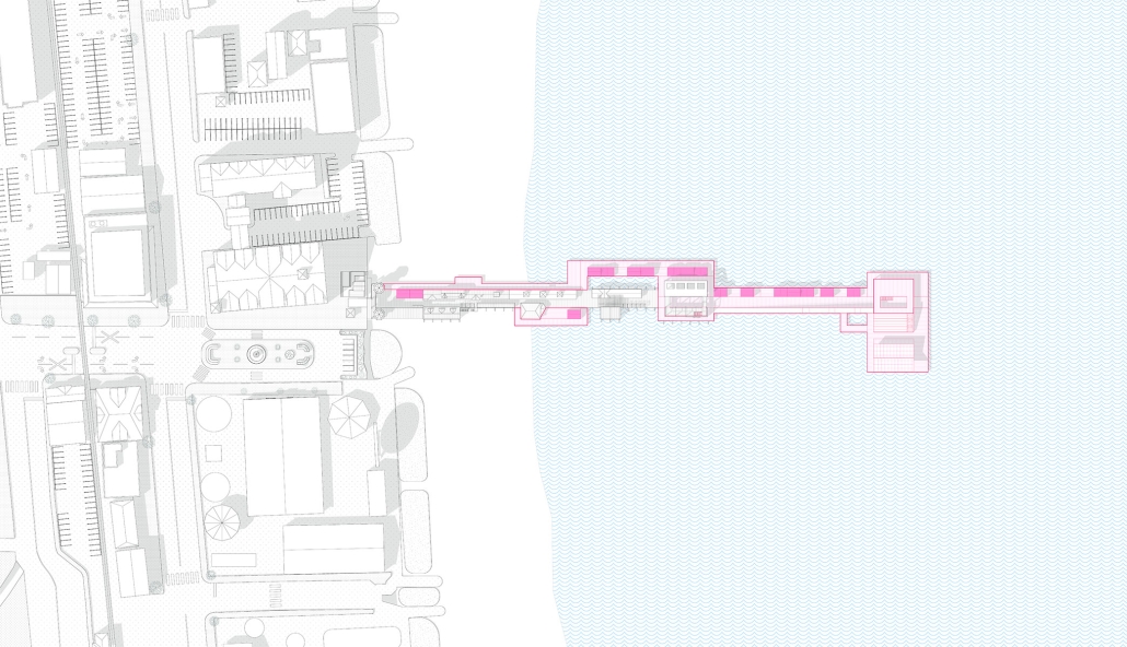
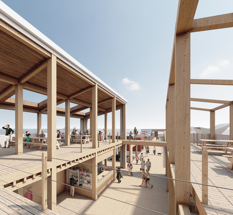
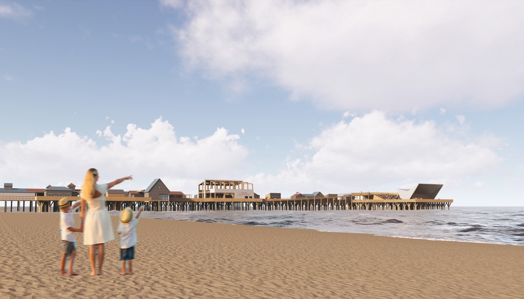
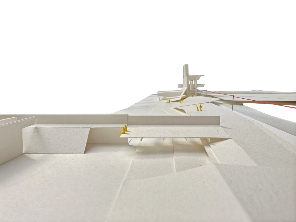
Located in Old Orchard Beach, Maine, a tourist beach town, the project proposes an extension of the current pier providing opportunities for vendor expansion. The new pier proposal is achieved through the implementation of subtractive and additive heritage strategies. It provides locals with the agency to expand their business onto the structural modules that will aggregate as needed based on future growth, extending the existing vendor and architectural patchwork. The existing main pavilion has been opened up as a midpoint for resting and [eating]. The newly designed end pavilion embraces the past entertainment values of the site, showcasing live performances and expansive views out to the water. The form of the performance structure is shifted to align with the main street of the town, inviting visitors to adventure through the entirety of the pier, especially during sunset, when sun rays reflect off of the metallic panels. The two-storey performance pavilion is accessible with the feature ramp leading tourists on a journey separated from the busy vendor stalls. The total pier addition allows the current architectural and vendor patchwork to be valued as a key component to the pier’s long-standing success since 1899.

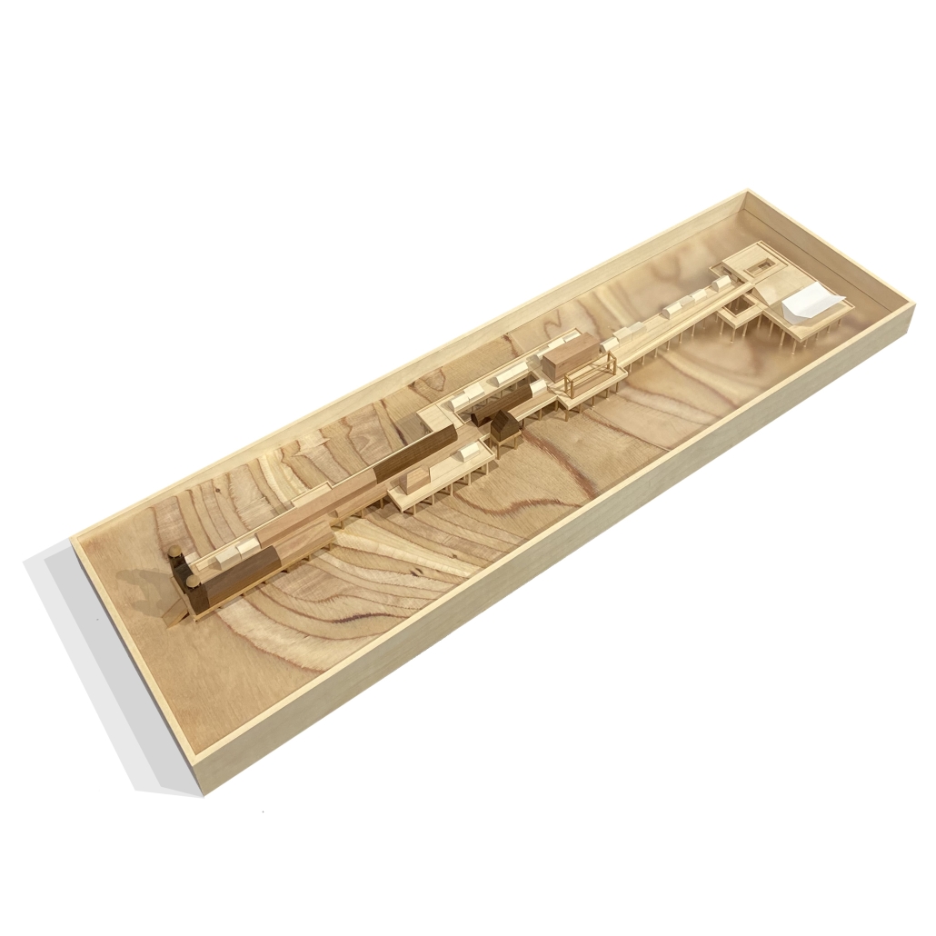
The physical model utilizes three types of wood to visualize the architectural patchwork of the current pier and the proposed extension. The burnt maple represents existing components of the pier, while the cherry represents existing components that have undergone renovations. This is contrasted with the basswood that represents the proposed patchwork extension.

Instagram: @jilliansproul, @olivianunn14

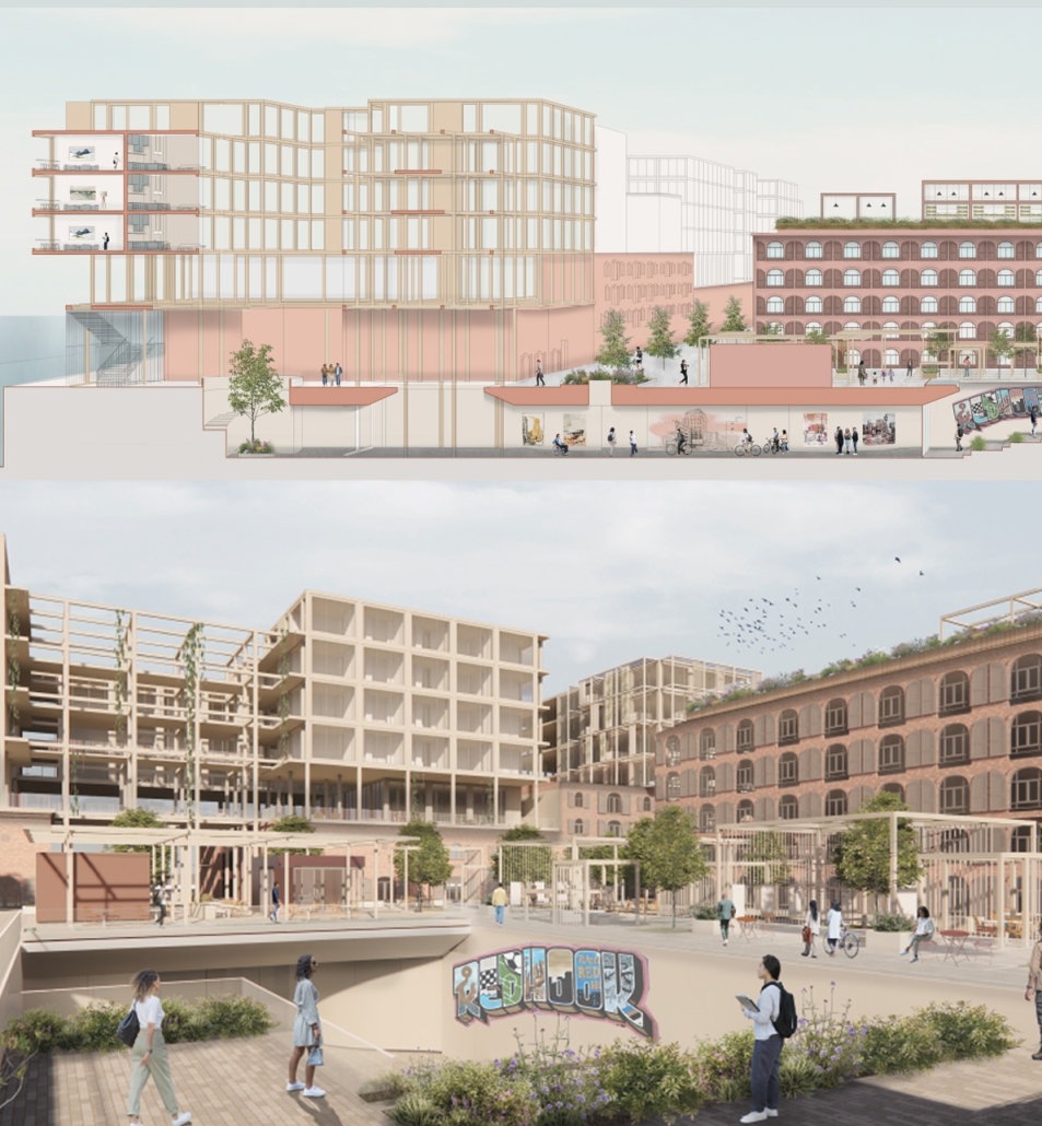
Reshaping Red Hook: Creative Placemaking and Connective Infrastructure. by Matthew Tepper, B.S. Architecture ’24
University of Virginia | Advisor: Mona El Khafif

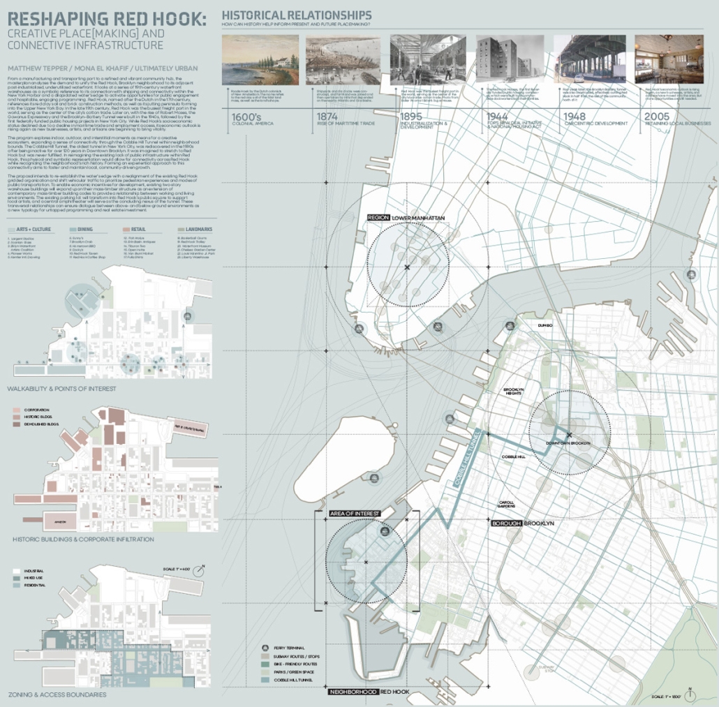
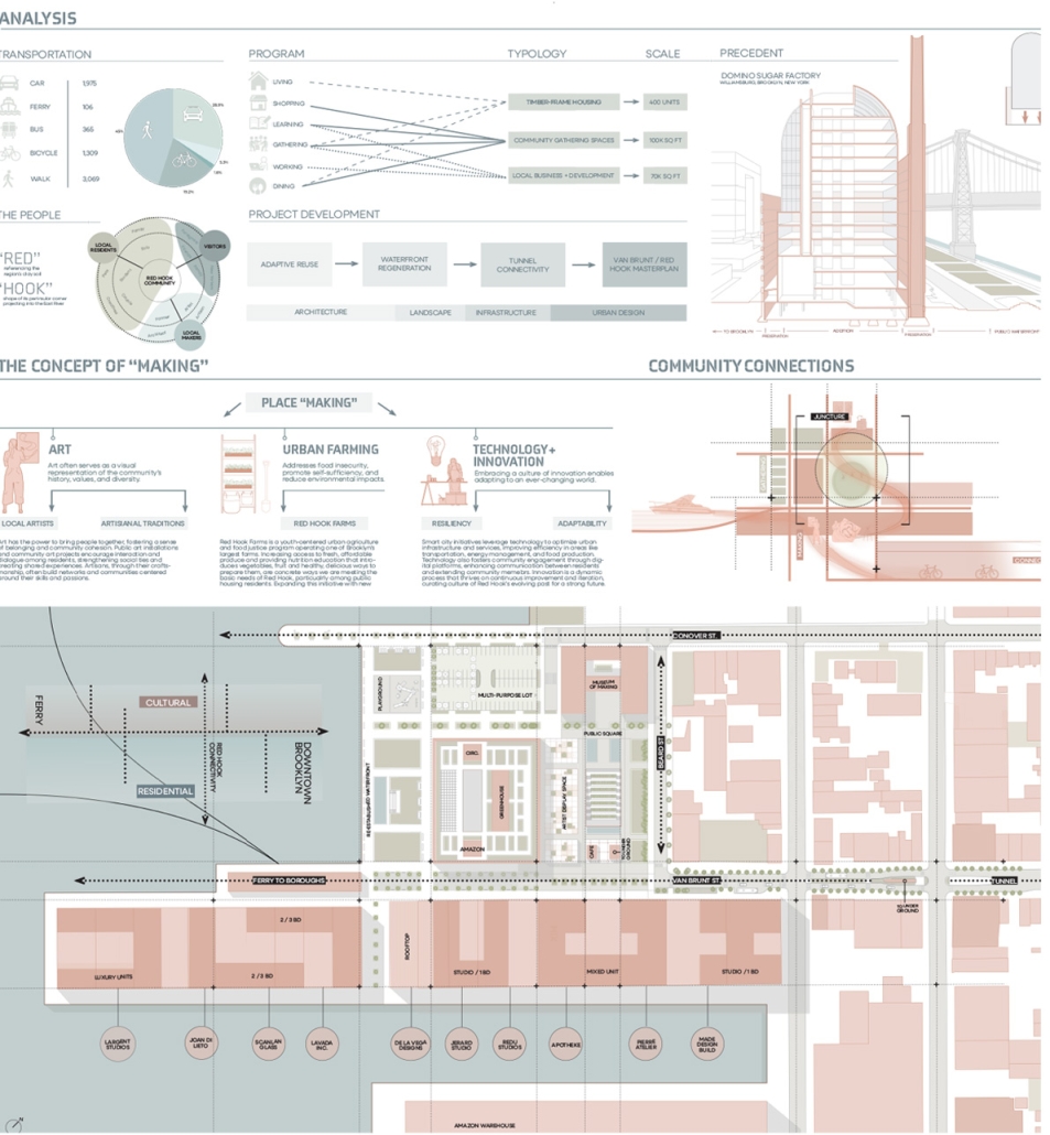
From a manufacturing and transporting port to a refined and vibrant community hub, the masterplan analyzes the demand to unify the Red Hook, Brooklyn neighborhood to its adjacent post-industrialized, underutilized waterfront. It looks at a series of 19th-century waterfront warehouses as a symbolic reference to its connection with shipping and connectivity within the New York Harbor and a dilapidated water’s edge to activate opportunities for public engagement and hospitable, engaging programming. 

Red Hook, named by the Dutch in the 17th century, references its red clay soil and brick construction methods, as well as its jutting peninsula forming into the Upper New York Bay. In the late 19th century, Red Hook was the busiest freight port in the world, serving as the center of the city’s cotton trade. Later on, with the rise of Robert Moses, the Gowanus Expressway and the Brooklyn–Battery Tunnel were built in the 1940s, followed by the first federally funded public housing projects in New York City. While Red Hook’s socioeconomic status declined due to a decline in maritime trade and employment access, its economic outlook is rising again as new businesses, artists, and artisans are beginning to bring vitality.

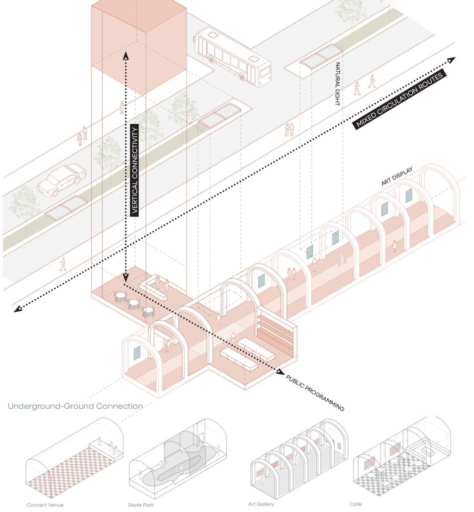
The program explores indoor, outdoor, and interstitial moments as means for a creative ecosystem, expanding a sense of connectivity through the Cobble Hill Tunnel within neighborhood bounds. The Cobble Hill Tunnel, the oldest tunnel in New York City, was rediscovered in the 1990s after being inactive for over 120 years in Downtown Brooklyn. It was imagined to stretch to Red Hook but was never fulfilled. In reimagining the existing lack of public infrastructure within Red Hook, this physical and symbolic representation would allow for connectivity across Red Hook while recognizing the neighborhood’s rich history. 

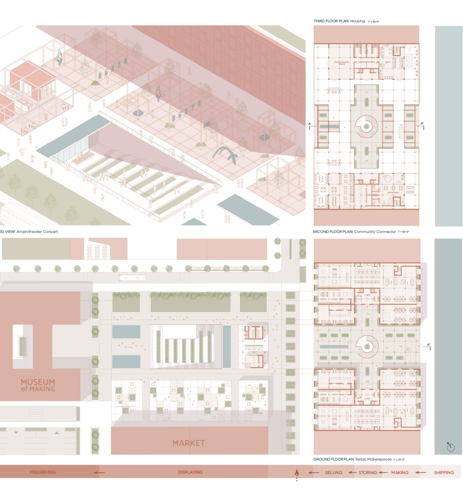
Forming an experiential approach to this connectivity aims to foster and maintain local, community-driven growth. The proposal intends to re-establish the water’s edge with a realignment of the existing Red Hook gridded organization and shift vehicular traffic to prioritize pedestrian experiences and modes of public transportation. To enable economic incentives for development, existing two-story warehouse buildings will expand upon their mass-timber structure as an extension of contemporary mass-timber building codes to provide a relationship between working and living environments. The existing parking lot will transform into Red Hook’s public square to support local artists, and a central amphitheater will serve as the concluding nexus of the tunnel. These transversal relationships can ensure dialogue between above- and below-ground environments as a new typology for untapped programming and real estate investment.

Instagram: @mattportfolio, @aschool_uva

Fluid Landscape: A Speculation on Edge by Marla Stephens, M. Arch ’24
University of Florida | Advisors: Charlie Hailey & Jeff Carney

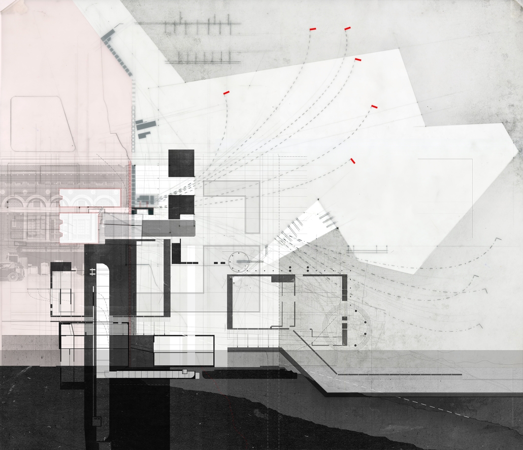
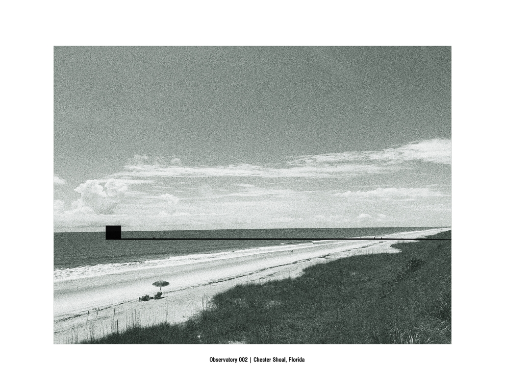
Architecture for a Fluid Landscape: A Speculation on Edge, addresses the ephemeral nature of dwelling on Florida’s coastal edge. This project aims to unearth Florida’s fluid strata to resurface a forgotten timeline of architectural ruins and stories lost at sea and to reinterpret future coastal habitation for an accreting landscape. Using Wilbur-by-the-Sea and Cape Canaveral, Florida as stations for witnessing and recording the evolution of an edge, this project will begin to negotiate the nature of impermanence and symbiosis of architecture along the shore. 

As time passes, layers of stories, artifacts, ecologies, and technologies are embedded within the anthropogenic landscape. Is time as fluid as the littoral edge? Is there a way to work between the layers, to establish a permanent marker of change, to record the unfolding of time on an uncertain edge? Time moves quicker and shorter here, each day is a different coast. On the edge, change is felt at a more alarming rate. Here we bear witness to the ecological impact we have made; impacts which are felt slowly, suddenly, or all at once. Can architecture make us notice more? Notice the imprint of a seashell along the shore, and the fluttering of the saturated sand made by a sand flea hiding beneath the surface; to the detrimental effects of toxic runoff which tarnishes the shore with a nauseating green film, and the infrastructural damage inflicted by hurricanes and rising tides. We must notice more, to slow down time once again and decelerate our current path towards exponential degradation, to restore Mother Nature’s natural procession.

This project will collect and unearth objects and stories found along the fluid landscape while using the Florida Houses of Refuge as a generative part for testing markers on the coast. The Houses of Refuge were ten stations along the east coast of Florida constructed for the sole purpose of saving the lives of shipwrecked persons, yet they evolved into much more. This project uses the forgotten coast of Chester Shoal as a proving ground for ever-evolving iterations of stations that witness the transformations of an ephemeral landscape.

Instagram: @charlie.hailey, @marla.stephens

Conservatory of Theater: A Spot Light in the User by John M. Campis-Bobe, B. Arch ’24
Pontifical Catholic University of Puerto Rico | Advisor: Pedro A. Rosario-Torres

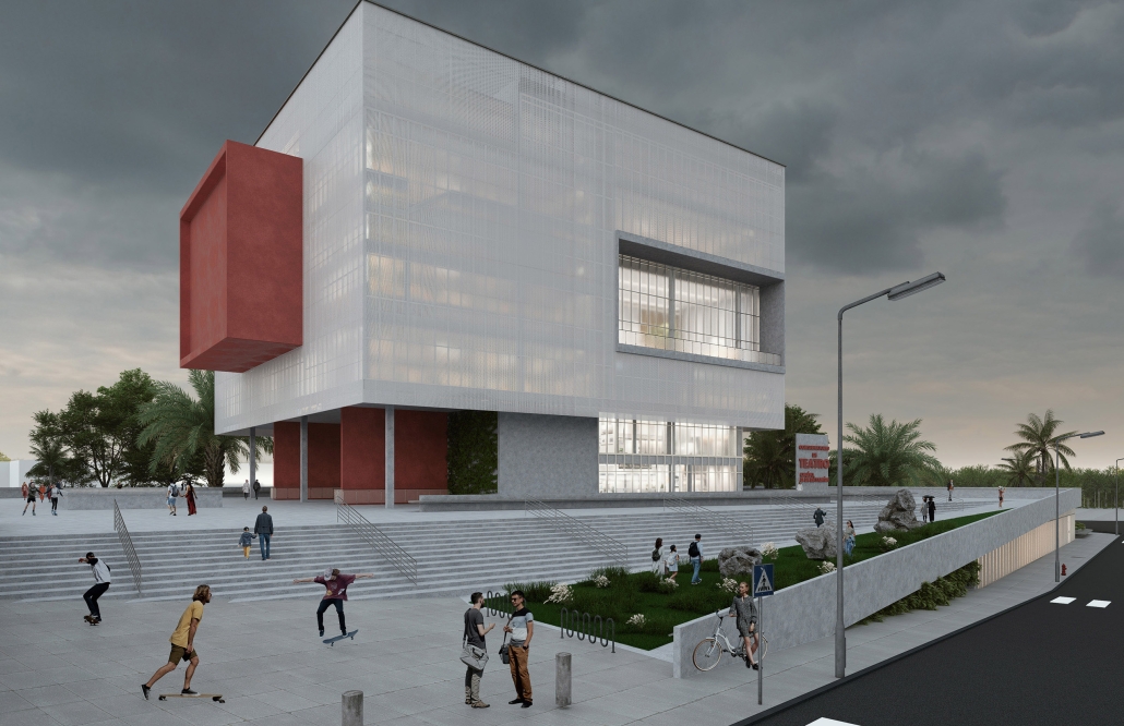
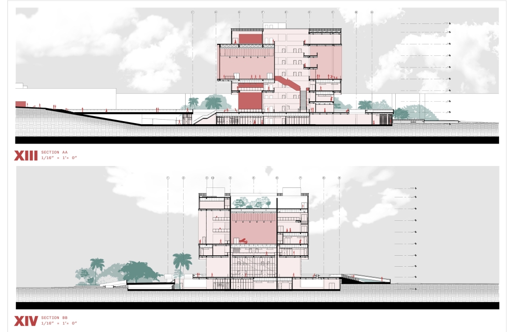
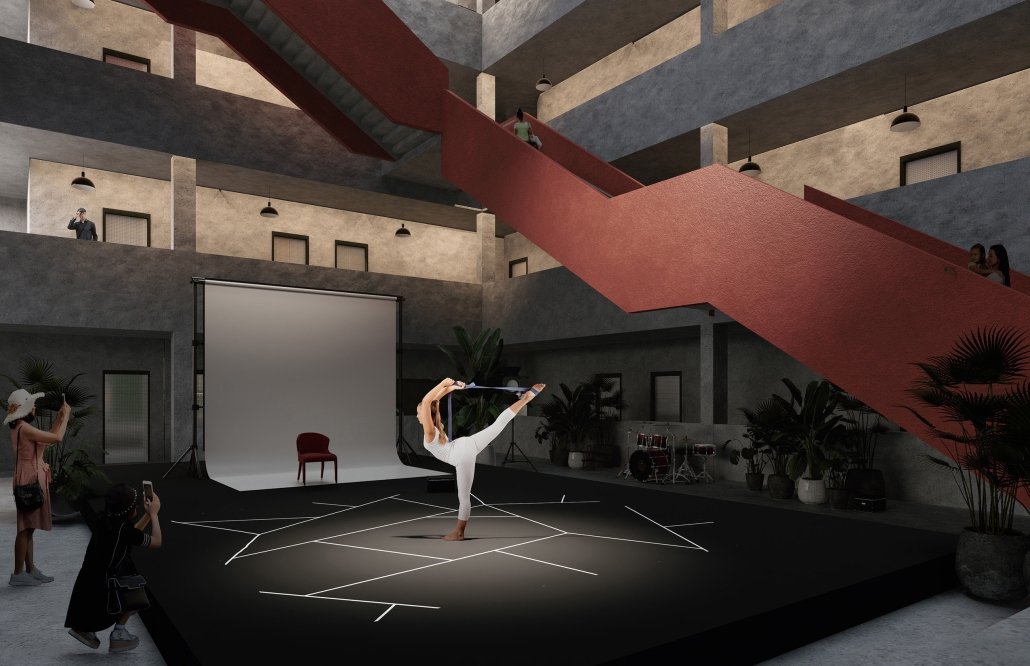
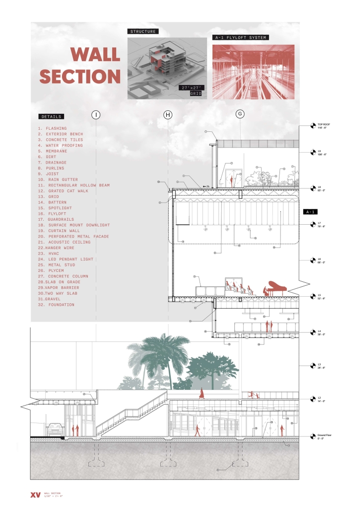
The decline of performing arts in contemporary culture can be attributed to a lack of cultural identity. Historically, theater served as a platform for societal reflection and discussion of political and sociocultural issues. Today, this art form has lost its prominence in many countries, necessitating a revival to inspire a new generation. To address this, the project employs the concept of a perfect prism to contrast its surroundings, highlighting the performance space as a vital expression of cultural identity.

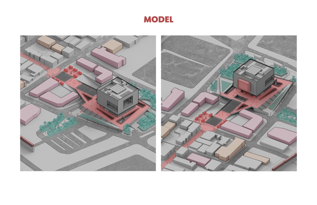
Located in Bayamón, Puerto Rico, near the urban train’s last station, the project identifies existing entities and highlights those proposed for improvement. By linking the urban core, it establishes a new theatrical district with an axis running from the town hall through Marti Street to the Theater Conservatory. The conservatory’s design incorporates six strategies from modern theater culture, seamlessly integrated into the urban context, emphasizing both external and internal engagement. Its purpose is to create a series of encounters between performances and spectators, inviting exploration and contemplation throughout the city. For example, urban niches carve fenestration within each façade, showcasing rehearsal rooms, foyers, and terraces to residents and visitors passing by. The black box theater is cantilevered from the building façade, marking the culmination of the theatrical district axis. Inside, there are adaptable spaces for various scenarios that aren’t restricted by a fixed arrangement. This expands on the versatility to reconfigure to the constant changes in our contemporary culture. To improve the user experience and accessibility, an elevated urban plaza is created, bridging the conservatory with the surrounding urban fabric and inviting community interaction. Due to the tropical climate, sustainable features include natural ventilation on all floors, permeable pavement, solar panels, and an underground cistern for water storage.

The final model reveals the axis that unifies the new theatrical district and an alternative route from the train station, designed to enhance pedestrian access. By integrating urban connectivity, cultural engagement, and sustainable design elements, the conservatory sets a new standard for functionality and environmental stewardship, marking a transformative icon for new cultural expression. 


Instagram: @johncampiss

Archi-eulogy: Negotiating Ruination in the Urban Void by Glory Nasr, B. Arch ’24
American University of Beirut | Advisor: Sinan Hassan

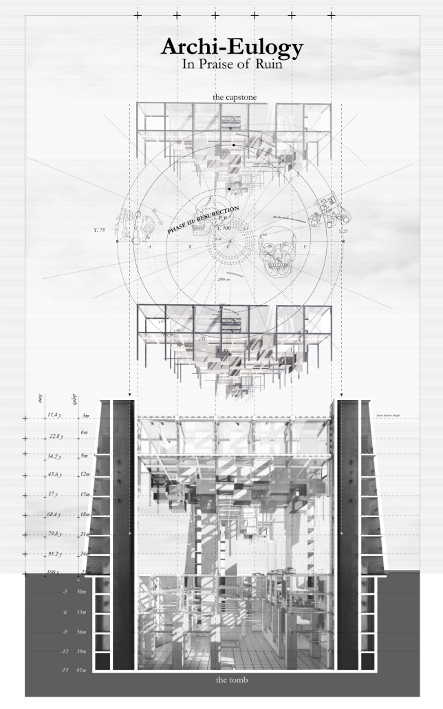
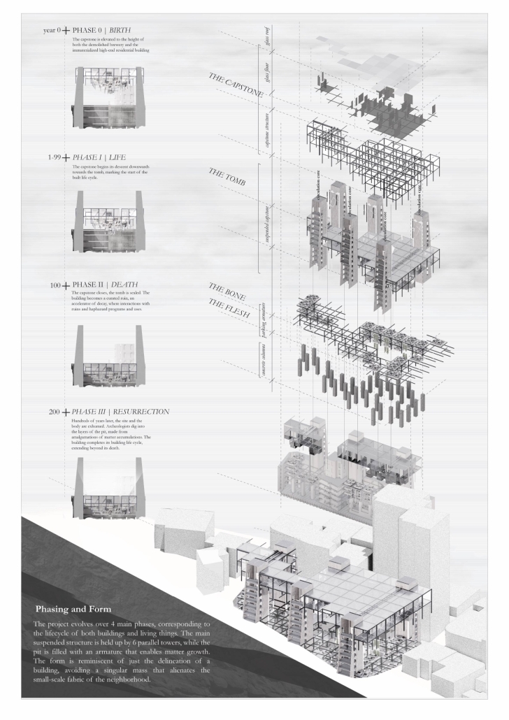
In a dense alleyway of a residential suburb of Beirut, Lebanon, lies a neighbourhood-sized construction site, halted at the excavation stage. Where once stood the Laziza Factory, the first brewery in the Levant that was demolished in 2017, remains a 20-meter-deep manufactured chasm, vestiges of the unfinished construction of a high-end, Starchitect-made residential project. The chasm resembles a tomb with no capstone, a tomb for the demolished brewery and the immaterialized lofts, but more importantly for the notion of architecture as a practice above the human realms of economic crisis. The result is an absurd condition caught between architecture, geology, and ruin. 

With this urban condition as the site of the project, Archi-eulogy stands as a manifesto 

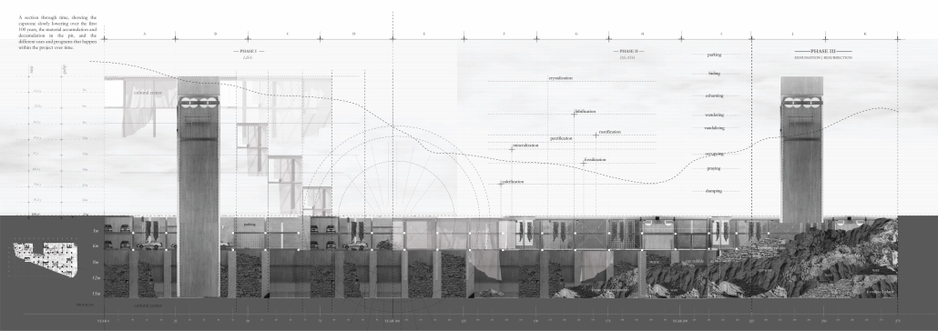
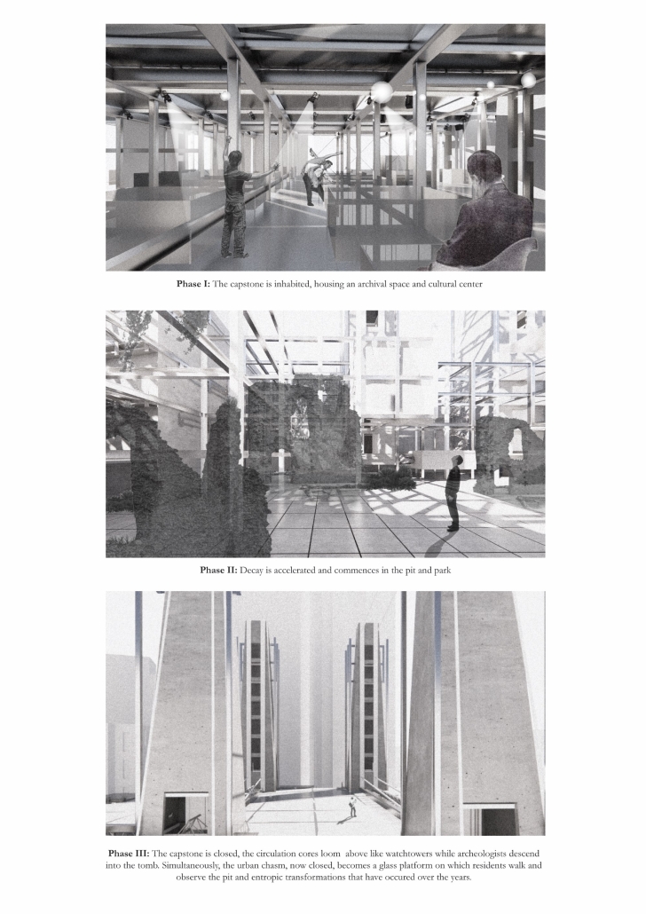
critiquing the method with which we build, developing an architecture that is inherently one of nonarchitecture. Building on the image of the site as an urban tomb, Archi-Eulogy proposes the acceptance of death through a lowering of a literal and metaphorical capstone onto the construction site over a 100-year cycle, corresponding to the average lifespan of a building. The capstone houses an art gallery and archival space, preserving the memory of the original brewery. Each height above the street level corresponds to a year, creating a geological stratification of the building height. As the capstone descends 0.5 cm a week 

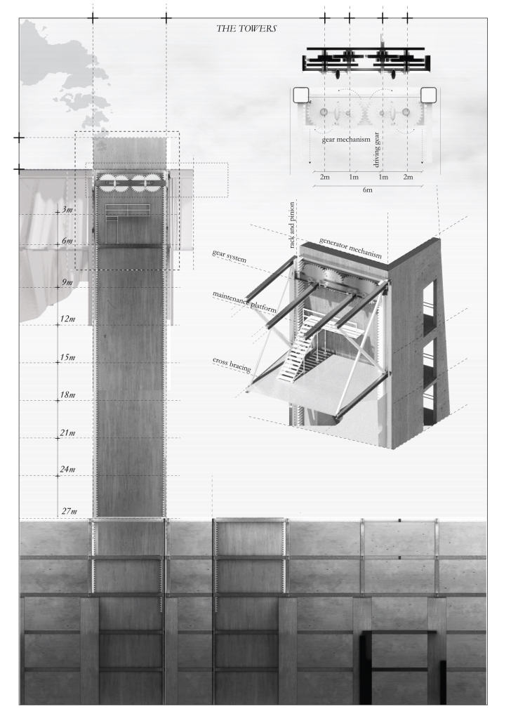
for a century, matter accumulates and decumulates in the pit. The pit houses a parking space on the upper two floors, while the bottom three floors are left as public space for the residents of the neighbourhood. Once the capstone closes and the excavation is remediated, the project enters its second phase, becoming a curated ruin-scape, allowing for informal uses of the public park. Finally, hundreds of years into the future, archaeologists descend into the pit through its towers, exhuming the archaeological body buried in the tomb. By literally and metaphorically closing the urban tomb, the project aims to remediate the violence the unfinished construction inflicted on the neighborhood. 

This project was the 2nd Prize Winner of the Areen Projects Award for Excellence in Architecture and won the Dean’s Award for Creative Achievement.

Instagram: @ard_aub

Stay tuned for Part XV!

2024 Study Architecture Student Showcase - Part XIII

Public spaces take the spotlight in Part XIII of the 2024 Study Architecture Student Showcase. The featured projects include recreation centers, parks, memorials, performance spaces, multi-faith facilities, city centers, and more!

Each student’s design was crafted with community needs at the top of mind. They utilize strategies ranging from reducing height in response to residential locations and combatting hostile architecture. They are also intentional about the use of materials with mediums such as wood, steel, and glass playing a role in curating the visitor experience. Each project aims to promote equity, education, belonging, socialization, and connectedness within their communities.

Scroll down to view these inclusive, accessible, and vibrant public spaces!

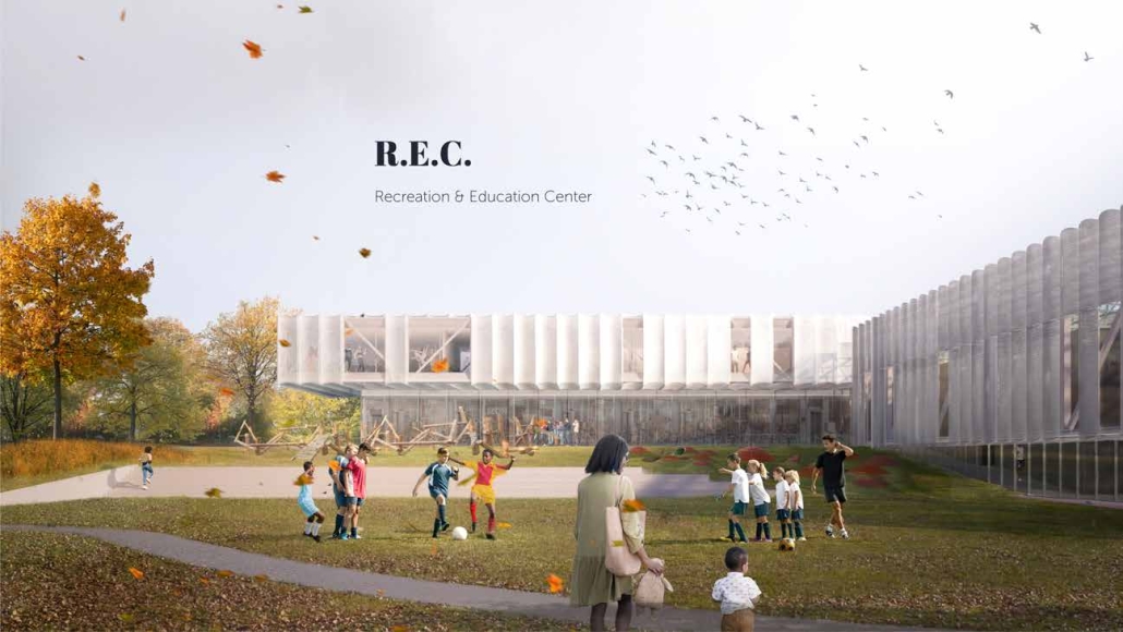
Tarboro Road Recreation Education Center by Lucas Stott, B. Arch ‘24
North Carolina State University | Advisor: Marshall Purnell

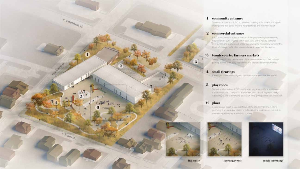
Compelled to provide vital community forums, recreation, and green spaces to East Raleigh, the 30,000-square-foot Recreation Education Center (R.E.C.) has created a gathering location for residents while linking local neighborhoods to Raleigh on a broader scale.

E. Edenton St. and New Bern Avenue have become defining features of East Raleigh, bringing in a surge of traffic from Downtown Raleigh. This results in a corridor of commercial properties and roadways that divide low-income neighborhoods. R.E.C. uses its visibility of these high-traffic roads to revitalize the region.

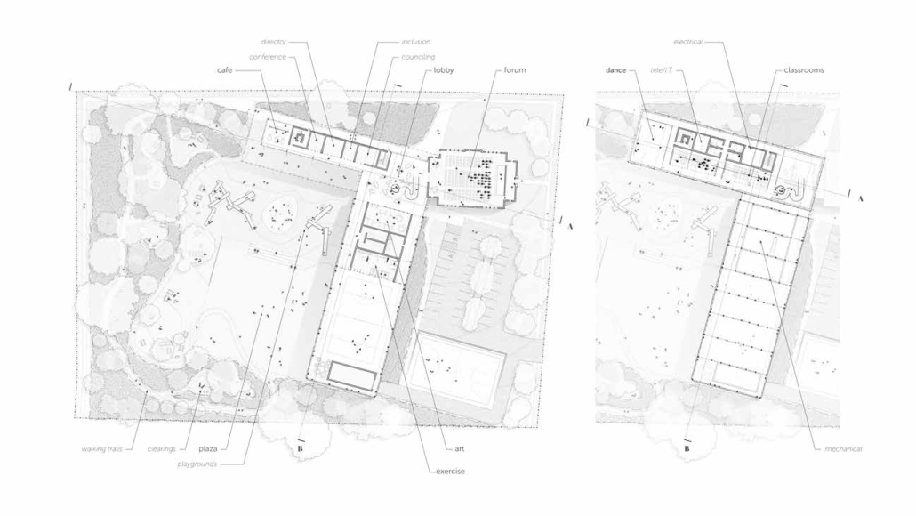
R.E.C.’s L-shape shields the neighborhood, opening towards the local community and protecting it from the intruding larger-scale city. Two diaphanous frames visible from the intersection attract new visitors intriguing fresh faces that would otherwise never visit the region. The existing historical educational building, converted into a 200-seat event hall, encourages public forums and community-building, breaking down barriers that traditionally separated East Raleigh from the rest of the city. 

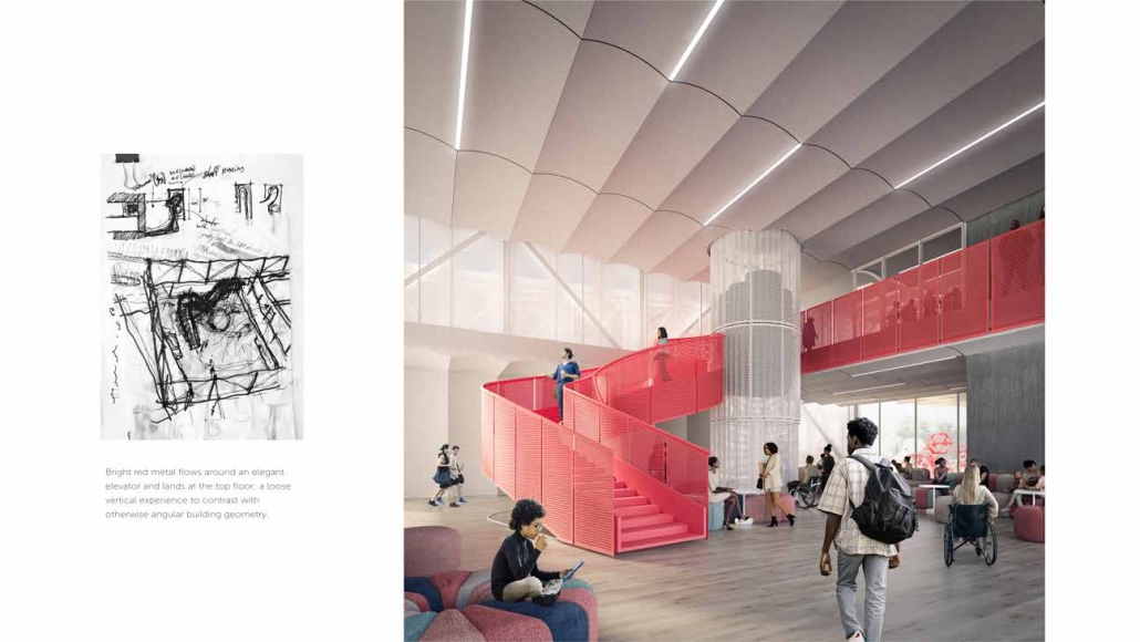
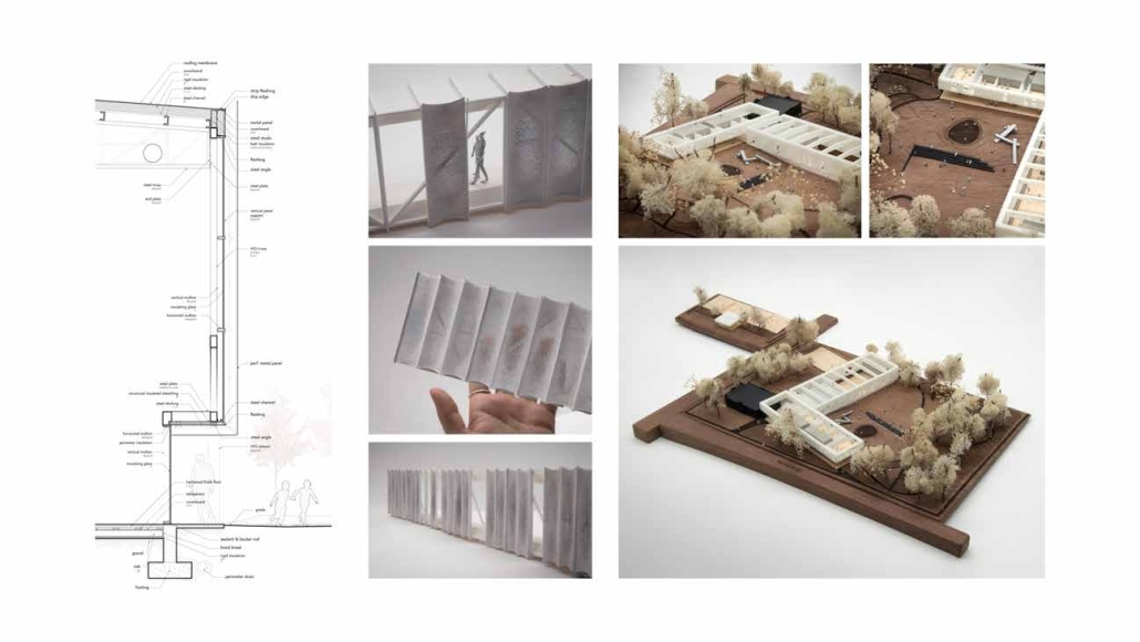
Commercial spaces and community resources are organized separately into two elevated frames, with an atrium acting as the convergence point and entry. The first frame, a 24-foot deep truss, suspends across the landscape, revealing the commercial gymnasium and activity spaces it protects. Ramps down to the gym address difficult topography to reduce the R.E.C.’s height in response to its residential context. The second frame floating over the atrium provides vital educational resources to the underprivileged community, fostering skill development to improve employment chances in a rapidly transforming economic landscape. Curved aluminum panels coating the floating frames are perforated with a pattern that interacts with light and shadow, creating a unique experience. 

The north end of the site is grafted into the neighborhood’s skin. The form tilts open to reveal an outdoor space optimized to bring in local pedestrian traffic, encouraging residents to treat it as their backyard. Enclosed between the building and forested paths on the north side, a large open court becomes an important anchor on the site, freely defined by community-organized events and activities.

This project won a 2024 AIA Triangle Student Design Award.

A Hostile City, Inequitable Privatization of Public Spaces by Bailey Berdan, M. Arch ’24
Lawrence Technological University | Advisor: Scott Shall

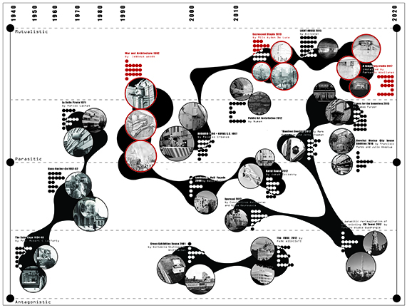
Hostile architecture is a term used to describe design strategies that are intended to deter certain groups of people or behaviors in public spaces. While bench dividers and ground spikes are widely recognized examples of hostile architecture, their impact goes beyond these small-scale designs. Hostile architecture is pervasive in areas such as policy, law, and privatization, and it can have serious negative consequences on a community’s economy, walkability, and overall environment. 

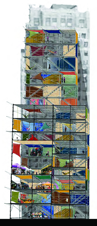
To address this issue, one potential solution is parasitic architecture, which is a practice that is not commonly used but is often employed as a response to dysfunctional conditions. Parasitic architecture involves the creation of structures that are attached to or embedded within existing buildings or infrastructure, utilizing underutilized or overlooked spaces. This approach has the potential to combat hostile architecture and empower communities to reclaim their right to public spaces. 

By repurposing underused spaces, parasitic architecture has the potential to increase the availability of public spaces, reduce the costs of new construction, and foster a sense of community ownership and engagement. Additionally, these structures can be designed to be flexible and adaptable, allowing them to evolve and respond to changing community needs over time. Overall, parasitic architecture represents a promising approach to combat hostile architecture and create more inclusive, accessible, and vibrant public spaces. By empowering communities to collaborate and take ownership of their public spaces, parasitic architecture has the potential to create more livable, sustainable, and equitable cities.

This project was a finalist for the ARCC King Student Medal Award.

Instagram: @__b.berdan__, @scott_shall

Counter [con]text by Zeina Medlej, B. Arch ‘24
American University of Beirut | Advisors: Rana Haddad & Dr. Howayda Al-Harithy

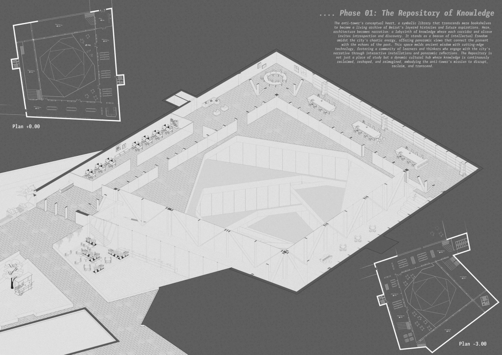
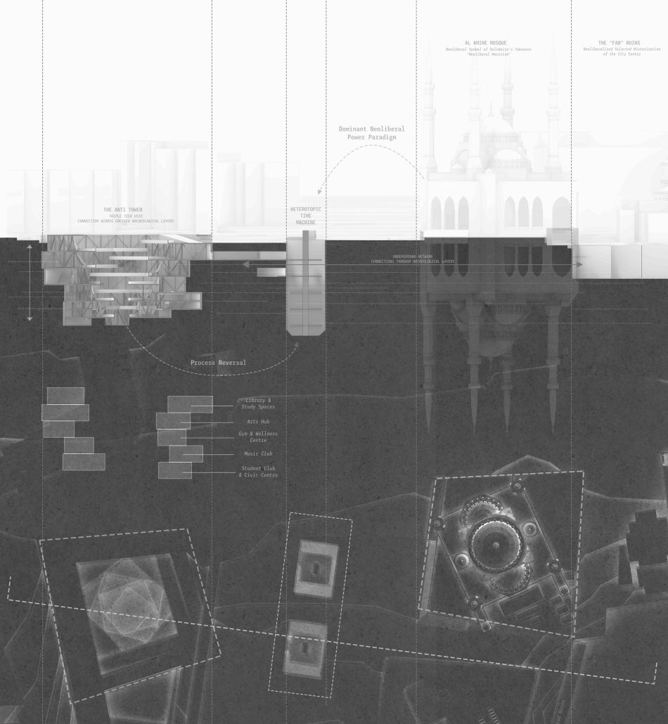
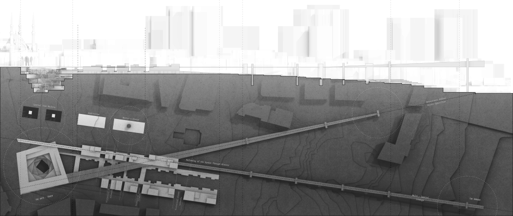
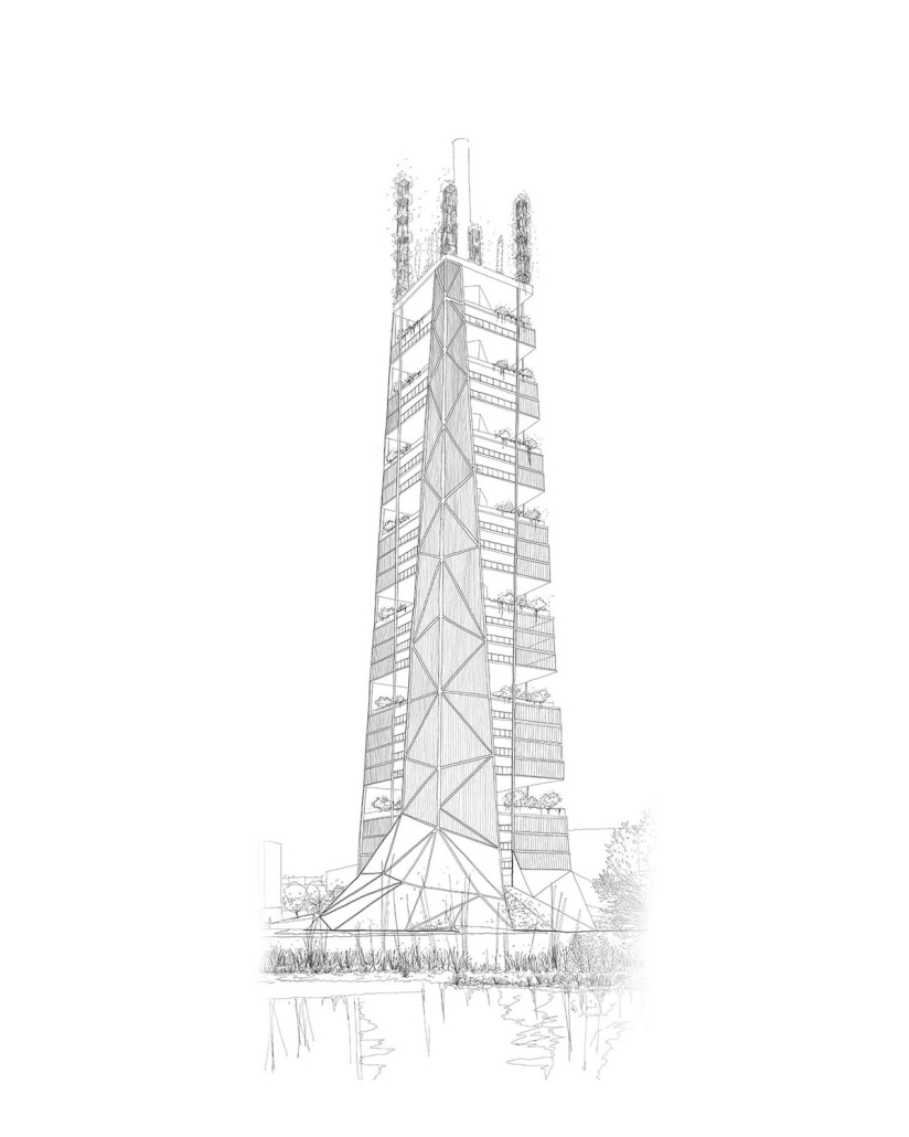
This thesis investigates how tactical public space interventions within Beirut’s neoliberal landscape can create heterotopic spaces that counteract dominant urban narratives. The study is grounded in the theoretical frameworks of Michel de Certeau, David Harvey, Henri Lefebvre, and Michel Foucault, focusing on how architectural constructs can reflect and engage with diverse social narratives beyond the homogenized, capitalist-driven designs.

The central question guiding this research is: How can tactical public space interventions within Beirut’s neoliberal landscape create heterotopic spaces that counteract dominant urban narratives?

The research is structured into two phases:

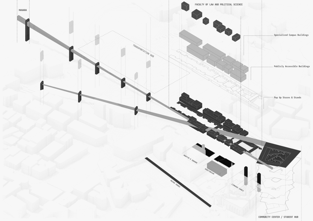
Phase 1: Initial disruption through punctual tactics. This phase involves programmatic interventions at 18 strategically chosen sites around Beirut. Each site is selected to reflect and challenge various neoliberal rationalities, aiming to create a series of small-scale disruptions that collectively unsettle the status quo and open up possibilities for transformation.

Phase 2: Tactical integration for large-scale disruption. This phase focuses on a single, impactful site—Martyrs’ Square—to implement a significant tactical intervention. The intervention transforms Martyrs’ Square into a multifunctional, dynamic urban space that serves as a cultural hub and community center. By integrating historical, cultural, and social elements, this transformation challenges and redefines the socio-spatial narratives of Beirut. The thesis proposes a heterotopic constellation of spaces that operate outside conventional time-space frameworks, fostering inclusivity, resilience, and public engagement. By opposing the dominant urban narrative, these tactical interventions aim to contribute to the creation of a more diverse and inclusive urban environment in Beirut.

Through this research, the thesis aims to demonstrate how tactical interventions can serve as powerful tools for social critique and urban transformation, ultimately fostering spaces that are not only physically distinctive but also socially transformative.

Instagram: @ard_aub

Urban Legacy –  Preserving Cultural Continuity in Land Scarce Singapore by Denzyl Zhang, M. Arch ’24
Savannah College of Art and Design (SCAD) | Advisors: Andrea Bertassi, Aaron Wilner & David Gobel

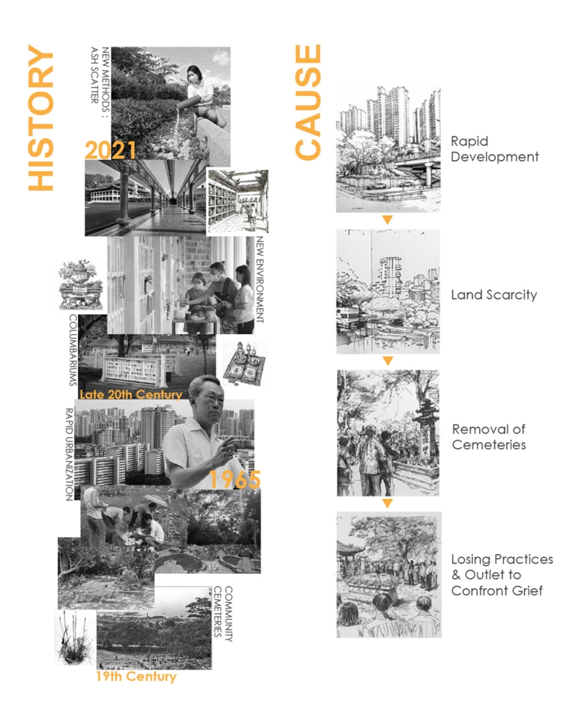
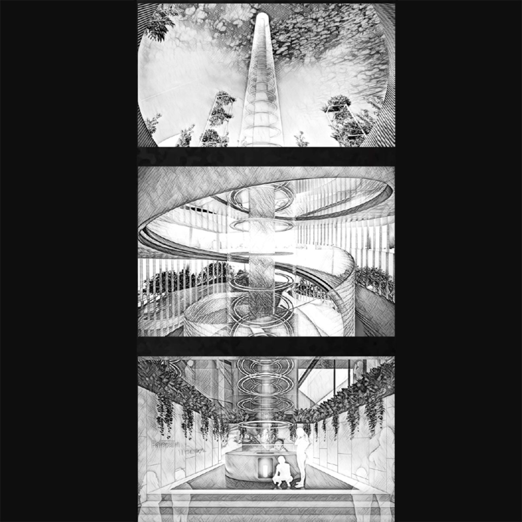
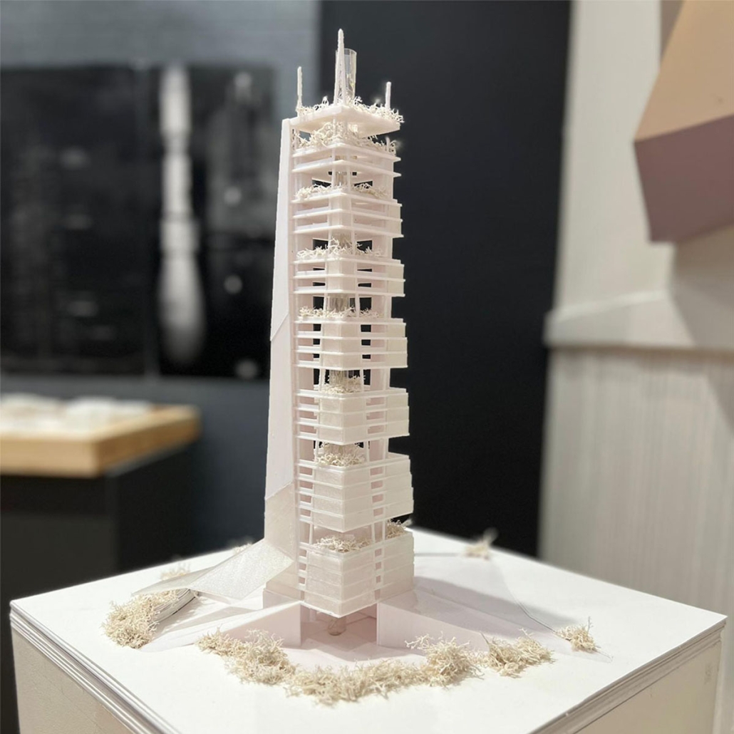
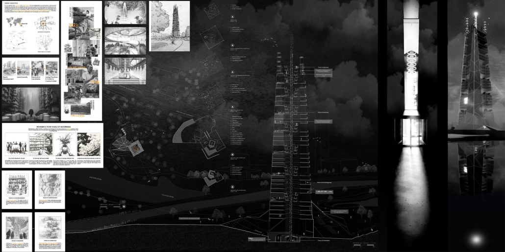
This thesis looks at how memorial spaces might be integrated into urban parks, with an emphasis on the Sanctuary of Passage, a prototype for ecological and culturally sensitive memorial architecture in Singapore’s Ang Mo Kio-Bishan Park. The design tackles the issues of urban congestion and the displacement of customary burial grounds caused by the urgent requirement for living space in increasingly urbanizing regions. The thesis suggests a paradigm in which memorial spaces coexist alongside recreational places while also improving the ecological and social fabric of urban surroundings. The Sanctuary of Passage is based on the idea of a journey through sorrow, expressed by a series of ascending spaces that represent the phases of bereavement. 

Each level of the construction provides a unique experience with nature and architecture, allowing for a gradual shift from grieving to recollection and healing. The proposal draws on the natural dichotomies of visibility and obscurity, enclosure and exposure, and nature and architecture to create a dynamic place that respects and reacts to Singapore’s unique cultural traditions around death. 

The thesis concludes with a design that reimagines the function of memorial spaces in urban environments, arguing that they may be effortlessly incorporated into the city’s landscape, acting as crucial public places that provide consolation and connectedness. By doing so, it establishes a precedent for future developments across the globe, implying that combining urban growth with memorialization techniques may produce places that commemorate the past while also benefitting the present and future.

This project won the AIA Savannah Thesis Honor Award.

Instagram: @denzyl.zhang, @andre_bertassi

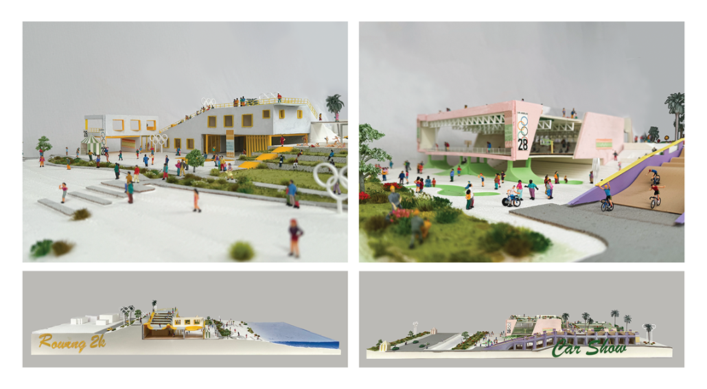
The Intragames: Shaping the Olympics for Local Publics by Weilin Berkey & Valentine Batteur, B. Arch ’24
Pratt Institute | Advisors: Evan Tribus, Cathryn Dwyre & Alex-Pierre de Looz

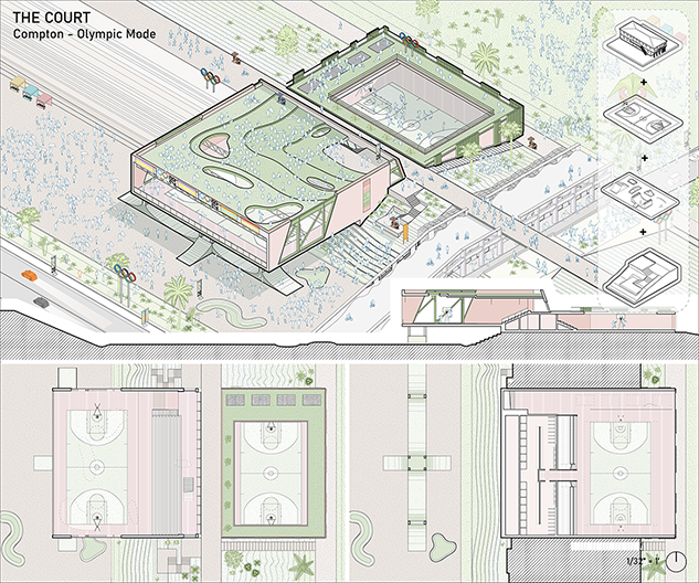
The nonprofit known as the International Olympic Committee can influence real-world social conditions through its corporate and financial power, thus making the [Olympic] Games a potential catalyst for new participatory publics. However, historically, the Olympic Games have struggled to benefit the host city beyond economics. Based on our research of previous Olympic Villages in recent years, they fail to acknowledge and engage with local programs and architecture, which we identify as the vernacular of the host city. 

Ironically, the goal of the Olympic Games is to embrace different cultures and to promote collectivity. Our research shows that, in fact, it produces negative effects on the host city by standardizing the way it deploys new venues and temporary housing. World-scale events like the Olympics often ignore local communities for profit. How might distributed hybrid vernacular venues amend the relationship between corporate goals and local needs to create new participatory publics within resident neighborhoods?

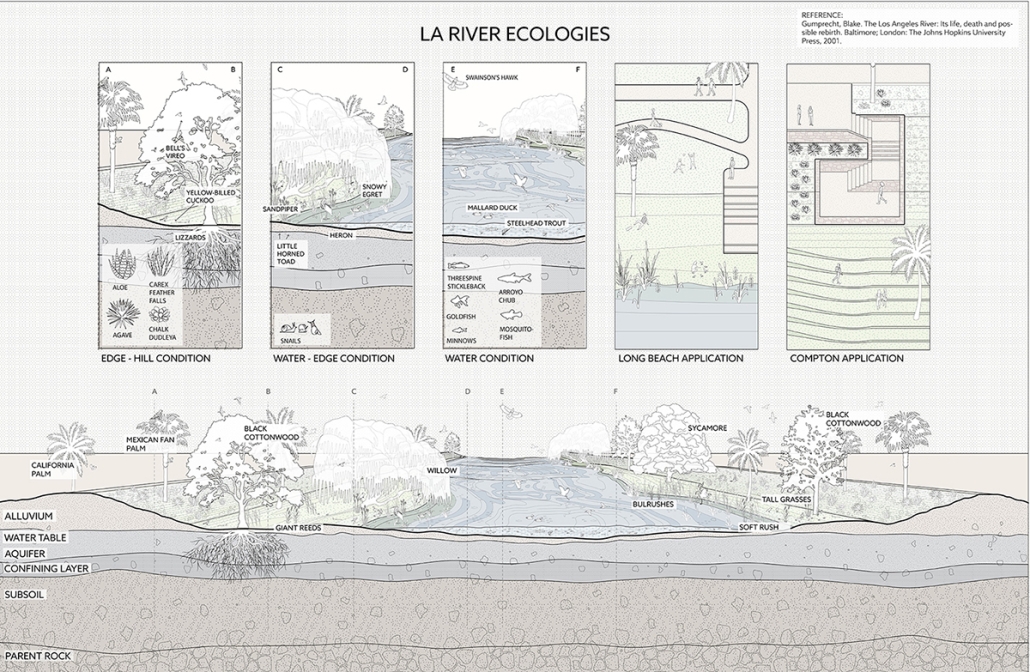
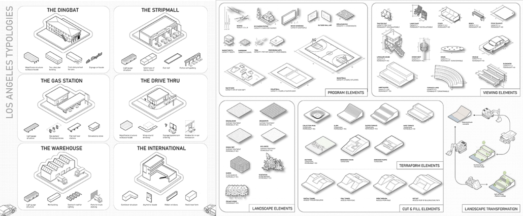
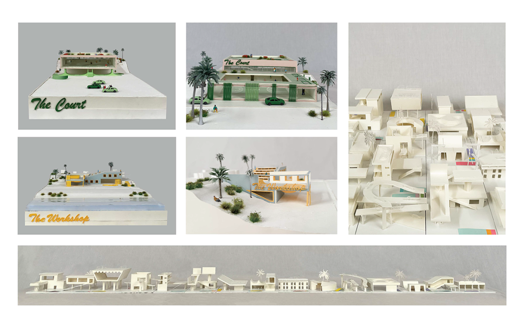
The Intragames hypothesizes that the use of vernacular typologies in combination with public spaces, will encourage locals to participate in collectivity sponsored by the Olympics. Currently, the upcoming Los Angeles 2028 Olympic plan focuses on improving existing infrastructure but neglects the potential connectivity among/between distributed venues. Layered with the existing competitive events, we want to incorporate new recreational and leisure Olympic events that the local fans can participate in along the LA River. Experimenting with combinations of vernacular typologies and Olympic programs is critical to our distributed venues’ longevity and future use. Additionally, having a deep understanding of the vernacular landscape will allow us to revitalize the forgotten concrete banks of the LA River and its connection to the city. 

This formula for designing new public venues will allow local spaces to be integral to urban-scale events. These additional programs will surpass the short timeframe of the Olympics, leaving new integrated publics along the river and changing the lasting impact of the games.

This project won The Best Degree Project of 2024, Undergraduate Architecture at Pratt Institute. 

Instagram: @wberkarch, @v.b._design, @pressg5, @pneumacat, @delicatemunch

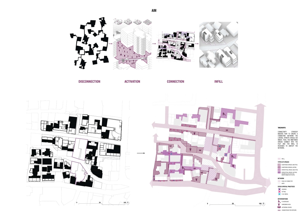
The Spaces In-Between: The Making of an Urban Network by Dana Kanaan, B. Arch ’24
American University of Beirut | Advisor: Dr. Howayda Al Harithy

In Beirut’s urban environment, the absence of and the treatment of public spaces has led to the weakening of community ties, fragmentation of communities, and urban isolation. This is exacerbated by rigid boundaries that separate districts and hinder social interaction, as public spaces are crucial for community cohesion. Moreover, there is an abundance of interstitial and in-between spaces that are underutilized and leftover. The rigid boundaries that separate districts and neighborhoods, whether physical or mental, combined with the neglect of these leftover spaces contribute to the fragmentation of urban communities and hinder social interaction. This is because social interaction occurs in the public realm. Thus, this fragmentation in the public sphere exacerbates the weakening of community ties and urban isolation.

Interstitial spaces in between buildings, especially those that act as ruptures in the urban fabric, can be activated and used as an opportunity for a network of connectivity. These interstitial areas can be activated through methods such as layering, dissolution, dissociation, and blurring. The objective of creating a blurred space is to foster social interaction, which emerges during periods of liminality and ambiguity. Therefore, a network of private spaces is created in the absence of public spaces utilizing interstitial and in-between spaces. 

This project was nominated for the Areen Projects Award for Excellence in Architecture

Instagram: @ard_aub

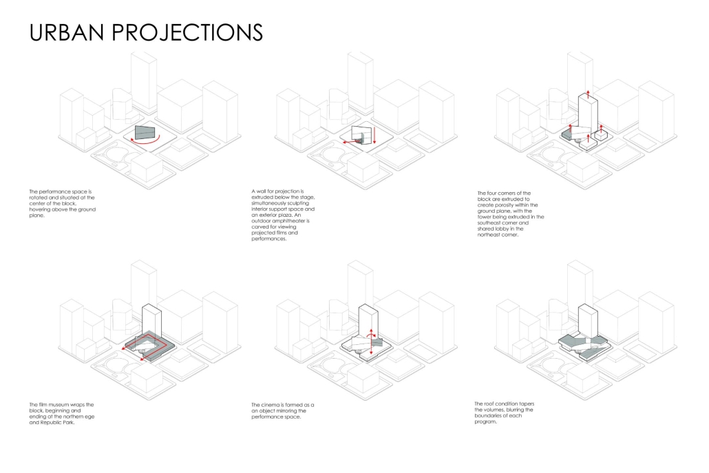
Urban Projections by Tessa Laplante & Julia Nahley, M. Arch ’24
The University of Texas at Austin | Advisor: Matt Fajkus

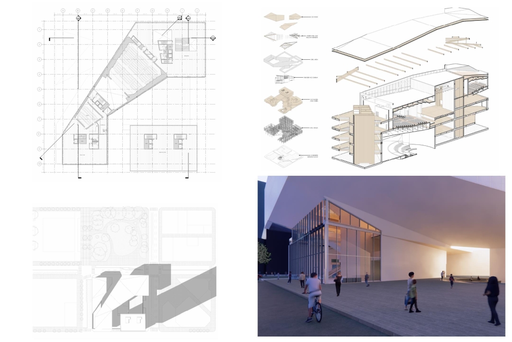
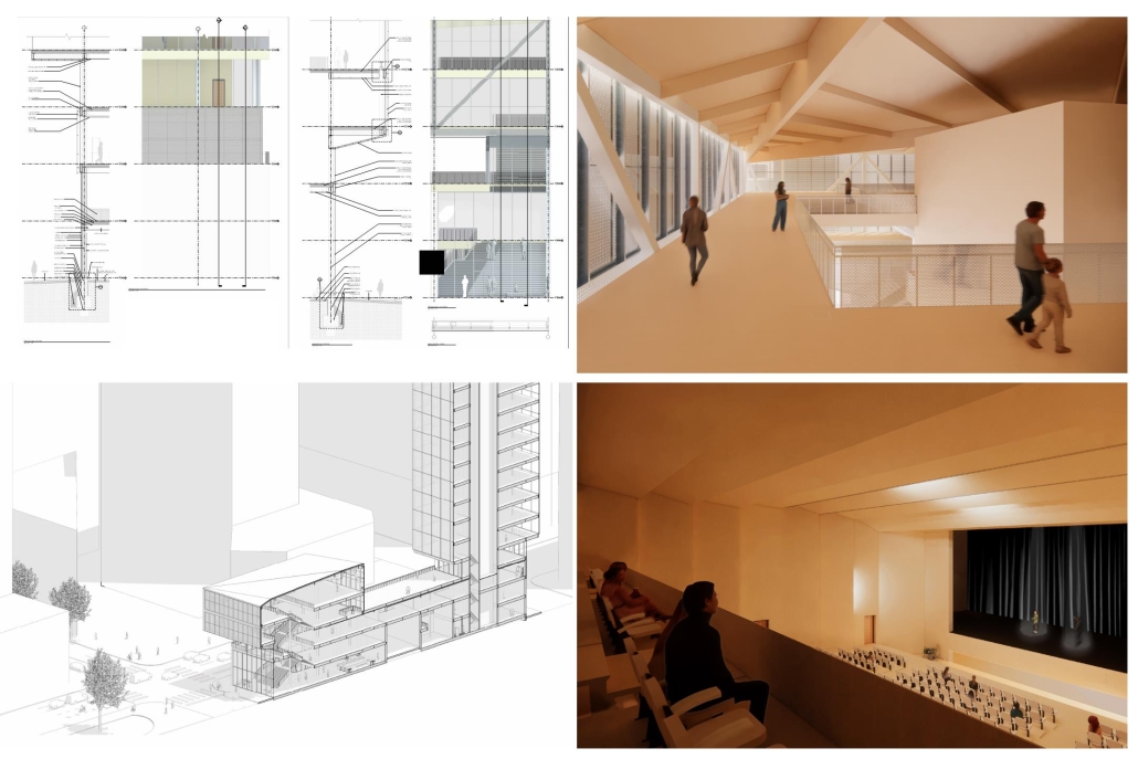
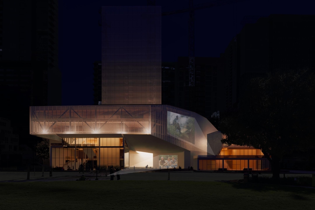
“Urban Projections” addresses the notion of a cultural landmark in the context of an evolving city. With the massive amount of development happening at such a rapid pace in Austin, it raises the question of how the city will maintain and continue to define its own cultural identity. In order to maintain it, [this] design includes a film museum, while live performance spaces continue to define the city’s culture. A key intention for the site is to encourage circulation through the urban block towards nearby greenspaces including Republic Park and Shoal Creek. The heart of the block is defined by an elevated and rotated performance space, which sculpts the public plaza beneath. A film museum wraps around the block at the third level, serving as a plinth that begins and ends at Republic Park. Liminal spaces are emphasized in the project, with vertical circulation and intermission spaces celebrated and shared between programs.

The notion of projection is repeated at all scales of the project, reflected in the projection of the building’s structure onto the exterior facades. A steel mesh acts as a surface for the projection, as well as a thermal barrier to filter light and movement between interior and exterior spaces. A steel frame with CLT cores and floors is utilized as a replacement for concrete in conjunction with steel trusses that support the cantilevered theater spaces and wrap the upper levels. As visitors process from the main lobby into the more private spaces, they experience a sequence of atmospheres generated by different relationships between wood and steel. Specifically, in spaces where the program is flexible, the relationship between materials is clear, with transparent glass exposing the building’s primary steel members and CLT floors. In contrast, the interiors of the theaters are entirely wood to encourage concentration for the experience. 

This gradient of privacy through materiality reflects the project’s overarching intention to blur the boundaries between programs without compromising the essence and needs of the programs themselves. In an effort to establish a cultural landmark, liminal spaces are celebrated to encourage new relationships within the site, rendering them just as important as the more defined programs. These shared moments exist as a stage for the city to maintain and continue to define its cultural identity.

Instagram: @tessamarie108, @julia_nahley, @mf.architecture

Expo 2025 by Trever Bellew, B.Sc in Architecture ’24
University of District of Columbia | Advisor: Golnar Ahmadi

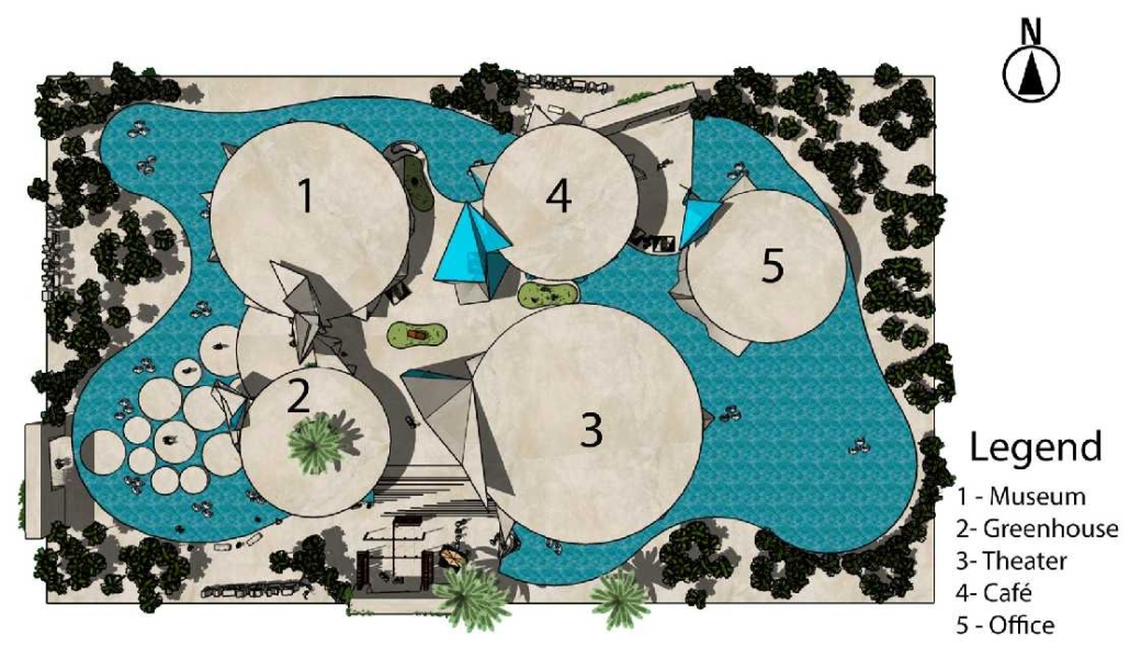
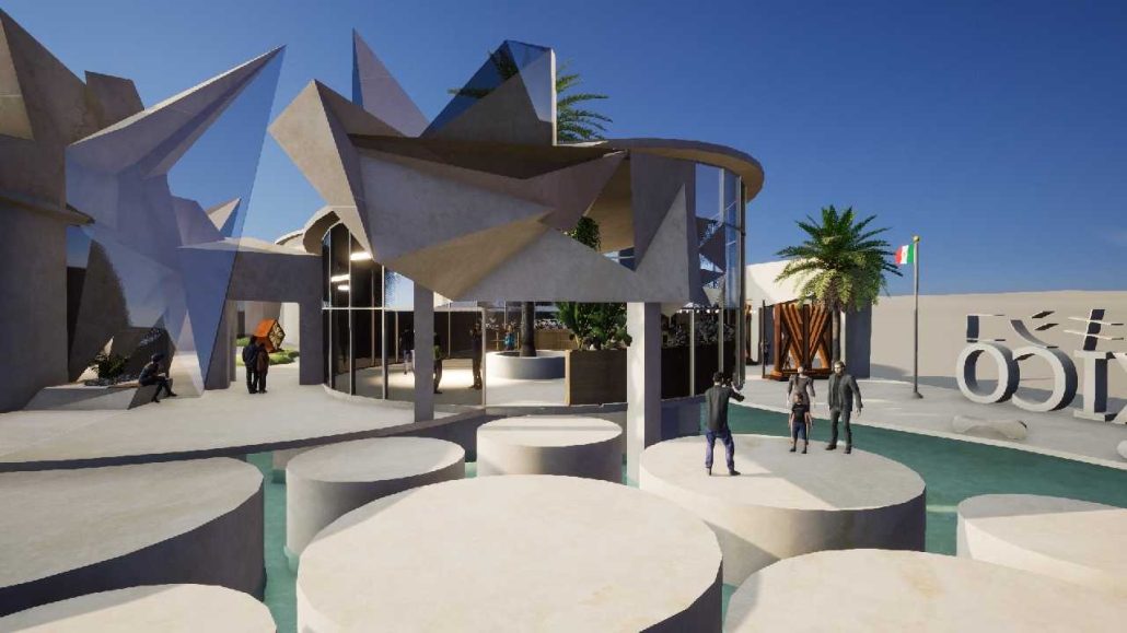
For the spring semester of 2023, students were required to design a pavilion for the 2025 World Expo that will take place in Osaka, Japan. The World Expo is a global event that showcases the best in technology, sustainability, and architectural design. With the theme “Designing Future Society for Our Lives,” the Expo aims to present innovative solutions and ideas that positively impact human lives. It focuses on sub-themes such as saving lives, connecting lives, and empowering lives, highlighting the Expo’s commitment to addressing global challenges and creating a better future.

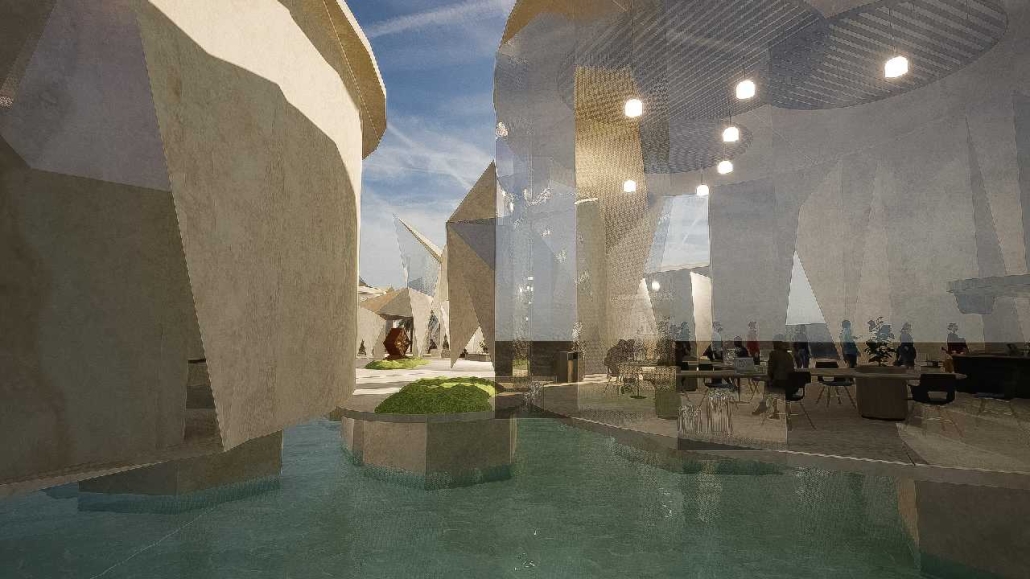
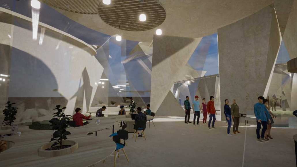
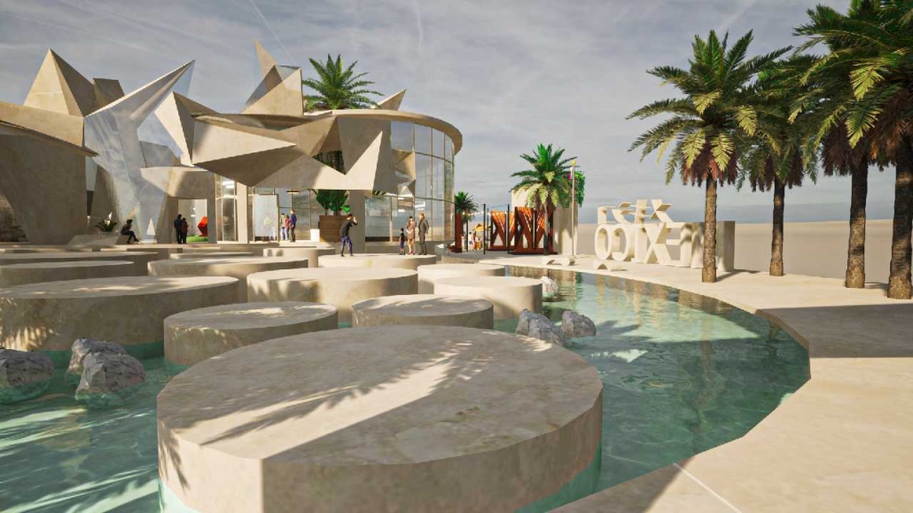
Being originally from Brazil, I challenged myself to create the Brazilian pavilion. [This design drew] inspiration from Burle Marx, a plastic artist, and architect who designed the most iconic boardwalk located in Copacabana, Rio de Janeiro, Brazil. I crafted an organic shell that encompasses the entire pavilion program. The project’s aim was to create an immersive experience that transports visitors to a jungle-like setting while educating them on various topics related to mental and physical health through the exhibit rooms. 

Instagram: @Golnarahmadi

Shopping Shells to City Cells by Ruyue Qi, B. Arch ’24
Rhode Island School of Design | Advisors: Junko Yamamoto & Leeland McPhail

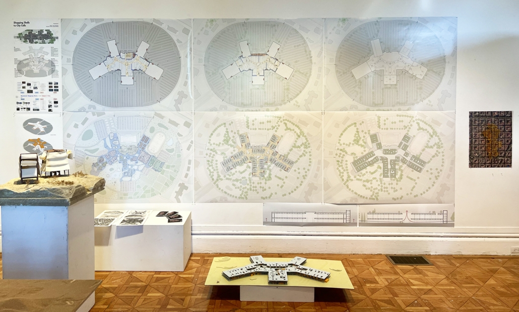
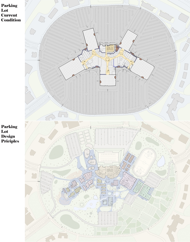
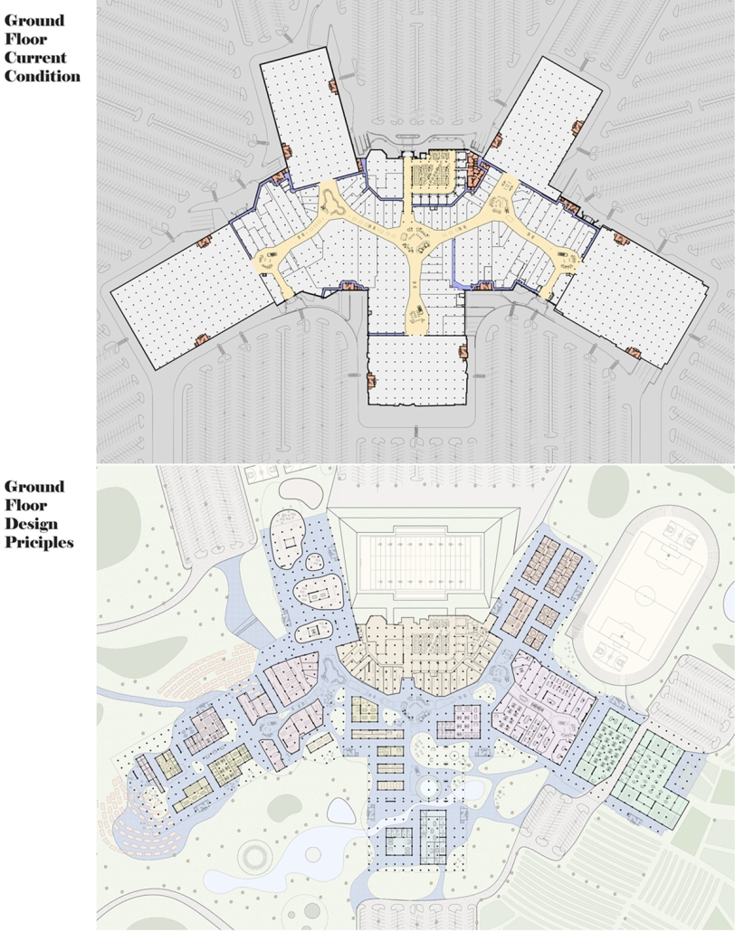
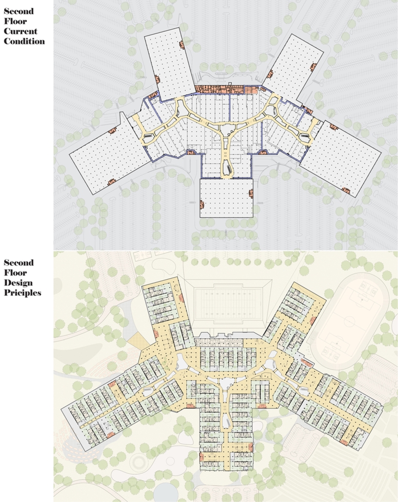
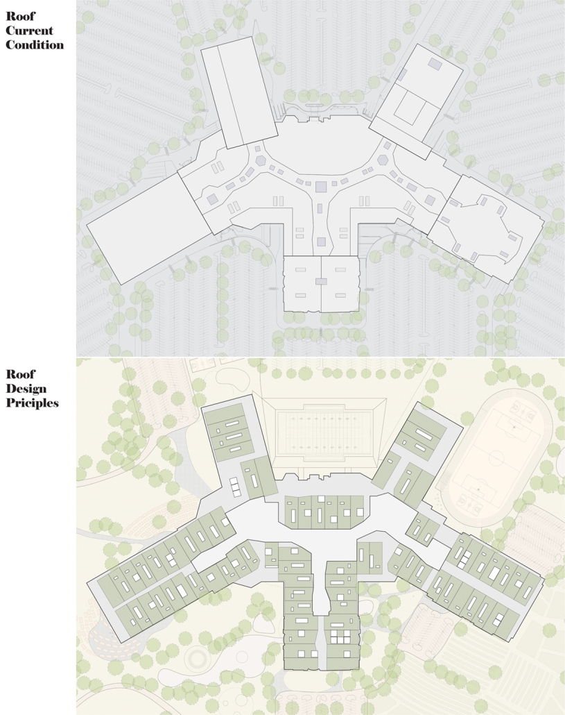
Shopping malls, spanning an area equivalent to 33+ Manhattans, are key symbols of consumerism. Built for short-term savings, these malls often become abandoned due to high maintenance costs and the rise of e-commerce. In the United States, out of an estimated 1,150 malls, it is forecasted that only about 150 may remain operational by 2032. Despite numerous closures, new mall construction continues as developers aim to attract shoppers with the Next Big Thing. Abandoned shopping malls (large size, connected layout, huge parking, enclosed structure, and strategic positioning) have the potential to be transformed into compact cities to nurture a future that is both eco-efficient and interconnected. 

Large abandoned shopping malls are large enough to become diverse and mixed-used neighborhoods. They can provide housing units with fixed infrastructure cores and flexible layouts, depending on the climate and needs. Additionally, abandoned malls could evolve into walkable neighborhoods connected by escalators and platforms. Existing escalators can create a unique urban environment where residents can easily navigate between different areas. Transforming vast parking lots into parks, gardens, and farms could enhance connectivity to nature and mitigate the urban heat island effect. Enclosed shopping malls depend solely on mechanical systems to provide a controlled climate inside, introducing natural ventilation could significantly lower their carbon footprint. By strategically repurposing abandoned shopping malls, we can revitalize neighboring areas by enhancing community involvement, boosting the local economy, and creating new communal spaces and facilities.

This project was a Thesis Award Nominee. 

Instagram: @julyqi_, @junkoyamamoto_

Beating Heart: A Joe Biden Presidential Center by Nick Biser, Aidan Knupsky & Kaiden Estep, B. Arch ’24
Marywood University | Advisors: Jodi La Coe & James Eckler

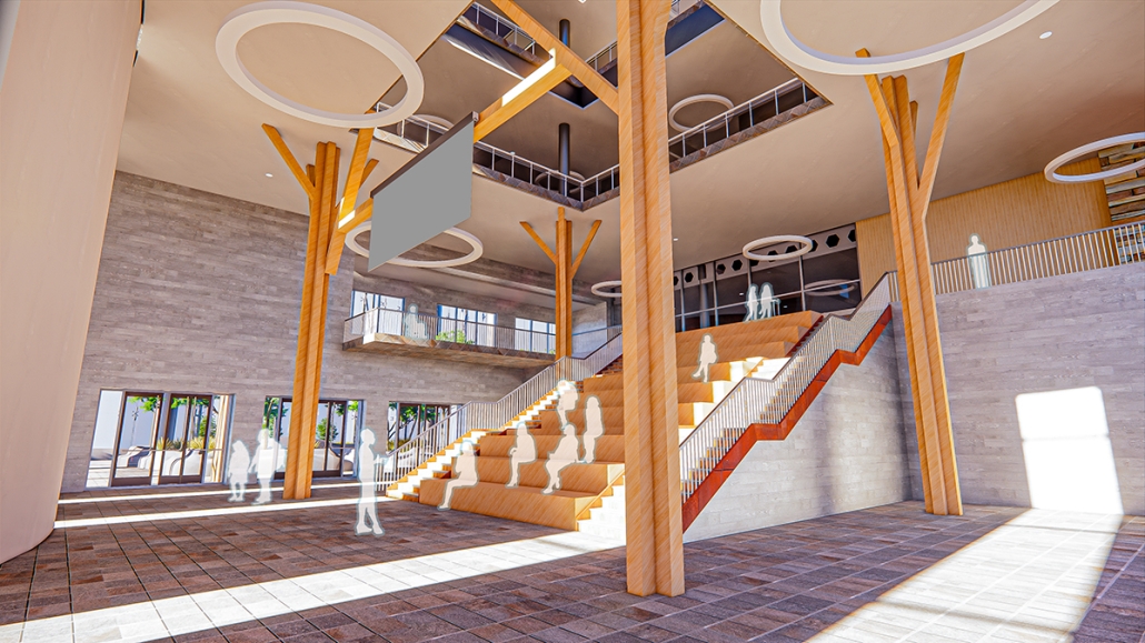
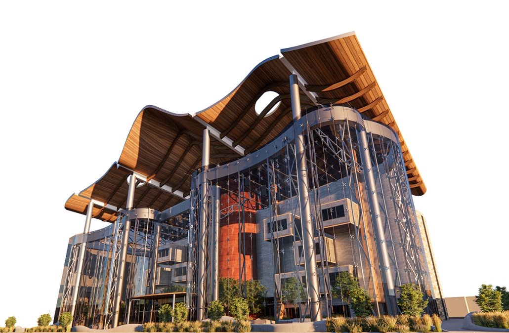
Located in the heart of Scranton, Pennsylvania, Beating Heart is a Presidential Center for Joe Biden housing his presidential archives, a museum, and a new gathering space for the community. Taking a symbolic approach to the design, the building is split between a massive tension cable glass facade and a tall stone building. These two different approaches are brought together by an all-encompassing canopy. This symbolic design follows President Biden’s aim to unite individuals, no matter how different they may seem on the outside. The organic shape of both the canopy and facade represents the changing nature of the American spirit and people. Instead of a traditional Presidential Library, Beating Heart conveys more of Biden’s wishes and beliefs. 

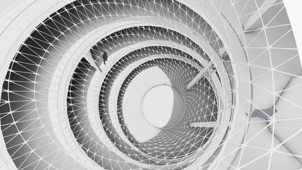
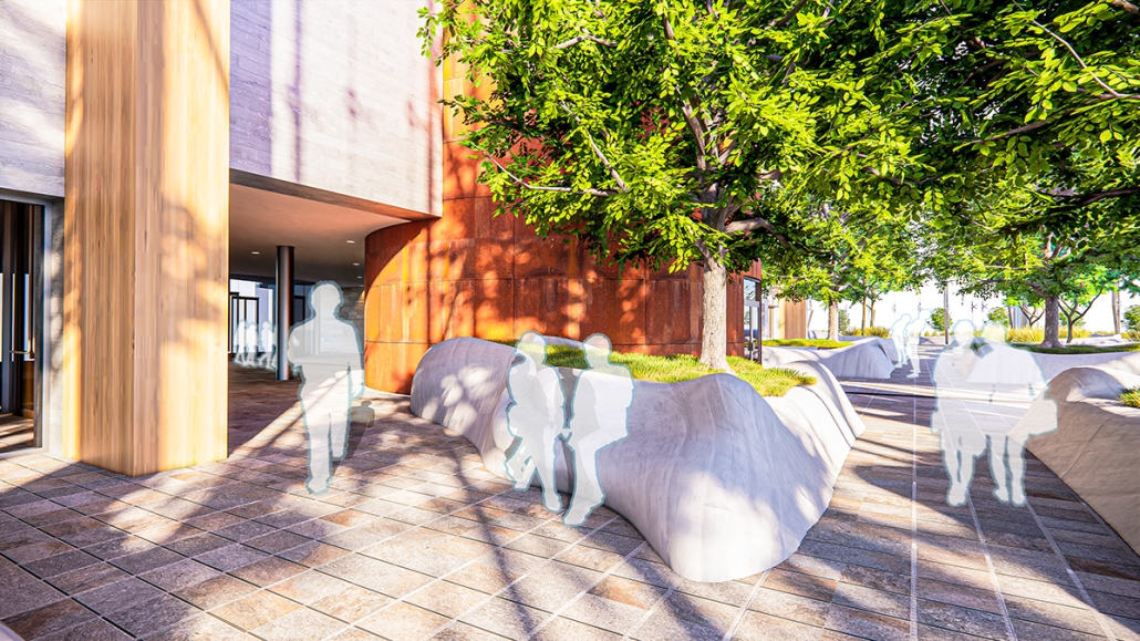
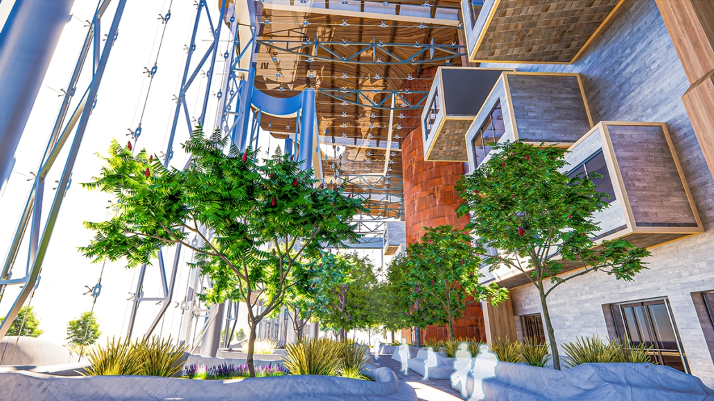
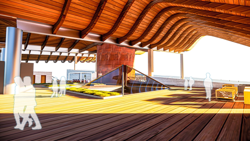
At the center of the building is a massive cylindrical Heart of America – a brilliant spiral stair clad in Cor-ten steel that stands in contrast to the rest of the building. The Heart extends over 120’ high, going past the roof for all of Scranton to see. The entirety of the first floor diverts from the typical museum program of a Presidential Library. The front half is surrounded by seemingly endlessly tall glass that surrounds the occupant in an indoor/outdoor space. This winter garden preserves native vegetation and reclaims what was once a desolate parking lot into a reborn green space. The glass facade supported by thin tension cables creates a visually seamless transition between the reworked streetscape and the interior. 

In coordination with the winter garden is a Living Learning Lab serving as a space for the Scranton Community to learn more about the vegetation in the winter garden as well as ecological conservation techniques. Lastly, the first floor hosts a large, double-height Community Room, which features a large learning stair for the community to gather and discuss current events and issues. The museum section occupies the upper stories having the occupant flow in and out of the central Heart. The exhibits rotate around two symmetrical interior atriums allowing clear visibility and transparency throughout the museum. The active rooftop provides a space to fully view the Electric City of Scranton. 

This project won a 2024 MUSOA Studio Award.

Instagram: @nick_biser, @biser_architecture_and_designs, @aidanknup07, @kaiden_estep, @jodilacoe

Regarding the Commons: Addressing the current social and economic power dynamics as they manifest in the public realm by Magdaline Kuhns, M. Arch ’24
Lawrence Technological University | Advisor: Scott Shall

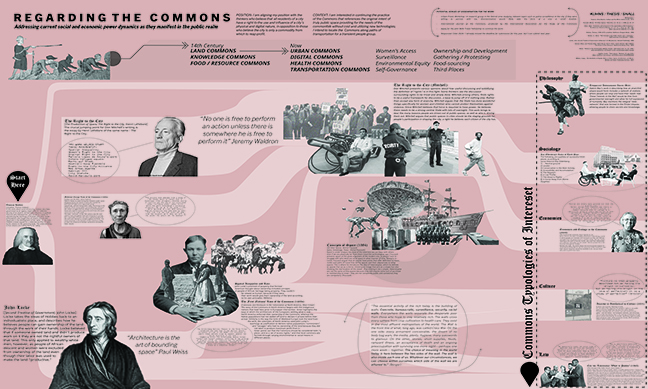
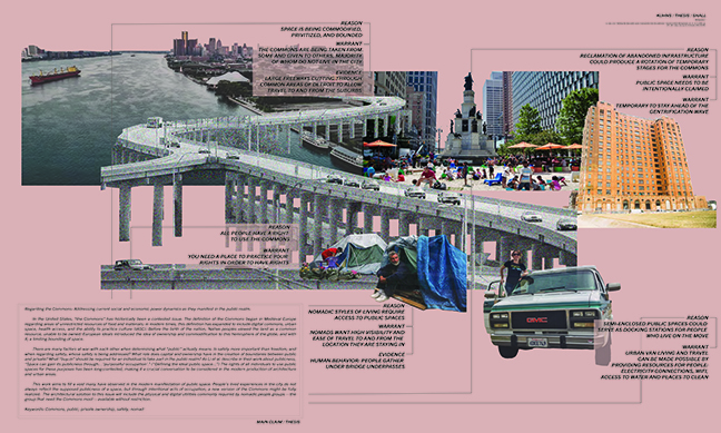
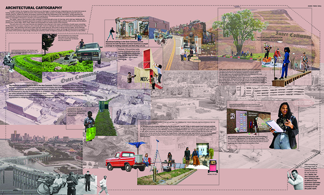
In the United States, “the Commons” has historically been a contested issue. The definition of the Commons began in Medieval Europe regarding areas of unrestricted resources of food and materials; in modern times, this definition has expanded to include digital commons, urban space, health access, and the ability to practice culture (IASC, 2023). Before the birth of the Nation, Native peoples viewed the land as a common resource, unable to be owned. European ideals introduced the idea of ownership and commodification to this hemisphere of the globe, and with it, a limiting bounding of space.

There are many factors at war with each other when determining what “public” actually means. Is safety more important than freedom, and when regarding safety, whose safety is being addressed? What role do capital and ownership have in the creation of boundaries between public and private? What “buy-in” should be required for an individual to take part in the public realm? As Li et al. describe in their work about publicness, “Space can gain its publicness through…’ purposeful occupation’.” (“Defining the ideal public space…”) The rights of all individuals to use public spaces for these purposes have been long-contested, making it a crucial conversation to be considered in the modern production of architecture and urban areas.

This work aims to fill a void many have observed in the modern manifestation of public space. People’s lived experiences in the city do not always reflect the supposed publicness of the space, but through intentional acts of occupation, a new version of the Commons might be fully realized. The architectural solution to this issue will include the physical and digital utilities commonly required by nomadic people groups – the group that needs the Commons most – available without restriction.

Instagram: @ace_kuhns, @scott_shall

Manus Mouvere by Dillon Alexander Brown, M. Arch ’24
Pennsylvania State University | Advisor: DK Osseo-Asare

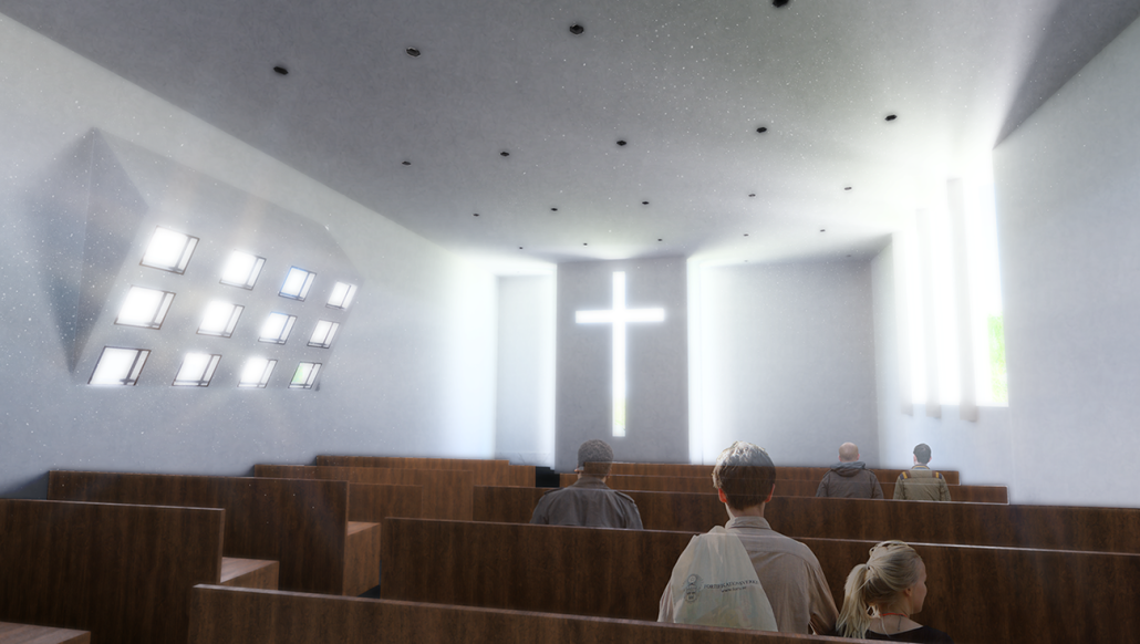
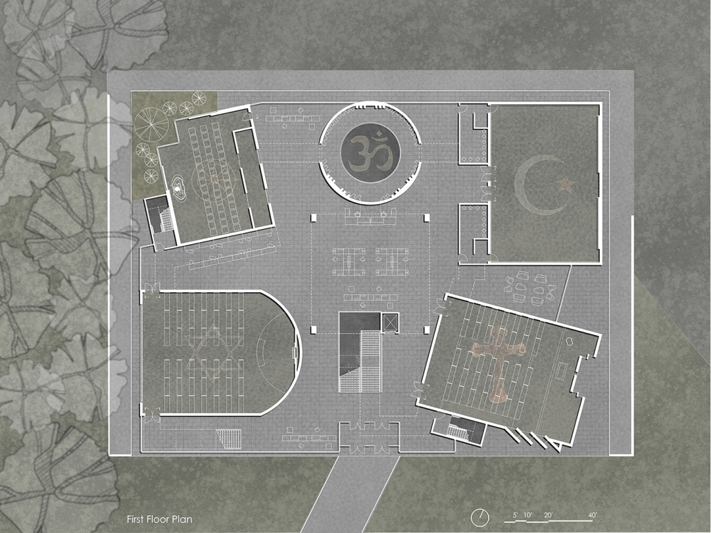
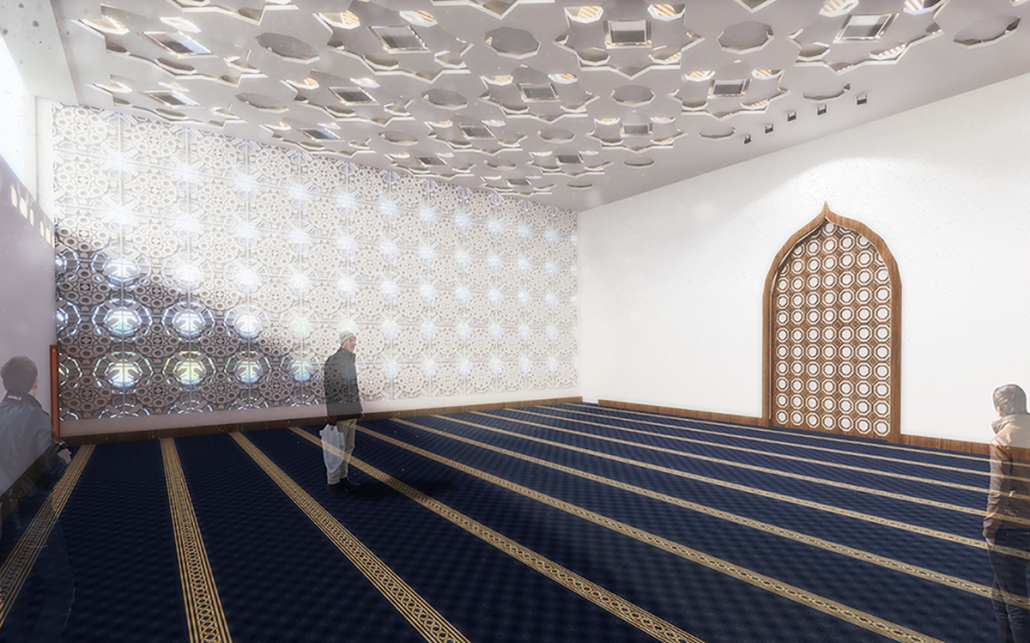
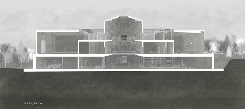
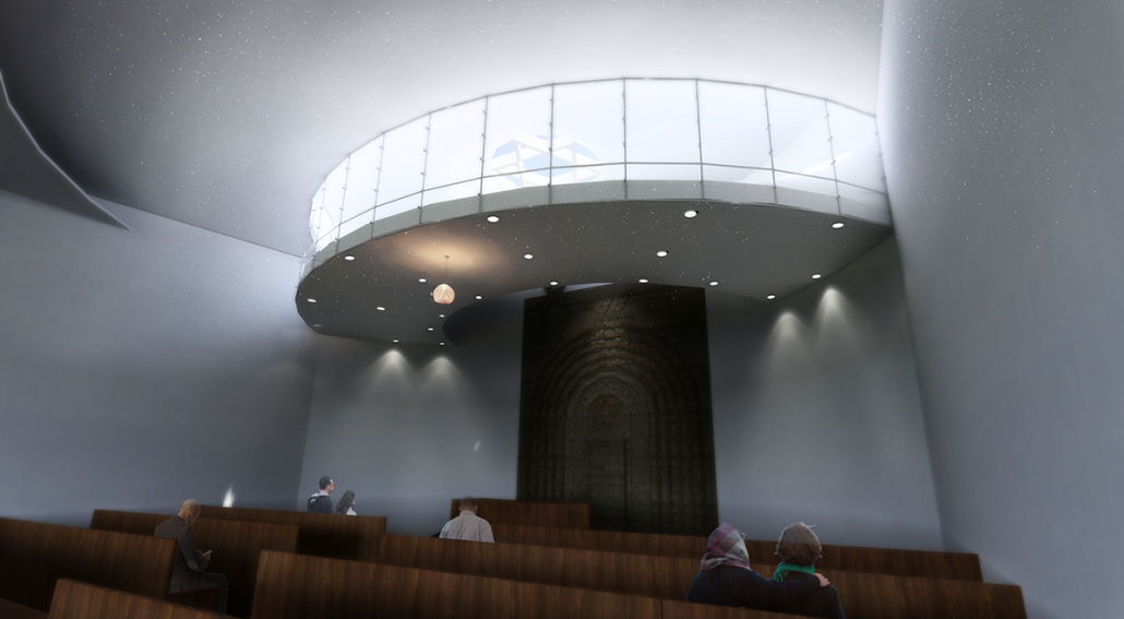
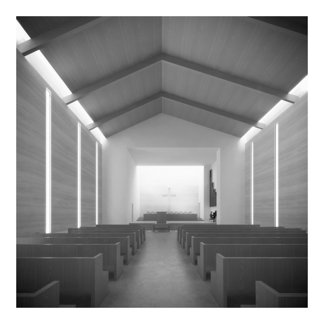
This project seeks to explore ineffable ideas in a physical space: designing a multi-faith facility in a multi-faith society. Based in Central Park, New York City, this building facilitates five distinct religions: Christianity, Judaism, Islam, Buddhism, and Hinduism. These five were selected from the census data of New York City. 

In preparation for the design, interviews were conducted at a temple with a religious leader for each religion, coinciding with a tour. Additional interviews with fellow students occurred to gain a more rounded understanding of each faith, their temple needs, and what could possibly lie for the future of the religion. With this information, five temples were designed within a single building and connected by a neutral secular space. 

Additionally, to explore the form of space the use of watercolor and pigment theory was used to see how different colors blended, or didn’t blend. This was done to explore how the culture of one faith may physically reside with another faith. The intuition gained from this exercise granted knowledge of how an idea may become overwhelmed and how much contrast is physically needed to keep a faith true to its own idea.

The exterior of the temples are angled to face their respective religious customary directions, but also act as geometry that encourages visitors to sit and face each other, a gesture to encourage dialogue. The building is designed to cross-pollinate understanding and promote tolerance between its visitors. It is representative of the existing religious landscape of New York City, and America as a whole.

This project won the ​​2024 Jawaid Haider Award.

Stay tuned for Part XIV!
2024 Study Architecture Student Showcase - Part VII

Welcome to Part VII of the 2024 Study Architecture Student Showcase! Today’s featured projects highlight spaces that serve their local communities. The student work below functions as more than just community centers, but as cultural and educational hubs as well. Each design presents an opportunity to transform communities by supporting the local economy, enhancing sustainability, creating an enriching environment, and more!
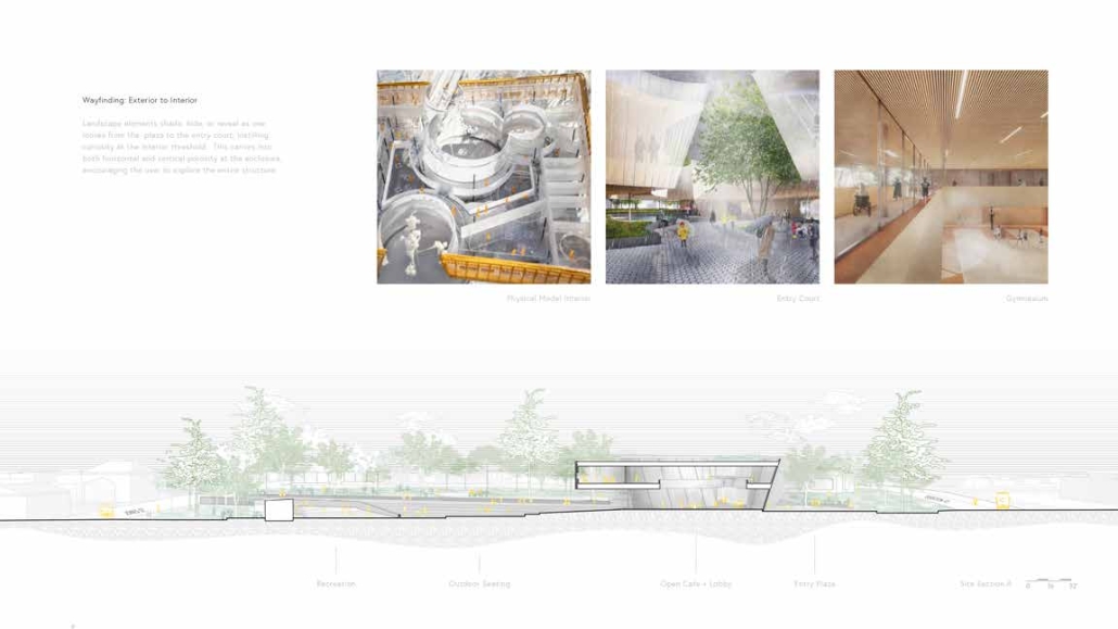
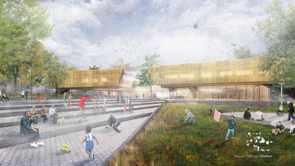
Tarboro Road Community Center by Maggie Kroening,  B. Arch ‘24
NC State University | Advisor: Doug Pierson

Tarboro Road Community Center

Anchors: Connecting Community to Landscape

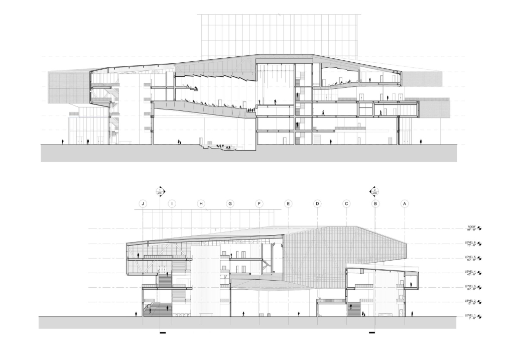
Architecture has the power to include or exclude, establish connections, foster pride, and generate emotion. In turn, when considering public projects, architects have the choice to design for all, promoting a more equitable built environment. This philosophy is exemplified in my design for Tarboro Road Community Center, called “Anchors,” bridging design aspects of both landscape and architecture.  

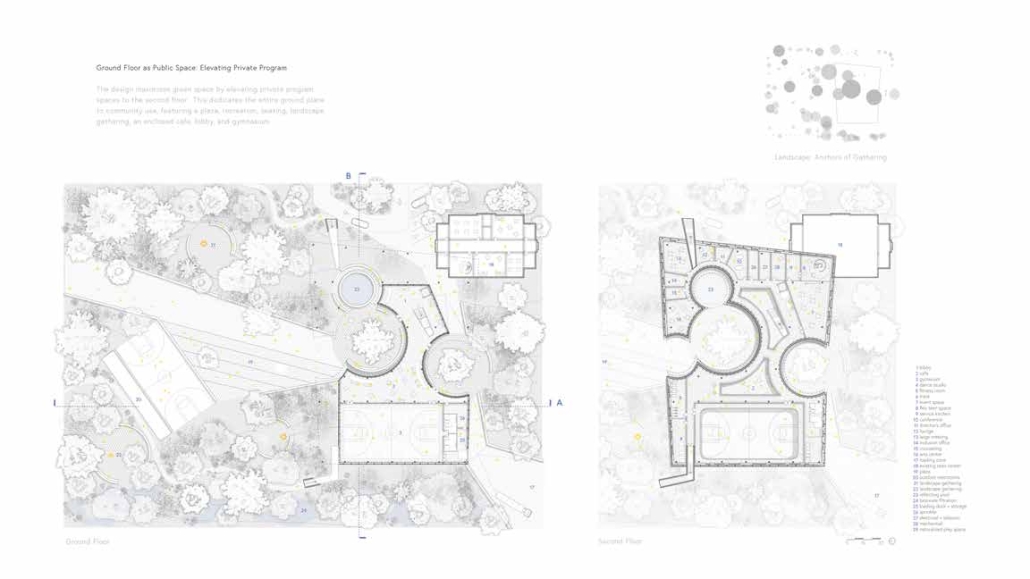
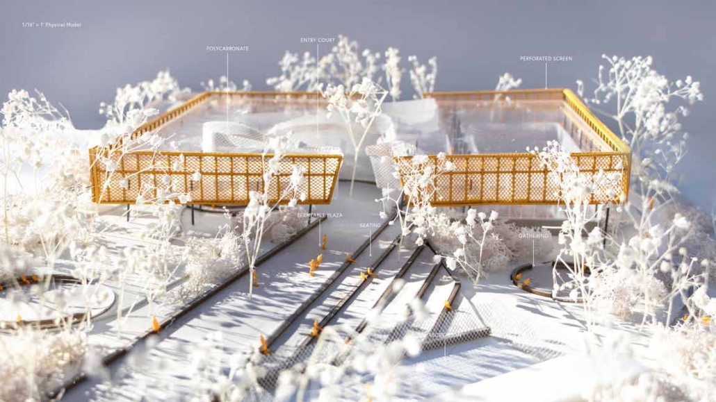
This informed my project parti: landscape as anchors of gathering. After delineating existing trees on site, the program is placed at the least intrusive spaces, preserving the canopy. Overall, the enclosure is created for the program, and mass is subtracted to reveal entry, instilling a beacon and public park for the community. This site resides in the historically underserved community of East Raleigh. Thus, my project, “Anchors” needed to function larger than a community center, acting as a social nexus as the region urbanizes.

The design maximizes green space by elevating private program spaces to the second floor. This dedicates the entire ground plane to community use, featuring a plaza, recreation, seating, landscape gathering, an enclosed café, lobby, and gymnasium. By creating an urban plaza and elevating private amenities to the second floor, the entire ground plane functions as a public space for the community.  

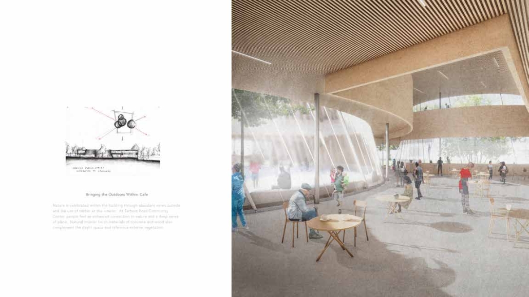
In designing a space for a community, it is important to reflect on memories of what makes a space meaningful, which are often rooted in nature.  At Tarboro Road Community Center, nature is not just integrated, but celebrated. The landscape incorporates elements that evoke memories of meaningful outdoor experiences. The terraced seating also overlooks the recreation court, allowing viewership during games.  A naturalized playspace not only offers children a safe environment but also incorporates bioswales for sustainable runoff filtration, reinforcing the center’s commitment to ecological celebration.

The Tarboro Road Community Center exemplifies the integration of architecture and landscape, where the natural environment and community needs converge. By preserving the historic trees and maximizing public green space, the center not only honors the past but also prepares for the future as East Raleigh evolves.  

This project won the 2024 AIA Triangle Student Design Award

Instagram: @maggie.k, @podarchitecturedesign, @ncstatedesign

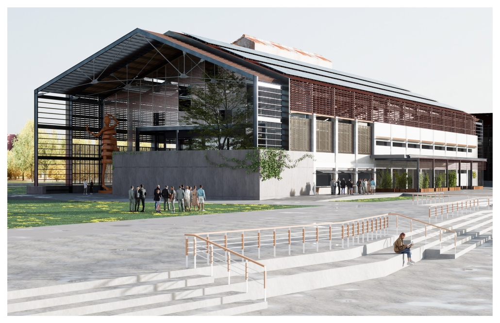
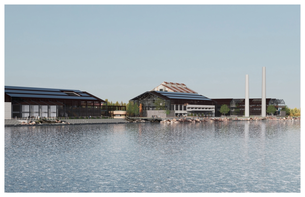
Aguirre Cultural and Visitor Center: The Revitalization of Abandoned Industrial Areas in the Communities by Sebastián R. Medina-Colón, B. Arch ’24
Pontifical Catholic University of Puerto Rico | Advisors: Pedro A. Rosario-Torres & Juan C. Santiago-Colón

The project is located in the Aguirre community in Salinas, Puerto Rico, and focuses on the former Aguirre Sugar Mill, situated near the coast and the community. This sugar mill was an economic pillar of the southern region in Puerto Rico since its establishment in the late 19th century. It spurred an economic boom centered on sugar production, becoming one of the largest and most productive facilities in the Caribbean. However, over time, the sugar industry faced economic challenges, and the sugar mill closed its operations in the 1990s. This closure caused several problems in the community, including the loss of jobs, population, commercial areas, and hospitals, leaving a forgotten and ruined community.

As a solution to this problem, the architectural proposal focuses on highlighting the area’s cultural, historical, and economic aspects. The main programs include a cultural and community center with recreational spaces, auditoriums for various local activities, a community market, and exhibition spaces with educational facilities to stimulate artistic and cultural interest in the area. Additionally, a visitor center is implemented to promote the local economy, which includes a virtual and interactive exhibition to present the history of the place and the processes used during that time, as well as commercial spaces, restaurants, and more.

The project advocates for returning the waterfront to the community by removing visual barriers and obstacles that currently restrict access to the coast. The intervention involves using part of the existing structures to preserve the sense of place, while new interventions are carried out in the deteriorated areas, fostering a strong urban node that highlights the cultural, economic, historical, and artistic activities of the place. The project focuses on three buildings selected for preservation. Two of them, formerly two-level warehouses, are proposed as the building for art and culture, oriented towards the community, and the community building facing the sea. The third and largest building of the sugar mill is designated for a commercial and exhibition space.

Instagram: @sebastianmedinacolon

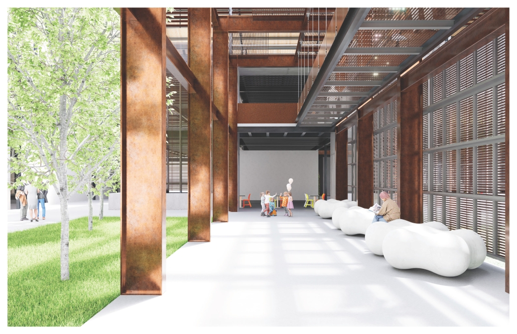
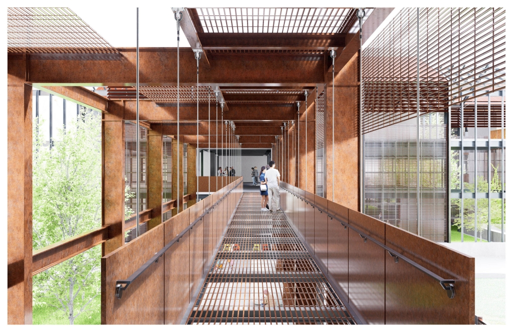
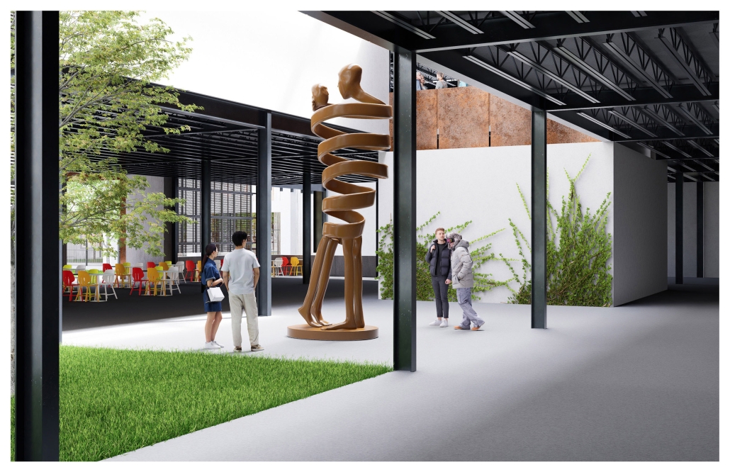
Centro Juvenil Reginal, De Fomento Educativo y Cultural by Salma Orozco Orozco, B. Arch ‘24
Universidad Anáhuac Querétaro | Advisors: Alfonso Galván & Jorge Javier

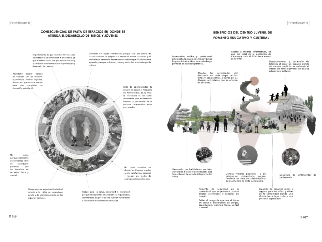
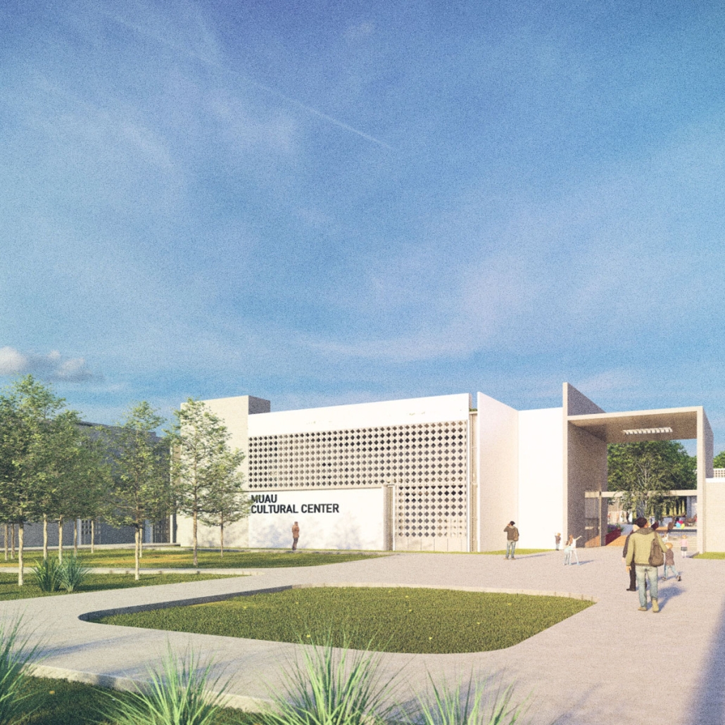
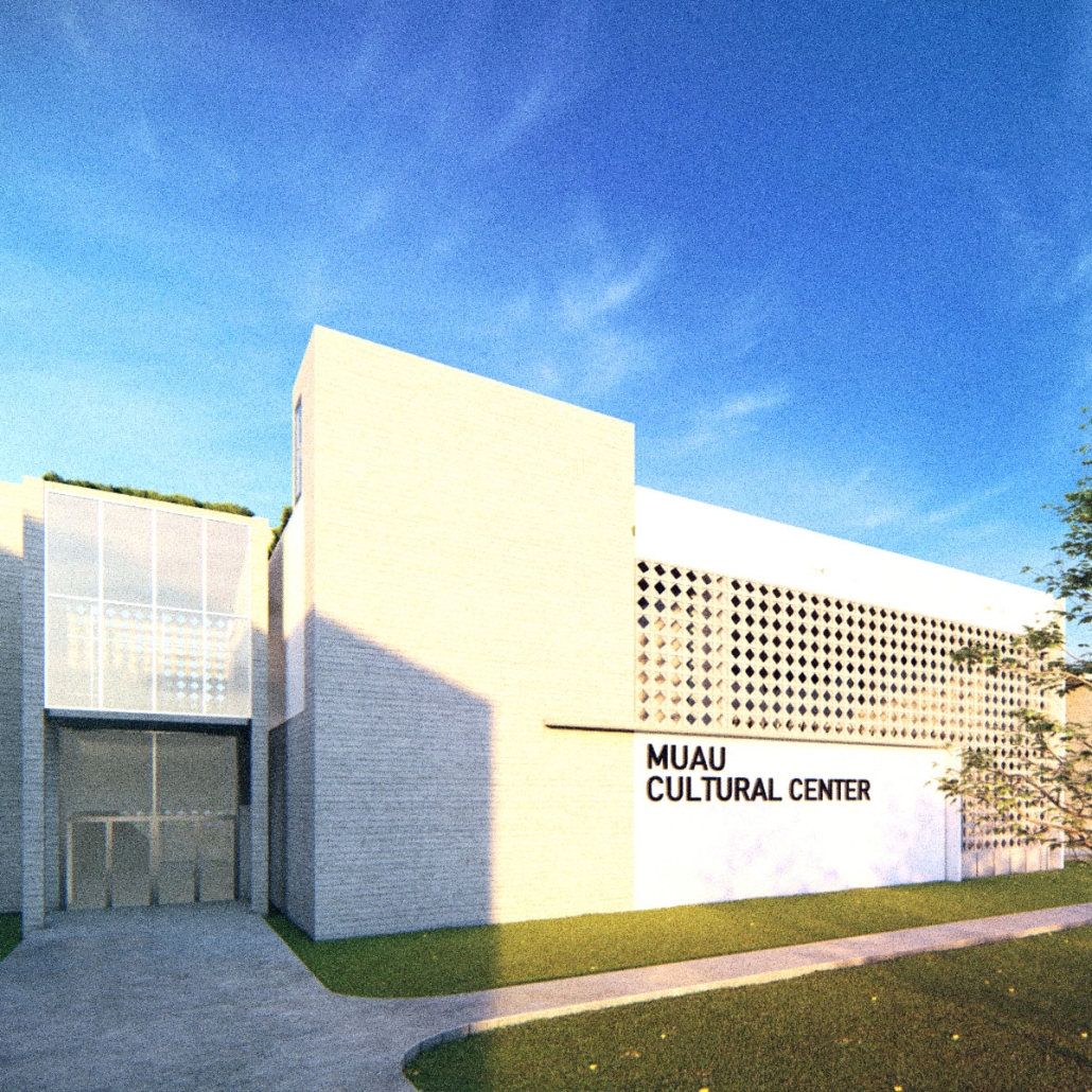
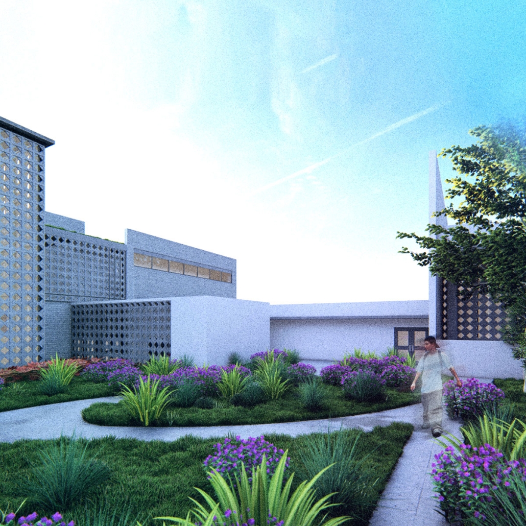
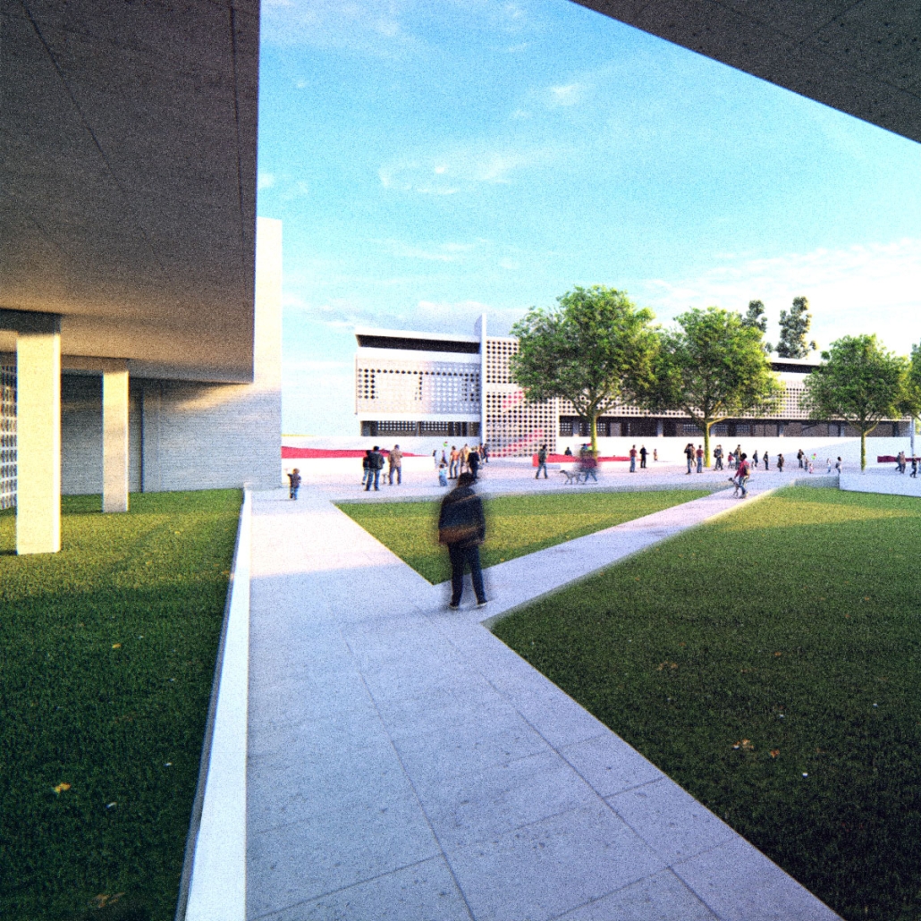
The project aims to create an innovative youth centre that will become the heart of the social and cultural life of Cadereyta de Montes, radiating its influence to neighbouring states. This space will be designed so that young people can explore and enhance their talents and skills in both the educational and cultural spheres. In addition to fostering individual development, it will seek to promote positive values and community integration, strengthening ties between the inhabitants of the area and reducing violence rates. 

The project also contemplates the revitalisation of urban spaces in Cadereyta de Montes, turning the youth centre into a tourist reference point in the region. It will seek to stimulate urban activity in the city, generating economic and cultural opportunities for its inhabitants. In short, the youth centre aspires to be much more than a meeting place for young people; it will be an engine of social and urban transformation in the entire community.

Instagram: @orsa.mx, @salma_orozco123, @arqwave, @arquitectura_anahuac

HYOO•GUH by Cristian Salvador Díaz Castillo & Lian Alejandro de la Puente Pozada, B. Arch ’24
Tecnológico de Monterrey | Advisors: María Guadalupe Peñuñuri Soto, Jocelyn Erandi Reyes Nieto, Luis Antonio Valle Cordero & Marco Tulio Muñoz Lopez

Hyoo Guh is an architectural project strategically located in Hermosillo, Sonora, Mexico, inspired by the Danish philosophy of “hygge,” which promotes the enjoyment of life’s simple pleasures. On a site of almost 30,000m², 11 towers will be built, including 4 mixed-use towers and 6 residential towers, generating a population density of 600 inhabitants. However, the project aims to attract all people who seek to celebrate life and generate community through architecture. Promoting this, Hyoo Guh’s main attraction is a central library, which along with the overall project, seeks to create an inclusive ecosystem for all, especially for children, in a way that promotes education and cultural development in an accessible and stimulating way for all ages.

The Danish philosophy of “hygge”, which focuses on warmth, intimacy, and the enjoyment of simple, cozy moments, has guided every aspect of Hyoo Guh. This approach is reflected in every detail of the design, creating an environment that invites relaxation and shared enjoyment, where users not only want to be, but to live, and spend most of their time. 

In addition, Hyoo Guh offers three different paths, each one of a distance under 600 meters, and marked with a different color that defines a different route, adapted to different users, these paths are intended to allow users to explore and experience the project in unique ways. Completing all three tours once adds up to one mile of distance, enriching the visitor’s experience.

The vision for Hyoo Guh is to become a landmark in the city, a place where people will go not only for necessity but for the pleasure of enjoying a welcoming and enriching environment.

Finally, Hyoo Guh aims to set a new standard for community and wellness in Hermosillo, creating an environment where every person feels not only welcome but deeply connected and enriched. Its library will not only be a center of knowledge, but a place where community flourishes, inspiring everyone to live with gratitude and full enjoyment.

Instagram: @teccampusson, @tecdemonterrey, @eaad.tec, @yochi_02

Wine, Water and Architecture: A Multiscale Approach to Terroir Expression by Carmen Al Chahal, B. Arch ’24
American University of Beirut | Advisors: Sandra Frem & Makram El Kadi

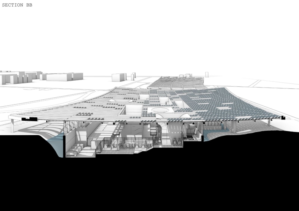
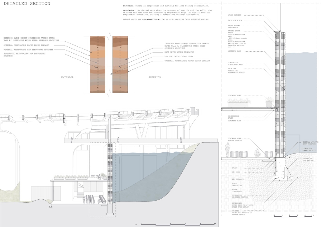
Focusing on Anjar within the expansive 215,000 sqm plot of the Bekaa Valley, this thesis seeks to demonstrate that architecture, when thoughtfully integrated into the wine-making process, has the potential to materialize and strengthen the links between terroir and wine production at multiple scales. By addressing water-sensitive processes responding to the challenges, fostering wineries as cultural hubs for local communities, and drawing inspiration from the site’s nature and potential, architecture can play a pivotal role in enhancing the sustainability, connectivity, and cultural richness of the wine industry.

Instagram: @ard_aub

Stay tuned for Part VIII!

2023 Study Architecture Student Showcase - Part XXXIII

Welcome to the final edition of the 2023 Study Architecture Student Showcase! In Part XXXIII, we highlight student work that centers on public spaces. The showcased designs include public parks, meeting spaces, community centers, commercial retail spaces, parking structures, pools, and more.

Re-encontrarse (Re-united) by Sophie Esther Zurhaar Ortiz, B.Arch ‘23
Universidad Anáhuac Querétaro | Advisors: Jorge Javier & Francisco Paille

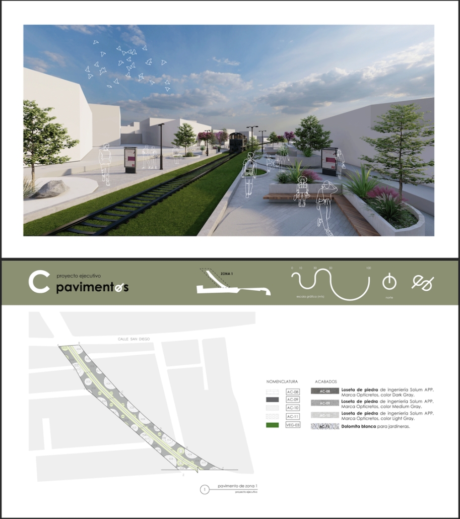
This project seeks to generate an urban design proposal for the recovery of public space in Felipe Carrillo Puerto. Aiming to propose meeting spaces where all kinds of activities can be carried out, recover the railroad tracks to stop being a physical barrier, and defragment the urban fabric, offering cohesive, healthy, and functional meeting spaces that together can regenerate the social fabric.

Instagram: @sophiezurhaar, @arqwave

PROSPECT NEW ORLEANS by Olivia Georgakopoulos, B.Arch ‘23
Tulane University | Advisor: Ruben Garcia-Rubio

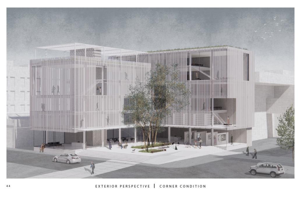
This project proposes to open the building to the city, creating a place that adds to its rich urban fabric. The site is a parking lot at the corner between the Contemporary Arts Center and the WWII Museum. While there are many voids in the surrounding context, like this site, they are not habitable. This project provides a much-needed public space for the many visitors to the surrounding museums. Taking inspiration from the L-shaped building typology in New Orleans, the building opens to the city, creating a public plaza. 

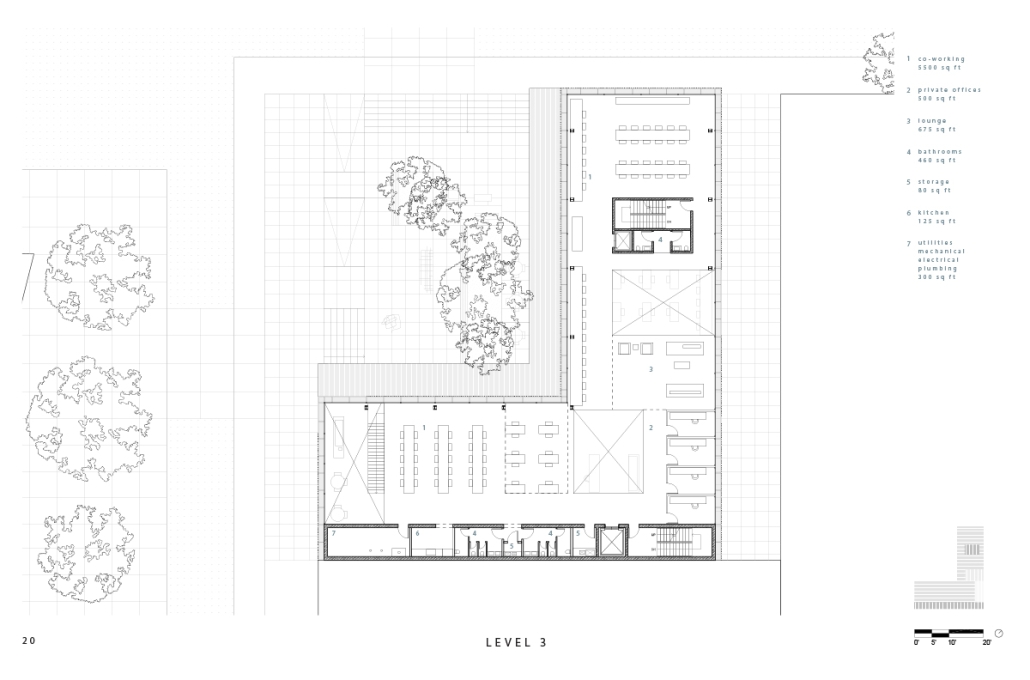
The building functions as an open-public platform connecting Camp Street and Andrew Higgins Blvd. The glass-enclosed first floor is fluid and can be completely opened, allowing for space not to be defined by interior or exterior. Rather, programs can spill out and interact between the interior and the plaza. The ground floor then becomes animated by human activity. The public programs, gallery, cafe, lobby, and lounge are housed on the first floor, and spaces to support the art center are above. 

Transparency of the building is achieved through the aluminum louvered facade, which acts as a theatrical scrim. This veiled facade reveals the animation on the inside of the building. This transparency is also experienced from the inside looking out: the interior programs interact with filtered and framed views of the city. 

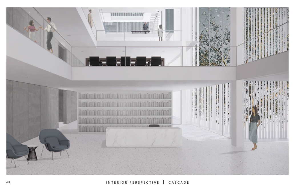
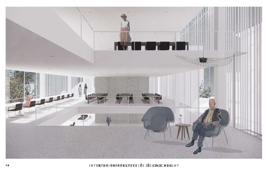
A chain of internal double-height spaces forms a visual cascade through the building, providing internal transparency and animation with continuous views from the bottom floor to the top floor and the sky. The overall design provides continuity between the interior, the plaza, the street level, and the city.

Instagram: @rubgarrub

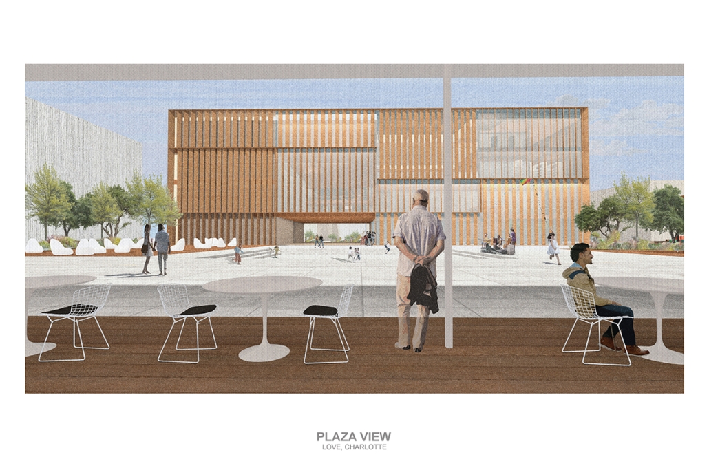
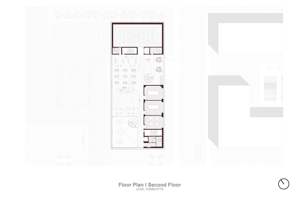
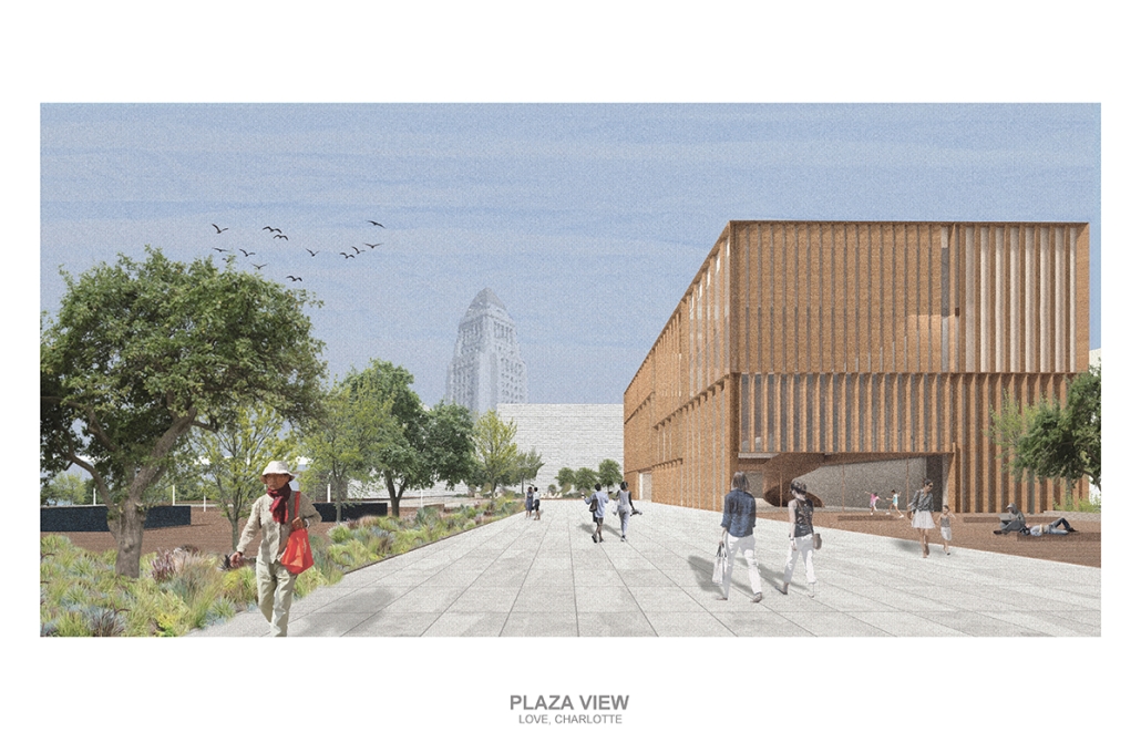
Los Angeles Media Library by Charlotte J. Love, B.Arch ‘23
Tulane University | Advisor: Ruben Garcia-Rubio

The Los Angeles Media Library began by building upon the urban design. The building began with the broken urban block typology found throughout the site, this promoted a continued focus on mobility within the project. The urban block shape was altered to accommodate one large building wrapped in louvers and two smaller pavilions hosting different program focuses on a plaza. This iteration of the broken urban block creates an inviting place for a public plaza. This plaza being at the literal intersection of the business and arts district makes it a perfect spot to hold a media center and library. This is relevant for both the site and the Greater Los Angeles.

The plaza has a number of public transportation stops and is located across the street from two museums making the plaza equally important to the design. The open space has a café, reading area, pavilion, and an outdoor theater. The buildings and walkways align with the surrounding roads and buildings leading to a central sunken space at the center of the plaza. Held within the building are two zones with thickened walls holding private programs such as classrooms, dark rooms, offices, etc. This allows the rest of the building to be much more open with a number of double heights as well as spaces with an indoor-outdoor feeling. This allows the building to be fluid and connected to the plaza, blurring the line between public and private spaces.

Instagram: @rubgarrub

HALLOWED GROUND by Ramona Reinhart, M.Arch ‘23
University of North Carolina at Charlotte | Advisor: Chris Jarrett

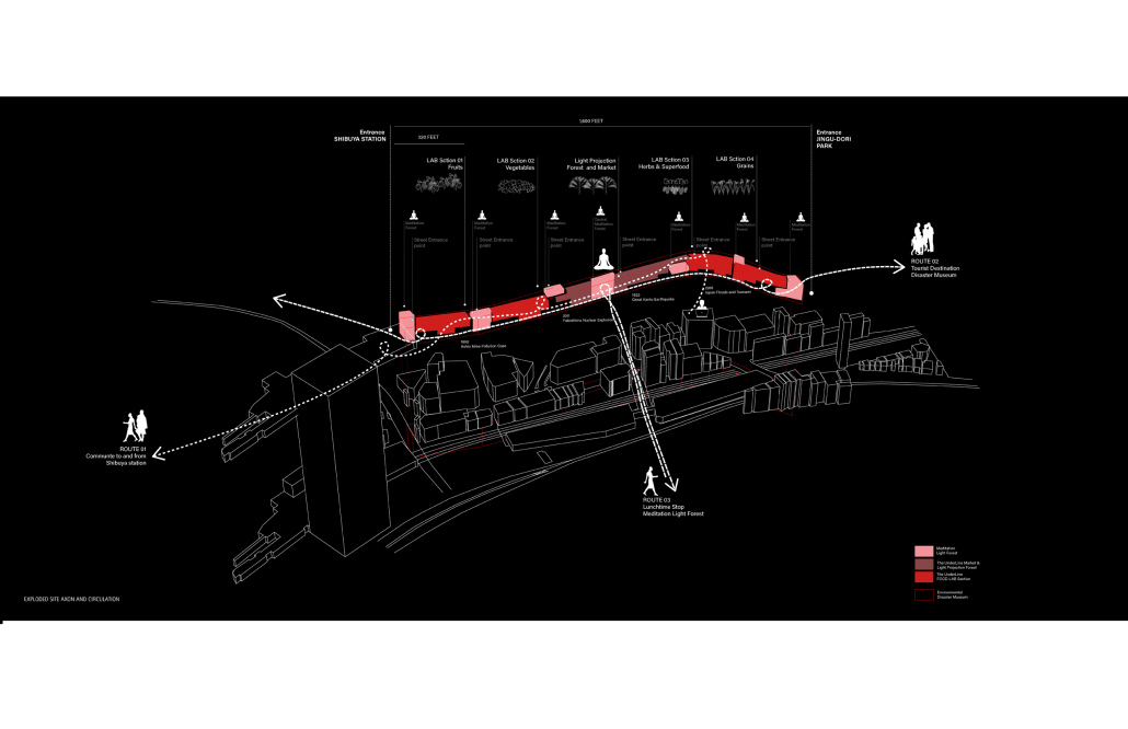
In “Taoka Reiun and Environmental Thoughts in the Early 1900s,” Ronald Loftus addresses Reiun’s cultural critique of Western modernization and the devastating forms of pollution that followed during Japan’s Meijin state beginning in 1880. As an early environmentalist and anti-modernist, Reiun argues that these natural disasters are ultimately a result of humanity’s disconnection from the natural and spiritual world. 

Located in Shibuya, Hallowed Ground proposes “The Under Line,” a linear futuristic public park, lab farm and market, integrated urban meditation spaces, and a museum for environmental disasters as a response to Tokyo’s culture of hyper-consumerism and capital development that “buried” many of Japan’s spiritual traditions and natural ecologies. The constant strive for economic growth resulted in large areas of impervious surfaces in the city. Surfaces that are now being hollowed out.

This project won the 2023 Best Architectural Diploma Project. As well as 2023 Excellence in Architectural Representation.

Instagram: @_ramonareinhartg

Little Megastructure by Yiman Yiman, M.Arch ‘23
UCLA Architecture and Urban Design | Advisor: Greg Lynn

“Little Megastructure” configures an inclusive community of aggregated spatial prototypes that celebrates social connection and belonging while supporting individuality. The prototypical forms can be combined and composed in a variety of ways to create a wide range of spaces. Clusters of parks, plazas, courtyards, and atriums in between modules throughout the megastructure foster a sense of community and belonging. With a clear hierarchy of spaces that are designed for different purposes and activities, having all the components of a city creates a sense of urbanism.

Park! Park! by Motomi Matsubara ‘23
UCLA Architecture and Urban Design | Advisor: Greg Lynn

“Park! Park!” offers a set of housing towers, their shapes, and scales informed by the interplay between the behavior of residents inside and automobile traffic outside. One of the towers is taller and leaner; another more lateral and rectangular. Here, fillets perform not only as an intimate icon, each interacting softly with adjacent housing towers, but also as mediators of the different scales of motions between two different physical bodies–people and cars.

Instagram: @m2c_works

Undefined Parking by Katie Yuan, M.Arch ‘23
University of Southern California | Advisor: Yaohua Wang

The lines drawn on maps to define the borders of countries and territories may appear solid and definitive at a glance. However, when magnified and viewed at a larger scale, these lines are composed of segments, curves, and dashes that intersect, connect, and overlap. Lines are one-dimensional, but when given 3-dimensional qualities, they become less concrete and defined. In other words, when lines are given different widths and heights, they are no longer elements that separate or confine objects, but rather they embody multiple conditions that can become spaces, tectonics, connections, and circulations.  

Formed through a series of intersecting, shifting, and offsetting lines, Undefined Parking appears as an urban boundary that separates the UCLA campus and residential area at an urban scale. In this condition, the boundary becomes a partition wall. At an architectural scale, the parking structure becomes the destination for both entering and exiting the site. Yet simultaneously, the structure’s various programs (offices, classrooms, green space, etc.) blur the distinction between the university campus and the urban site. In this condition, the boundary becomes a destination. At a model scale, the volumes, ramps, walls, and planes are interlocked and joined together through the distinct tectonic elements of each individual piece. In this condition, the boundary becomes a connection. 

Perhaps, lines or boundaries exist in multiple conditions and cannot be defined…

This project was awarded the USC Master of Architecture Distinction in Directed Design Research.

Instagram: @katie0712yl, @yaohua_wwww

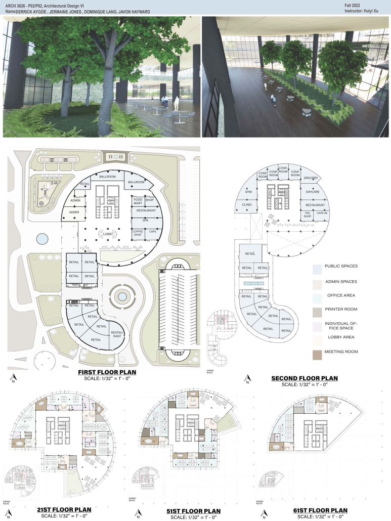
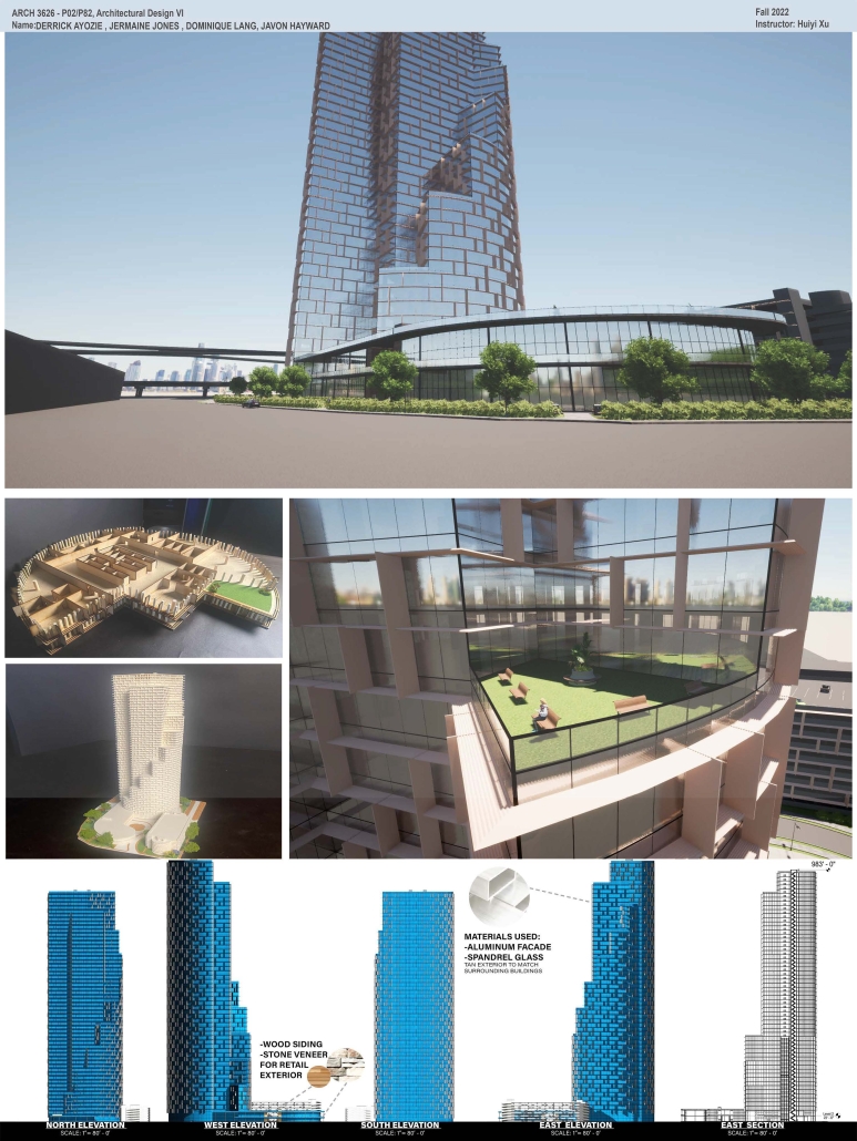
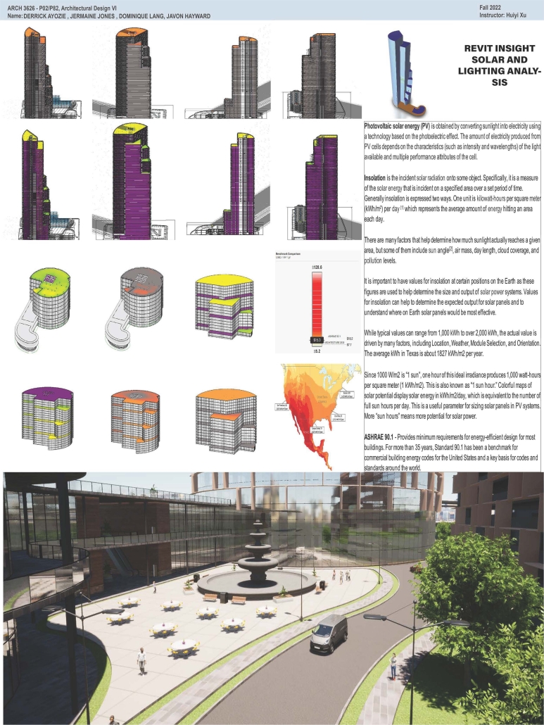
High-Rise Building by Jermaine Jones, Dominique Lang, Javon Hayward & Derrick Ayozie, B.Arch ‘23
Prairie View A&M University | Advisor: Huiyi Xu

According to the U.S. Census Bureau’s population estimates from 2021, there were 69,094 new residents added to the Greater Houston area. Some developers have purchased land in the Houston City Centre area, on the corner of I-10 Hwy and Beltway 8 in the City Centre, and plan to build an iconic high-rise building. This project is a mixed-use office building. The location of the project is in the Memorial City district of Houston, Texas. City Centre is a 50-acre development with 2.1 million square feet of gross floor space, including 400,000 square feet of retail, restaurants, and entertainment, a 149,000 square foot fitness facility, 425,000 square feet of office space, a variety of rental, and non-rental residential developments: a Microsoft office, Memorial Hermann Hospital, Memorial City Mall, Houston of City College, and diversified restaurants such as Taste of Texas, Pappadeaux Seafood Kitchen, and other retailers are all around it. 

This project will bring more people to this area to contribute to the local business and land value. The potential tenants of the high-end office building with commercial spaces and a parking garage will be the headquarters offices, banks, medical offices, high education offices, etc.

DIGNITY by Macinnis Kraus, M.Arch ‘23
The University of Texas at Austin | Advisor: Nichole Wiedemann

Working with a local church in West Campus and inspired by the student interest in “serving” over “services,” the design is for a re-combination of worship, living, and service. Two transitional housing towers provide residences for formerly itinerate populations and create bookends to the public landscape. The individuals may work here –apprenticing in the artisan maker space or running the restaurant– providing some financial stability for the immediate and the future. In addition, public showers, laundry, and bathroom facilities support the broader community. Embracing the pragmatic and poetic potential of water, light, and body (human-scale moments), the project seeks to provide dignity for all user groups.

This project was nominated for Design Excellence at the UT School of Architecture.

Instagram: @nicholewiedemann

Intertwining blocks in Los Angeles by Joey A. Tomshe, B.Arch ‘23
Tulane University | Advisor: Ruben Garcia-Rubio

Intertwining blocks is proposed to act as an agricultural information and research center for the previously designed master plan, and, in the future, there would be more of these spread out around LA which are connected. It will feature many new innovations in the agriculture field with the goal of informing the public about the advanced research being performed in LA today.

The initial concept for this project was to intertwine four blocks, creating an indoor street that acts as a social condensing space, relating to the distinct street types created in the master plan, with the social condensing space containing lighter elements than the heavier blocks. The project features six types of farms, a mediateque, and research stations for botanists. The form of the social condenser space comes from trees in plan view, then those same circles are introduced in sections to influence the roof. To combat the heat from glass roofs, the proposal will be installed with an automated computer system that processes and manages a database to optimize comfort and energy efficiency. Along the face of the roof structure is a series of operable louvers that can open and close, which allows for natural ventilation as well as sun deflection. Similarly, on the roof the northern faces of the arches can pivot open, allowing for full circulation. Furthermore, the roof allows for rain collection with built-in gutters and features solar panels on the north two blocks. Due to the repetition of louvers on the roof, a facade of varying size stone panels is introduced to disrupt this rhythm and add variation. Some panels were removed for windows and others, on the south facade, were turned into farming panels that interact with the farm in front.

Instagram: @rubgarrub

2023 Study Architecture Student Showcase - Part XI

Welcome back to another week of the Study Architecture Student Showcase! In Week XI, we highlight student projects that use space as an avenue to create equitable community resources. From neighborhood civic buildings to multi-faceted housing units, this week’s featured projects address bridging societal gaps and emphasize the importance of creating opportunities for social interaction and dialogue between diverse communities. By taking a look at the projects below, you will learn how each student project proposes a space that promotes inclusivity and fosters community connections.

Center for Tolerance by Rebecca Dejenie, B.Arch‘23
The Boston Architectural College | Advisors: Peter Martin and Robert Gillig

This design imagines the Roxbury Crossing station as a free station as it becomes a new node for the city of Boston. The Center for Tolerance is a civic building that would allow different activities from music studios, makerspaces, food court, material exchange library, multi-purpose classrooms, exhibits, offices, studios, therapy clinics, and meditation spaces, to gardens with seats to encourage users to sit and converse with one another. As the site is located on the border of two neighborhoods, it will provide a spatial bridge for people from different backgrounds to come together to heal. This building will be used as a resource for all – especially those who come from disadvantaged backgrounds. This building is a representation of what equity in the built environment can look like.

This project was awarded the Best of B. Arch Degree Project 2023.

Dis-Luxury from Luxury: Inequality Brought by Consumerism and Luxury Reimagining by Eduardo A. Caraballo-Arroyo B.Arch ‘23
Pontifical Catholic University of Puerto Rico | Advisors: Pedro A. Rosario-Torres, Luis V. Badillo-Lozano & Manuel De Lemos-Zuazaga

In Curitiba, Brazil, an architectural project is reimagining luxury and addressing social division to foster a community that values inclusivity, sustainability, and social equity. By challenging the pursuit of material wealth and status, this project aims to create an inclusive society where individuals feel fulfilled and valued. The project recognizes that luxury is often associated with abundance and comfort but can lead to marginalization, inequality, scarcity, and disconnection within communities. In a capitalist and consumerist society, luxury is marketed as an asset of ease and comfort, perpetuating social divisions and excluding those who cannot afford it. To address this problem, the architectural project seeks to interconnect both ends of the wealth spectrum through spaces that foster communication, action, and self-development.

The objective is to design an urban-social space that combines the rewards and necessities derived from luxury. This space offers physiological resources, developmental opportunities, a sense of belonging, and luxurious experiences, becoming a social equalizer and a support system for the community. By emphasizing the emotions associated with luxury, such as power, confidence, security, and contemplation/enjoyment, the project creates spaces for interactions and community communication. Elements such as small-scale farming, community/cultural integration, open spaces for social and community activities, and emancipatory and cultural educational spaces are included in the program. The project also aims to reduce limitations by embracing degrowth and minimalist systems.

The main strategy revolves around luxury as an emotional reaction. Luxury consumption triggers psychological responses associated with trust, power, contentment, and security. The architectural design incorporates pathways and axes that lead towards focus areas, lifting the first level and creating porous volumes to enhance openness and connection. Strategically positioned openings offer views towards the focus areas, creating voids and spaces that provide experiential and spatial experiences. By implementing this design, the project aims to address luxury inequality, foster social cohesion, and create spaces that promote inclusivity, equal access to resources, and a sense of well-being for all members of society. Through its transformative power, this project challenges conventional notions of luxury and redefines its role in creating a more connected and equitable world.

Instagram: @_eaca23

Kordilyera Vernacular Inspired Interpretive Center in Paradise Hills, San Diego by Greco Cosente, B. Arch ‘23
NewSchool of Architecture and Design |Advisor: Raúl Díaz

With historical and cultural aspects of Paradise Hills being mainly single-family dwellings from the 1950s and its relation to the military, specifically the navy, a demographic group of the Filipino population has emerged throughout the years. Generic designs of suburban parks do not cater to the needs of the current population. In an attempt to advance green space, park designs drawing from culture with the architectural language of pavilions are explored. The project caters to bridging the gap between community park design and Filipino residents through a Kordilyera-inspired Interpretive Center in Paradise Hills, San Diego; A reinstitution of cultural identity for U.S.-born Filipino-Americans.

The project was awarded the Outstanding Design Award – Degree Project.

U Belong: A New Live/Work Housing Prototype by Jada Rezac and Margaret Phillips, M. Arch ‘23
Kansas State University |Advisor: Zhan Chen – Assistant Professor

The current housing crisis in the US challenges architecture to address a critical need while presenting the opportunity to propose new solutions. The studio, titled: In With the New, operates as a laboratory in which to explore innovative possibilities for multi-family living. Students design new models that reframe housing as a multi-faceted domain, able to navigate various scenarios and support diverse communities.

Jada and Margaret’s project responds to the evolving needs of contemporary living by integrating residential units and workspaces. The project uses a calibrated arrangement of U-shaped modules to create new possibilities for both living and working.

The unit clusters maintain a high degree of porosity, which allows more access to natural light and promotes cross ventilation. These considerations enhance human comfort and productivity while presenting an innovative strategy for improving the overall health of its inhabitants.

The relationship between living and working units and their arrangement also seeks to alleviate social isolation. The units are grouped into smaller neighborhoods, fostering familiarity and more meaningful social interactions. Communal spaces within these neighborhoods and intersecting circulation paths also help build a stronger sense of community within a large complex.

The project was nominated for the Nominated for the Heintzelman Prize at Kansas State University.

Instagram: @jadarezac ; @margaret_rose_phillips ; @studiozhan

See you next week for the next installment of the Student Showcase!