Posts
2023 Study Architecture Student Showcase - Part XXXIII
Welcome to the final edition of the 2023 Study Architecture Student Showcase! In Part XXXIII, we highlight student work that centers on public spaces. The showcased designs include public parks, meeting spaces, community centers, commercial retail spaces, parking structures, pools, and more.
Re-encontrarse (Re-united) by Sophie Esther Zurhaar Ortiz, B.Arch ‘23
Universidad Anáhuac Querétaro | Advisors: Jorge Javier & Francisco Paille
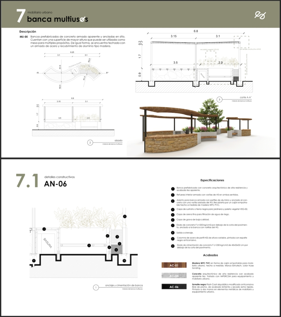
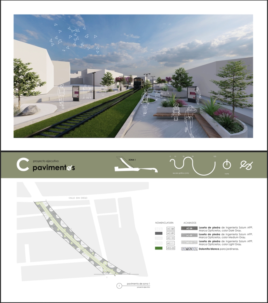
This project seeks to generate an urban design proposal for the recovery of public space in Felipe Carrillo Puerto. Aiming to propose meeting spaces where all kinds of activities can be carried out, recover the railroad tracks to stop being a physical barrier, and defragment the urban fabric, offering cohesive, healthy, and functional meeting spaces that together can regenerate the social fabric.
Instagram: @sophiezurhaar, @arqwave
PROSPECT NEW ORLEANS by Olivia Georgakopoulos, B.Arch ‘23
Tulane University | Advisor: Ruben Garcia-Rubio
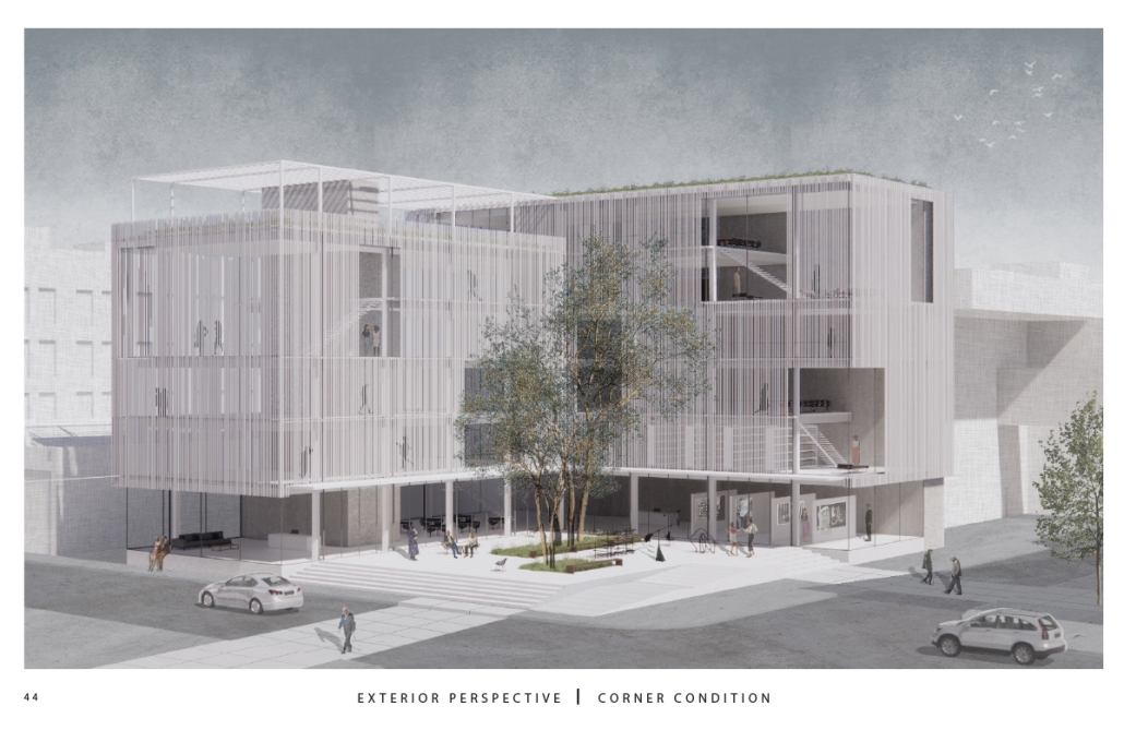
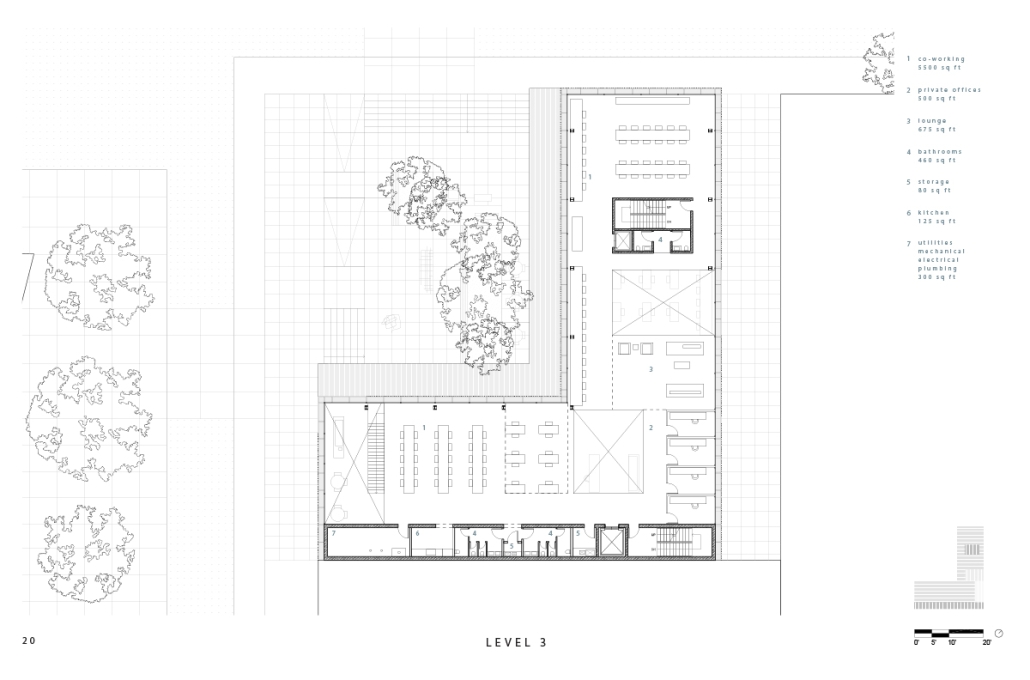
This project proposes to open the building to the city, creating a place that adds to its rich urban fabric. The site is a parking lot at the corner between the Contemporary Arts Center and the WWII Museum. While there are many voids in the surrounding context, like this site, they are not habitable. This project provides a much-needed public space for the many visitors to the surrounding museums. Taking inspiration from the L-shaped building typology in New Orleans, the building opens to the city, creating a public plaza.
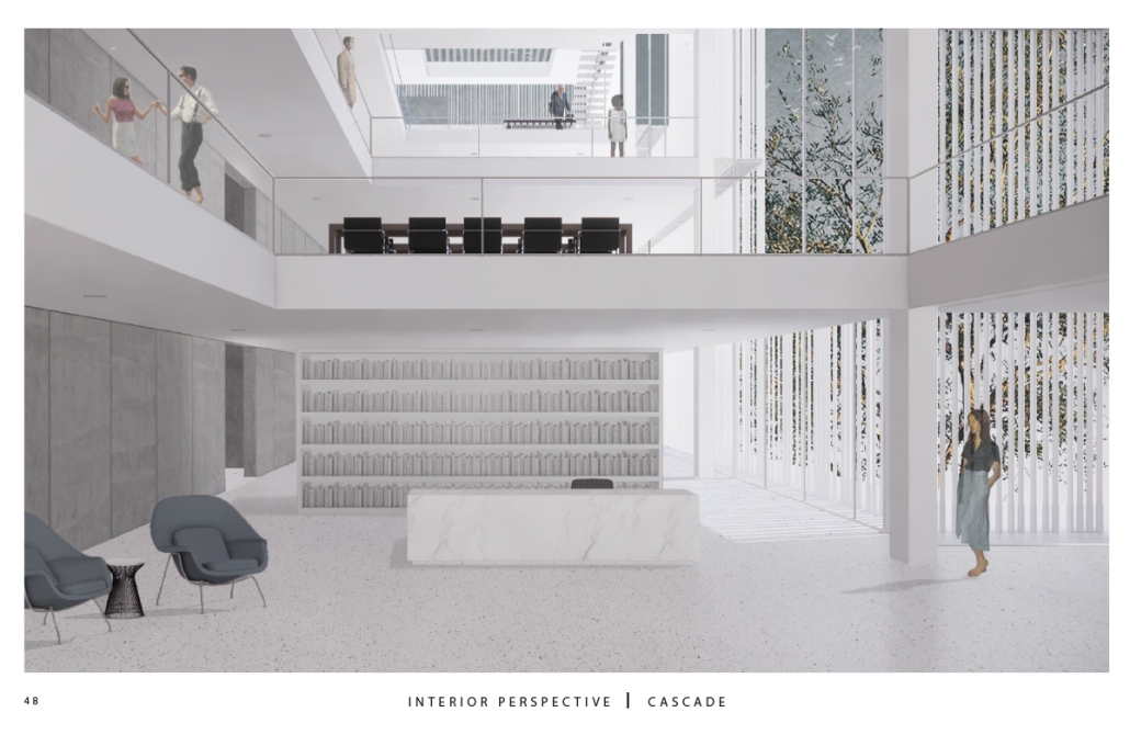
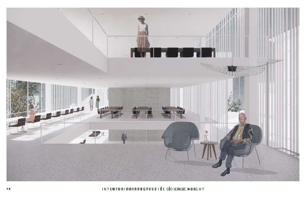
The building functions as an open-public platform connecting Camp Street and Andrew Higgins Blvd. The glass-enclosed first floor is fluid and can be completely opened, allowing for space not to be defined by interior or exterior. Rather, programs can spill out and interact between the interior and the plaza. The ground floor then becomes animated by human activity. The public programs, gallery, cafe, lobby, and lounge are housed on the first floor, and spaces to support the art center are above.
Transparency of the building is achieved through the aluminum louvered facade, which acts as a theatrical scrim. This veiled facade reveals the animation on the inside of the building. This transparency is also experienced from the inside looking out: the interior programs interact with filtered and framed views of the city.
A chain of internal double-height spaces forms a visual cascade through the building, providing internal transparency and animation with continuous views from the bottom floor to the top floor and the sky. The overall design provides continuity between the interior, the plaza, the street level, and the city.
Instagram: @rubgarrub
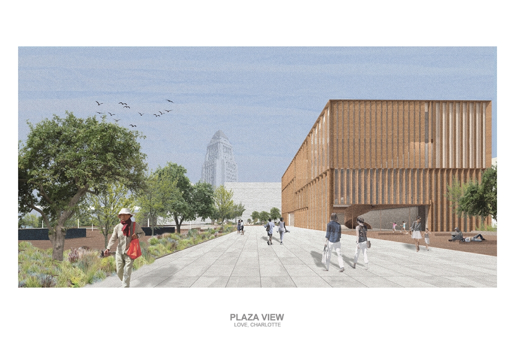
Los Angeles Media Library by Charlotte J. Love, B.Arch ‘23
Tulane University | Advisor: Ruben Garcia-Rubio
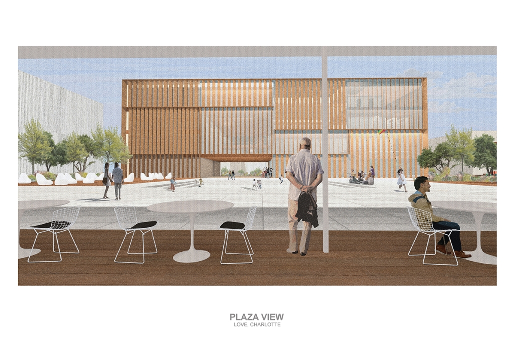
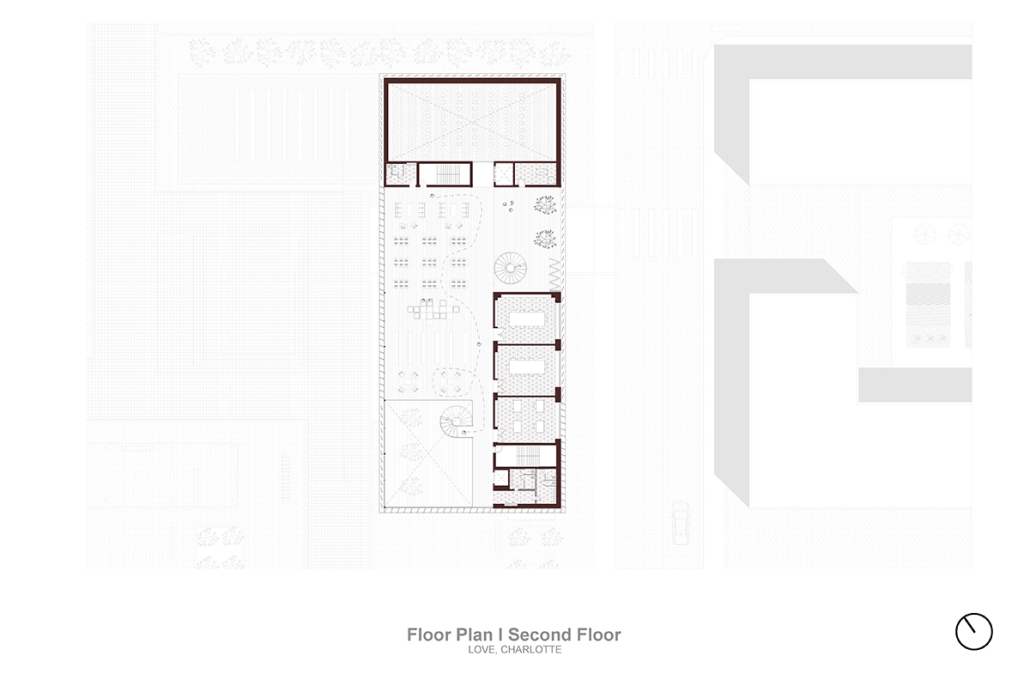
The Los Angeles Media Library began by building upon the urban design. The building began with the broken urban block typology found throughout the site, this promoted a continued focus on mobility within the project. The urban block shape was altered to accommodate one large building wrapped in louvers and two smaller pavilions hosting different program focuses on a plaza. This iteration of the broken urban block creates an inviting place for a public plaza. This plaza being at the literal intersection of the business and arts district makes it a perfect spot to hold a media center and library. This is relevant for both the site and the Greater Los Angeles.
The plaza has a number of public transportation stops and is located across the street from two museums making the plaza equally important to the design. The open space has a café, reading area, pavilion, and an outdoor theater. The buildings and walkways align with the surrounding roads and buildings leading to a central sunken space at the center of the plaza. Held within the building are two zones with thickened walls holding private programs such as classrooms, dark rooms, offices, etc. This allows the rest of the building to be much more open with a number of double heights as well as spaces with an indoor-outdoor feeling. This allows the building to be fluid and connected to the plaza, blurring the line between public and private spaces.
Instagram: @rubgarrub
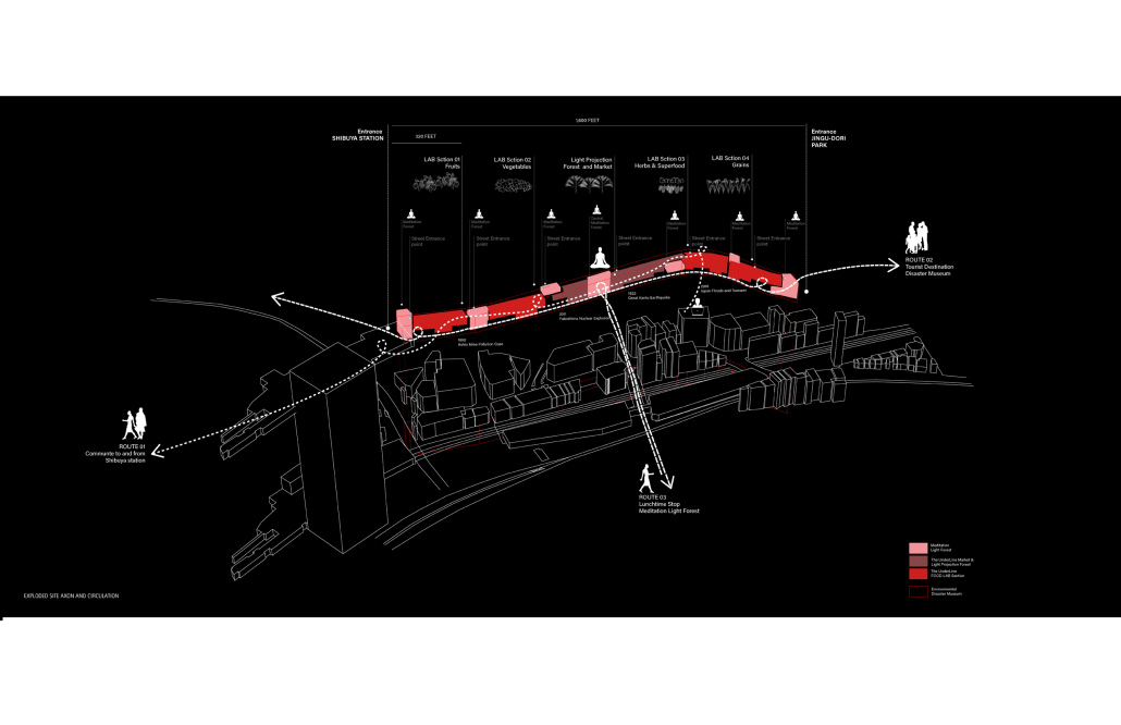
HALLOWED GROUND by Ramona Reinhart, M.Arch ‘23
University of North Carolina at Charlotte | Advisor: Chris Jarrett
In “Taoka Reiun and Environmental Thoughts in the Early 1900s,” Ronald Loftus addresses Reiun’s cultural critique of Western modernization and the devastating forms of pollution that followed during Japan’s Meijin state beginning in 1880. As an early environmentalist and anti-modernist, Reiun argues that these natural disasters are ultimately a result of humanity’s disconnection from the natural and spiritual world.
Located in Shibuya, Hallowed Ground proposes “The Under Line,” a linear futuristic public park, lab farm and market, integrated urban meditation spaces, and a museum for environmental disasters as a response to Tokyo’s culture of hyper-consumerism and capital development that “buried” many of Japan’s spiritual traditions and natural ecologies. The constant strive for economic growth resulted in large areas of impervious surfaces in the city. Surfaces that are now being hollowed out.
This project won the 2023 Best Architectural Diploma Project. As well as 2023 Excellence in Architectural Representation.
Instagram: @_ramonareinhartg
Little Megastructure by Yiman Yiman, M.Arch ‘23
UCLA Architecture and Urban Design | Advisor: Greg Lynn
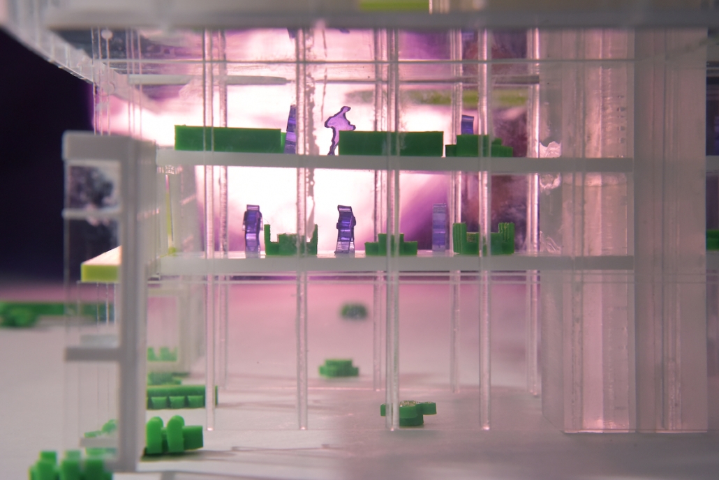
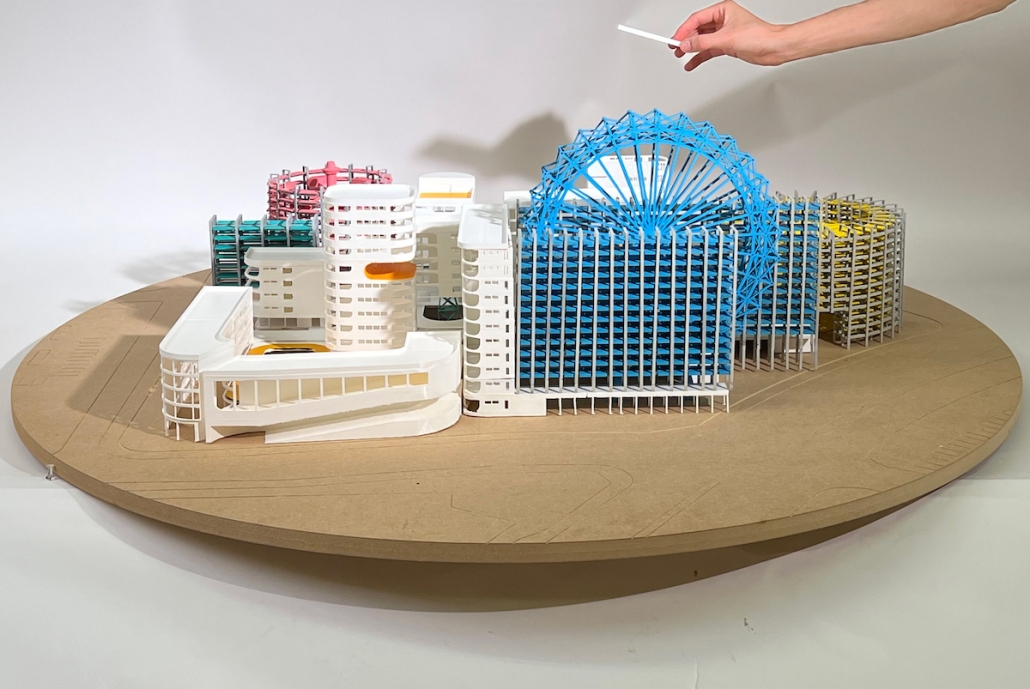
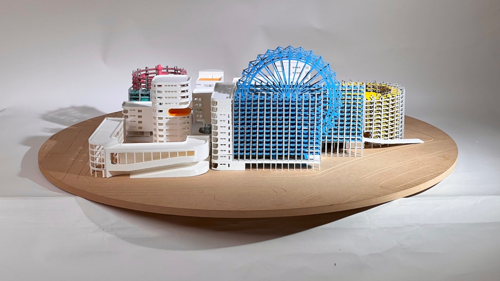
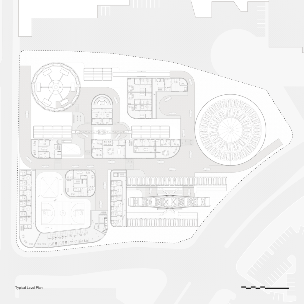
“Little Megastructure” configures an inclusive community of aggregated spatial prototypes that celebrates social connection and belonging while supporting individuality. The prototypical forms can be combined and composed in a variety of ways to create a wide range of spaces. Clusters of parks, plazas, courtyards, and atriums in between modules throughout the megastructure foster a sense of community and belonging. With a clear hierarchy of spaces that are designed for different purposes and activities, having all the components of a city creates a sense of urbanism.
Park! Park! by Motomi Matsubara ‘23
UCLA Architecture and Urban Design | Advisor: Greg Lynn
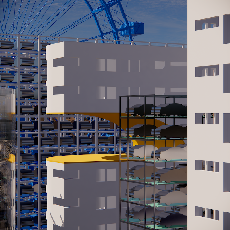
“Park! Park!” offers a set of housing towers, their shapes, and scales informed by the interplay between the behavior of residents inside and automobile traffic outside. One of the towers is taller and leaner; another more lateral and rectangular. Here, fillets perform not only as an intimate icon, each interacting softly with adjacent housing towers, but also as mediators of the different scales of motions between two different physical bodies–people and cars.
Instagram: @m2c_works
Undefined Parking by Katie Yuan, M.Arch ‘23
University of Southern California | Advisor: Yaohua Wang
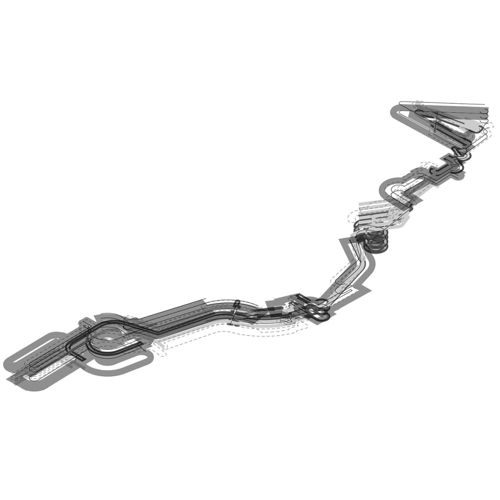
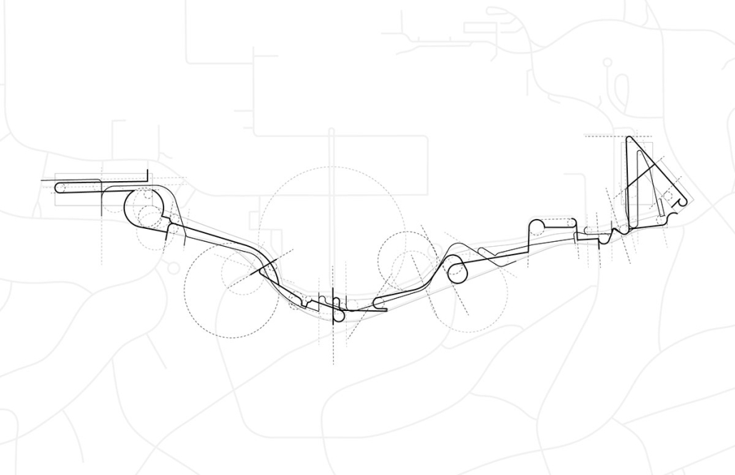
The lines drawn on maps to define the borders of countries and territories may appear solid and definitive at a glance. However, when magnified and viewed at a larger scale, these lines are composed of segments, curves, and dashes that intersect, connect, and overlap. Lines are one-dimensional, but when given 3-dimensional qualities, they become less concrete and defined. In other words, when lines are given different widths and heights, they are no longer elements that separate or confine objects, but rather they embody multiple conditions that can become spaces, tectonics, connections, and circulations.
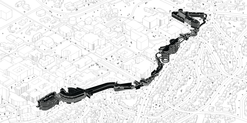
Formed through a series of intersecting, shifting, and offsetting lines, Undefined Parking appears as an urban boundary that separates the UCLA campus and residential area at an urban scale. In this condition, the boundary becomes a partition wall. At an architectural scale, the parking structure becomes the destination for both entering and exiting the site. Yet simultaneously, the structure’s various programs (offices, classrooms, green space, etc.) blur the distinction between the university campus and the urban site. In this condition, the boundary becomes a destination. At a model scale, the volumes, ramps, walls, and planes are interlocked and joined together through the distinct tectonic elements of each individual piece. In this condition, the boundary becomes a connection.
Perhaps, lines or boundaries exist in multiple conditions and cannot be defined…
This project was awarded the USC Master of Architecture Distinction in Directed Design Research.
Instagram: @katie0712yl, @yaohua_wwww
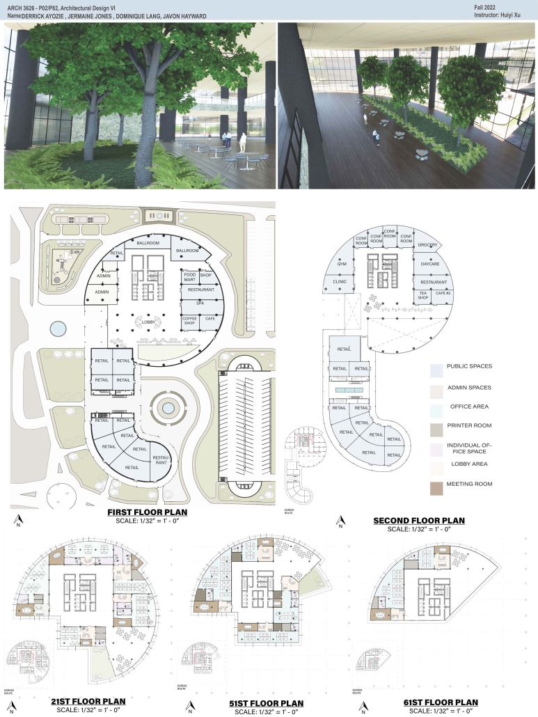
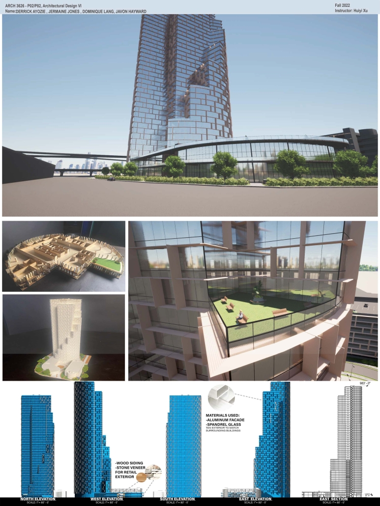
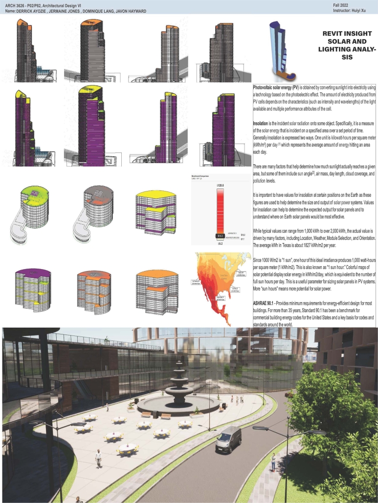
High-Rise Building by Jermaine Jones, Dominique Lang, Javon Hayward & Derrick Ayozie, B.Arch ‘23
Prairie View A&M University | Advisor: Huiyi Xu
According to the U.S. Census Bureau’s population estimates from 2021, there were 69,094 new residents added to the Greater Houston area. Some developers have purchased land in the Houston City Centre area, on the corner of I-10 Hwy and Beltway 8 in the City Centre, and plan to build an iconic high-rise building. This project is a mixed-use office building. The location of the project is in the Memorial City district of Houston, Texas. City Centre is a 50-acre development with 2.1 million square feet of gross floor space, including 400,000 square feet of retail, restaurants, and entertainment, a 149,000 square foot fitness facility, 425,000 square feet of office space, a variety of rental, and non-rental residential developments: a Microsoft office, Memorial Hermann Hospital, Memorial City Mall, Houston of City College, and diversified restaurants such as Taste of Texas, Pappadeaux Seafood Kitchen, and other retailers are all around it.
This project will bring more people to this area to contribute to the local business and land value. The potential tenants of the high-end office building with commercial spaces and a parking garage will be the headquarters offices, banks, medical offices, high education offices, etc.
DIGNITY by Macinnis Kraus, M.Arch ‘23
The University of Texas at Austin | Advisor: Nichole Wiedemann
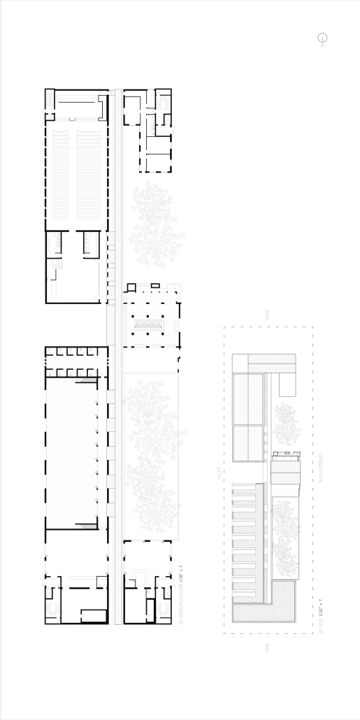
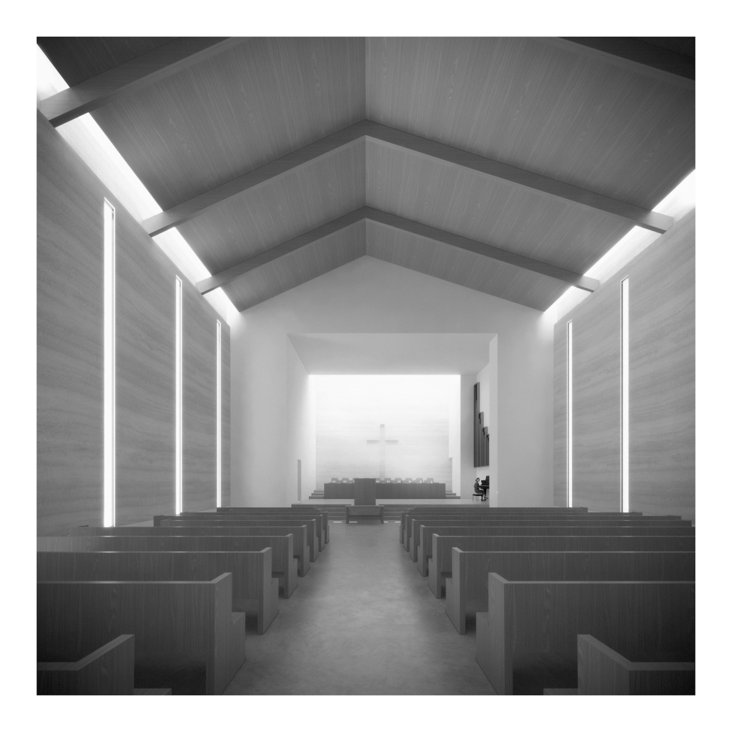
Working with a local church in West Campus and inspired by the student interest in “serving” over “services,” the design is for a re-combination of worship, living, and service. Two transitional housing towers provide residences for formerly itinerate populations and create bookends to the public landscape. The individuals may work here –apprenticing in the artisan maker space or running the restaurant– providing some financial stability for the immediate and the future. In addition, public showers, laundry, and bathroom facilities support the broader community. Embracing the pragmatic and poetic potential of water, light, and body (human-scale moments), the project seeks to provide dignity for all user groups.
This project was nominated for Design Excellence at the UT School of Architecture.
Instagram: @nicholewiedemann
Intertwining blocks in Los Angeles by Joey A. Tomshe, B.Arch ‘23
Tulane University | Advisor: Ruben Garcia-Rubio
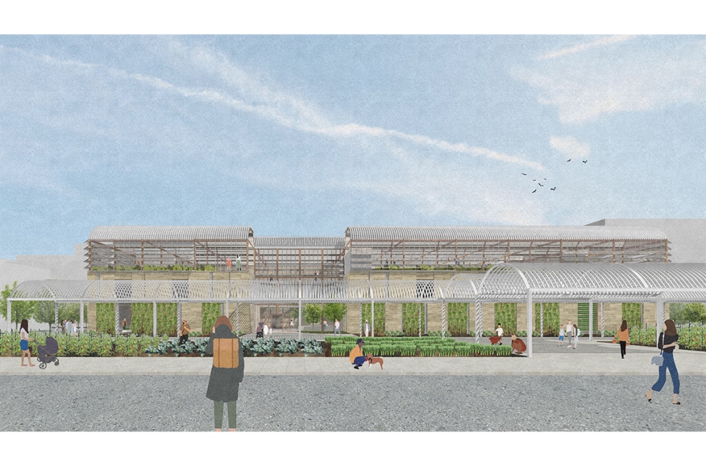
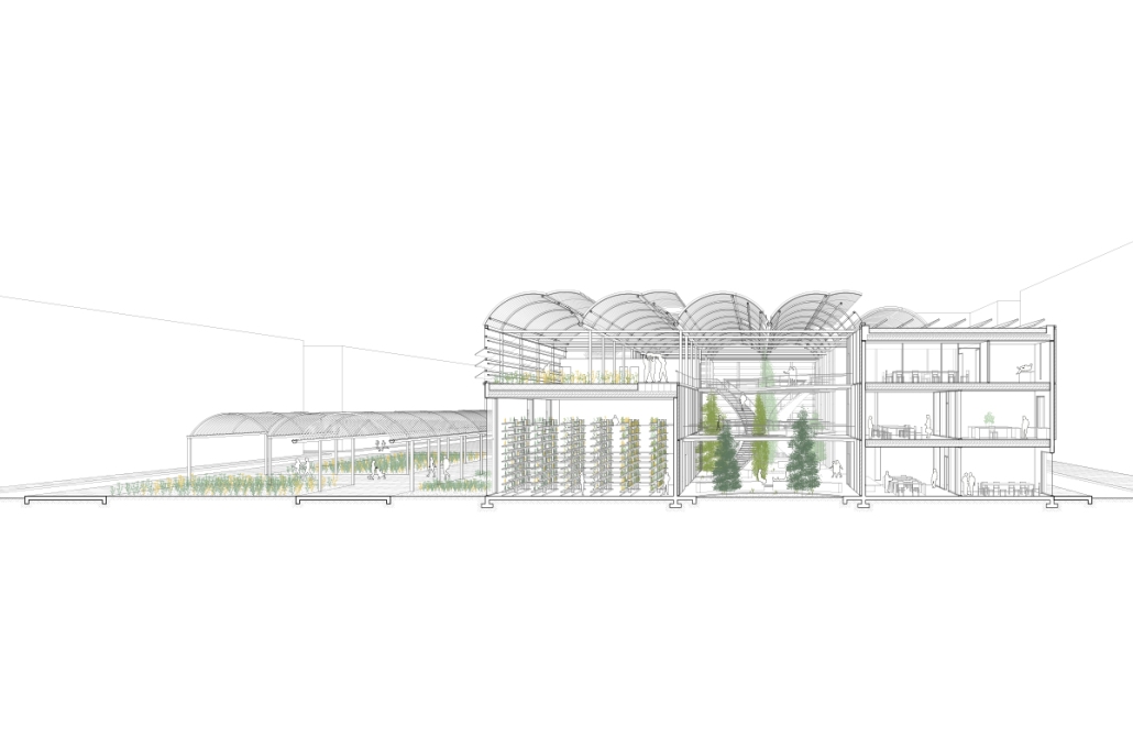
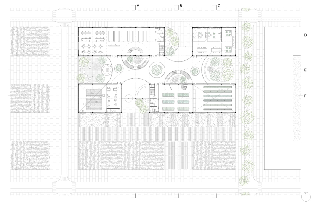
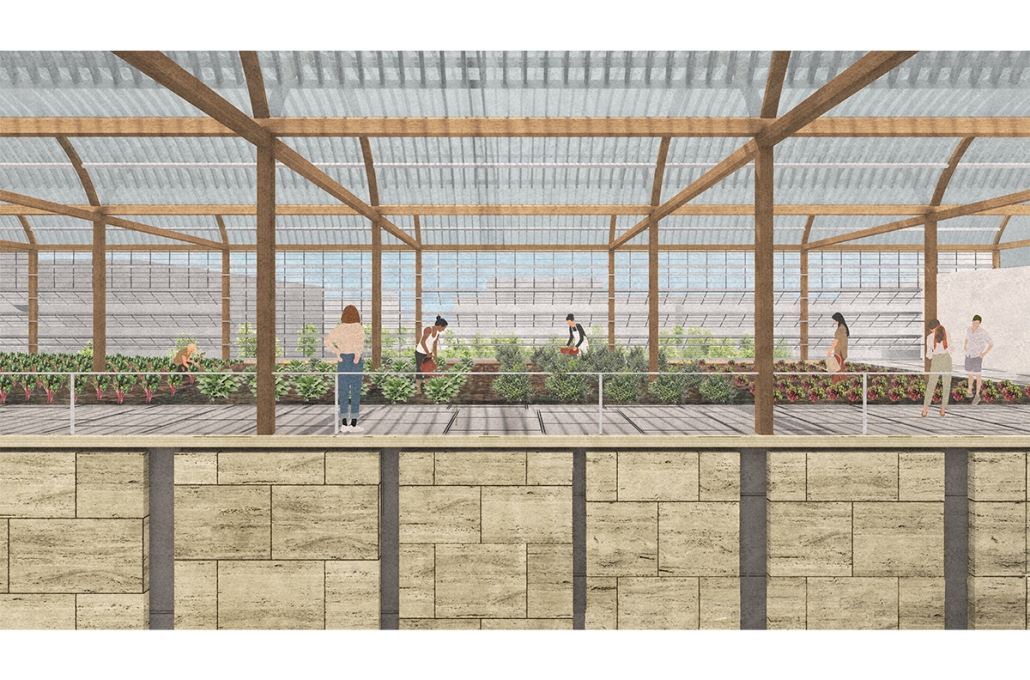
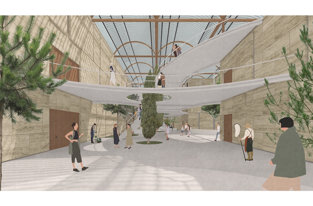
Intertwining blocks is proposed to act as an agricultural information and research center for the previously designed master plan, and, in the future, there would be more of these spread out around LA which are connected. It will feature many new innovations in the agriculture field with the goal of informing the public about the advanced research being performed in LA today.
The initial concept for this project was to intertwine four blocks, creating an indoor street that acts as a social condensing space, relating to the distinct street types created in the master plan, with the social condensing space containing lighter elements than the heavier blocks. The project features six types of farms, a mediateque, and research stations for botanists. The form of the social condenser space comes from trees in plan view, then those same circles are introduced in sections to influence the roof. To combat the heat from glass roofs, the proposal will be installed with an automated computer system that processes and manages a database to optimize comfort and energy efficiency. Along the face of the roof structure is a series of operable louvers that can open and close, which allows for natural ventilation as well as sun deflection. Similarly, on the roof the northern faces of the arches can pivot open, allowing for full circulation. Furthermore, the roof allows for rain collection with built-in gutters and features solar panels on the north two blocks. Due to the repetition of louvers on the roof, a facade of varying size stone panels is introduced to disrupt this rhythm and add variation. Some panels were removed for windows and others, on the south facade, were turned into farming panels that interact with the farm in front.
Instagram: @rubgarrub
2023 Study Architecture Student Showcase - Part XII
Welcome to Part XII of the Study Architecture Student Showcase! This week, the featured student projects invite viewers to reimagine performance centers through a new lens. The following designs use film, sustainable construction, and music to create innovative spaces. As the venue for artistic expression, these performance centers provide opportunities for exploration, inspiration, and celebration.
Delaminated Ground by Austin James Barcelona, B.Arch ‘23
Woodbury University | Advisors: Aaron Gensler and Erin Wright
Site Location: Governors Island, New York City
“Art makes the familiar strange so that it can be freshly perceived. To do this, it presents its material in unexpected and even outlandish ways: the shock of the new.” —Viktor Shklovsky
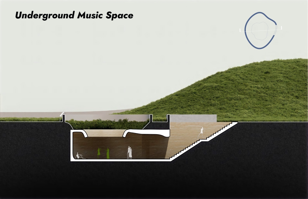
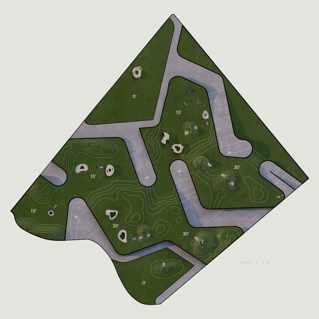
This project alludes to spaces of leisure – a park, a field, a golf course – while delaminating the ground plane to offer spaces of diversion initially defamiliarizes the original subject, and thus, distancing it from the observer. It asks one to perceive in the ground for the first time – to fully grasp something that seems routine in hopes to trigger one’s imagination and inspire new ideas. In a time where our world is at our fingertips and with navigational tools and endless algorithms force-feeding us ideas, this project encourages one to get lost and to see the world anew offering a space exploration – celebrating what can happen when we lose ourselves – in a place, in our feelings, or in an experience. These poetic consequences hope to influence our environmental, ethical, emotional, and esthetic prejudices and understandings to create a sense of wonder while one wanders through the delaminated ground. When fully immersed in space, one is encouraged to develop new connotations and celebrate the art of collaboration through discovery and happenstance.
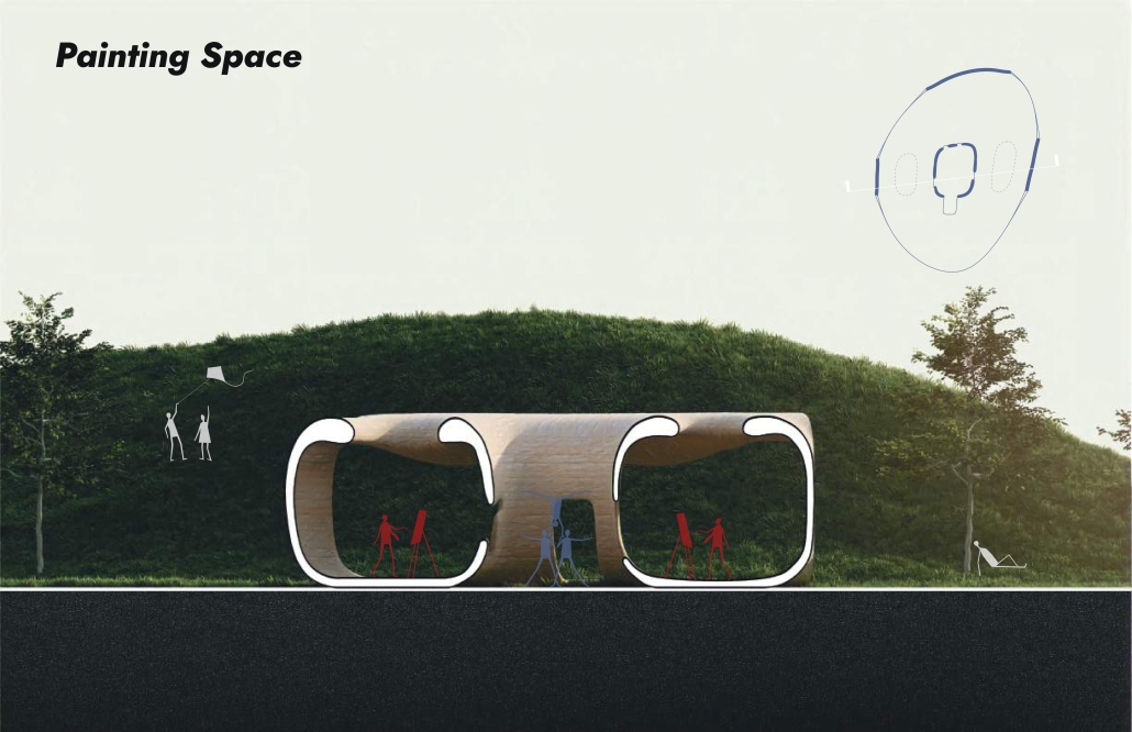
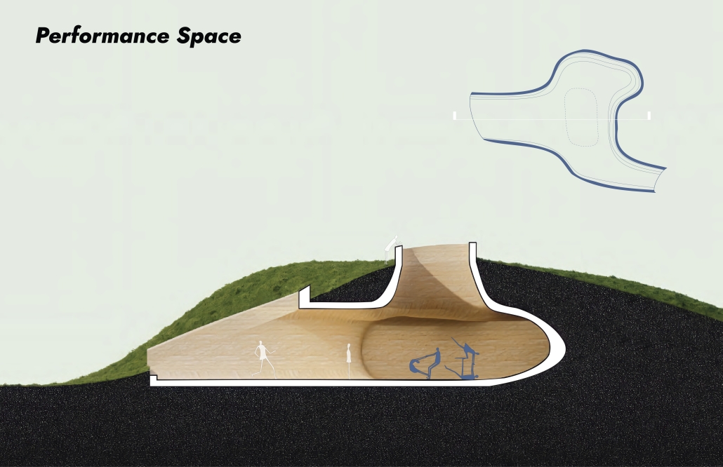
Sound studies were conducted to meticulously design and create three distinct types of spaces on the site: music, painting, and performance areas. The music spaces have been strategically placed underground to optimize acoustic performance. By situating the painting spaces above ground, artists can benefit from abundant natural lighting, fostering an ideal environment for their creative expression. The performance spaces have been integrated into the landscape, submerged within the topography to provide visitors with an immersive theatrical experience that transcends traditional boundaries.
This project was recognized in the Woodbury Thesis Archive (MADE Woodbury Exhibition).
Instagram: @austinbarcelona / @austinbarcelona_archives
Ambivalent Theater by Chris Saour ‘23
Rensselaer Polytechnic Institute School of Architecture | Advisors: Ryosuke Imaeda, Faculty Advisor. Rhett Russo, Final Project Assessment Committee Member
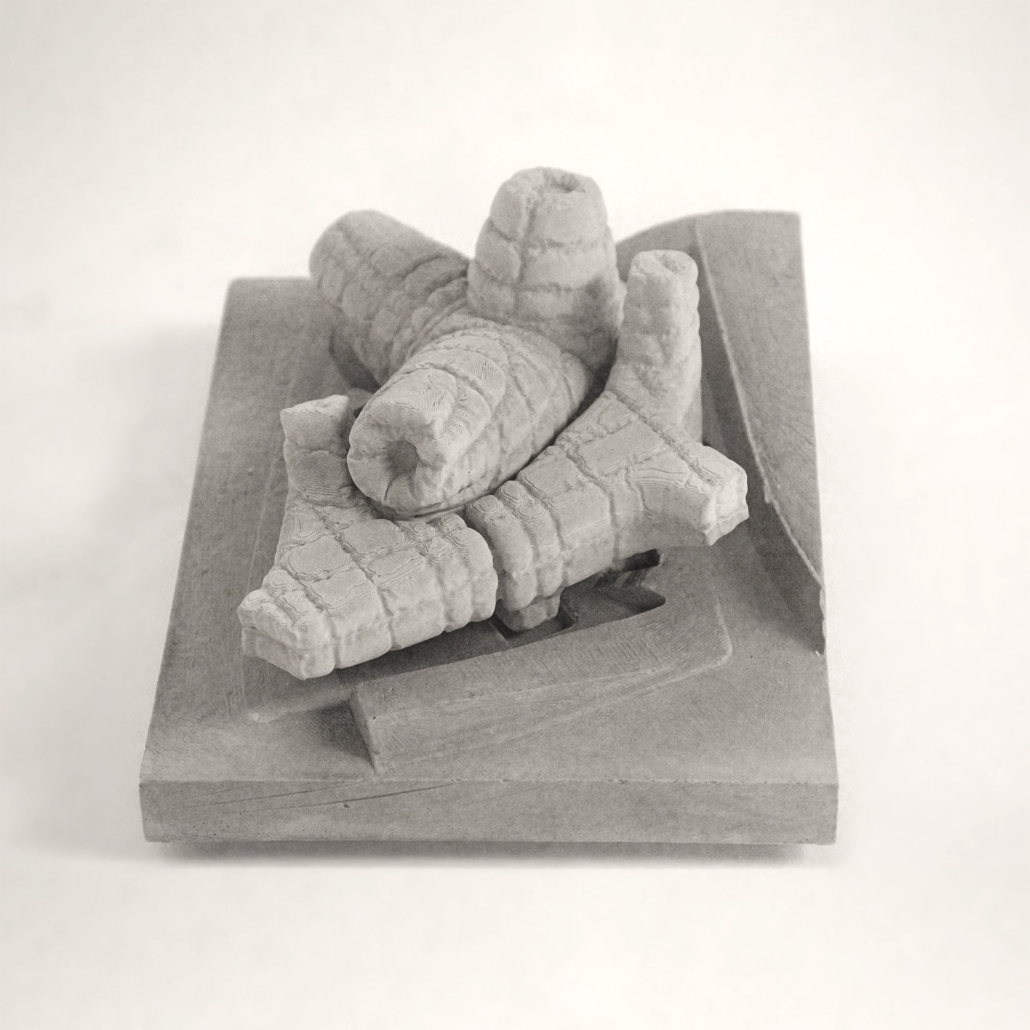
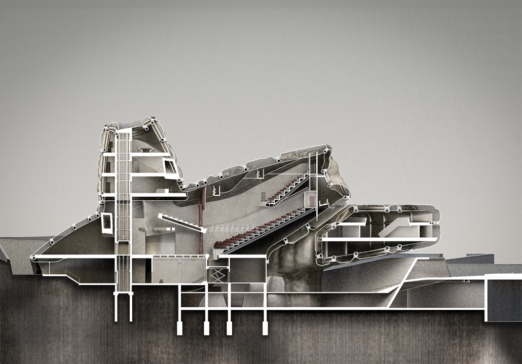
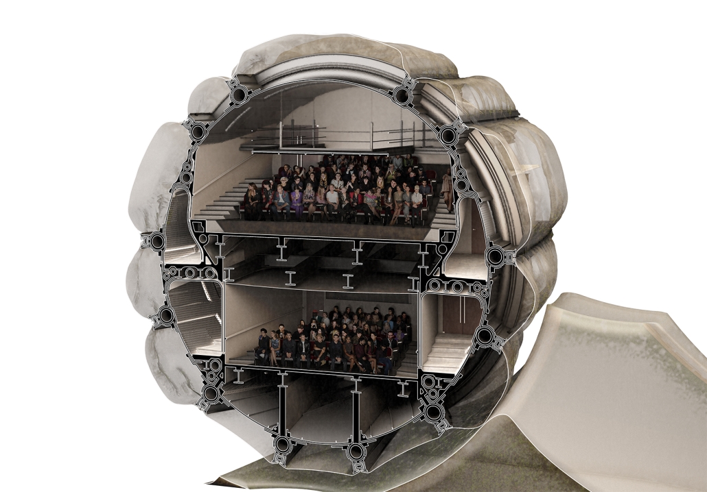
We perceive architecture in perspective despite its ubiquity of flat construction. This project reevaluates the relationship between flat and perspective through a series of camerawork and explores architectural anonymity and ambivalence.
The two visual modes are unfolded through an ideological interpretation of fisheye lenses, telephoto lenses, and dolly zooms. Films like Jean-Pierre Jeunet and Marc Caro’s The City of Lost Children (1995) use fisheye lenses to warp characters, while photographs like Arne Svenson’s Neighbors and Michael Wolf’s Tokyo Compression employ telephoto lenses to hide subjects’ identities. Alfred Hitchcock’s Vertigo (1958), Steven Spielberg’s Jaws (1975), and Tobe Hooper’s Poltergeist (1982) dynamically oscillate between them by using dolly zooms. The ideas of anonymity and program are further linked to Michael Mann’s Manhunter (1986), and Walter Gropius’s Total Theater (1927). Rooted in, yet, contrary to three theories of Jacques Rancière, Michel Foucault, and Walter Benjamin, anonymity in this project is redefined as an effect that bestows identity over time and dynamically changes between speaking and unspoken.
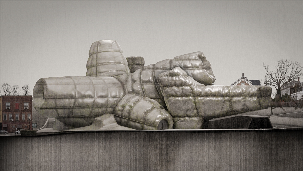
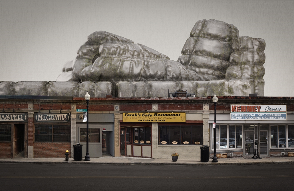
The ambiguity of the materiality of the theater, whether concrete, metal, or fabric, is created by the vinyl façade, which inflates and deflates by the heat produced by the audiences and performances. Located in Boston, Massachusetts, the building offers the fluctuations of the temperatures between inside and outside, which contributes to the movement of the façade. When it expands, the skin becomes flat in some places while wrinkled in others. When the theater is not operating, the façade deflates and remains loose and flaccid. One can view the building from afar, and perhaps recognize if two auditoriums are operating together or independently by seeing their expressions.
This project is not to produce a spectacular theatrical experience as an urban icon, which for some reason tends to be a common goal of contemporary theaters. Rather, by ideologically understanding the dolly zoom as both orthogonal (flat) and fisheye (indexical), it finds its own architectural significance through the quasi-material change granted by the modulation of the façade between tense and flaccid. The theater, thus, lies in the center of discrete materials, the ambivalence of which yields new aesthetics.
Instagram:@chrissaour, @ryoimaeda
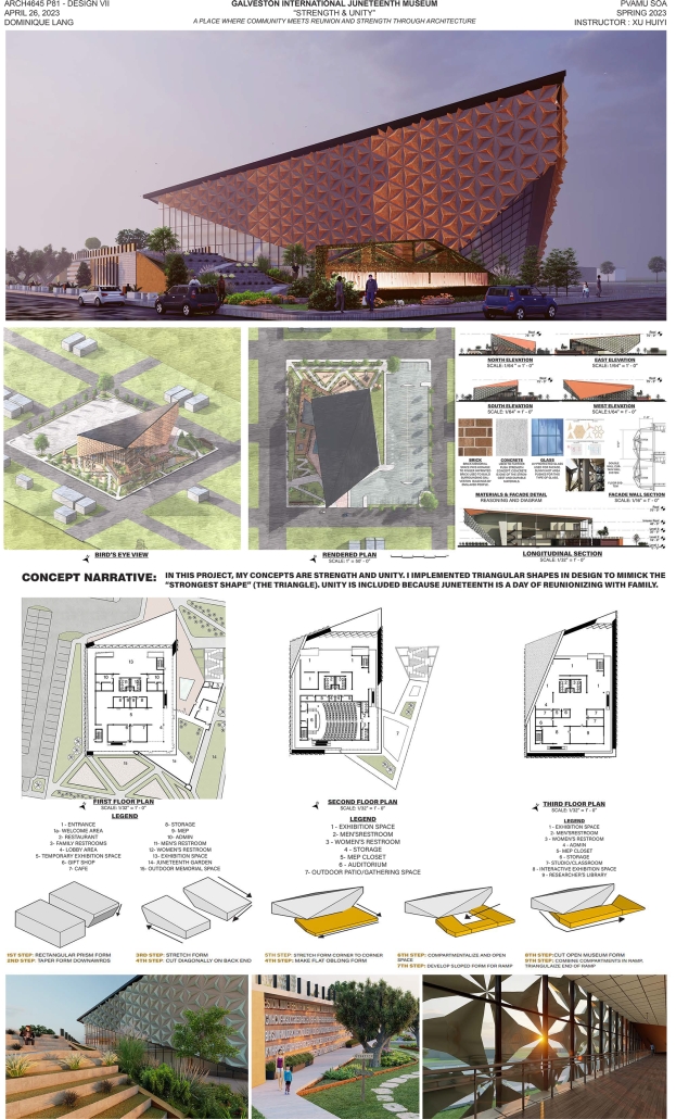
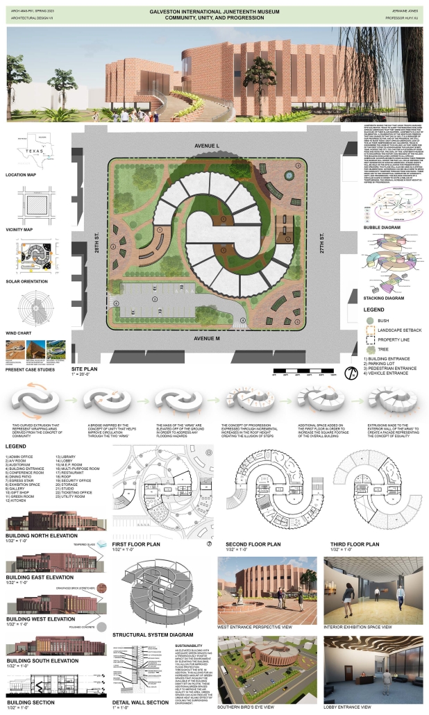
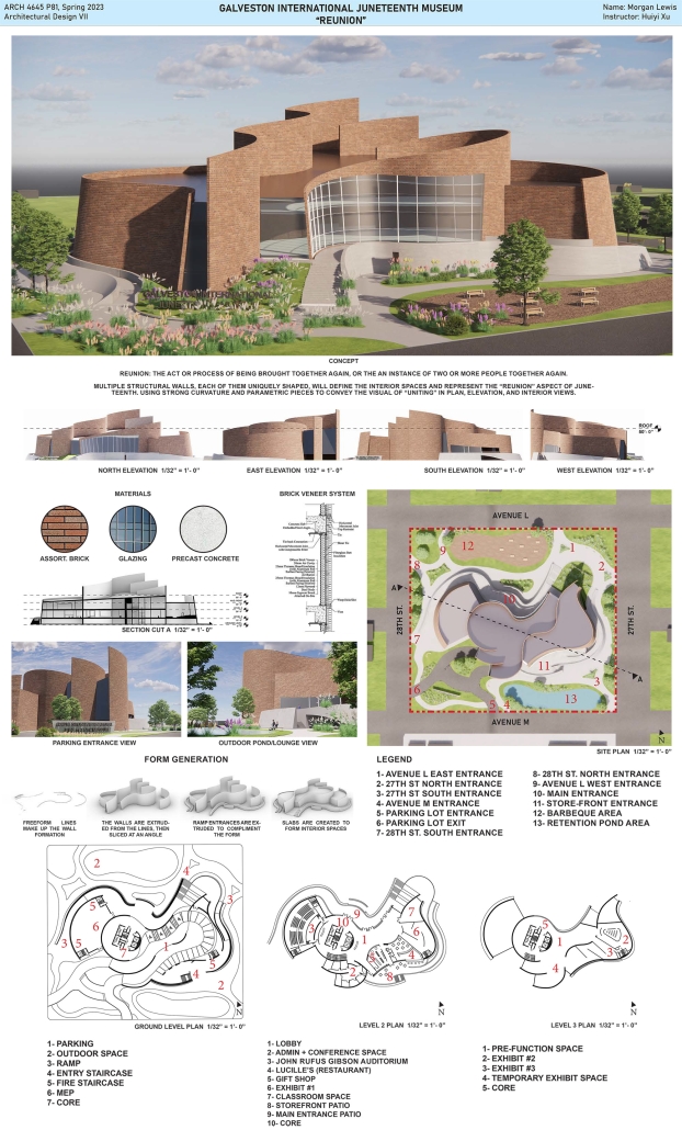
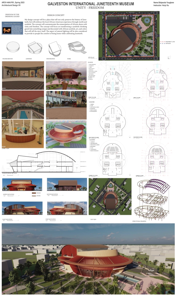
Galveston International Juneteenth Museum by Jermaine Jones, Morgan Lewis, Dominique Lang, Sidpaoda Yougbare, and David Galo, B.Arch ‘23
Prairie View A&M University | Advisor: Huiyi Xu
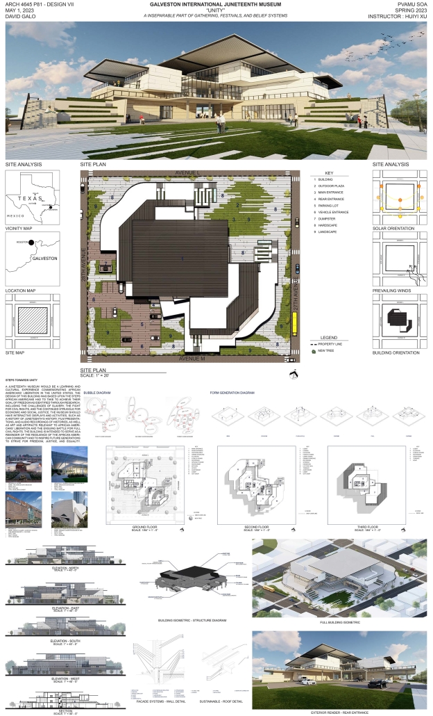
“Juneteenth Museum” is an iconic symbolic building in the state of Texas and the United States of America. The location of the project is in Galveston, Texas. The building is a place to show the culture of African Americans in the state of Texas. The new museum should be the epicenter for education, preservation, and celebration of Juneteenth nationally and globally. The program is supported by the African American History Council and the Galveston African American Community. The programs include a lobby, exhibition spaces, an auditorium, administration offices, lecture rooms, a gift shop, outdoor exhibitions, equipment rooms, and outdoor parking spaces.
Harvesting Education by Lydia Roberts and Michael Lee, Bachelor of Science in Architectural Studies ‘23
Illinois School of Architecture |Advisors: Isabella Hillman and Francisco Javier Rodríguez-Suárez, FAIA
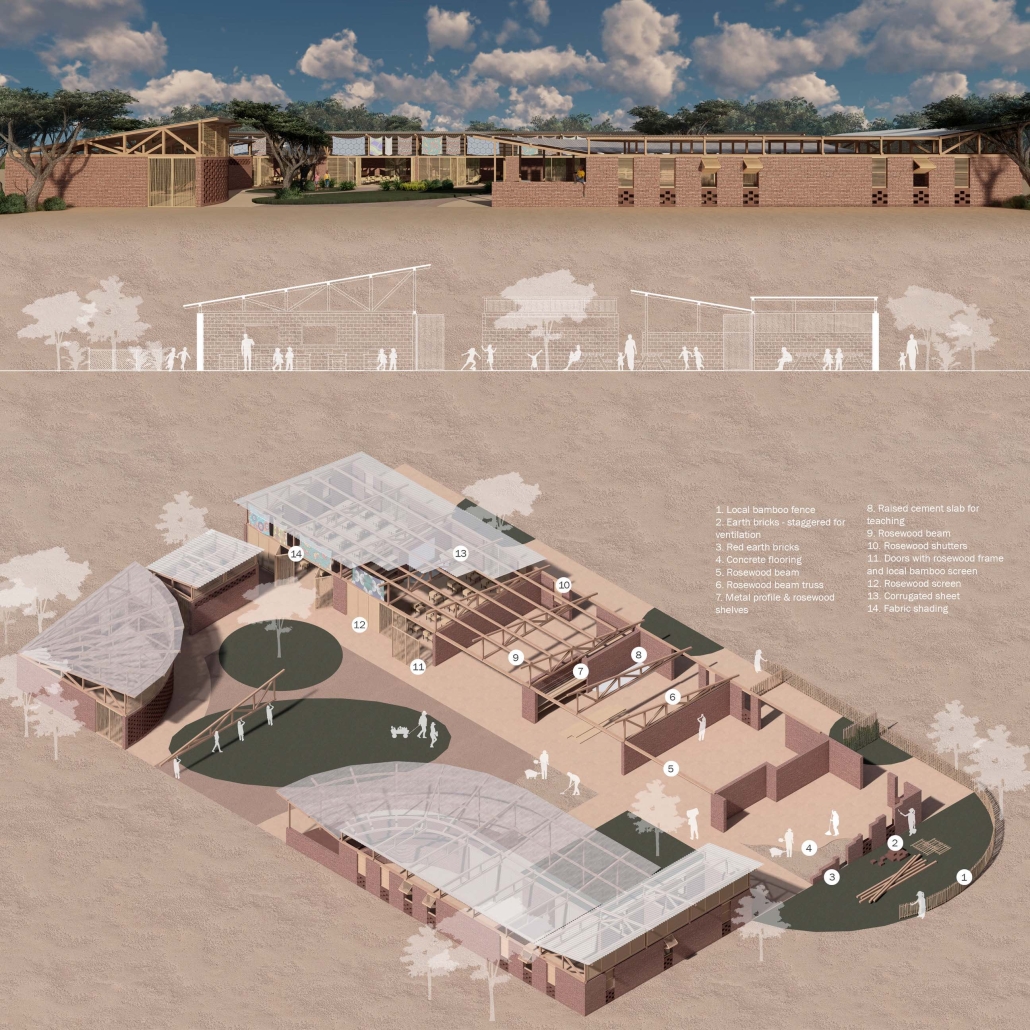
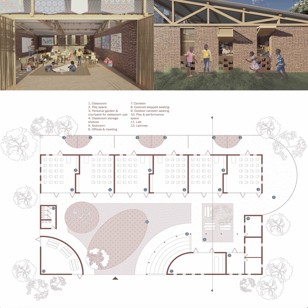
Harvesting Education is a sustainable and cultural architecture design for a primary school in rural Senegal, Africa. This design’s main features are individual garden spaces for each classroom and an expansive courtyard that doubles as a presentation and performance space. The design was created using locally and easily sourced materials, with construction techniques that can be performed by the community. Rooms are naturally ventilated through the use of perforated walls, a lifted roof structure, and carefully placed windows. Each classroom has a number of fabric shading devices connecting to the roof structure. These pieces of fabric provide a location for cultural expression, as well as artwork produced by the students to be displayed.
This project was awarded the 2nd Place Earl Prize, Senior Studios, Illinois School of Architecture.
Instagram: @archatillinois
International Juneteenth Museum by Jarvis Hawkins, B. Arch ‘23
Prairie View A&M University |Advisors: Dr. Rania Labib and Stephen Song
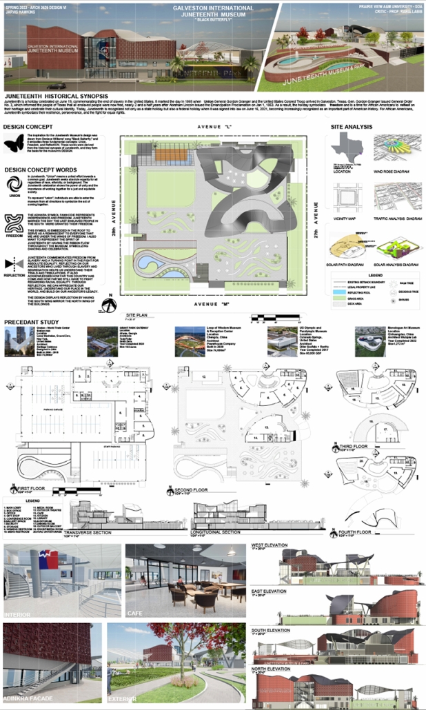
The goal of this project was to design an International Juneteenth Museum in Galveston, Texas. Juneteenth is a holiday celebrated on June 19, commemorating the end of slavery in the United States. Today, Juneteenth is becoming increasingly recognized as an important part of American history. For African Americans, Juneteenth symbolizes their resilience, perseverance, and the fight for equal rights.
The inspiration for the Juneteenth Museum’s design was drawn from Deniece Williams’ song “Black Butterfly,” and it embodies three fundamental concepts: Union, Freedom, and Reflection. These words were derived from the historical synopsis of Juneteenth, and they form the basis for the museum’s design.
This student’s work is currently exhibited in the Nia Afro-American Gallery in Galveston, Texas, and the TIPHC Gallery in Prairie View A&M University in part of Juneteenth Celebrations.
See you next week for the next installment of the Student Showcase!









![layout [Converted]](https://studyarchitecture.com/wp-content/uploads/MArch-SP23-403C.3-RS-Lynn-Yiman-DG-01-Travis-Dagenais-1030x572.jpg)
![layout [Converted]](https://studyarchitecture.com/wp-content/uploads/MArch-SP23-403C.3-RS-Lynn-Yiman-DG-02-Travis-Dagenais-1030x572.jpg)

