"Preservation as Provocation" Winners Discuss Designs
(via National Trust Preservation Leadership Forum)
The Farnsworth House is one of the most revered buildings of the 20th century. Designed by Ludwig Mies van der Rohe in 1945 and constructed in 1951, it is a vital part of modern iconography. The building first opened to the public in 2005 and a modest visitor’s center was erected. Visitors, programming, and staff have made this 1,700-square-foot building too small. In a bi-annual competition called “Preservation as Provocation,” architecture students were challenged to design a new visitor’s center for the Farnsworth House. The competition is hosted by Association of Collegiate Schools of Architecture and the AIA Historic Resources Committee, and more than 400 students and 50 faculty sponsors from 34 schools participated in 2015–16.
The competition was judged blindly by jurors selected for their expertise with Farnsworth, flood management, design, and preservation management: Maurice Parrish, executive director of the Farnsworth House; Tom Jacobs, principal at Krueck + Sexton Architects in Chicago; David Waggonner, president of Waggonner and Ball Architects in New Orleans; and Ashley Wilson, Graham Gund Architect at the National Trust for Historic Preservation in Washington, D.C.

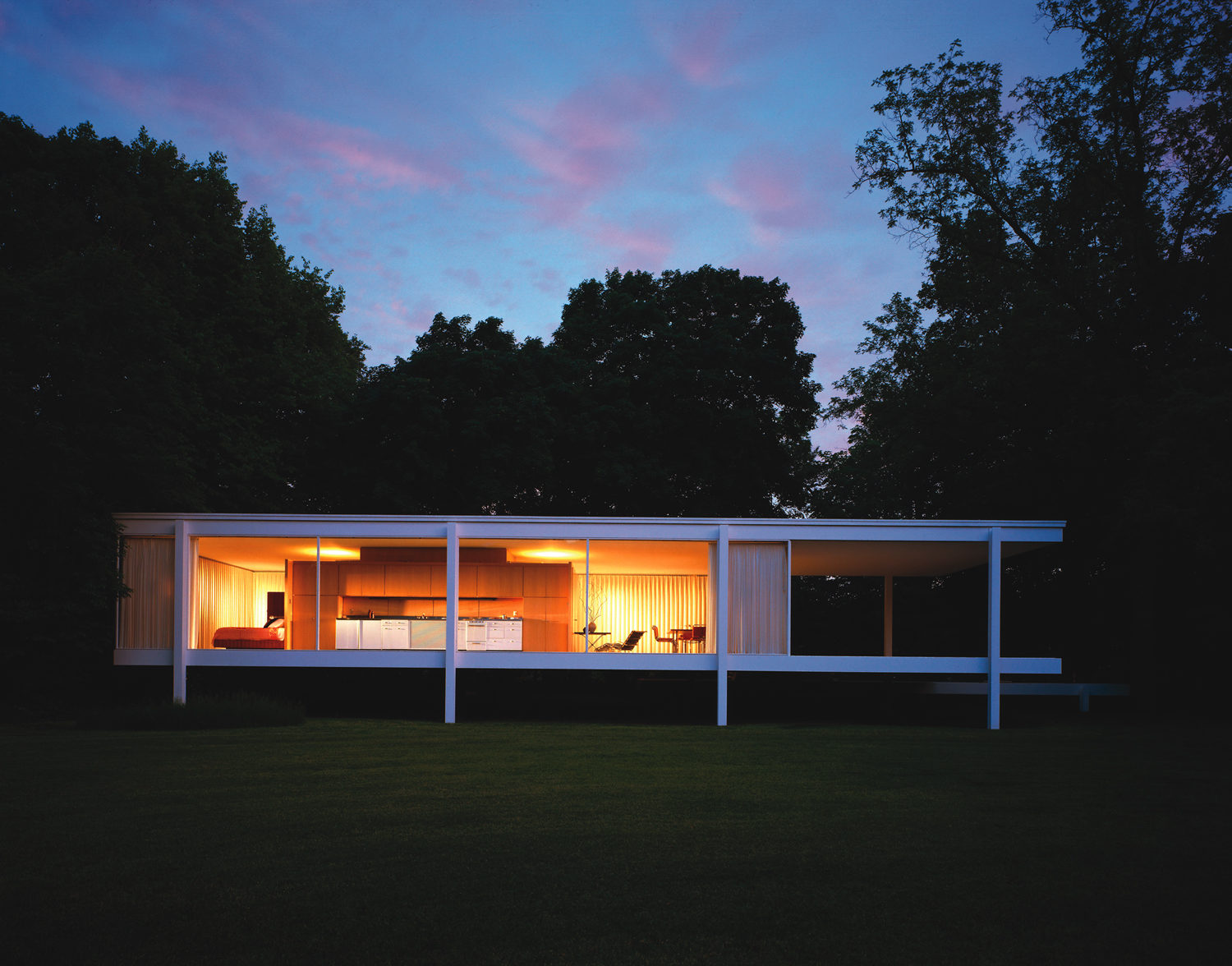
Farnsworth House | Credit: National Trust for Historic Preservation
Students wrestled with the programmatic and philosophical requirements of creating a space that prepares visitors for the spiritual experience of Farnsworth. Part of the challenge lay in the topography as much of the site is in a floodplain, rendering it unbuildable. The winners were Chase White, who holds both undergraduate and master’s degrees in architecture from the University of Texas at San Antonio; Paul Isaacs, who is in the master’s program at the University of Kentucky School of Architecture; and Bohyun Chang and Suk Lee, architecture students at Iowa State University. They responded to a few questions about their projects
What was your concept—the big idea?
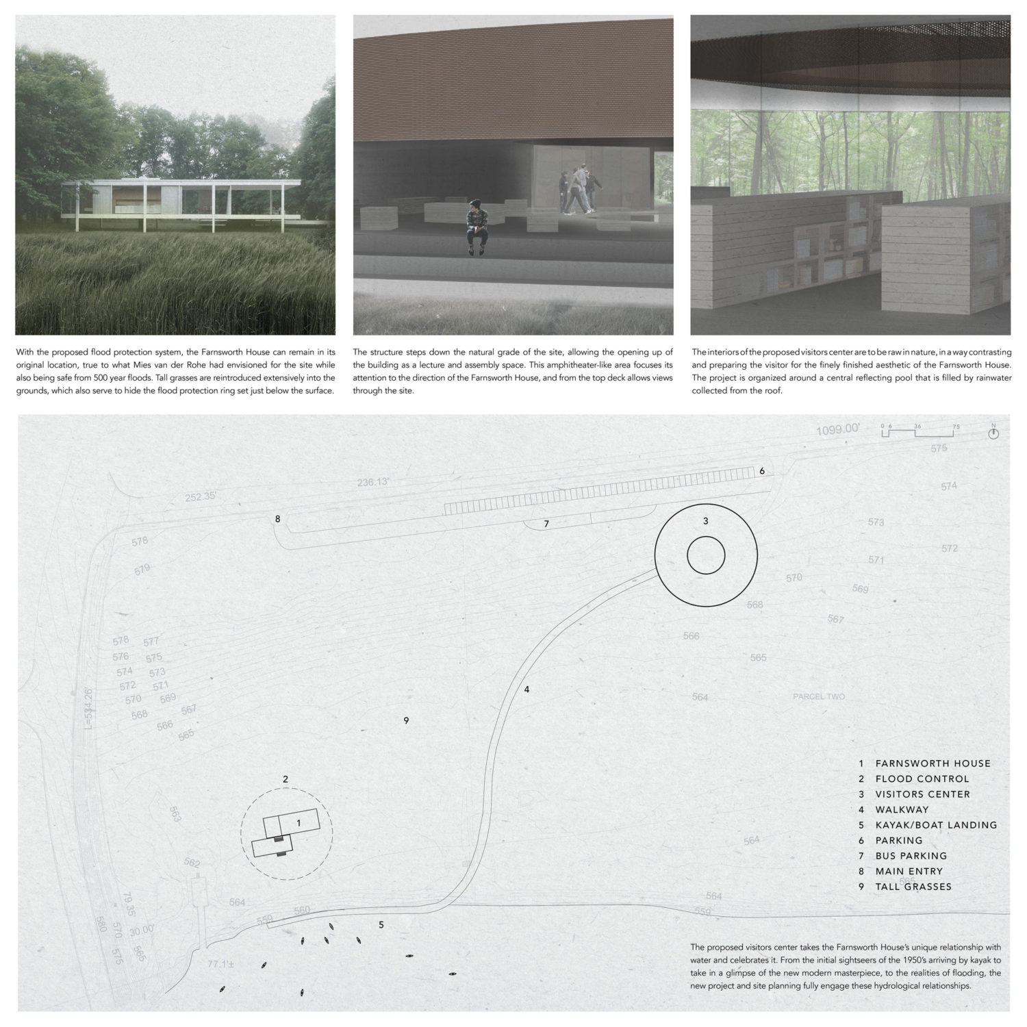
Chase White: It sounds obvious, but from the get-go we knew that the project should be positioned conceptually to add its own meaning to the site while still relating directly to Mies van der Rohe’s masterpiece. We basically used a language similar to what Mies van der Rohe pioneered, but made it something of a conceptual inversion. We continued his pure geometry by using the circle to pair with the rectilinear design of the Farnsworth House. Where Mies van der Rohe employed a lightweight design that lifted the Farnsworth House off the ground, my proposed visitor’s center would employ heavy concrete that sinks into the site. Even the materiality of our project would strike a contrast, employing raw materials whereas the Farnsworth House has a finely finished aesthetic.
Bohyun Chang: We sought to provide individual experiences of the ground, water, and sky, while the Farnsworth House creates a combined experience of those elements.
Suk Lee: The design is intended to let individuals have their own experiences with and reactions to the Farnsworth House through a series of framed spatial experiences.
Paul Isaacs: I began by exploring the forms of visitor’s centers, which can fall into several categories: a gatehouse to a protected area, such as a zoo or sacred site; a pavilion in the midst of a natural landscape like a national park lodge; or simply an existing building. Eliminating the latter options, I designed the visitor entry as a gate house attached to a wall, not unlike the ones marking the entrances to grand estates. It was also important to tell the story of Mies van der Rohe’s journey through architecture, and I looked at the Barcelona Pavilion, the Brick Country House, and his skyscrapers for inspiration and details.

Collecting Pieces | Credit: Bohyun Chang and Suk Lee, Iowa State University
What did you learn about the challenges of this site?
White: Due to the realities of flooding at the Farnsworth House site, the topography was one of most decisive factors in how and where to design.
Lee: The flood issue was challenging, as was the physical distance between the house and parking lot.
Chang: For me, the challenge was providing a continuous and smooth transition between the parking lot, visitor’s center, and the Farnworth House—as well as translating our design concept into architectural elements.
Isaacs: The more obvious challenge was proximity to the river, which floods almost annually during the early spring, inundating most of the site, including the house itself. The second was the story of Edith Farnsworth’s lost battle for privacy. She expected her property to remain isolated and undisturbed until a highway bridge was built less than 100 feet away from the house. This line of thinking ultimately lead to the decision to locate the new visitor’s center where the old one stood—out of the flood plain and out of sight of the Farnsworth House.

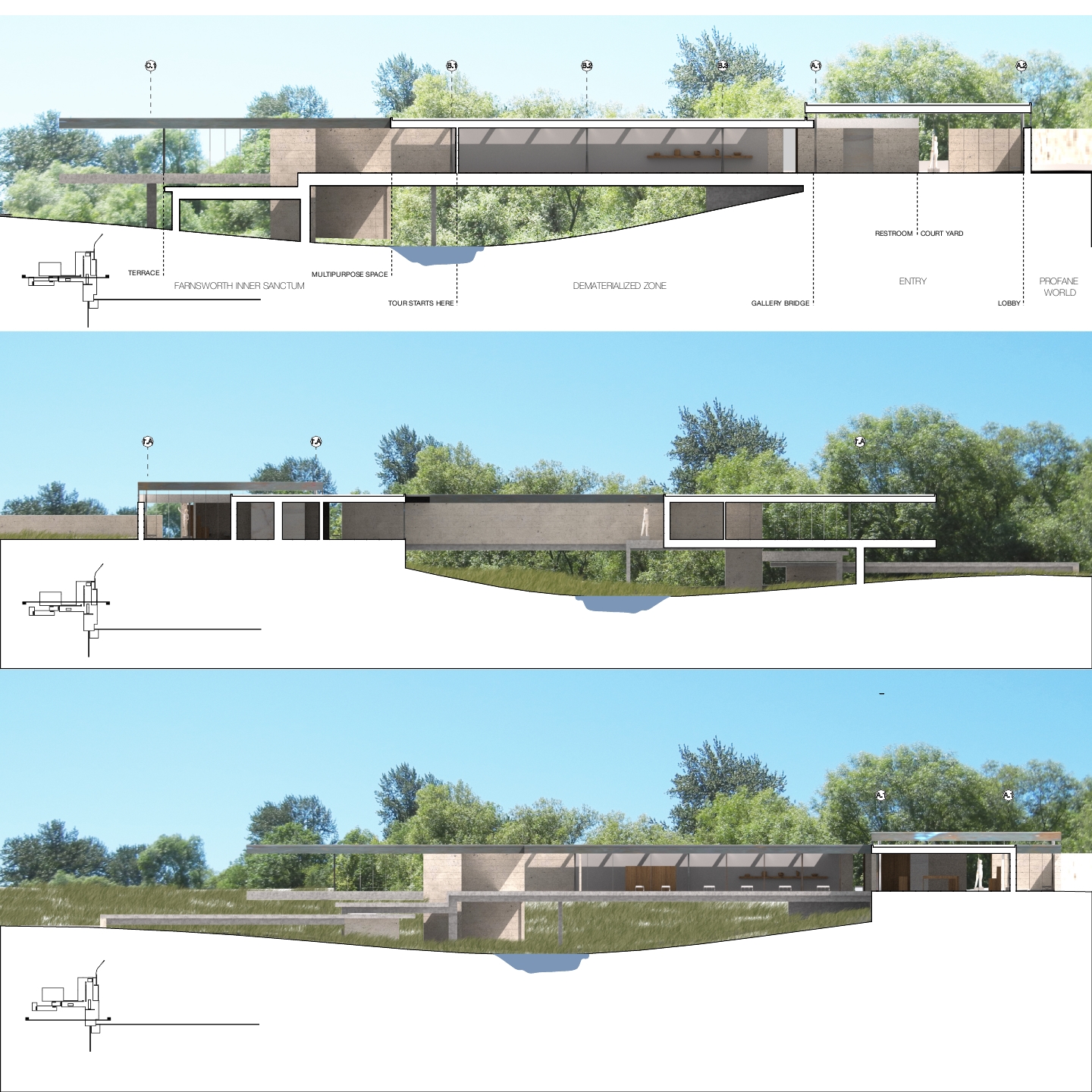
Farnsworth House Visitor Center | Credit: Paul Isaacs, University of Kentucky
Was it intimidating to design a building in close proximity to one of the most revered structures in the world?
Lee: That was the most important aspect of the project. My design exists to serve the Farnsworth House. I was very careful to respect that fact and also to create an emotional element, like the Farnsworth House itself does. I did not think of it as intimidating—it was the purpose of the competition.
Chang: For our studio, the competition was a one-month practice in preparation for another contextual project that was located near the Kimbell Art Museum in Dallas, which features the Renzo Piano Pavilion and the architecture of Tadao Ando. It was not intimidating in terms of the design—but its structural aspects were intimidating.
Isaacs: My work will never be as great as van der Rode’s, so it would be unhealthy to try to compete. This project is different—it is well aware of its place in the grander scheme of things and seeks a reverential role.
[Farnsworth House Visitor Center]
How did you try to minimize impact and create a building that complements the Farnsworth House?
Lee: I replaced a current bridge with the visitor’s center, creating an artificial landscape to connect visitors to Farnsworth. I was imagining the center as part of the journey, since the Farnsworth House focuses not only on itself but also on its surroundings.
Isaacs: The visitor’s center attempts to set up a series of dichotomies with the Farnsworth House. Farnsworth is a transparent pavilion on stilts, whereas the visitor’s center is an opaque wall built into the landscape.

Ode to Mies | Credit: Chase White, University of Texas at San Antonio
While this competition is theoretical, the Farnsworth House does need a visitor’s center. Now that you’ve completed the competition, how hard do you think it will be to design a beautiful and appropriate building for this site?
White: The best design for the site will certainly be one that gives Farnsworth the space to be experienced as it was originally.
The biggest takeaway from our project is our flood control system, which I envisioned as a large steel ring that would be raised and lowered hydraulically. Set just below the ground, this system would be unnoticeable during normal operations and would allow the Farnsworth House to remain safe from flooding. If flooding of the house continues, at some point there may be nothing left to require a visitor’s center.
Chang: Our design simply avoided the flooding dilemma by placing the visitor’s center on the northern side of the site.
Were you able to visit Farnsworth House while preparing for this competition? What did you think when you saw this building for the first time?
Lee: I visited Farnsworth one year before the competition, and the distance from the parking lot to the Farnsworth House was a journey for me. My expectations built during the long walk through nature, so I had a very emotional response upon reaching the Farnsworth House. Thus, I preserved that journey in the design, conceiving of the trip from the parking lot to the Farnsworth House and back to the visitor’s center as one experience.
Isaacs: I visited Farnsworth at the start of the competition. I had seen the house more than a million times in pictures, drawings, models, and documentaries. The reverence I have for Mies van der Rohe’s work caused me to treat walking through and around the house as almost sacred. Removing my shoes meant more than preserving the travertine tile of the interior from scuff marks—it indicated respect for a sacred boundary. I walked around as one does deep in meditation or prayer, drinking it all in.
I really appreciated the way the tour was constructed: briefing, journey, reveal, and reverie. I wanted to preserve that form, but also to make the approach down the original driveway close to what Edith would have experienced and focus the return journey on the landscape and the river.
Ashley Wilson is the Graham Gund Architect at the National Trust for Historic Preservation.
For more on the competition, visit ACSA’s website.
