Posts

2024 Study Architecture Student Showcase - Part X

Part X of the 2024 Study Architecture Student Showcase highlights projects that address various aspects of urban morphology and city life. The featured work takes place in metropolitan settings including Los Angeles, Tokyo, Philadelphia, Camden, Ras Beirut, and Brooklyn.

The presented themes include fostering engagement in urban settings, creating spatial pauses in the city, the adaptability of urban design in response to societal changes, supporting the needs of city dwellers, and more. Scroll down to browse the award-winning student work!

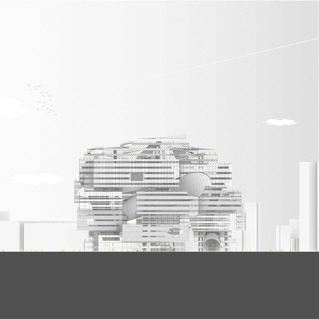
LEARNING FROM LITTLE TOKYO: MEMORIES IN GEOMETRY by Osamu Sakurai, M. Arch ‘24
University of Southern California | Advisor: Andy Ku

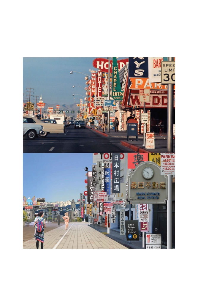
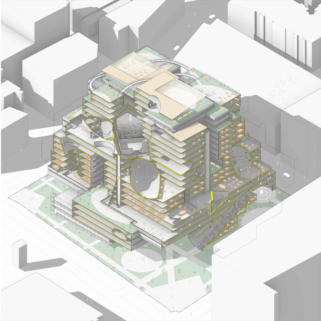
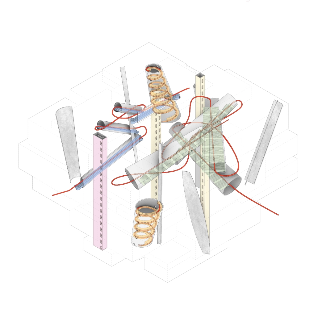
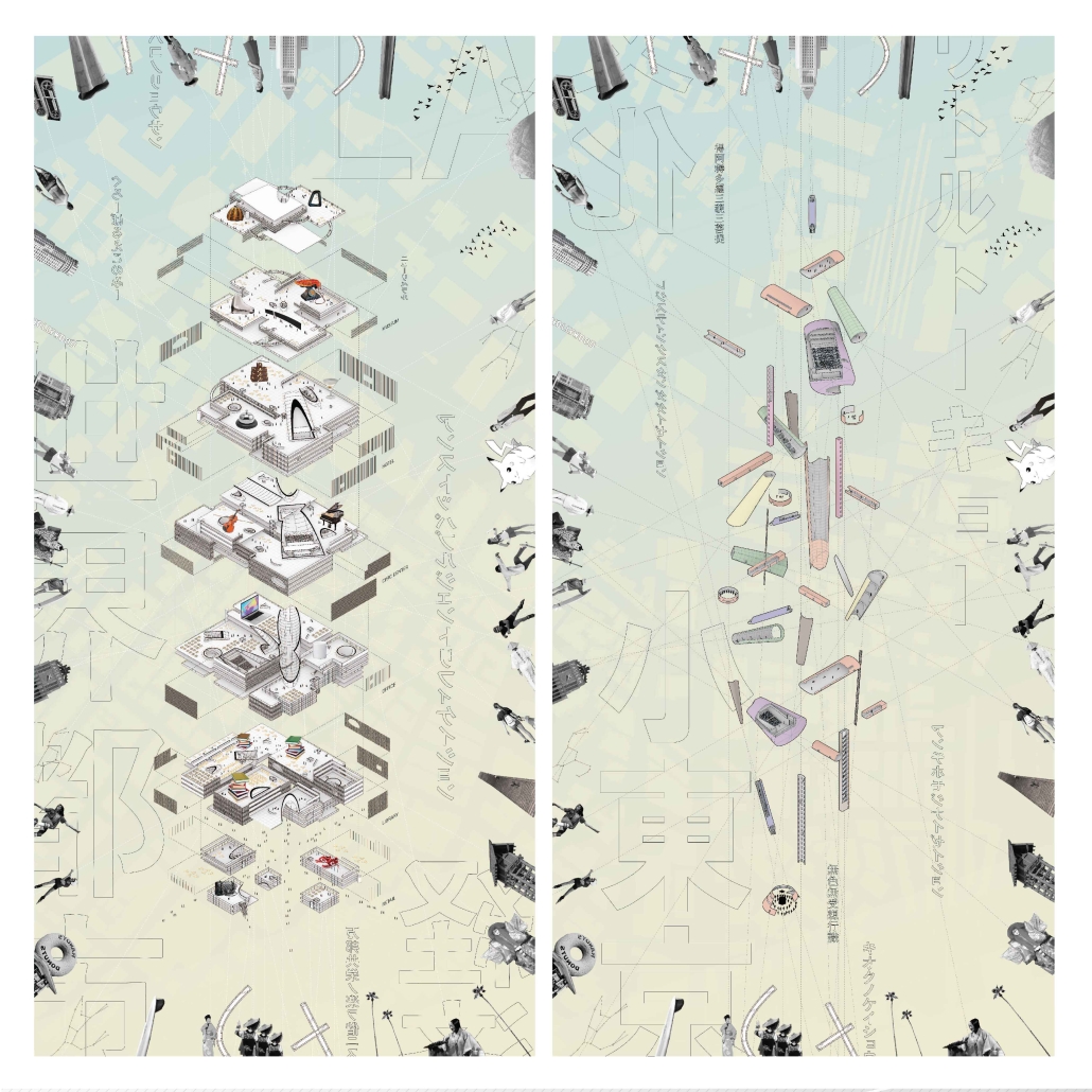
The loss of regional identity in urban large-scale redevelopment, accelerated by the pressures of globalization, continues worldwide, with homogeneous spaces isolated from local environments and nature taking center stage within giant monoliths. Little Tokyo in Los Angeles is no exception to this trend. The aim of this project is to contemplate regional identity within the global context, with the means being “boxes” and “free shapes.” The “boxes” symbolize both participation in and challenge to globalization simultaneously. Randomly stacked boxes serve as a gesture to incorporate the external environment and attempt to supply external spaces vertically. The “free shapes” (geometry) strive to transform the identity of Little Tokyo into tangible forms. Only these two operations shape the architecture, emerging amidst the tension between internationalism and localism. Born in the midst of internationalism and localism, this architecture seeks to preserve the regional identity within the pressure of redevelopment, further developing and passing it on to future generations.

This project won the Master of Architecture Design Communication in Directed Design Research Award.

Instagram: @osamusakurai0420

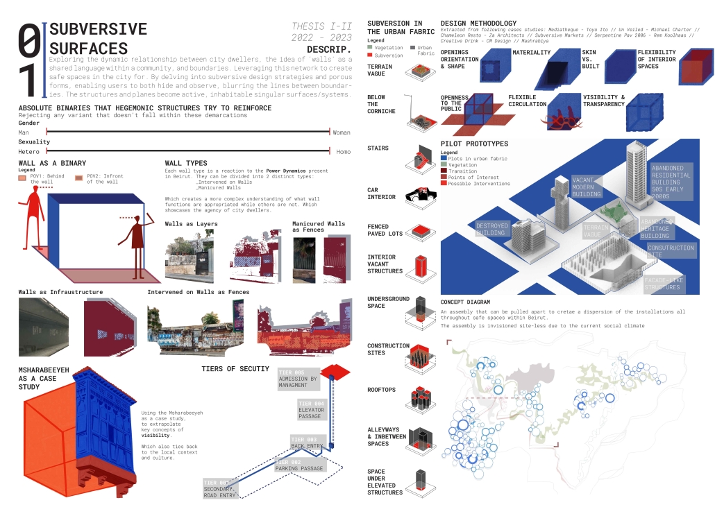
Subversive Surfaces by Aya El Zein, B. Arch ’24
American University of Beirut | Advisor: Sinan Hassan

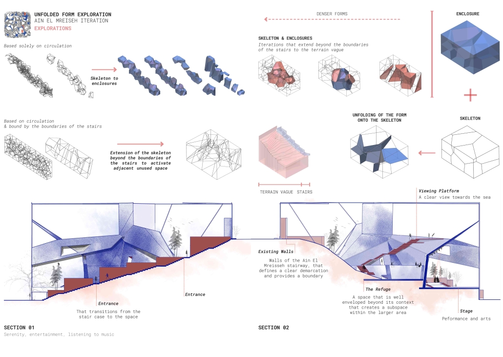
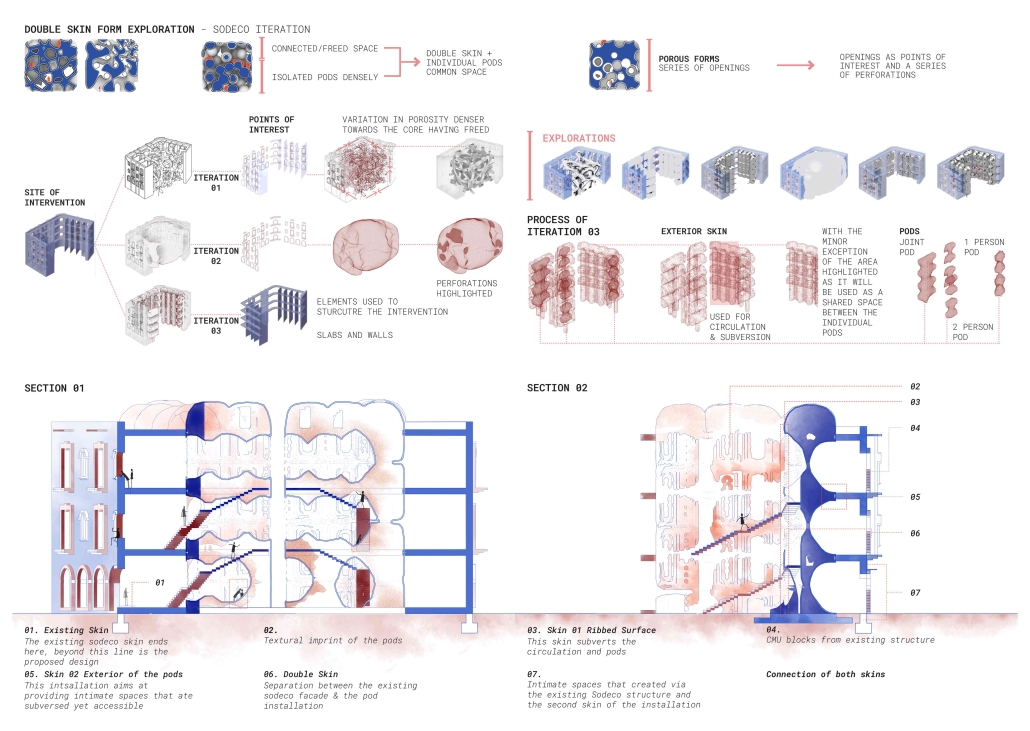
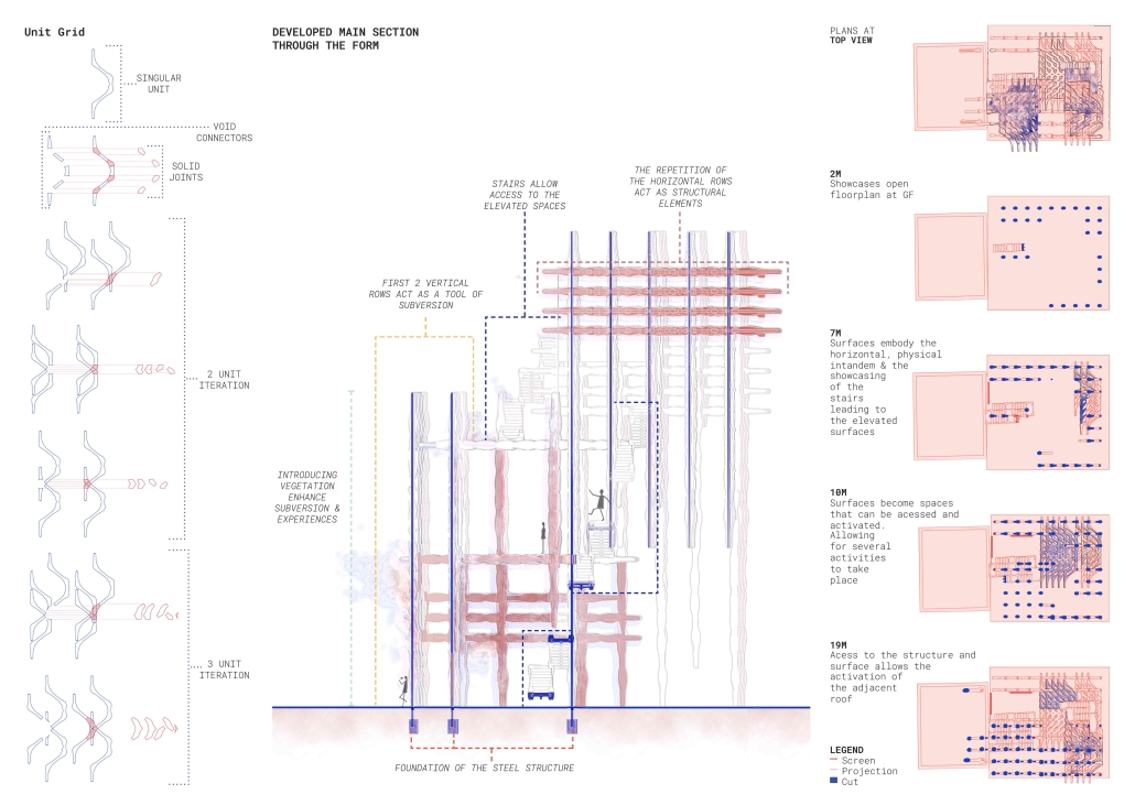
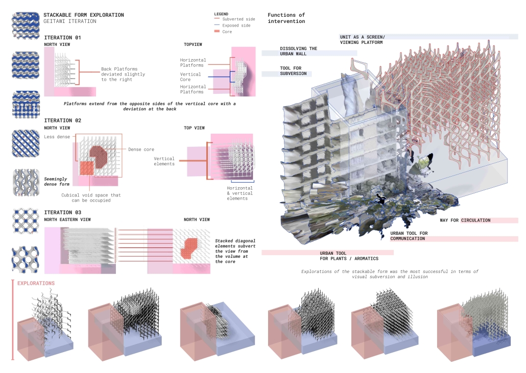
Exploring the dynamic relationship between city dwellers, walls as a shared language within a community, and boundaries that dictate the public and private understanding. The wall becomes an urban communication tool, materializing the reaction to societal power dynamics. The walls are a clear sign of the way in which the environment is dealing with the public, either by rejecting any intervention (manicured fenced walls) or by allowing for a layered intervention by the public. Following the analysis of the walls, a binary emerged, the wall itself within an architectural framework is seen as a planar separator between the indoor and outdoor/front and back. Thinking of the wall as a surface is where the forms started to emerge. Taking into account the need to subvert the users, the structures and planes become active, inhabitable singular surfaces/systems. Leveraging the surface-based network to create safe spaces in the city for minority groups. By delving into subversive design strategies and porous forms, enabling users to hide yet observe, thus granting them an added layer of agency whilst blurring the lines between boundaries. Shedding the planar notions of vertical and horizontal planes situated on top of each other. Dissolving the urban wall into a surface that inhabits the space having attributes of verticality and horizontality. 

Instagram: @ard_aub

The Vertical Fold by Riwa Karanouh, B. Arch ‘24
American University of Beirut | Advisors: Dr. Howayda Al-Harithy & Hana Alamuddin

Modern-day life is fast-paced & intense which compromises the everyday experience leading to the disengagement of the urban dweller from his surroundings. The architecture is complicit in this disengagement, by not interacting at the urban level. 

Therefore, how can projects in Beirut have a set of pauses to re-engage people with their surroundings, reinforcing the notion of urban citizenship and belonging? 

A hypothesis of using spatial engagement strategies was explored to produce spatial pauses in the city, defining “pause” as an experiential moment of engagement with the built environment. It is not about physically stopping, but a shift in experience. 

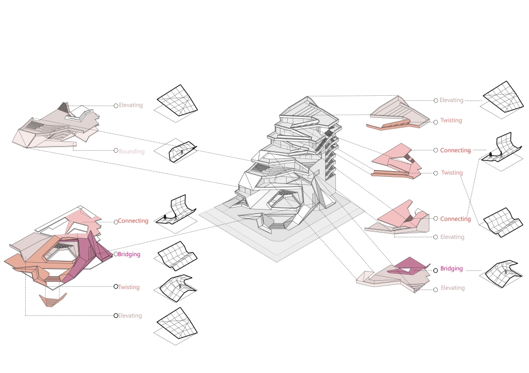
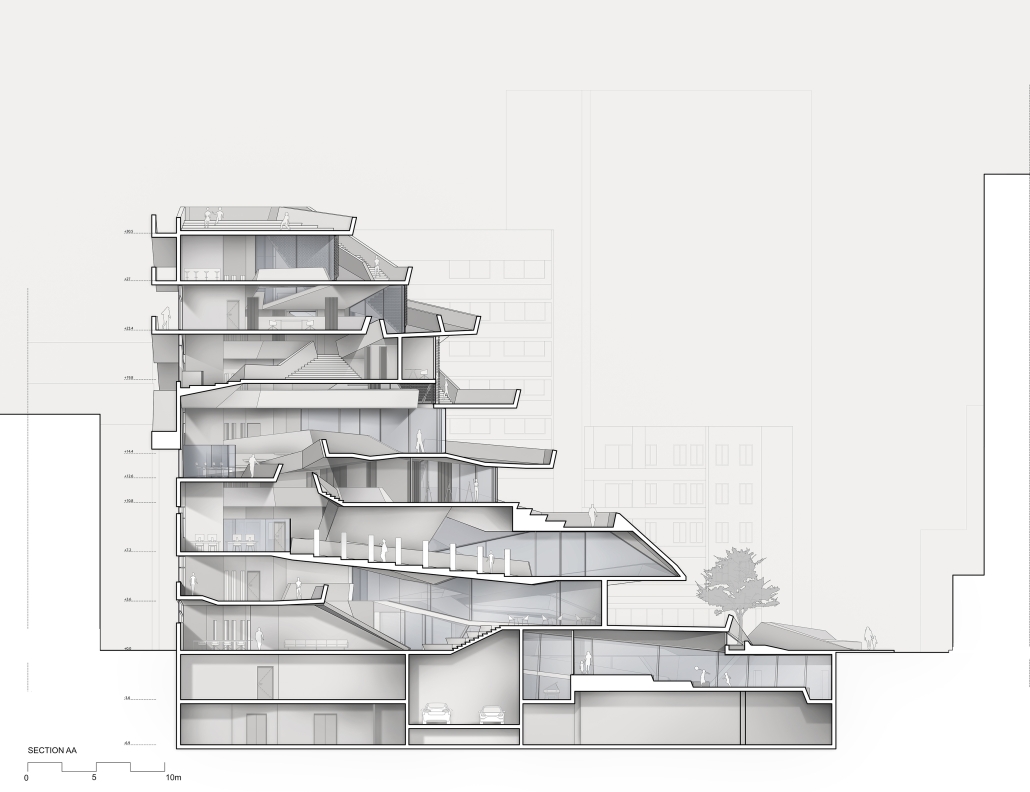
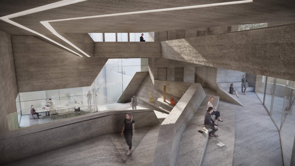
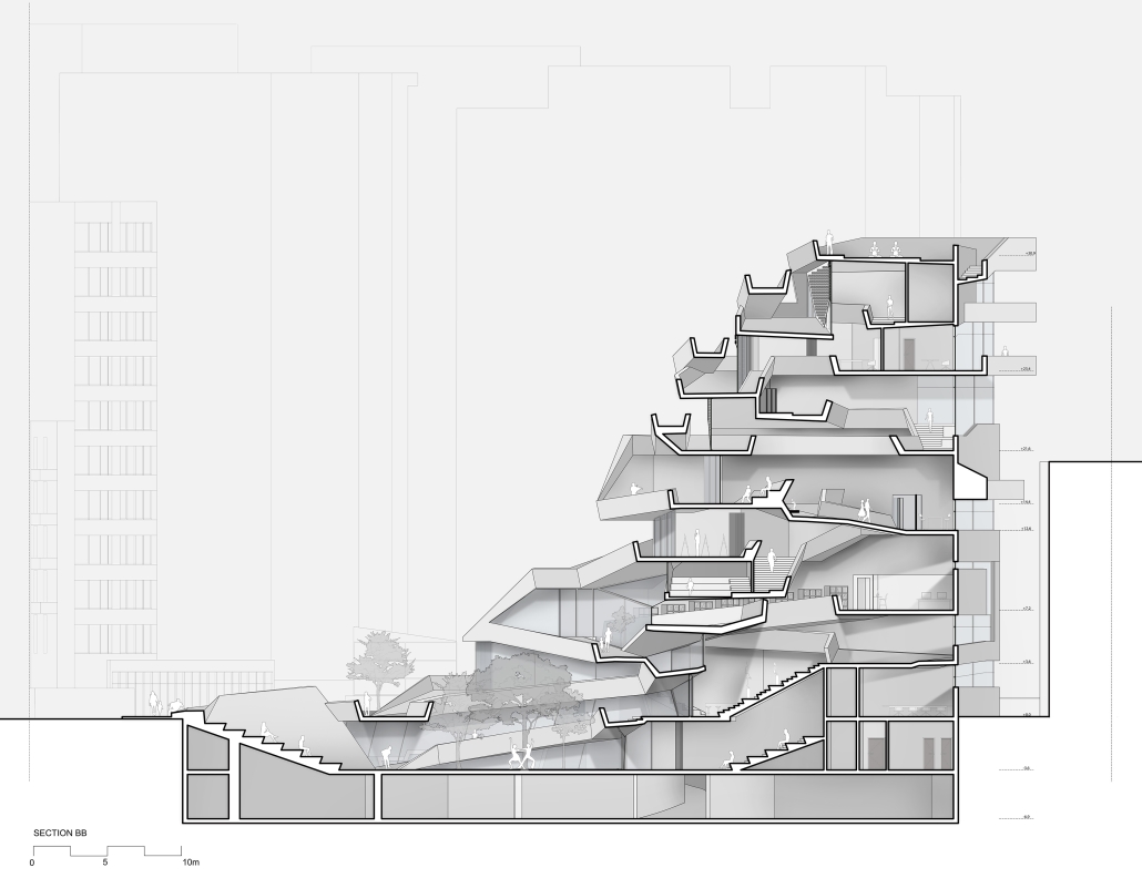
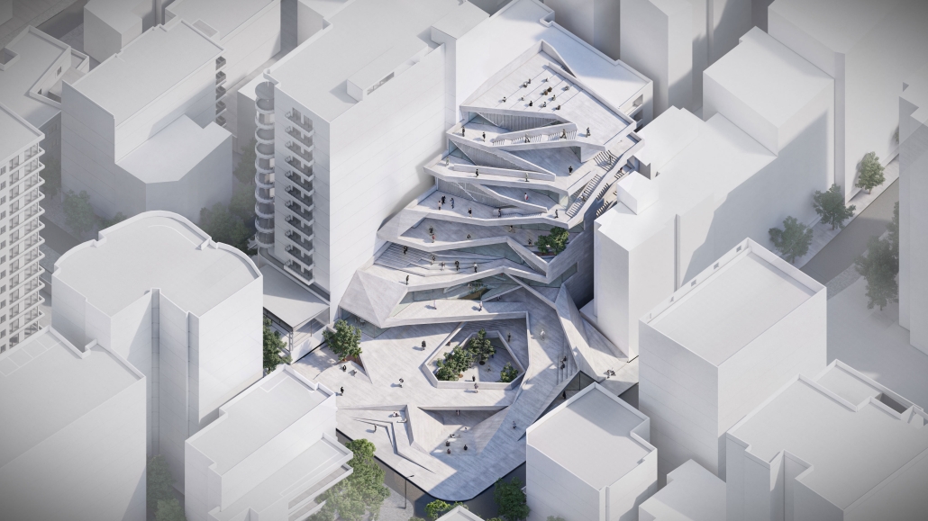
Jeanne d’Arc Street, a prominent street in Ras Beirut, has witnessed the loss of its sociocultural spatial practices compromising its experience. To reinvigorate its public realm and engage the citizens, a design system of folding was employed. Through extending, elevating, and twisting the ground plane, Jeanne d’Arc is integrated into the site, serving as a theatrical vertical extension of the street, compelling pedestrians to pause and engage with the building. The folded surfaces serve as interactive connectors, seamlessly linking the underground, ground, and vertical planes, transforming individuals into active engaged performers in the urban experience. 

This project was the First Prize Winner of the Areen Projects Award for Excellence in Architecture

Instagram: @ard_aub

The Architectural Sublime in Artificially Intelligent Mobility Systems by Wayne Li & Jack Zhang, BS (Bachelor of Science in Architecture) ’24
Washington University in St. Louis | Advisor: Constance Vale

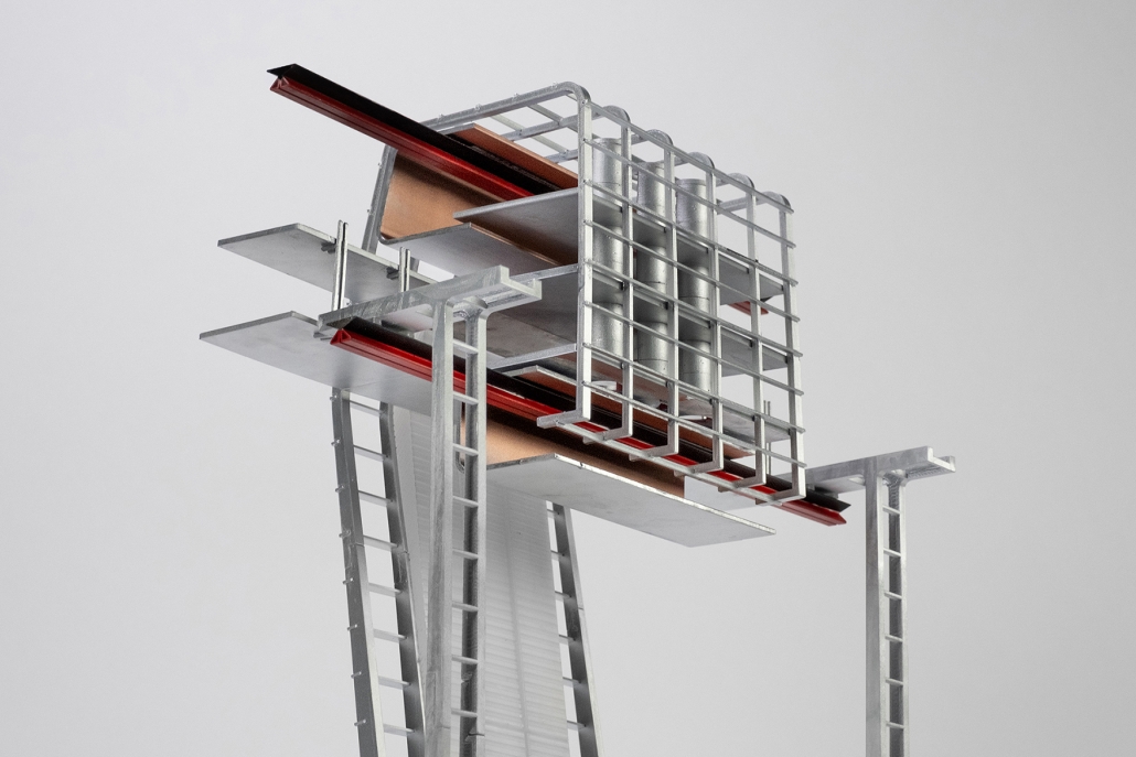
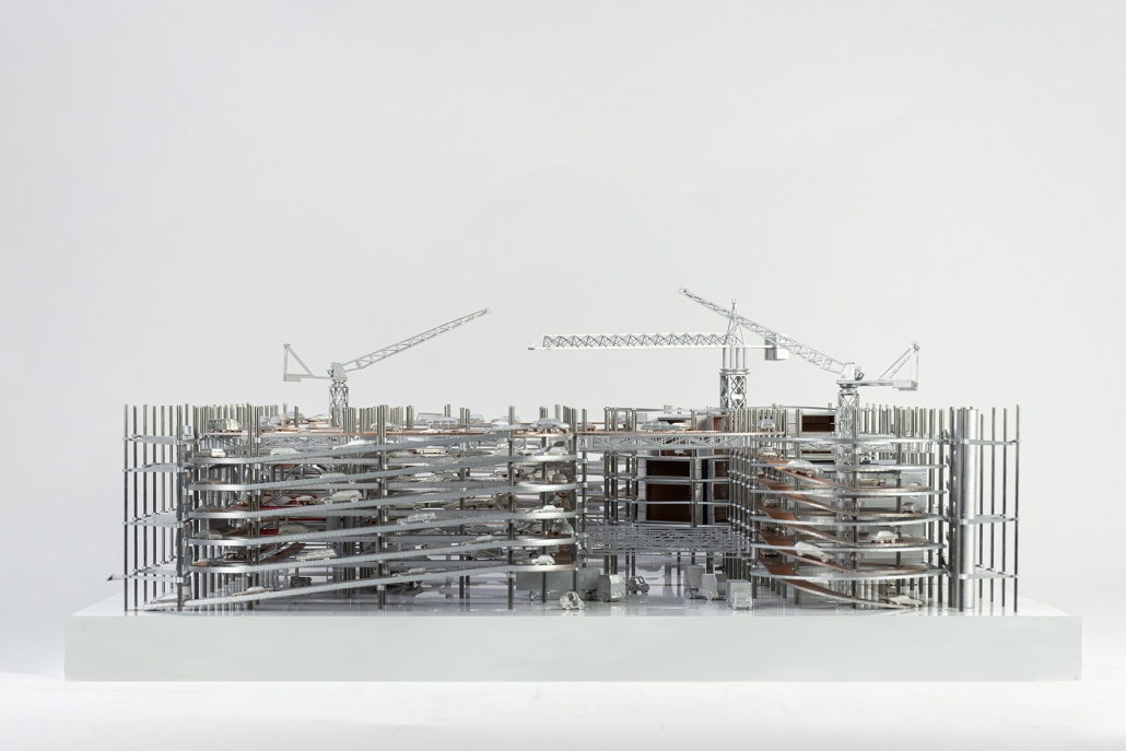
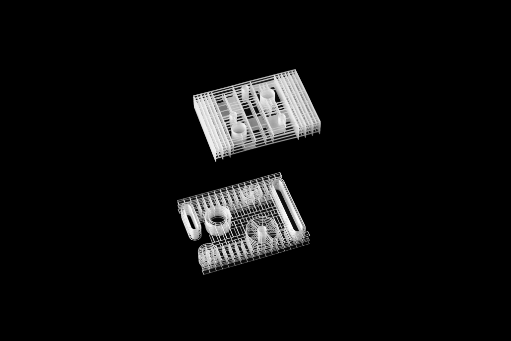
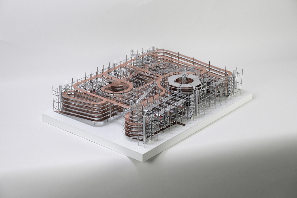
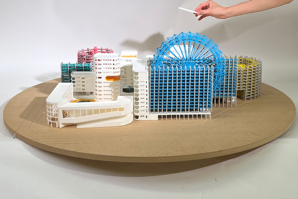
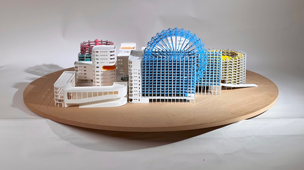
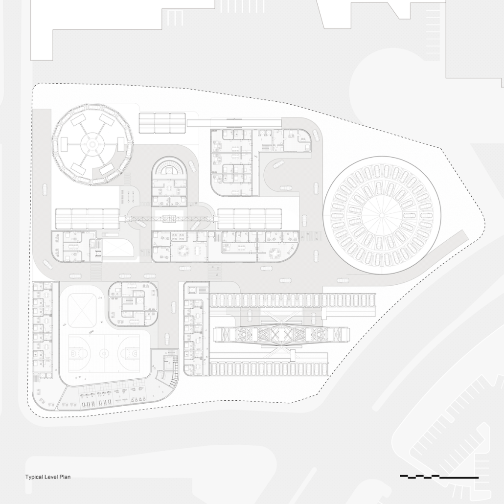
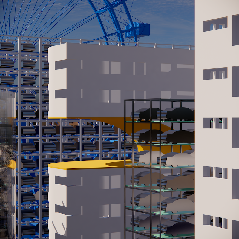
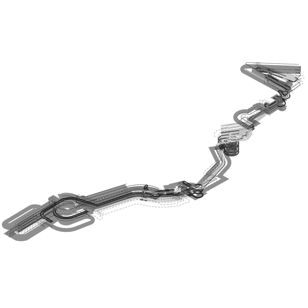
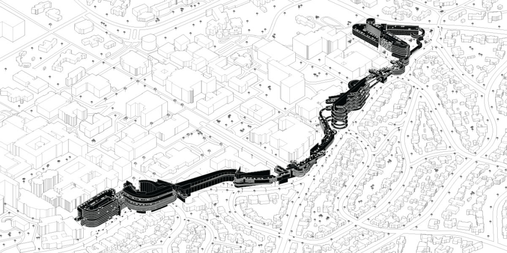
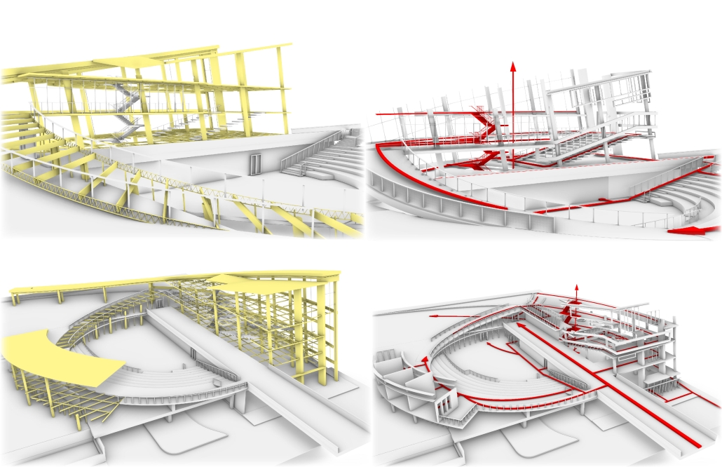
Our project aims to redefine urban mobility, shifting from private car ownership to a shared, autonomous vehicle (AV) system. This initiative tackles LA’s infamous traffic by converting parking lots near public programs into dynamic AV hubs, creating a network of connected nodes across the city. The project’s design embodies the sublime, with intricate structural frameworks that evoke a sense of awe and, at the same time, foster an enlightening experience to let people understand how AV works. AVs move around the intricate circulation, recharging as they move through the long trajectory before returning to circulate in the city, thus eliminating the need for circulating and increasing traffic in the city. Its adaptable structure allows pedestrians to witness the inner workings of AV operations, fostering engagement and education. Through transforming static spaces into active educational hubs, the project promotes a cohesive, efficient, and forward-thinking urban landscape, guiding Los Angeles into a new era of connectivity and communal urban life.

This project was collected for Washington University in St. Louis’ student work publication, Approach.

Instagram: @wayne_li_0611, @jack_arch_, @constancevale, @washu.architecture

Dream House by Meisam Dadfarmay, M. Arch ’24
Pennsylvania State University | Advisor: DK Osseo-Asare

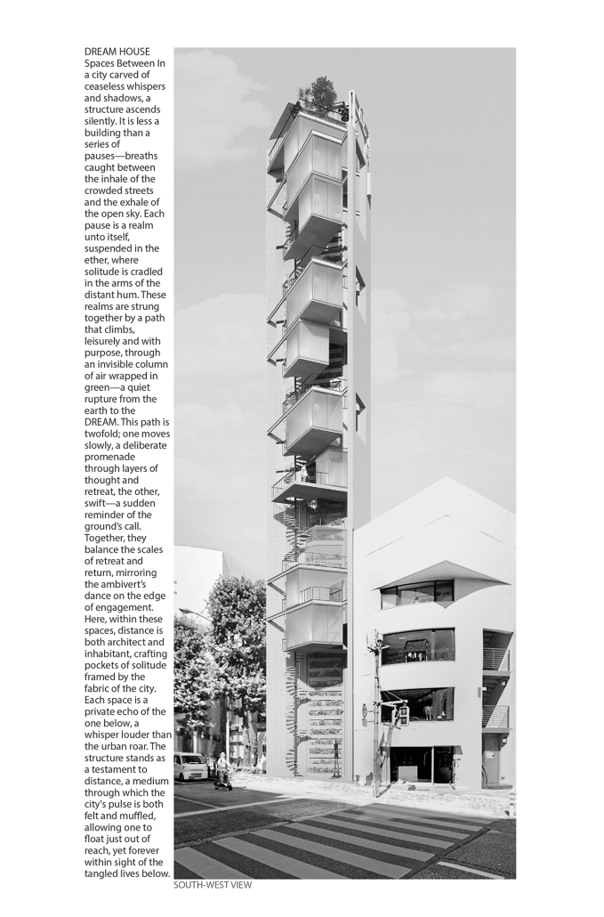
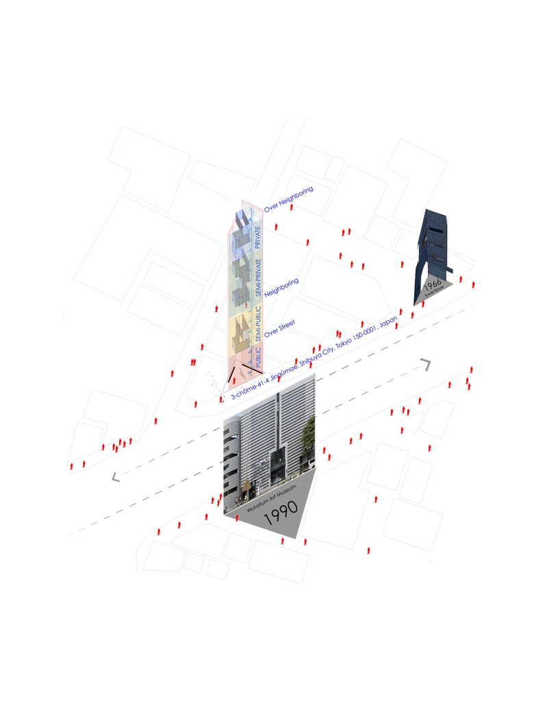
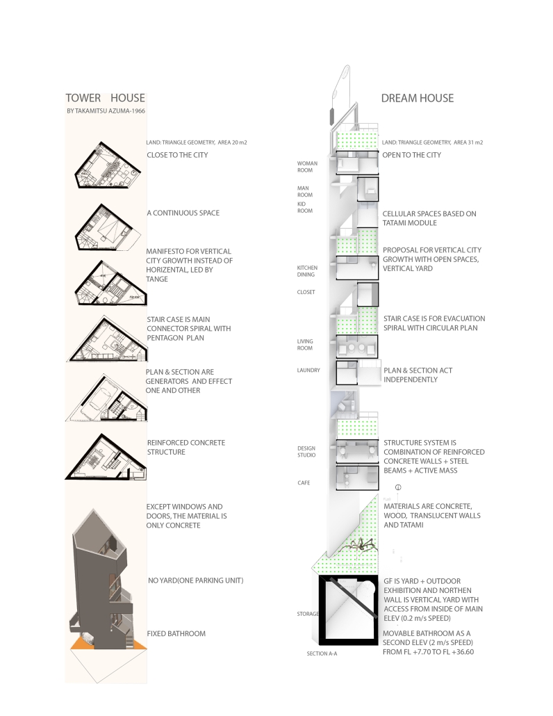
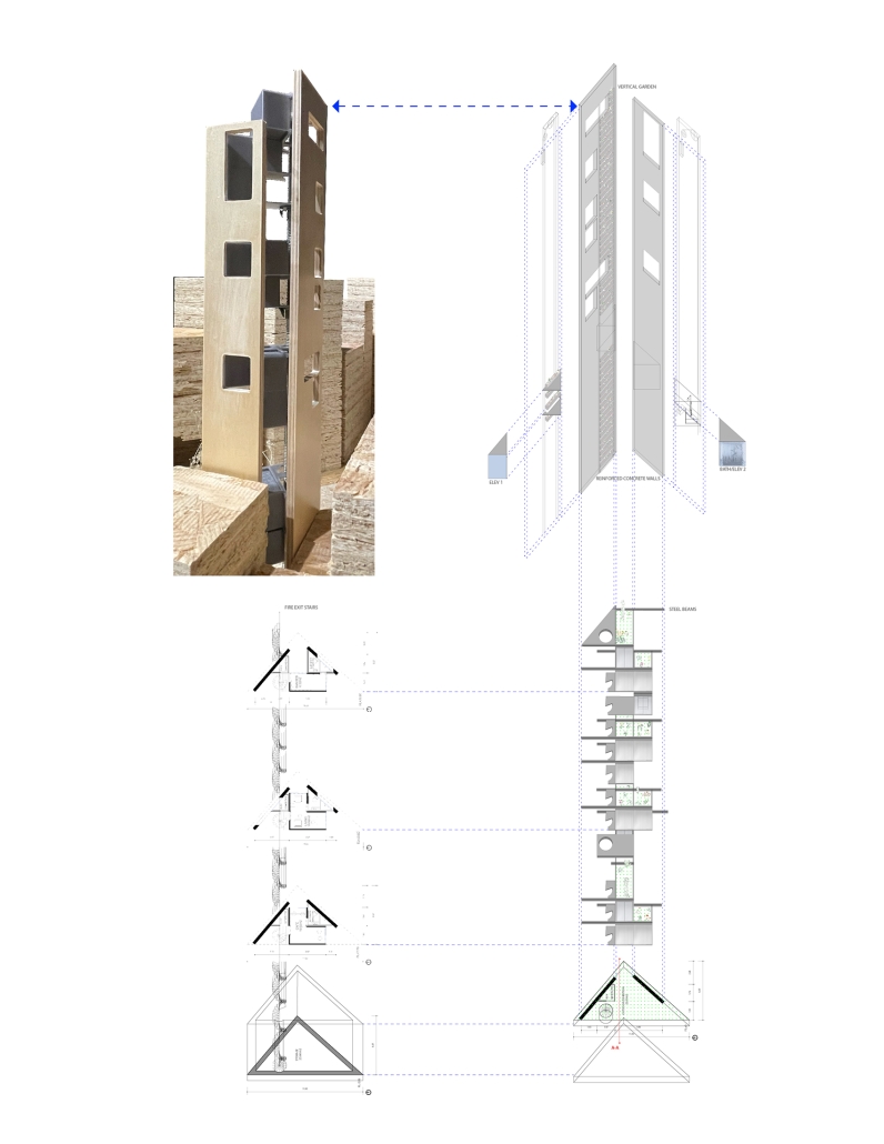
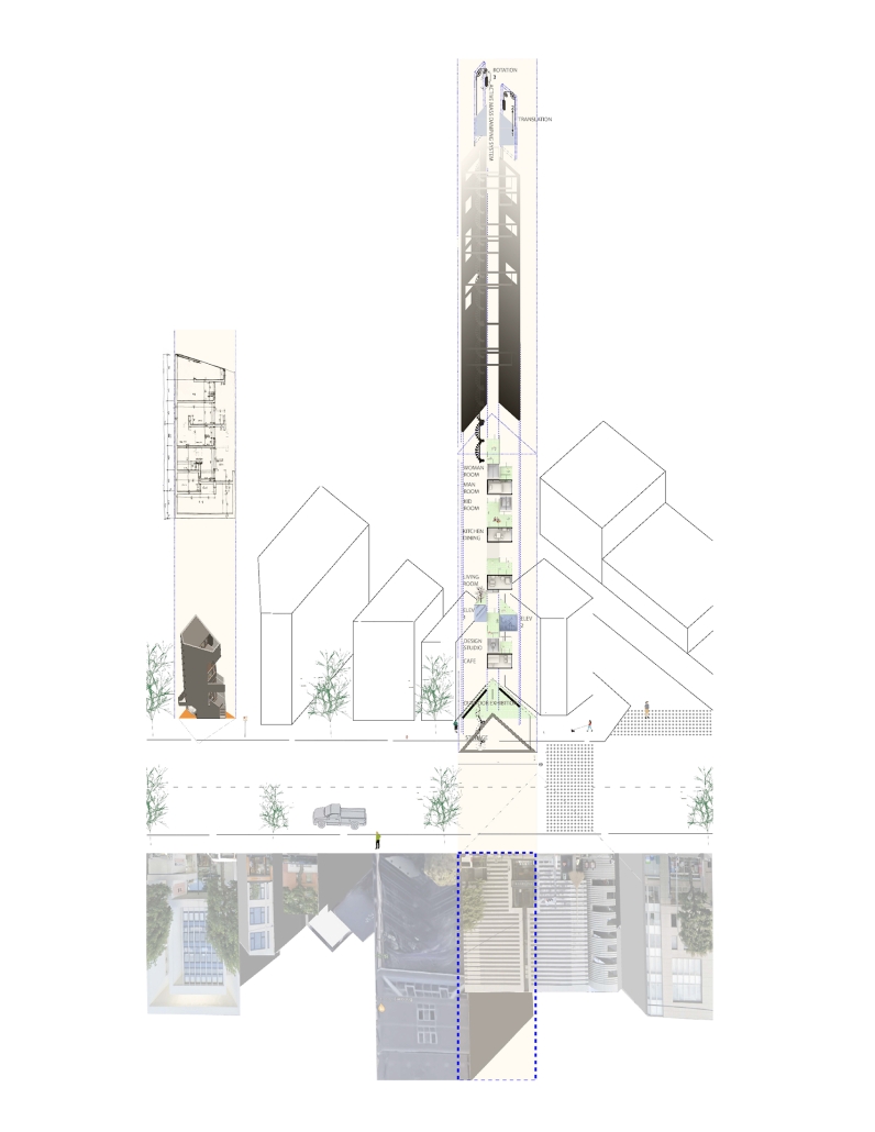
“Dream House,” is a project I designed for myself as a personal home and workplace, examining how these spaces adapt and transform to reflect the dynamic nature of dense cities and the architect’s life, and a vision for the future of architecture, where design transcends traditional functionalities and purposes. It is also a proposal for vertical city growth in Tokyo, which is a dialogue with my precedent project, ‘Tower House,’ designed by Takamitsu Azuma in 1966. Tower House, a project designed for architecture itself, is located close to my project site, and both are situated in tiny sites with almost the same geometry. Tower House stands as an impressive example of innovative architecture, illustrating how limitations in space can lead to creative and functional design solutions. It remains a testament to Azuma’s architectural vision and the adaptability of urban design in response to societal changes.

The Dream House concept, influenced by Slavoj Žižek’s theories, delves into homes composed mainly of secondary spaces, highlighting the importance of spatial arrangement in architectural design. Žižek’s critique of contemporary architecture, focusing on “Architectural Parallax” and “interstitial space,” his perspective connects Jameson’s “political unconscious” to the architectural realm. This viewpoint sees underutilized spaces as potential solutions to social issues, particularly class struggle, scrutinizing the ideological underpinnings of architectural projects and their claims of “anti-elitism.” 

The connection between the “Dream House” concept and architectural critique lies in their shared interest in the ideological ramifications of architectural design. Both perspectives view space not just as physical dimensions, but as carriers of socio-political and cultural narratives. The “Dream House” concept focuses on individual architects’ choices, while the broader critique examines architectural trends and their societal impacts. 

Together, these perspectives seek to uncover deeper meanings in spatial design, questioning how these designs influence or challenge the prevailing socio-political dynamics in both personal homes and public structures.

This project received the Haider Award for Design Excellence – Honorable Mention.

Instagram: @meisamdadfarmay

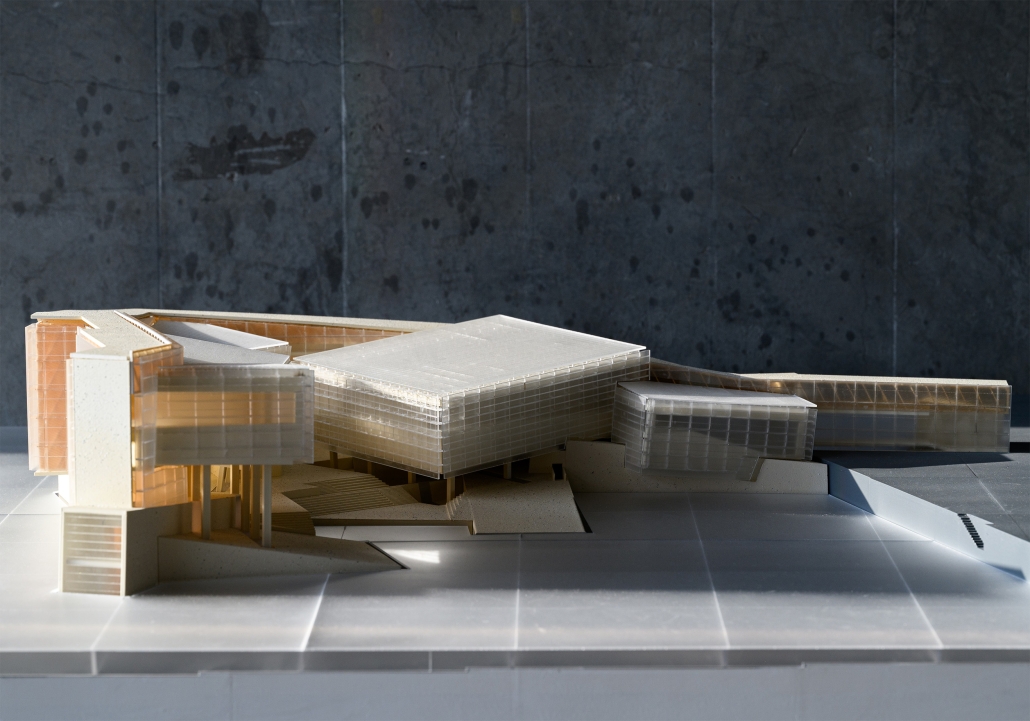
Gateway Park and Arts Center, Camden, NJ by Philip Edmonston, BS Architecture ’24
University of Virginia | Advisors: Peter Waldman & WG Clark

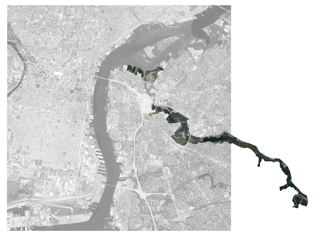
Situated between two industrially important rivers, Philadelphia was laid out on a grid plan in 1682 by William Penn. The city is organized around two axes and is punctuated by four public parks, each within walking distance of the others. While Penn’s ideal city was historically planned for its residents, its partner city Camden was not.

Camden, [located] on the east shore of the Delaware (A), began as an industrial zone serving Philadelphia. After the twilight of American urban industrial centers in the latter half of the twentieth century, Camden fell into deep poverty as a result of disinvestment. No longer used for manufacturing, Camden became a center for cheap office space – more affordable than Philadelphia while still benefiting from proximity to the larger city. This shift in Camden’s financial basis caused a shift in urban planning, where former industrial space was razed and new offices were built. Further, new highways bisected Camden’s neighborhoods, allowing non-residents to work in Camden’s downtown, but sectioning off some neighborhoods from others. Because of historic disinvestment and continuing urban renewal, Camden has become hostile to its residents, who are alienated from their city. 

Camden has been treated as culturally secondary to Philadelphia – while there is a strong “Philly” identity, Camden’s identity has not been cultivated and protected in the same way. Because it is culturally undervalued, historic preservation is not seen as vital in Camden as it is in Philadelphia. This in turn causes a pattern of razing and building new, and it is because of this pattern that Camden is losing connection to its historic spaces. We connect with our cities through historic spaces and the weathering apparent in the material of old buildings. This project proposes not a clean-slate renewal, but rather a care for and celebration of weathering, history, and the industrial space that facilitated Camden’s development.

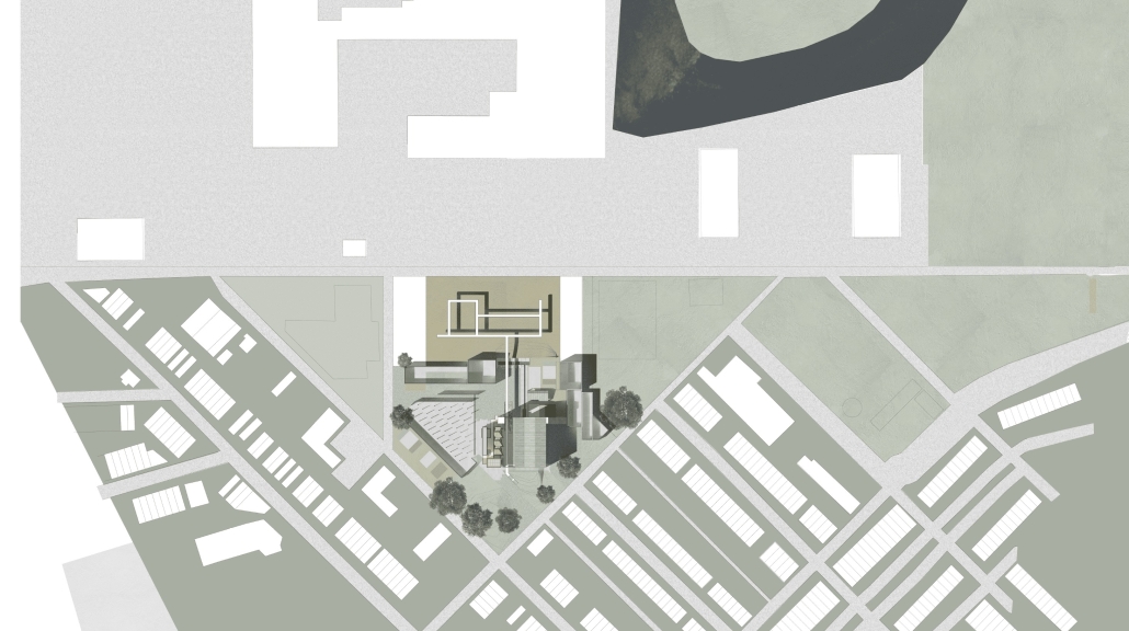
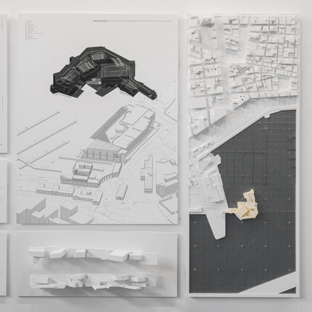
The Gateway neighborhood (B) in Camden is one such example. Lying between the I-676 highway to the West and the Cooper River to the east, the neighborhood is relatively isolated from Camden’s downtown and from the city’s public space. Further, the Campbell’s Soup headquarters to the North cuts Gateway off from the rest of the city. The project becomes a new Northern boundary for Gateway and connects it to the larger Cooper River Park.

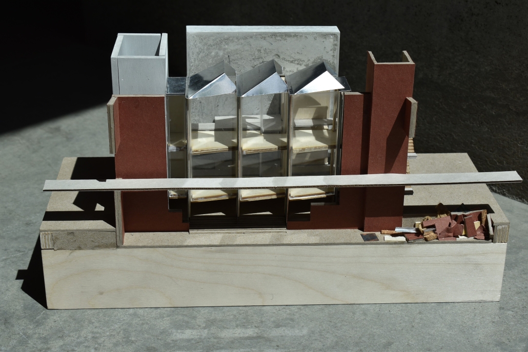
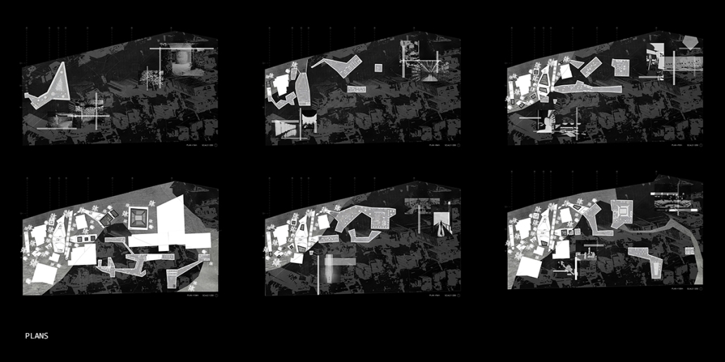
At the site scale, the project exhibits a series of methods for environmentally conscious use of formerly industrial space. These three methods: infill, excavation, and bioremediation through aeration, are shown in sequence as visitors walk across a path connecting the Gateway neighborhood to the Cooper River Park. The excavated and infilled areas are designed as park spaces, while the bioremediation space lies under a series of raised pathways. 

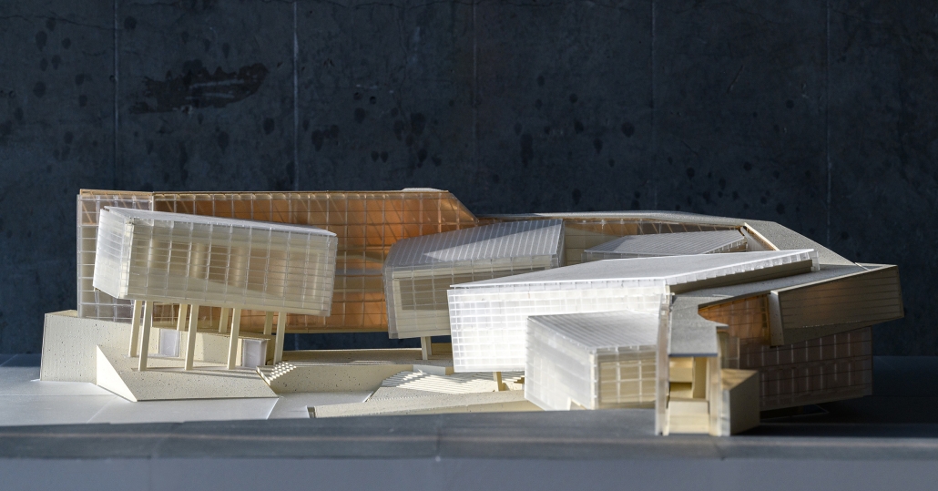
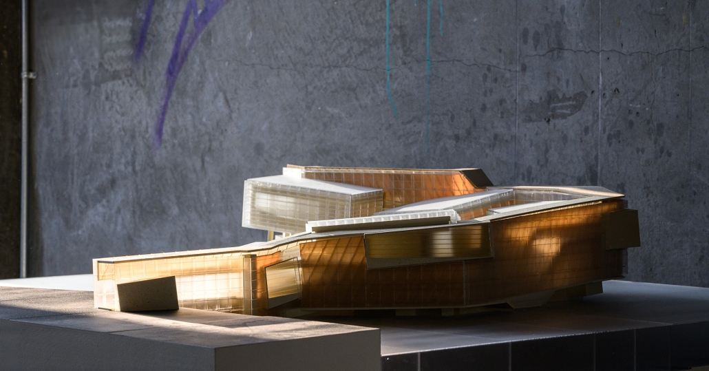
In addition to providing residents with a new boundary and park, the project proposes an art space serving residents and visiting artists. The space, designed using principles taken from the industrial context, consists of three components: a residence and service space for visiting artists, a workspace for artists and residents, and a meeting hall for local groups.

This project was recognized as a 2024 Exceptional Thesis Project at the University of Virginia.

Instagram: @philip.edmonston, @aschool_uva

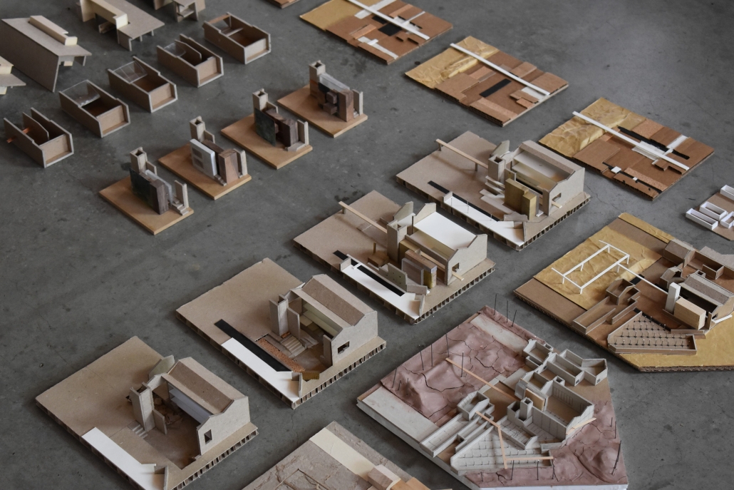
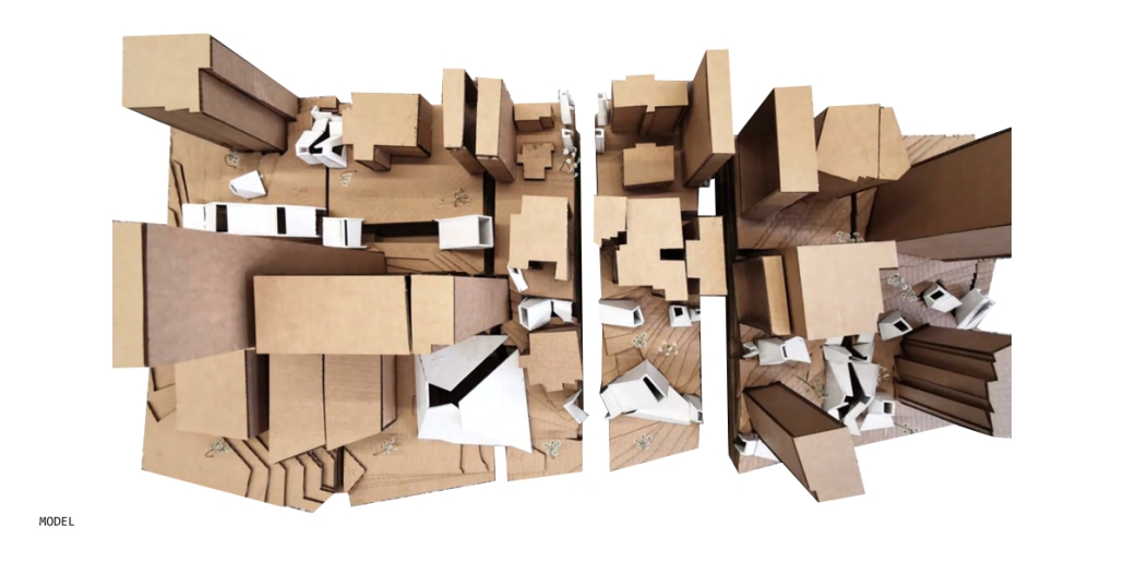
Into the [dys]utopian maze, the case for subterranean spatial re-organization and dis-orientation by Sarah Karam, B. Arch ’24
American University of Beirut | Advisor: Sinan Hassan

Inspired by Italo Calvino’s Invisible Cities and Fritz Lang’s Metropolis, this thesis envisions a novel architectural and urban morphology to uncover hidden (dys)utopian experiences within our environments. Recognizing that our mental depiction of the physical world is limited by societal conventions, this project introduces the concept of a “third space,” — a realm where conscious and unconscious aspects merge, allowing for a deeper exploration of our urban landscapes.

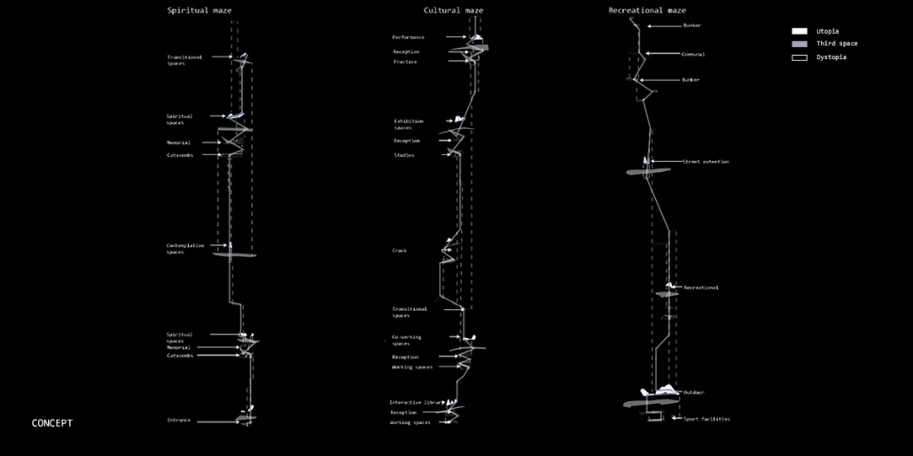
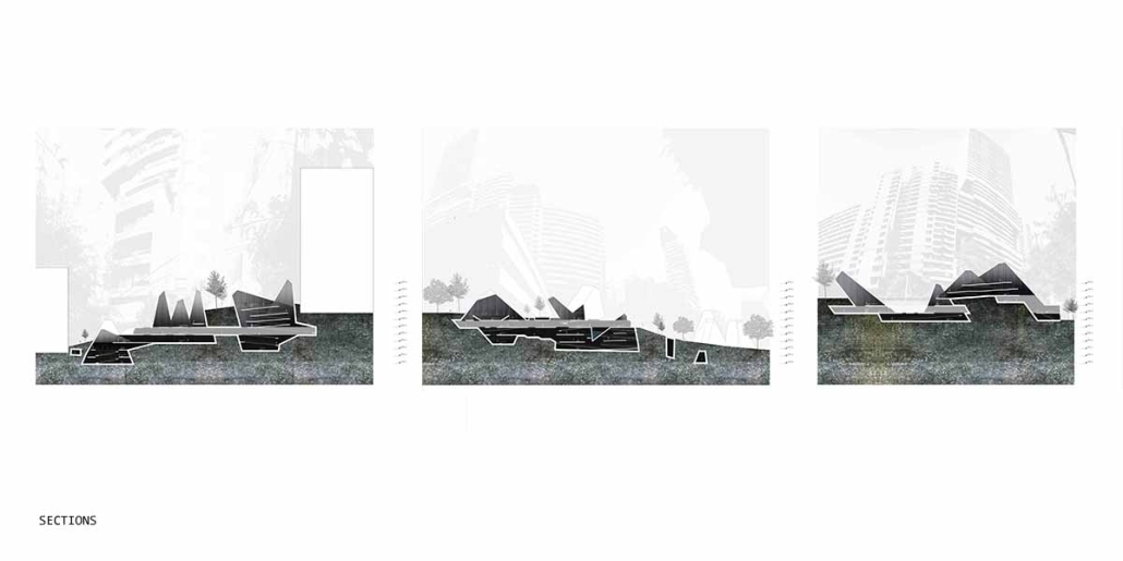
Drawing upon Sigmund Freud’s Oedipus complex, it is posited that humans possess an intrinsic desire to get lost, a need that can be facilitated through the architectural form of a maze. The maze acts as a connective tissue, enabling individuals to encounter new perspectives and engage with the (dys)utopian layers of their environment. The research begins with a theoretical investigation into the interplay between dystopian/utopian experiences, the third space, and the maze. This involves analyzing case studies and testing strategies to select a suitable site, ultimately choosing Sassine, Ashrafiye, Lebanon. The final intervention includes a subterranean spatial reorganization aimed at uncovering a (dys)utopian world, with the third space mediating between utopian and dystopian elements.

The project employs the maze to challenge conventional spatial orientation and organization. It rethinks circulation and spatial distribution, creating unpredictable encounters and perspectives. The maze, both above and below ground, facilitates diverse (dys)utopian experiences, blending formal and informal activities, and connecting the disjointed urban fabric of Sassine.

Concisely, this thesis proposes an architectural framework that integrates (dys)utopian thoughts into a third space through the labyrinthine design, addressing the human desire to get lost and reimagining the urban experience. Through this, the project aims to create a dynamic and multifaceted urban morphology that transcends traditional spatial conventions.

This thesis was nominated for the Areen Projects Award for Excellence in Architecture.

Instagram: @ard_aub

Beyond The Wall by Zili He & Wenan Hu, B. Arch ’24
Southern California Institute of Architecture | Advisor: Maxi Spina

In the past, the wall offered both contextual and functional performances by unifying the interior programs and the exterior experience along the wall. The purpose of the wall here is its security and infrastructural nature, as well as a social and organizational one. A wall is not only a figure full of turns and edges but also a linking device that connects all the spaces and experiences associated with it.

This thesis borrows from, learns from, and adopts strategies from ancient city walls and therefore transfers them into a new generator for architecture, which can be applied through articulation in multiple layers and multiple scales. Challenging the efficiency-oriented cliche of the convention center, letting the wall typology generate a sequence of experiences while responding to the large, this thesis offered a new perspective looking at large civic buildings with urban ambitions.

“The wall is what contains. defines. channels. constraints, limits. stops, articulates and divides.” —A field of walls, Dogma.

Instagram: @luke_hezili2001, @olllihu, @maxispina

Midnight on the Stairs by Shun Sasaki, B. Arch ’24
Southern California Institute of Architecture | Advisor: Karel Klein

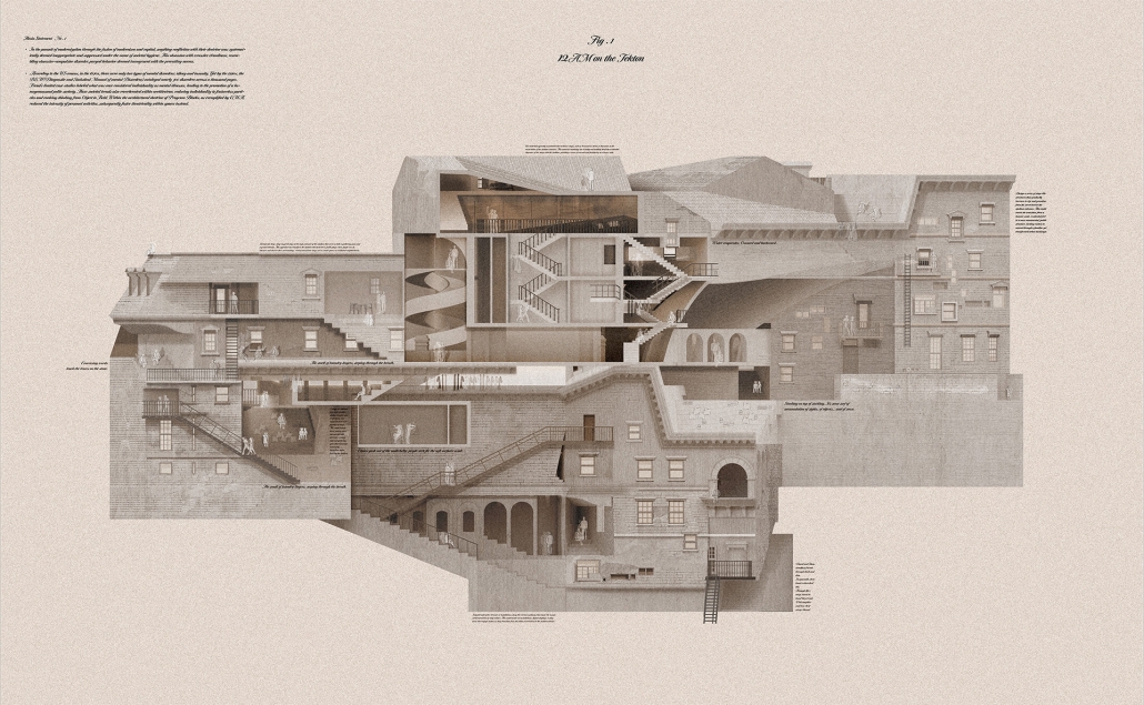
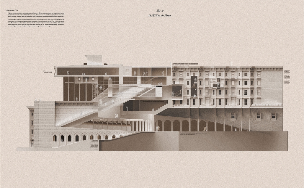
This project explores the reinterpretation of societal norms, architectural spaces, and individual identities homogenized by modernization by investigating the diachronic transformation of architectural elements. The fusion of modernism and capitalism suppressed behaviors conflicting with their doctrines under societal hygiene, leading to an obsession with cleanliness and, in architecture, the “theatricalization of architectural spaces.” Recently, the architectural doctrine of Program Blocks, exemplified by OMA, has disregarded individual activities that do not fit the intended program, considering activities within architecture only through the combination of programs.

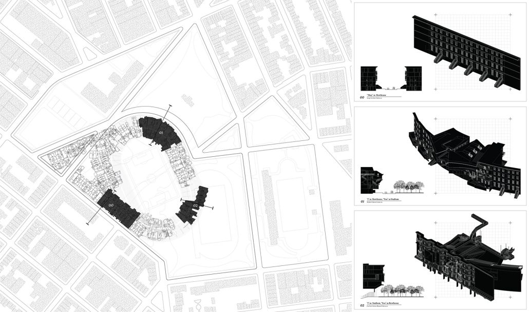
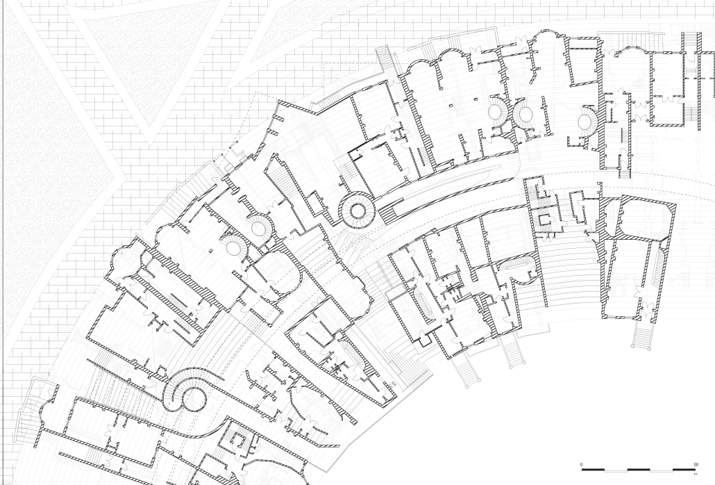
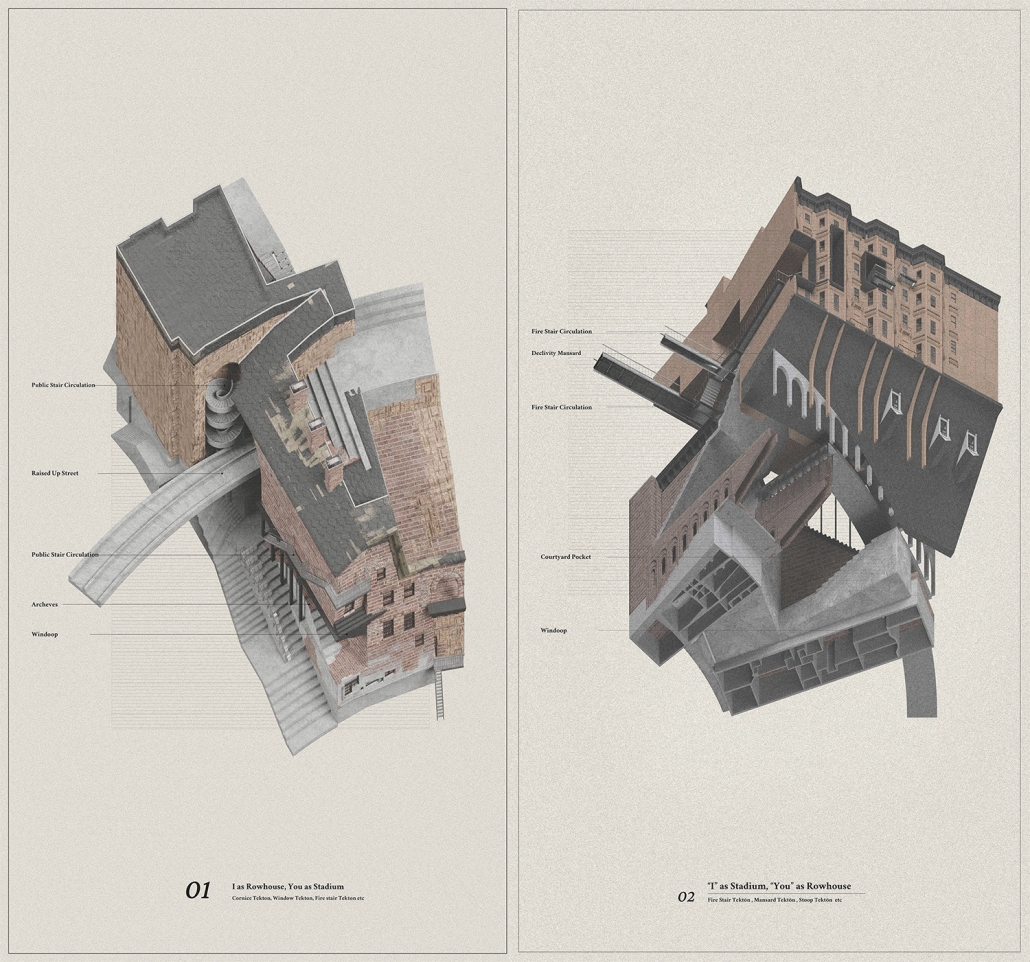
This project, “Residential Stadium,” is based on the brief of the public competition “Residential Stadium: Adaptive Reuse,” held in 2018 on a site in Brooklyn, New York. In this thesis, I first examine the ‘stoop’—a distinctive architectural element observed on the facades of Brooklyn rowhouses—investigating how a generic stair typology acquires its unique ‘stoop’ identity. Next, by overlaying the semi-public nature of the stoop with the function of stadium seating, I designed a program that integrates stair/stoop/stadium seating within a single stair typology. Furthermore, by extending this architectural element to other features characteristic of Brooklyn rowhouses, such as fire stairs, balconies, cornices, and windows, the design aims to create architectural devices that mediate between residential and stadium spaces. The activities occurring within these spaces are intended to expand the discussion beyond what traditional design methods with program blocks can capture.

At the massing scale, the relationship between the residential and stadium programs transforms into three typologies based on their degree of integration with the adjacent urban street.

In Chunk 0, typical rowhouses line North 12th Street, showcasing a standard Brooklyn rowhouse configuration. In Chunk 1, the floor plan of a generic stadium superimposed with Brooklyn rowhouses creates an unusual spatial relationship, with the adjacent roadway extending into McCarren Park. In Chunk 2, the roadway disappears, leaving Brooklyn rowhouses floating above the park’s meadow, detached from the urban street. The space is completely open at the ground level, with the stadium field connected to the park’s field.

This thesis reveals enigmatic objects from architectural and societal shifts, enhancing our understanding of their impact on society and identity.

Instagram: @ssasaki636, @karelnyla

Stay tuned for Part XI!

2023 Study Architecture Student Showcase - Part XXXIII

Welcome to the final edition of the 2023 Study Architecture Student Showcase! In Part XXXIII, we highlight student work that centers on public spaces. The showcased designs include public parks, meeting spaces, community centers, commercial retail spaces, parking structures, pools, and more.
Re-encontrarse (Re-united) by Sophie Esther Zurhaar Ortiz, B.Arch ‘23
Universidad Anáhuac Querétaro | Advisors: Jorge Javier & Francisco Paille

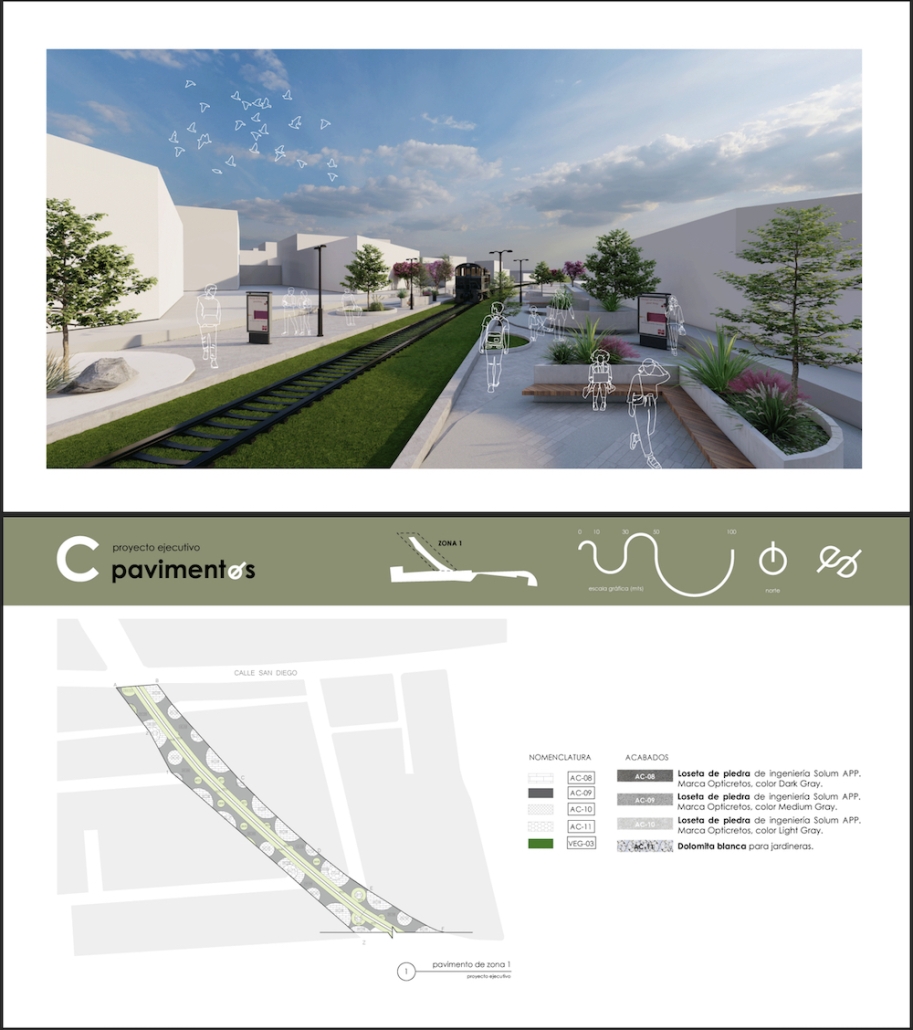
This project seeks to generate an urban design proposal for the recovery of public space in Felipe Carrillo Puerto. Aiming to propose meeting spaces where all kinds of activities can be carried out, recover the railroad tracks to stop being a physical barrier, and defragment the urban fabric, offering cohesive, healthy, and functional meeting spaces that together can regenerate the social fabric.

Instagram: @sophiezurhaar, @arqwave

PROSPECT NEW ORLEANS by Olivia Georgakopoulos, B.Arch ‘23
Tulane University | Advisor: Ruben Garcia-Rubio

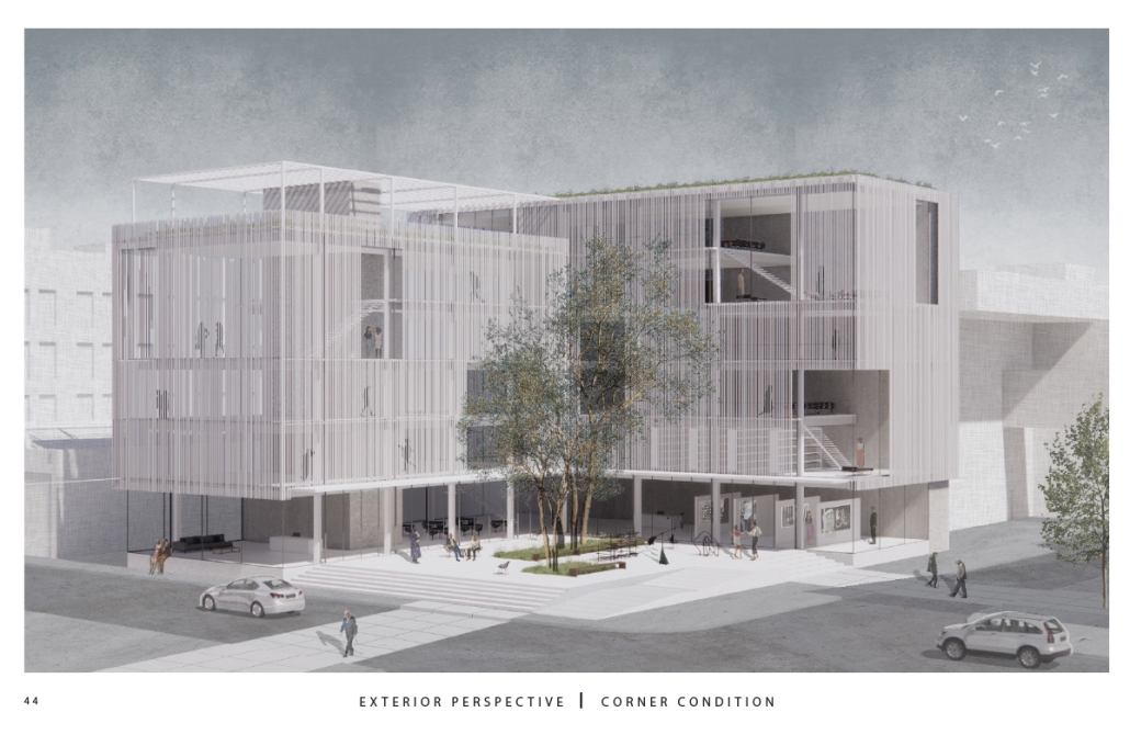
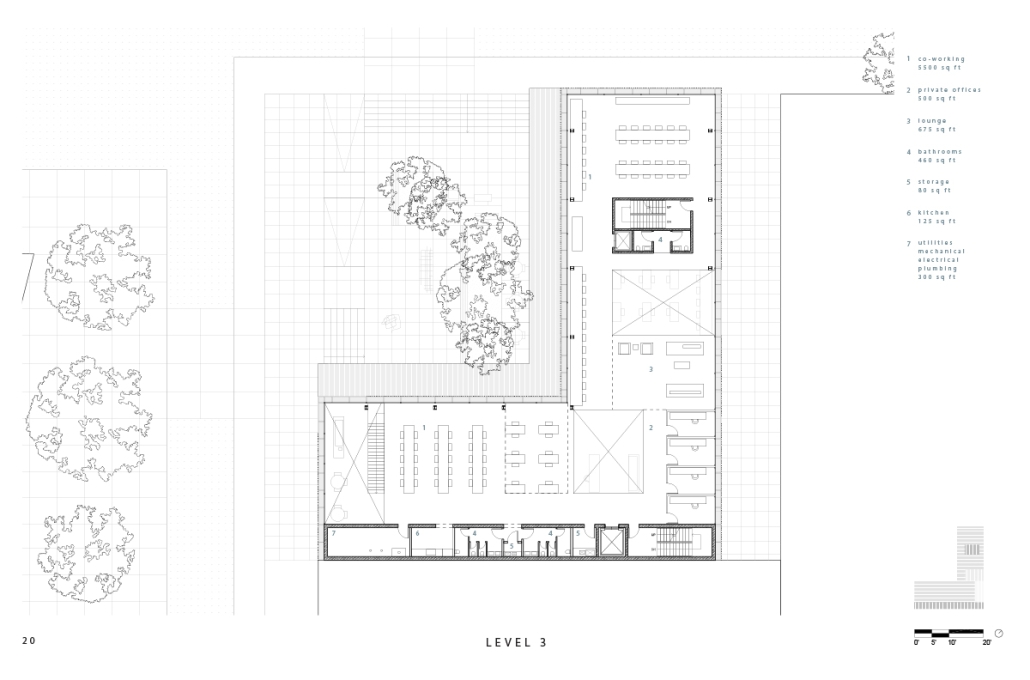
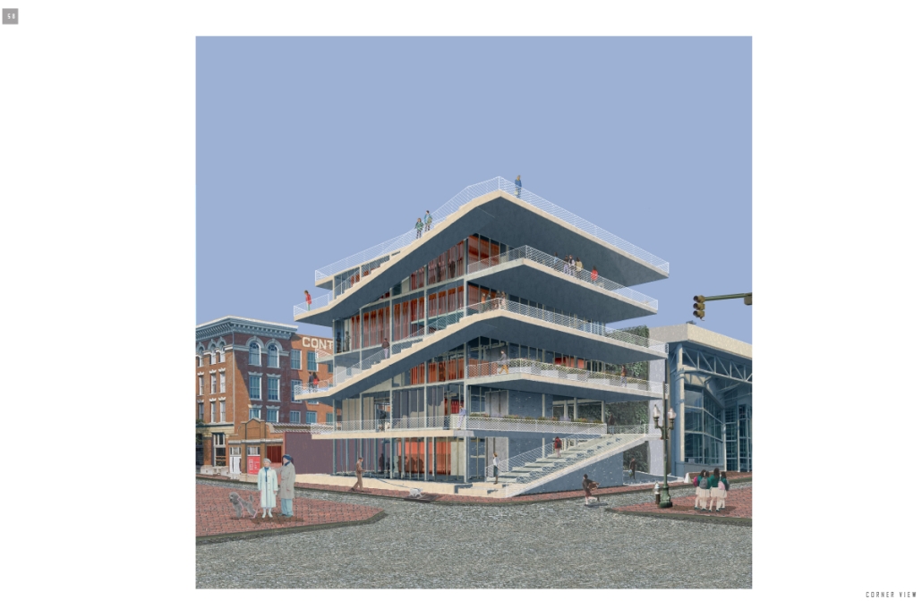
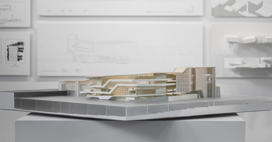
This project proposes to open the building to the city, creating a place that adds to its rich urban fabric. The site is a parking lot at the corner between the Contemporary Arts Center and the WWII Museum. While there are many voids in the surrounding context, like this site, they are not habitable. This project provides a much-needed public space for the many visitors to the surrounding museums. Taking inspiration from the L-shaped building typology in New Orleans, the building opens to the city, creating a public plaza. 

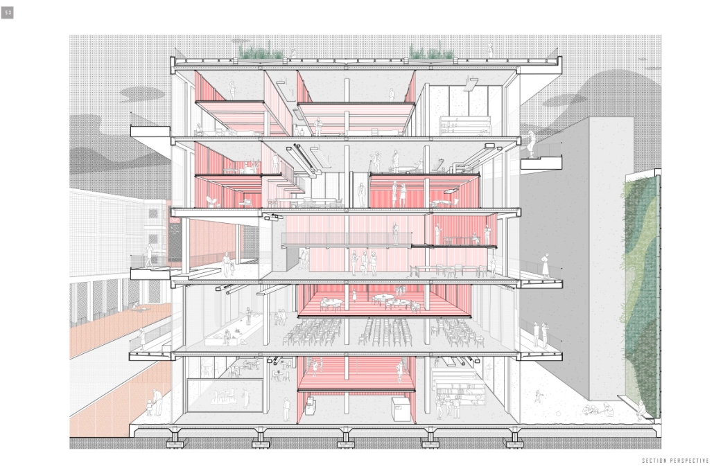
The building functions as an open-public platform connecting Camp Street and Andrew Higgins Blvd. The glass-enclosed first floor is fluid and can be completely opened, allowing for space not to be defined by interior or exterior. Rather, programs can spill out and interact between the interior and the plaza. The ground floor then becomes animated by human activity. The public programs, gallery, cafe, lobby, and lounge are housed on the first floor, and spaces to support the art center are above. 

Transparency of the building is achieved through the aluminum louvered facade, which acts as a theatrical scrim. This veiled facade reveals the animation on the inside of the building. This transparency is also experienced from the inside looking out: the interior programs interact with filtered and framed views of the city. 

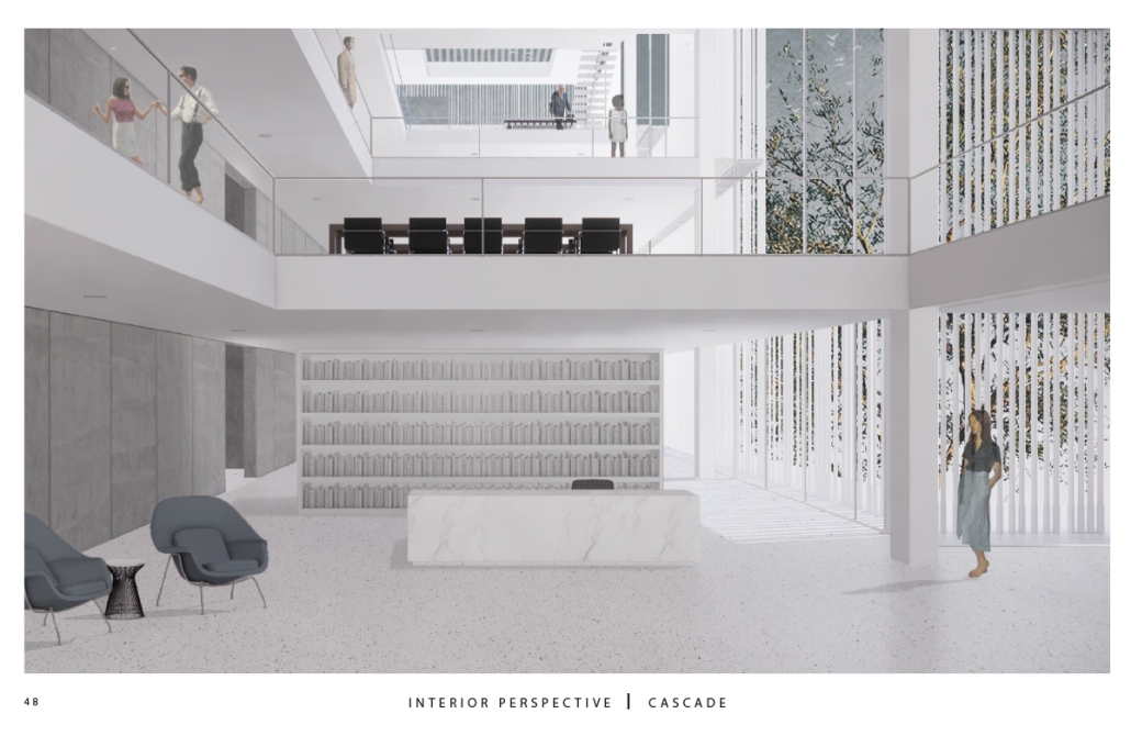
A chain of internal double-height spaces forms a visual cascade through the building, providing internal transparency and animation with continuous views from the bottom floor to the top floor and the sky. The overall design provides continuity between the interior, the plaza, the street level, and the city.

Instagram: @rubgarrub

Los Angeles Media Library by Charlotte J. Love, B.Arch ‘23
Tulane University | Advisor: Ruben Garcia-Rubio

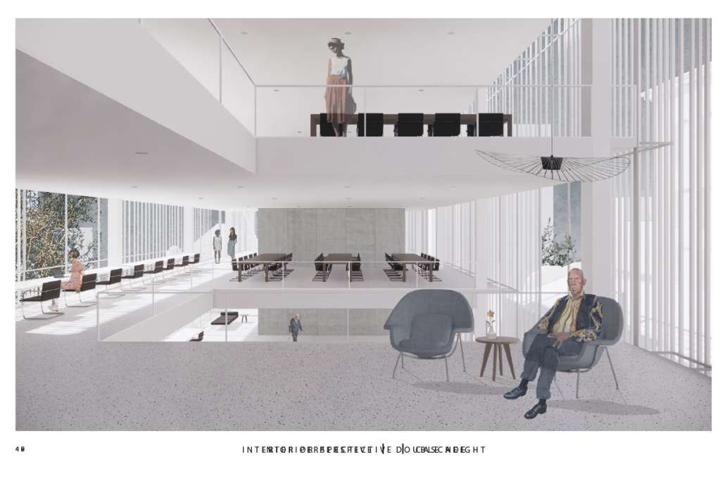
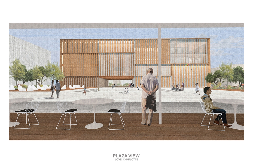
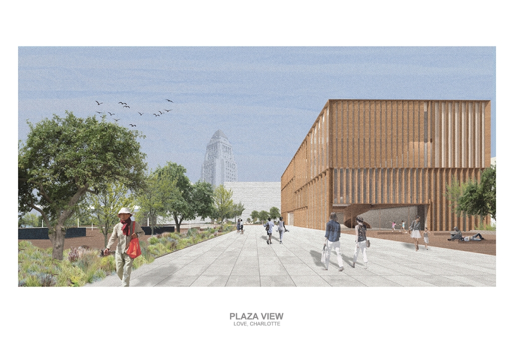
The Los Angeles Media Library began by building upon the urban design. The building began with the broken urban block typology found throughout the site, this promoted a continued focus on mobility within the project. The urban block shape was altered to accommodate one large building wrapped in louvers and two smaller pavilions hosting different program focuses on a plaza. This iteration of the broken urban block creates an inviting place for a public plaza. This plaza being at the literal intersection of the business and arts district makes it a perfect spot to hold a media center and library. This is relevant for both the site and the Greater Los Angeles.

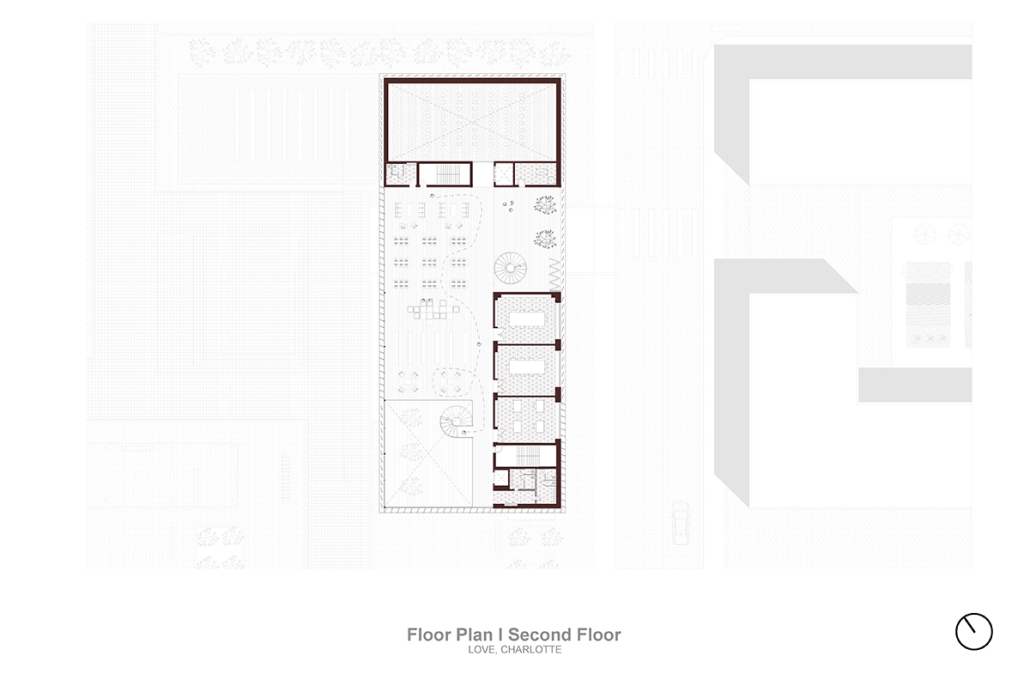
The plaza has a number of public transportation stops and is located across the street from two museums making the plaza equally important to the design. The open space has a café, reading area, pavilion, and an outdoor theater. The buildings and walkways align with the surrounding roads and buildings leading to a central sunken space at the center of the plaza. Held within the building are two zones with thickened walls holding private programs such as classrooms, dark rooms, offices, etc. This allows the rest of the building to be much more open with a number of double heights as well as spaces with an indoor-outdoor feeling. This allows the building to be fluid and connected to the plaza, blurring the line between public and private spaces.

Instagram: @rubgarrub

HALLOWED GROUND by Ramona Reinhart, M.Arch ‘23
University of North Carolina at Charlotte | Advisor: Chris Jarrett

In “Taoka Reiun and Environmental Thoughts in the Early 1900s,” Ronald Loftus addresses Reiun’s cultural critique of Western modernization and the devastating forms of pollution that followed during Japan’s Meijin state beginning in 1880. As an early environmentalist and anti-modernist, Reiun argues that these natural disasters are ultimately a result of humanity’s disconnection from the natural and spiritual world. 

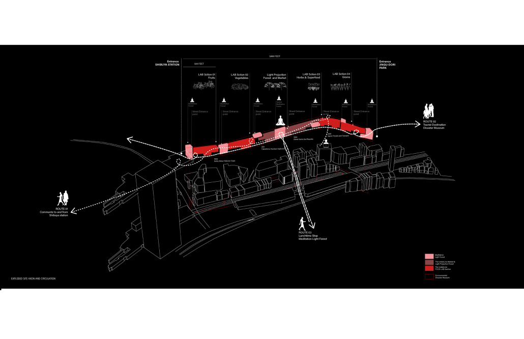
Located in Shibuya, Hallowed Ground proposes “The Under Line,” a linear futuristic public park, lab farm and market, integrated urban meditation spaces, and a museum for environmental disasters as a response to Tokyo’s culture of hyper-consumerism and capital development that “buried” many of Japan’s spiritual traditions and natural ecologies. The constant strive for economic growth resulted in large areas of impervious surfaces in the city. Surfaces that are now being hollowed out.

This project won the 2023 Best Architectural Diploma Project. As well as 2023 Excellence in Architectural Representation.

Instagram: @_ramonareinhartg

Little Megastructure by Yiman Yiman, M.Arch ‘23
UCLA Architecture and Urban Design | Advisor: Greg Lynn

“Little Megastructure” configures an inclusive community of aggregated spatial prototypes that celebrates social connection and belonging while supporting individuality. The prototypical forms can be combined and composed in a variety of ways to create a wide range of spaces. Clusters of parks, plazas, courtyards, and atriums in between modules throughout the megastructure foster a sense of community and belonging. With a clear hierarchy of spaces that are designed for different purposes and activities, having all the components of a city creates a sense of urbanism.

Park! Park! by Motomi Matsubara ‘23
UCLA Architecture and Urban Design | Advisor: Greg Lynn

“Park! Park!” offers a set of housing towers, their shapes, and scales informed by the interplay between the behavior of residents inside and automobile traffic outside. One of the towers is taller and leaner; another more lateral and rectangular. Here, fillets perform not only as an intimate icon, each interacting softly with adjacent housing towers, but also as mediators of the different scales of motions between two different physical bodies–people and cars.

Instagram: @m2c_works

Undefined Parking by Katie Yuan, M.Arch ‘23
University of Southern California | Advisor: Yaohua Wang

The lines drawn on maps to define the borders of countries and territories may appear solid and definitive at a glance. However, when magnified and viewed at a larger scale, these lines are composed of segments, curves, and dashes that intersect, connect, and overlap. Lines are one-dimensional, but when given 3-dimensional qualities, they become less concrete and defined. In other words, when lines are given different widths and heights, they are no longer elements that separate or confine objects, but rather they embody multiple conditions that can become spaces, tectonics, connections, and circulations.  

Formed through a series of intersecting, shifting, and offsetting lines, Undefined Parking appears as an urban boundary that separates the UCLA campus and residential area at an urban scale. In this condition, the boundary becomes a partition wall. At an architectural scale, the parking structure becomes the destination for both entering and exiting the site. Yet simultaneously, the structure’s various programs (offices, classrooms, green space, etc.) blur the distinction between the university campus and the urban site. In this condition, the boundary becomes a destination. At a model scale, the volumes, ramps, walls, and planes are interlocked and joined together through the distinct tectonic elements of each individual piece. In this condition, the boundary becomes a connection. 

Perhaps, lines or boundaries exist in multiple conditions and cannot be defined…

This project was awarded the USC Master of Architecture Distinction in Directed Design Research.

Instagram: @katie0712yl, @yaohua_wwww

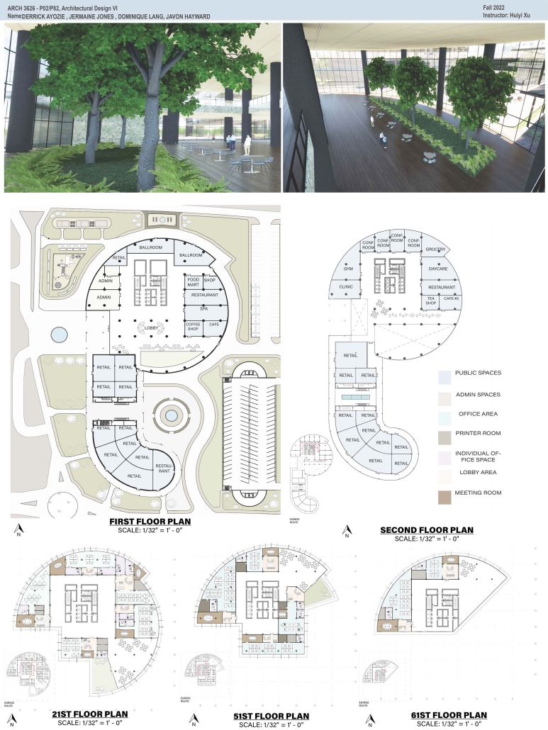
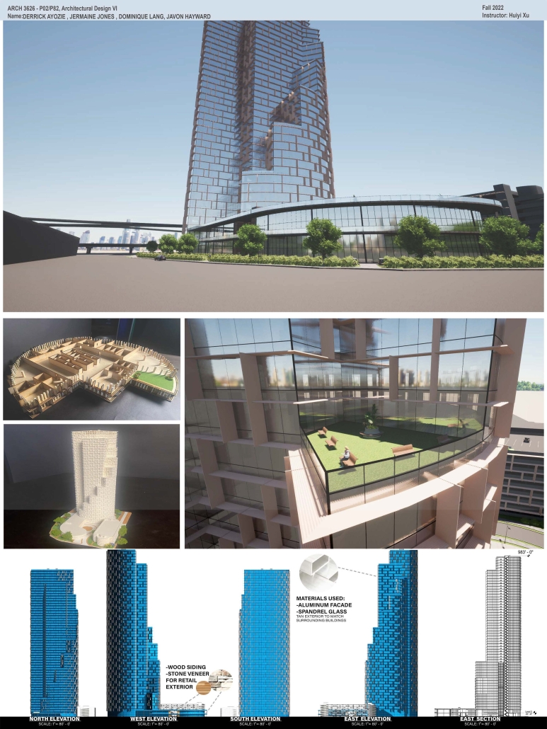
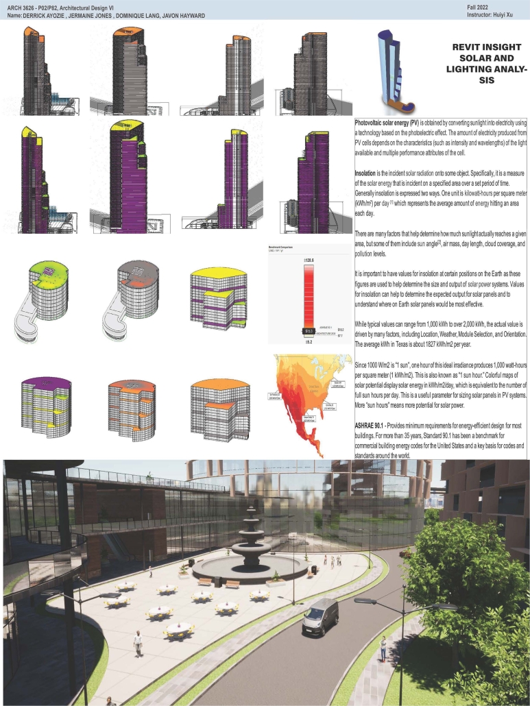
High-Rise Building by Jermaine Jones, Dominique Lang, Javon Hayward & Derrick Ayozie, B.Arch ‘23
Prairie View A&M University | Advisor: Huiyi Xu

According to the U.S. Census Bureau’s population estimates from 2021, there were 69,094 new residents added to the Greater Houston area. Some developers have purchased land in the Houston City Centre area, on the corner of I-10 Hwy and Beltway 8 in the City Centre, and plan to build an iconic high-rise building. This project is a mixed-use office building. The location of the project is in the Memorial City district of Houston, Texas. City Centre is a 50-acre development with 2.1 million square feet of gross floor space, including 400,000 square feet of retail, restaurants, and entertainment, a 149,000 square foot fitness facility, 425,000 square feet of office space, a variety of rental, and non-rental residential developments: a Microsoft office, Memorial Hermann Hospital, Memorial City Mall, Houston of City College, and diversified restaurants such as Taste of Texas, Pappadeaux Seafood Kitchen, and other retailers are all around it. 

This project will bring more people to this area to contribute to the local business and land value. The potential tenants of the high-end office building with commercial spaces and a parking garage will be the headquarters offices, banks, medical offices, high education offices, etc.

DIGNITY by Macinnis Kraus, M.Arch ‘23
The University of Texas at Austin | Advisor: Nichole Wiedemann

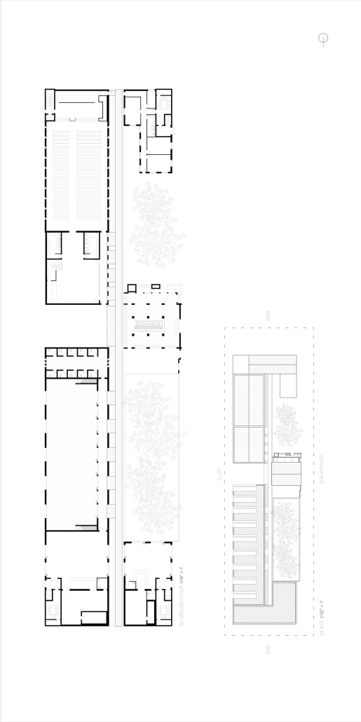
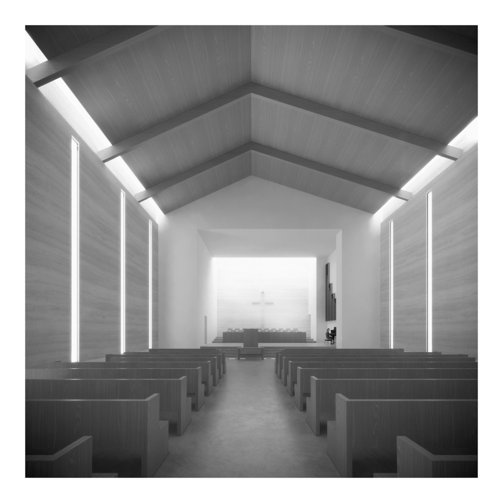
Working with a local church in West Campus and inspired by the student interest in “serving” over “services,” the design is for a re-combination of worship, living, and service. Two transitional housing towers provide residences for formerly itinerate populations and create bookends to the public landscape. The individuals may work here –apprenticing in the artisan maker space or running the restaurant– providing some financial stability for the immediate and the future. In addition, public showers, laundry, and bathroom facilities support the broader community. Embracing the pragmatic and poetic potential of water, light, and body (human-scale moments), the project seeks to provide dignity for all user groups.

This project was nominated for Design Excellence at the UT School of Architecture.

Instagram: @nicholewiedemann

Intertwining blocks in Los Angeles by Joey A. Tomshe, B.Arch ‘23
Tulane University | Advisor: Ruben Garcia-Rubio

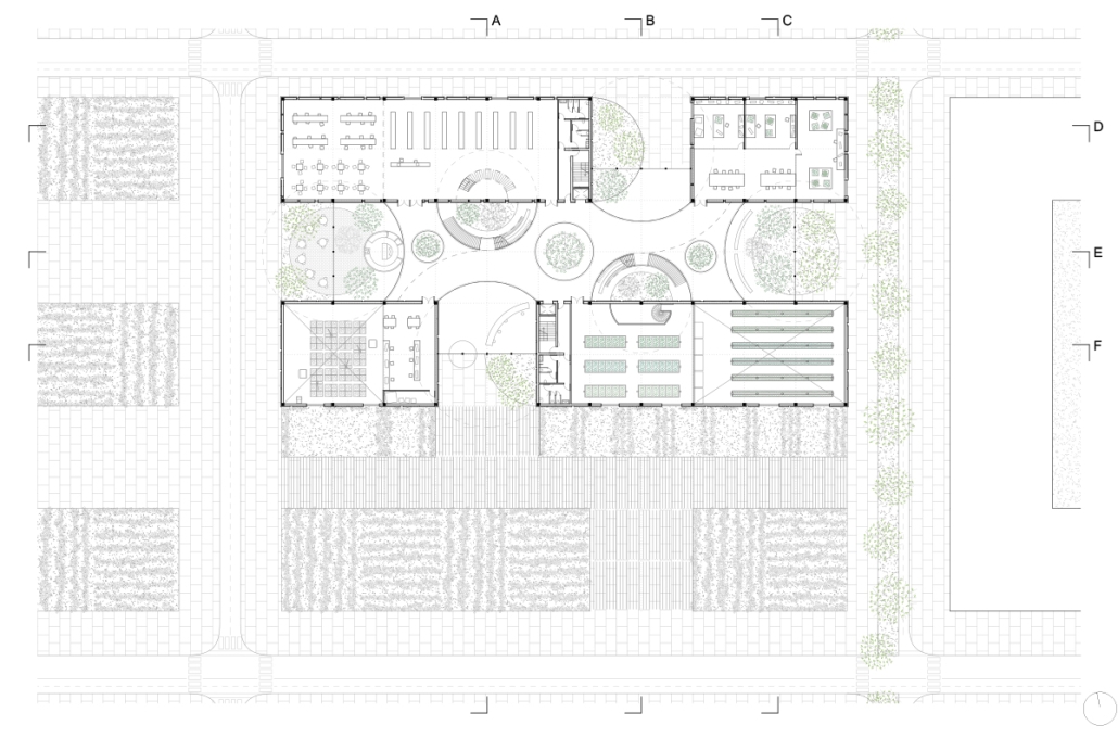
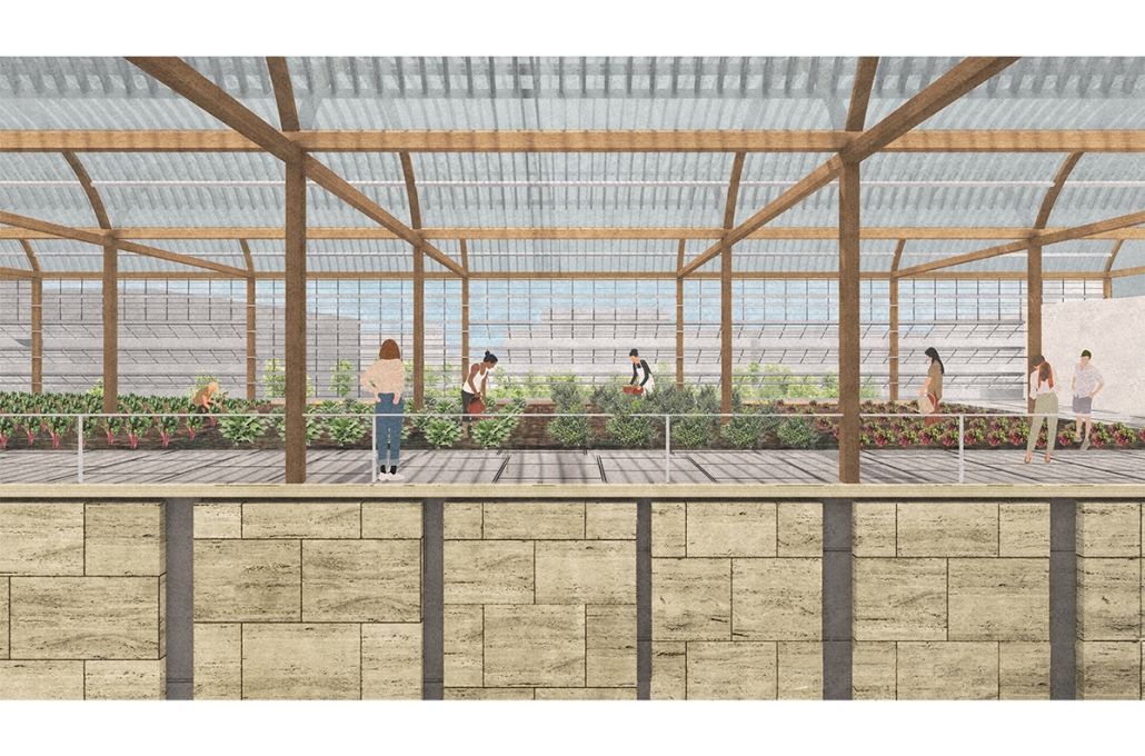
Intertwining blocks is proposed to act as an agricultural information and research center for the previously designed master plan, and, in the future, there would be more of these spread out around LA which are connected. It will feature many new innovations in the agriculture field with the goal of informing the public about the advanced research being performed in LA today.

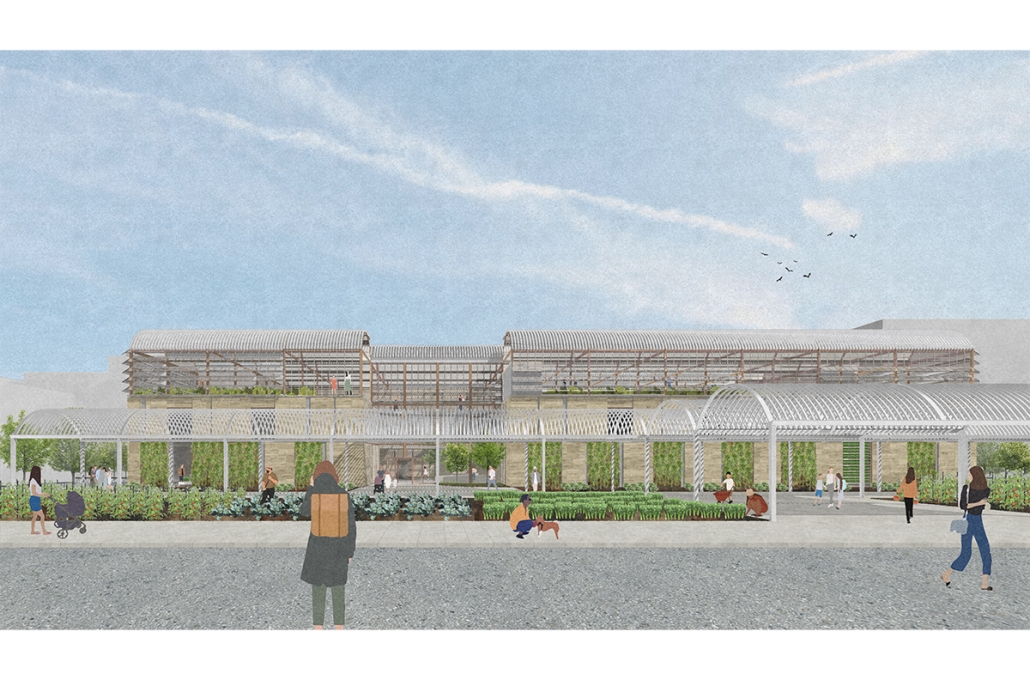
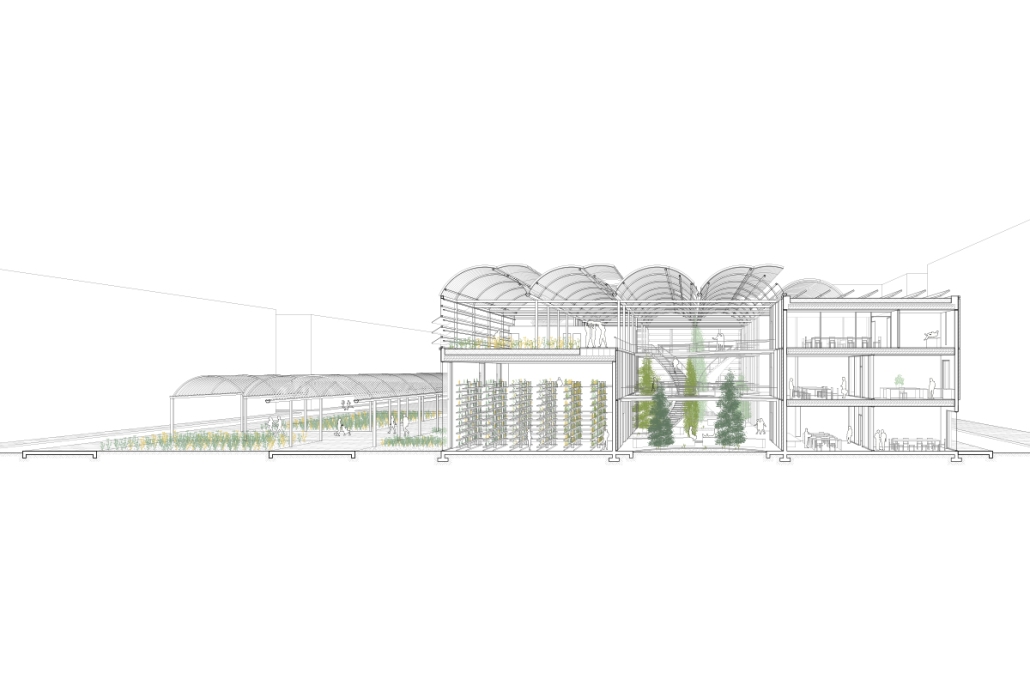
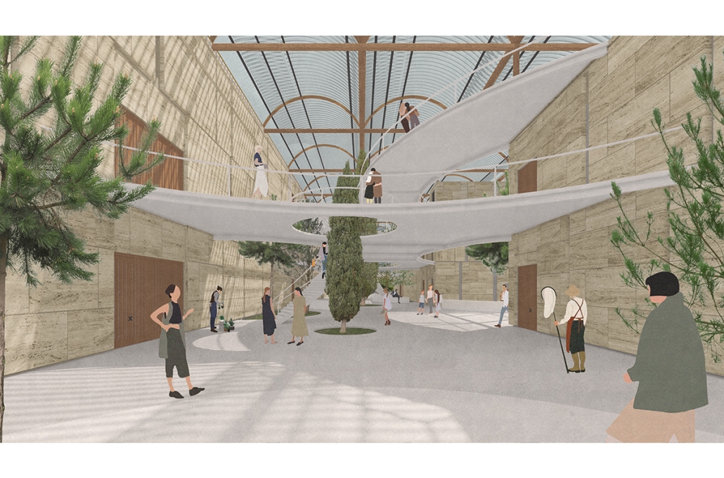
The initial concept for this project was to intertwine four blocks, creating an indoor street that acts as a social condensing space, relating to the distinct street types created in the master plan, with the social condensing space containing lighter elements than the heavier blocks. The project features six types of farms, a mediateque, and research stations for botanists. The form of the social condenser space comes from trees in plan view, then those same circles are introduced in sections to influence the roof. To combat the heat from glass roofs, the proposal will be installed with an automated computer system that processes and manages a database to optimize comfort and energy efficiency. Along the face of the roof structure is a series of operable louvers that can open and close, which allows for natural ventilation as well as sun deflection. Similarly, on the roof the northern faces of the arches can pivot open, allowing for full circulation. Furthermore, the roof allows for rain collection with built-in gutters and features solar panels on the north two blocks. Due to the repetition of louvers on the roof, a facade of varying size stone panels is introduced to disrupt this rhythm and add variation. Some panels were removed for windows and others, on the south facade, were turned into farming panels that interact with the farm in front.

Instagram: @rubgarrub

2023 Study Architecture Student Showcase - Part XIX

Welcome to Part XIX of the Study Architecture Student Showcase! As Urbanism continues to shape the study of architecture, today’s student showcase highlights projects that impact Urban Life. 

The featured designs seek to optimize the use of the available space while creating cohesive and functional built environments that meet the needs of all city dwellers. They also confront issues that impact urban spaces by addressing the increasing carbon footprint of the DFW Metropolitan Area and predicting a future where a massive electric vehicle charging car park replaces the greenspace of NYC’s Central Park.

Shifting Super Block by Yenifer Diaz, B.Arch ‘23
The New York Institute of Technology | Advisor: Prof. Michelle Cianfaglione

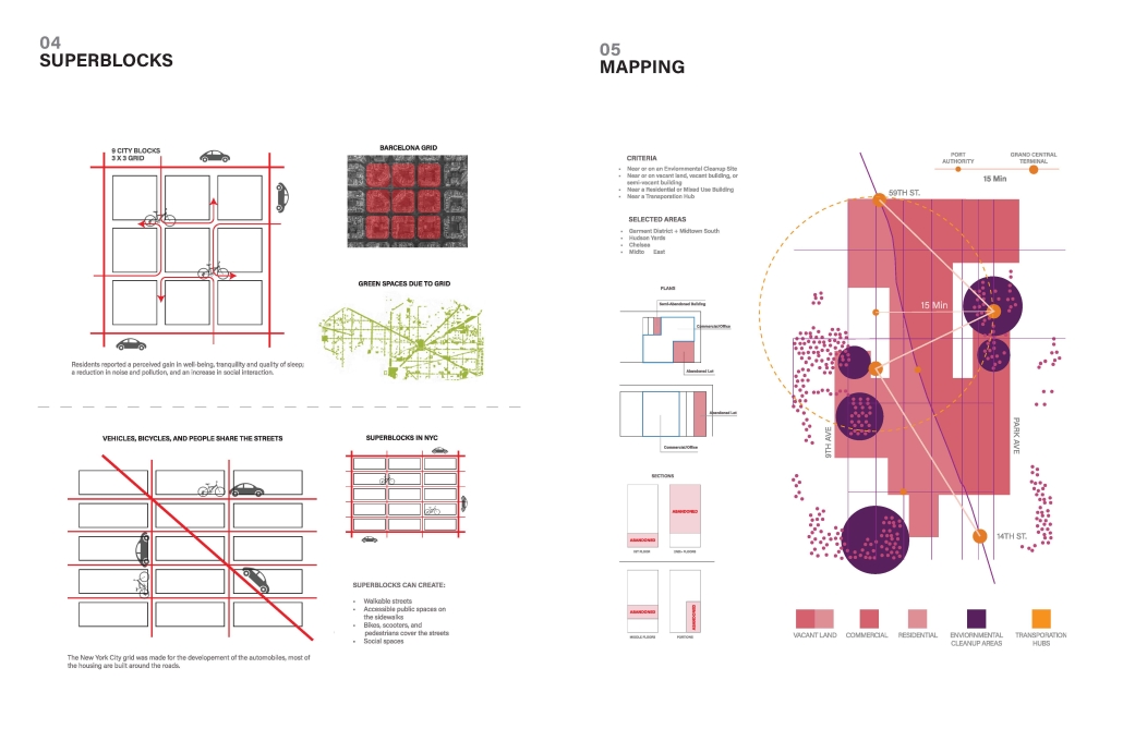
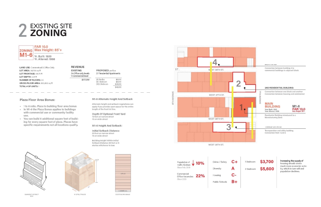
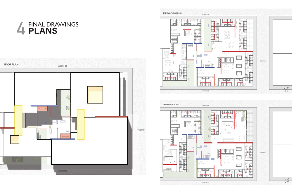
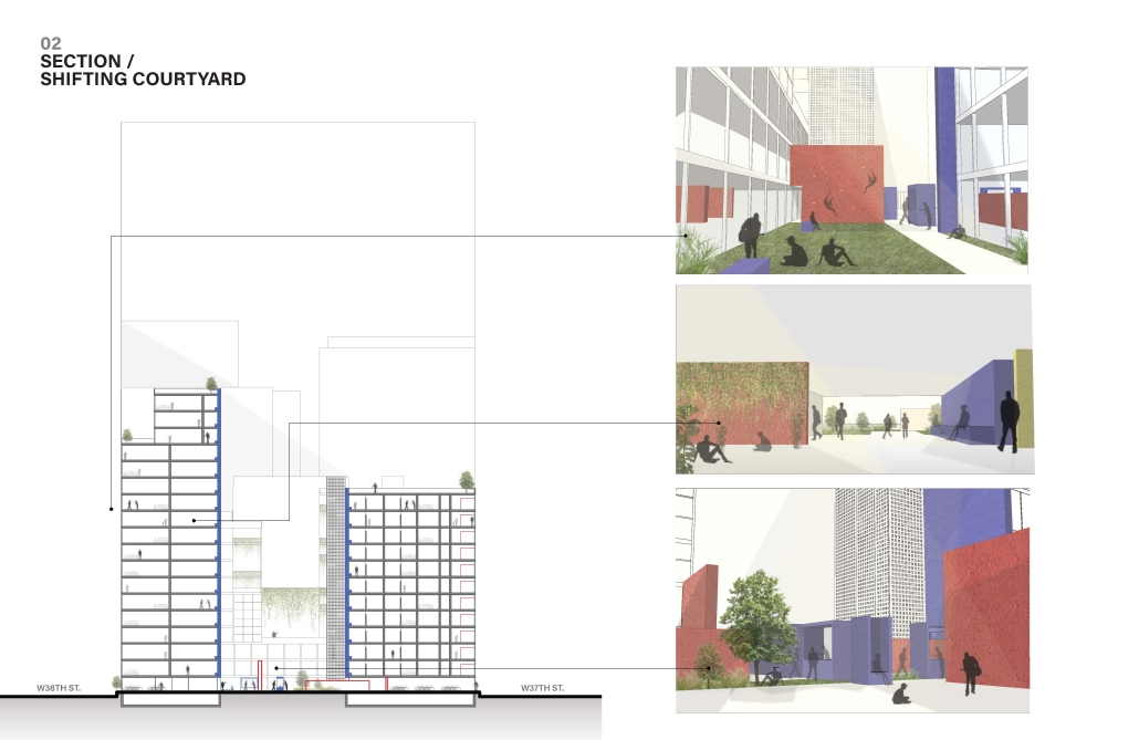
This research aims to answer the reasons for vacancies and how to solve the problem, especially in a city like New York. To create a shifting superblock with a seamless

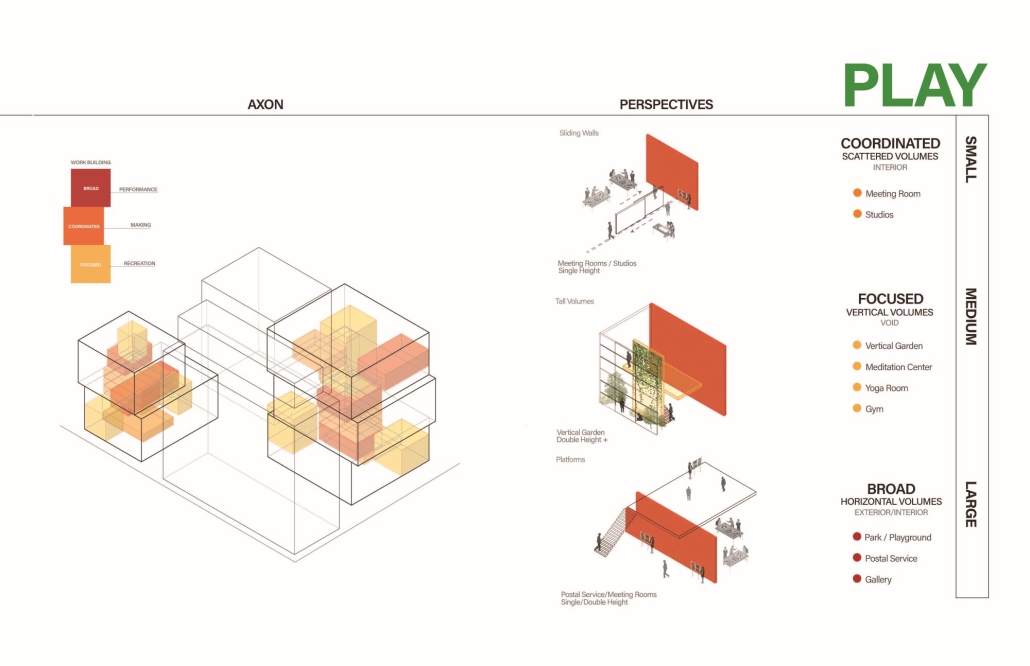
Live | Work | Play, a “city within a city,” where neighborhoods are not disconnected from the empty lots and abandoned buildings, and where services are available to anyone.  

How do we build a neighborhood through the integration of Live | Work | Play?

The aim is to create a superblock-type concept where neighborhoods are not disconnected. It began with research on zoning and its limits on building laws and regulations, to “What is a superblock?” and expanded to “What is a 15-minute city and how can it be integrated into a city like New York?”

Instagram: @michellecianfaglione, @nyitarch, @exdarchitecture

“A City Within a City”: Culturally Sensitive Architecture Adaptation in San Francisco by Zijie Zhou, M.Arch ‘23
University of Utah, School of Architecture | Advisor: Valerie Greer, AIA, LEEP AP, NOMA

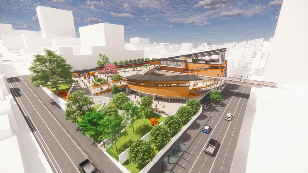
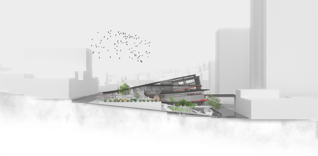
My site, located at Portsmouth Square in San Francisco, is positioned between the towering skyscraper side of the city and the low-rise Chinatown side. Throughout its rich history, Portsmouth Square has functioned as a significant community plaza for local Chinese immigrants, providing opportunities for entertainment and socialization for over 100 years. However, with the rapid influx of tourism and urban development, Portsmouth Square has become a point of conflict for the local Chinese residents and tourists, deterring both parties. This dissonance, reflected in the lack of connection between culture and architecture, has effectively created a divide — a cultural gap — between San Francisco and Chinatown, which is now referred to as “a city within a city.”

The tension and disconnect that exist between the two facets of this location can only be met with a considerate and nuanced approach. With sustainability and longevity in mind, I aimed to design beyond noteworthy architecture; instead, I aim to establish a structure for something more intangible – a community gathering space that embodies the values of rich culture and a diverse community. This conscientious design was intended to protect and enhance the quality of life for the local Chinese community, preserving their cultural heritage and identity while also encouraging community cohesion with those who are visiting or don’t explicitly belong to the Chinatown community. To achieve my goal, I aspire to cultivate a new cultural identity that resonates with the locals’ sense of belonging and loyalty.

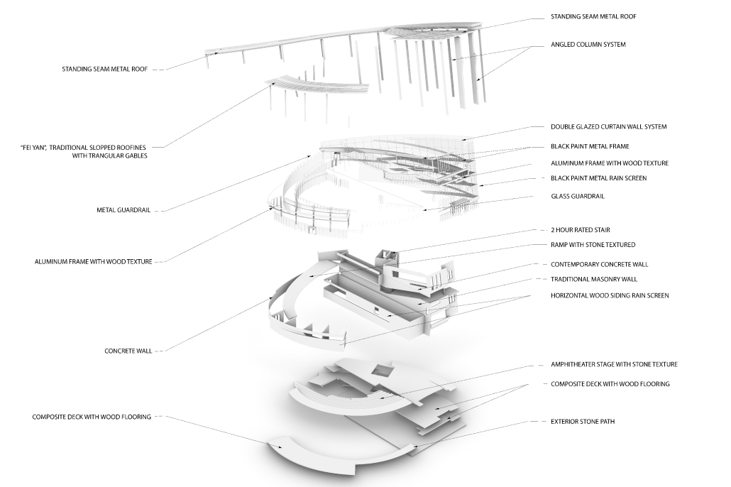
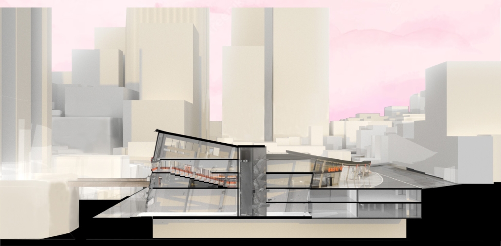
The symbolic architectural design serves as a beacon of light that resonates within the hearts of every community member, illuminating the entire community living space. Through this architectural platform, I hope to foster social connectivity and strengthen the ties between people, communities, and cultures. This culturally sensitive approach will not only establish a landmark structure for visitors from all over the world but also establish a solid foundation for a vibrant community hub for local residents.

Welcome to the Carmart by Maggie McMickle, M.Arch ‘23
University of California, Berkeley | Advisors: Rene Davids and Greig Crysler

In the blocks surrounding Douglass Park in Chicago, over 80% of households are led by single mothers. In addition to performing paid labor to financially support their families, these mothers also perform thirty hours of unpaid domestic labor for their families per week, leaving little time for rest, play, or personal development. This project proposes a monolithic housing collective that spans three city blocks, sitting on the viaduct of an unused rail line. Domestic labor is outsourced to dedicated programs that stretch into the surrounding neighborhood. Collective meals are hosted in the shared kitchen and dining facility, and an on-site cafe is open to both residents and the public. A laundry service takes dirty clothes and returns them washed and folded. Children are cared for at different ages in different facilities, with a nursery and daycare for young children, an after-school program for the nearby elementary and middle school, and a recreation center for older children. By freeing overburdened mothers from this domestic labor, they are able to rest, play, and nurture themselves and their children.

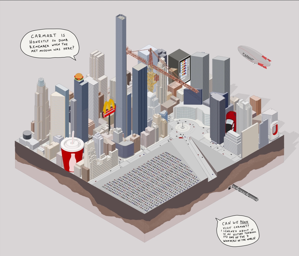
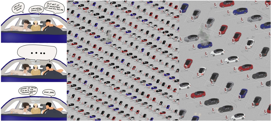
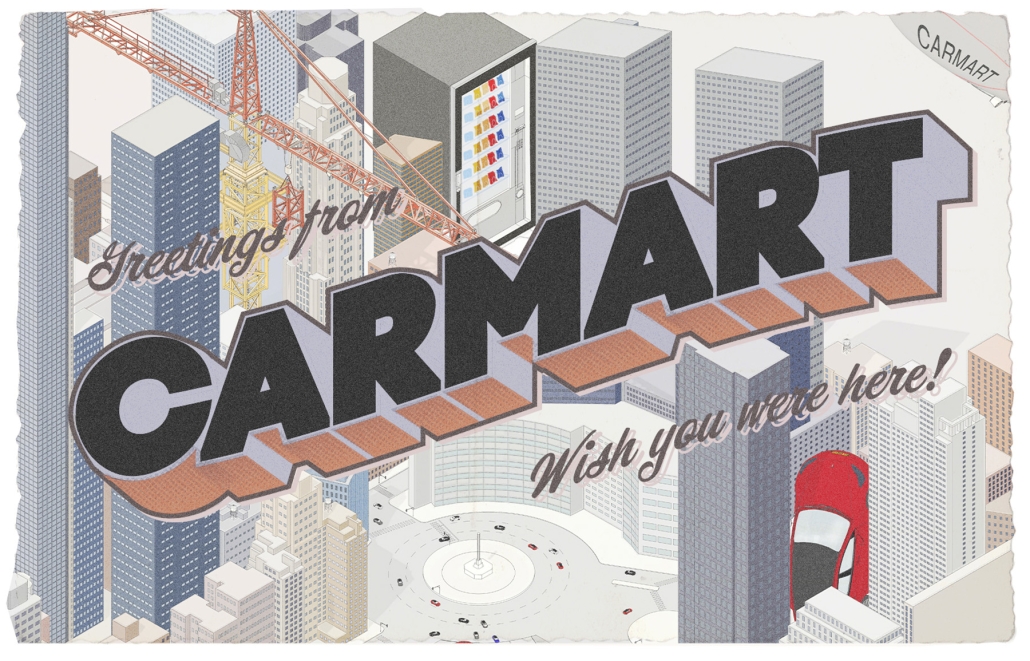
Since the inception of the automobile, the urban fabric of modern American cities has been altered. With the emergence of electric vehicles, there is the potential for a new way we can design our cities around the automobile; now, the car has the potential to leave an impact on buildings. This thesis, entitled, Welcome to the Carmart explores the idea of creating an auto-centric megastructure in Central Park in New York City – the least car-dependent city in the States, to provide a critique of the car. The narrative of the Carmart provokes what may be considered a dystopian future for urbanists, the greenscape of Central Park is bulldozed and replaced with a massive EV charging car park. Through a narrative that imagines a dystopian future, the project embodies themes of consumerism, capitalism, the American dream, and the social and urban implications of creating spaces for cars that take away from the character of cities. 

This project won the Chester Miller Award.

Instagram: @magg_zzz, @r.davids, @carmart.usa

Prospect Offices in New Orleans by Leah N. Bohatch, B.Arch ‘23
Tulane University | Advisor: Ruben Garcia-Rubio

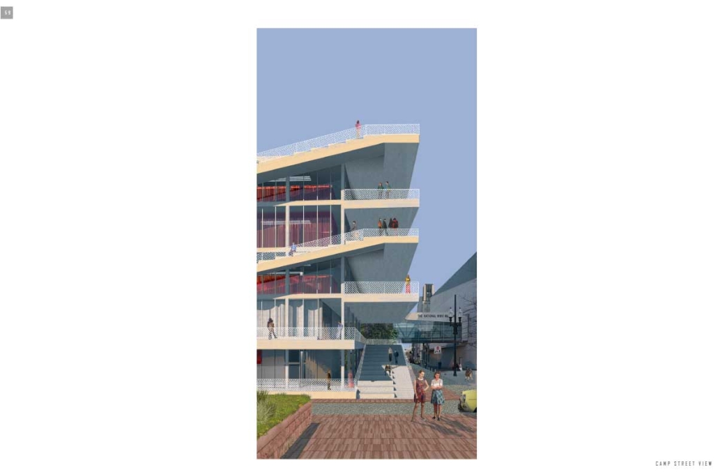
The site is in the Business District of New Orleans in-between Uptown and Downtown, near many places of communal gathering and public interaction. Camp St. and Andrew Higgins Blvd. mark the intersection of visitors and locals, highlighting the site as a corner of importance and an area for improvement in how the community can interact and be showcased. This will be accomplished through an inversion of the typical interior plaza wrapped by a program. 

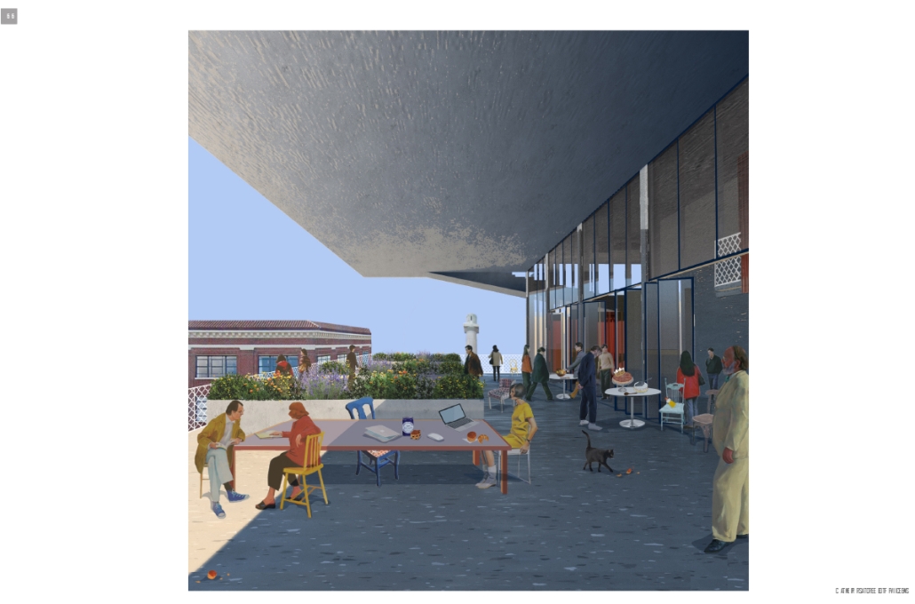
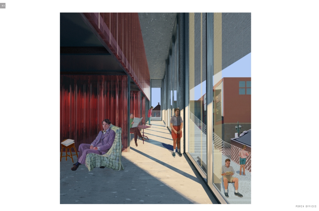
This proposal calls to wrap the plaza around the building as a programmatically independent staircase that relates the pedestrian to the surrounding views and displays the inhabitant to the city. This strategy is accomplished by creating an object building to allow circulation around the building. The programmatic strategy includes a system of concrete slabs and columns along a 20’ x 20’ grid that becomes the frame of the project and is related to the city scale. Within this larger frame, human-scale polycarbonate boxes plug into the structure and create smaller-scale unique interactions at each level of the project that relate to New Orleans vernacular architecture such as porch-style, semi-communal office spaces, and balcony-mezzanine offices and walkways. 

The plaza wraps around the building as it is folded along the grid of columns. This allows for a program to be placed at each stair ranging from work areas to outdoor stages. Also, terraces are used as extensions of the offices to allow for a seamless interaction between an interior work environment and a shaded exterior office space. The destination of the continuous exterior plaza is a community roof garden that allows for 360 views of the city and a plaza on the roof plane. The stormwater runoff from the roof garden and the terraces is drained through an attachment to the building’s columns.

Instagram: @rubgarrub

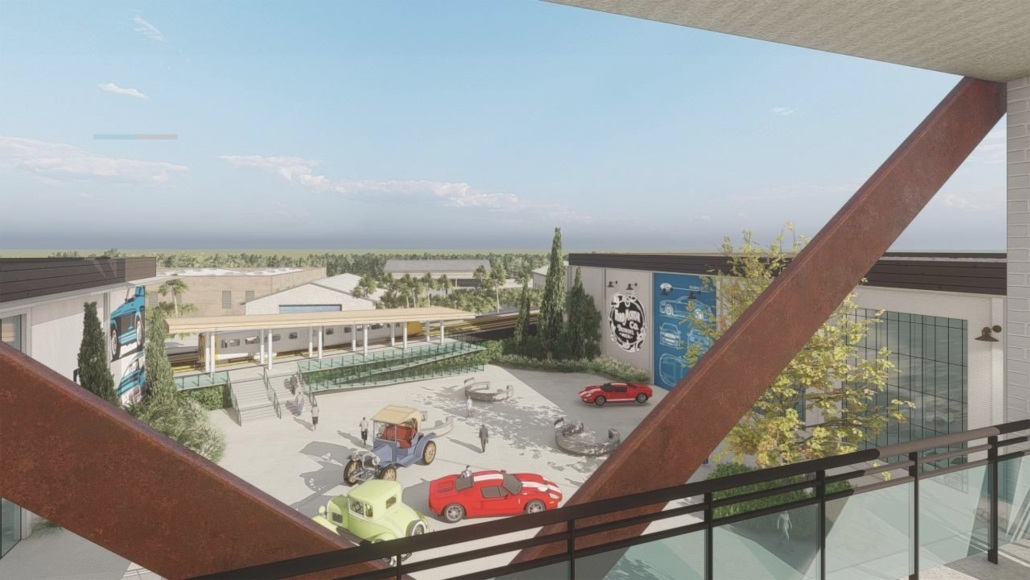
Revitalization of an Automotive Industrial Area by Joshua Díaz-Arroyo, B.Arch ‘23
Pontifical Catholic University of Puerto Rico| Advisors: Pedro A. Rosario-Torres, Luis V. Badillo-Lozano & Manuel De Lemos-Zuazaga

This research is about breathing new life into deserted automotive factories scattered across the globe, with a particular emphasis on those that occupy sizeable plots in urban areas, impeding the growth of cities. The project strives to tap into the latent resources that these empty lots offer, leveraging the pre-existing infrastructure, structures, road access, and location to uncover their full potential.

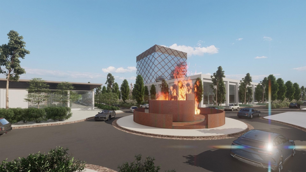
Located in the Northwestern United States, specifically in Detroit, Michigan, is the Central Square. This area has been deemed part of the “Rust Belt” due to the numerous deserted automotive factories there. The project’s objective is to infuse life back into the area by reviving social and cultural activities, improving the economy, and increasing accessibility to surrounding communities. To achieve these goals, spatial programs and a central square are implemented, connecting the communities and integrating the programs seamlessly. 

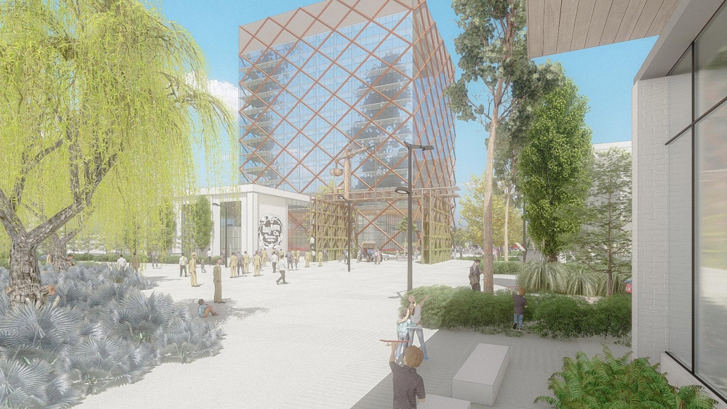
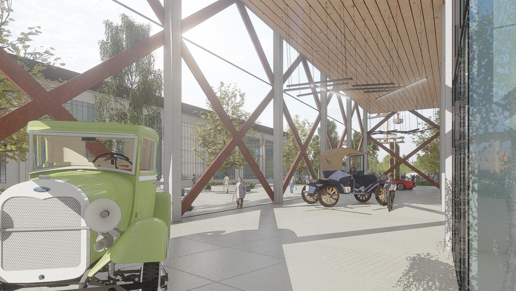
The proposal entails the integration of a Car Museum, an office tower, and commercial areas. The existing structure, formerly intended for vehicle assembly, spans four levels in a horizontal layout. As part of the proposal, the existing building is divided to create a spacious longitudinal plaza that spans the entire site. This plaza serves as a versatile exterior space, connecting the various programs and facilitating seamless movement between them. The proposed design seeks to optimize the use of the available space while creating a cohesive and functional site that meets the needs of all stakeholders. Furthermore, it was the designer’s deliberate choice to erect a tower in order to produce a striking visual contrast to the project’s predominantly horizontal design. To achieve this, a diagrid is employed, which is reminiscent of the exoskeletons of factories, wherein the structural framework of the building is left bare and visible. The existing structure houses the automobile museum and offices, while the commercial district comprises four other new buildings.

The ambitious project seeks to delve into the vast expanse of space and express its distinctive characteristics, while simultaneously discovering the promising possibilities that abandoned automotive factories may offer. The proposal also aims to motivate and encourage others to unite with available resources and foster innovative ideas.

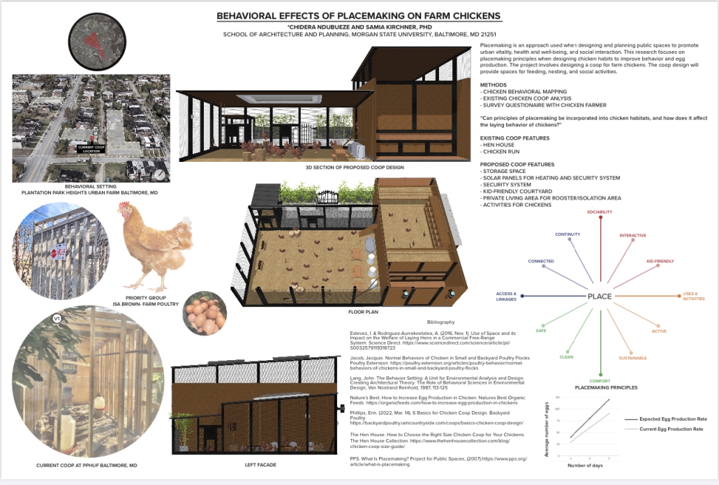
BEHAVIORAL EFFECTS OF PLACEMAKING ON FARM CHICKENS by Chidera Ndubueze, BSAED (Bachelor of Science in Architecture and Environmental Design) ‘23
Morgan State University | Advisor: Samia Kirchner

Placemaking is an approach used when designing and planning public spaces to promote urban vitality, health and well-being, and social interaction. This principle has been used to design and revitalize public spaces and urban plazas to become sociable and capable of achieving a multiplicity of activities. Placemaking principles should be incorporated when designing chicken habitats because they will positively affect the behavior of chickens and the production of eggs. The behavioral setting for this research will be the Plantation Park Heights Urban Farm in Baltimore, MD. The farm was established to combat food deserts and provide food on the plates of Park Heights residents. It maintains a principle of bringing Cleaner Greener Foods to less fortunate communities in Baltimore. The priority group is the chickens on the farm. The common chicken breed at Plantation Park Heights is the ISA Brown. This is a crossbreed of chicken with sex-linked coloration. They are docile and provide optimum egg production. This study will focus on the question: “Can principles of placemaking be incorporated into chicken habitats, and how does it affect the behavior of chickens?” This research will be conducted through interviews and storytelling (via the Facing Project), surveys, and questionnaires. The process for this research involves a comprehensive literature review on the study of the behavior of chickens from birth. The design project involves designing a chicken coop/ conservatory that is sufficient for the number of chickens on the farm. The coop design will provide spaces for feeding, nesting, and social activities.

This project received the Outstanding Research Poster Award at the 28th Annual Undergraduate and Graduate Research Symposium, Morgan State University.

Instagram: @samiarabkirchner

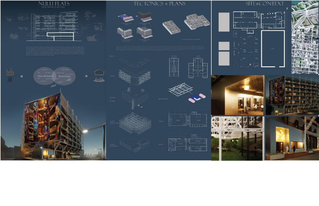
The Critical Application of Metabolic and Mobile Architecture to the Modern Urban Fabric by Peter Hall, Bachelor of Sc. in Architectural Sc. ’23
Western Kentucky University | Advisor: Shahnaz Aly

Urban analysis of architecture has taken multiple and diverse directions that in some way try to create a city that is accessible and walkable. NULU Flats takes on the approach of mobile architecture and metabolic theory to create a functioning microcosm of both ideas applied critically in a growing urban environment. The project, at around 90,000 SF, applies ideas of “megastructure” by creating a building skeleton that can evolve with the needs of the city on the linear path of time. The lower two levels of the structure are incorporated into the megastructure as a static piece of the building that contains necessities such as parking, mercantile space, and workspace. The following six floors are suspended residential modular units. With the flexibility to swap modular units and create new spaces, the project provides a critical application of metabolic and mobile thought.

This project received the Outstanding Senior Capstone Project Award.

Instagram: @petehall01

Reframe: Looking Inward, Gazing Outward by Nadia Calderón & Eliot Sauquet, B.Arch ’23
Southern California Institute of Architecture | Advisor: Peter Testa

Reframe, a proposal for the Museum of the 20th Century located in the Tiergarten District of Berlin, is centered on the superposition of volumetric, urban typologies and domestic thresholds through the construction of multipart views. By reintroducing site-specific architectural tropes related to urban housing, the project promotes an unstable, anticipatory character of architecture that is subject to constant reprogramming and transformations. The proposal focuses on the juxtaposition and overlap of two spatial logics: the arrangement of urban block typologies, and the integration of small-scale, domestic interiors. The objective of the project is to reactivate the immediate built environment of Berlin by inserting instances of domesticity into the expansiveness of a field of monuments.

The proposal for the Museum of the 20th Century expansion draws on the architectural and domestic history of Berlin by referencing the façade and configuration of L-type housing. By over-scaling and continuously aligning L-types, nested, sunken courtyards are generated between the discrete parts of the scheme. In aggregating large-scale urban typologies and domestic interiors, the project generates a series of close-knit gallery spaces that unravel across the site and reconstruct a pattern of circulation that is inveterate to Berlin. The project is focused on the creation of key sightlines and nested courtyards between volumetric components, and it further addresses the configuration of Berlin housing typologies by establishing a perimeter wall that intimately frames unfolding views and spatial processions. The scheme challenges conventional modes of perception by foregrounding the museum as a place of past and present cultural production that is continuously responding to the activities of Berlin. By encouraging the users to inhabit the space of the museum as they would inhabit housing, the experience of viewing art becomes substantially more intimate and imbued in the context of the city.

Instagram: @eliot_sauquet

I can’t BREATHE because I won’t CHANGE by Ryan Playle, M.Arch ’23
University of Texas at Arlington | Advisor: Ursula Emery McClure

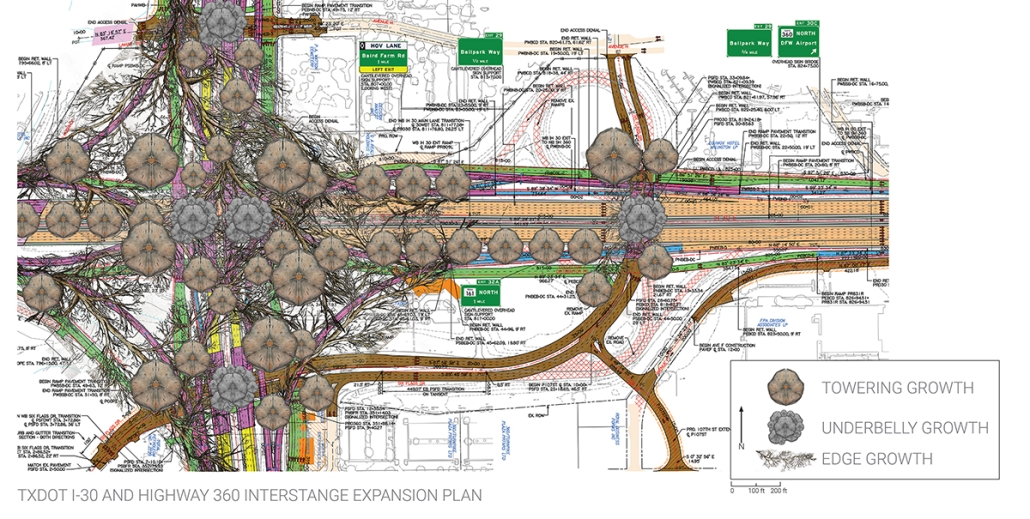
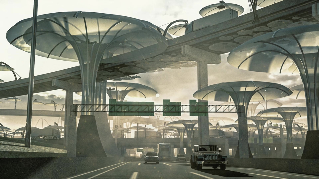
“I can’t breathe because I won’t change” deals directly with one of Arlington’s most toxic areas. The interchange zone of I-30 and 360 is not only undergoing a massive highway infrastructure reconstruction but is also one of DFW’s most heavily trafficked areas, and it is surrounded by major industrial sites and power grid distribution networks. 

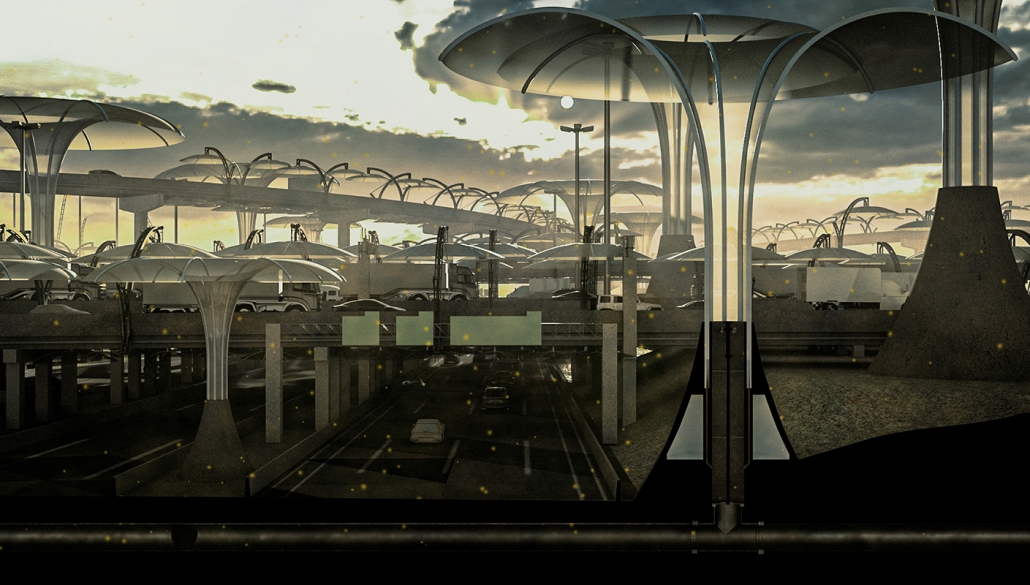
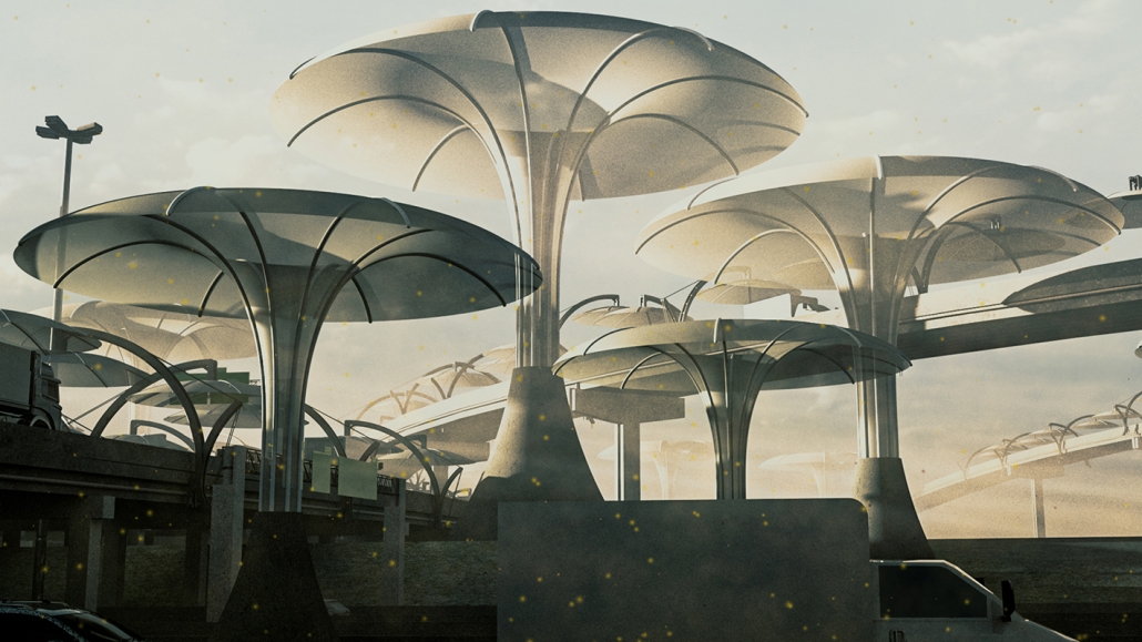
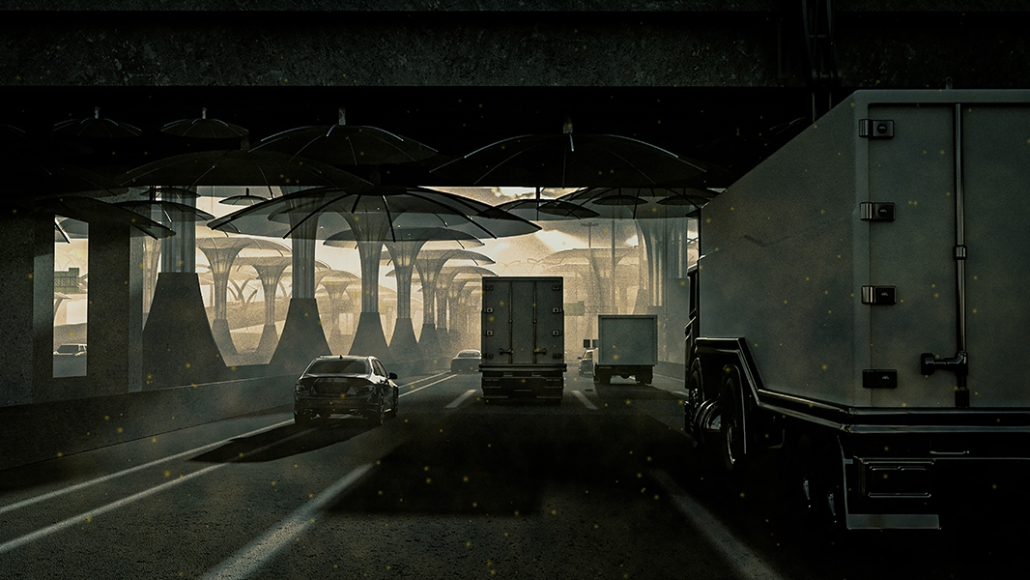
These factors make it one of the densest carbon production zones in Arlington and an overall unhealthy environment. Ryan, who commutes through this interchange daily, found this area both challenging and screaming for a new future. His project accepts that reducing the carbon producers in this area is presently futile and instead, he must design a new infrastructure that negates the carbon. Working with the diverse scales and conditions that highway interchanges create (above, below, and aside,) Ryan designed carbon collectors that can be attached or embedded into the current TX DOTD highway construction methods. These mushroom-capped collectors act like huge vacuums, sucking up the carbon monoxide emitted by the producers and processing the pollution internally. In conjunction with their technological duties, the S.C.U.M. (Smog Collecting Umbrella Mechanisms) towers signify the east gateway to the city of Arlington.

They create a dramatic and signature infrastructure identifying ARL, similar to the St. Louis Arch or the Golden Gate Bridge in San Francisco. The “I can’t breathe because I won’t change” project may have been initiated from a toxic observation but in its conclusion, generates not only a healthier Arlington but also a more identifiable Arlington. 

This project was featured in a community exhibit for the City of Arlington.

Instagram: @emerymcclurearchitecture, @ryantuckerplayle

See you next week for the next installment of the Student Showcase!