2025 Study Architecture Student Showcase - Part VII
Part VII of the 2025 Study Architecture Student Showcase features outstanding projects on the theme of history and culture. Each student utilizes architectural storytelling to celebrate cultures, honor history, foster connection, and promote civic engagement. From international expo pavilions and welcome centers connecting border towns to augmented reality apps that reimagine the museum experience, the projects presented in today’s showcase feature designs that are both innovative and insightful.
Browse the projects below for more details!
Heart of the Mayan – Prosperity for All by Oscar Rodriguez-Lopez, B.Sc. in Architecture ‘25
University of the District of Columbia | Advisor: Dr. Golnar Ahmadi
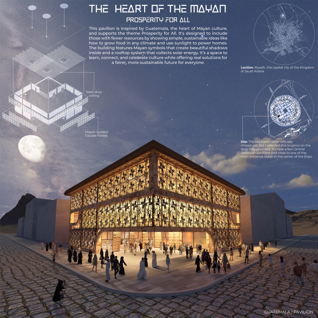
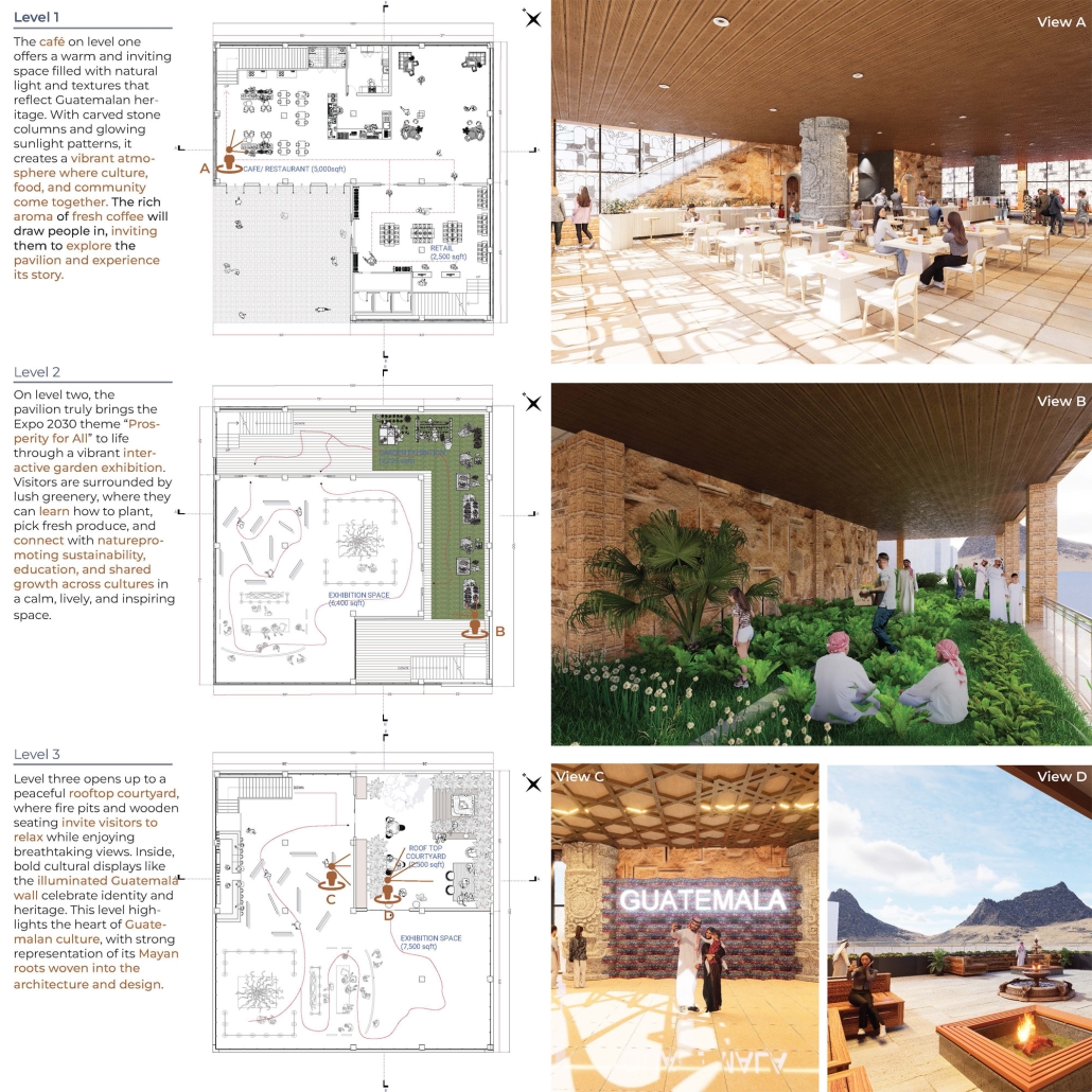
The “Heart of the Mayan – Prosperity for All” pavilion draws deep inspiration from Guatemalan culture, its Mayan roots, and a vision for a more inclusive future. This project aims to bridge heritage with sustainability by creating a space that educates and empowers visitors through immersive architectural storytelling.
Designed for the 2030 Riyadh Expo, the pavilion reflects core values of community, culture, and resilience. It transforms a simple structure into an engaging cultural experience across three levels. The first floor attracts visitors with the scent of local food from a café and market, echoing the vibrancy of Guatemalan streets. The second level integrates an interactive garden where guests learn how to grow and harvest crops sustainably, making the connection between tradition and future resilience. The third level houses a cultural exhibition and leads to a rooftop courtyard inspired by Spanish colonial architecture, offering a serene space for reflection.
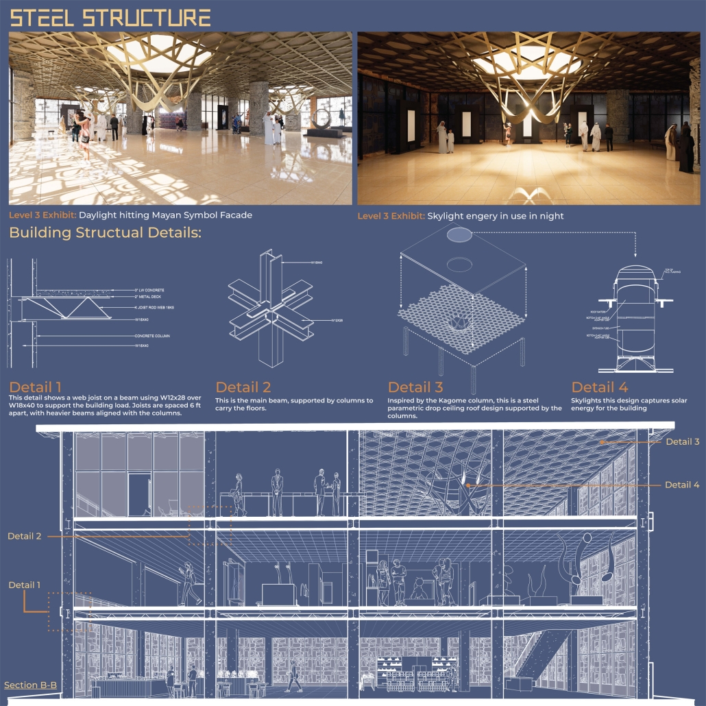
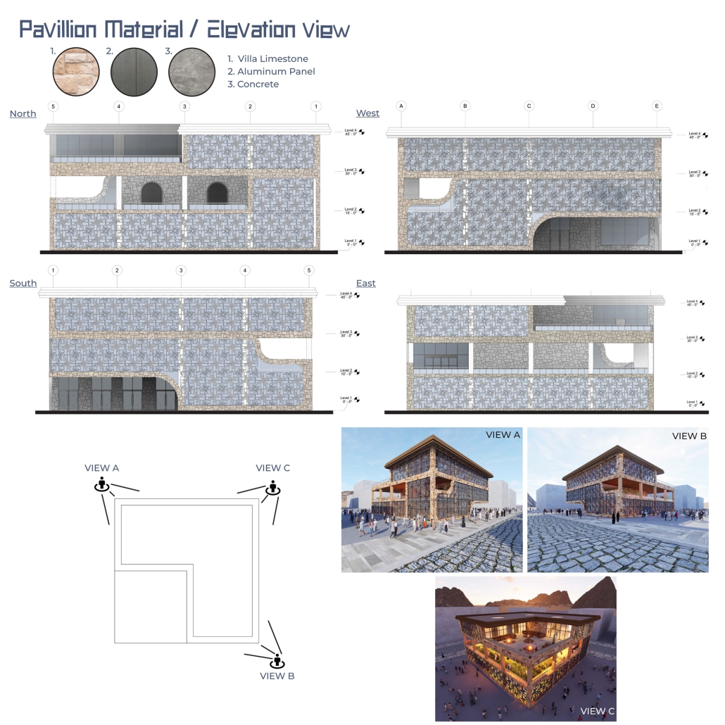
Architecturally, the pavilion employs a steel structural system with parametric ceiling designs inspired by the Kagome pattern. This not only evokes Mayan symbolism but also enhances visual storytelling through shadows and light. Solar skylights power parts of the building, promoting energy efficiency. Exterior materials such as concrete with wood-textured finishes, limestone, and aluminum panels further blend traditional aesthetics with modern sustainability.
Overall, the pavilion serves as more than just a national showcase — it’s a platform to share Guatemala’s cultural identity while offering practical ideas for a fairer, greener future. It invites everyone, regardless of background, to learn, reflect, and celebrate together.
Instagram: @golnarahmadi
Terra Redux: Reimagining of Memory, Space, and Territory by Fnu Rupan, M.Arch ’25
University of Tennessee-Knoxville | Advisors: Avigail Sachs, Jennifer Akerman, Chad Manley & James Roha
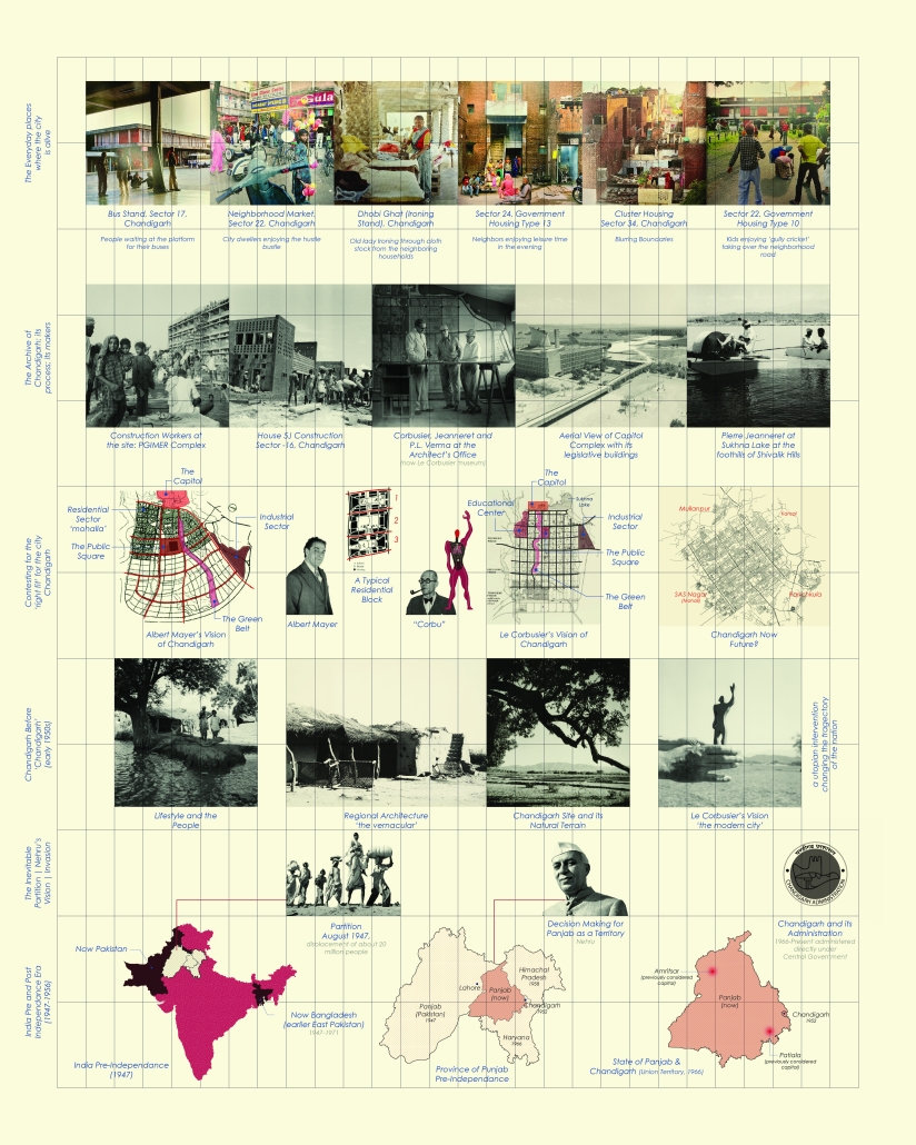
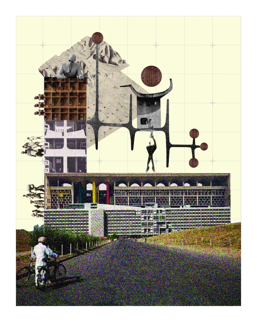
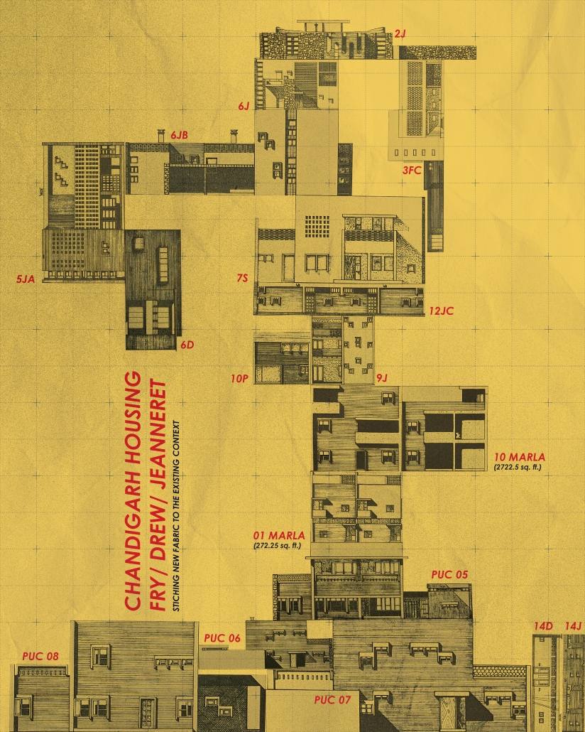
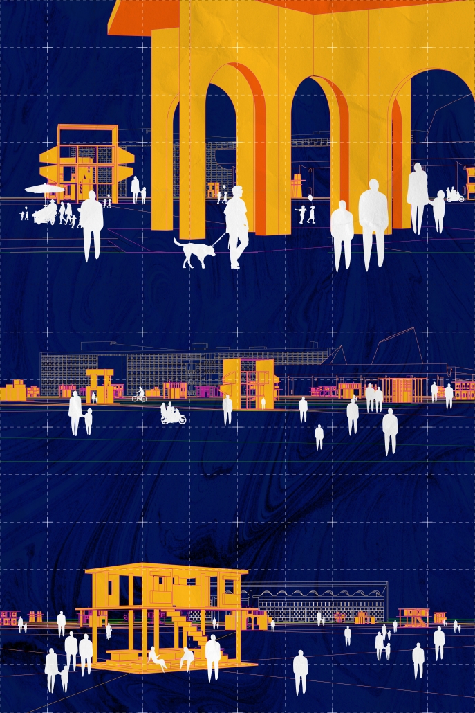
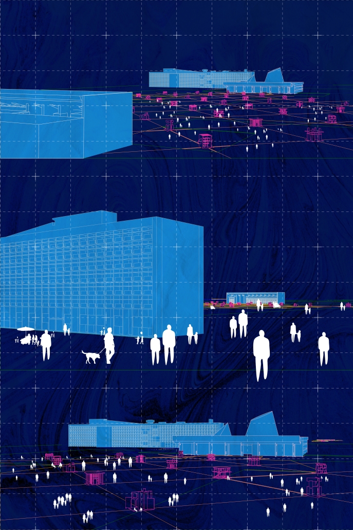
“TERRA REDUX: Reimagining of Memory, Space, and Territory” is a thesis project that critically reexamines Chandigarh—a city envisioned as a modernist utopia after the 1947 Partition of India—through the lens of lived experience, postcolonial rupture, and spatial appropriation. Rather than opposing Le Corbusier’s imposed vision, the project investigates the nuanced interplay between planned monumentalism and the organic, everyday use of public space by its citizens.
Initiated through detailed documentation of daily life in Chandigarh, the project reveals how ordinary people reclaim and transform rigid urban spaces using temporary, vernacular materials—like tarps, crates, and salvaged wood. These grassroots interventions subtly contest the top-down modernist planning by fostering human-scale, adaptable, and socially meaningful environments. Drawing from these findings, the project evolves into a speculative reimagining rooted in the city’s realities rather than its utopian aspirations.
The speculative intervention centers on the Capitol Complex, a monumental site emblematic of Chandigarh’s modernist ideology. Inspired by Bernard Tschumi’s Parc de la Villette, the design introduces a humanizing layer over this imposing space. A diagonal grid—deviating from the city’s rigid orthogonality—is overlaid and punctuated with 13 follies. The number 13, deliberately excluded in Chandigarh’s planning due to superstition, is reclaimed here to symbolize inclusion and challenge dominant narratives of spatial purity.
Each folly—ranging from reading rooms and market spaces to prayer halls and gossip squares—serves as a catalyst for community interaction and spontaneous appropriation. Collectively, they frame an alternative urban logic that centers lived memory, cultural identity, and public agency.
Ultimately, TERRA REDUX questions architecture’s complicity in placelessness while proposing a restorative vision that bridges historical identity with contemporary civic life. It champions architecture not as a static imposition but as an evolving, responsive dialogue between place, people, and time.
Instagram: @rupan.naraini, @avigailsachs, @james.roha, @j_akerman
John McCain Opportunity Center by Malachy Roberts, M.Arch ’25
Arizona State University | Advisor: James Wesala
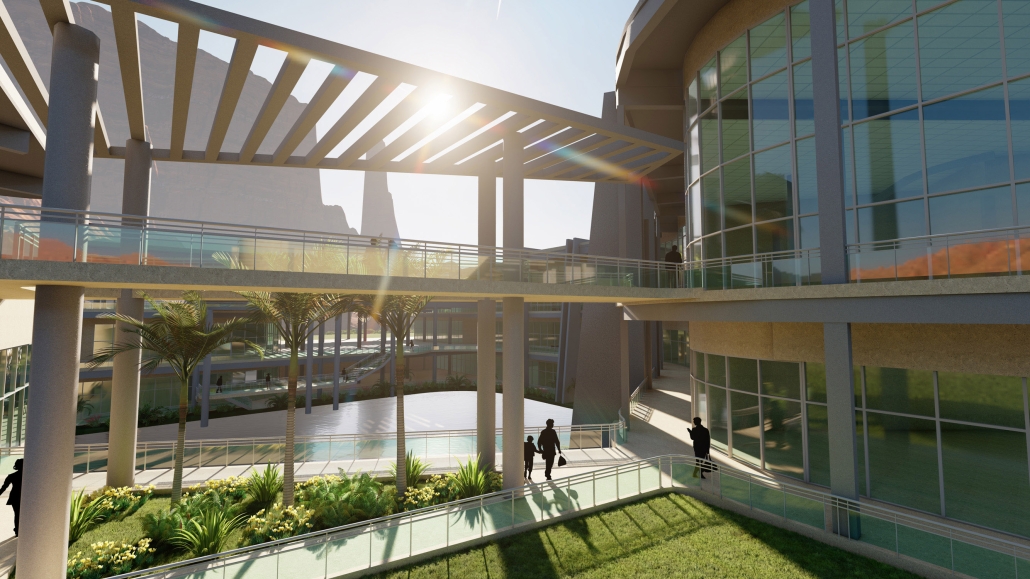
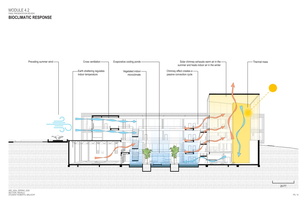
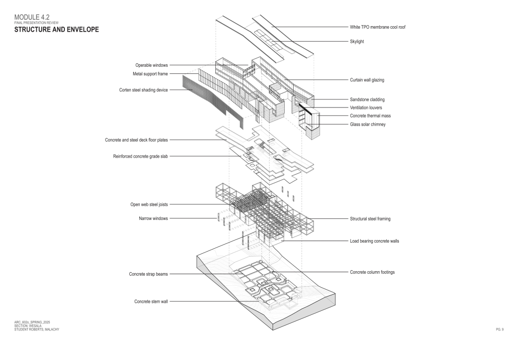
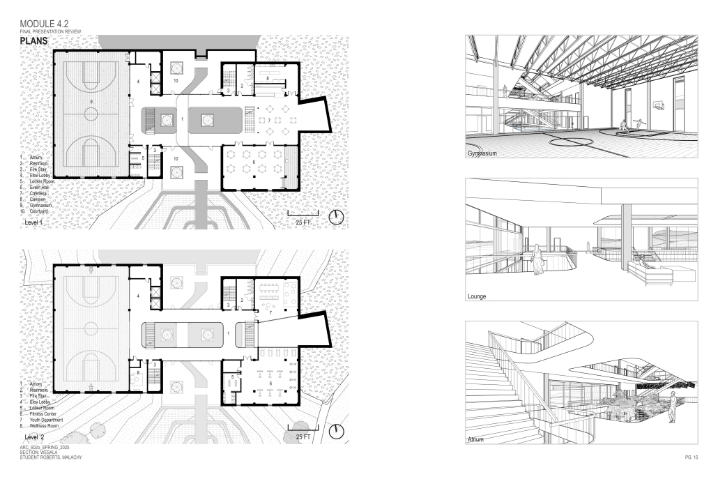
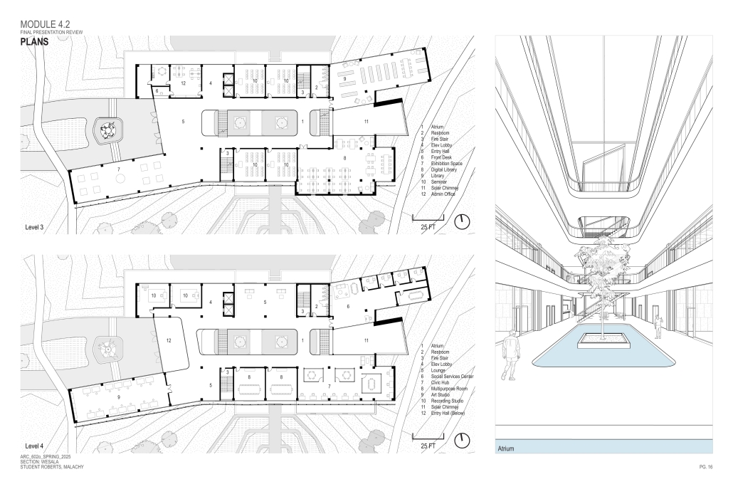
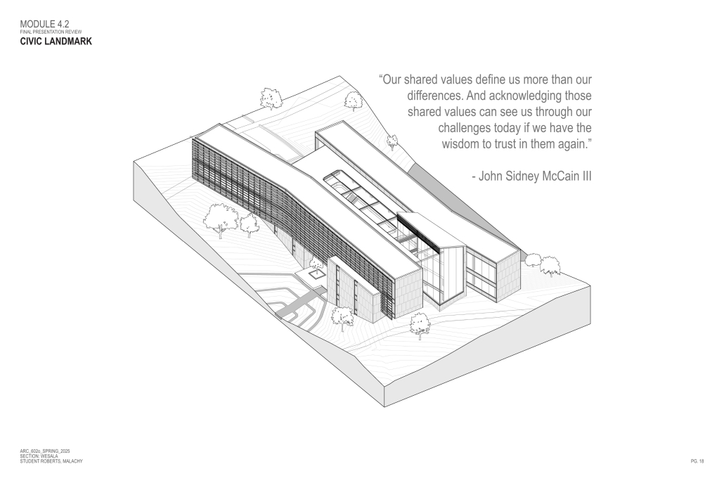
The John McCain Opportunity Center is a civic space dedicated to addressing social issues central to John McCain’s legislative efforts, particularly as an advocate for people’s rights. Systemic inequities affect a wide range of marginalized communities that face barriers to opportunity. A community center that fosters education, resources, and empowerment aligns with the broader mission of advancing social equity and civic engagement.
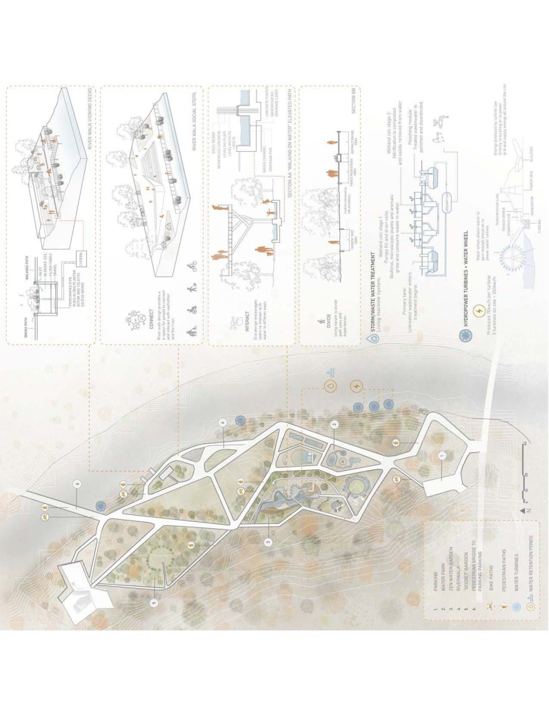
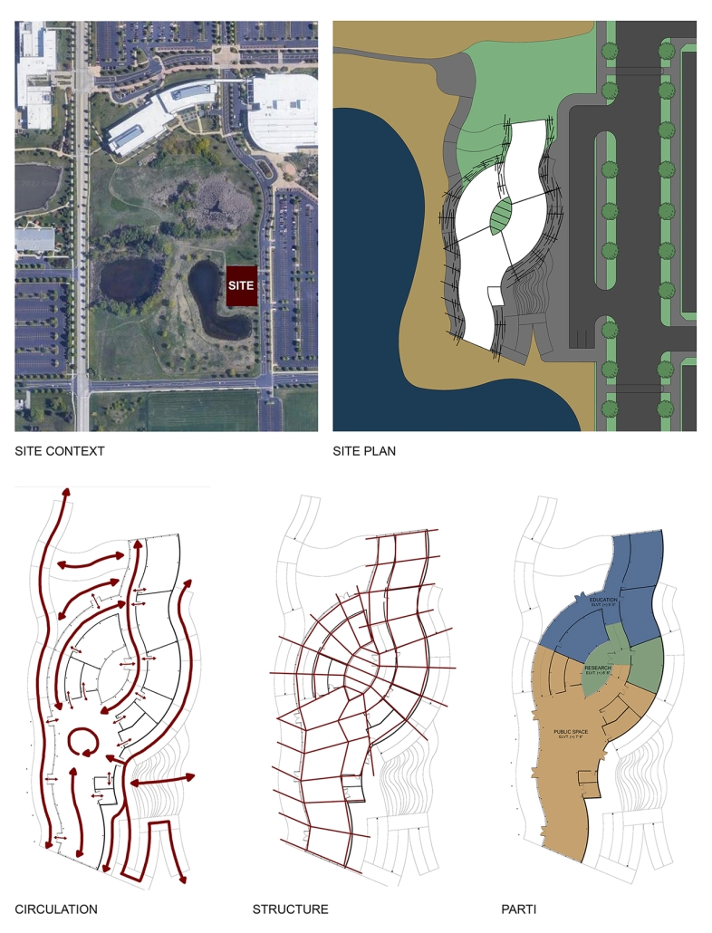
A defining element of this project is its connection to water infrastructure, specifically the canal systems that have sustained life in the desert for centuries. The Hohokam people, who inhabited the Phoenix region over a thousand years ago, engineered an extensive network of canals. These waterways were, and remain, crucial to the ability to sustain a community in the desert.
Today, the New Crosscut Canal, located adjacent to the project site, plays a vital role in delivering irrigation water, supporting hydroelectric power, and facilitating urban connectivity through its canal-side paths. This continued reliance on water infrastructure reinforces the local theme of the studio by highlighting the interplay between natural resources, historical continuity, and civic development. By integrating the New Crosscut Canal into its architecture, the McCain Opportunity Center will establish a direct dialogue between past and present.
The design will embrace the canal as both a functional and symbolic element, incorporating water for public engagement and sustainable practices while framing views of this essential infrastructure. The project will also acknowledge the canal’s role in shaping Phoenix’s economy and settlement patterns, linking it to broader discussions on resource equity, climate resilience, and the social networks that form around shared infrastructure.
In a culmination of these ideas, the John McCain Opportunity Center seeks to bridge history and contemporary civic engagement, reinforcing how water, migration, and Indigenous innovation remain at the heart of Phoenix’s identity. By embracing these themes architecturally, the project will become not just a community center, but a space of reflection, education, and continued advocacy for social and environmental justice.
This project received the AIA Medal for Academic Excellence.
Instagram: @designed.by.james.architecture
The Suppressed Interior: Amache Reimagined by Andrea Malta & Gabriel Herrada, B.Arch ’25
University of Colorado Denver | Advisor: Leyuan Li
In southeastern Colorado, the town of Granada is shaped by the legacy of the Amache internment camp, where over 7,000 Japanese Americans were forcibly relocated during World War II. The closure of the camp left a lasting absence, disrupting the social and economic rhythms of Granada and leaving many of its public spaces underused or forgotten.
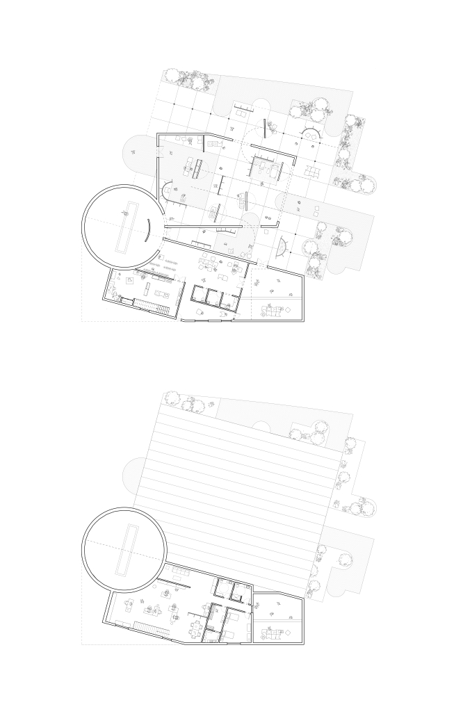
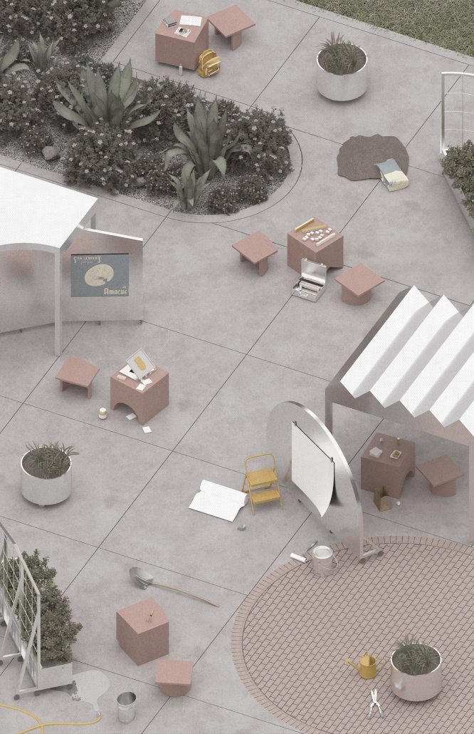
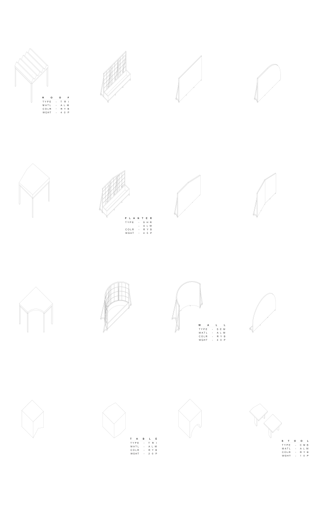
This project responds through a dual design strategy: a modular furniture system and a museum, each addressing memory and community at different scales. The furniture system, developed from fundamental architectural elements (walls, tables, roofs, and benches), draws direct inspiration from the interior conditions at Amache. Each furniture piece echoes these dynamics, offering flexible, reconfigurable tools that reflect the spirit of adaptation and communal life. Deployed across Granada, the system invites informal markets, shared meals, storytelling, and reflection. Its mobility and simplicity support a renewed sense of public life grounded in memory, participation, and everyday use.
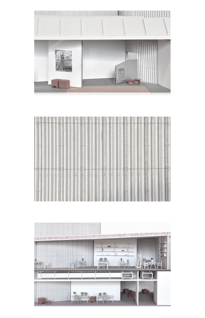
The museum complements this strategy by providing a space for preservation, dialogue, and evolving interpretation. Composed of two intersecting volumes that pivot around a circular Reflection Room, the building is organized to support changing narratives. One wing contains a flexible gallery with movable partitions, while the other houses curatorial and archival functions, including a raised archive that underscores the value of historical memory within the project’s spatial hierarchy.
Cast brick, sculpted light, and rhythmic rooflines define the museum’s material language, creating an environment that is both grounded and responsive. Central to its mission is the belief that curatorial practice should be active and evolving. Exhibitions are not fixed; they shift with new voices and community input, reinforcing the idea that history is not static but continually shaped.
Together, the museum and the furniture system offer a framework for reactivating space, honoring collective memory, and fostering connection. The project does not seek to memorialize the past as something distant, but to reengage it, transforming absence into presence, and creating spaces where reflection and public life can coexist and grow.
This project won the 2025 CAP Undergraduate Architecture Studio Award.
Instagram: @andrea_malta_, @gabriel.3dm, @li__leyuan
Against the Current / Contra la Corrient by Danielle Contreras-Eaton, Dulce Cervantes & Juliana Suarez, B.Arch ’25
Arizona State University | Advisors: Julia Lopez & Christy Weiler
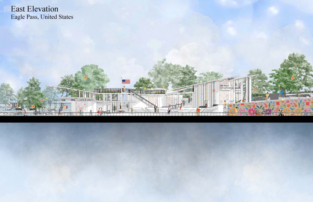
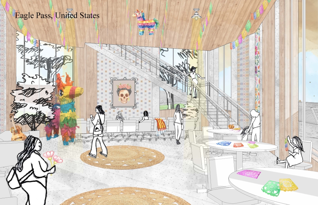
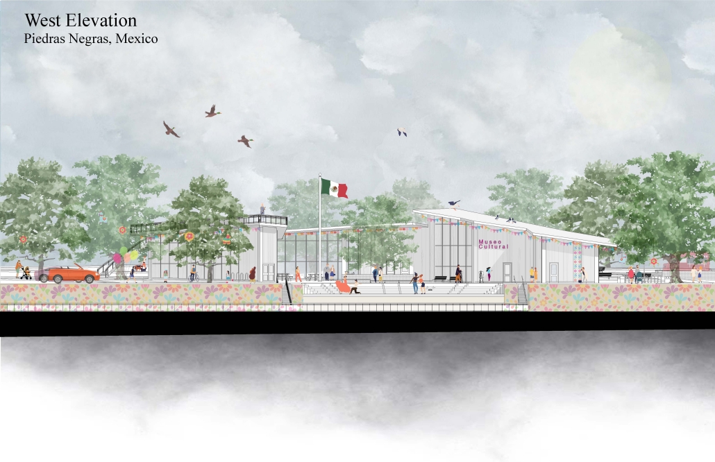
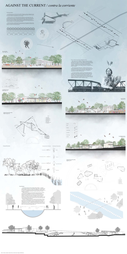
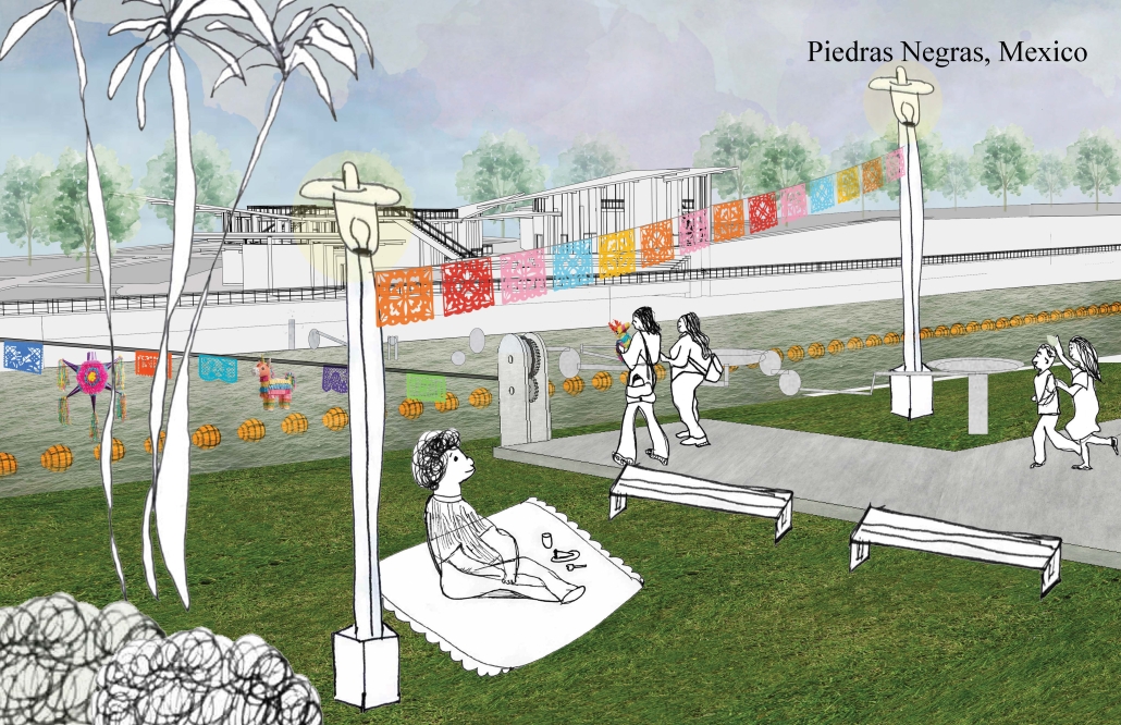
Our project, “Against the Current/Contra la Corriente,” is set in Eagle Pass, Texas, and Piedras Negras, Mexico. A mission to redefine the border by connecting these sister cities with culture, connection, and creativity.
Each binational welcome center is located in each city, encouraging cultural exchange and ecological restoration between Eagle Pass, Texas, and Piedras Negras, Mexico. Inspired by papel picado and piñatas, our project features amphitheaters on both sides of the Rio Grande, creating spaces for performances that celebrate and share cultural expressions.
A pulley system strung with recycled seed-paper flags and piñatas allows for interactive engagement across the river, symbolizing connection and dismantling bias. Flags crafted in one country travel to the other, where they are displayed over the river, eventually sprouting new life in the other country.
Built with recycled materials, each welcome center prioritizes sustainability, while the ecological restoration area [helps to] restore the water quality of the Rio Grande River.
Our goal is to redefine the border into a space that promotes dialogue, creativity, and connection. Encouraging art and creativity to flow through both countries, feeling united in these architecturally similarly designed museums. Never fully knowing which side of the border you are on.
This project received the ASU Design Excellence Award.
Instagram: @danielleeatonn, @dulcecervantess, @julisuarez___, @architecture.at.asu
Echoes of Newark: An Augmented Reality Journey by Aixa Roman & Steven Ghobrial, B.Arch ’25
New Jersey Institute of Technology | Advisor: Andrzej Zarzycki
Vision | Aspiration
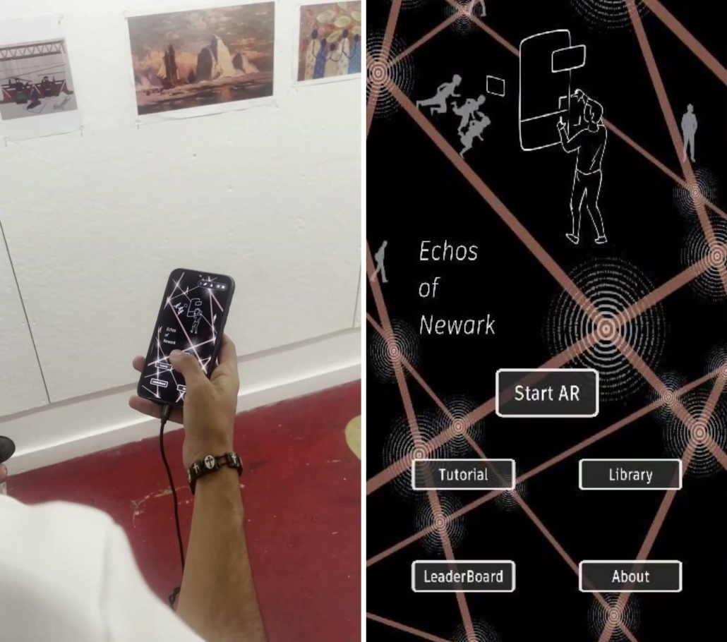
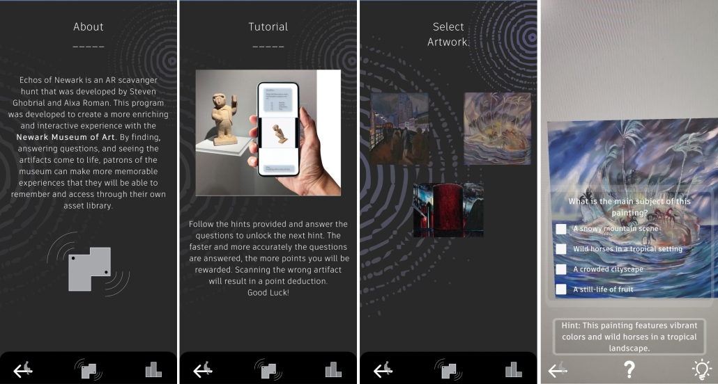
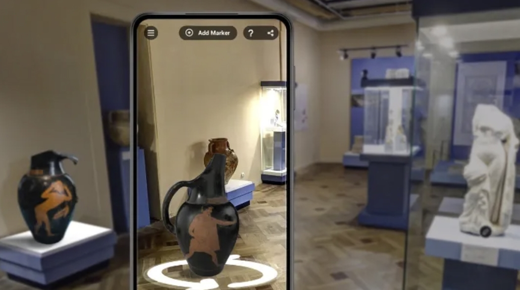
“Echoes of Newark” seeks to make the Newark Museum of Art more accessible, engaging, and educational by bridging the gap between traditional museum experiences and modern technology, providing an innovative way to learn about art and history. Transforming art exploration into an immersive and interactive adventure, this app uses augmented reality (AR) to engage visitors in a dynamic scavenger hunt experience. By answering thought-provoking questions, users unlock hints and build a personalized collection of artifacts, enriched with insightful information. Each discovery brings art to life, showcasing paintings in new styles or seasonal transformations, creating a deeper connection with the museum’s treasures. This engagement is facilitated by generative AI tools, transforming text and image prompts into video-based environments. By fostering curiosity and friendly competition through a daily leaderboard, the app encourages repeat visits and community engagement. It meets the museum’s need to attract diverse audiences, amplify its cultural impact, and create lasting memories for visitors of all ages.
Project Description:
Use AR to function in the form of a scavenger hunt, where the user will answer questions to get hints and build a collection of the artifacts they find. This collection will also have information on the artifacts that can be accessed after the completion of each hint. After each correct answer, the user will also be given the chance to see these paintings come to life, or in different styles or seasons, through generative AI-facilitated experiences. The faster and more accurately the questions are answered, the more points they will earn. AI-generated visuals provide an alternative take on art pieces, rethinking initial artist assumptions and stimulating ‘what-if’ questions. In addition to the AI technology project implements computer vision (image recognition) to connect conventional art imagery with interactive content.
This project was selected for the Dana Knox Research Showcase 2025 at NJIT.
Instagram: @arc_tecture_, @andrzejzarzycki
Body Double: Mythmaking and Identity in a Virtual Countryside by Collin Caywood, M.Arch ’25
Virginia Tech | Advisor: Luis Borunda
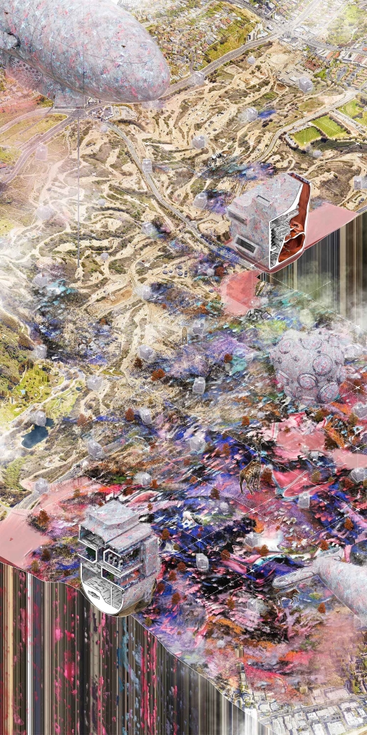
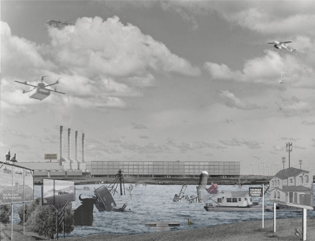
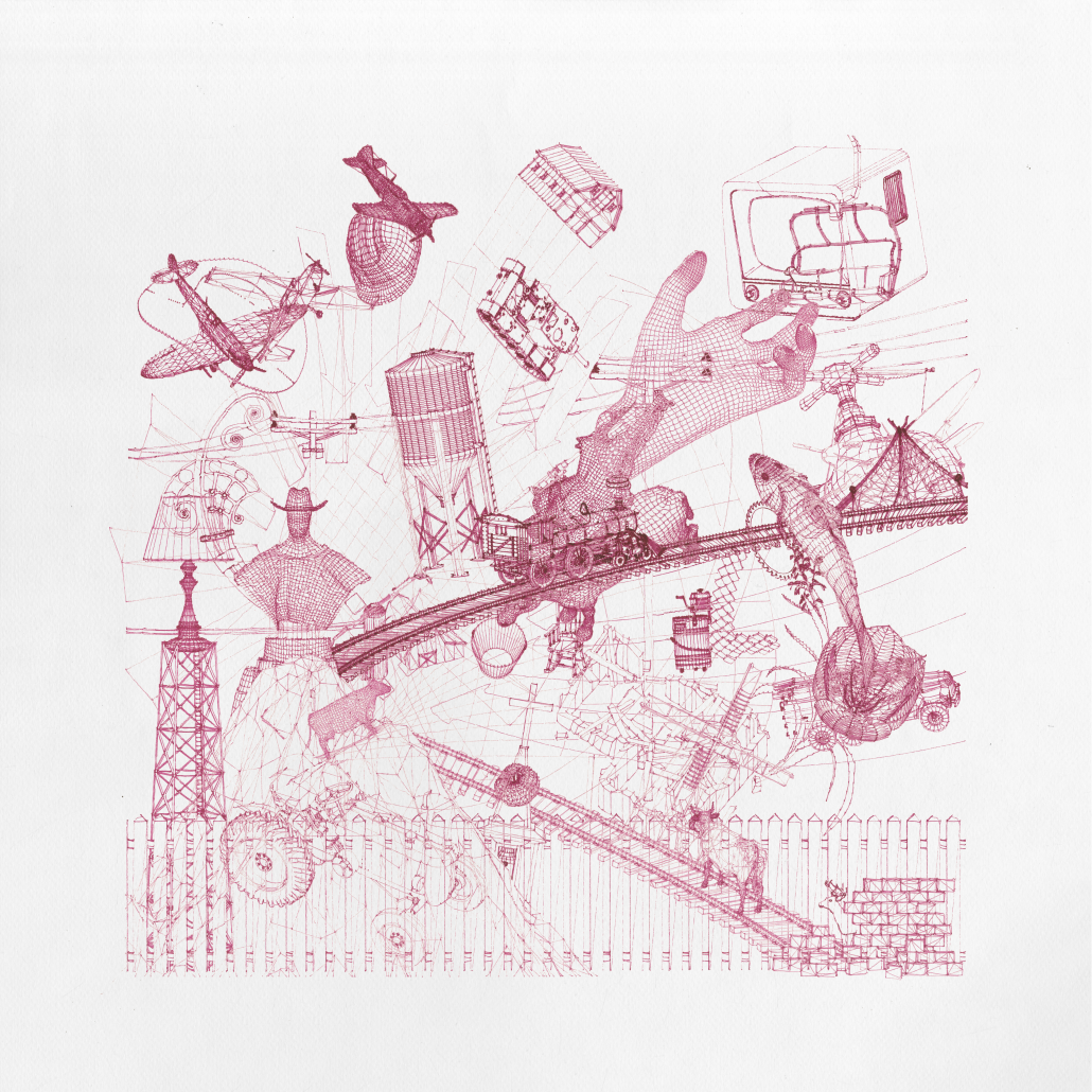
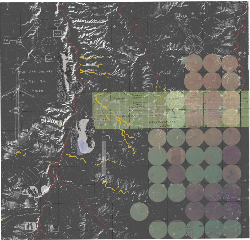
“Body Double: Mythmaking and Identity in a Virtual Countryside” interrogates the role of architecture in territories where spatial meaning is overwritten by digital platforms. Collin Caywood analyzes how rural geographies, once framed as sites of agrarian autonomy, have become symbolic backdrops for labor extraction and ideological projection. The thesis asserts that digital infrastructures (logistics, data centers, platform labor) do not eliminate place, but recode it through topological systems that obscure material conditions.
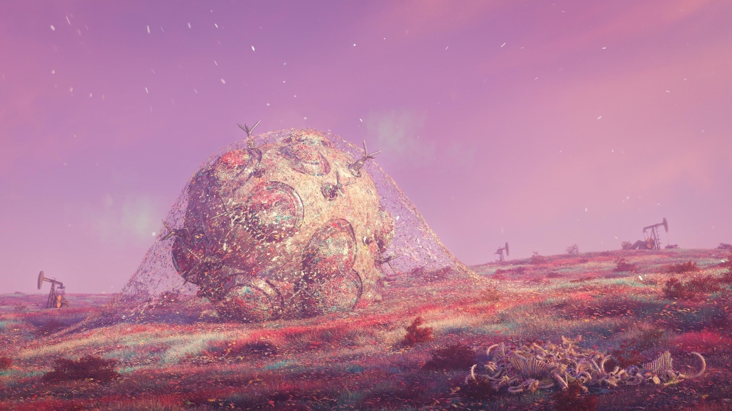
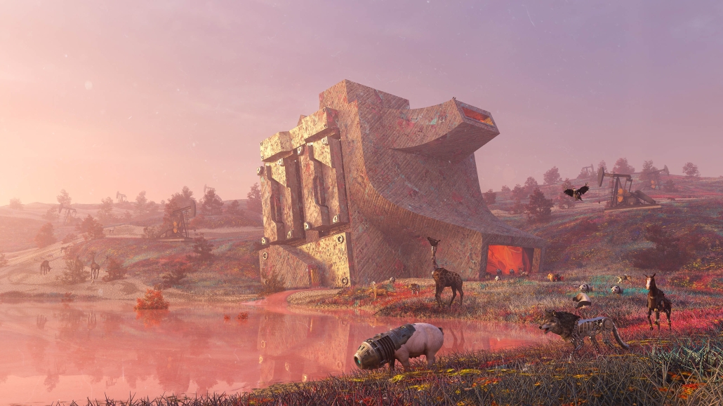
Using architectural drawing as both an analytical and speculative tool, Caywood constructs a body of work that operates between cartography, representation, and installation. His projects examine how identity and economy are distributed across media networks, refracted in the aesthetics of the rural image, and reassembled in spatial typologies designed for digital labor. A series of parafictional interventions, ranging from modular domestic partitions to perspectival montages, frame the countryside as a stage for new cultural and economic scripts.
Rather than offer solutions, Body Double unveils the architectural consequences of dislocation, symbolic flattening, and the collapse of local context. It repositions the architect’s agency: not as a form-giver within traditional site boundaries, but as a narrator and systems mapper within entangled material-virtual terrains.
The thesis introduces parafiction as a critical design method for exposing and reconfiguring the socio-spatial consequences of platform economies in rural contexts.
This project received the AIA Medal of Academic Excellence Award and the Virginia Tech School of Architecture’s Graduate Architecture Thesis Award.
Instagram: @coil.cc
Annex for the National Museum of Finland in Helsinki by Dalia Alkhatib, Master of Arts in Advanced Architectural Design (MA-ARH) ’25
Academy of Art University | Advisor: Mark Mueckenheim
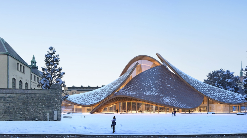
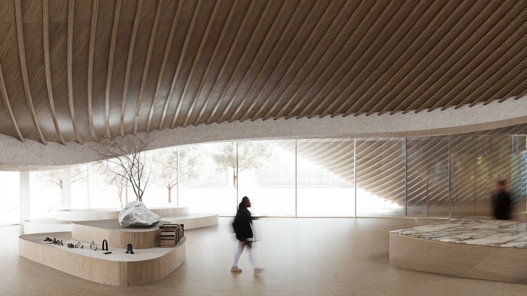
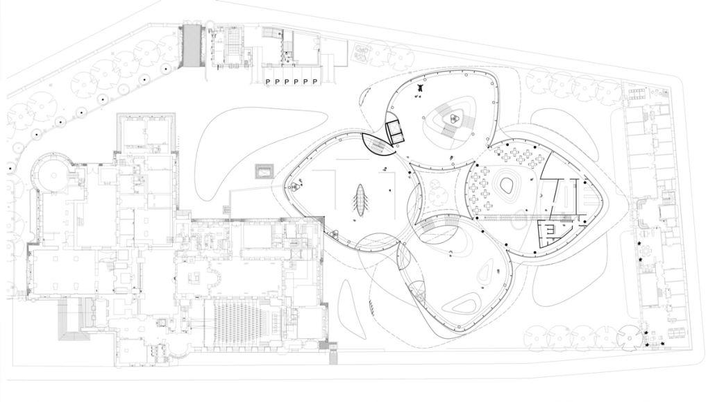
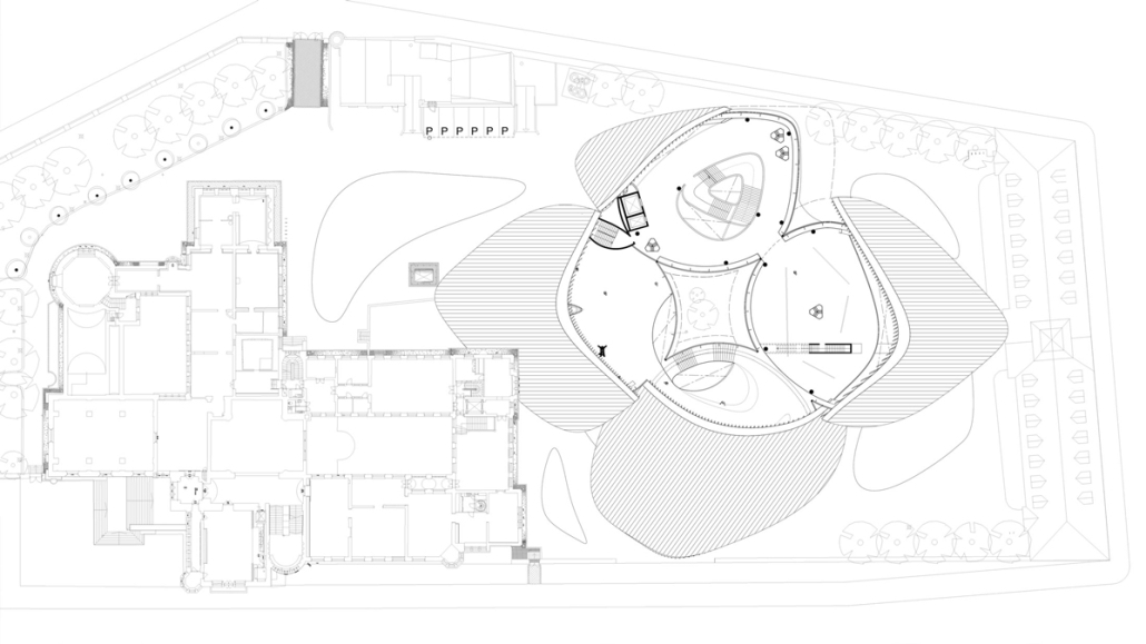
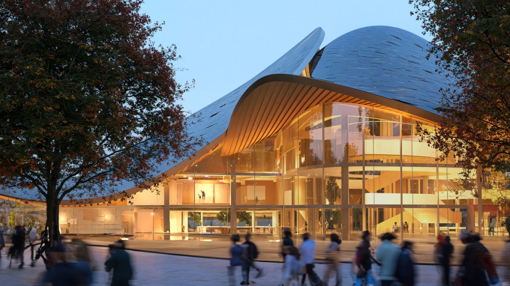
This project proposes an annex to the National Museum of Finland in Helsinki, developed in response to a 2019 open international competition. The site adjoins the historic main building by renowned Finnish architects Herman Gesellius, Armas Lindgren, and Eliel Saarinen—architects whose influence extends well beyond Finland’s borders. The new Annex is designed to host large-scale international exhibitions and support a broad range of cultural, artistic, and civic events, from performances and conferences to public gatherings. It will also include the museum’s main restaurant, helping to form a cohesive cultural campus with the existing museum and park. At its core, the project reinterprets Finnish national heritage through a contemporary lens. The concept of the museum annex reflects the evolving identity of modern Finnish society, grounded in a shared responsibility for the future.
Architecturally, the Annex contrasts and complements the historic structure with a bold design of four hyperbolic paraboloid roofs, supported by concrete columns and a ring beam. This lightweight and transparent form introduces openness and accessibility, offering a powerful new symbol for culture as a catalyst for change. By framing national heritage as a dynamic and welcoming narrative, the Annex fosters dialogue between the past and the present, creating a vibrant space that embodies Finnish culture’s contemporary values.
This project was recognized as an Outstanding MA Project by the Academy of Art University.
Instagram: @mcknhm_architects
Urban Fractal by Nicoleta Rugina, M.Arch ’25
Oxford Brookes University | Advisor: Adam Holloway
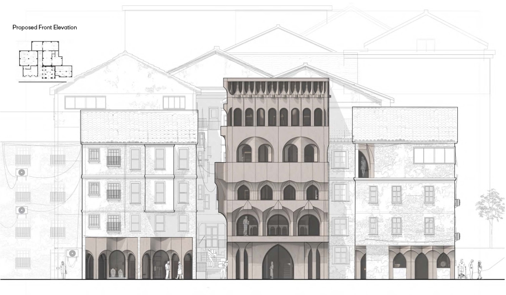
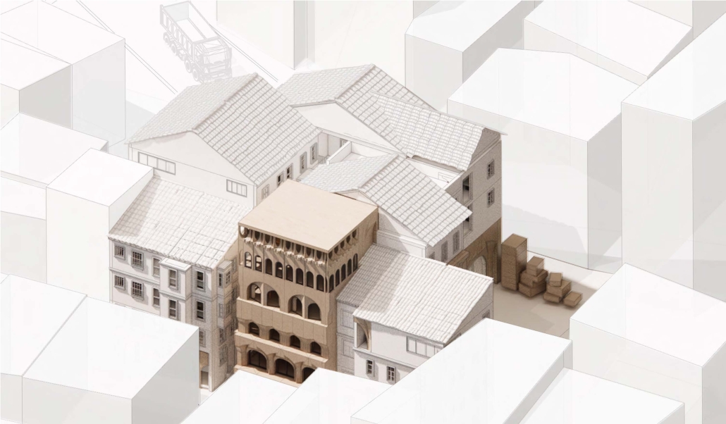
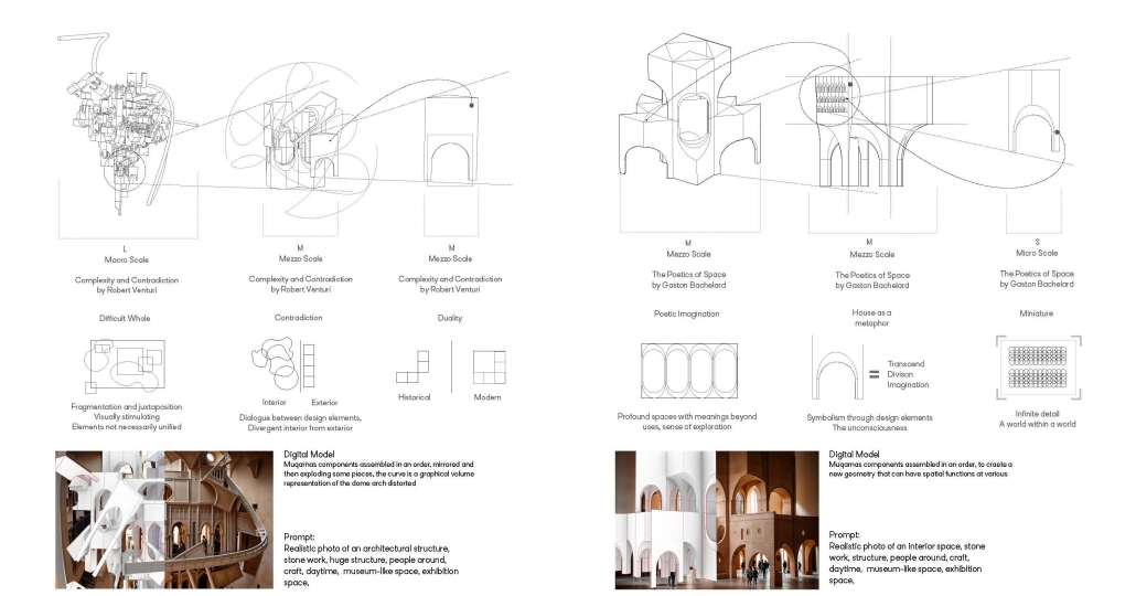
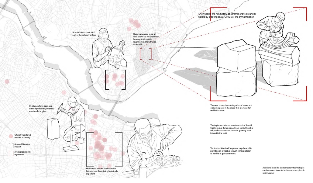
This project explores the revival of traditional Turkish craftsmanship through the lens of muqarnas, a decorative architectural element known for its intricate, geometrical design. By investigating the scalability of muqarnas components at different levels-ranging from city objects to structural elements, [this] project aims to reimagine its role in contemporary architecture. In doing so, it bridges the gap between historical techniques and modern design, while fostering a deeper connection to cultural heritage and promoting sustainable, locally-rooted practices in the evolving architectural landscape of Turkey.
The potential of this project is to expand as a result of craftsmen’s revolution against mass production and the reincorporation of the crafts profession, mixed with advanced technologies. The new explorations and geometries that can come from human work and machine can give birth to a sculptural language as a reflection of skill, culture, and innovation.
This project was awarded the Fielding Dodd Prize & WWA Prize.
Instagram: @nikoleta__11
Glimpses Within: A Performing Arts Center by Sydney Hopkins, BAA ’25
University of New Mexico | Advisor: Liane Hancock
The Barelas neighborhood in Albuquerque, New Mexico, is one of the city’s oldest communities, rich in cultural identity and history. For generations, families have lived and worked here, creating strong communal bonds. Yet, this community has faced repeated disruptions such as the rerouting of Route 66, the closure of the railyards, and aggressive urban renewal, all of which have displaced residents and fragmented its historic fabric. This project, a Performing Arts Center, responds to those losses by exploring how architecture can help restore and reinforce a sense of place.
To do so, the design considers how Form, Meaning, and Activity can work together to serve the Barelas community. The building’s form blurs the boundary between interior and exterior, creating visual and physical connections that foster openness. A key feature is a central corridor that functions like an outdoor path. Though enclosed, it is flooded with natural light and flanked by transparent materials. It becomes the heart of the building, guiding movement and offering freedom of navigation while echoing the flow of public life outside.
The building envelope plays a central role in inclusion. It incorporates varied levels of opacity, revealing glimpses of the life within while maintaining moments of privacy. This approach invites curiosity. Those outside are drawn in, not by force but through visual engagement. The façade becomes a threshold that communicates welcome, activity, and cultural presence. Meaning is embedded through material and expressive identity. The building stands as a recognizable landmark, offering a symbol of resilience and pride. Activity is addressed through multi-use spaces that serve both performance and everyday community needs.
This building does not attempt to overwrite what has been lost, but rather to acknowledge it and respond with care. By amplifying visibility, creating access, and embedding memory into the design, the project becomes a living framework for connection. It is a space that reflects the resilience of Barelas and strengthens its future.
Instagram: @sydney_hopkins_
Interconnected Experience: Interactive Pocketbook by Kamil Ciemierkiewicz & Hee Jun, B.Arch ’25
New Jersey Institute of Technology | Advisor: Andrzej Zarzycki
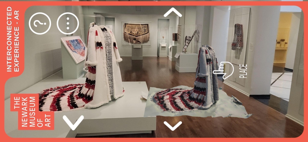
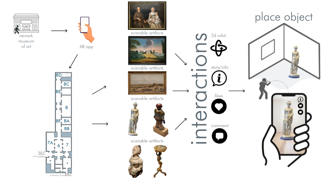
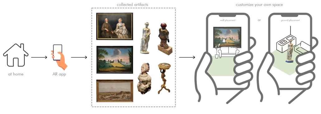
“The Interconnected Experience” augmented reality (AR) app reimagines the museum experience by transforming passive observation into active, personalized engagement. Designed for use at institutions like the Newark Museum of Art, the app allows visitors to scan artifacts using their smartphones, unlocking rich contextual information and building a digital collection that persists beyond the visit, thus addressing the “30-second gaze” phenomenon of the fleeting museum memories.
One of the app’s standout features is its ability to animate artworks using AR. Visitors can also “place” scanned artifacts in their own environments—such as a sculpture on a living room table or a painting on a bedroom wall—using AR overlays. This not only extends the museum experience into everyday life but also supports reflective learning by allowing users to revisit and reinterpret artworks in new contexts. The app’s remote access mode enables users to curate their own virtual galleries, making it a valuable tool for educators, students, and art enthusiasts.
Conceptually, the app aligns with constructivist learning theory, which emphasizes active, contextualized knowledge construction. It also supports the democratization of cultural access by preserving past exhibits and making them available to users who may not be able to visit in person. For curators, the app offers practical utility: it can be used to visualize exhibit layouts before installation, reducing setup time and improving spatial planning.
The technical implementation of the app utilizes Unity, a cross-platform game engine that supports real-time 3D rendering and interactive UI development, paired with Vuforia, an AR software development kit (SDK) that enables image recognition and tracking.
The user interface (UI) supports social features like liking and commenting, and future iterations may include curator feedback loops and VR integration for fully immersive gallery experiences. This technical ecosystem ensures that the app is not only engaging and educational but also adaptable to evolving museum needs and visitors’ expectations.
Instagram: @kamil2134, @andrzejzarzycki
MATTER: Preservation Center for Indigenous Culture and Knowledge by Ana Cecilia Gutierrez Torreseptien, B.Arch ’25
Washington University in St. Louis | Advisor: Zahra Safaverdi
“The Preservation Center for Indigenous Culture and Knowledge” explores how architecture can care for knowledge without possessing it. Rooted in the belief that objects matter not just as material things but as vessels of identity, memory, and story, the project challenges traditional archival and museum models that often strip artifacts from their cultural contexts. Instead, it proposes an architecture that honors Indigenous knowledge through respectful preservation, digital transformation, and spatial storytelling.
Set in Texhoma—a town straddling the Texas-Oklahoma border with a complex and layered history—the project confronts themes of land, migration, biodiversity, and cultural erasure. A drawing apparatus, designed to visualize these overlapping histories, records long-term geographical conditions via carbon transfers. Historical events such as agricultural practices and Indigenous presence are “drawn” through changeable keys. In doing so, the machine becomes a speculative tool for reinterpreting both past and possible futures.
The architectural program unfolds as a puzzle-like matrix of spaces, built from modular prisms derived from a “spherinder”—a hybrid geometry that steps across three axes. This system allows for adaptive spatial configurations without breaking the relationships established in the original adjacency matrix. Colored puzzle pieces scale up or down and rotate to embed a variety of functions while maintaining continuity. The primary spherinder structure acts as a dynamic core, housing a hydraulic lift that cycles objects through three stages: dematerialization, engagement, and archiving.
Walls thicken to house layered digital archives and “pockets” for re/dematerialized objects. These pockets blend into the architecture and reveal their contents only when activated. The largest cylinder stores these digital-physical hybrids with varied levels of accessibility and privacy, ensuring community agency over what is seen, held, and remembered.
In rethinking how matter, importance, and care intertwine, the project proposes architecture not as a container, but as a collaborator in the storytelling of culture.
The Hendersonville Music Center by Andrew Tyler Tate, B.S. in Architectural Science ’25
Western Kentucky University | Advisor: Shahnaz Aly
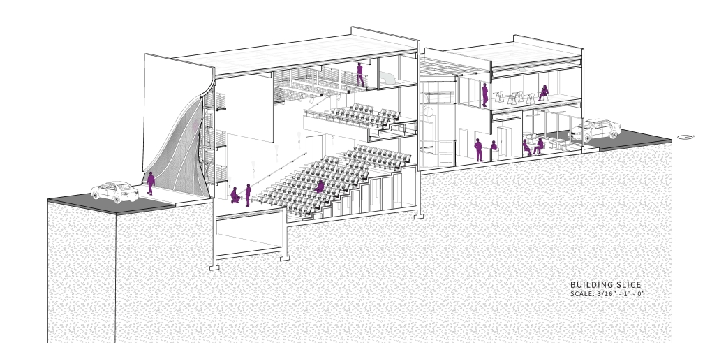
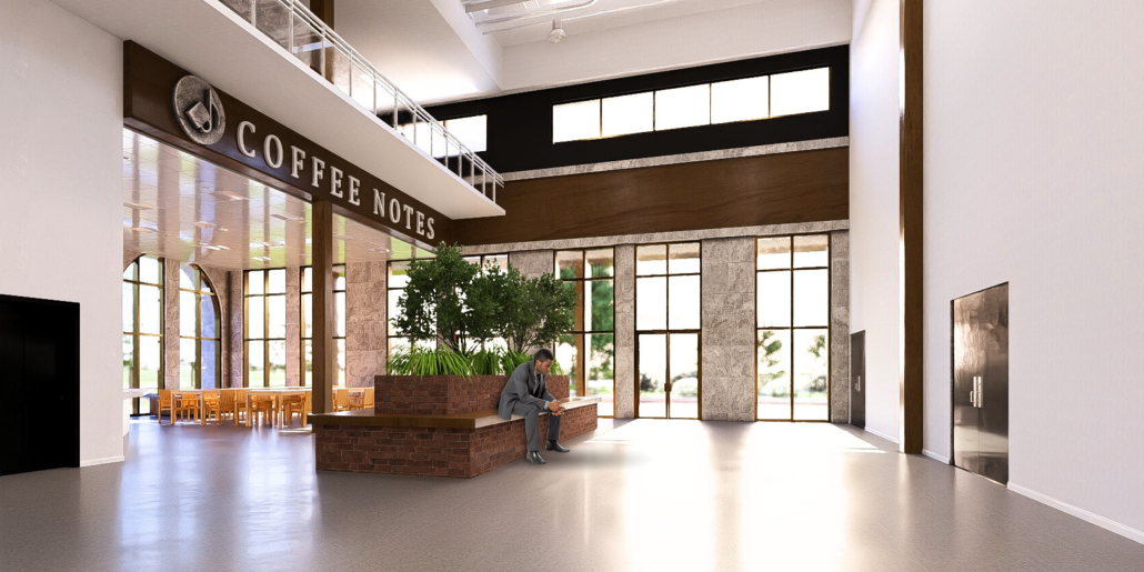
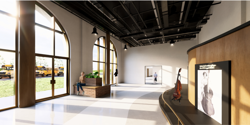
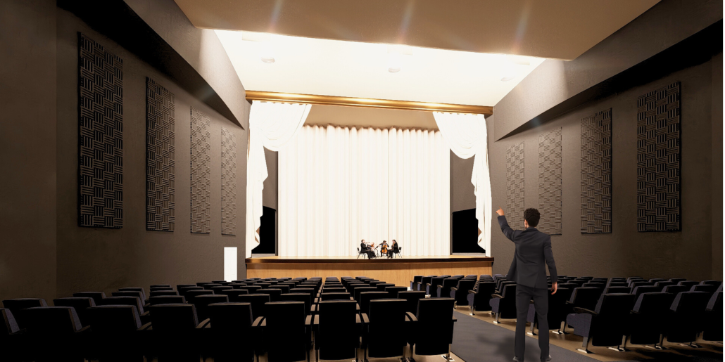
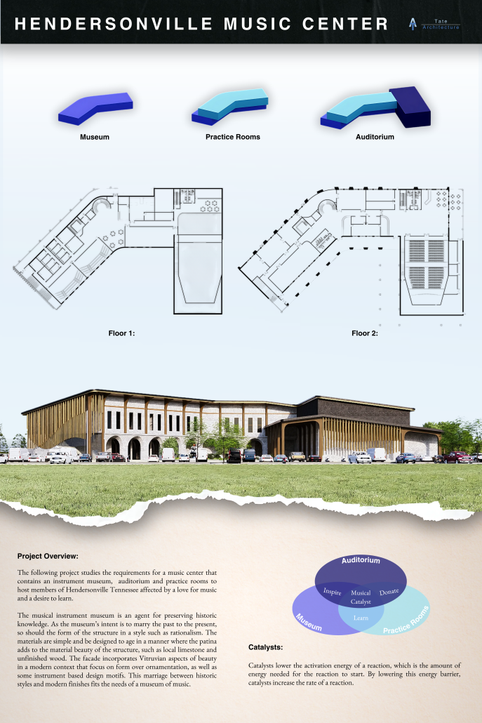
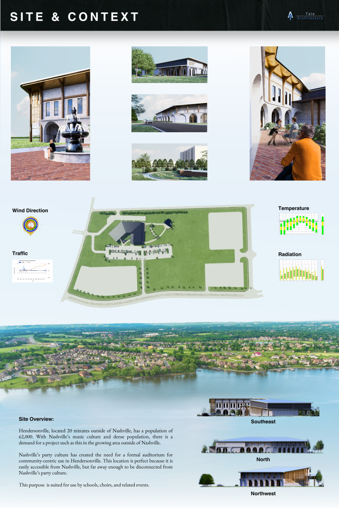
This project consists of a music center located in Hendersonville, Tennessee. This music center consists of an instrument museum, auditorium, and community practice rooms. This multi-use music center will fulfill three functions that include an auditorium, practice rooms, and an instrument museum. There is currently no auditorium in Hendersonville, so this auditorium wishes to provide a community gathering space, as well as a formal concert space outside of Nashville’s party culture. This auditorium will donate a portion of its profit to supply instruments to the practice rooms for citizens of the community to rent for free. The practice rooms will receive instrument donations from the community as well, in an effort to reuse instruments people would throw away or never play again. A music museum will showcase instruments, what genres they are used for, and the science of how they work. This pulls people from all around, and makes this a destination space for members outside of the community.
This music center will incorporate Vitruvian aspects of beauty in a modern context that will focus on form over ornamentation with simple modern finishes. The materials will be designed to age in a manner that the patina adds to the material beauty of the structure, such as concrete forms and unfinished wood. This marriage between historic styles and modern finishes fits the needs of a museum of music, because as we study the history of music, we marry the past and present; thus, the style of the structure should embrace historic forms in a modern context, such as rationalism or other classical revival styles, such as Beaux Arts. The styles above reflect the requirements for a museum, auditorium, and practice rooms to host members of the community, invariably affected by a love for music and a desire to learn.
This project was recognized as an Outstanding Capstone Project in Architectural Science by WKU.
Instagram: @atate21
Stay tuned for Part VII!















![layout [Converted]](https://studyarchitecture.com/wp-content/uploads/MArch-SP23-403C.3-RS-Lynn-Yiman-DG-01-Travis-Dagenais-1030x572.jpg)
![layout [Converted]](https://studyarchitecture.com/wp-content/uploads/MArch-SP23-403C.3-RS-Lynn-Yiman-DG-02-Travis-Dagenais-1030x572.jpg)

