Posts

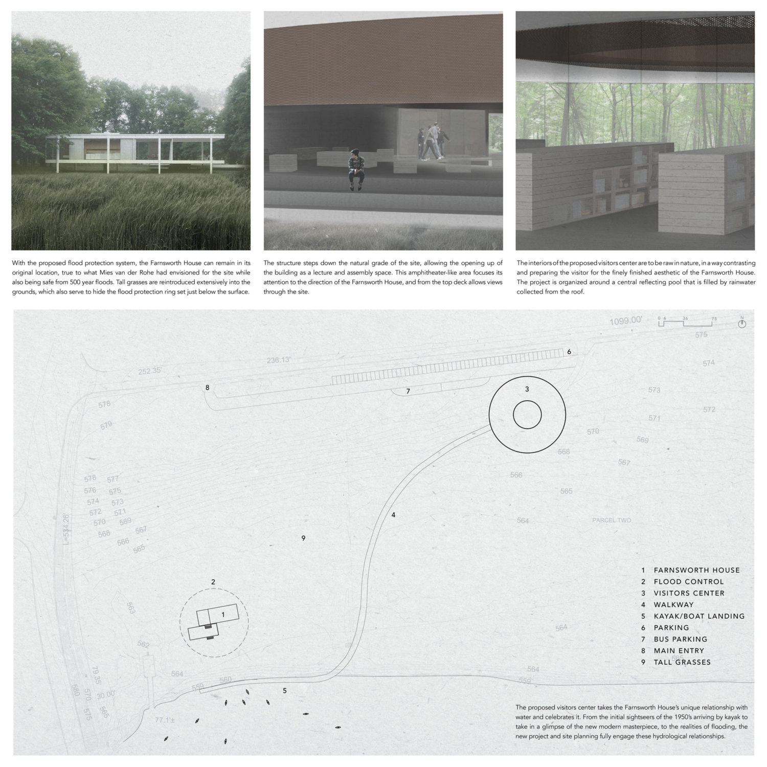
2020 Student Thesis Showcase - Part I

Have you ever wondered what students design in architecture school? A few years ago, we started an Instagram account called IMADETHAT_ to curate student work from across North America. Now, we have nearly 3,000 projects featured for you to view. In this series, we are featuring thesis projects of recent graduates to give you a glimpse into what architecture students create while in school. Each week, for the rest of the summer, we will be curating five projects that highlight unique aspects of design. In this week’s group, the research ranges from urban scale designs focused on climate change to a proposal for a new type of collective housing and so much in between. Check back each week for new projects. 

In the meantime, Archinect has also created a series featuring the work of 2020 graduates in architecture and design programs. Check out the full list, here.

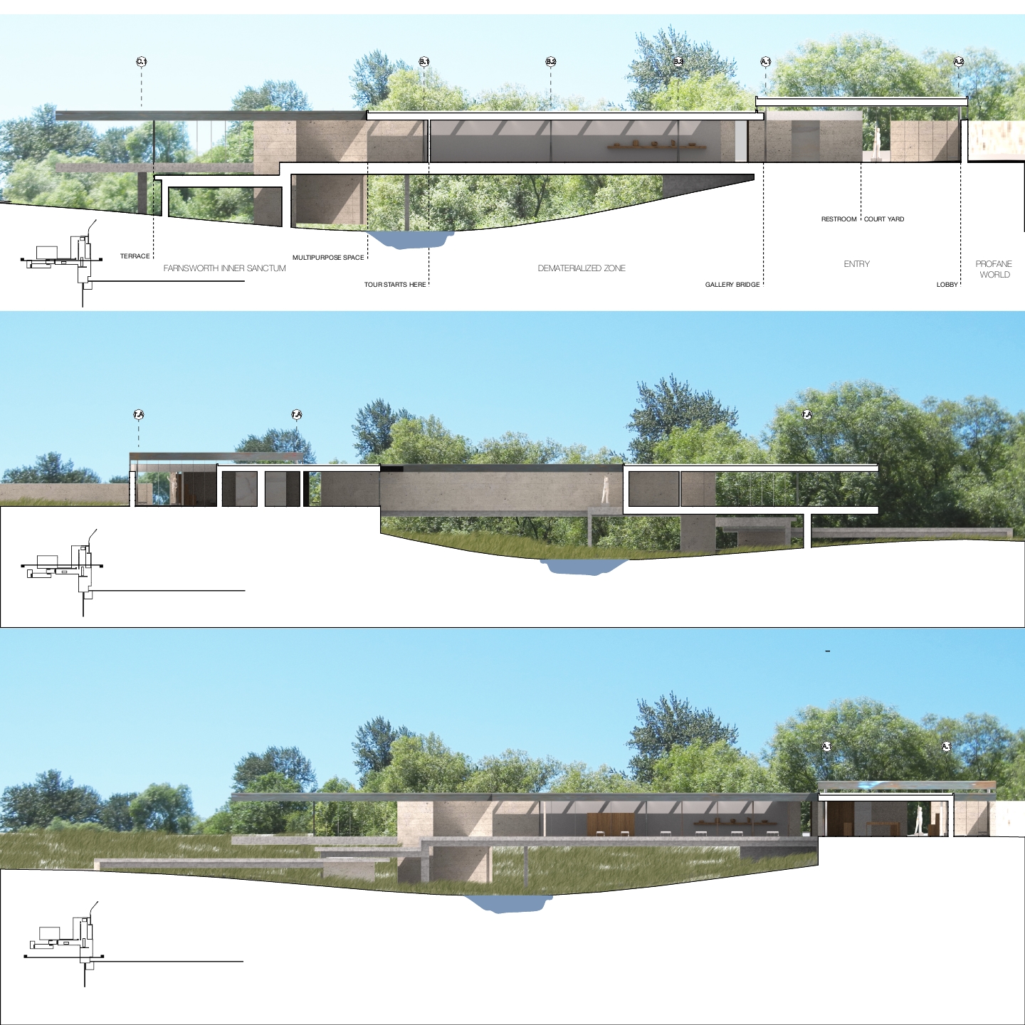
Redefining the Gradient by Kate Katz and Ryan Shaaban, Tulane University, M.Arch ‘20

Thesis Advisors: Cordula Roser Gray and Ammar Eloueini / Course: 01-SP20-Thesis Studio

Sea level rise has become a major concern for coastal cities due to the economic and cultural importance tied to their proximity to water. These cities have sustained their livelihood in low-lying elevations through the process of filling, bridging, and raising land over coastal ecosystems, replacing their ecological value with infrastructures focused on defining the edge between city and nature. Hard infrastructures have been employed to maintain urban landscapes but have minimal capacity for both human and non-human engagement due to their monofunctional applications focused on separating conditions rather than integrating them. They produce short-term gains with long-term consequences, replacing and restricting ecosystems and acting as physical barriers in a context defined by seasonal transition. 

To address the issues of hard infrastructure and sea level rise, this thesis proposes an alternative design strategy that incorporates the dynamic water system into the urban grid network. San Francisco was chosen as the location of study as it is a peninsula where a majority of the predicted inundation occurs on the eastern bayside. In this estuary, there were over 500 acres of ecologically rich tidal marshlands that were filled in during the late 1800s. To protect these new lands, the Embarcadero Sea Wall was built in 1916 and is now in a state of neglect. The city has set aside $5 billion for repairs but, instead of pouring more money into a broken system, we propose an investment in new multi-functional ecologically-responsive strategies. 

As sea levels rise, the city will be inundated with water, creating the opportunity to develop a new circulation system that maintains accessibility throughout areas located in the flood zone. In this proposal, we’ve designed a connective network where instance moments become moments of pause and relief to enjoy the new cityscape in a dynamic maritime district. 

On the lower level, paths widen to become plazas while on the upper level, they become breakout destinations which can connect to certain occupiable rooftops that are given to the public realm. The bases of carved canals become seeding grounds for plants and aquatic life as the water level rises over time. Buildings can protect high-risk floors through floodproofing and structural encasement combined with adaptive floorplates to maintain the use of lower levels. The floating walkway is composed of modular units that are buoyant, allowing the pedestrian paths to conform and fluctuate with diurnal tidal changes. The composition of the units creates street furniture and apertures to engage with the ecologies below while enabling a once restricted landscape of wetlands to take place within the city. 

The new vision of the public realm in this waterfront district hopes to shine an optimistic light on how we can live with nature once again as we deal with the consequences of climate change.

Unearthing the Black Aesthetic by Demar Matthews, Woodbury University, M.Arch ‘20

Advisor: Ryan Tyler Martinez
Featured on Archinect

“Unearthing The Black Aesthetic” highlights South Central Los Angeles’s (or Black Los Angeles’s) unique positioning as a dynamic hub of Black culture and creativity. South Central is the densest population of African Americans west of the Mississippi. While every historically Black neighborhood in Los Angeles has experienced displacement, the neighborhood of Watts was hit particularly hard. As more and more Black Angelenos are forced for one reason or another to relocate, we are losing our history and connection to Los Angeles.

As a way to fight this gentrification, we are developing an architectural language derived from Black culture. So many cultures have their own architectural styles based on values, goals, morals, and customs shared by their society. When these cultures have relocated to America, to keep their culture and values intact, they bought land and built in the image of their homelands. That is not true for Black people in America. In fact, until 1968, Black people had no rights to own property in Los Angeles. While others began a race to acquire land in 1492, building homes and communities in their image, we started running 476 years after the race began. What percentage of land was left for Blacks to acquire? How then can we advance the development of a Black aesthetic in architecture?

This project, most importantly, is a collaboration with the community that will be for us and by us. My goal is to take control of our image in architecture; to elevate, not denigrate, Black life and culture. Ultimately, we envision repeating this process in nine historically Black cities in America to develop an architectural language that will vary based on the history and specificities of Black culture in each area.

KILLING IT: The Life and Death of Great American Cities by Amanda Golemba, University of Wisconsin-Milwaukee, M.Arch ’20

Advisors: Nikole Bouchard, Jasmine Benyamin, and Erik Hancock / Independent Design Thesis

For decades, post-industrial cities throughout the United States have been quietly erased through self-imposed tabula rasa demolition. If considered at all, demolition is touted as the mechanism for removing unsightly blight, promoting safety, and discarding the obsolete and the unwanted. Once deemed unworthy, rarely does a building survive the threat of demolition. 

In the last decade, the City of Chicago has erased over 13,000 buildings with 225 in just the last four months. Not only does this mass erasure eradicate the material and the spatial, but it permanently wipes the remnants of human bodies, values, and history — a complete annulment of event, time, and memory. 

But why do we feel the need to erase in order to make progress?

Our current path has led to a built environment that is becoming more and more uniform and sterile. Much of America has become standardized, mixed-use developments; neighborhoods of cookie-cutter homes and the excessive use of synthetic, toxic building materials. A uniform world is a boring one that has little room for creativity, individuality, or authenticity.

This thesis, “KILLING IT,” is a design proposal for a traveling exhibition that seeks to change perceptions of the existing city fabric by visualizing patterns of erasure, questioning the resultant implications and effects of that erasure, and proposing an alternative fate. “KILLING IT” confronts the inherently violent aspects of architecture and explores that violence through the intentionally jarring, uncomfortable, and absurd analogy of murder. This analogy is a lens through which to trace the violent, intentional, and premature ending and sterilization of the existing built environment. After all, as Bernard Tschumi said, “To really appreciate architecture, you may even need to commit a murder.”1 But murder is not just about the events that take place within a building, it is also the material reality of the building itself. 

Over the life of a building, scarring, moments in time, and decay layer to create an inhabitable palimpsest of memory. This traveling exhibition is infused with the palimpsest concept by investigating strategies of layering, modularity, flexibility, transparency, and building remains, while layering them together to form a system that operates as an inhabitable core model collage. Each individual exhibition simultaneously memorializes the violence that happened at that particular site and implements murderous adaptive reuse strategies through collage and salvage material to expose what could have been.

If we continue down our current path, we will only continue to make the same mistakes and achieve the same monotonous, sterilizing results we currently see in every American city and suburb. We need to embrace a new path that values authenticity, celebrates the scars and traces of the past, and carries memories into the future. By reimaging what death can mean and addressing cycles of violence, “KILLING IT” proposes an optimistic vision for the future of American cities. 

      1. Tschumi, Bernard. “Questions of space: lectures on architecture” (ed. 1990)

A New Prototype for Collective Housing by Juan Acosta and Gable Bostic, University of Texas at Austin, M.Arch ‘20

Advisor: Martin Haettasch / Course: Integrative Design Studio
Read more: https://soa.utexas.edu/work/new-prototype-collective-housing

Austin is a city that faces extreme housing pressures. This problem is framed almost exclusively in terms of supply and demand, and the related question of affordability. For architects, however, a more productive question is: Will this new quantity produce a new quality of housing? 

How do we live in the city, how do we create individual and collective identity through architecture, and what are the urban consequences? This studio investigates new urban housing types, smaller than an apartment block yet larger and denser than a detached house. Critically assessing existing typologies, we ask the question: How can the comforts of the individual house be reconfigured to form new types of residential urban fabric beyond the entropy of tract housing or the formulaic denominator of “mixed-use.” The nature of the integrative design studio allowed for the testing of material systems and construction techniques that have long had an important economic and ecological impact.

“A New Prototype for Collective Housing” addresses collectivity in both a formal and social sense, existing between the commercial and residential scales present in Austin’s St. John neighborhood as it straddles the I-35 corridor; a normative American condition. A diversity of programs, and multigenerational living, create an inherently diverse community. Additionally, a courtyard typology is used to negotiate the spectrum of private and shared space. Volumes, comprising multiple housing units ranging from studio apartments to four bedrooms, penetrate a commercial plinth that circulates both residents and mechanical systems. The use of heavy timber ensures an equitable use of resources while imbuing the project with a familiar material character.

ELSEWHERE, OR ELSE WHERE? by Brenda (Bz) Zhang, University of California at Berkeley, M.Arch ’20

Advisors: Andrew Atwood and Neyran Turan
See more: https://www.brendazhang.com/#/elsewhere-or-else-where/

“ELSEWHERE, OR ELSE WHERE?” is an architectural fever dream about the San Francisco Bay Area. Beginning with the premise that two common ideas of Place—Home and Elsewhere—are no longer useful, the project wonders how disciplinary tools of architecture can be used to shape new stories about where we are.

For our purposes, “Home,” although primarily used to describe a place of domestic habitation, is also referring generally to a “familiar or usual setting,” as in home-base, home-court, home-page, and even home-button. As a counterpoint, Elsewhere shifts our attention “in or to another place,” away. This thesis is situated both in the literal spaces of Elsewhere and Home (landfills, houses, wilderness, base camps, wastelands, hometowns) and in their culturally constructed space (value-embedded narratives determining whether something belongs, and to whom). Since we construct both narratives through principles of exclusion, Elsewhere is a lot closer to Home than we say. These hybrid spaces—domestic and industrial, urban and hinterland, natural and built—are investigated as found conditions of the Anthropocene and potential sites for new understandings of Place.

Ultimately, this thesis attempts to challenge conventional notions of what architects could do with our existing skill sets, just by shifting our attention—Elsewhere. The sites shown here and the concerns they represent undeniably exist, but because of the ways Western architecture draws thick boundaries between and around them, they resist architectural focus—to our detriment.

In reworking the physical and cultural constructions of Homes and Elsewheres, architects are uniquely positioned to go beyond diagnostics in visualizing and designing how, where, and why we build. While this project looks specifically at two particular stories we tell about where we are, the overall objective is to provoke new approaches to how we construct Place—both physically and culturally—within or without our discipline.


The Second Studio Podcast

(via The Second Studio)

The Second Studio, formerly known as the “Midnight Charette,” is a podcast about design and the everyday. Hosted by architects David Lee and Marina Bourderonnet, it features a variety of renowned design professionals in unscripted and long-format interviews, allowing for thoughtful takes and more personal discussions. With the hosts’ extensive professional and academic backgrounds, the show’s array of subjects are covered critically and honestly. Some episodes are reviews of projects, while others are guides for young designers, discussions on questions from listeners, interviews, or humorous explorations of everyday life.

In The Second Studio’s “Tips and Tactics” episodes David and Marina provide helpful advice on “How to Get Hired as a Designer”, “How to Make a Portfolio”, “Choosing the Right Architecture Program”, and “What Software Programs to Use” among other topics. The show also has a hotline through which guests can call or text questions for the hosts.

The Second Studio Podcast has over 130 episodes and has been rank favorably across podcast aggregators, reaching number one on Player FM’s trending architecture podcasts and tenth in Apple’s design podcasts. The show was also included in Draper’s list of Architectural Podcasts You Should Follow. The show is available on iTunes, YouTube, Spotify, and all other Podcast directories.

David Lee is a registered architect in New York and California and holds a Bachelor of Architecture and Master of Urban Design. He worked in New York City for several years on custom residential projects, towers, master plans, and an award-winning PS1 MoMA installation. He has taught a range of undergraduate architecture studios and guest lectured at schools and conferences.

Marina Bourderonnet is a French architect and designer with a Bachelor of Architecture and studies in art at the Ecole des Beaux-Arts. She has worked in several architecture offices in New York City and Paris on a variety of projects including mixed-used, residential, healthcare, and interior design. She loves cheese and is a brutal critic at design reviews.

Design:ED Podcast

The path to becoming an architect can seem daunting and unclear for young architects trying to navigate their careers. So many variables make it seem as if your decisions now will dictate your entire future within the field. Which school should I attend? Should I pursue my architectural license? How do I go about starting a successful architecture firm? These questions are common among young architects, and while you can try to piece together some answers yourself, it can still seem overwhelming.

The Design:ED Podcast is a one stop shop to provide valuable, unmatched, insight into the field of architecture told by those you have lived it. By hearing the honest truth about the highs and lows of the industry through personal experiences provides a path for young architects on how to navigate their own careers based off of professional keys to success as well as how to avoid common pitfalls. The long-form podcast format provides additional insight into the personalities of these industry leaders to provide a personal perspective, outside of their portfolio, that set them apart from their peers.

Thus far the podcast has featured some of the nation’s leading architects and their personal stories such as Matt Fajkus, and Ted Flato of Lake Flato Architects. As well as, former business partner to Charles Moore, Arthur Andersson, with many more still to come. Each guest provides a unique account of the design industry that will prove to be valuable to individuals at all levels of the industry.

Along with the Design:ED Podcast, the designed.podcast Instagram features student work from all over the country to further provide inspiration while in the studio. By listening to the podcast and seeing other students work, new architects it will be motivated to launch their careers to the next level.

To have your work featured or if you’re interested in being a guest on the podcast please email designed.podcast@gmail.com or reach out on Instagram @designed.podcast

Listen to Design:ED on iTunes or Google Play .


Aaron Prinz is currently an M.Arch candidate at the University of Texas at Austin. He was raised in the rural town of Red Bluff, California, and moved to San Francisco to pursue a career in stand-up comedy. At the age of twenty-six, Prinz began studying architecture at Portland State University in Portland, Oregon where he graduated Cum Laude while also interning at Studio Petretti Architecture. Prinz currently resides in Austin, Texas.

Resource: Scenario Journal

Scenario Journal is an online project focused on the next generation of urban landscapes. Scenario seeks to create a free and accessible platform for showcasing conversations that spark collaboration, rethink urban landscape performance, and lay down a framework for design innovation. 

The online journal is co-edited by Stephanie Carlisle, Principal at KieranTimberlake and a lecturer of Urban Ecology at the University of Pennsylvania School of Design and Nicholas Pevzner, full-time lecturer in the Department of Landscape Architecture at the University of Pennsylvania School of Design.

The latest issue, Migration, contains fourteen articles ranging from human to plant migration and everything in between. See the list below for specific articles. Visit ScenarioJournal.com for more information on future calls, past issues, and more.

Introduction: Migration 
by Stephanie Carlisle and Nicholas Pevzner

Migrations in Our Habitats, Scaling from the Clone to the Continent
by Steven N. Handel

Fluid Geographies: Strategies for the Landscape Left Behind
by Karl Kullmann

The Continental Compact: Eastward Migration in a (New) New World
by Ian Caine and Derek Hoeferlin

Ode to Joy
by Traumnovelle

Flood + Forest: A Migration Corridor for Reconnecting the Brussels Landscape
by Wim Wambecq and Bruno De Meulder

Movebank: An Interview with Roland Kays
by Nicholas Pevzner and Stephanie Carlisle

Trade as Form
by Alex Klatskin

Coding Flux: Redesigning the Migrating Coast 
by Fadi Masoud

Landscape and Displacement: A Practical Intervention on a Syrian Informal Settlement in Lebanon
by Maria Gabriella Trovato

The Spatialization of Migration Policy in Europe
by Tami Banh and Antonia Rudnay

Segunda Vida: an Architecture of Resilience
by Mike Yengling

Travel by Night
by Audrey Burns Leites

Urban Sanctuary Network
by Eduardo Rega

Check out the previous 5 issues on Extraction (5), Building the Urban Forest (4), Rethinking Infrastructure (3), Performance (2), and Landscape Urbanism (1).

To learn more about University of Pennsylvania’s Architecture, Urban Ecology, or Landscape Architecture programs, visit their website.

UBuffalo architect creates Light/Station installation

(via University of Buffalo News Center)

BUFFALO, N.Y. — During the day, light pours in from two sides through the more than 72,000 holes laser-precision drilled into the stainless steel panels that veil the building’s façade.

At night, an inversion occurs and light glows from within, identifying the structure’s presence in the surrounding neighborhood.

For his newest project, University at Buffalo architect Christopher Romano embarked upon a two-year journey through the manipulation of light and metal as design materials. The result is a signature architectural structure nestled in the shadows of three iconic buildings on Buffalo’s historic East Side.

It’s called Light/Station, and the recently completed project has transformed an abandoned gas mart into a striking 1,545-square-foot design studio, green room and conference facility for Buffalo-based Torn Space, a critically acclaimed, avant-garde theater company.

Light and history were core components of Romano’s design concept from the beginning.

“Light serves as the connective tissue for all the components of the façade. It’s a material. It’s a central element to the multi-layered façade, where the lighting is a layer behind the steel panels, which typically isn’t done because it’s risky,” says Romano, who designed the façade through his firm Studio NORTH Architecture.

Romano is also a research assistant professor in UB’s School of Architecture and Planning. A small team of UB architecture students also worked on the project.

Some of the smaller prototypes were developed and tested using the school’s digital fabrication equipment under the direction of Daniel Vrana, a staff member in the Fabrication Workshop and current employee at Studio NORTH Architecture.

A LOOK AT LIGHT/STATION (PHOTOS BY DOUGLAS LEVERE)


Read more

Parsons’ Design-Build Project Transforms the Entrance Hall of Children’s Museum of the Arts

(via The New School News)

When you consider the function of a lobby, ideas like “entrance,” “waiting area,” or maybe “the way to get from the door to the elevator” probably come to mind.

But a lobby is more than just a way to get from point A to point B: It’s also meant to convey a lasting image of the institution or business.

That’s the kind of thinking that motivated students and faculty members at The New School’s Parsons School of Design in the transformation of the 1,200-square-foot entrance hall of the Children’s Museum of the Arts (CMA) in TriBeCa.

Led by Design Workshop, an innovative design-build studio comprising graduate architecture students, the project highlights Parsons’ commitment to design-led civic engagement and its real-world educational approach.

“The ‘learning by doing’ model, which is the backbone of the Parsons Design Workshop, affords our students the opportunity to fully realize their designs in built form,” says Joel Stoehr, director of Design Build Projects at Parsons’ School of Constructed Environments. “Student designers learn how an idea evolves from concept sketch to construction document to building permit and how these ideas are realized in the transformation of raw material into constructed artifact.”

The renovation was created to meet several of CMA’s design needs, including stroller storage, acoustics, branding, and increasing visibility of the visitor services desk. (Photo/Diego Ledezma-Perez)

Designed during the spring 2017 semester and constructed over the summer, the renovation was created to meet several of CMA’s design needs, including stroller storage, acoustics, branding, and increasing visibility of the visitor services desk. The centerpiece of the renovation is a new wall made up of two layers of perforated plastic illuminated by colored lights. The wall divides the lobby space into a “functional side,” which includes a new stroller parking area and storage space, and a “fun side,” a gathering space “where visitors of all ages are delighted by the light and pattern,” according to Angela DeGeorges, MArch ’18, a Design Workshop student who worked on the renovation.

Interactive Light Wall (Photo/Diego Ledezma-Perez)

“The CMA renovation is a spatial reorganization that accommodates the diverse and changing needs of the museum,” she adds. “Our strategy was to address each of CMA’s challenges with an architectural intervention that solves a problem but also brings visual delight to the space.”

Additionally, a series of dichroic acrylic panels suspended from the ceiling in front of the large south-facing windows allow light of different colors to be simultaneously reflected and transmitted. When parents check in to CMA, “the open lobby allows children to play in the colorful light projecting on the floor from the windows, be intrigued by a chase of color along the wall, or dance in front of an interactive art piece by Danny Rosen,” according to the students who worked on the project.

A series of dichroic acrylic panels suspended from the ceiling in front of the large south-facing windows allow light of different colors to be simultaneously reflected and transmitted. (Photo/Diego Ledezma-Perez)

A challenge faced by those working on the project was making sure that the materials used were both environmentally friendly and safe for children visiting CMA. That’s where Parsons’ Healthy Materials Lab (HML) came in. Jack Dinning, head researcher at HML, conducted workshops and consulted with Design Workshop students throughout the design, product evaluation, fabrication, and installation processes.

“Kids are particularly vulnerable to the effects that toxic materials can have on their health,” Dinning said. “Exposures during this stage of life can disrupt their early developmental processes, both physical and cognitive, leading to disorders ranging from asthma to learning disabilities to life-threatening illnesses like childhood brain cancers.”

With this concern in mind, Dinning and the students incorporated safer rubber flooring, sustainably forested plywood, and acoustic treatments made of recycled plastic.

Design Workshop echoes the real-world experience of collaborating with a real client. With guidance from Parsons faculty members Sharon Sutton, Nick Brinen, Mark Gardner, and Stoehr and assistance from West Chin Architects and Conto and Sons contractors, students participated in focus groups with museum visitors and conducted research before creating a proposal. During construction, they made decisions about which materials and hardware to use and generated shop drawings outlining their proposed design. By collaborating with a client, they had a chance to get their hands dirty and familiarize themselves with all aspects of the design and building of a commissioned project.

Parsons’ Design Workshop (Photo/Diego Ledezma-Perez)

The CMA lobby renovation is the latest project highlighting Parsons’ and Design Workshop’s commitment to design-led civic engagement. Past collaborations include the creation of a seating area at El Sitio Feliz, a popular community garden in Harlem; and changing room pavilions at the Sunset Park Recreation Center pool in Brooklyn and the Highbridge Recreation Center in Washington Heights.

In the renovation of the CMA lobby the Parsons students had a very satisfied client.

“The new lobby strengthens our ability to welcome all children and their families to make art at CMA,” says Barbara Hunt McLanahan, executive director of the museum. “We are delighted to have the opportunity to work with students from The New School to create an innovative and inviting entry to the museum. We look forward to welcoming visitors into our new lobby and lounge.”

Design Workshop Children’s Museum of the Arts Renovation (Photo/Diego Ledezma-Perez)


Learn more about Parson’s School of Design here.

CU Denver Students Build Pop-up Installation at Denver Park

CU Denver’s Maymester class designs and builds entryways for Square on 21st, a collaboration with the City of Denver.

(via CU Denver Today)

CU Denver students got to ditch the classroom in favor of turning soil, pounding nails and solving in-the-field design problems during a Maymester Design Build class. They put their creative stamp on an entire city block, installing archways that grace the entrances to a new City of Denver concept – a summer pop-up park, featuring food trucks, a dog park and music – in the Ballpark neighborhood.

“For me, it’s incredible to have the city say, ‘Yes, we trust you with $10,000,’” said student Genevieve Hampton. That was the budget that students and their instructors – Maria Delgado and Jo VandenBurg from the College of Architecture and Planning (CAP) and Monica Wittig from Inworks – received from the city to design and install the eye-catching entryways.

In late spring, the city closed the one-block section and began covering the pavement with turf, 60 trees, a music stage and the artful, student-designed entrances at Lawrence and Larimer streets. It’s fitting that 21 students enrolled in the Maymester course as the the verdant and shady block is now dubbed “The Square on 21st.”

Architecture student Tyler Ellis said the tangible nature of the project has been rewarding. “We’re mostly focused on the page when we’re in design studio,” he said, “so being able to see it manifested in physical form has been great.”

Maria Delgado, a doctoral Design and Planning student at CU Denver, was so inspired by the new CU in the City marketing campaign that she scoured the internet for design projects that would integrate student learning with downtown’s urban environment. “I was researching possible content for my spring class. I was inspired by Chancellor Horrell and our campus leadership’s whole concept of CU Denver being ‘CU in the City,’” Delgado said. “This project is a result of that movement.” Jo VandenBurg, another instructor in the class, added, “This is what you get when you say ‘CU in the City:’ You get cool stuff in the city.”

Delgado, a doctoral student in the Design and Planning Program in CAP, reached out to the city’s office of Community Planning and Development last winter when she saw the project posted online. Her initial suggestion was for city officials to critique a few student-created renderings. “From that meeting they said, ‘Well, actually we have $10,000 budgeted (for the entryways) and we’d love for your students to design and build something,’” Delgado said.

With a tight deadline approaching – the park opened June 15, with Denver Mayor Michael Hancock and other dignitaries in attendance (photo at top) – Delgado wondered how she and her students would be able to get all the work done in time. The solution was a CAP-Inworks cross-listed Maymester course that literally put students in hardhats out on the street.

Hampton said Design Build students are usually limited to creating small-sized models in the studio. “To walk through this design on this scale is something we’re not used to – it’s exciting,” she said. “It’s a design project with real-world constraints that we’ve had to adjust to, like the curve of the street.”

In spring, CAP and Inworks students met several times with city representatives to explain their idea and receive feedback. The designs were nearly ready when the Maymester Design Build class started on May 15.

Although the class runs three weeks, students only had 11 days to complete everything for The Square on 21st project. That’s how quickly they moved from a computer rendering, to figuring out how to build the entrances, to ordering the materials, to cutting the wood sheets, to installing and painting them. “It was crazy,” VandenBurg said of of the process, noting that students worked 9 a.m. to 5 p.m. each day over that span.

While CAP graduate students in Design Build have created projects across the state and in the metro area, the Ballpark effort marks the first time a Design Build undergraduate class has installed a local project. “It’s really cool because it’s just a few blocks away from school,” Delgado said. “It’s been a real collaboration for CAP, Inworks and the City to be able to visit the site daily and see the project grow.”

Grand way to make an entrance

The collaboration included access to cutting-edge technology available through both CAP and Inworks. CAP recently acquired a computer numerical control (CNC) router that replicates a machine already available at Inworks. The two CNCs allowed students to cut 83 sheets of plywood for the arches – set in accordion-like fashion at the Larimer entrance, where 14 are installed, and the Lawrence entry (seven more) – in quick and precise fashion.

The pop-up park will host food trucks, summer concerts and serve as a pleasant gathering spot for folks strolling or cycling just east of Coors Field.  The Square on 21st acts as a trial run for a potential permanent “activated block” to be installed in a pocket of town lacking green space, said Delgado, who founded the CU Denver Design Build Institute of America student chapter club.

The entrances play a key role in the park. They guide walking and bicycling visitors into the green space, encouraging them to meander through the park.

For Delgado, the best part of Maymester has been seeing students’ faces light up with pride as the entrances gained dimension and flair. “It’s neat because other people will be able to experience what our students have designed and built,” she said. “They’ve left a mark.”


Check out CU Denver’s Architecture Program!

"Preservation as Provocation" Winners Discuss Designs

(via National Trust Preservation Leadership Forum)

The Farnsworth House is one of the most revered buildings of the 20th century. Designed by Ludwig Mies van der Rohe in 1945 and constructed in 1951, it is a vital part of modern iconography. The building first opened to the public in 2005 and a modest visitor’s center was erected. Visitors, programming, and staff have made this 1,700-square-foot building too small. In a bi-annual competition called “Preservation as Provocation,” architecture students were challenged to design a new visitor’s center for the Farnsworth House. The competition is hosted by Association of Collegiate Schools of Architecture and the AIA Historic Resources Committee, and more than 400 students and 50 faculty sponsors from 34 schools participated in 2015–16.

The competition was judged blindly by jurors selected for their expertise with Farnsworth, flood management, design, and preservation management: Maurice Parrish, executive director of the Farnsworth House; Tom Jacobs, principal at Krueck + Sexton Architects in Chicago; David Waggonner, president of Waggonner and Ball Architects in New Orleans; and Ashley Wilson, Graham Gund Architect at the National Trust for Historic Preservation in Washington, D.C.

Farnsworth House | Credit: National Trust for Historic Preservation

Students wrestled with the programmatic and philosophical requirements of creating a space that prepares visitors for the spiritual experience of Farnsworth. Part of the challenge lay in the topography as much of the site is in a floodplain, rendering it unbuildable. The winners were Chase White, who holds both undergraduate and master’s degrees in architecture from the University of Texas at San Antonio; Paul Isaacs, who is in the master’s program at the University of Kentucky School of Architecture; and Bohyun Chang and Suk Lee, architecture students at Iowa State University. They responded to a few questions about their projects

What was your concept—the big idea?

Chase White: It sounds obvious, but from the get-go we knew that the project should be positioned conceptually to add its own meaning to the site while still relating directly to Mies van der Rohe’s masterpiece. We basically used a language similar to what Mies van der Rohe pioneered, but made it something of a conceptual inversion. We continued his pure geometry by using the circle to pair with the rectilinear design of the Farnsworth House. Where Mies van der Rohe employed a lightweight design that lifted the Farnsworth House off the ground, my proposed visitor’s center would employ heavy concrete that sinks into the site. Even the materiality of our project would strike a contrast, employing raw materials whereas the Farnsworth House has a finely finished aesthetic.

Bohyun Chang: We sought to provide individual experiences of the ground, water, and sky, while the Farnsworth House creates a combined experience of those elements.

Suk Lee: The design is intended to let individuals have their own experiences with and reactions to the Farnsworth House through a series of framed spatial experiences.

Paul Isaacs: I began by exploring the forms of visitor’s centers, which can fall into several categories: a gatehouse to a protected area, such as a zoo or sacred site; a pavilion in the midst of a natural landscape like a national park lodge; or simply an existing building. Eliminating the latter options, I designed the visitor entry as a gate house attached to a wall, not unlike the ones marking the entrances to grand estates. It was also important to tell the story of Mies van der Rohe’s journey through architecture, and I looked at the Barcelona Pavilion, the Brick Country House, and his skyscrapers for inspiration and details.

Collecting Pieces | Credit: Bohyun Chang and Suk Lee, Iowa State University

What did you learn about the challenges of this site?

White: Due to the realities of flooding at the Farnsworth House site, the topography was one of most decisive factors in how and where to design.

Lee: The flood issue was challenging, as was the physical distance between the house and parking lot.

Chang: For me, the challenge was providing a continuous and smooth transition between the parking lot, visitor’s center, and the Farnworth House—as well as translating our design concept into architectural elements.

Isaacs: The more obvious challenge was proximity to the river, which floods almost annually during the early spring, inundating most of the site, including the house itself. The second was the story of Edith Farnsworth’s lost battle for privacy. She expected her property to remain isolated and undisturbed until a highway bridge was built less than 100 feet away from the house. This line of thinking ultimately lead to the decision to locate the new visitor’s center where the old one stood—out of the flood plain and out of sight of the Farnsworth House.

Farnsworth House Visitor Center | Credit: Paul Isaacs, University of Kentucky

Was it intimidating to design a building in close proximity to one of the most revered structures in the world?

Lee: That was the most important aspect of the project. My design exists to serve the Farnsworth House. I was very careful to respect that fact and also to create an emotional element, like the Farnsworth House itself does. I did not think of it as intimidating—it was the purpose of the competition.

Chang: For our studio, the competition was a one-month practice in preparation for another contextual project that was located near the Kimbell Art Museum in Dallas, which features the Renzo Piano Pavilion and the architecture of Tadao Ando. It was not intimidating in terms of the design—but its structural aspects were intimidating.

Isaacs: My work will never be as great as van der Rode’s, so it would be unhealthy to try to compete. This project is different—it is well aware of its place in the grander scheme of things and seeks a reverential role.

[Farnsworth House Visitor Center]

How did you try to minimize impact and create a building that complements the Farnsworth House?

Lee: I replaced a current bridge with the visitor’s center, creating an artificial landscape to connect visitors to Farnsworth. I was imagining the center as part of the journey, since the Farnsworth House focuses not only on itself but also on its surroundings.

Isaacs: The visitor’s center attempts to set up a series of dichotomies with the Farnsworth House. Farnsworth is a transparent pavilion on stilts, whereas the visitor’s center is an opaque wall built into the landscape.

Ode to Mies | Credit: Chase White, University of Texas at San Antonio

While this competition is theoretical, the Farnsworth House does need a visitor’s center. Now that you’ve completed the competition, how hard do you think it will be to design a beautiful and appropriate building for this site?

White: The best design for the site will certainly be one that gives Farnsworth the space to be experienced as it was originally.

The biggest takeaway from our project is our flood control system, which I envisioned as a large steel ring that would be raised and lowered hydraulically. Set just below the ground, this system would be unnoticeable during normal operations and would allow the Farnsworth House to remain safe from flooding. If flooding of the house continues, at some point there may be nothing left to require a visitor’s center.

Chang: Our design simply avoided the flooding dilemma by placing the visitor’s center on the northern side of the site.

Were you able to visit Farnsworth House while preparing for this competition? What did you think when you saw this building for the first time?

Lee: I visited Farnsworth one year before the competition, and the distance from the parking lot to the Farnsworth House was a journey for me. My expectations built during the long walk through nature, so I had a very emotional response upon reaching the Farnsworth House. Thus, I preserved that journey in the design, conceiving of the trip from the parking lot to the Farnsworth House and back to the visitor’s center as one experience.

Isaacs: I visited Farnsworth at the start of the competition. I had seen the house more than a million times in pictures, drawings, models, and documentaries. The reverence I have for Mies van der Rohe’s work caused me to treat walking through and around the house as almost sacred. Removing my shoes meant more than preserving the travertine tile of the interior from scuff marks—it indicated respect for a sacred boundary. I walked around as one does deep in meditation or prayer, drinking it all in.

I really appreciated the way the tour was constructed: briefing, journey, reveal, and reverie. I wanted to preserve that form, but also to make the approach down the original driveway close to what Edith would have experienced and focus the return journey on the landscape and the river.

Ashley Wilson is the Graham Gund Architect at the National Trust for Historic Preservation.


For more on the competition, visit ACSA’s website.

Architectural Filmmaking and Storytelling with Ian Harris

Frame by frame, moment by moment, we record the world around us through our senses. We experience the warmth of light through a window, the sound of our footsteps in a hallway, the texture of a handrail, the aroma of something cooking in the kitchen. These senses create the full experience of the spaces we inhabit. They each play a role in the story of the space that we occupy. With the technological advancements in creating and distributing video we now have a way to tell the story of a design, the imagined or realized space can come alive at 24 frames per second. In the profession of architecture, video provides a new way of communicating the experience of the spaces and places designers create for those that may not be able to experience them first hand.

StudyArchitecture met with Ian Harris, director of Archiculture and co-founder of video production agency, Arbuckle Industries, to chat about teaching video to architecture students as a way to expand the way they think and talk about design.

Preparing to interview David Rockwell of Rockwell Group

Read more

USF Architecture Grads Design Award-Winning Disaster Relief Shelter

(via WUSF)

In 2009, University of South Florida School of Architecture and Community Design students Sean Verdecia and Jason Ross watched Hurricane Katrina and the aftermath. What struck them was the lack of quick, proper shelter for the victims of an event like this.

Sean Verdecia, left, and Jason Ross worked with USF's technology transfer office to patent their design and develop a business plan., HANDOUT

Sean Verdecia, left, and Jason Ross worked with USF’s technology transfer office to patent their design and develop a business plan., HANDOUT

“It started with disasters,” Verdecia said. “We noticed that there’s a second disaster, where people are given these shelters that lack human dignity. We thought that maybe we could use our architecture skills to maybe come up with something new that could solve this issue.”

Even after graduating, the pair continued working on the problem and came up with an answer: AbleNook. “AbleNook is a modular disaster relief dwelling that you can put together without tools in under two hours,” Verdecia said. The duo was encouraged by professor Mark Weston to take their idea to USF’sTechnology Transfer Office, which helped them form a start-up company.

What also came in handy was a crowd-funded Kickstarter campaign they held in 2012 to build a second prototype for field testing. “We started getting these $5,000 donations pouring in and that was like, the light bulb when off and were like, ‘Oh my gosh, people really love this idea, we need to keep working on this,’” Verdecia said. “At its heart, it’s a humanitarian project and people respond to that.”  What makes AbleNook unique is that it does a lot of things other shelters can’t do.

“Maybe they can’t be deployed on an uneven terrain, or you need a whole crew to take it out to the field to assemble it, or it’s not insulated, or it’s not secure, or it doesn’t provide human dignity,” Verdecia said, adding, “when we developed this design, we wanted it to be able to check all those boxes.”

The smallest version of AbleNook has an interior space of 64 square feet, is 20 feet long and about 13 feet high, with ceilings that are 10 feet high. “It’s made out of aircraft grade aluminum and structurally insulated panels that you can just click together without any tools,” Verdecia said. If there was a need for a number of shelters to be sent to a disaster site, they can be sent out en masse on the back of a truck and delivered to a scene. “These would be shipped out from our facility, flat packed, almost like an IKEA product and then when it arrives, it’s more like a Lego product that you put together yourself,” Verdecia said.

The AbleNook has thermal insulation and a number of frosted glass windows and natural ventilation techniques to keep the interior warm or cool, depending on the climate. The expandable design means additional units can be set up side by side or on top of one another. It’s also attractive enough with an arched roof and a porch that AbleNook can be used as a portable office, classroom, or even as a prefabricated home.

“We see this kind of like a Mercedes, that you have two versions of the Mercedes,” Verdecia said. “You have the utility version and then you have the luxury version, so you can take the same base platform and you can have it as a delivery vehicle or you can have it as this luxury SUV.”

Read more.

(via WUSF)

To learn more about AbleNook, check out their website!  www.ablenook.com

If you want to know more about the USF Architecture Program, check out their profile page on StudyArchitecture.com!