Posts

2023 Study Architecture Student Showcase - Part XI

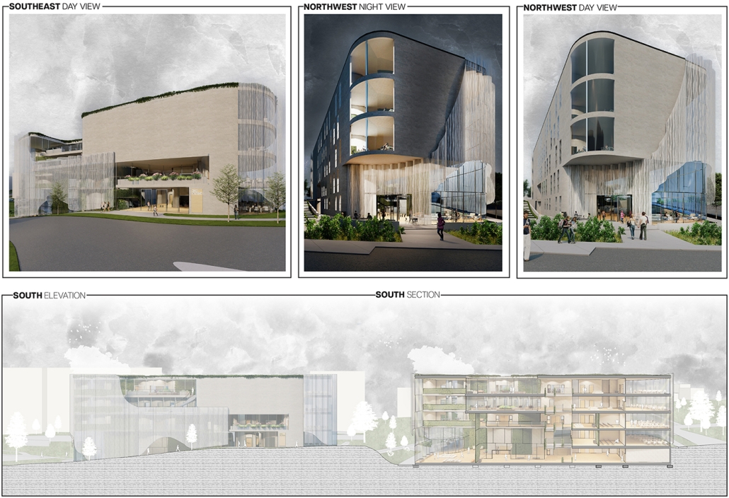
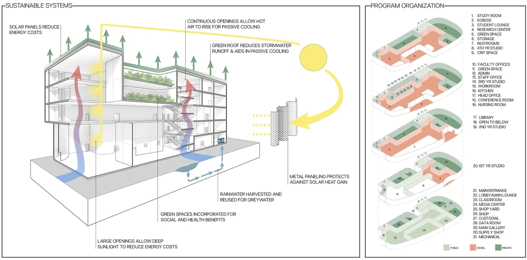
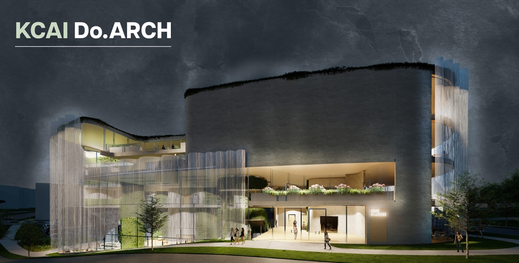
Welcome back to another week of the Study Architecture Student Showcase! In Week XI, we highlight student projects that use space as an avenue to create equitable community resources. From neighborhood civic buildings to multi-faceted housing units, this week’s featured projects address bridging societal gaps and emphasize the importance of creating opportunities for social interaction and dialogue between diverse communities. By taking a look at the projects below, you will learn how each student project proposes a space that promotes inclusivity and fosters community connections.
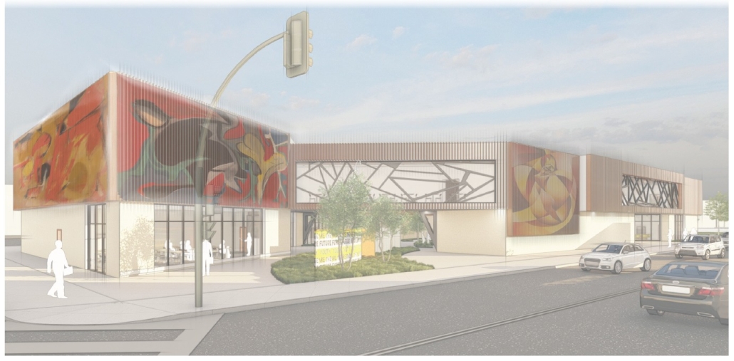
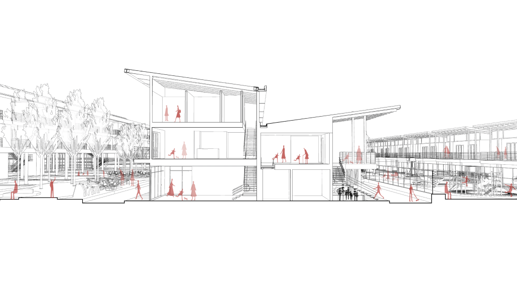
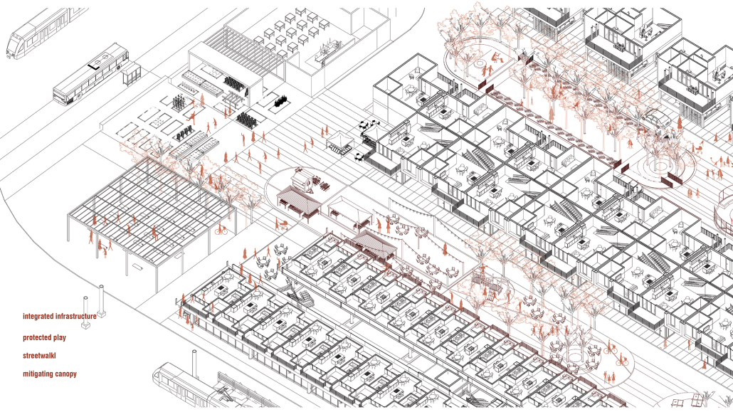
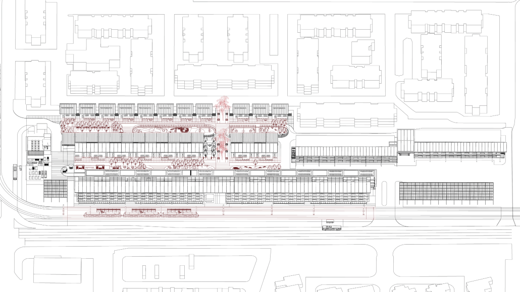
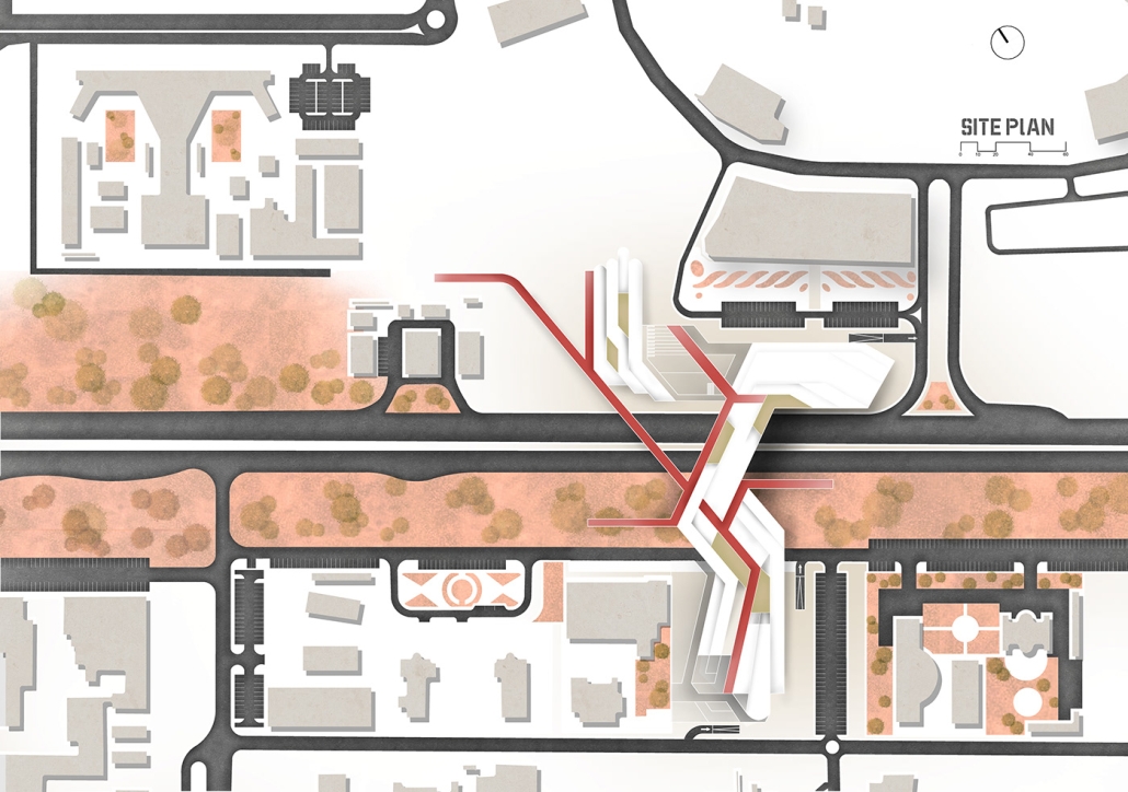
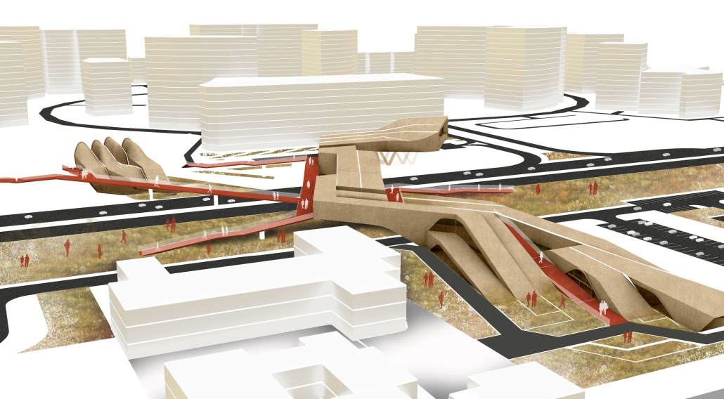
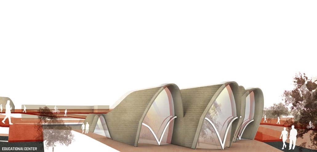
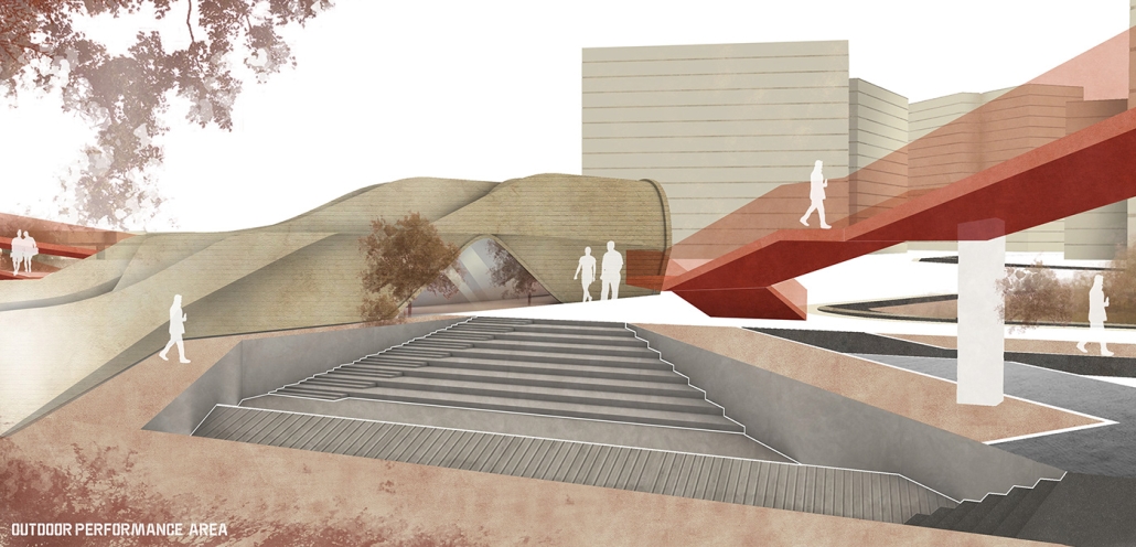
Center for Tolerance by Rebecca Dejenie, B.Arch‘23
The Boston Architectural College | Advisors: Peter Martin and Robert Gillig

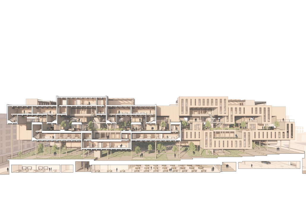
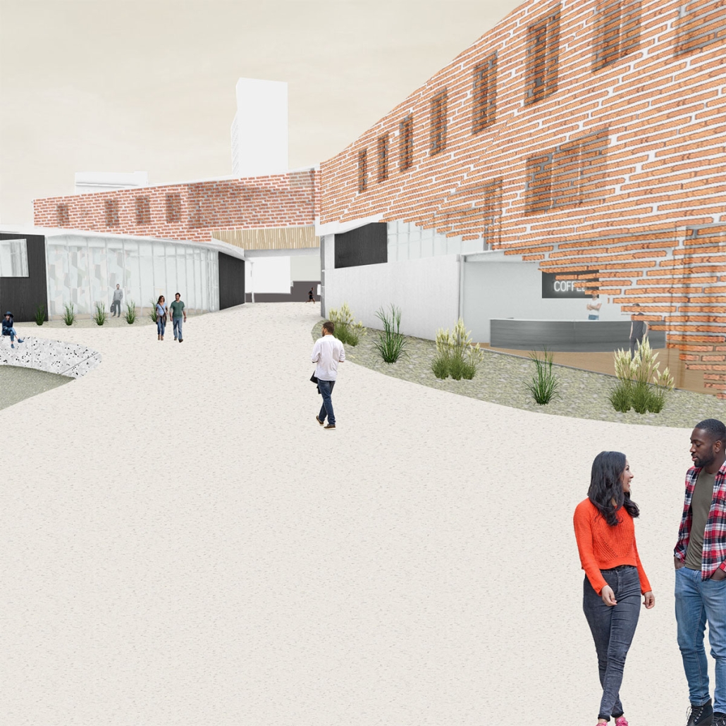
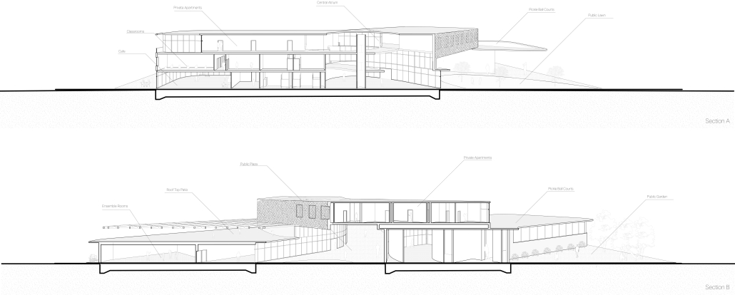
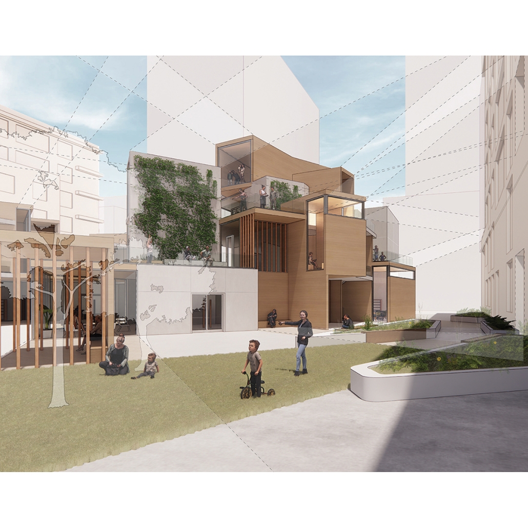
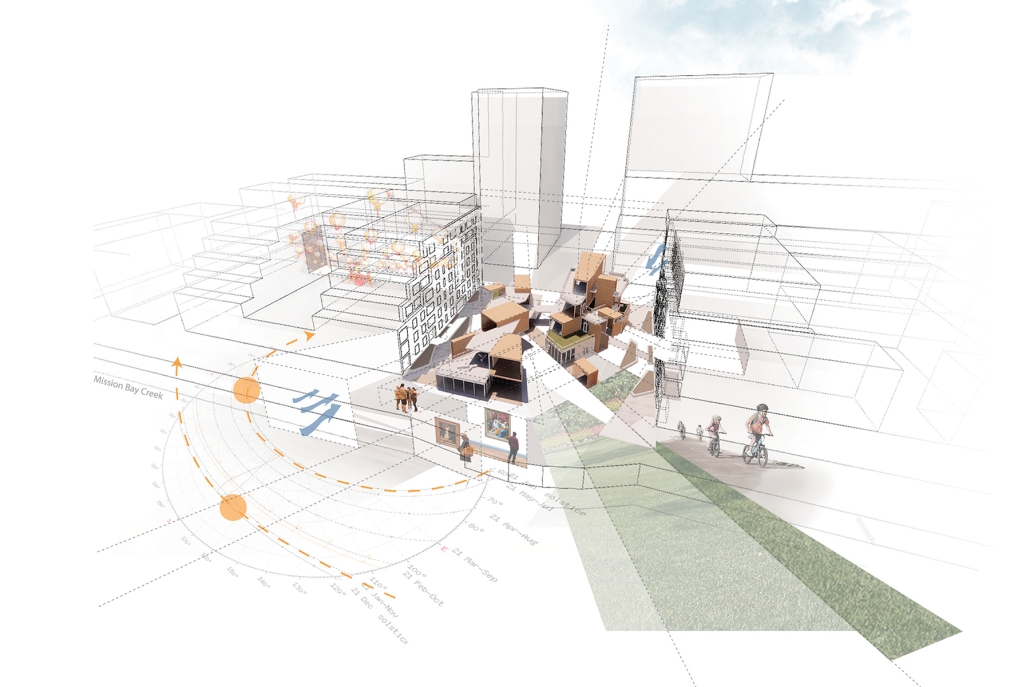
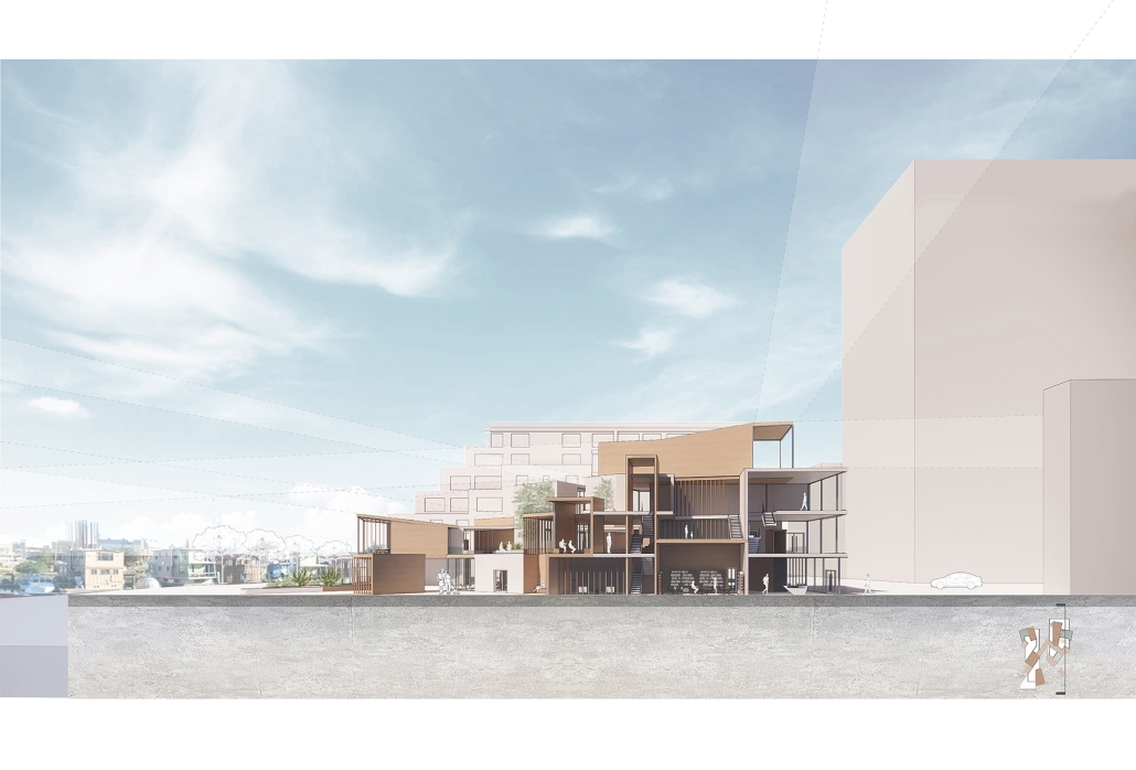
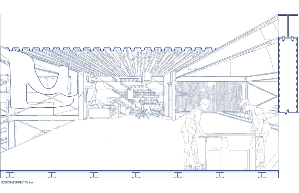
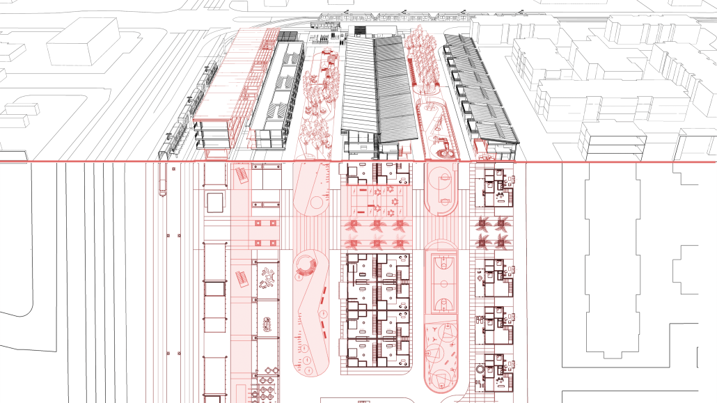
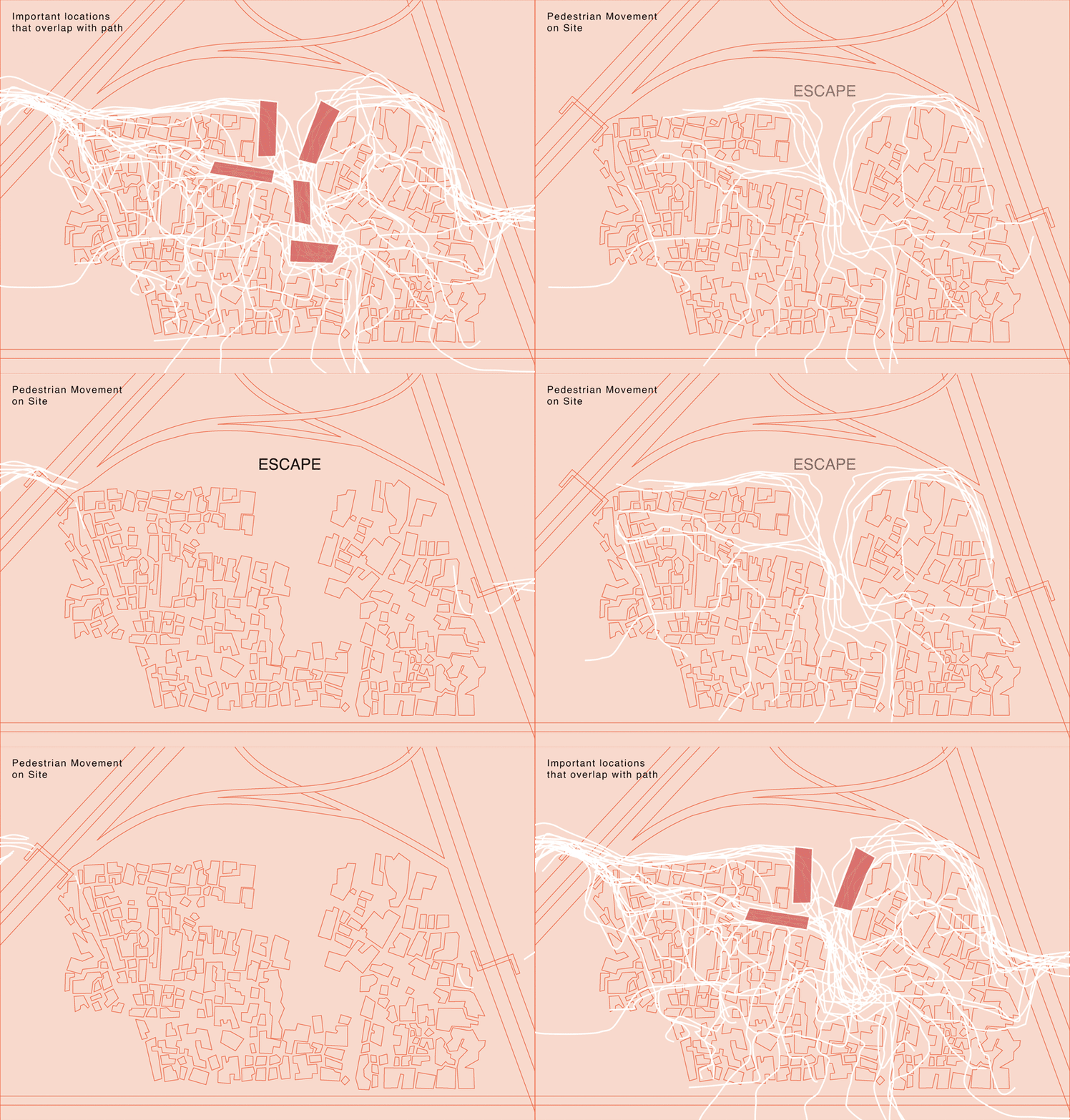
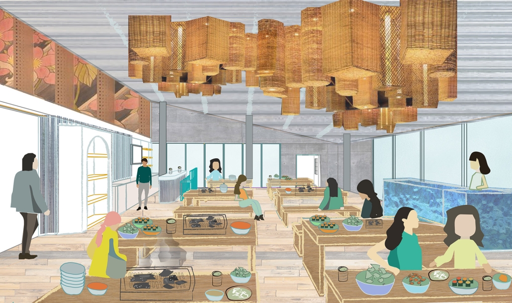
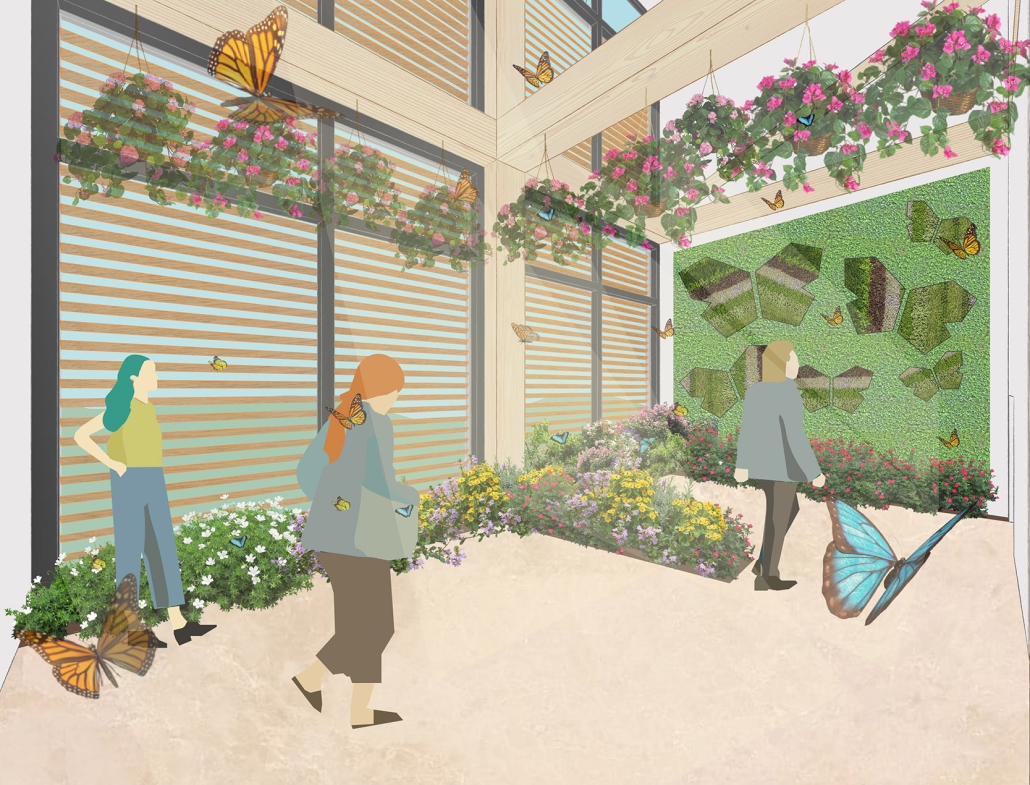
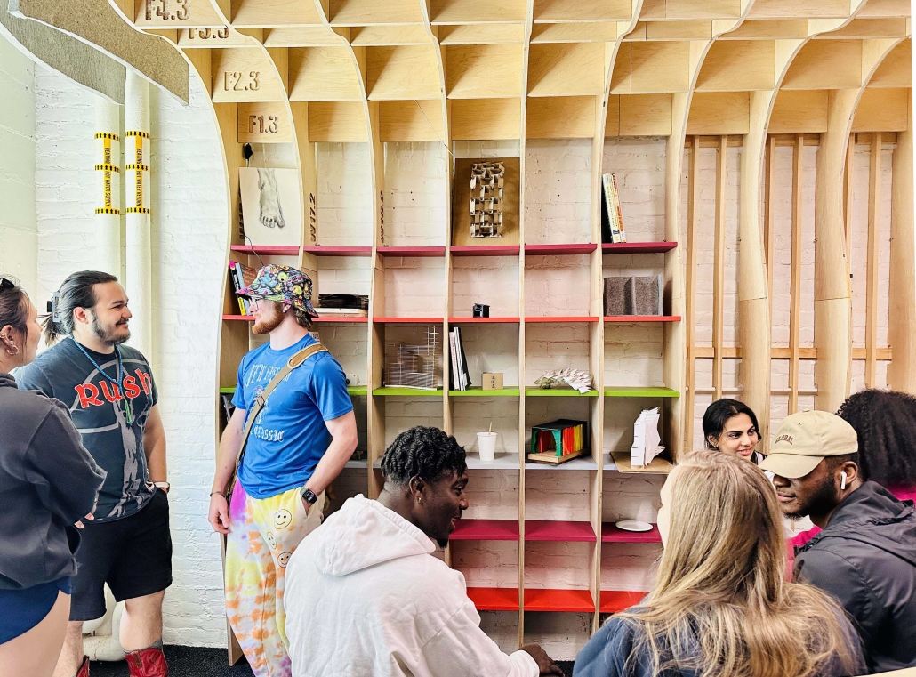
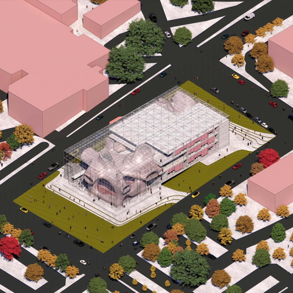
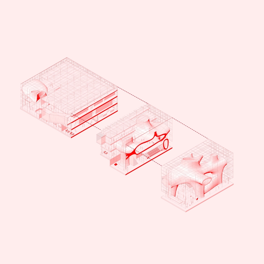
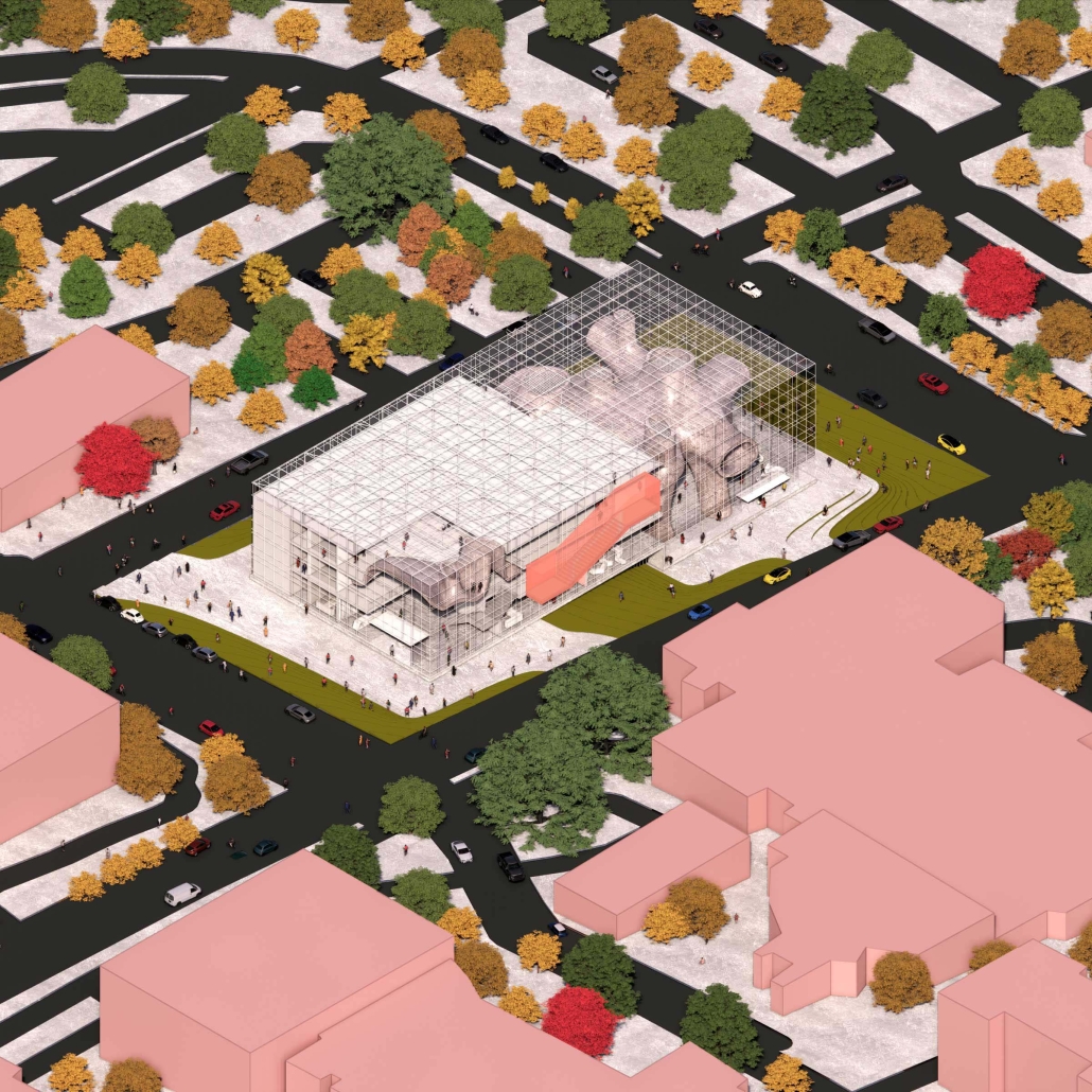
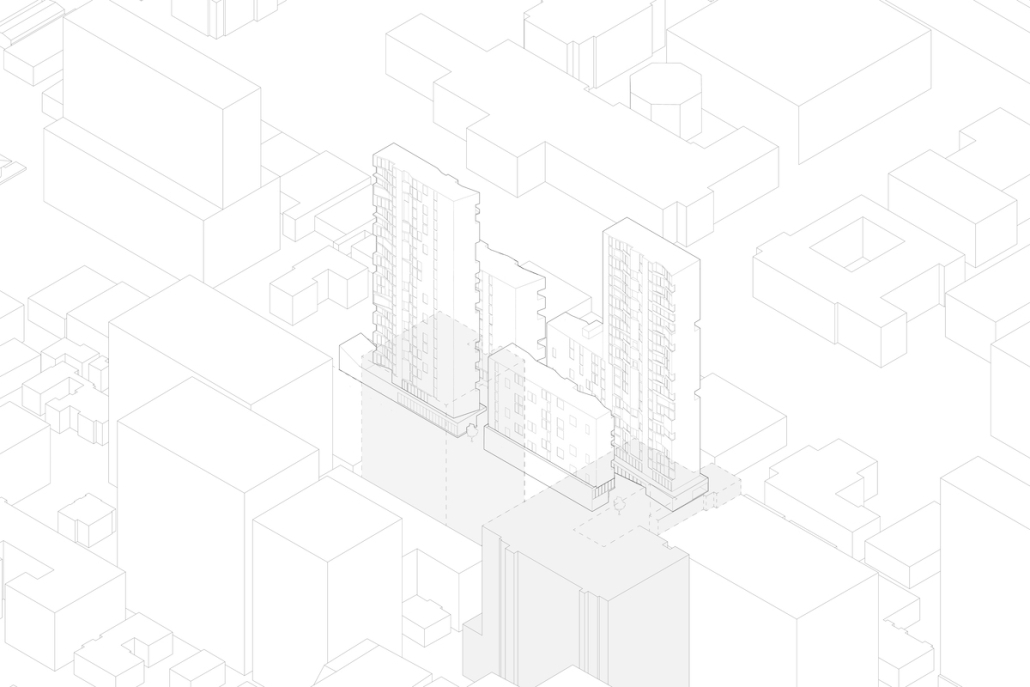
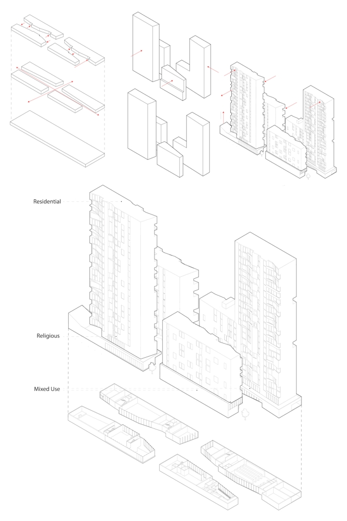
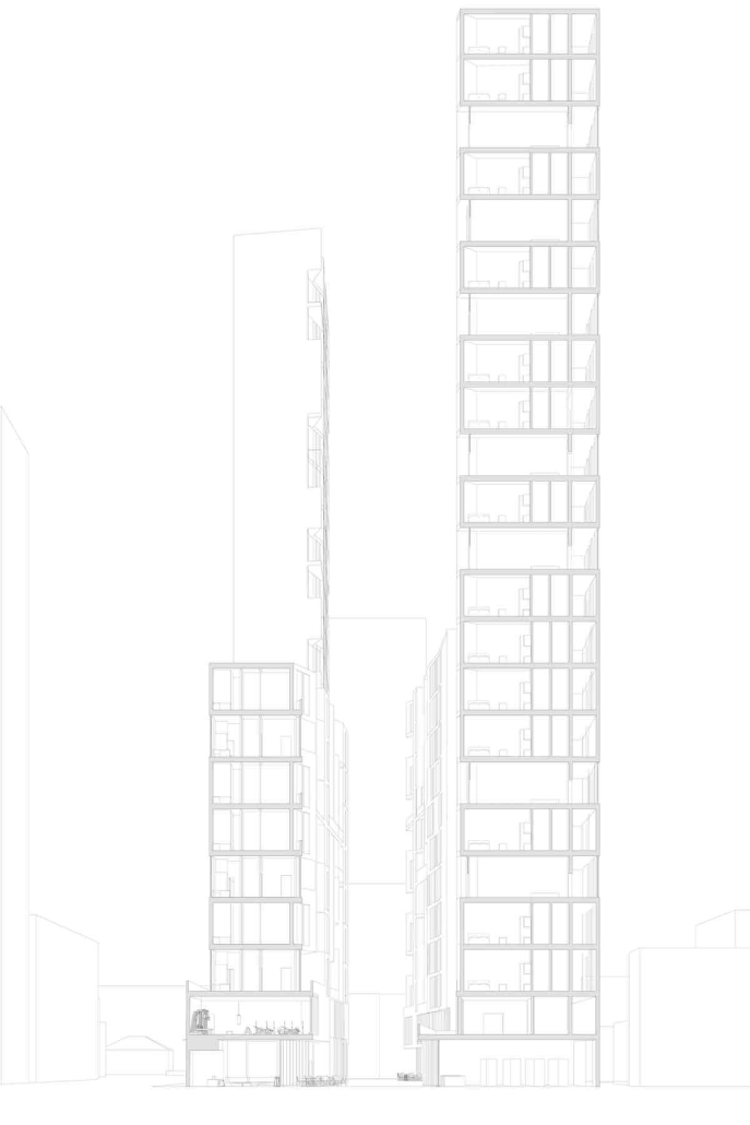
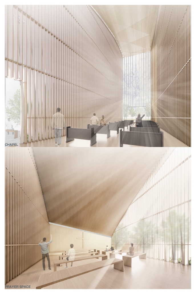
This design imagines the Roxbury Crossing station as a free station as it becomes a new node for the city of Boston. The Center for Tolerance is a civic building that would allow different activities from music studios, makerspaces, food court, material exchange library, multi-purpose classrooms, exhibits, offices, studios, therapy clinics, and meditation spaces, to gardens with seats to encourage users to sit and converse with one another. As the site is located on the border of two neighborhoods, it will provide a spatial bridge for people from different backgrounds to come together to heal. This building will be used as a resource for all – especially those who come from disadvantaged backgrounds. This building is a representation of what equity in the built environment can look like.

This project was awarded the Best of B. Arch Degree Project 2023.

Dis-Luxury from Luxury: Inequality Brought by Consumerism and Luxury Reimagining by Eduardo A. Caraballo-Arroyo B.Arch ‘23
Pontifical Catholic University of Puerto Rico | Advisors: Pedro A. Rosario-Torres, Luis V. Badillo-Lozano & Manuel De Lemos-Zuazaga

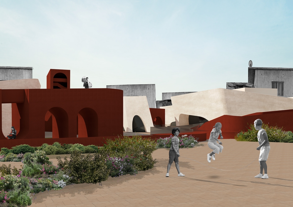
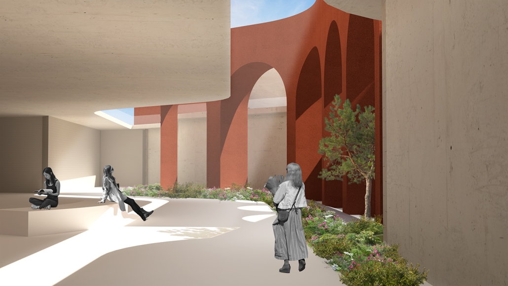
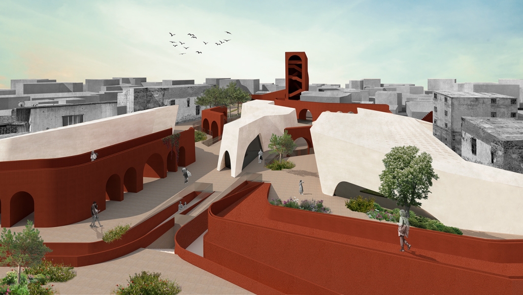
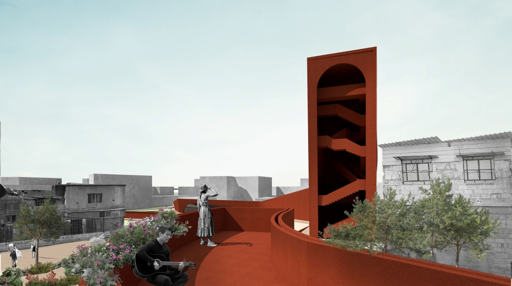
In Curitiba, Brazil, an architectural project is reimagining luxury and addressing social division to foster a community that values inclusivity, sustainability, and social equity. By challenging the pursuit of material wealth and status, this project aims to create an inclusive society where individuals feel fulfilled and valued. The project recognizes that luxury is often associated with abundance and comfort but can lead to marginalization, inequality, scarcity, and disconnection within communities. In a capitalist and consumerist society, luxury is marketed as an asset of ease and comfort, perpetuating social divisions and excluding those who cannot afford it. To address this problem, the architectural project seeks to interconnect both ends of the wealth spectrum through spaces that foster communication, action, and self-development.

The objective is to design an urban-social space that combines the rewards and necessities derived from luxury. This space offers physiological resources, developmental opportunities, a sense of belonging, and luxurious experiences, becoming a social equalizer and a support system for the community. By emphasizing the emotions associated with luxury, such as power, confidence, security, and contemplation/enjoyment, the project creates spaces for interactions and community communication. Elements such as small-scale farming, community/cultural integration, open spaces for social and community activities, and emancipatory and cultural educational spaces are included in the program. The project also aims to reduce limitations by embracing degrowth and minimalist systems.

The main strategy revolves around luxury as an emotional reaction. Luxury consumption triggers psychological responses associated with trust, power, contentment, and security. The architectural design incorporates pathways and axes that lead towards focus areas, lifting the first level and creating porous volumes to enhance openness and connection. Strategically positioned openings offer views towards the focus areas, creating voids and spaces that provide experiential and spatial experiences. By implementing this design, the project aims to address luxury inequality, foster social cohesion, and create spaces that promote inclusivity, equal access to resources, and a sense of well-being for all members of society. Through its transformative power, this project challenges conventional notions of luxury and redefines its role in creating a more connected and equitable world.

Instagram: @_eaca23

Kordilyera Vernacular Inspired Interpretive Center in Paradise Hills, San Diego by Greco Cosente, B. Arch ‘23
NewSchool of Architecture and Design |Advisor: Raúl Díaz

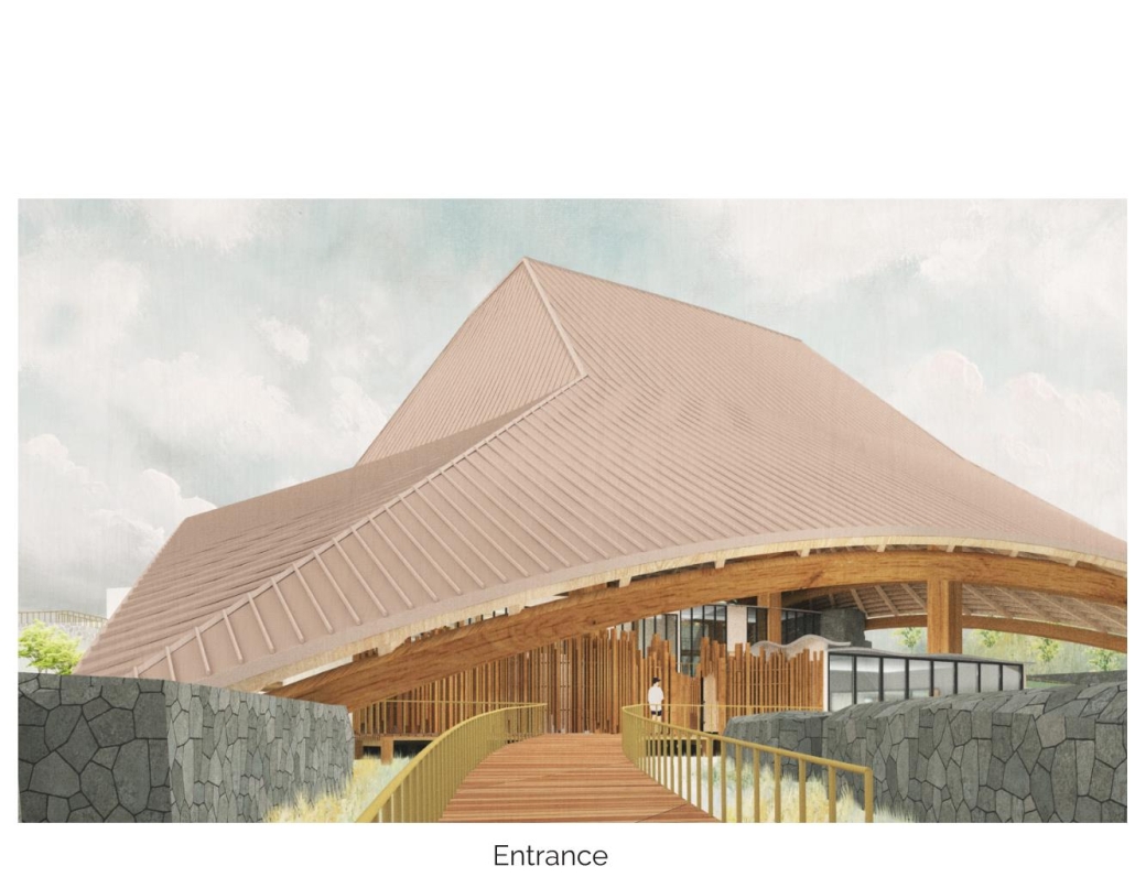
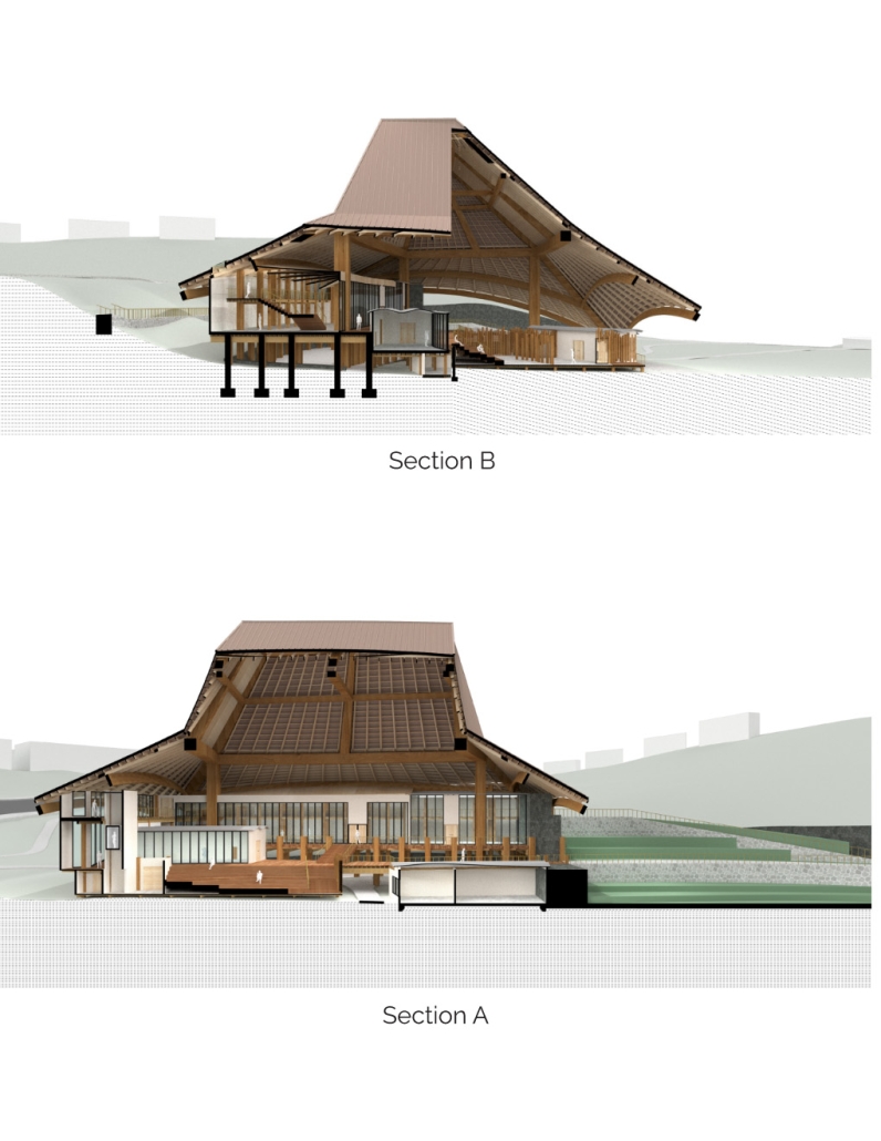
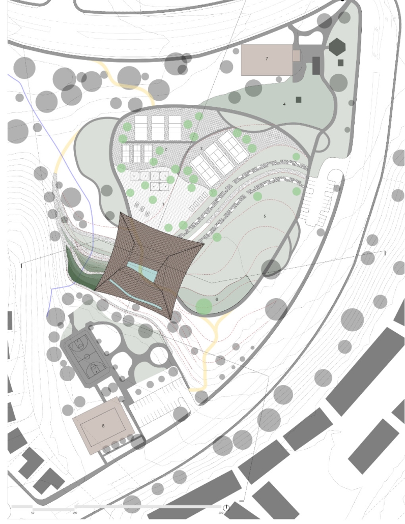
With historical and cultural aspects of Paradise Hills being mainly single-family dwellings from the 1950s and its relation to the military, specifically the navy, a demographic group of the Filipino population has emerged throughout the years. Generic designs of suburban parks do not cater to the needs of the current population. In an attempt to advance green space, park designs drawing from culture with the architectural language of pavilions are explored. The project caters to bridging the gap between community park design and Filipino residents through a Kordilyera-inspired Interpretive Center in Paradise Hills, San Diego; A reinstitution of cultural identity for U.S.-born Filipino-Americans.

The project was awarded the Outstanding Design Award – Degree Project.

U Belong: A New Live/Work Housing Prototype by Jada Rezac and Margaret Phillips, M. Arch ‘23
Kansas State University |Advisor: Zhan Chen – Assistant Professor

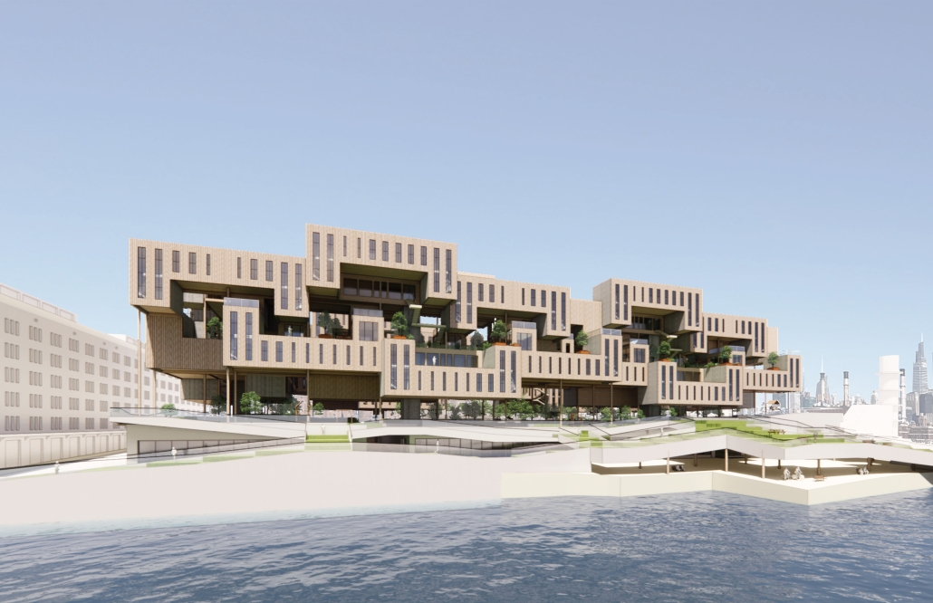
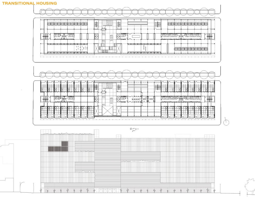
The current housing crisis in the US challenges architecture to address a critical need while presenting the opportunity to propose new solutions. The studio, titled: In With the New, operates as a laboratory in which to explore innovative possibilities for multi-family living. Students design new models that reframe housing as a multi-faceted domain, able to navigate various scenarios and support diverse communities.

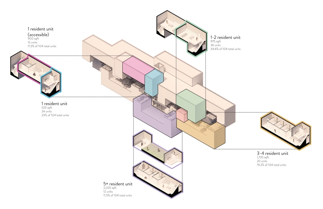
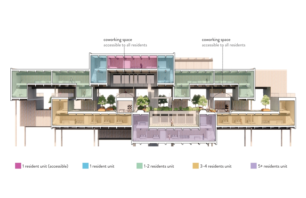
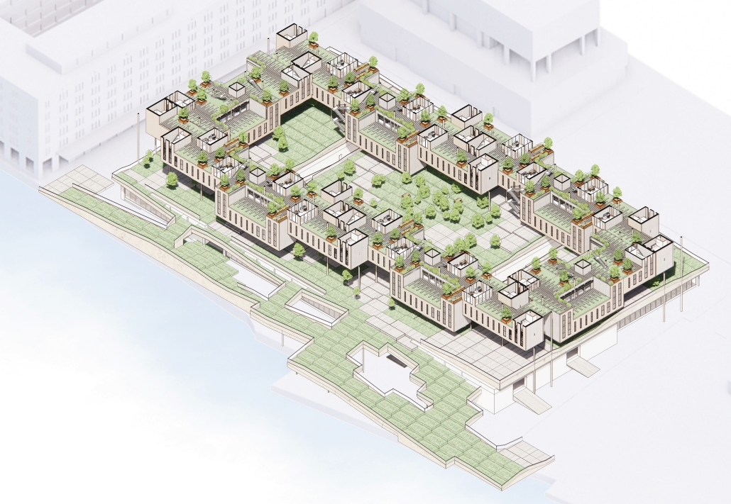
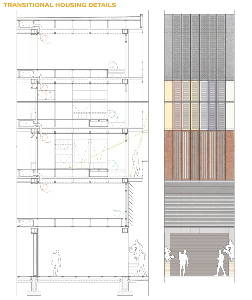
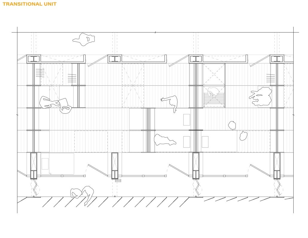
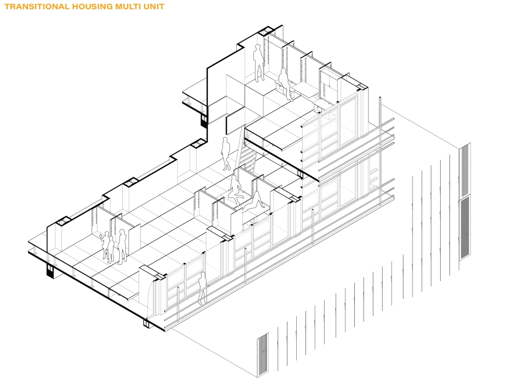
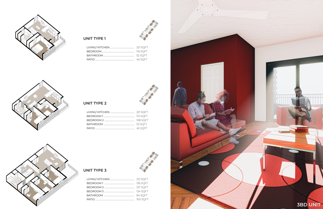
Jada and Margaret’s project responds to the evolving needs of contemporary living by integrating residential units and workspaces. The project uses a calibrated arrangement of U-shaped modules to create new possibilities for both living and working.

The unit clusters maintain a high degree of porosity, which allows more access to natural light and promotes cross ventilation. These considerations enhance human comfort and productivity while presenting an innovative strategy for improving the overall health of its inhabitants.

The relationship between living and working units and their arrangement also seeks to alleviate social isolation. The units are grouped into smaller neighborhoods, fostering familiarity and more meaningful social interactions. Communal spaces within these neighborhoods and intersecting circulation paths also help build a stronger sense of community within a large complex.

The project was nominated for the Nominated for the Heintzelman Prize at Kansas State University.

Instagram: @jadarezac ; @margaret_rose_phillips ; @studiozhan

See you next week for the next installment of the Student Showcase!
2023 Study Architecture Student Showcase - Part X

Welcome back to another week of the Study Architecture Student Showcase! In Week X, we shift our focus to student projects that address the urgent and critical challenges posed by natural disasters. The devastating impact of natural calamities often necessitates innovative and resilient design solutions to ensure the safety and well-being of communities. This week’s featured projects go beyond traditional architectural approaches, presenting thought-provoking concepts that explore resiliency and transformation in the face of adversity.

Resiliency and Transformation in Appalachia by William Robert Clark, M.Arch‘23
University of California, Berkeley | Advisor: René Davids

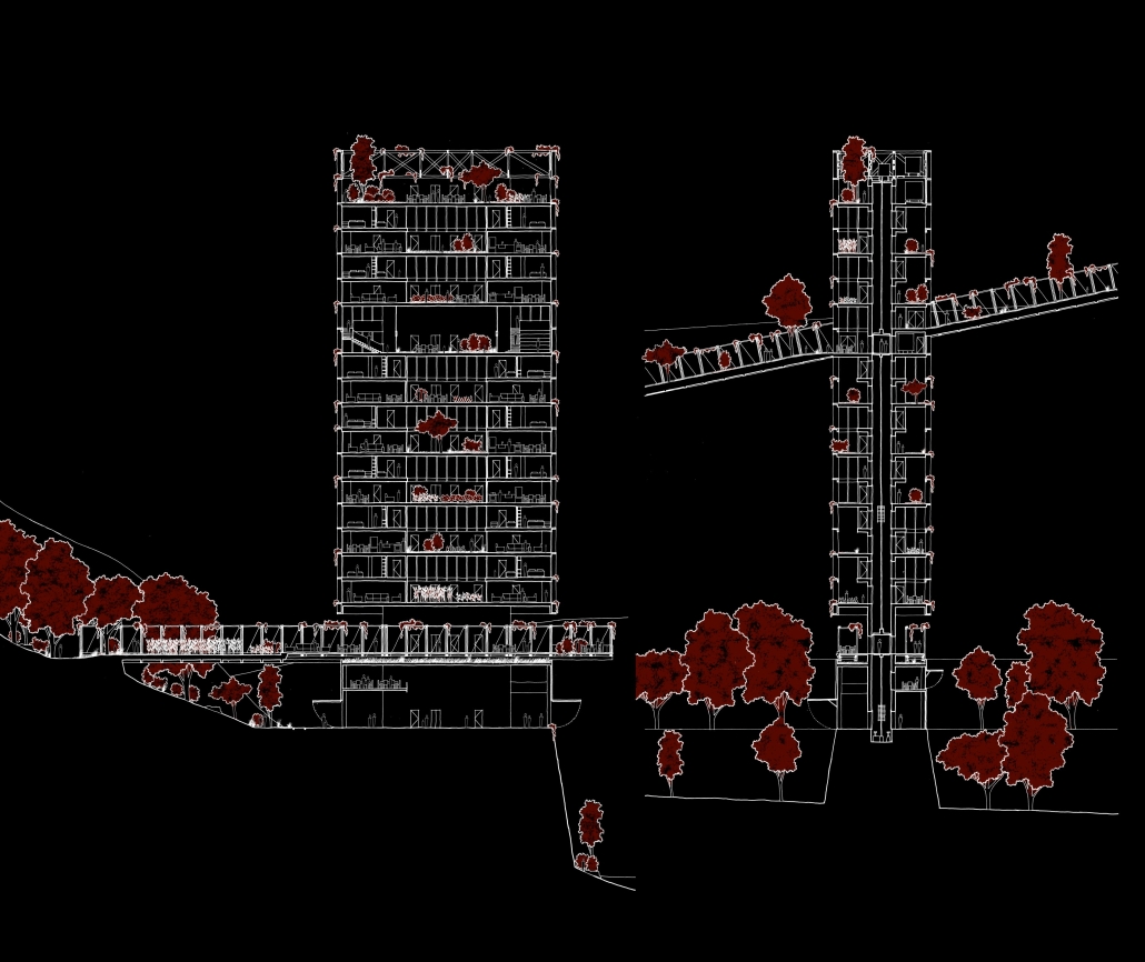
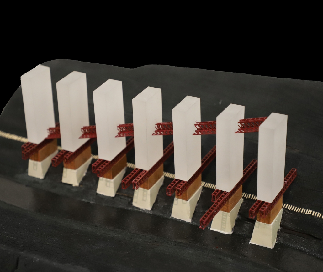
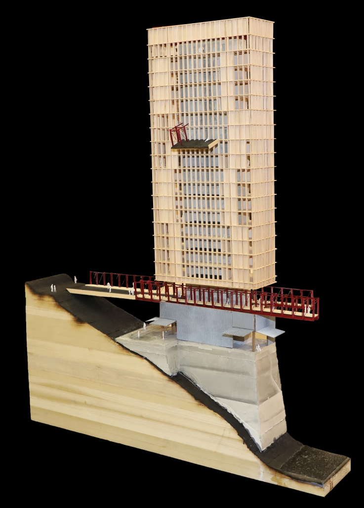
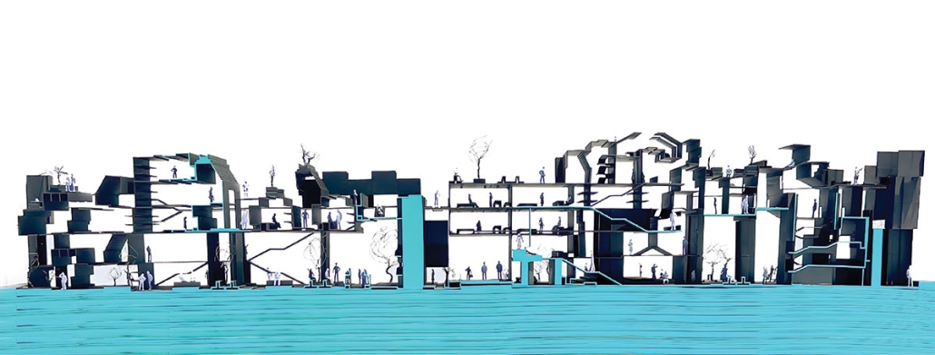
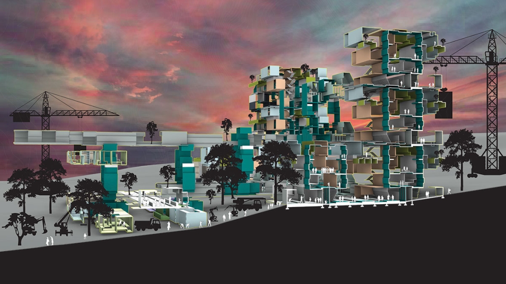
This past summer, Eastern Kentucky was hit with record breaking rain which caused floods killing dozens of people and destroying millions of dollars of infrastructure and property. While discussion and design around flood resiliency is not new, these events in Central Appalachia create a new opportunity to reimagine the idea of resiliency, and how it applies to some of our smallest and most isolated communities. Drawn from precedents of industrial mining infrastructure, the design seeks to maximize the safety and wellbeing of the community, while minimizing the exposed footprint of the site. The result is a systematic transformation of the landscape and community environment. Ultimately, ‘Resiliency and Transformation in Appalachia’ is meant to be a provocation against longstanding habits of living so that communities can find stability in an extreme environment.

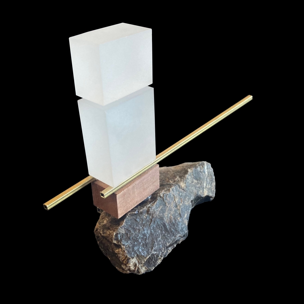
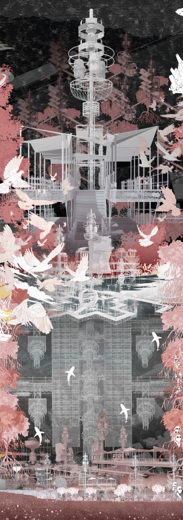
This provocation takes form in a series of towers, which emerge from base of the mountain along the river’s edge. The design challenge of these towers wasn’t the flooding or the extreme topography, it was how to design around the people, and the lives they wish to lead in connection with their landscape. This turned the core driver of the design to minimize the feeling that one is living within a tower. Each unit has its own individual “yard,” and floor plates are suspended by cables, eliminating the use of columns. A series of bridges connect the residential spaces back into the mountain, allowing the forest to meet the tower, and to provide a buffer for the community programs along the ground. The towers are connected by a Hollow (hol-er) Bridge, allowing residents to travers up through the towers, as if they were walking up through the mountain valley to their neighbors. This bridge meets the tower at a common area, which serves a variety of community functions. Along the ground, community spaces are connected by a greenway along the railroad tracks, which serve both pedestrian and commercial use. The towers create a form that is resilient in emergencies, protecting its residents and their spaces, but the design pushes to maintain a way of life, inseparable from the mountains.
Instagram: @robert_clark_arch, @r.davids

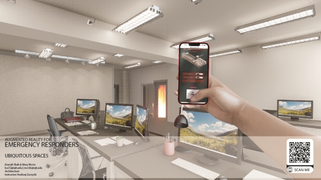
Augmented Reality for Emergency Responders by Krunali Shah & Mary Riccio, B.Arch ‘23
New Jersey Institute of Technology  | Advisor: Andrzej Zarzycki

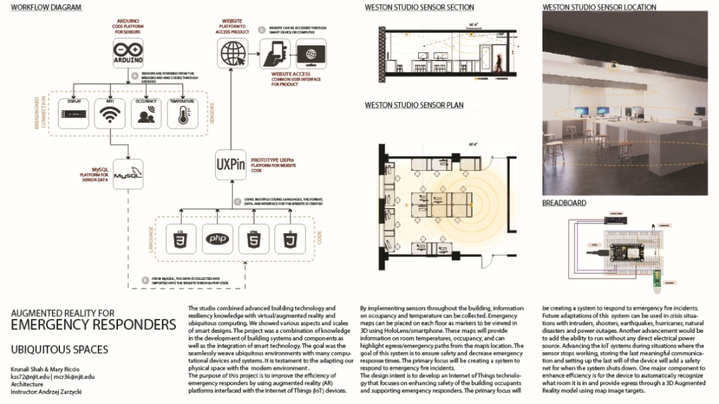
The studio combined advanced building technology and resiliency knowledge with virtual/augmented reality and ubiquitous computing. We showed various aspects and scales of smart designs. The project was a combination of knowledge in the development of building systems and components and the integration of smart technology. The goal was to seamlessly weave ubiquitous environments with many computational devices and systems. It is a testament to adapting our physical space to the modern environment. The purpose of this project is to improve the efficiency of emergency responders by using augmented reality (AR) platforms interfaced with the Internet of Things (IoT) devices. By implementing sensors throughout the building, information on occupancy and temperature can be collected. Emergency maps can be placed on each floor as markers to be viewed in 3D using HoloLens/smartphone. These maps will provide information on room temperatures, and occupancy, and can highlight egress/emergency paths from the map’s location. This system aims to ensure safety and decrease emergency response times. The primary focus will be creating a plan to respond to emergency fire incidents. The design intent is to develop an Internet of Things technology that focuses on enhancing the safety of the building occupants and supporting emergency responders. The primary focus will be creating a system to respond to emergency fire incidents. Future adaptations of this system can be used in crises with intruders, shooters, earthquakes, hurricanes, natural disasters, and power outages. Another advancement would be to add the ability to run without any direct electrical power source. Advancing the IoT systems during situations where the sensor stops working, storing the last meaningful communication, and setting up the last will of the device will add a safety net for when the system shuts down. One major component to enhance efficiency is for the device to automatically recognize what room it is in and provide egress through a 3D Augmented Reality model using map image targets.

Instagram: @krunali_shahh, @maryric

Interrogating Boundaries: Miami Lines of Endurance by Alexandra Wise, Maryam Basti, M.Arch ‘23
University of Miami | Advisor: Shawna Meyer

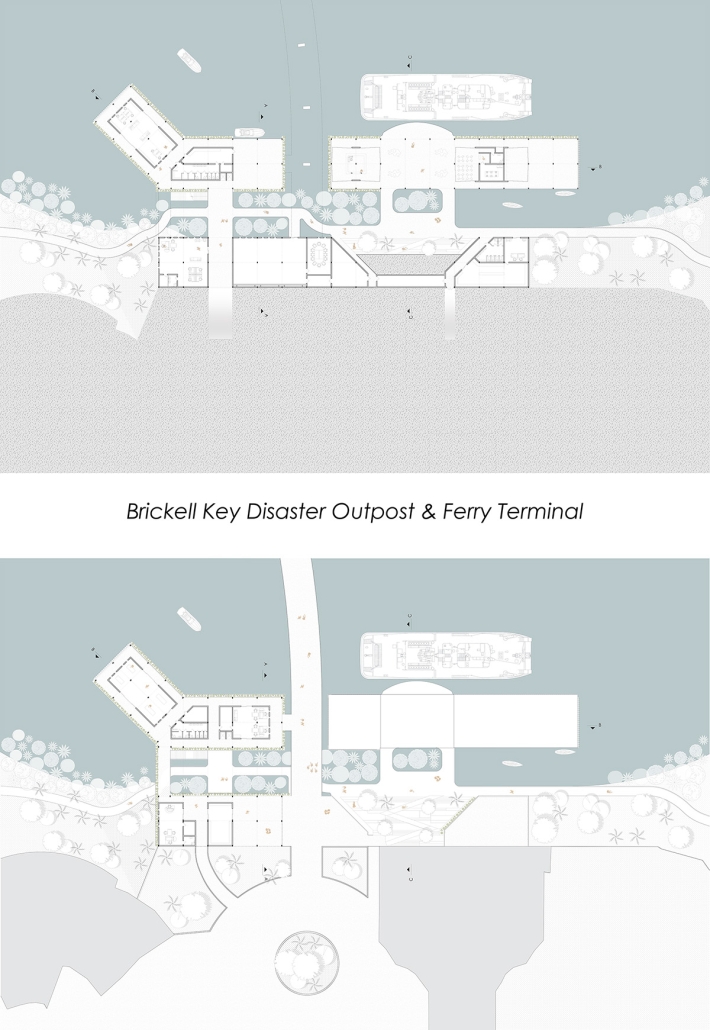
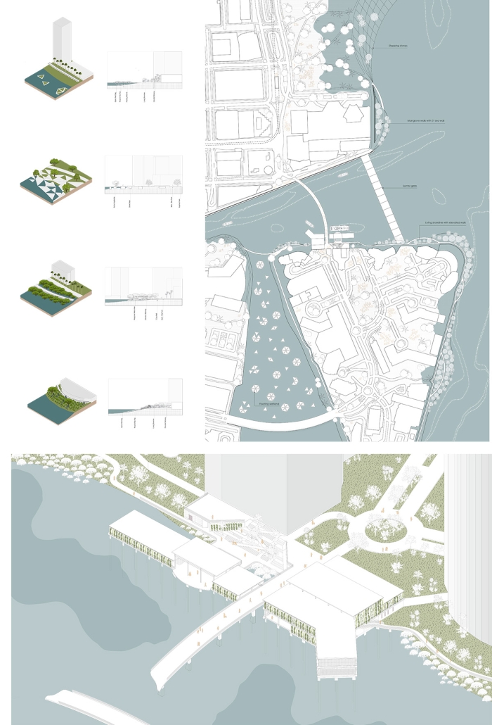
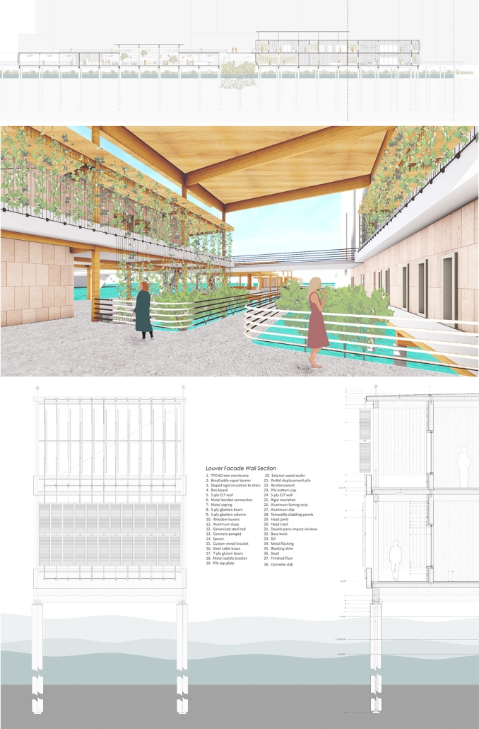
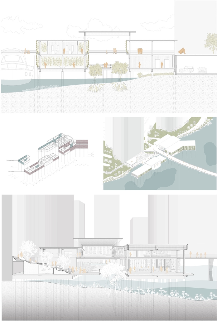
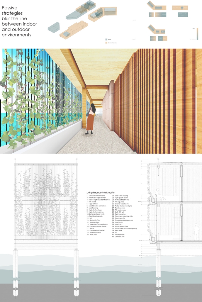
Miami, Florida faces pressing environmental and social challenges that require the city to rapidly adapt to ever-changing conditions like rising sea levels and an increased rate of severe tropical storms. An in-depth understanding of existing edge conditions and the social, environmental, and governmental implications of the US Army Corps of Engineers Coastal Storm Risk Management Study was needed to develop a project that serves to fortify the city’s edges while letting nature regain control. An ecotypic response to these challenges, the Brickell Key Disaster Outpost Center and Ferry Terminal breaks the intrusive barriers that disconnect the land from the sea. By dissolving existing hard edges and rebuilding with softer and looser conditions that accept and evolve with the dynamic environmental forces that exist at the site. The elevated building complex prepares for the rising sea and monumental king tides while reducing its footprint in the landscape. The outpost center and ferry terminal provide a haven for those affected by catastrophes by facilitating movement and providing equitable access to disaster relief resources. This project was awarded the Integrated studio Prize.

Instagram: @u_soa, @ateliermey, @maryam.basti, @_alexwise

See you next week for the next installment of the Student Showcase!

2023 Study Architecture Student Showcase - Part IX

Welcome back to the Study Architecture Student Showcase, and a joyful start to the New Year! In this ninth week of the Student Showcase, we’re excited to highlight outstanding projects that delve into the realm of cultural centers and museum design. Our featured projects span diverse locations and tackle unique challenges, each a testament to the creative minds shaping the future of architecture. Join us as we explore the intriguing designs of the following projects. Each project is a unique journey into the intersection of architecture, culture, and community, offering a glimpse into the transformative power of thoughtful design.

Chinatown Cultural Activity Community Center (CCACC) Learn, Create, and Spread! Space by Jessica Ivana, B.Arch‘23
California State Polytechnic University, Pomona | Advisor: Katrin Terstegen

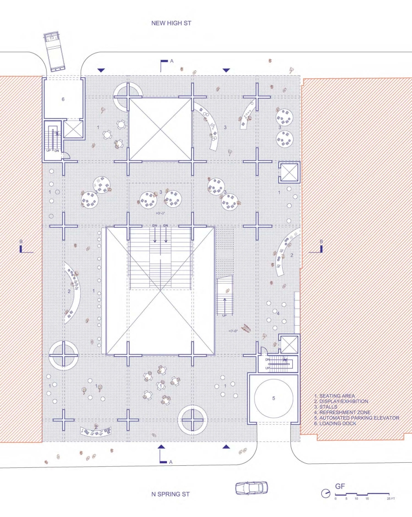
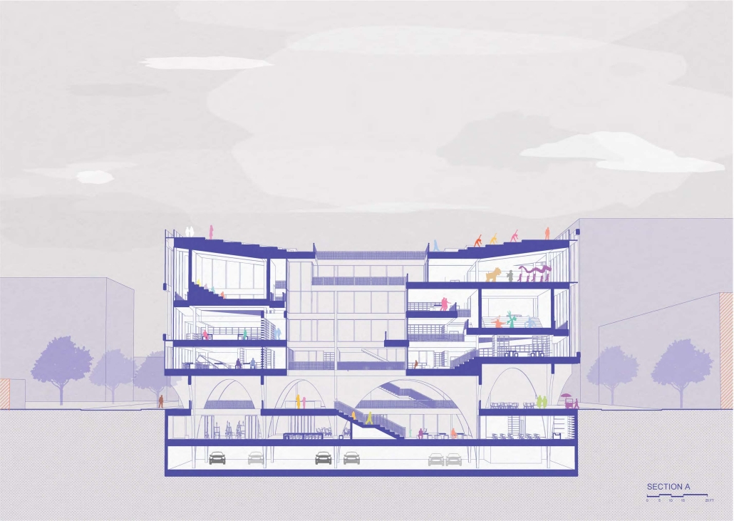
Community centers have always served as a place for locals to engage in independent study and receive support. The proposed Chinatown Cultural Activity Community Center (CCACC) is located on an underdeveloped parking lot on the east side of Chinatown and seeks to activate and expand the cultural values, activities, and character of this part of Chinatown, which currently lacks pedestrian-friendly activities compared to Broadway Street and the rest of the neighborhood.

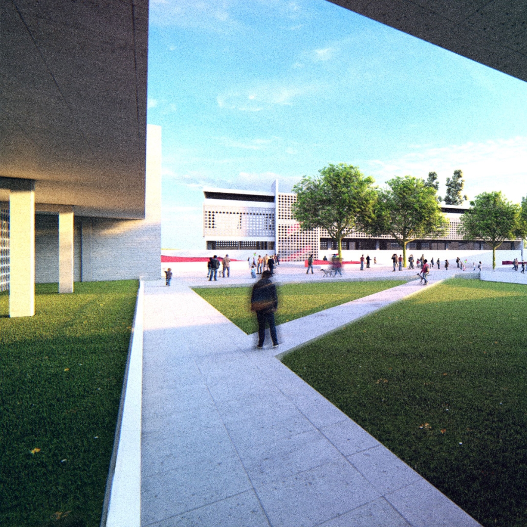
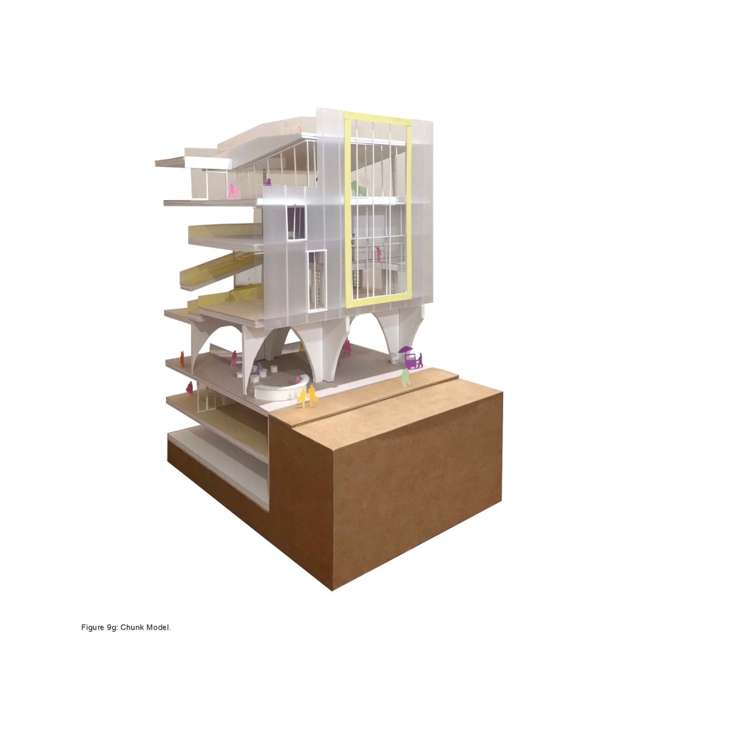
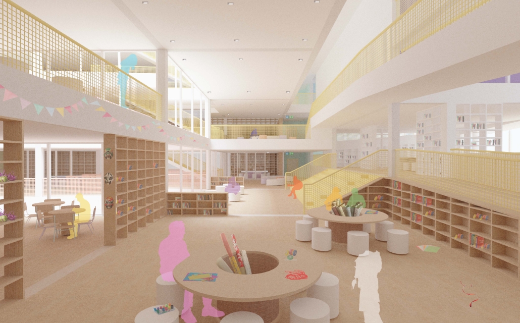
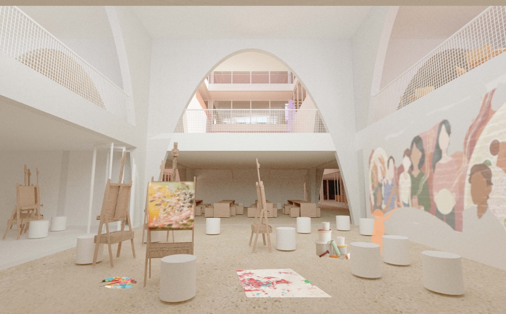
The CCACC serves as a hub for innovative exploration, offering a comfortable workspace for people of all ages to learn, create, and exchange knowledge and wisdom, regardless of their talents or impairments, whether they are residents or visitors. It fosters a sense of belonging to the community while breaking down the boundaries between arts, culture, and creativity, and aims to act as a medium for people to develop new hobbies or knowledge. On the exterior, the center has a gentle and slightly playful character that blends in with the surrounding buildings but stands out with its white perforated skin, offering a glimpse into the activities and knowledge celebrated within the structure through a composition of aperture sizes.

As an urban response to the through-lot site condition, the volume of the center is elevated, providing porosity and connecting the two streets. At the street level, a grid of arches penetrates through the lower levels, acting as legs or roots that tie the learning community center above and below. In the interior, spaces and structure are more expressive and flexible, providing a variety of activity spaces and spatial experiences. This project was awarded the Senior Project Award at California State Polytechnic University, Pomona.

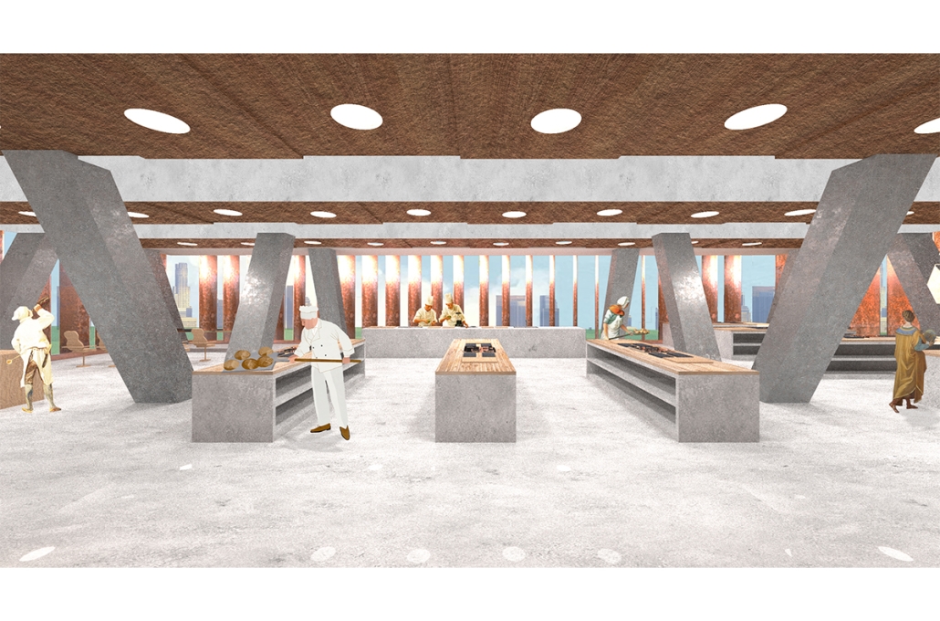
Culinary Center for Los Angeles by Leo I. Dumonteil Cabanas, B.Arch ‘23
Tulane University  | Advisor: Rubén García Rubio

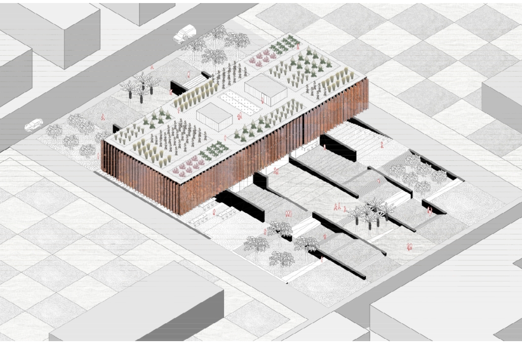
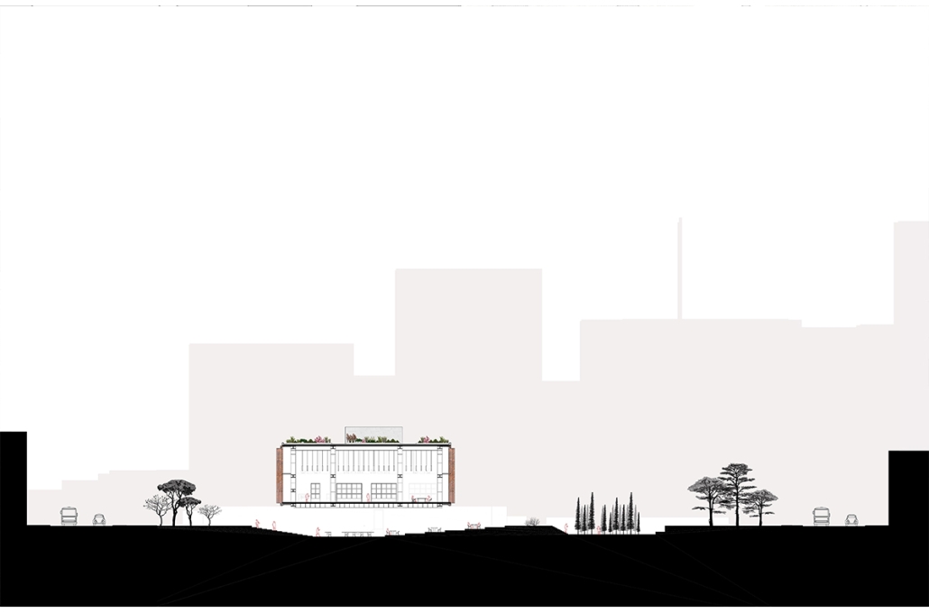
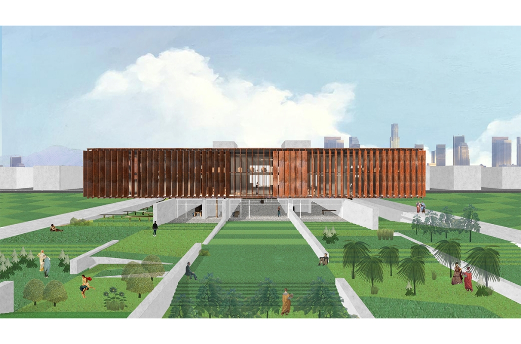
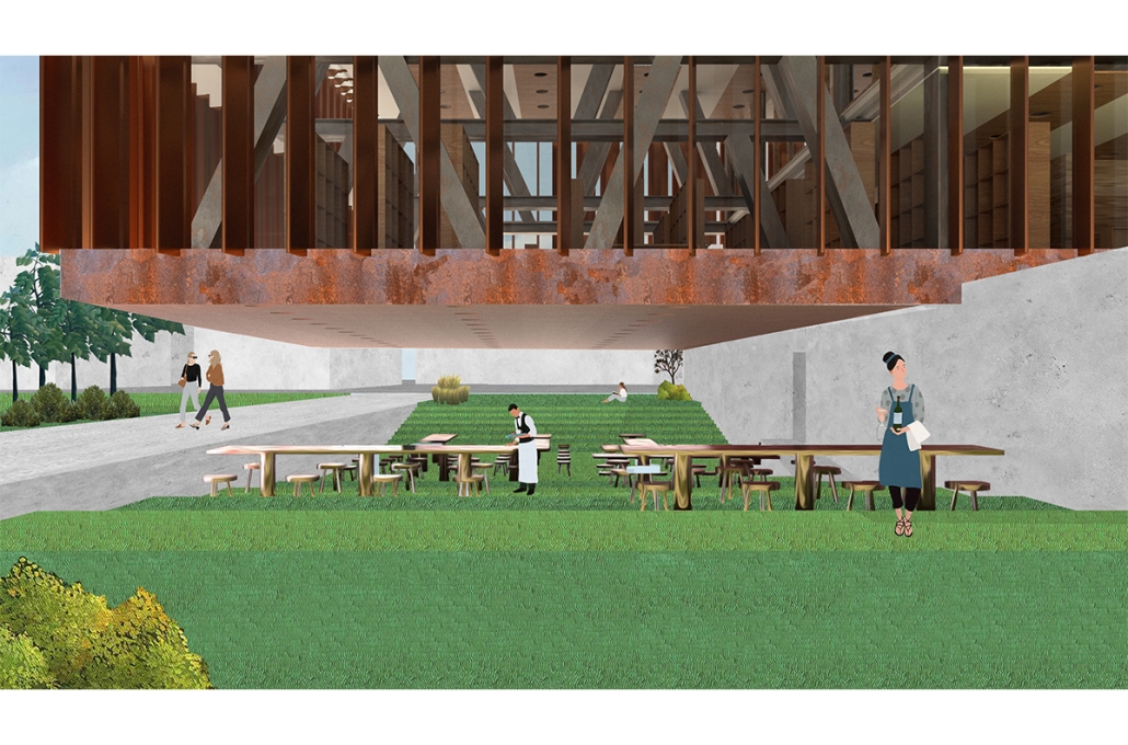
This new culinary center has the purpose of revitalizing the knowledge of cooking that has been lost in newer generations. Many young adults have evolved to rely on fast food chains as a result of their fast-paced lifestyle. Providing a place where simple knowledge such as cooking can counter this trend. The building itself is an expression of two worlds of architecture. The ground floor is designed by following the parallel strips of the green canvas it is set one. This provides a one-way porosity connecting two ends of a garden. This first level is meant to represent a heavy and solid architecture style which translates into the materiality choices. Moving into the remaining floors the change of atmosphere changes immediately. This isolated box has an architecture reminiscent of Mies van der Rohe. The space is light and airy with almost no existing walls. The program is not set by walls other than by the structure itself allowing for a continuous space to be created. This structure extends into the lateral wings of the box which create two cantilevered ends. These cantilevers then create two public spaces into the outdoors providing shade for the public in LA’s harsh climate. Lastly a set of different topographical offsets are introduced into the landscape. Some may rise while others may sink. These special conditions are then introduced to different gardens that contribute to the growing of crops. These micro topographies also allow the building to express its present as some areas near the building have deeper topography offsets. This mélange of architecture styles allow the public to experience learning in a way that challenges the perspective one has on architecture and culinary.

Instagram: @rubgarrub

Allegro by Ryan Call, B.S.Arch ‘23
Texas Tech University Huckabee College of Architecture | Advisor: Erin Hunt

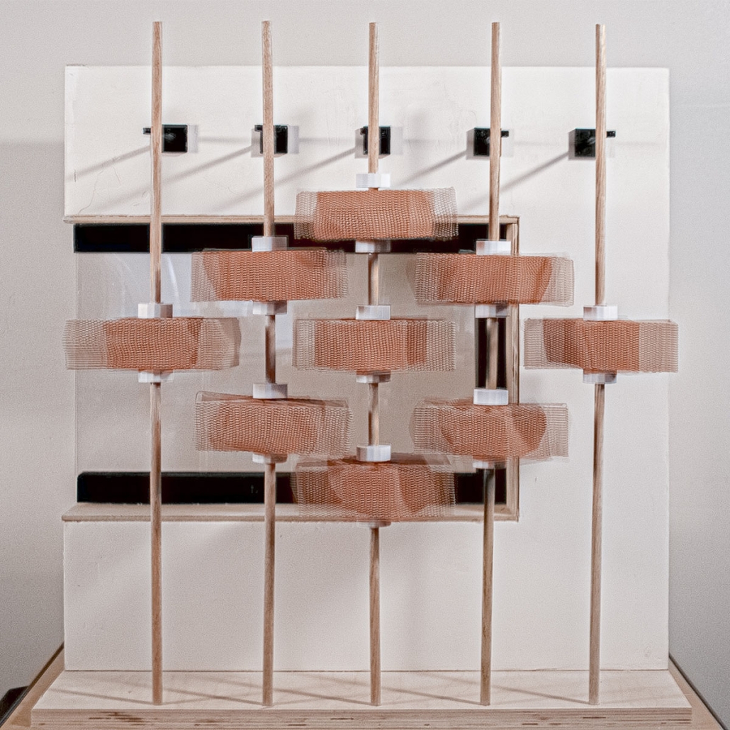
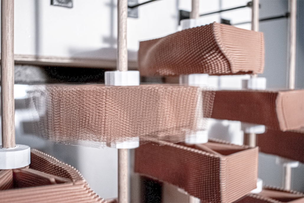
Inspired by the cultural and climatic conditions of Lubbock, as well as the Llano Estacado region at large. Allegro fills a niche within the musical scene, providing a place for up-and-coming artists to live and perform in the heart of the arts district downtown. Programmatically, this space provides practice rooms, community multi-use spaces, a recreational area, and part-time housing units for musicians to live and perfect their craft. The form of Allegro is a repeated figure, stacked, mirrored, and rotated, opening in the center as a point of gathering and passage for the downtown area. ​ The façade is wrapped in a kinetic screen to provide solar shading in the warmer months and opens for more sunlight in the colder months. The screen is made up of a single unit, divided into nine smaller units mimicking the sublet undulations of the land. Each block was created through computational design and digital fabrication using clay 3D printing. Allegro explores the possibilities of clay as a dynamic building unit that performs both for efficiency and visual effect while functioning as a place of community for Lubbock.​

What’s in a Monolith? by Peter Rosa, B.Arch ‘23
Southern California Institute of Architecture (SCI-Arc)| Advisor: Russell Thomsen

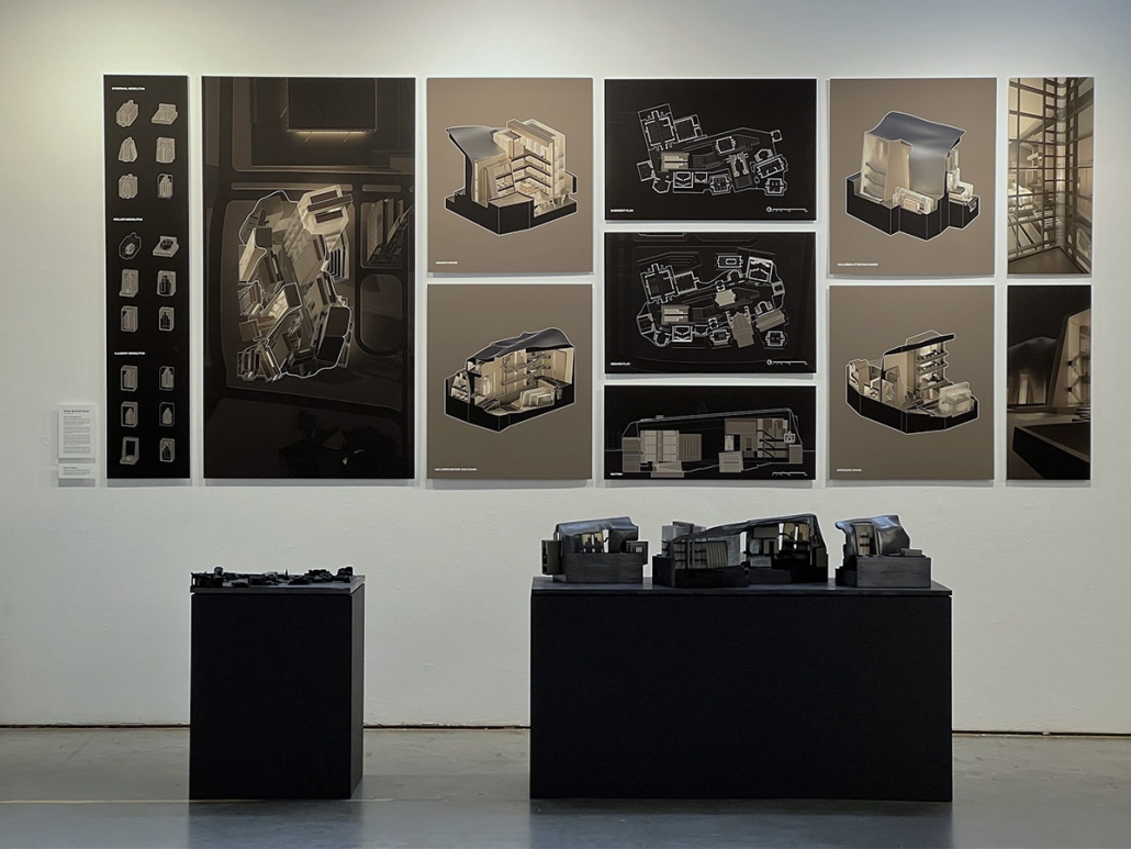
“The simplicity of the architectural monolith does not aim at abstraction, nor does it share the minimalist aspiration to non-referential object hood. Rather, it seeks to maximize the expressive potential of common architectonic configurations by condensing their figurative allusions into one eloquent gesture.” — Rodolfo Machado, Monolithic Architecture. The thesis interest lies in exploring the idea of what Machado posits as the expressive potential of the architectural monolith. It questions how the role of architectural monolith differs across various expressions and how these can begin to reframe our understanding of the contemporary architectural monolith.

In wanting to expand our definition of what a monolith can be, I began to think of a monolith as one of many kinds, each of these lending itself to a multitude of expressions with their own behaviors. By establishing a set of monolithic behaviors and deploying these across different scales, orientations, and material expressions; the thesis argues against a rigid definition of monolithicity and presents various in an attempt to subvert the conventional notions of monolithicity while simultaneously expanding upon the lexicon of work that informed it.

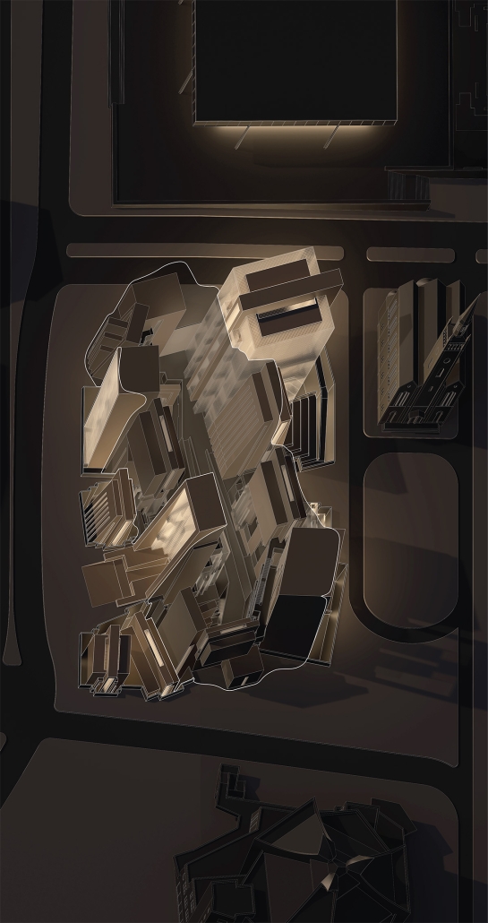
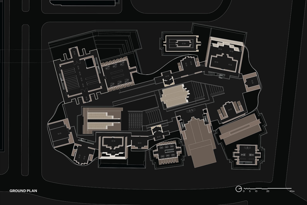
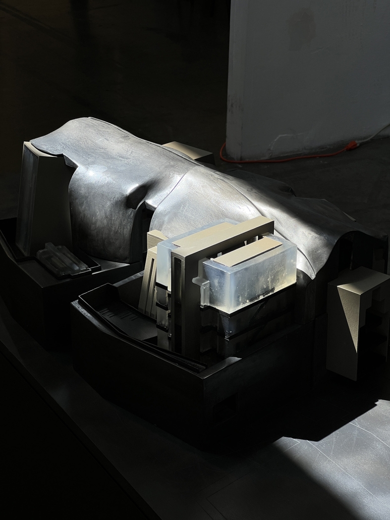
This proposal for the Museum of the Twentieth Century in Berlin is comprised of shrouded monolith with figures that become subsumed and embedded within it becoming a catalog of monolithic expressions. In its context, the proposal reframes the spatial experience of the museum by deploying a range of monolithic expressions each with their own spatial consequences.

Instagram: @rntarch

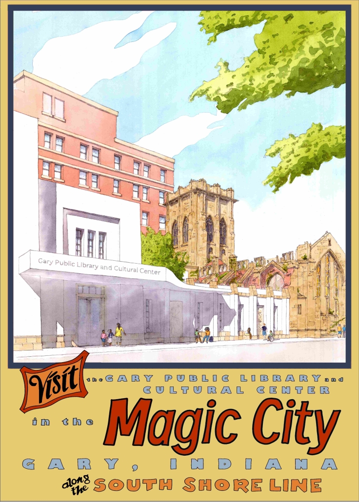
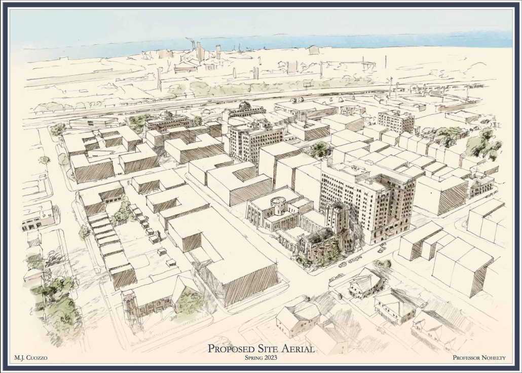
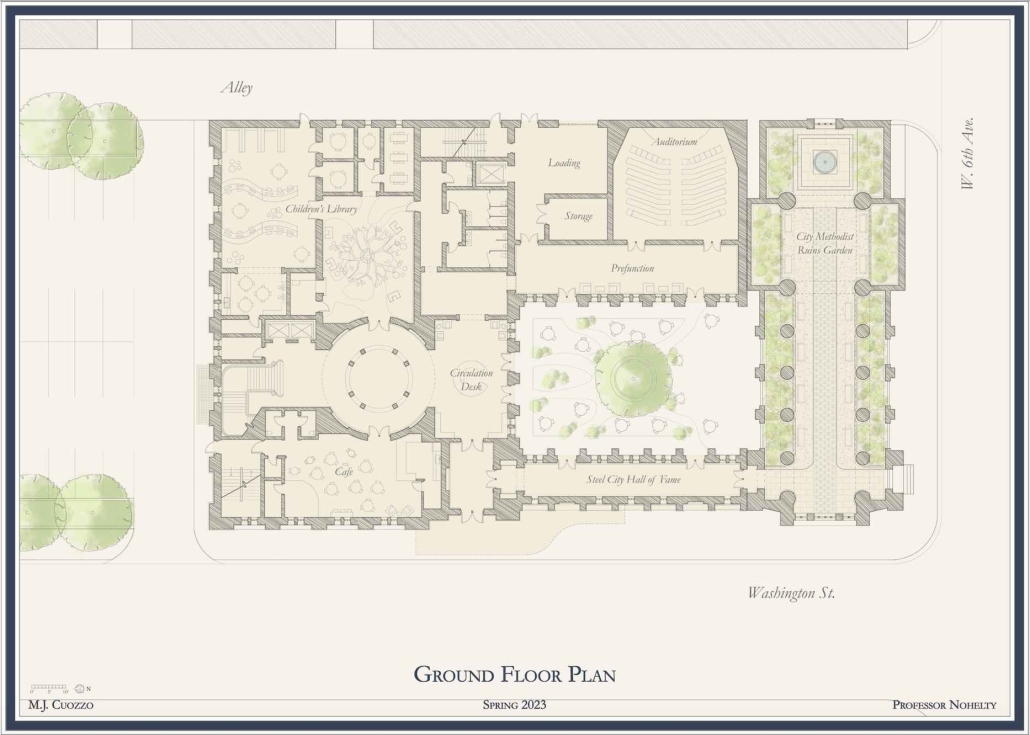
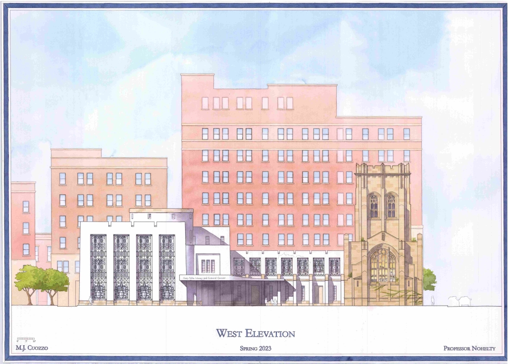
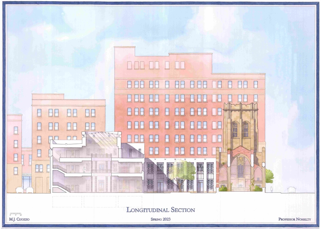
Blackness in Architecture: A Library and Cultural Center in Gary, IN by Miranda Cuozzo, B.Arch ‘23
University of Notre Dame | Advisor: Sean Patrick Nohelty

Architecture is shaped by group identity, which, in turn, is shaped by architecture. This interdependent process is what allows a culture to develop its own architectural character. Unfortunately, constant oppression has denied African Americans the freedom to fully participate in this process. This gap in American architecture contributes to the continued dehumanization of African Americans and their culture, and is a gap that can be filled by developing architecture that truly expresses the beauty and depth of African American people. Through the design of a Library and Cultural Center in the heart of the often forgotten city of Gary, Indiana, this project explores what architecture that intentionally represents and embodies Black American culture looks like and is ultimately about affirming Black people’s humanity. Throughout the completion of this project, I was often forced to defend the notion that Black Americans had a culture distinct from that of other Western people, events that further proved the necessity of this work. While this may seem like a minor oversight, the inability to see a people’s culture and heritage is an inability to see their full humanness. Architecture and culture go hand in hand, and by developing architecture that speaks to the Black American experience, I hope to fill a gap in the American architectural tradition and to contribute to a broader understanding and acceptance of Black American culture that will one day render the questioning of Black humanity obsolete.

This project was awarded the Noel Blank Design Award.

Instagram: @rando_studios

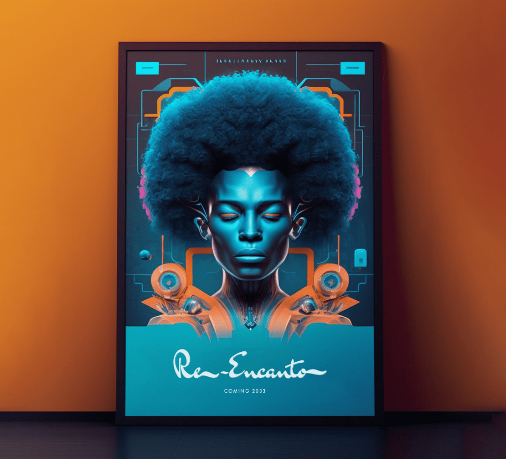
Re-Encanto by Emir Taheri, B.Arch ‘23
NewSchool of Architecture and Design | Advisor: Daniela Deutsch

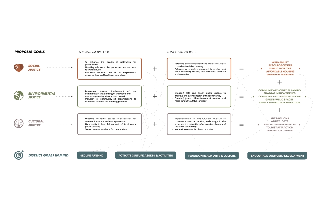
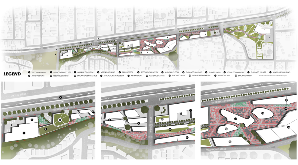
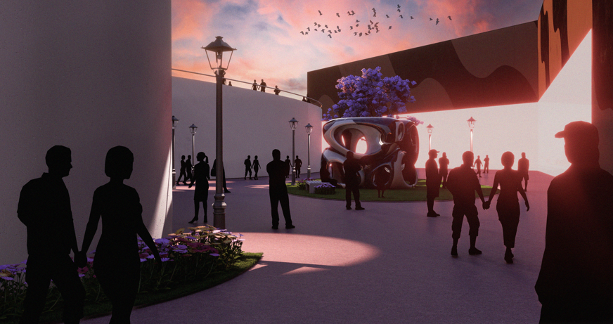
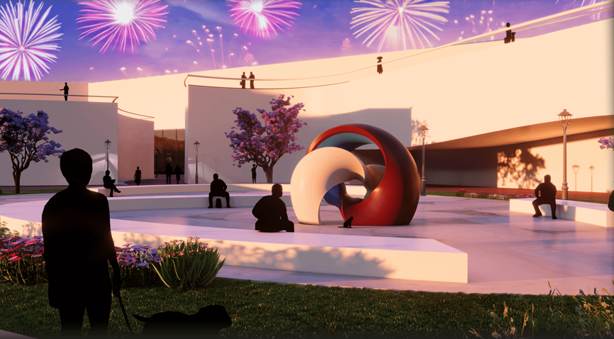
Encanto, once a semi-rural district, has experienced a decline in recent years. Our urban studies have identified the Imperial Avenue corridor as a prime location for redevelopment, with its rundown infrastructure and low occupancy. The presence of the South Chollas Valley hills and canyons further adds potential for commercial revitalization. Our project aims to capitalize on these opportunities by creating a central hub area focused on an Afrofuturism museum. The Afrofuturism museum will serve as a dynamic space, showcasing the intersection of black culture with science fiction, fantasy, and technology. By providing a unique platform for exploring the rich history and creativity of black communities, the museum will promote cultural appreciation and understanding. To enhance the overall experience, the surrounding area will be thoughtfully designed with public art displays, interactive installations, and green spaces. These elements will encourage exploration, interaction with the environment, and cultural exchange. Through this transformative project, Encanto will regain its vibrancy, becoming a catalyst for cultural enrichment and inspiration.

Instagram: @rhythmarch

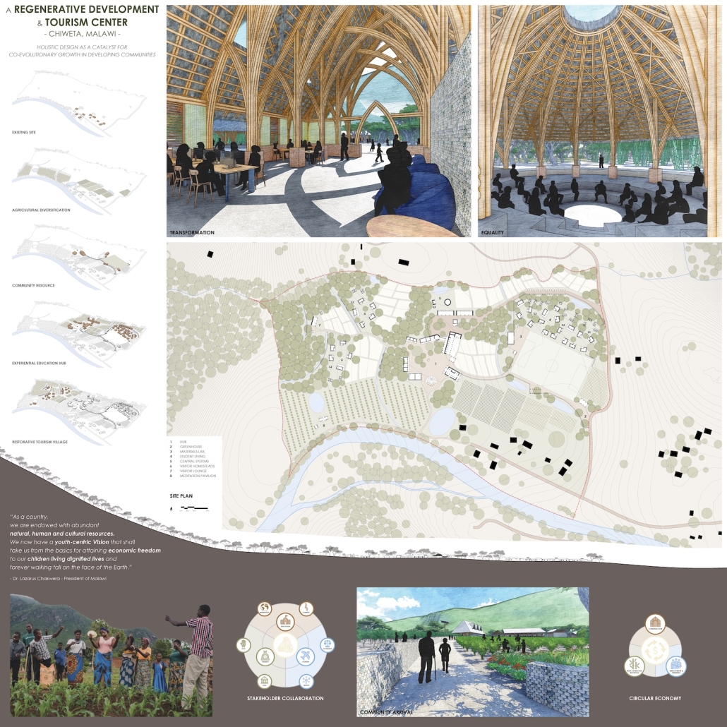
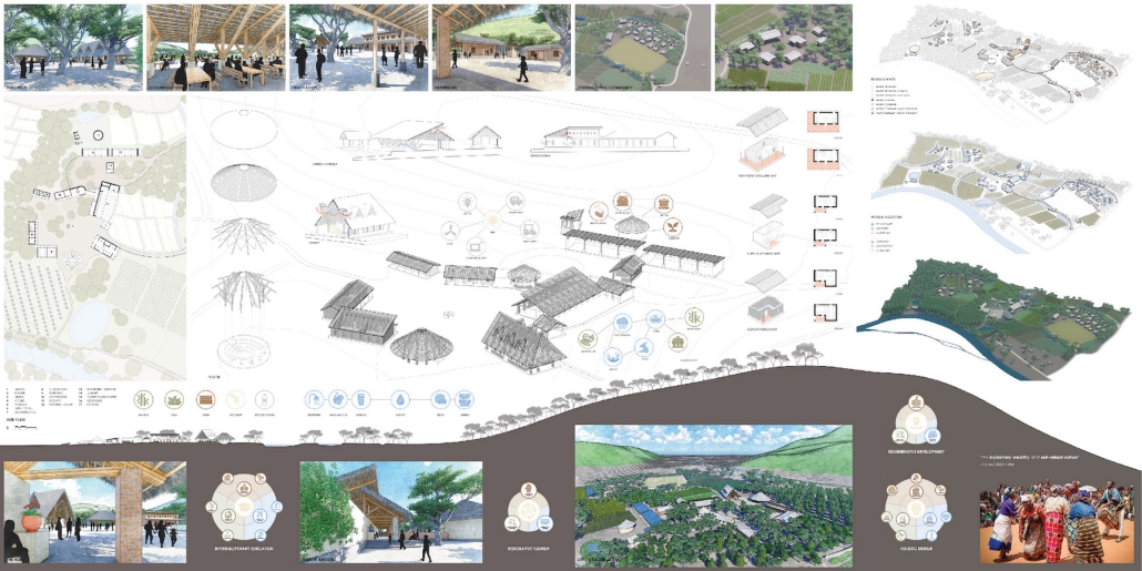
A REGENERATIVE DEVELOPMENT & TOURISM CENTER: HOLISTIC DESIGN AS A CATALYST FOR CO-EVOLUTIONARY GROWTH IN DEVELOPING COMMUNITIES by Mason Reinhart, M.Arch ‘23
Catholic University of America | Advisor: Jason Montgomery

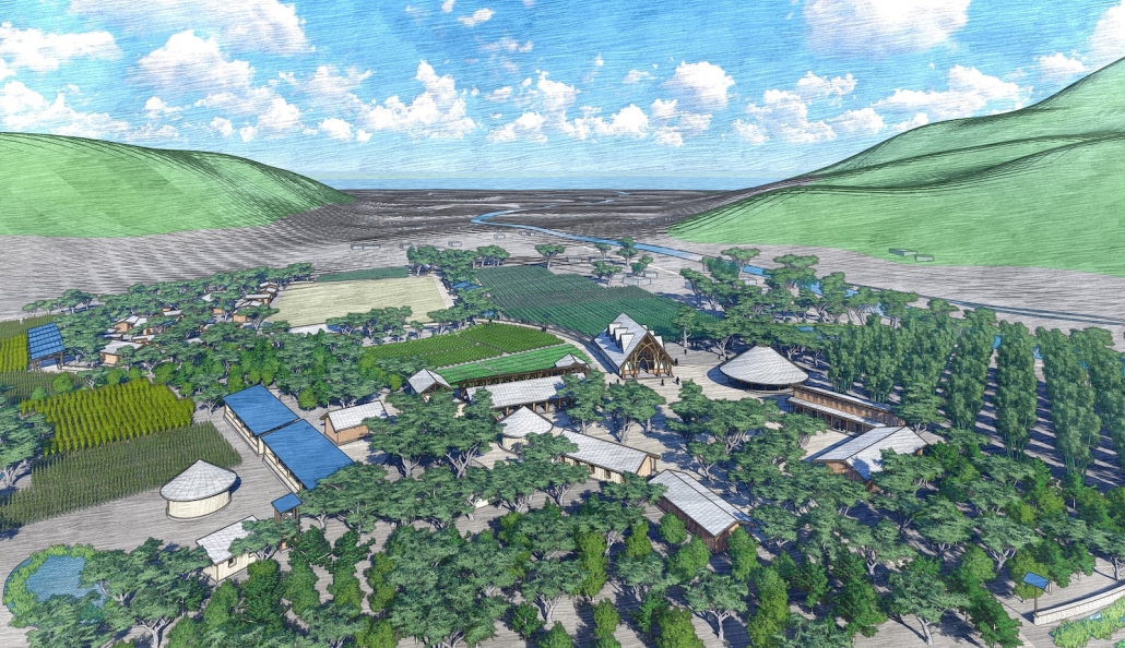
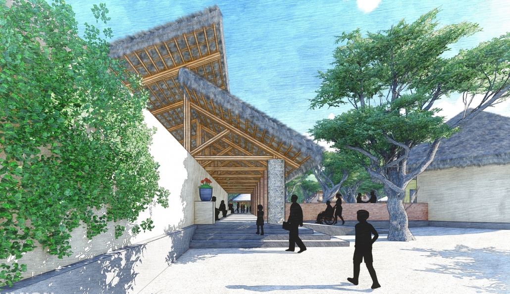
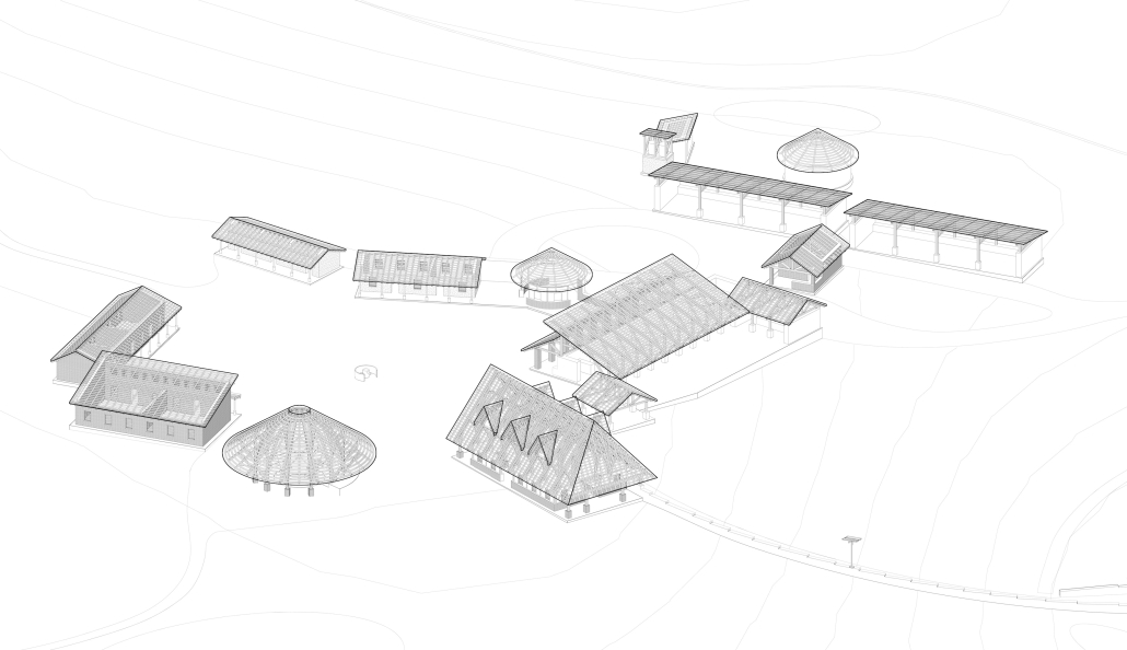
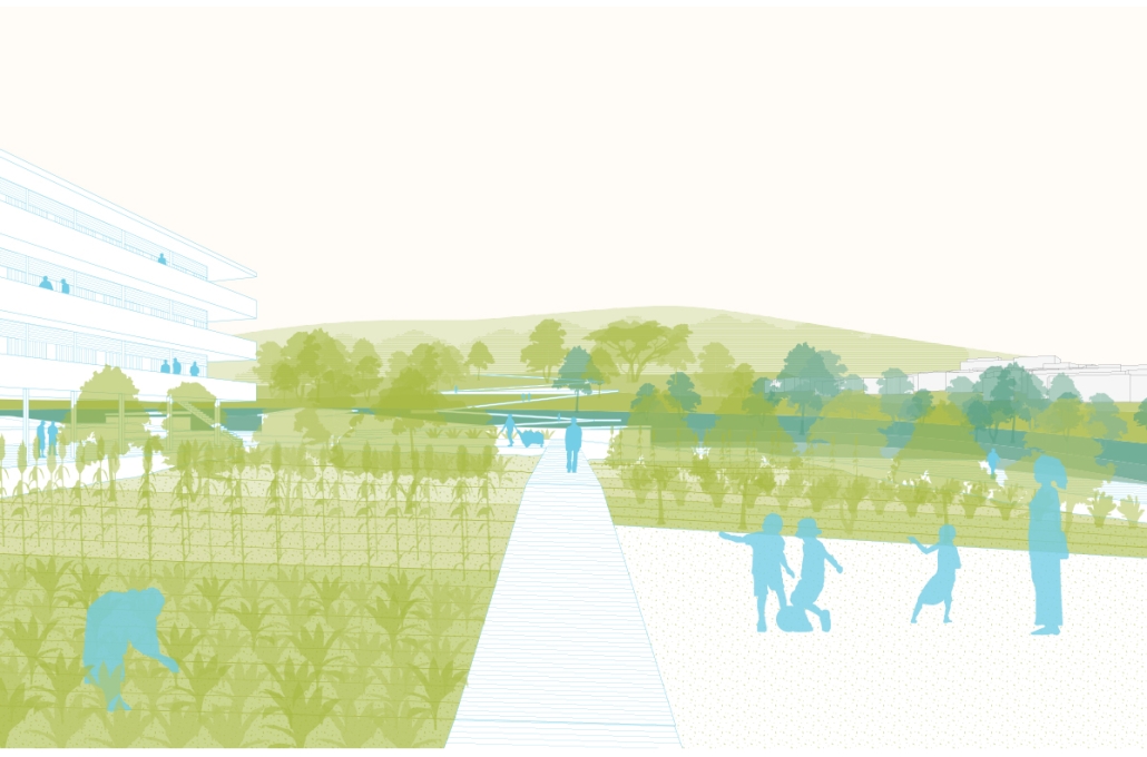
This thesis demonstrates how architecture can be a catalyst for regenerative growth through the holistic design of community development projects that co-evolve with natural systems over time. The Regenerative Development & Tourism Center in Chiweta, Malawi is a phased development project that serves as a community resource, educational hub, and restorative tourism destination. The center’s multi-purpose programming provides economic, educational, and experiential benefits to its various stakeholders. Construction with zero-kilometer materials and operation through closed-loop systems produces positive environmental impacts. The campus is a prototype for development in rural communities that addresses issues on local, regional, national, and international levels. The center in Chiweta is site-sensitive in responding to the physical and climatic conditions, celebrating the local community’s agricultural lifestyle, and contributing to Malawi’s national development and tourism goals.

This project was nominated for Super Jury.

Instagram: masonreinhart_, 007jmontgomery0888

See you next week for the next installment of the Student Showcase!

2023 Study Architecture Student Showcase - Part VIII

Tune in for week VIII of the student showcase. This week we feature student projects focused on the theme of safety, demonstrating thoughtful responses to diverse challenges. Check out the student work below!

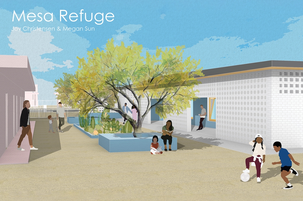
Mesa Refuge by Joy Christensen and Megan Sun, BA in Architectural Design ‘23
University of Washington  | Advisor: Elizabeth Golden

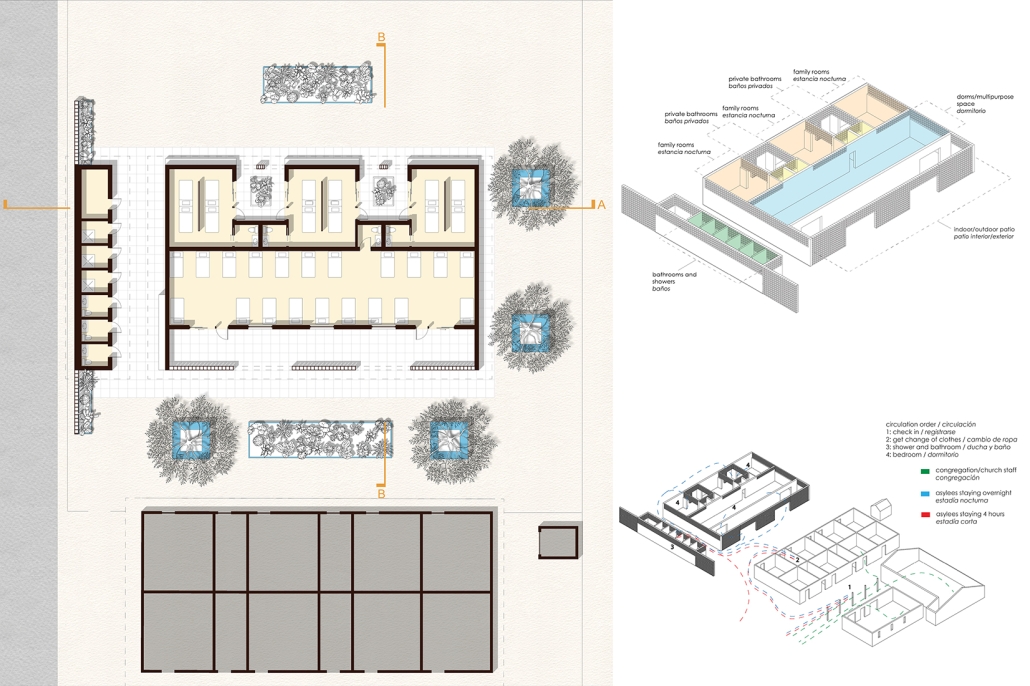
The Iglesia Cristiana El Buen Pastor is located in Mesa, Arizona, a suburb of about 500,000 inhabitants east of Phoenix. Each week U.S. Immigration and Customs Enforcement (ICE)—the federal law enforcement agency responsible for enforcing immigration laws in the United States—transports groups of asylees to the church as a temporary measure while arrangements are made for travel to a final destination. At the church, guests can take a shower, change into clean clothes, and eat a meal before the next phase of their journey. Asylum seekers typically come from a variety of countries and backgrounds and may have experienced persecution, violence, or other threats in their homeland. Many arrive to the U.S. after a long and difficult journey, often having fled their homes with only a few belongings.

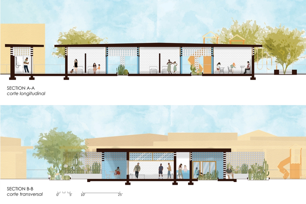
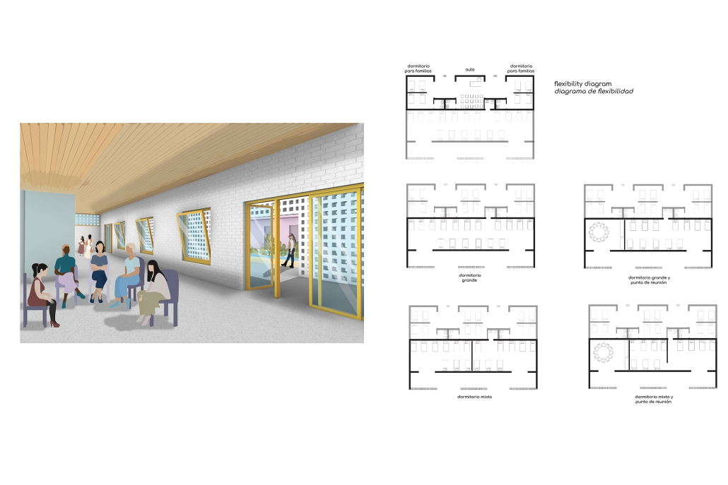
The Mesa Refuge will shelter the asylees on the church campus. The program contains short term housing for individuals and families (between twenty to forty people ) as well additional shower and restroom facilities. When not in use, the building will be used as a multipurpose room for the congregation. The church has a very limited budget and there is a need to build economically as well as sustainably.

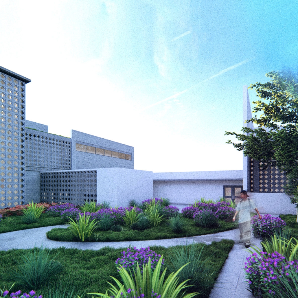
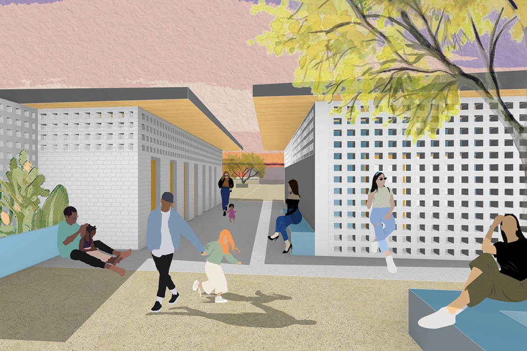
Our proposal focuses on the privacy of the asylum seekers and their connection to nature through views to planted areas around the building and filtered daylight that fills the main spaces. A strategy of layered walls and masonry screens promotes natural ventilation and provides a sense of protection without feeling fully enclosed. Colorful murals cover benches and the wall facing the main entry to the church, welcoming guests and inviting them into their new home.

Instagram: @megan.sun, @joy_architecture, @elidorata,

Urban Living Room by Zoe Qiaoyu Zheng, B.Arch ‘23
Academy of Art University  | Advisor: Sameena Sitabkhan

Naturally, we tend to keep a certain distance when interacting with other people, especially during the post-pandemic era. The Urban Living Room aims to bring neighborhood life into public space while creating blurred boundaries that create conditions of privacy. The design introduces public programs like cafes, shops, galleries, and varied open spaces which blend traditional library and private spaces with adjacent buildings. Formal moves respond to natural light, wind, and views, but also create opportunities to block visual contact with adjacent residences and provide private programmed spaces for users.

The building was divided into two parts connected by a bridge providing flexible circulation. By utilizing different material patterns to guide visitors through the space, the design enriches relationships with neighbors. Originally the site featured the natural environment, so the building is elevated for people to enjoy the natural vegetation on different levels. Visitors are welcome to celebrate their time here and the architecture creates invisible boundaries to protect their personal space as needed. This Urban Living Room is not just a library or another public space for people to hang out; the proposal also provides opportunities for people to safely interact in personally acceptable proximities.

This project was awarded the B.Arch Thesis Design Excellence Award at the Academy of Art University.

Instagram: @aauschoolofarchitecture

Where Density and Desire Meet by Rita Momika, M.Arch ‘23
Arizona State University  | Advisor: Claudio Vekstein

In Phoenix Arizona spreads in the art district of what is named Roosevelt Row, an approximate 3,000 feet long street where the multifunctional businesses take advantage of using the district for portraying their own voices and talents.

In light of the global movements calling for more inclusivity, it is crucial for spaces like Roosevelt Row to ensure that everyone feels safe and welcomed. This means taking active steps to address any discrimination or harassment that may occur within the community. Creating safe and inclusive environments require a commitment to creating microcosmic monuments of different social issues that are a safe space for conversation and alignment between people.

A program that spans 2,000 feet long, an infrastructure capable to contain multiple activities and functions. An architectural base, a steel system able to put up with changes through time as well as establish relations between the public and the private. The structures become the skeleton, the connection, and the network of systems throughout the dynamic street.

By actively promoting diversity and inclusion, Roosevelt Row alleyways begin to foster spaces with a sense of belonging for people from historically oppressed communities, such as people of color, women, indigenous people and immigrants. By valuing and respecting the diversity of voices within the community, Roosevelt Row can help to foster a culture of inclusivity and create a more equitable future for all.

ST.LOUIS R.EFUGEE I.NTEGRATION M.ODEL (RIM) by Saad Khan, B.Arch ‘23
New York Institute of Technology  | Advisor: Farzana Gandhi

In 2022, the U.S./Mexico border witnessed a significant influx of migrants, reaching a staggering total of 2 million encounters. Among this population, approximately 30,000 individuals seeking asylum have been granted admission this year. However, those whose asylum claims are rejected or pending face the challenging circumstances of residing in makeshift tent cities located along the border ports of Mexico. Even for those who are admitted, overcrowded centers, tents, and cities lacking plans for economic development and social integration pose additional hardships. One proposed intervention after the migrants’ arrival at the border involves the relocation of these refugee and asylum-seeking populations to declining urban areas like St. Louis, Missouri. This strategic relocation would include the implementation of a transitional housing typology that encompasses co-living spaces, shared working environments, and public amenities. Another intervention aimed at fostering cultural integration and combating xenophobia entails establishing an exchange center within St. Louis. This center would offer diverse programs designed to cater to the needs of both the incoming and existing populations residing in the city.

This project was awarded the faculty thesis award at NYIT.

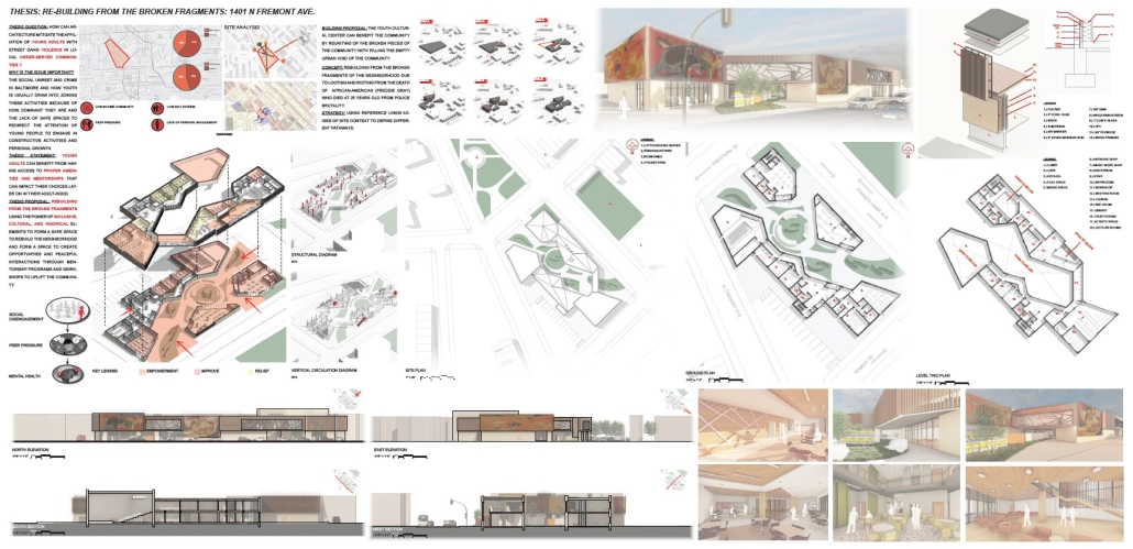
RE-BUILDING FROM THE BROKEN FRAGMENTS: YOUTH CENTER IN BALTIMORE by Kevin Ufua, M.Arch ‘23
Morgan State University  | Advisor: Carlos A. Reimers

How can architecture mitigate the affiliation of young adults with street gang violence in local under-served communities?

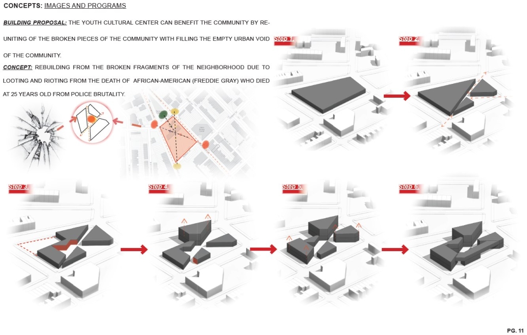
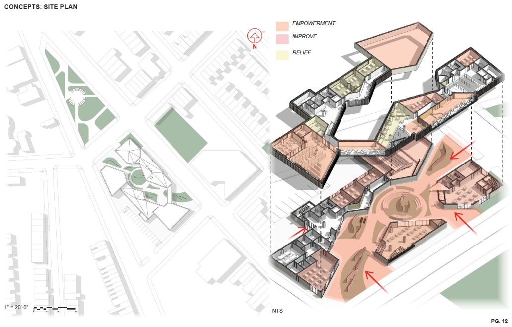
Low-income environments, limited parental involvement, peer pressure, and low self-esteem are all factors impacting under-served communities in Baltimore. The social unrest and crime can draw youth into joining gangs and violent behavior because of how dominant they are and the lack of safe spaces to redirect the attention of young people to engage in constructive activities and personal growth. Young adults can benefit from having access to proper amenities and mentorships that can impact their choices later on in their adulthood. This thesis addresses this issue, creating a youth center in a landmark location of social unrest in the city of Baltimore.

Instagram: @swagboy__kevin, @reimerscarlos

Living in Thresholds by Darren Petrucci, M.Arch ‘23
Arizona State University  | Advisor: Claudio Vekstein

The theory of feminist architecture contends that we need to rediscover the spatial relationships that have defined modern architecture. Coming from a matriarchal family in Venezuela, I wanted to explore if the ramifications of my upbringing (a matriarchial structure) were influenced by the neighborhood environment in which we lived. This project hopes to examine the concepts of public and private spheres within which we live, through the analysis of case studies, and to explore the impact of the transition between these spaces. It is these transitions, or the combination of them, that introduce architectural conditions that lead to more caring housing communities.

To begin we must understand that how we live extends past the boundaries of our house and encompasses how we move throughout the home, neighborhood, and city. The majority of housing developments undermine spontaneous social safety nets and contribute to the loss of community cohesion; it’s usually removed from the city center, thereby alienating already socio-economically vulnerable people from city resources. The single-family prototype does not address the diverse members of society — single mothers/fathers, seniors, young professionals, single women, LTBQ+, multigenerational families, etc. To create a community of care is to meet all the needs of a person (physical, emotional, health, and safety). This happens when we re-evaluate housing, based on our existence, as multi-dimensional and design our spaces to redefine the “social” aspects of housing, where the collective experience of community creates a natural threshold identity between the public and the private.

The articulation of the project applied these ideas of thresholds to an existing site in Phoenix, AZ. The restructuring and rezoning of the site allowed for the implementation of differing degrees of housing densities brought together by public urban spaces that served the community. The articulated bands became the varying housing typologies that allow for the agglomeration of different combinations of families to inhabit; while the “voids” became a place to maintain a sense of openness to the immediate and greater community. These public spaces became the extension of the house and blurred the concept of public and private.

Instagram: @paolavalentinaaa

See you next week for the next installment of the Student Showcase!

2023 Study Architecture Student Showcase - Part VII

Welcome to week VII of the showcase. This week we feature student projects on furniture design and projects that use innovative materials. Check out the student work below!

The Moth: The Contemporary Comfort Chair by Alondra Pulido, M.Arch ‘23
University of Washington  | Advisor: Rick Mohler

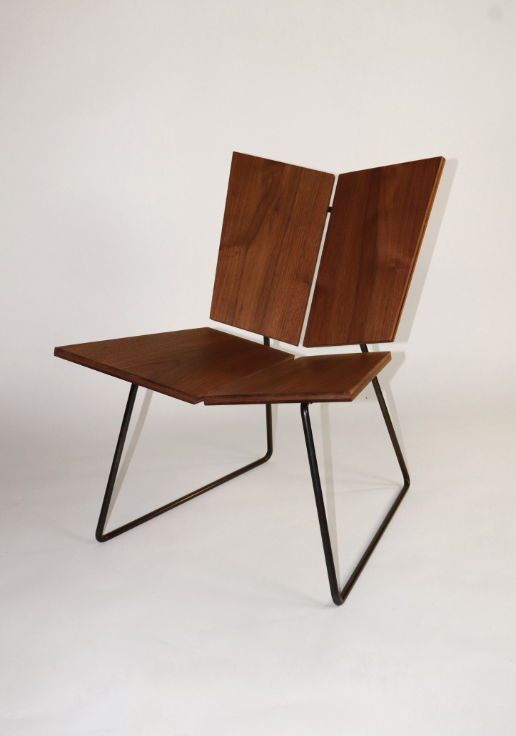
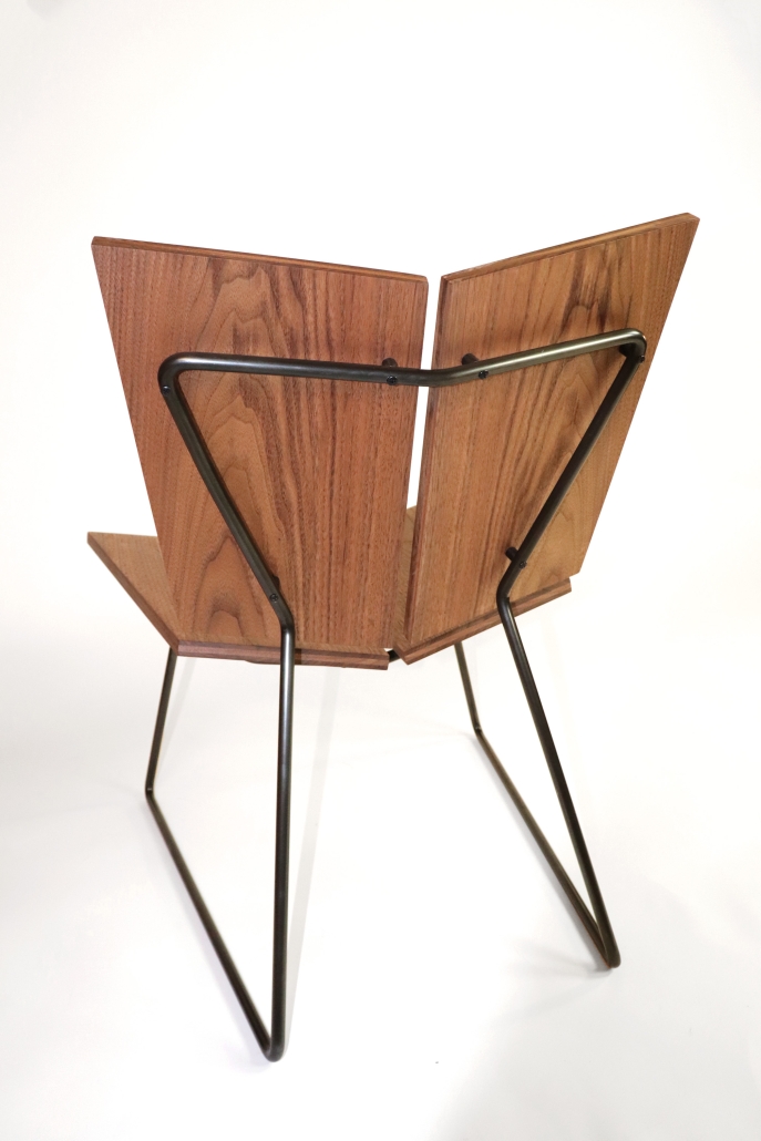
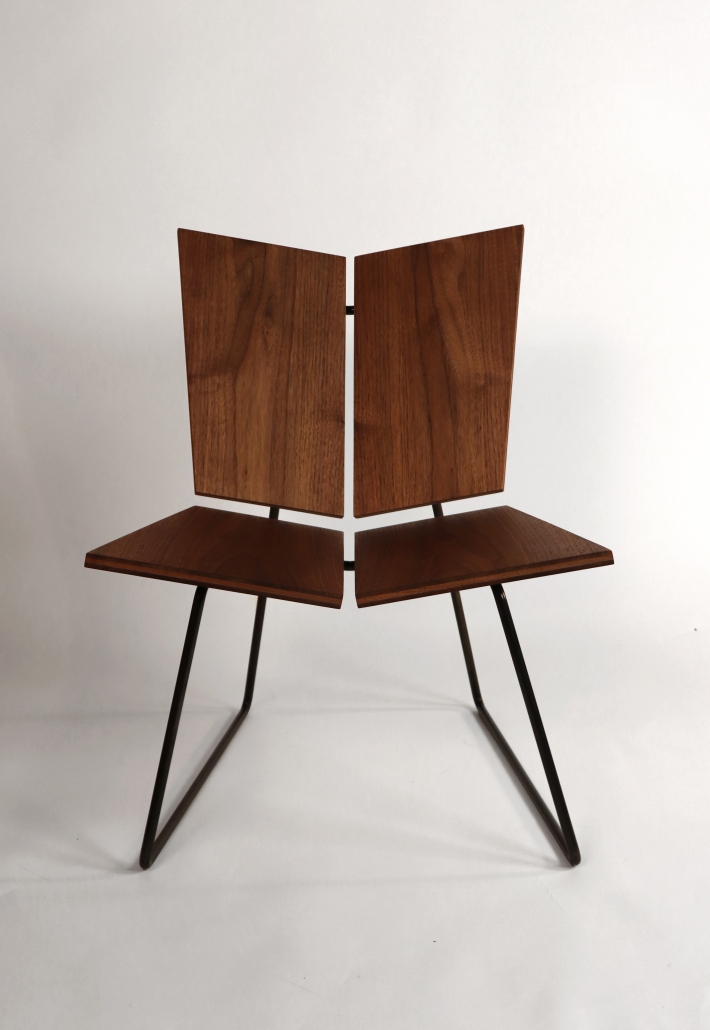
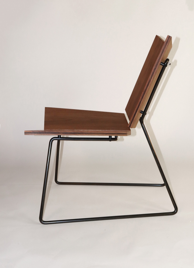
The Moth lounge chair combines modern striking shapes with a flexible form factor that adapts to all body types. Its design offers an unexpected seating experience, capturing the unconventional elegance and beauty of a moth. This lounge chair combines steel and wood to create a contemporary piece that ensures durability and comfort.

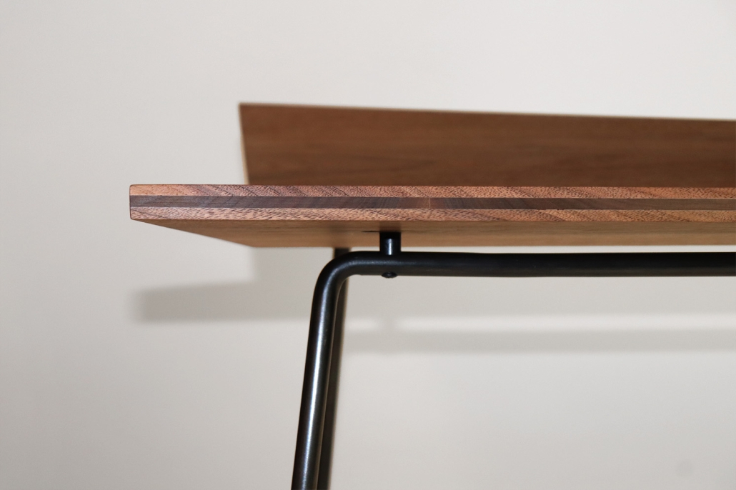
The lounge chair’s flexible quality is attributed to its steel rod base that is welded together to form a continuous loop structure. This steel framework supports a cantilever seat and adds a playful element to the overall seating experience. The chair’s back and seat are defined by four laminated walnut panels, evenly spaced apart and gently sloping toward the center for enhanced comfort. These panels are affixed to the steel structure using black delrin standoffs, creating a floating feeling and highlighting the contrast of wood and steel materials. This striking contrast is further enhanced by the framework, which mirrors the sharp angles on the backside and underside of the wooden panels.

The walnut veneers used in the chair are sourced from a single walnut slab, which was processed and milled in the student fabrication lab. The steel components are also bent, welded, and blackened in the same space. This ensured a cohesive production process in which the interaction between materials informed each other, resulting in the final product.

Instagram: @alondrapul, @swithycofurniture, @mohler.rick

DK22 by Dominic Kaufer, M.Arch ‘23
University of Washington  | Advisor: Rick Mohler

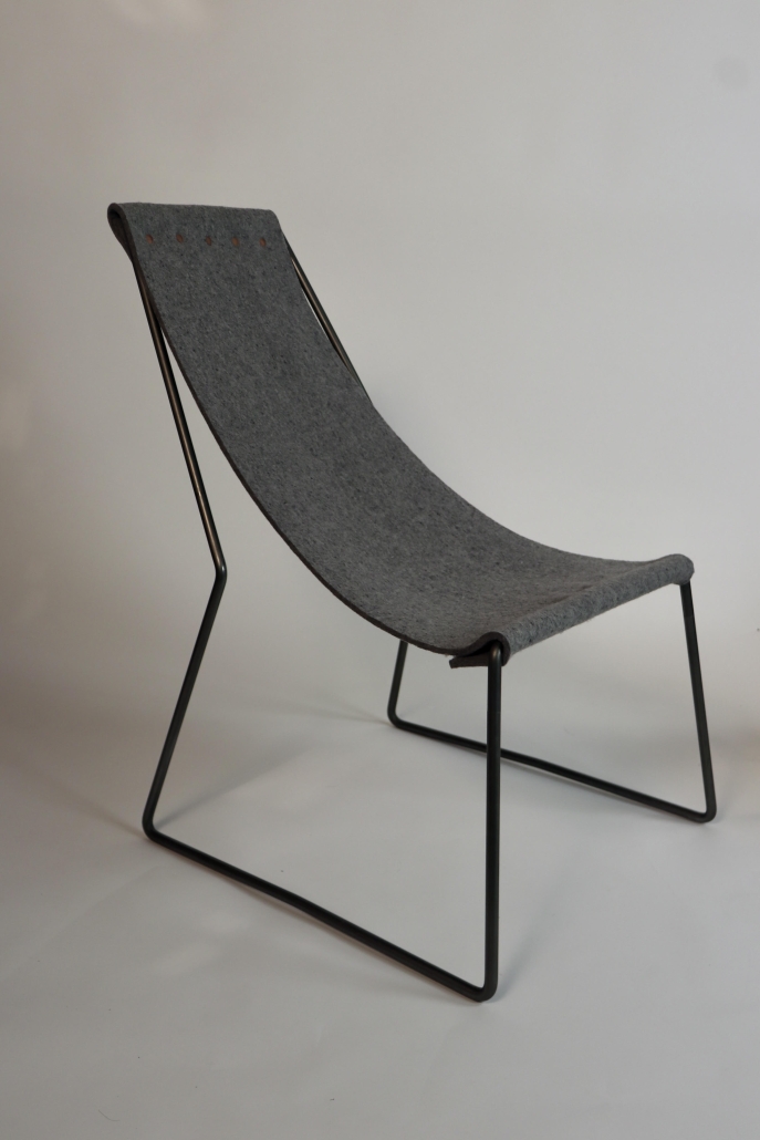
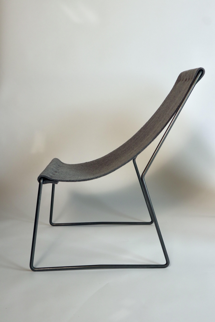
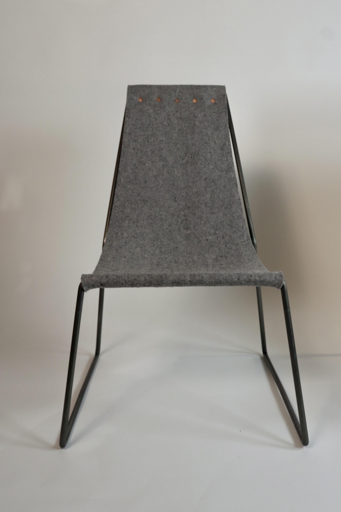
In this studio we were taught Danish furniture design principles and encouraged to consider those principles in our designs. I was particularly interested in the principle of minimalism, which I interpreted as using the least amount of material and “moves” necessary for a given idea to work well.

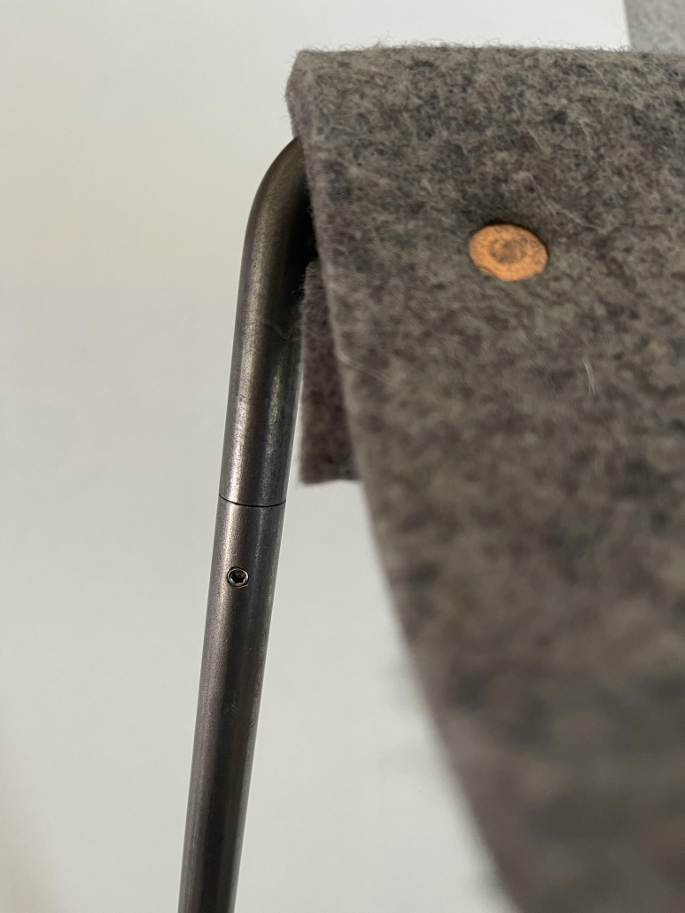
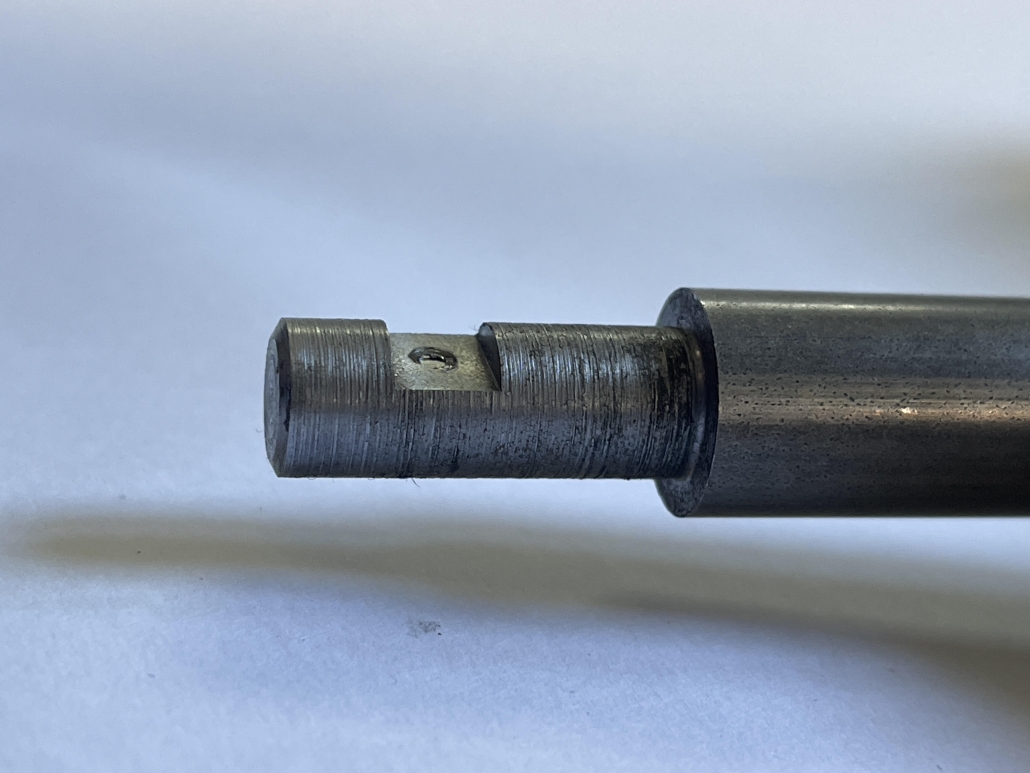
This chair is the result of a handful of prototypes using steel and felt, built over the span of a ten-week quarter. The design strives for apparent simplicity, with motifs taken from single-line drawings and tattoos. While the frame appears to be a single bent piece of round steel rod, it is actually four pieces in total – two sides and two stretchers. Concealed joints were turned on the lathe and are held together with small, allen head set screws. The steel frame was treated with a mixture of beeswax and boiled linseed oil to minimize rust and wear. The sling is 1/4” thick f7 industrial felt and is attached to itself around the stretchers with hammered copper rivets.

This chair would not have been possible without the help of my classmates and instructors. Special thanks to the instructors – Erling, Kimo, and Steve – for their help and insight throughout design and construction. I would also like to thank the UW Fabrication Lab staff – Rae, Jack, and Brian – for their help in turning this idea into something tangible (and sit-able)!

Instagram: @kominicdaufer, @swithycofurniture, @mohler.rick

Recovering Surface Addict by Kevin Cendejas, M.Arch ‘23
Cranbrook Academy of Art  | Advisor: Gretchen Wilkins

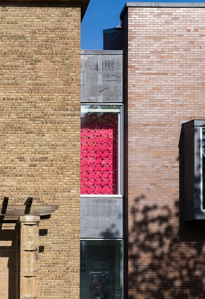
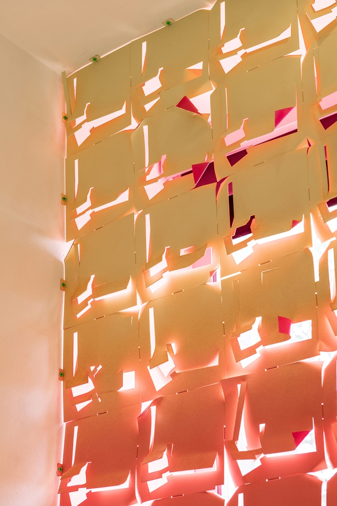
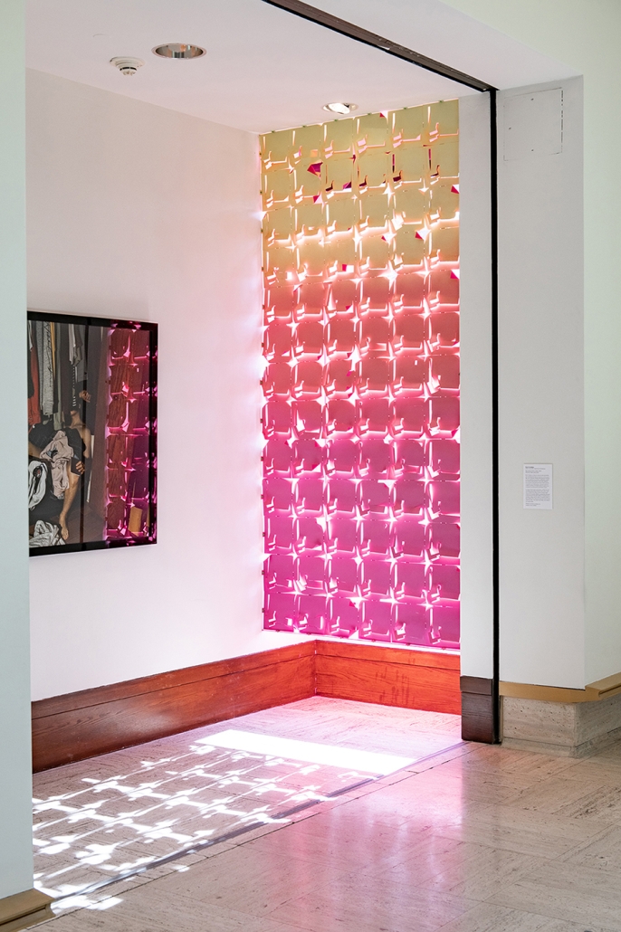
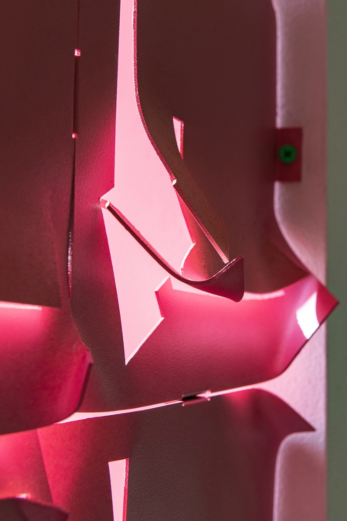
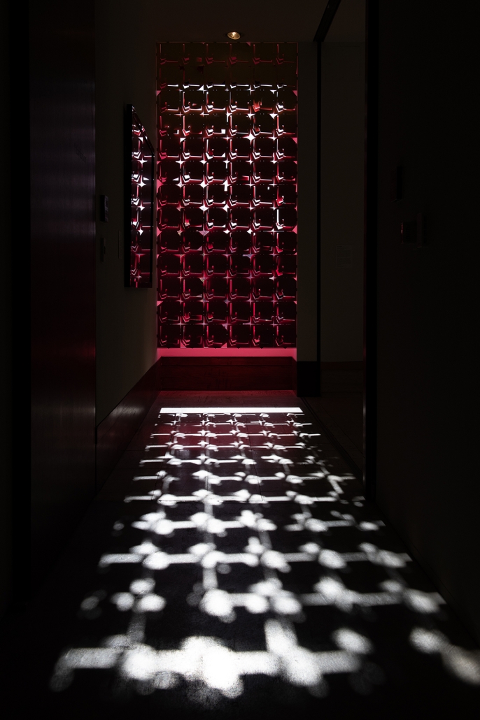
Recovering Surface Addict is a fabricated surface of encounter and mixture; configuring and reconfiguring relations between body, space, craft, color, and light. The surface consists of seventy-eight unique aluminum panels unified by a color gradient while also disrupting the glow of fluorescent fuchsia through each panel incision and bend. Neither wall nor window, the surface possesses qualities of both by mediating between inside and outside, and between separation, connection and interaction. Folds in the metal panels produce a dense yet floating surface in which light and color might be sensed as material and fabric through dynamically changing hues and shades. The luminous surface is textured by plays of light, sensitive to shifting weather conditions outside which become absorbed by and dispersed across the surface. The experience of mediated color and light on the surfaces produces an environment that changes through movement, proximity and time. Observers become accomplices to the layered temporal and sensory effects of the surfaces in real time and space.

Instagram: @kevin.cendejas, @grtnwilkins

Footwear to Facades by Shaun Rankin, M.Arch ‘23
University of Southern California  | Advisor: Alvin Huang

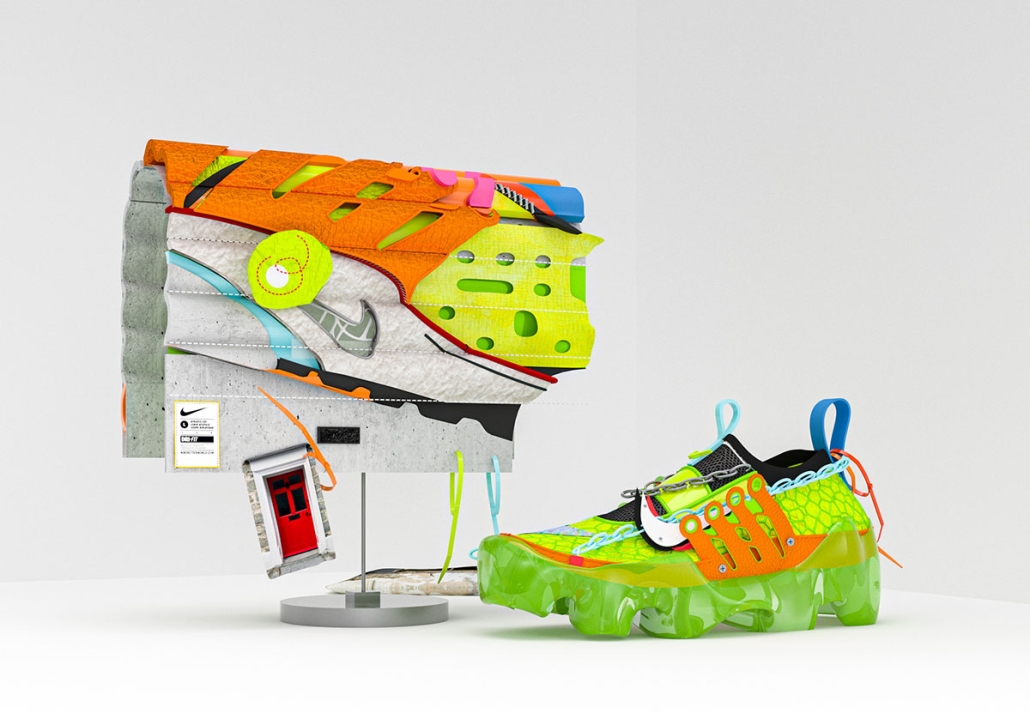
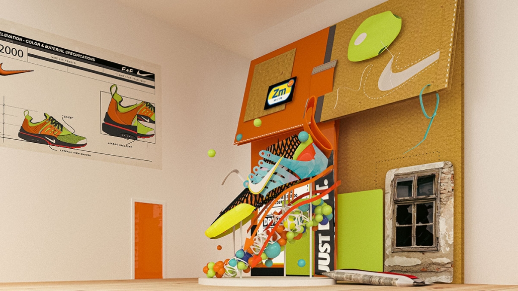
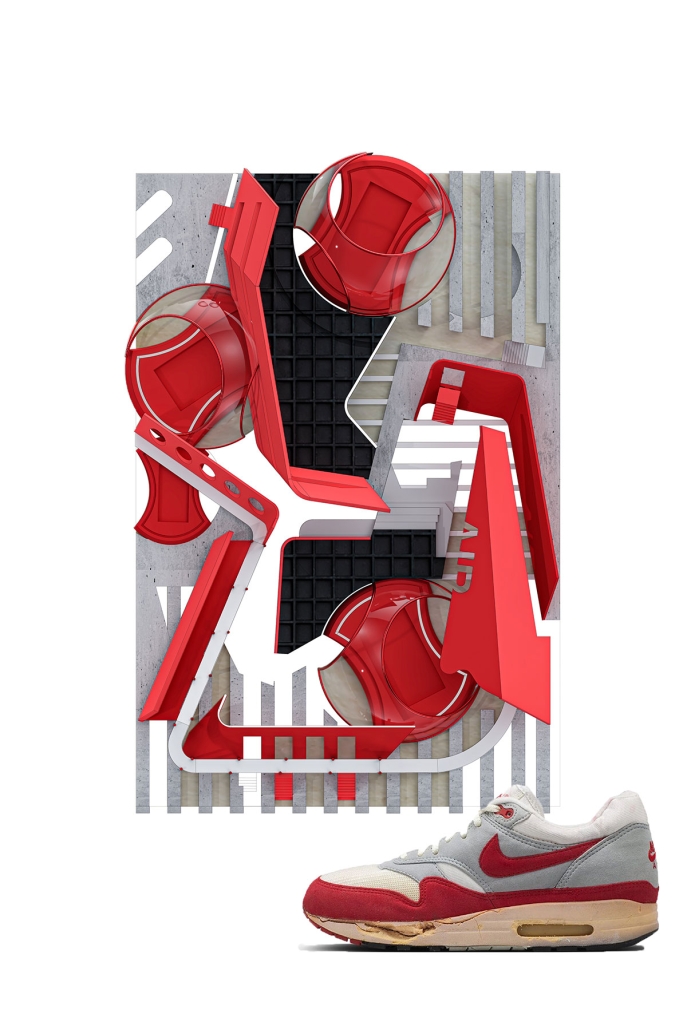
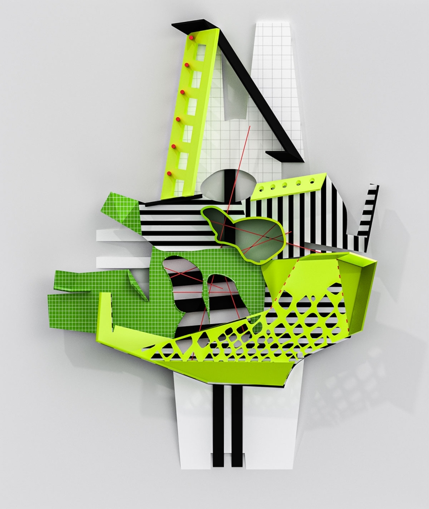
Tectonics in architecture is the integration of structure and construction, implementing technical aspects, detail, and cultural and aesthetic qualities. It involves both the process of making architecture and the product of that process, elevated to an art form. I examined the relationship between architecture and footwear through an aesthetic and tectonic lens. I critically analyzed the process of creating footwear art and how it is derived. Through specific techniques of footwear design, such as stitching, weaving, and branding, I aim to develop new ways to generate architecture. By using these techniques, I hope to encourage the discipline to design and think more creatively about how we enclose our spaces, develop spatial relationships, and consider materials. This perspective raises the question of whether architecture can be temporary or even switched out daily, much like a pair of shoes.

This project was awarded the USC Master of Architecture Distinction in Directed Design Research and the A+D Museum Design Awards In School Category.

Instagram: @shaunrankin_, @ryantylermartinez 

deadstock by Christopher Torres, M.Arch ‘23
Lawrence Technological University  | Advisor: Masataka Yoshikawa

Deadstock refers to merchandise that’s never been sold. The project challenges itself to accumulate different merchandise to evolve itself into a structure that keeps evolving and producing deadstock in the form of architecture and spatial construct.

This project was awarded the Dean’s Award at Lawrence Technological University

Instagram: @creesetoepair

See you soon for the next series of the Student Showcase!

2023 Study Architecture Student Showcase - Part VI

We are back for installment VI of the Study Architecture Student Showcase! As we delve into this installment, our focus turns towards projects that stand as beacons of sustainability. Each showcased endeavor exemplifies a commitment to thoughtful design, incorporating eco-conscious elements that not only enhance the aesthetic appeal but also contribute to a harmonious coexistence with the environment.

Imbalance, Prospect NOLA by Andreea Dan, B.Arch ’23
Tulane University | Advisor: Ruben Garcia-Rubio

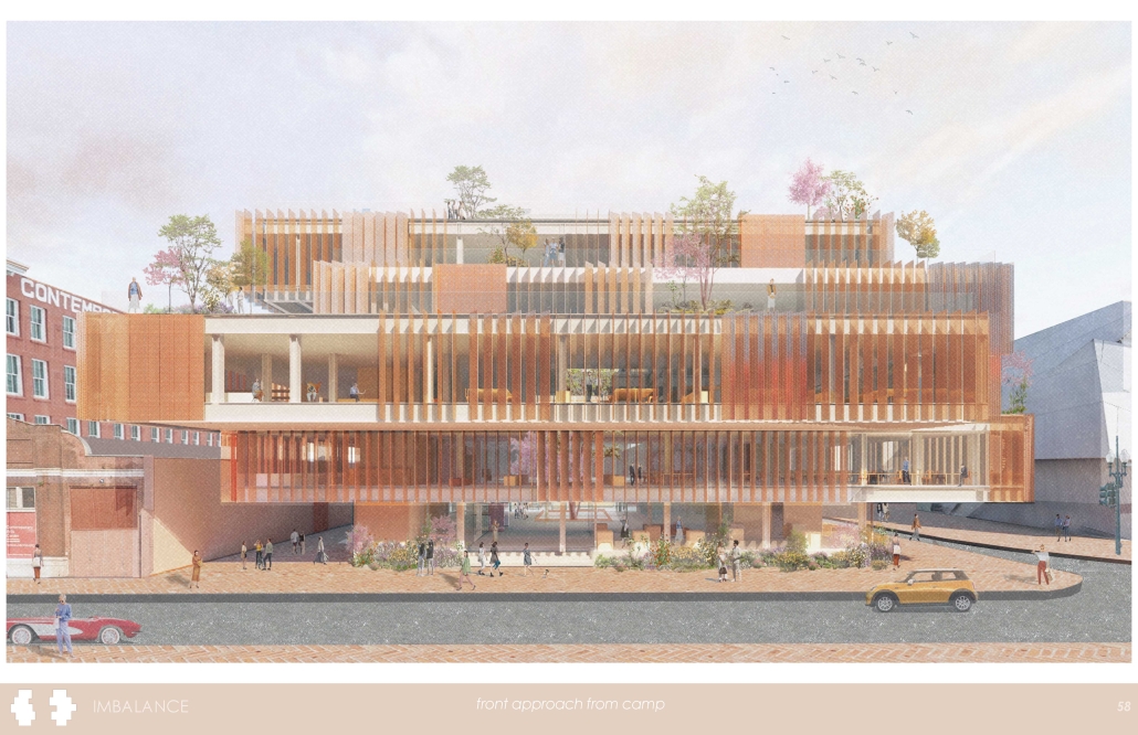
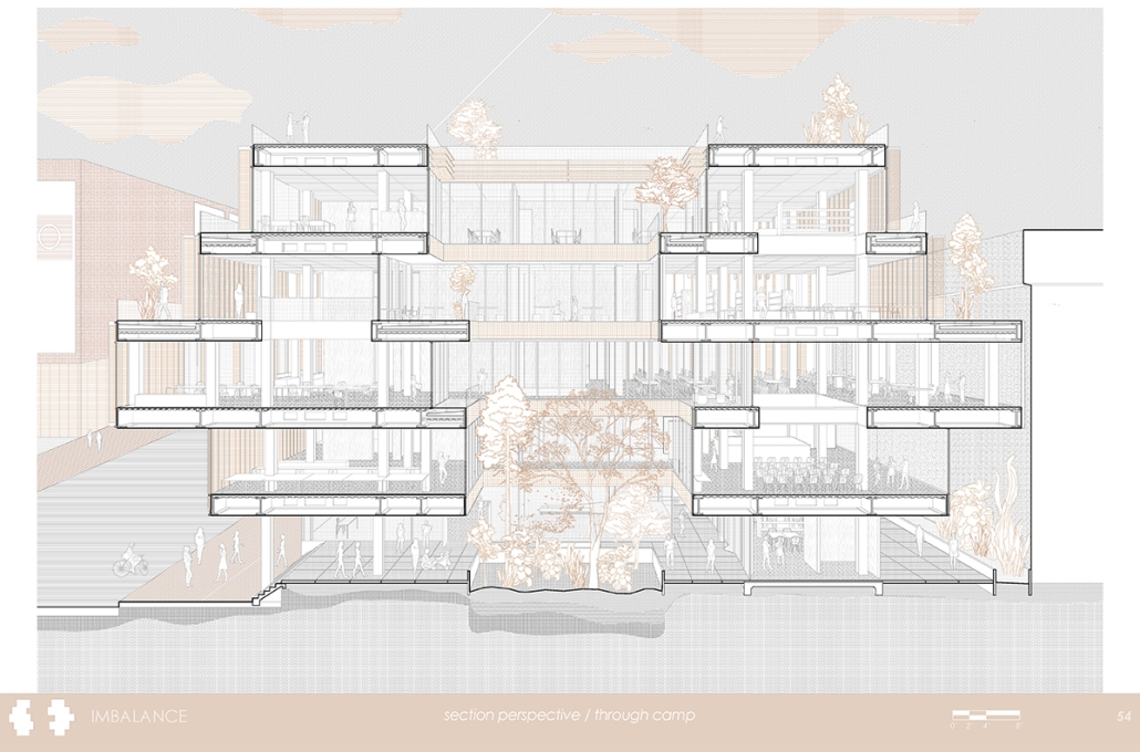
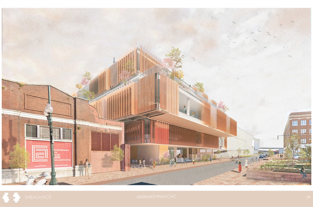
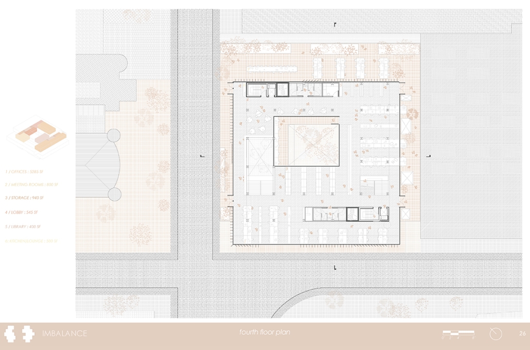
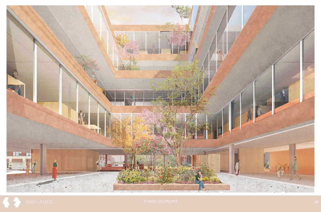
The proposal focuses on the unification of spaces sectionally, both within the proposal, and with the context of the site the proposal is on. The process for developing the concept began with analysis of the surrounding site, where several public and tourist destinations are located. It was then determined that the proposal would need to unite all these entities in some spatial way. The parti was developed through the massing of a five-level cube in the allowable construction zone. An interior courtyard cut-out was then created. From here, the ground floor was divided into separate volumes with exterior space for fluid movement of the public. The upper floors were then each shifted, offset, and extended purposefully depending on site context in order to create meaningful sectional relationships. This overall massing became the central concept that was then further developed around this concept of multi-level connections. From here, different aspects were then decided upon — environmental considerations were made in the prioritizing of cross ventilation and development of green and blue roofing wherever possible, due to the large abundance of exterior terrace space. Cantilevers and facade elements were utilized in order to allow sun shading from summer sun, which is ideal in the climate conditions. The proposal’s structure was also constantly developed and adjusted in order to allow for extreme cantilevers on each floor, but still keep the structure as light as possible. The proposal consists firstly of a central ring of steel bays that runs through each floor. Then, trusses are attached to this central ring when large cantilevers are present. Then, the beams are extended even further for different lengths of cantilevers. Finally, cables are introduced on certain floors to hang the floor slabs below and allow for a lighter structure. As far as programmatic and circulatory elements go, the proposal moves from more public to more private as levels increase from the ground floor up, and circulation is always central around the interior courtyard of each floor and back to the core elements in either corner of the proposal. As seen on each floor plan, core elements are attached to the egress stair in a linear rectangle in either accessible corner of the project. Apart from the ground level, each plan is similar in layout with the placement of open office spaces both on the interior and the exterior. Finally, the facade of the proposal becomes clear in the project’s elevations, where it can be seen that the entirety of the upper levels have a double-layer facade. The inner layer is composed of double-paned glass that is operable in certain areas. The outer layer is made up by mechanically operable sun-shading louvers that are constructed of copper mesh. These louvers run from floor to ceiling and can be rotated a full 180 degrees to allow for the optimal amount of sun exposure to the interior space.

This project was selected as one the 2023 Metropolis Future100.

Instagram: @rubgarrub

Urban Infill Gallery, Studio, Residence by Irvin Amezola, AAS (Pre-Architecture) ‘23
College of DuPage | Advisor: Mark Pearson

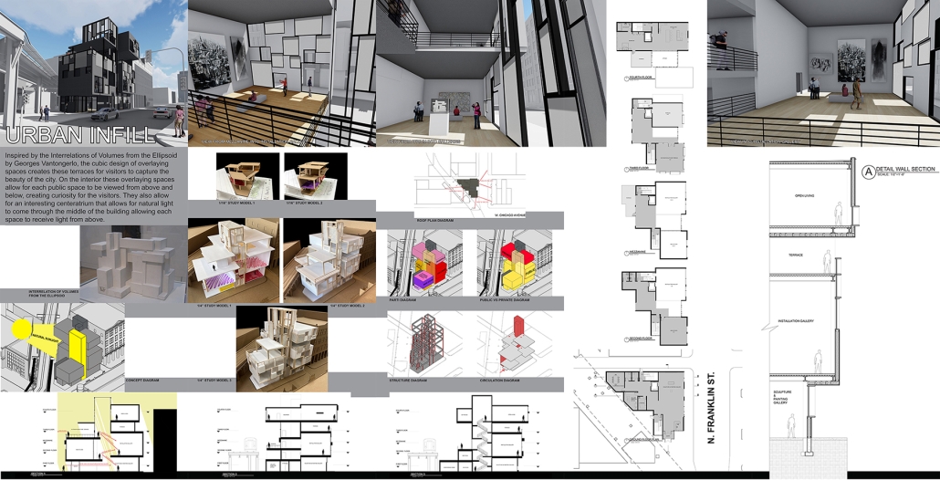
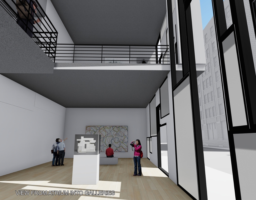
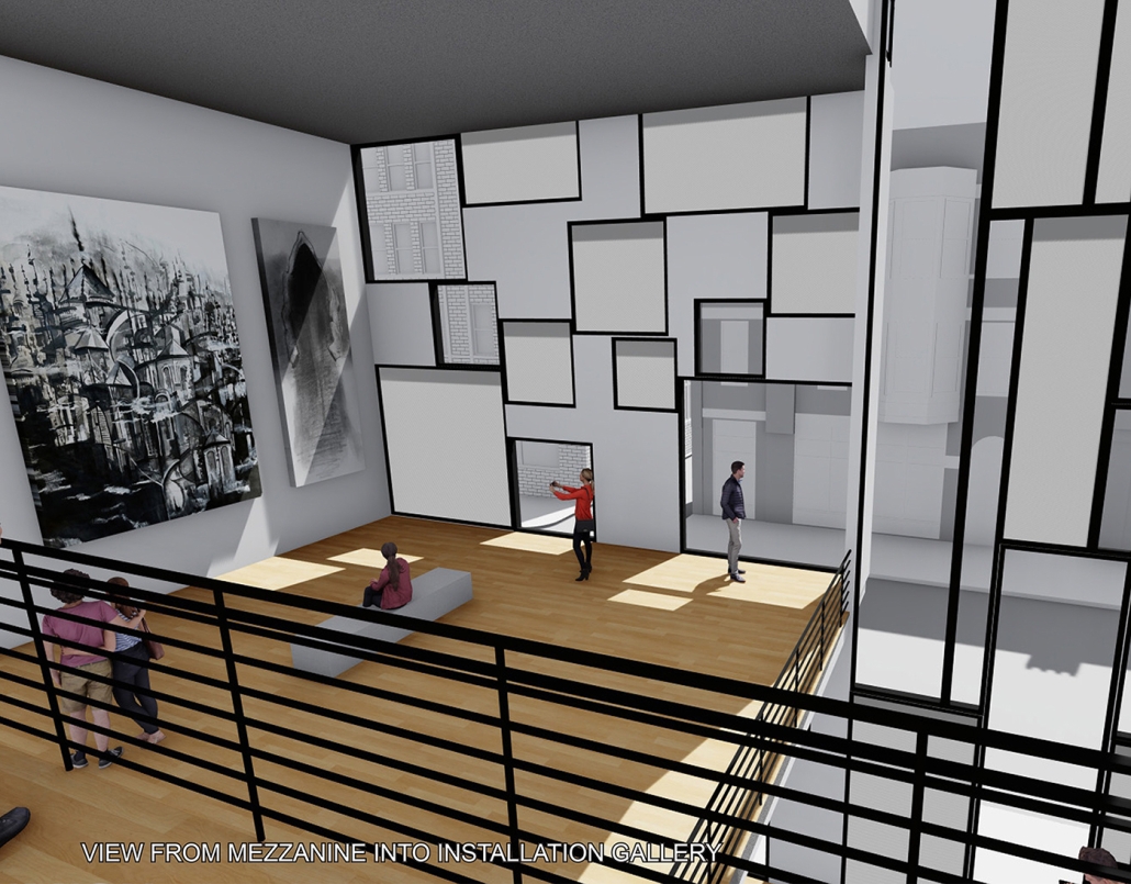
PROGRAM STATEMENT: Located in the River North Gallery District in Chicago, IL, this project challenges students to design a community arts center that will act as a creative hub and arts incubator for the assigned site. The building contains galleries, studio workspace, and a small residential unit to accommodate visiting artists in residence. Successful projects should be sustainable and responsive to the site, context, and natural environment. Students are asked to draw inspiration from selected works of art that are researched at the beginning of the semester. These works of art then become part of the permanent gallery collection for the project. This project challenges students to design in section and consider the modulation of natural daylight as fundamental criteria for the project. Students are also asked to consider programmatic organization, circulation, structure, materiality, and detail. Successful projects are expected to develop innovative design solutions based on a clear design concept.

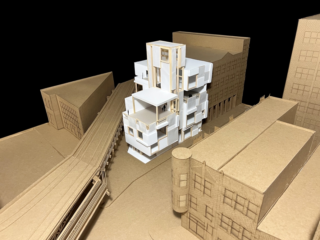
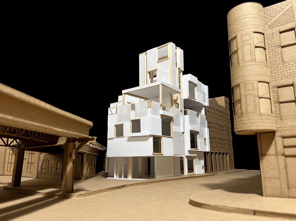
DESIGN CONCEPT: Inspired by the artwork “Interrelations of Volumes from the Ellipsoid” by Georges Vantongerlo, this project is a cubic composition of overlapping volumes. The cubic forms create spaces and terraces for visitors to appreciate the beauty of the artwork and the city. On the interior these overlapping spaces allow for public spaces to intertwine and be viewed from above and below, creating curiosity for visitors. The project also includes a vertical center atrium that channels natural daylight into the middle of the building, allowing each space to receive light from above.

Instagram: @irvinamezola, @ma_pearson75, @cod_architecture

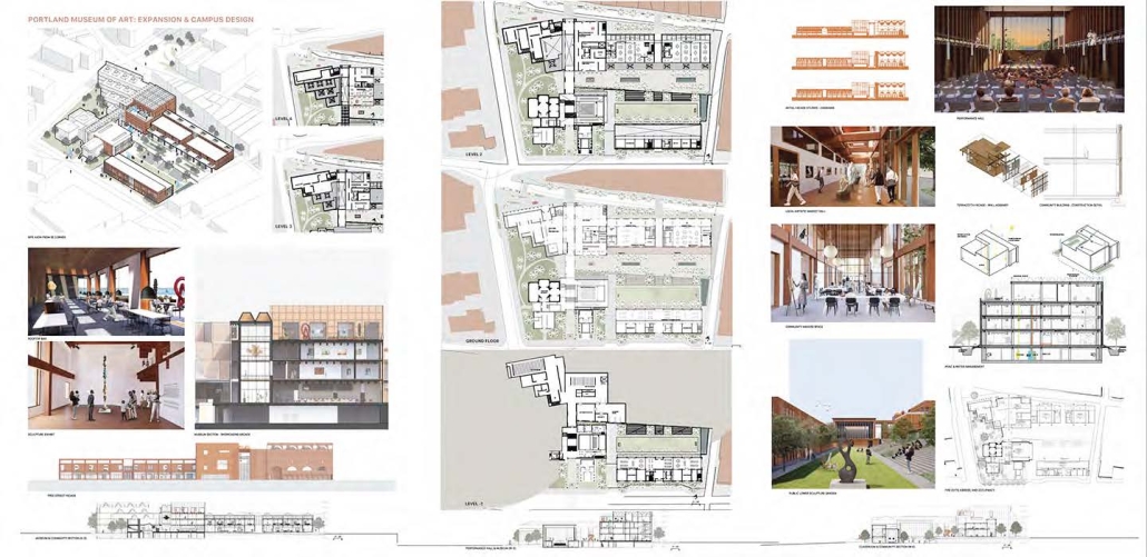
Portland Museum of Art Expansion and Free Street Art District by Zack Blizard, B.Arch “23
University of Oregon | Advisor: James Tice

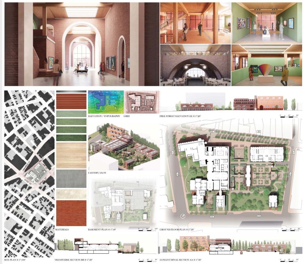
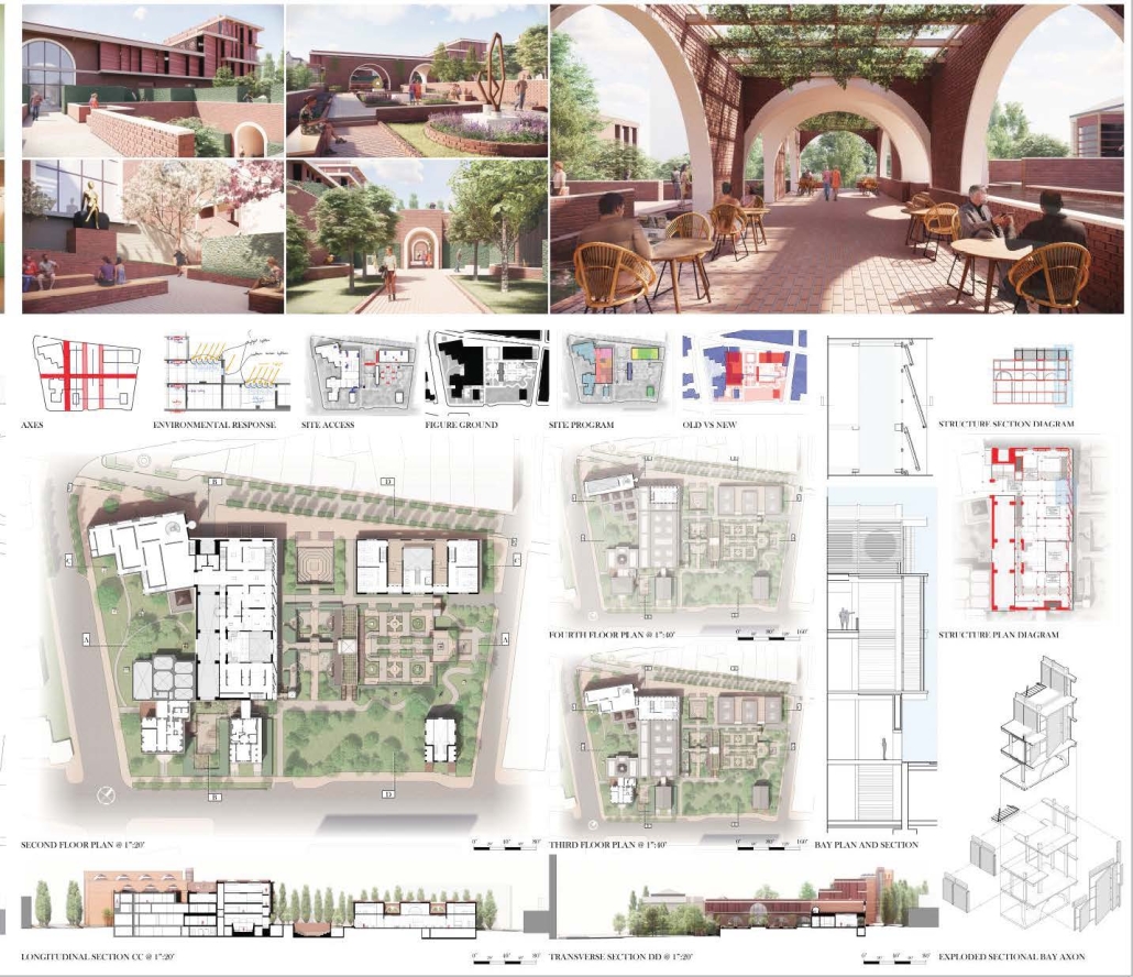
This thesis level architectural studio at the University of Oregon was based on an international architectural competition sponsored by the Portland Museum of Art, Portland, Maine for the expansion of its landmark museum designed in 1982 by Harry Cobb of I.M. Pei & Partners. The studio accepted the basic parameters and goals of the competition brief of 2022 for expanded galleries, services, and community space to enhance and unify the existing campus of historic structures and landscape gardens. In addition, students were challenged to expand the program and the site beyond that required by the competition to engage the unique urban setting of the museum in the historic center of city on Congress Square and Free Street. The design challenge, then, was to expand the PMA building and campus and to create an urban art center for the entire city of Portland, enhancing its unique physical and cultural contexts.

The studio focused on urban design, sustainability, community engagement, and use of local materials. The goal was to honor the existing PMA and its unique setting in the city and expand its program and facilities for the larger community.

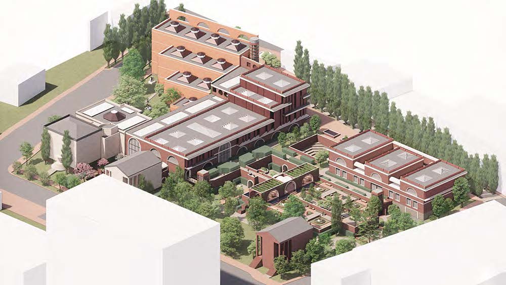
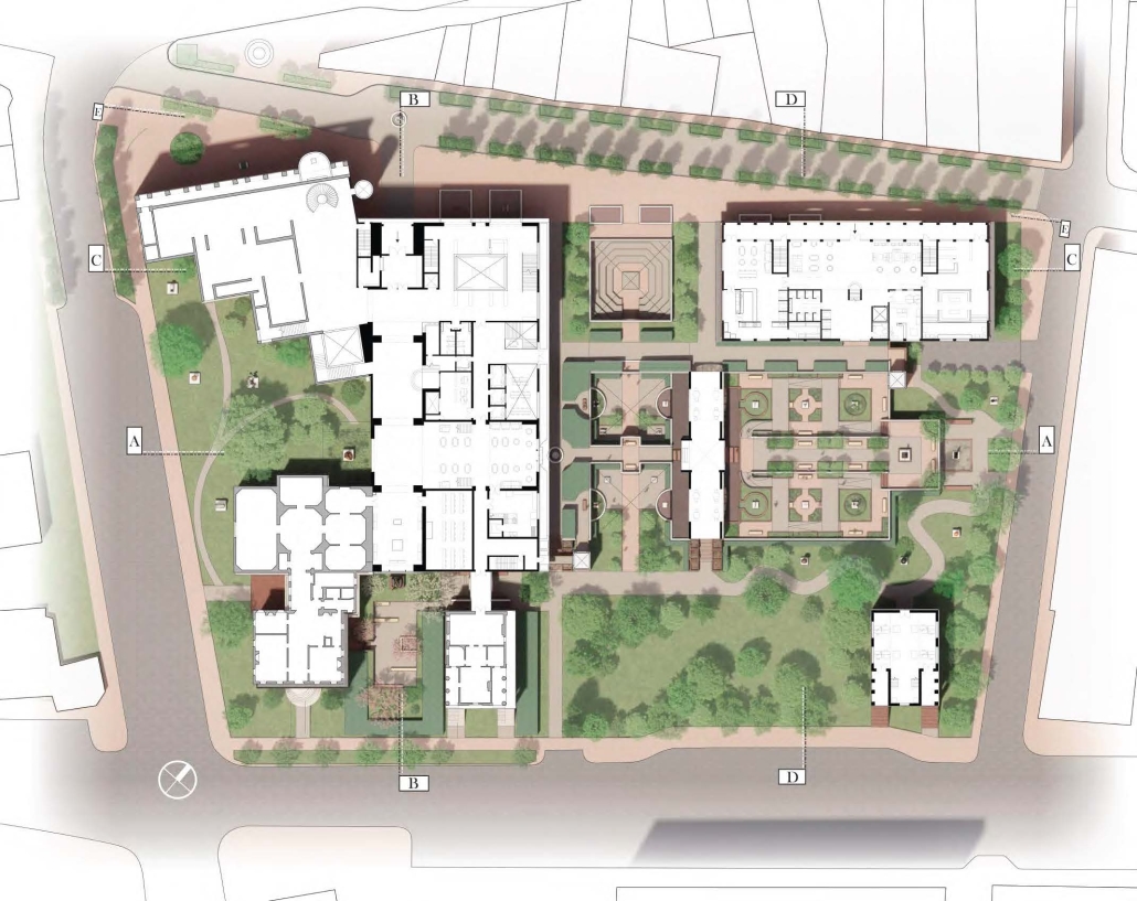
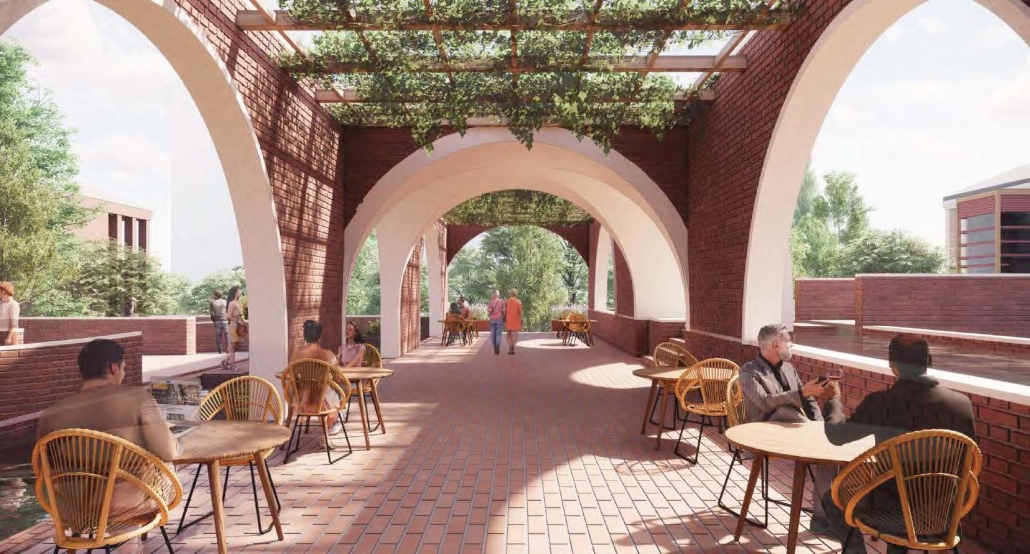
The design by Zack Blizard, shown here, met these challenges by complementing the existing museum with expanded day-lit galleries and extensive community gardens. These elements are integrated as a series of interconnecting interior and ‘outdoor rooms’ for sculpture and summer performances All exterior spaces, including sunken gardens, are accessible through carefully designed ramps and elevators. The structure is primarily mass timber above the ground level faced with the traditional water-struck brick, a local material of which a large part of the 19th century city was comprised. The existing galleries are expanded on an upper-level gallery designed to respond to solar considerations and take advantage of natural daylighting. Additional community spaces, including classrooms for the nearby Maine College of Art and Design were provided along Free Street to the north along with public shops and restaurant making Free Street and Congress Square and Market a creative hub for the city’s new art center and PMA expansion.

About Time: Redressing the Runway by Triciajane Asuncion, B.Arch ‘23
University of Illinois at Houston  | Advisors: Sheryl Tucker de Vazquez, Ophelia Mantz, & Dr. Leslie Vollrath

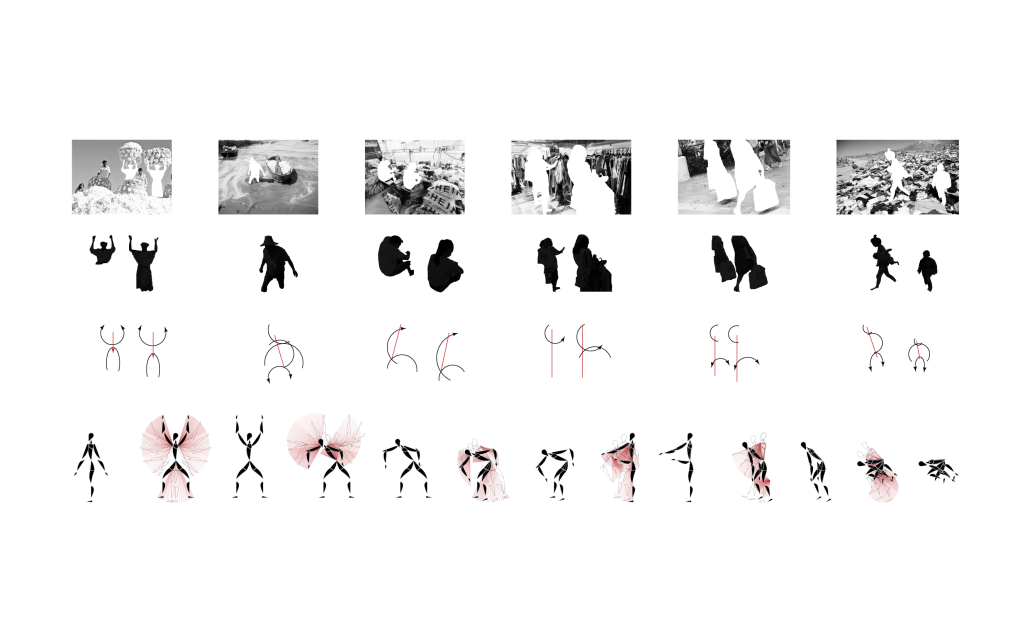
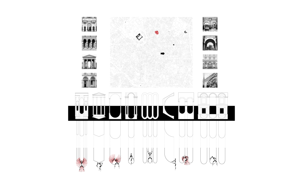
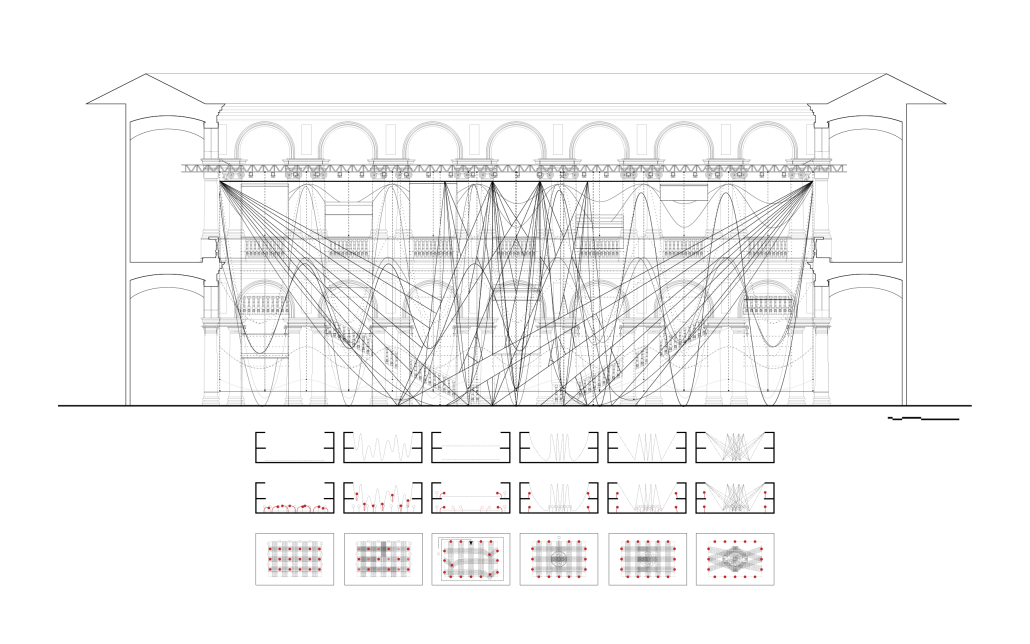
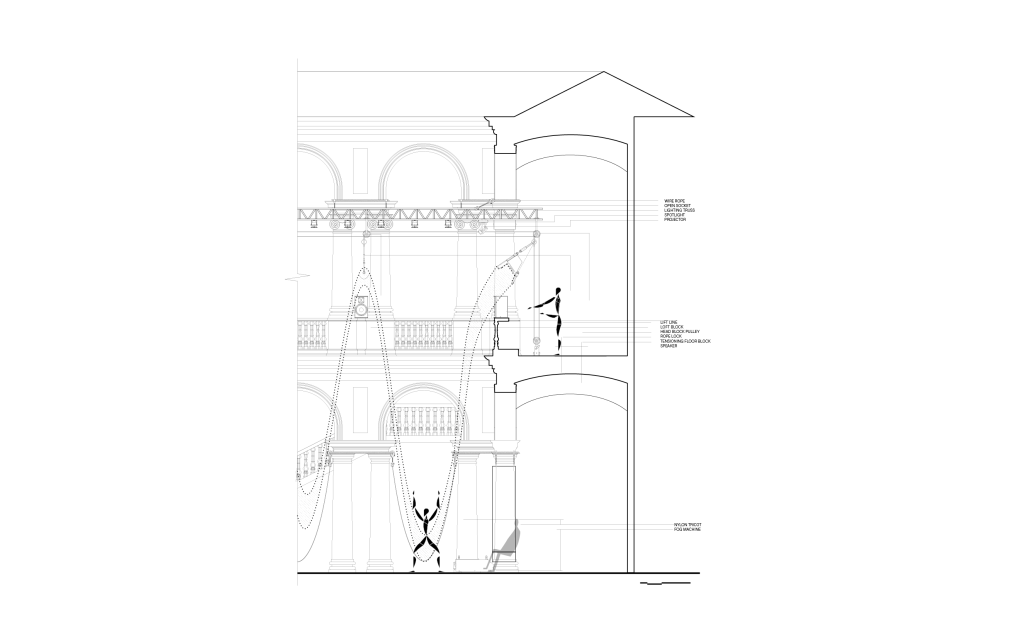
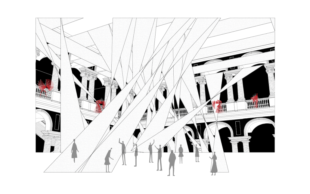
About Time: Redressing the Runway breaks down the fourth wall between consumption culture and the global fashion supply chain. Sited in the Brera courtyard arches of Milan, Italy, semi-transparent fabric draped as catenary arches as a runway set design transforms throughout the show to communicate flow, movement, excess, contamination, and suffocation associated with the fashion industry. Generally used as a construction element in fashion, the fabric becomes redefined in the runway show to expose the underbelly of the problematic industry. Created for the intention of desire and spectacle, runway shows encourage consumption and even overconsumption, employing allure to conceal the ugly reality of the industry. The terms, “back of house” and “front of house” are used in this investigation to indicate the fashion production process the everyday consumer does not see, and the point of sale retail environment that the consumer experiences, respectively. The show is divided into three acts to immerse the audience in the fashion production process in its entirety to create awareness of the backstage conditions the everyday consumer doesn’t see. Walter Benjamin’s The Arcades Project and Guy Debord’s The Society of the Spectacle offers philosophical insight on consumption and commentary on the arch typology as a symbol of the fetishization of commodified goods and experiences. Through draping, stretching, and layering, the fabric is manipulated in a number of ways throughout the runway show, which is transformed with and by a choreography that mirrors the bodily labor of workers. The transformation of fabric explores the material’s spatial and temporal possibilities in the runway, creating moments of tension, movement, and contradiction. Through presenting such issues in a theatrical format that reveals the “back of house” underbelly through a “front of house” runway presentation, the hope is to propose alternative solutions for a more sustainable and ethical practice.

This project won the 2023 Outstanding Thesis Award.

Instagram:@tricxajane, @SherylVazquezarchitecture

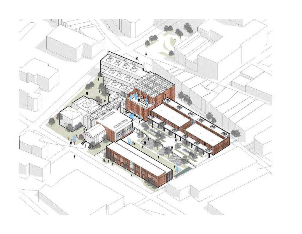
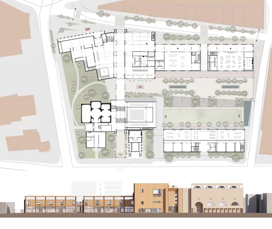
Portland Museum of Art Expansion by Brena Daly, B.Arch ‘23
University of Oregon  | Advisors: James Tice

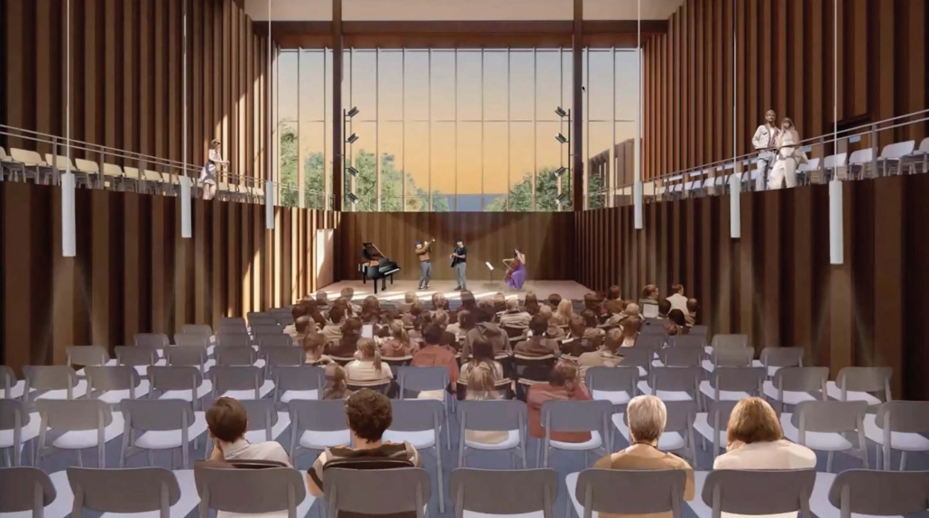
This thesis-level architectural studio at the University of Oregon was based on an international architectural competition sponsored by the Portland Museum of Art, Portland, Maine for the expansion of its landmark museum designed in 1982 by Harry Cobb of I.M. Pei & Partners. The studio accepted the basic parameters and goals of the competition brief of 2022 for expanded galleries, services, and community space to enhance and unify the existing campus of historic structures and landscape gardens. In addition, students were challenged to expand the program and the site beyond that required by the competition to include the entire city block on which the museum is located. The idea is to engage the unique urban setting of the museum in the historic center of the city on Congress Square and Free Street. The design challenge, then, was to expand the PMA building and campus and to create an urban art center for the entire city of Portland, enhancing its unique physical and cultural context. The studio focused on urban design, sustainability, community engagement, and use of local materials. The goal was to honor the existing PMA and its context in the city and expand its program and facilities for the larger community. The design by Brena Daly, shown here, met these challenges by expanding the existing museum with a north-south public arcade that connects with neighboring streets and major program elements. Beyond new galleries for the museum, the project envisions a public garden, performance hall, community ‘maker space’, and community classrooms. The facade was designed to complement Cobb’s arcuated facade of brick, using similar proportions and regulating lines employing local terra cotta. The structure features mass timber, keying into native materials of the region. A roof top restaurant and sculpture terrace overlook the harbor to the south connecting visually and symbolically to the Portland’s historic waterfront.

See you soon for the next series of the Student Showcase!

2023 Study Architecture Student Showcase - Part V

Welcome back to another installment of the Study Architecture Showcase. In week 5 we focus on student architecture projects that discuss the innovative ways in which software can redefine traditional approaches and contribute to the creative process.

Color Space: From Image to Object by Aileen Zaldana, B.Arch ’23
Woodbury University | Advisor: Mark Ericson

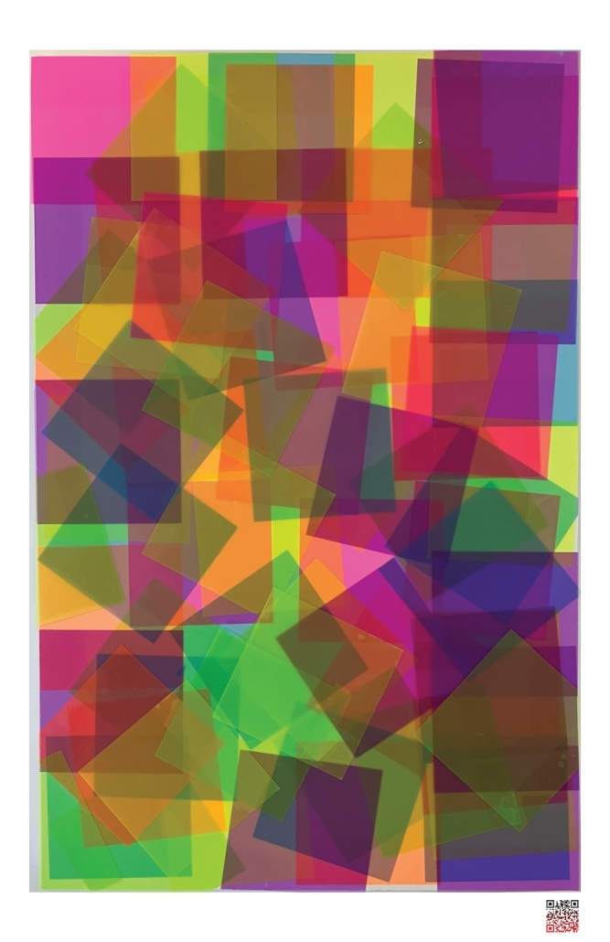
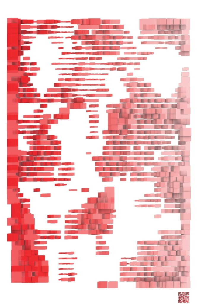
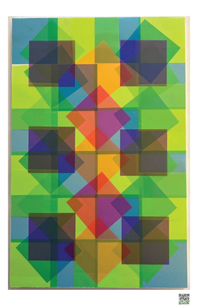
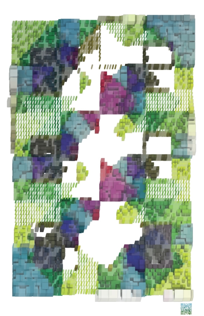
Color Space: From Image to Object is a project that examines the role of images in Architectural production. It began with a careful study of Josef Alber’s Interaction of Color and translated its methods into a software plugin Rhinoceros 3D™ written in the programming language of Python. The project challenges the dominance of architectural drawing by developing software for producing three-dimensional objects from two-dimensional images. The software uses the properties of color associated with each pixel in an image and user inputs to generate a three-dimensional object. While Architecture continues to prioritize the drawing over all other media, this project proposes the image viable medium for the production of architectural form and space. Furthermore, by centering the work in the production of a software tool to be used by others, the project offers a model for distributed authorship in lieu of the more common model of single authored thesis projects. The software is the thesis project and the images and objects are products of other students, friends and family use of the software tool. Color Space is a collaborative tool for the production of architecture from images. If offers not only an alternative mode production—from image to object—but also an alternative form of authorship.

This project was selected for inclusion in Woodbury’s End of Year exhibition entitle MADE.

Instagram: @_z.a.e.z_, @m_cericson

Digital Endemicity: Localized Characteristics for Architectural Fabrication by Gabriel Garofalo, M.Arch ‘23
Toronto Metropolitan University | Advisor: Prof Vincent Hui and Jason Ramelson

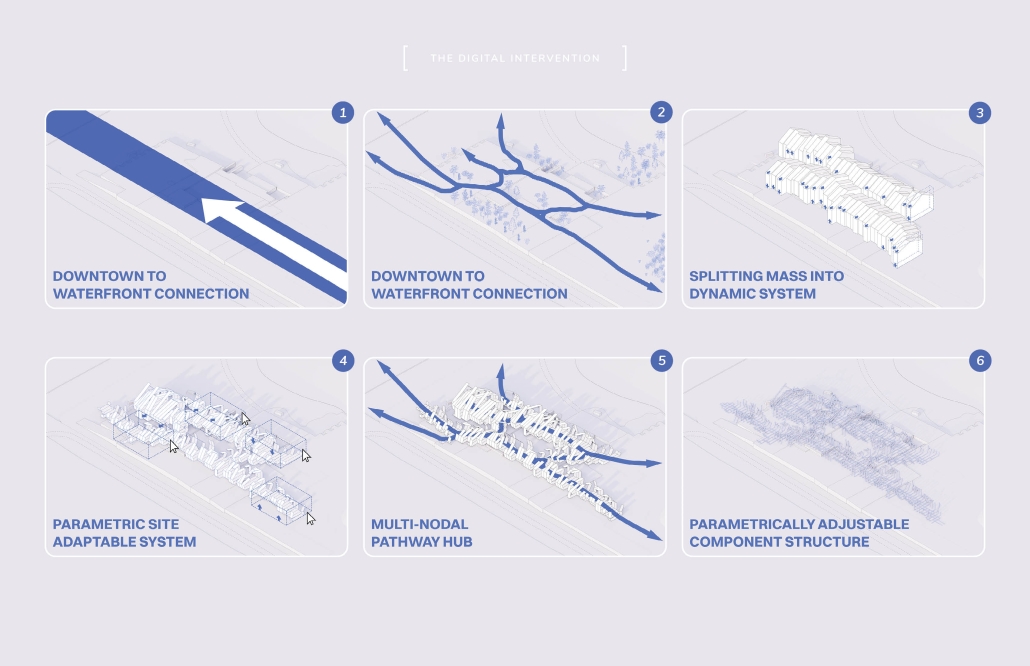
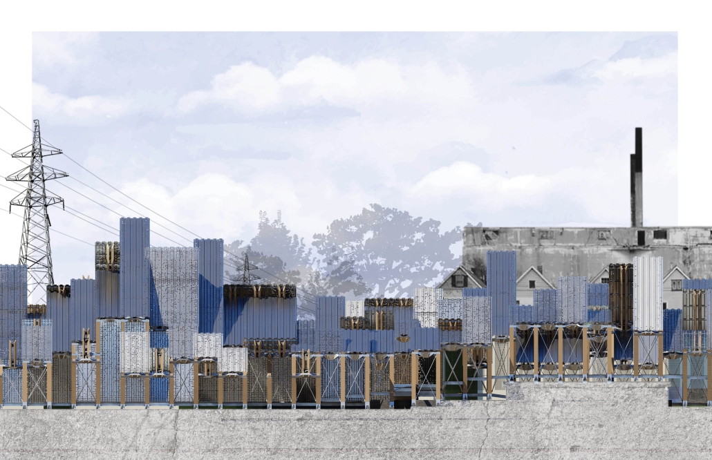
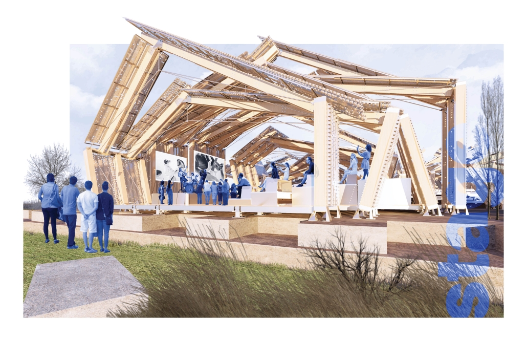
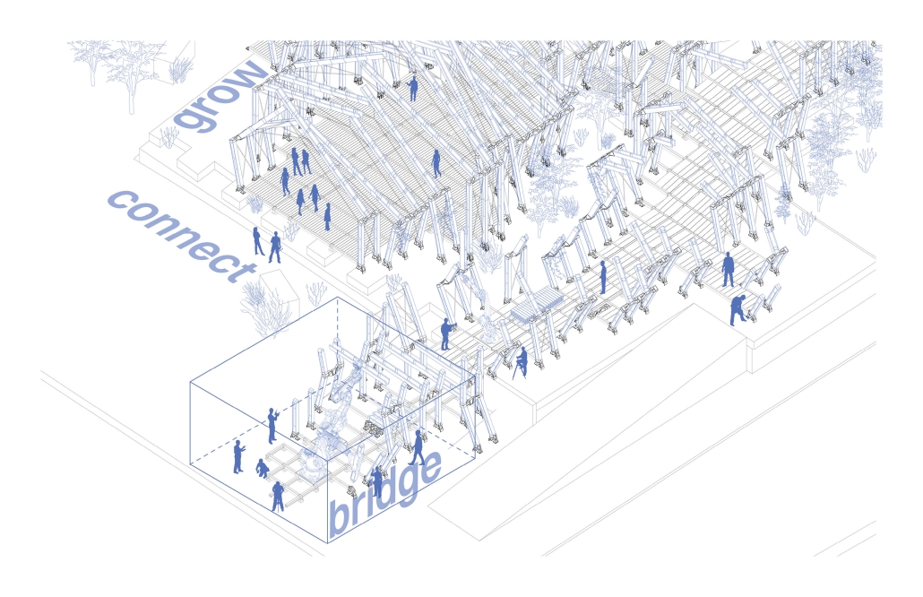
The architectural industry and academia have standardized the use of digital tools. From the drawing of a line, to the fabrication of a wall, all architectural processes are intertwined with digital interpretations. Technology merged with contextual knowledge has the ability to inform future advancements in digital fabrication. As digital tools encompass the architectural industry the direction of implementation is crucial to the future built context and its relationship to its physical environment. The current disconnections between object and place is evident in contemporary digital architecture and parametric design. Endemicity, in this context, refers to specifically localized elements within an environment. This thesis project highlights how future digital technologies and existing endemic elements can be blended into a system of fabricating architecture. Through extensive reflection of meaningful definitions of localized materiality, tools, methods, knowledge and social contexts, conceptual frameworks for extracting, fabricating and assembling have been defined. This in turn results in a digitally endemic process that can be applied to unique environments with differentiating programmatic uses. This process was tested within a brownfield urban site in Hamilton, Ontario. Here data and analysis resulted in the digital design of components and processes for fabricating. The architectural intervention lightly cascades across the uneven terrain and provides an urban connection to the waterfront from the city’s downtown core. Additionally, the digitally fabricated and robotically assembled system is a hub for local creativity, holding performance stages, and creative marketspaces as nodes along the urban pathway. The architectural components and the in-situ construction strive to develop ties with the community and evoke a sense of locality to their built environment. At this turning point in the making of architecture, there exists an ability to guide the use of digital tools to define an architectural character that enhances the built object and the inhabitants relationship to their environment.

Atlas of Memory: Representation of the invisible in architectural drawing through generative coding by Julia Lopez, M.Arch “23
Arizona State University | Advisor: Elena Rocchi

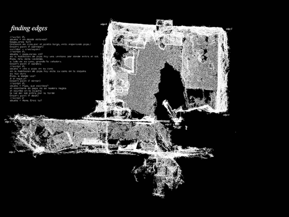
How do we draw the space of the invisible? This thesis starts to question and investigate the use of speculative architectural representation as an allegorical narrative fiction to reawaken faded memories. Through the use of generative coding, fragments of stories can be used to stimulate the imagination and help us to start to represent the invisible. This will ultimately allow multiple voices to be heard together, even when they represent stories from different times. Memory is not just a recall of past events but it is an active process that shapes our perception of the present. Memory is not a linear narrative but a fragmented and subjective experience. Our memory of physical spaces are not just passive recollections, but active constructions that shape and constitute our sense of self and identity. This project starts to and investigate how coding programs like p5js and touch designer enter and support the representation of architectural drawings and the invisibility of memories by means of stories and finds a new methodology in which generative coding provides a perfect mesh between speculative and the tangible; to make the invisible, visible. Throughout the course of this project the representation of the invisible took on a personal approach as the following study observed and recorded my grandmother’s transition of life and her own unconscious and conscious state, which had been in continual flux for 5 months. During her moments of hallucination, she would take it upon herself to draw and through the use of generative coding I have been able to investigate the overlay of her drawings into the coding program one in which the system is able to measure data points that can now be used to process the representation of the space she was inhabiting; the invisible. This ultimately resulted in an atlas of memories. Her memories.

This project was selected for The Design School Design Excellence Award in Spring 2023

Instagram: @julia.a.lopez

THE EMPHATIC ESCAPE by Chawin Wongsrisoontorn, Sree Vandana Bendalam, and Raymond Du, M.Arch ‘23
University of Illinois at Urbana-Champaign  | Advisor: Yun Kyu Yi

Recently, the use of machine learning and artificial intelligence (AI) has been emerging in various artistic fields and professions, including illustration. AI is now not only used for representing designs but also as a generative tool for visual art. OpenAI tools like Stable Diffusion, DALL×E, and Midjourney enable the generation of images without the need for skilled experts. Users can simply input a text that describes the scene or desired characteristics, and the computer generates images that match the description.

These new tools are not only shaking up the visual art domain but also have the potential to impact the future of architecture and architects. The once undeniable domain of creativity for architects no longer exclusively belongs to them. As architects, will we still remain the sole creators of designs? This project is an outcome of research studio that aims to speculate on the future use of AI as design generators and explore the role of architects within this context.

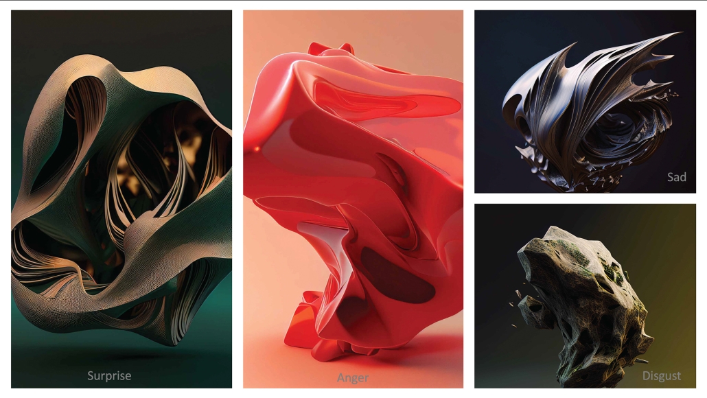
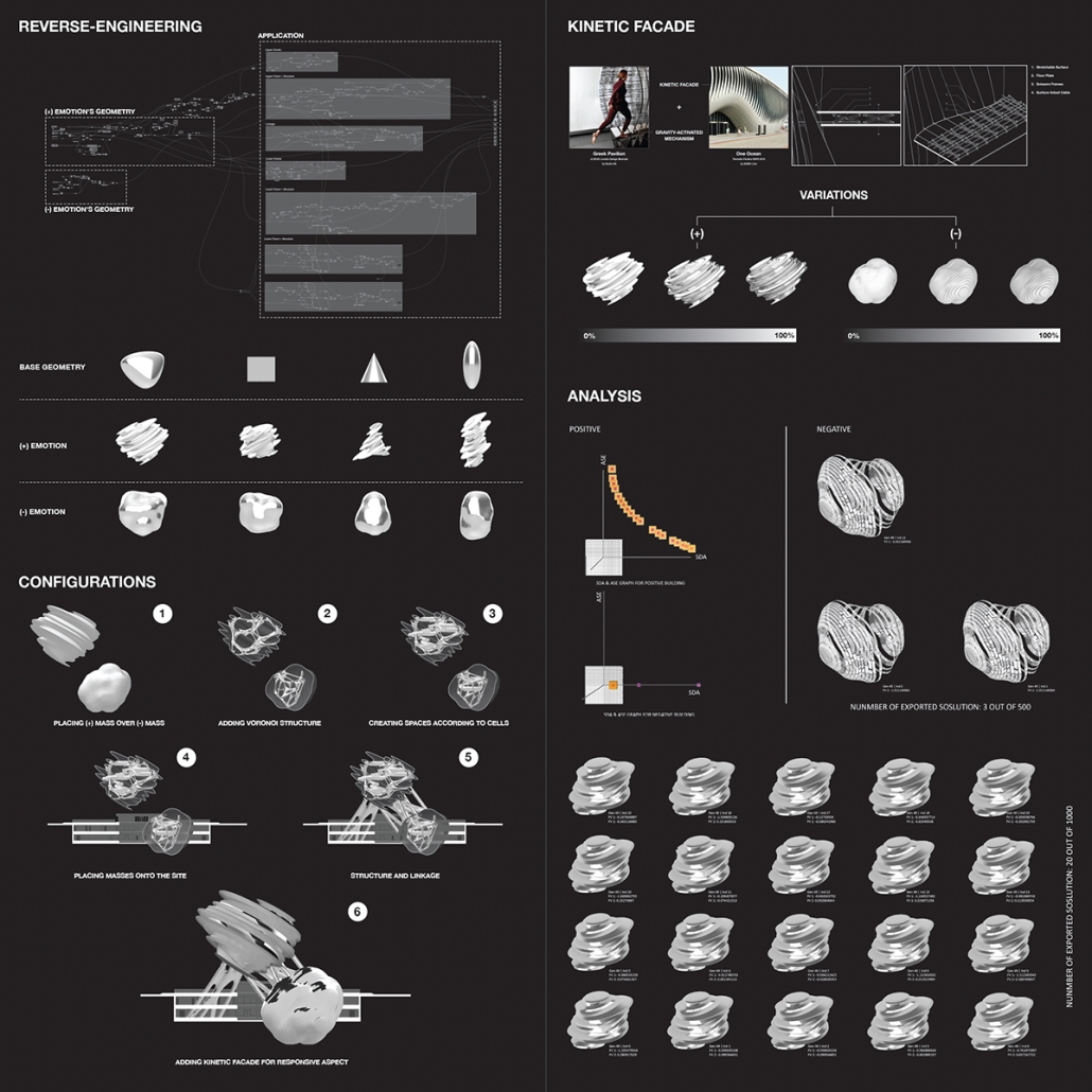
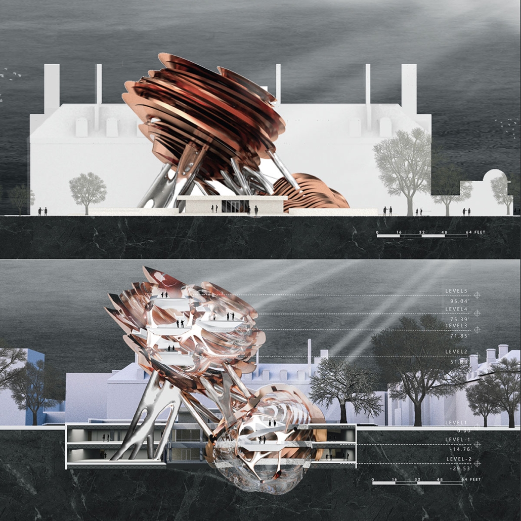
The project utilized Facial Expression Capturing AI to analyze participants’ emotional expressions on morphing geometry and find a form that captures different surveyors’ emotions, which was then used to generate a building form. In order to convey changes in emotions through the building’s facade, the project developed a kinetic facade system that changes its appearance based on the density of occupants in the space. Additionally, a multi-objective optimization method with a machine learning algorithm was employed to determine the size of the kinetic facade system.

This project won second place in the University of Illinois at Urbana Champaign Design Excellence Awards.

Instagram: ral_isoa, redrum_du, chaawin, i.n.f.i.n.i.t.e_loop

See you next week for the next series of the Student Showcase!

2023 Study Architecture Student Showcase - Part IV

Given the current discussions around the built environment, architecture and the effects of war at this time, let’s take a look at the student work that focuses on just that. This week we delve into projects that study the effects of war.

Haven by Naya Aslan, B.Arch ’23
American University in Dubai | Advisor: Abdellatif Qamhaieh, PhD

As a result of the civil war in Syria, many Syrians left the communities they lived in and became internally displaced persons, living in informal camps around Damascus, the capital of Syria. As a result of this displacement and the overall violent events, a sense of loss and disorientation overwhelms these communities. They are also entirely neglected by the regime and live in peripheral areas of the city in run-down, poorly-serviced informal camps.

Haven is a project proposed to reintegrate these communities into the city and re-introducing them to their Syrian heritage. The aim is to restore their national pride and remind them of what it means to be Syrian. The project represents an ambitious design that combines architecture, heritage, and landscape interventions.

This project received the American University in Dubai Senior Showcase – Second Place Award.

Instagram: @naya_aslan, @abdellatifqamhaieh

Seeds of Hope by Narges Abdul Aziz, B.Arch ’23
American University in Dubai | Advisor: Anna Cornaro, PhD

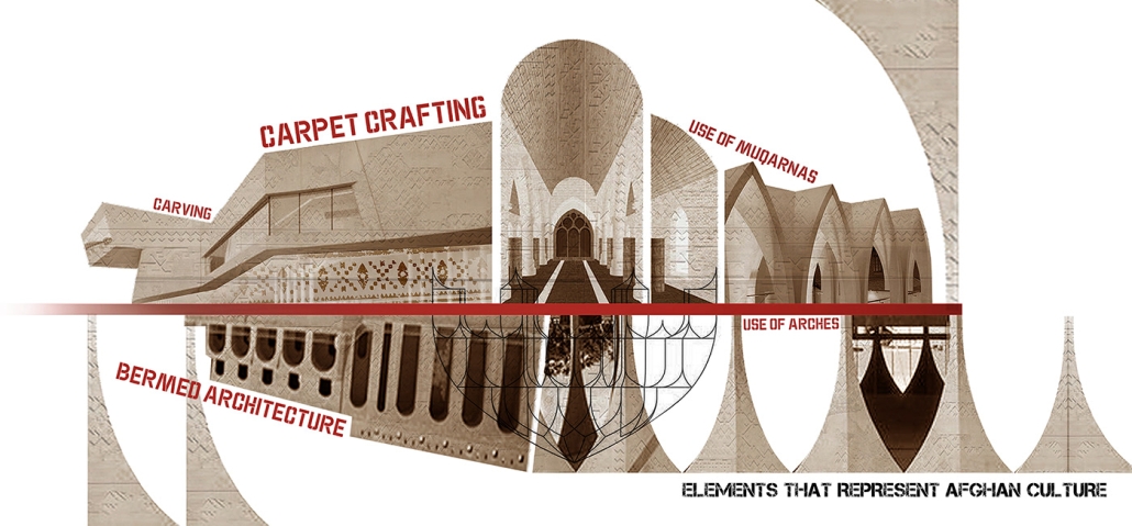
The Taliban’s takeover of Afghanistan on August 15, 2021, has resulted in significant consequences affecting the country’s cultural and national identity while also depriving its citizens of fundamental human rights. The situation raises questions about how the Afghan community residing outside the country can aid the cultural connections beyond the nation’s borders.

The rise of the Afghan community in the UAE can not only help overcome the loss of Afghan culture, identity, and heritage but also connect people of different nationalities through its intertwined culture. Over many centuries, Afghanistan’s culture has been shaped by its neighboring countries and the Middle East region, with influences evident in its language, music, architecture, and hospitality. These cultural traits provide a unique opportunity for people from different countries to explore Afghan culture, find common ground, and establish strong bonds.

This project aims to preserve Afghan culture and heritage while fostering connections among diverse individuals. The UAE’s multiculturalism makes it an ideal location for this initiative. The Afghan community in the UAE can leverage this connection to strengthen cultural ties and create a more unified society based on shared interests and goals.

This project received the American University in Dubai Senior Showcase – Third Place Award.

Instagram: @annacornaro

Olivewood Ties by Samantha Miller, MLA
University of British Columbia | Advisor: Fionn Byrne

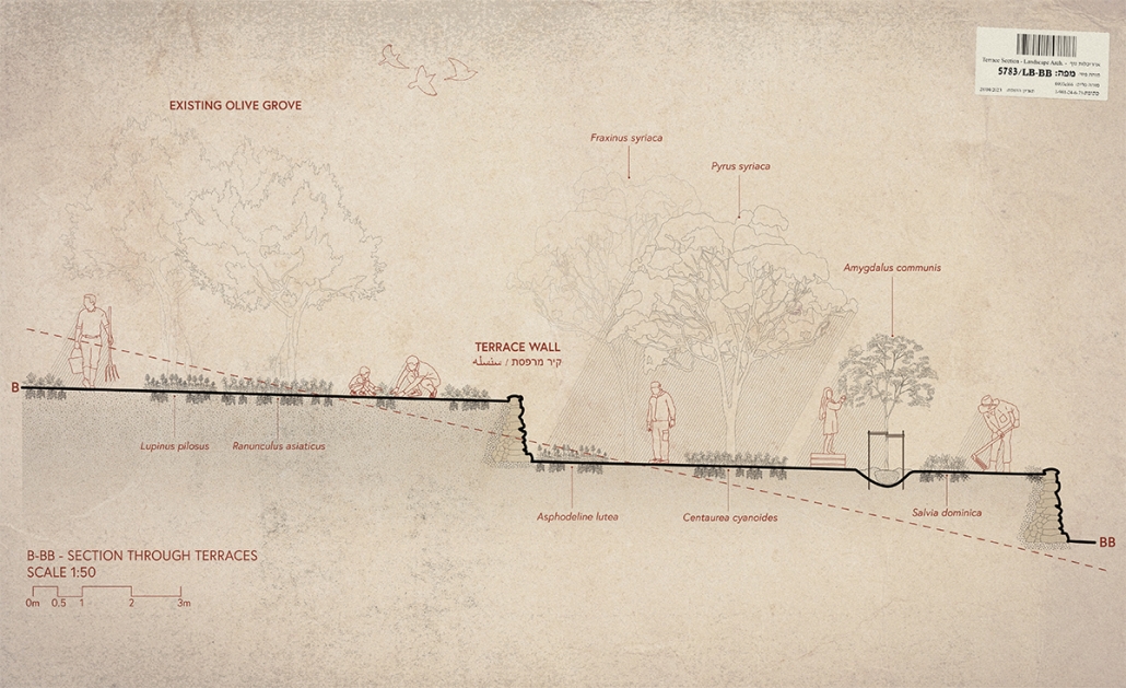
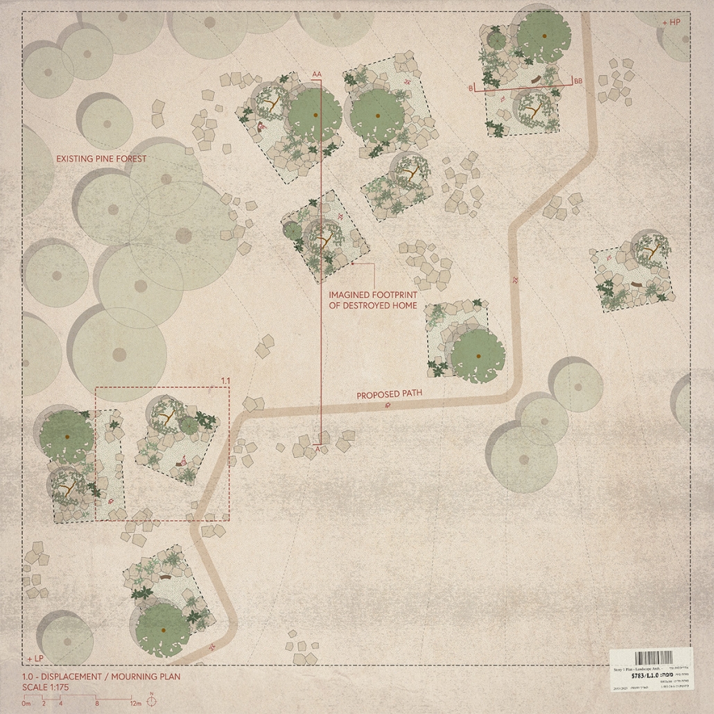
Past and present peace negotiations have failed to propel Israelis and Palestinians to coexistence and liberation. These nations have conflicting collective narratives that make it challenging to accept the legitimacy of the other’s right to exist. Furthermore, physical barriers to peace, such as the nearly 800-kilometre separation barrier, erode possibilities for interaction and human connection. This academic endeavor challenges the myth that peace and war are binary and cannot exist simultaneously. Upon the acceptance that the consequences of war are sociocultural and spatial, we can begin navigating a spatial strategy for peace-building. Both groups share a deep-rooted love and respect for the land they call home or dream of one day returning to. Because of this, these communities have enmeshed realities, and their futures are both tied to each other and the land.

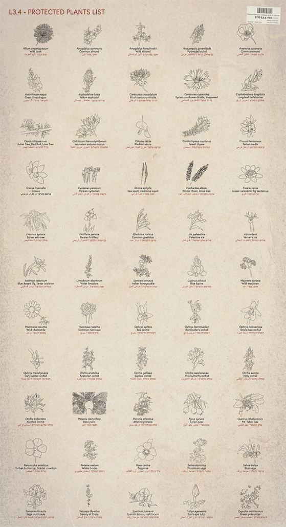
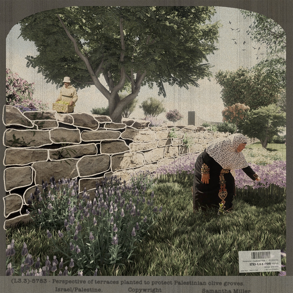
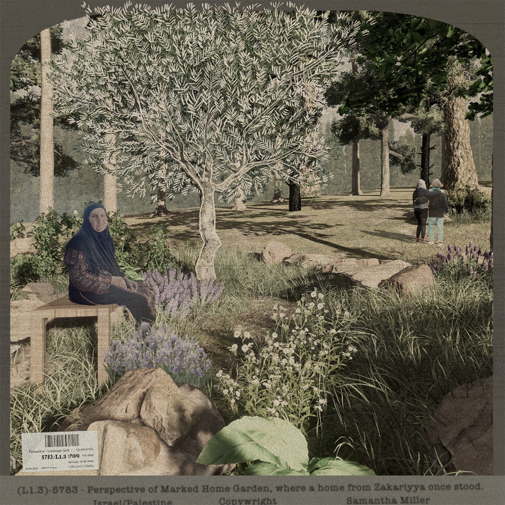
Olivewood Ties investigates how landscape can be a peace-building mechanism in the divided context of Israel/Palestine. Presently and historically, trees like the pine and the olive were proxy soldiers, employed in war-fighting, land acquisition, and nation-building. If trees and flora were instead proxy peace-builders, what implications do different landscape design strategies possess and moreover, what opportunities do they offer as a mechanism toward healing and unity?

The three design proposals are framed as ‘stories/counter stories.’ Their sites and stories are chosen due to their proximity to the wall, their history of trees being used as a weapon or nation-building tool, and their opportunity for peace-building or healing at different scales. The proposals offer strategies to find peace within war and heal lands and peoples simultaneously. In this way, we can acknowledge facts on the ground, power imbalances, and traumas and respond to them with empathy. Ultimately, this project aims to reveal the faces of perseverance, the activist groups who unite Israelis and Palestinians, and the trees who bore witness to the tears of suffering and celebration of liberation.

This project received the Dr. John Wesley Neill Prize.

Instagram: @millersami, @fionn_byrne

People, Parts, Production. by Brandon Chin, M.Arch ’23
University of Southern California | Advisor: Lisa Little

The exponentially growing migrant and refugee populations of Iztapalapa, Mexico City requires a new typology strategy and system of parts. Through explorations of human scale, the parts create housing, an educational institution, and healthcare facilities for the displaced. The design intent plays with the placement and orientation of interconnected parts to be mass-produced and mass-customized whole.

The United Nations defines a megacity as a place which has a population of 10 million or more people. Current data shows that Mexico City (CDMX) is ranked 7th in the world with a population of 21.9 million. This geographic location is also a destination place for the forcibly displaced people (refugees) and according to Bloomberg, Mexico received more than 100,000 asylum claims in 2020 – 173% more compared to 2019. More specifically, Iztapalapa – the densest populated suburb in CDMX – is a site of asylum for the displaced and unfortunately possesses slums and homelessness. Iztapalapa is one of sixteen regions in Mexico City and has a population of 1,835,486.

With neighborhoods like Iztapalapa, it can be subject to “high levels of concentration of large numbers of people in specific areas; high levels of consumption and production; uncontrolled development and land-use deterioration due to a lack of effective planning policies; high levels of air pollution due to the excessive use of private vehicles; high demand for water, and a dependency on fossil fuels for energy” (Madero, Morris). While these data points prove to be consistent with megacities across the globe, the problem here is that inhabitants in Iztapalapa lack what many of us have access to – which is housing, healthcare facilities, and education. Leveraging the concept of participatory frameworks and redistribution of resources, the Discrete model will identify a framework to generate a program targeted to building spaces for the displaced to live in, have access to healthcare, and occupy spaces to learn.

This project received the USC Master of Architecture Distinction in Directed Design Research.

Instagram: @b.hart.c, @lisa_k_little

Jeong at the Joint Security Area (JSA) by Lianna Moze and Jason Chavez-Carballo, B.Arch ’23
New York Institute of Technology | Advisor: Dongsei Kim

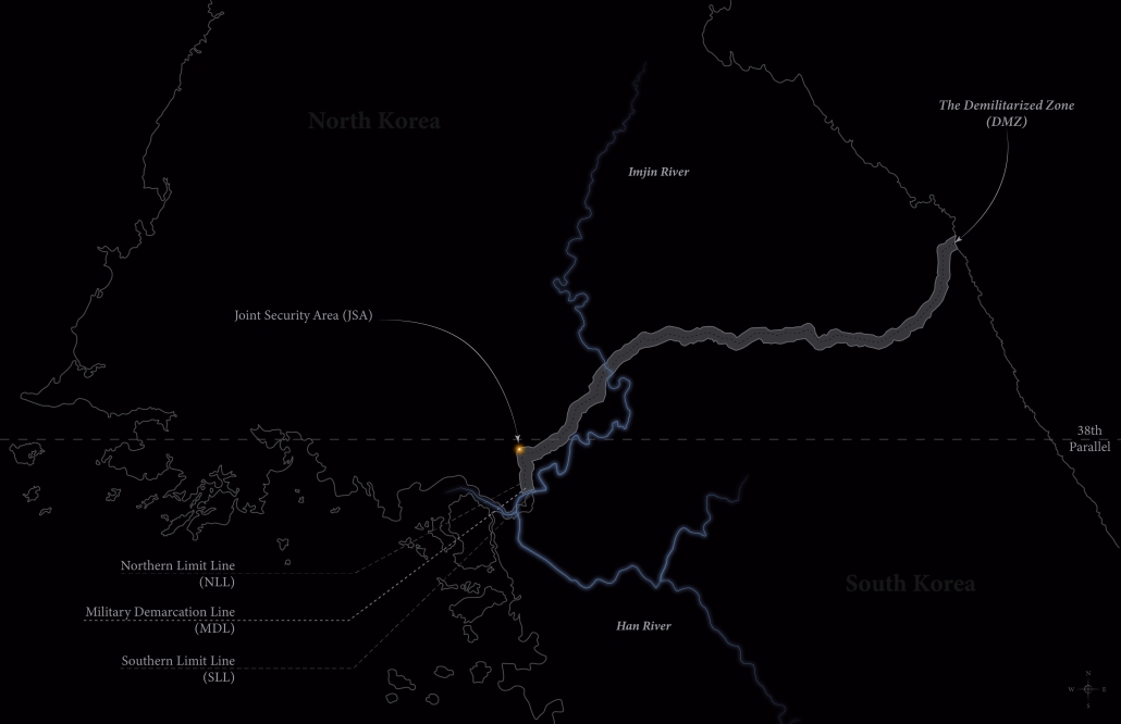
The Demilitarized Zone (DMZ) between North and South Korea is one of the most militarized areas in the world. Protected from urbanization for the last 70 years, the DMZ has become an involuntary park for flourishing flora and fauna with minimal human intervention and a relic of the Cold War.

“Jeong at the Joint Security Area (JSA)” is located at the center of the conflicted border between North and South Korea. The proposal reimagines this politically tense DMZ as a new cultural center that focuses on the shared history and culture between North and South Korea before its division.

A new relationship between North and South Korea is built over time by building this project in this politically charged space. Programs such as Korean-themed Temple Stay, Farm to Table Restaurant, Culinary School, Theater, and DMZ Museum are utilized to transform existing buildings used for security and meetings at the JSA into spaces that activate shared values and history between the two Koreas. Senses related to eating, conversing, playing, learning, and leisure are amplified to activate the notion of “Jeong” (Korean for meaning “affection,” “attachment,” “love,” or “intimacy) between the people of the two Koreas.

Instagram: @jsc_designs_, @little.lianna_, @jasontaco2, @dongsei.kim

Changes: Tracing Time by Zeina Lotfy, B.Arch ’23
New York Institute of Technology | Advisor: Dongsei Kim

The Demilitarized Zone (DMZ) between North and South Korea is one of the most militarized areas in the world. Protected from urbanization for the last 70 years, the DMZ has become an involuntary park for flourishing flora and fauna with minimal human intervention and a relic of the Cold War.

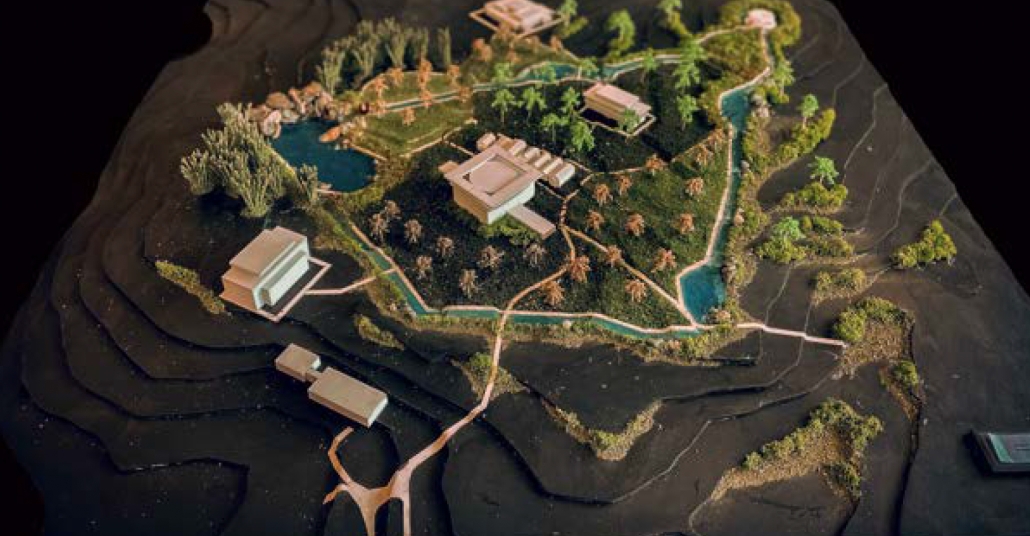
“Changes: Tracing Time” is inspired by the rivers and ecological flows that cut across the political border between North and South Korea. It focuses on the constantly changing characteristics of nature and how it can initiate change to the stalemate between North and South Korea. The project is placed directly on the Military Demarcation Line (MDL) at the Joint Security Area (JSA) to transform the human-made political line into an ecologically driven reconciliatory space. Further, the project attempts to project an alternative future amplified by natural processes expressed through water flows and seasonal change.

The project’s trails follow the existing undulating topography of the landscape parallel to the flows of the water and existing buildings. The pathways are weaved with programs such as the gardens inspired by traditional Korean Gardens that encourage the users of the space to engage with the surrounding nature. Native flora and fauna that have symbolic and ritualist significance to both Koreas, such as the Korean Red Pine and persimmon trees, are mediated by the project’s architecture and landscape that aspire to resolve the seventy-year-old conflict and divide.

Instagram: @zeina.designs, @dongsei.kim

See you next week for the next series of the Student Showcase!

2023 Study Architecture Student Showcase - Part III

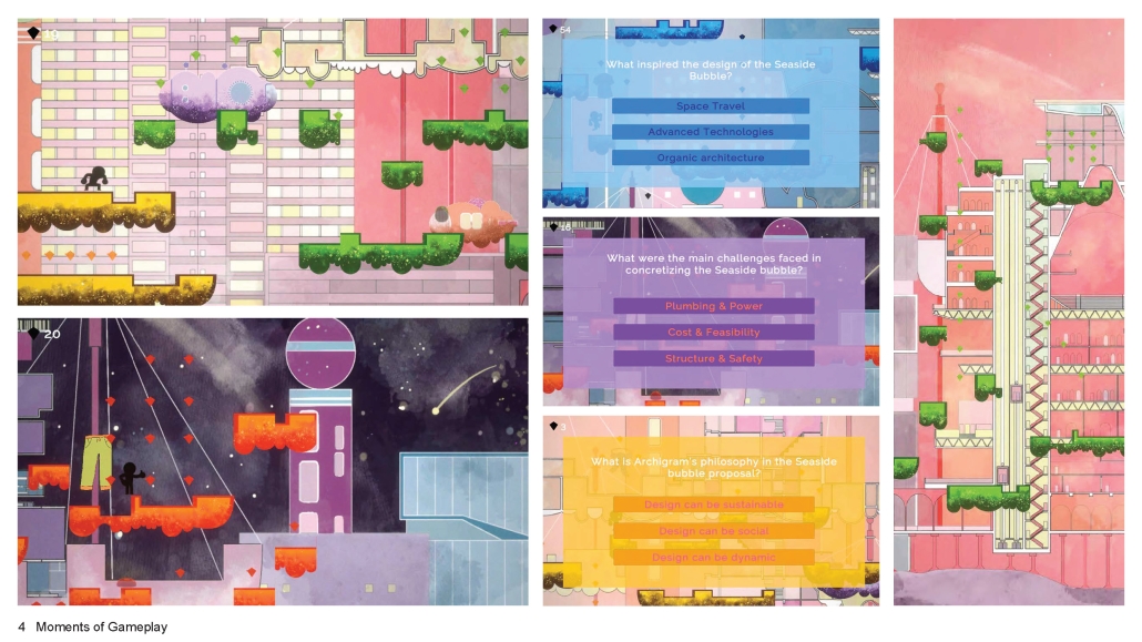
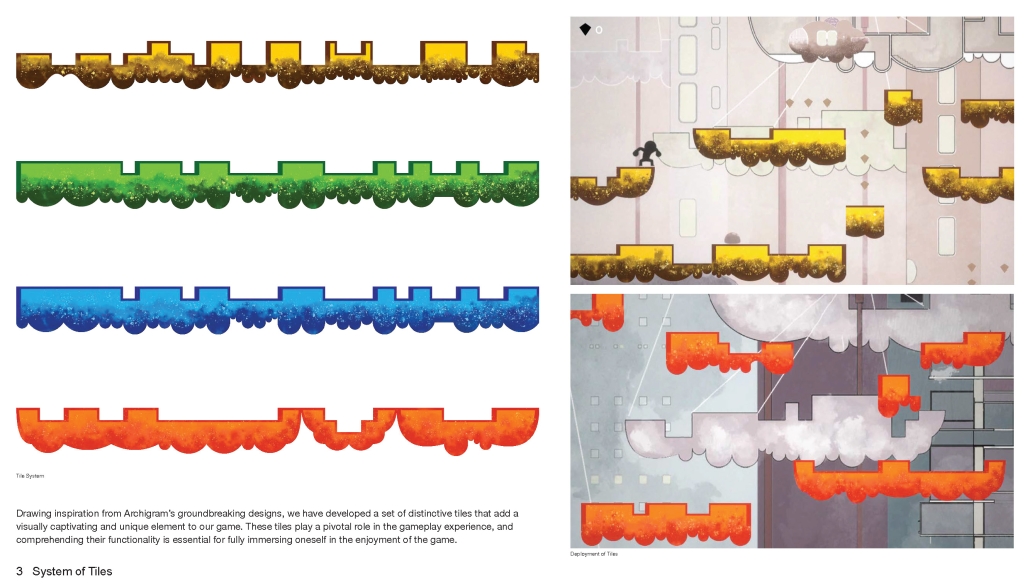
This week the 2023 Student Showcase takes a broad look at buildings and parks on university campuses. We look at a couple of design build projects completed by architecture students as well as adaptive reuse designs and new builds that aim to evolve architectural education curriculum through wellness and sustainability. Shifting gears slightly we also feature a video game that inspires architecture learning, after all campus should be a space that encourages enjoyment while learning.

We hope you enjoy this week’s collection of student work and come back next week for a new installment.

Commensalis by Dakota Witte and Dylan Moyano, B.Arch ’23
Washington State University | Advisor: Vahid Vahdat

Commensalism is a biological relationship between two organisms in which one benefits while the other derives neither a benefit nor harm. Here at Washington State University, creating relationships amongst the design disciplines is challenging at the very least. Students are expected to become masters of their own curriculum, however in design, we are also expected to share knowledge with our cousin disciplines. This ideology has become a greater necessity as miscommunications between designers and builders create complications in the design process. The origin of these obstacles can be attributed to our academic backgrounds. A lack of communication can be attributed to the traditional academic architecture practiced amongst universities.

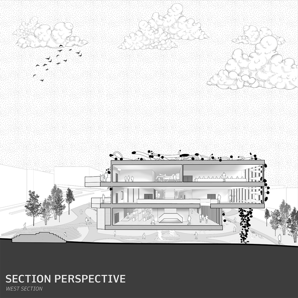
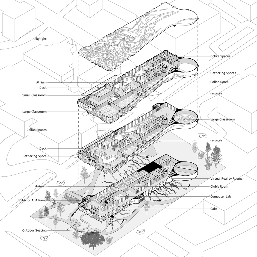
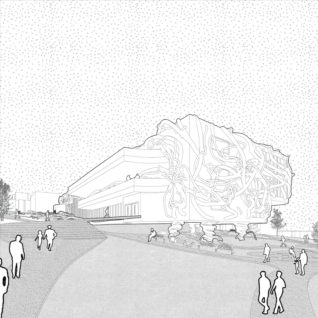
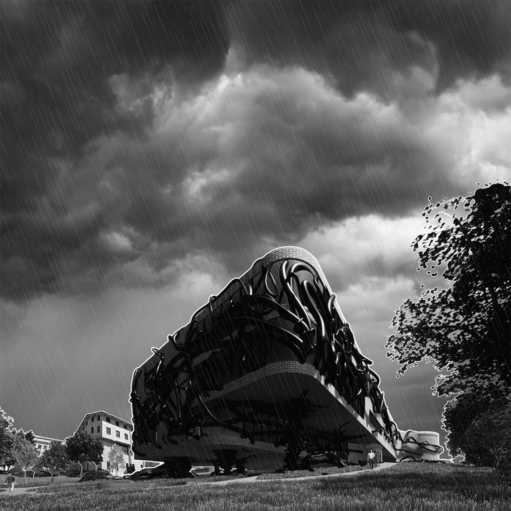
Our goal in this project was to innovate this narrative and create both a physical and psychologically alternative to the educational practice of design. We set out to create a commensalism between design disciplines and the academic system. Our site was located on the South end of WSU’s campus. As a prime location, we began creating an academic building for both engineers and architects. The unfamiliar organism’s veins stretch and pull through the natural scenery. Initially seeming like something out of the Twilight Zone, further innovation within our environment gives a drastic alternative to the organism as it begins to create flower beds and public benches that surround the structure. Exterior cladding of our structure uses traditional red brick to pay respect to the surrounding architecture of campus.

We felt it was important to iterate that our intentions are not to change higher education itself, but rather change the systems we have been using for hundreds of years. To show this, the organism has begun to encompass the exterior of the structure changing its shape as it begins spreading throughout campus. The interior of Commensalis creates a mix of both public and private spaces with a heavy emphasis on interdisciplinary collaboration. This first level is home to a large museum space meant to display the projects of various students. The second and third levels of the structure also hold multiple public and private seating areas to encourage a variety of study methods.

Instagram: @dakota.witte, @dgm.design2022, @3rdscript

ArchiLounge by Neroly Mora, Daniel Gribben, Michael Anzalone, Kayla Dawson, Kianna Ladue, Julia Dorr, Abby Lumpkin, Nate Simpson, Lauren Trippiedi, Charles Vasas, Joe Walsh, Serene Martens, M.Arch ’23 and B.S. Arch ’23
Norwich University | Advisor: Tolya Stonorov

Our typical SoA+A design build program has an outward, community focus – this is based on our belief that architecture can help people through providing solutions to society’s problems. This year, however, I was able to teach a design build studio that had a special opportunity to look inwards and focus on our own SoA+A community.

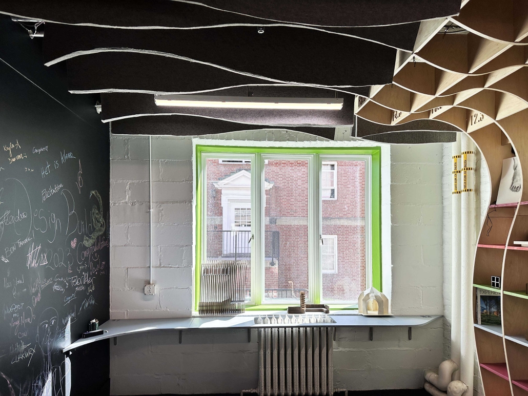
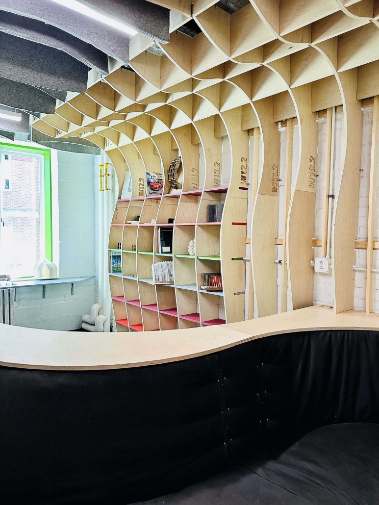
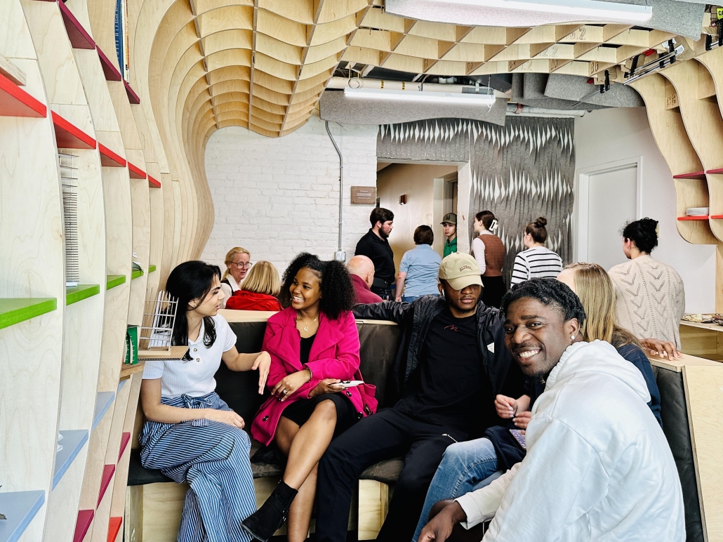
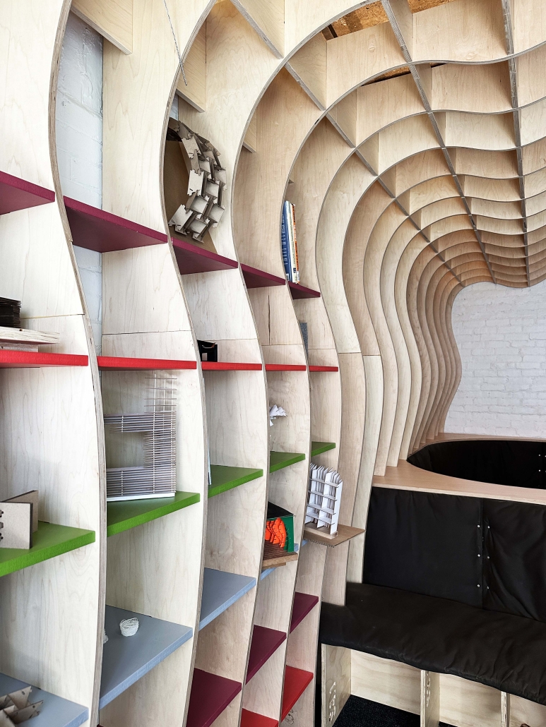
The ArchiLounge design build studio focused on the design and fabrication of the student lounge in Chaplin Hall as well as an overall look on how we could bring our current branding into the building. The studio reimagined and redefined what was needed and proposed an innovative, material rich, dynamic solution. This began with an outreach effort to the entire SoA+A community to determine what program the space should encompass. As part of the lounge, the studio incorporated a memorial to Donovan Kurt, a beloved architecture student who tragically passed in 2022.

The studio’s main focus was on investigating and redesigning the student lounge in Chaplin. This began by understanding how to draw as builts, a tool used in most architecture offices. We conducted a model-focused precedent study and a Surface + Joint study with an emphasis on digital fabrication, both in terms of the joint and overall spaces. We worked with our digital fabrication tools: 3D Printers, CNC router and laser cutters and a CNC router workshop was taught after our initial research. The bulk of the studio involved a heavy investigation into materiality and making. We poured concrete, worked with fabric, wood and metal. While each student had an area of study and is developing expertise, it was my intention that each student contribute to all aspects of the project through group discussions. In order for these group discussions to be successful it was imperative that the studio have an atmosphere of open dialogue. While we discussed and critiqued ideas, we made sure that we were not excluding people from contributing to this process. Working across the table was also an opportunity for all of the studio to learn more about how we all solve problems. I worked many hours outside of studio to try to ensure a successful group environment. This studio had the most cohesive group dynamic that I have experienced in my 11 years of teaching.

The design build process is a ground breaking pedagogy that encourages students to problem solve, think together, and make real design innovations in the field. Students learned that their drawings had real meaning and tangible implications. The studio had extensive community engagement as we worked with the SoA+A students, faculty and staff. Community-focused work in design build studios consistently demonstrates that holding community activism as a goal, yields a rich student experience as a result. I believe that this impact is two-fold: 1) students gain confidence because they are entrusted to design and build a real project and thereby achieve results outside of their comfort zone and 2) they are able to see concretely how their own work can help the community.

Through the design build experience, students shape a personal, more inclusive, definition of the architectural process and its tangible social and economic impacts. Working with the team of 12 architecture students was fantastic, but also challenging. The students were consistently motivated and worked cohesively to produce a beautiful building. Students repeatedly described these design build courses as some of the most valuable of their architecture education.

Instagram: @eaglewolf_14, @_juliadorr_, @abbylmpkn, @stonorovworkshoparchitects, @norwichdesignbuild

Voiland College Student Center by Chenlu Zhang and Luke Nye, B.S. Arch ’23
Washington State University | Advisor: Vahid Vahdat

In this project, we used a variety of software to build a workflow (rhino, revit, enscape, photoshop, to ensure a high level of finished product quality in a limited time.

The link between creativity and schooling has always been a difficult relationship to explain. In the fields of architecture, engineering, and creation, a heavy amount of creativity is required. Creativity requires boundaries to be broken and order not to interfere, which is a direct counter to that of modern education. As a result of the inherit divide between these elements of education and creativity, “Discrete Rectagular” replicates this relationship in the physical structure.

A cavity-shaped, complex organic structure is present next to solid traditional interior rooms. This cavity shape represents creativity as the solid routine structures represent the order that is required in education. For the spaces to work well together, we decided that the organic shape should hold most of the lounging area required in this site while the traditional rooms should be responsible for the more practical uses of the building. This division of labor further defines the relationship between creativity and order. To not disrupt the shape of the entire site, we modified the existing architectural topologies which in turn influence the structure giving it it’s shape. The loadbearing columns at the base of the organic structure are connected to the structure which displaces the overall weight. A lightweight steel was used for the skin (scaffolding with curtain wall glass) of the building which increases the sense of breathing.

The conventional practice of introducing the outdoor environment is not adopted, but the shell through its transparency is used to release the interior space of the whole building giving a spectacle to engage with. Furthermore, the main entrance is equipped with a similar organic shape to continue this spectacle and desire to be inside. The whole building is made of white light material and metallic material so that its square volume floats in place and disappears. The organic structure is heavily used for lounging as we want to challenge the existing academic architecture typology but not change it completely. Hence we chose to use this alternative style.

Instagram: @clzpurplem, @3rdscript

KCAI DoARC by Jessie Grieser, Kendall Hartley, Halima Moore and Abriana Wilson, B.S. Design, ’23
University of Nebraska-Lincoln | Advisor: Peter Olshavsky, Ph.D.

If education involves “values made flesh,” then what values will be incarnate by the year 2050? To think through the entanglements of this question, third year architecture students were asked to design of a Department of Architecture (DoARC) building on the Kansas City Art Institute campus in Kansas City, MO. This effort started from the basis that design education is changing. Our architectural lives, and the education that prepares us to live them well, should aim at our being someone and not just acting professionally.

This 30,000 sq. ft. project, rethought architectural education through curriculum, pedagogy, and the agency of architecture. This new project on the famed arts campus was approached through wellness in connection with sustainable systems. The department was divided into four and one-half levels to support the programmatic needs of its social life. The east and west edges of the building were rounded to create unique campus spatial conditions and maximize view across the Kansas City arts district. The layering of program enables students, faculty and staff to have quality light and in views on three sides. Subtractive gestures on the building’s face to create exterior green spaces and sheltered entrance conditions. Entrances were placed on campus side (facing the quad) and public side (facing Nelson-Atkins Museum) on two different levels to respond to the existing site’s ten foot east-west slope. The facade was develop with white brick to connect to the existing masonry on campus, while the long southern face used glazing and metal paneling to control atmospheric lighting, prevailing winds for natural ventilation, and manage solar heat gain to reduce energy consumption. The external landscape was developed to establish a new social place on a campus that was lacking quality outdoor spaces. Permeable pavers, bio-swales, and native plantings helped managed run-off from the sloped quad while creating a quality natural environment in which student could occupy on the southern end of the intimate arts campus.

Instagram: @jess_grieser, @kendallhartley_, @polshavsky

Cultural Kitchen by Emily Pressprich, Austin Bass, Brandon Garza, Caitlin Truong, David Alvarez, Ian Green, Taylor Sanville, Ivan Cherniske, Kana Takagi, Maddie Crane, Marianne Fitzwilliam, Morocco Branting, Pamela Aymar, Patrick Norton, Radha Iyer and Yessenia Islas, M. Arch ’23
University of Washington | Advisor: Steve Badanes, Jake LaBarre and Miriam Gee

Designed and built by 16 students in the spring quarter of 2023, the World Cultural Kitchen is a gathering and cooking space for visitors, volunteers, and student workers at the UW farm, a 1.5 acre urban farm and educational center on the University of Washington campus. The Cultural Kitchen will be used for cooking and farming demos by the UW Farm, celebrations that are hosted at the adjacent Center for Urban Horticulture, and as a unique meeting place for visitors to the nearby walking trails of the Union Bay Nature area.

The design is a consensus-based group project, working with both graduate and undergraduate architecture students (2 of which are construction management double majors) to create a beautiful and durable structure to meet the needs of the client within an 11 week quarter. After refining a loose program, the class presents their schematic design to the client and then works to develop a construction document set which incorporates client feedback that is appropriate for a tight budget and even tighter construction schedule. By week five, they are building and testing project elements, developing their construction skills, and refining details to preassemble the project elements in studio. The final weeks of the studio involve project layout, site prep, reassembly, and finally a celebratory ribbon cutting as the project gets turned over to the client.

Instagram: @emilypressprich, @aust1n_bass, @caitlinche, @ivancherniske, @crane_maddie, @morocco.branting, @pameaymar, @patrick_norton, @jacoblabarre, @build_lightly, @co.everything, @NeighborhoodDesignBuildStudio

Bubble Rumble by Kathy Bi, Clytie Mak, Tien Pham and Yuzhou Wang, M.Arch ’23
University of California, Los Angeles | Advisor: Feghali Yara

Bubble Rumble is an educational platform-game that draws inspiration from Archigram’s Seaside Bubbles and City Pop aesthetics. Players ascend platforms, progressing from daytime to nighttime, encountering architectural and artistic moments. Trigger questions provide architectural knowledge, emphasizing learning through play. Bespoke tiles, derived from Archigram’s iconic imagery, give Bubble Rumble a distinctive visual language.

Drawing inspiration from Archigram’s groundbreaking designs, we have developed a set of distinctive tiles that add a visually captivating and unique element to our game. These tiles play a pivotal role in the gameplay experience, and comprehending their functionality is essential for fully immersing oneself in the enjoyment of the game.

Instagram: @feghali.yara

Humb.LED by Trenton Scott, B.Arch ’23
Tuskegee University | Advisor: Roderick Fluker and Dr. Carla Jackson Bell

The design proposal seeks to strengthen community-university relations by developing a public park which links two existing sites significant to each: Tuskegee University campus stadium and a Tuskegee community park and recreational center. Both facilities are enhanced and expanded architecturally and promote sports participation and fitness in bringing together members of each community. The shared spatial programming also provides opportunities for the university to strengthen its recruitment pipeline locally and community engagement for students and faculty.

Instagram: @carla_jackson_bell


Head Heart Hands by Tyler Littes, B.Arch ’23
Tuskegee University | Advisor: Roderick Fluker and Dr. Carla Jackson Bell

The project explores the aesthetic implications for a new campus living learning center in the context of the existing historic district of Tuskegee University. Space, program, and material use combine to form an inviting and comforting living environment for students – allowing them to feel empowered to achieve their full educational potential. Symbolically the project employs the themes of head, heart, and hand in addressing student needs, and linking to Tuskegee’s founding, the campus, and the teaching philosophy of Booker T. Washington.

Instagram: @carla_jackson_bell

PASSAGE by Gabriel Valdez, B.Arch ’23
The University of Texas at Austin | Advisor: Nichole Wiedemann

Inspired by the latent potential of old alleys throughout the increasingly dense West Campus, the design introduces another alley, an informal and lively pedestrian passage, that unites a range of people and programs. The strategy helps to resituate a longstanding religious institution, who owns the property, and introduce student living and services. While the base is shaped by mixed-use and church functions creating a public sphere, the residential towers are shaped by views and light. Suggestive of the larger pedestrian network in the neighborhood, the PASSAGE creates a social landscape through intermingling and movement.

Instagram: @nicholewiedemann

Lighthouse Christian Study Center by Alyssa Lee, M.Arch ’23
California Baptist University | Advisor: Dr. Matthew Niermann

The Lighthouse Christian Study Center is on a college campus acting as a beacon of light and hope within its community. The beacon draws faithful people into the unified structure to experience transcendence through the use of light. The Center contains three primary live, study, and worship spaces.

Each significant space displays organized connectivity within a unified form. The gleaming exterior is complemented by an outdoor plaza, cafe, and prayer garden support student life and vibrancy. The post and lintel structure incorporates sun-shading twisting vertically oriented louvers along tall glazed facades. The dynamism of each aluminum louver gives a sense of movement to those passing by and through the building, with further liveliness provided by the varying effect of daylight through the vertical strokes of the facade.

Instagram: @cbuarch

Stay tuned for the next installment of 2023 Student Showcase!

2023 Study Architecture Student Showcase - Part I

Welcome back to the Study Architecture Student Showcase fall series!

We put out a call over the summer for student work and received a record number of submissions – thank you to everyone who participated. With the Fall semester in full gear, we are excited to share the most outstanding projects with you over the next few months. To give you an insight into what it is like to study architecture, we will take a closer look at student thesis and capstone work from 2023.

Throughout the Student Showcase series, we will feature work from recent graduates of ACSA member schools from across the globe. These projects will highlight an array of topics and explorations, ranging from building designs focused on women empowerment or climate change to research on biomaterials and much more. Tune in every week for a new installment focused on a specific topic.

This week we take a look at projects that are aimed at combatting the issue of flooding, which we are seeing rise in frequency across the globe. In the last few weeks alone, we have seen extreme examples of just how damaging floods can be. The work below focus on how we can improve the flood protection process.

Urban Flooding Reuse for Addis Ababa (Ethopia) by Michael Clifton, B.Arch ’23
Tulane University | Advisor: Ruben Garcia-Rubio

The Urban Flooding Reuse Proposal is intended to create a way for residents of the river meander to live with and reuse flood water for their own benefit. This is a response to a high population of Addis Ababa’s (Ethiopia) residents living in highly vulnerable areas to flooding and a high amount of housing being built from weaker materials like mud and wood. These two problems that exist in the city lead to dangerous living conditions with flooding in a city that experiences plenty of rain and flooding yearly—and is projected to see much more in the future due to climate change.

The proposal tackles other problems as well such as cleaning polluted water and creating public space in the city, while restructuring at-risk housing. The city has problems with pollution due to poor drainage and sewerage systems, and the amount of green space is far below the World Health Organization standard.
The proposal uses a system of channels that serve as pathways for water to travel from parcel to parcel while also being slow mobility pathways for pedestrians. The system for flow of water includes inputs from the Upper Kebena River, and introduces three different types of parcels for different treatment of water. The first being retention pools which hold water at the first stop in the system. The retention pools also include some natural vegetation for slight cleaning at this point. The second parcels are cleaning parcels, which have more natural vegetation and help clean water through the use of bioswales. The third type of parcels are for reuse of water and mostly come in the form of urban agriculture while also providing spaces for recreation and leisure throughout the river meander. The reuse parcels are spaces that create a public environment for pedestrians and can help create jobs through farming. The new housing buildings can have shops on the ground floor as well to help keep the informal economy alive in this area. Runoff water from the city is cleaned through the use of underground water deposits which will help with solid waste filtration and chemical cleaning before water from the streets enters the system. The proposal also includes bridges and ramps to help pedestrians cross the river and more extreme terrain on the north side of the river meander, creating a better connection from the city to the river.

This project was selected by the Oslo Triennale.

Instagram: @rubgarrub

Creative Triggering by Christine Chen, Meichen Duan, Ji Hyun Hwang, Jing Kang, Hong Ke, Wanshan Li, Zhe Li, Xinru Liu, Hoi Yau Lo, Ankita Mallick, Weixuan Wang, Ruijie Zhang, Wenhao Zhang, M. Arch ’23
University of Melbourne | Advisor: Justyna Karakiewicz & Theo Blankley

This studio takes the site of Australia’s largest major urban regeneration project – located at Melbourne, Fishermans Bend – which is over 480 hectares of land directly adjacent to the CBD. We propose the future of the precinct in light of ecological, environmental, structural and social changes across staged developments into the next century.

The Fishermans Bend precinct has its challenges. Much of it is threatened by flooding. A significant portion of the land is heavily contaminated by previous industrial users. We have learned that the quick fixes we often employ are based on misinterpreting symptoms for causes as we try to address current problems. We can observe that our quick interventions distract us from doing the deeper work needed that might lead to a better world for the planet, for all species and the environment, rather than just for the electorate.

By 2025, the Stage 1 will be completed and will feature large scale facilities for advanced manufacturing, fabrication, testing and prototyping with large scale collaborators such as the University of Melbourne, Boeing, Tesla, and others. By 2050, the Victorian Government proposes there will be 80,000 residents and employment for up to 80,000 people. Looking forward, we know that by 2100, much of Fishermans Bend could be under water, even under the most moderate predictions for sea level rises. We know that most of the surface soil is toxic. This combination of toxic land and flooding does not suggest that this is suitable place to live.

Combining Slow, Medium and Fast approaches, the propositions are illustrated by small, medium and large projects. These include two urban infrastructure strategies, and eight architectural projects.The works shown here illustrates an incremental development, with Stage 1 in 2025-2030, Stage 2 in 2030-2050, and Stage 3 in 2050-2100. Students worked collaboratively and developed programs and outcomes that interconnected and linked with each other – as evidenced in the final panels showing relationships between proposals and how one project may ‘trigger’ another.

Instagram: @msdsocial, @msd.gallery, @theoblankley, @meichend_, @lohoiyau, @ankitamallick,

BQE Hydrology Hub by Emma Mangels, B.Arch ’23
New York Institute of Technology | Advisor: Evan Shieh

The re-imagination of the Gowanus Canal aims to address the environmental and hydrological issues facing the Gowanus Canal at the local scale and the surrounding neighborhoods of Brooklyn at the borough scale. The Gowanus Canal and the surrounding neighborhood of Red Hook has been a highly-contested area due to the status of the waterway being declared a superfund site. As well as flooding occurring on the shoreline and also in-land which can be traced back to the out-dated combined sewer outflow system or CSO feeding into the canal.

To address this issue, a “Hydrology Hub” will be created at the crossing of the Brooklyn Queens Expressway (BQE) at the local scale to clean water in an efficient manner and reduce in-land flooding as well as making the water filtration process visible to the community. The hub will allow for people to follow the newly designed circular system of water filtration that uses both natural and man-made processes. The filtration circulation will bring the person down to the canal level where a walkable park will take over the current hard-edge of the canal. In order to protect the new in-land system, the borough scale will include the implementation of a soft shoreline to slow erosion and provide habitats for flora and fauna, creating a “kit of parts” to foster an environmentally resilient community while also placing an emphasis on circular systems of water.

Instagram: @mangels.arch, @ev07

Island Revitalization by Kelly Zheng, B.Arch ’23
New York Institute of Technology | Advisor: Farzana Gandhi

Coney Island is a peninsula that sits in the southern part of New York City. The site is a smaller scale of NYC that demonstrates the environmental problems that the city faces. It is an area full of residential structures and commercial businesses.

Coney Island suffers from bad air quality, urban heat, flooding, and poor water management, causing bad living quality and health risks. These issues should not be understood and treated separately. They are all part of a reciprocal ecosystem where one problem typically worsens another.

It is essential to develop a holistic and comprehensive integrated solution that makes Coney Island more livable today and far into the future. The proposal is inspired by such solutions found around the world and at multiple scales from masterplan to kiosks.

Coney Island was originally a collection of islands and shifting sand, with inlets connecting the islands during low tide periods. In the late 1700s, the sand-shifting movements closed the inlets, so the residents filled in the space and connected the islands into one whole island. Coney Island Creek was the water body that separated Coney Island from the mainland. Over time, the island expanded due to natural and manmade activities such as sand shifting or landfilling.

The proposal reintroduces the creek, forming additional routes for water flow. Additional canals will be integrated, dividing the island into 3 mini-islands. This development isolates the island’s midsection, the portion that will be most likely affected by flooding. The isolation prevents water overflow from entering the surrounding inland areas. The middle mini-island will be redeveloped as an amusement island, and be designed as a sponge park to absorb flooding or overflowing water.

Recreational areas and water management systems are incorporated into the islands, rapidly expanding the amount of green and blue to decrease the environmental risks. Real-time visual notifications and warning systems are integrated into the streets, using lights, sounds, and kiosks to educate people about environmental factors and give alerts for safety threats. The strategies and real-time data systems work together to build a stronger, low-vulnerable community for citizens and visitors.

Instagram: @kellyzhangarch

Replacement by Zoe Holiday, B.Arts ’23
Savannah College of Art and Design | Advisor: Gordon Nicholson

Replacement is a Community Center located in Wilmington Island, GA. The site is nestled between an elementary school, a fire station, and two churches. A walking path alongside a main road accessing the site encourages pedestrian and vehicular engagement. The proposed community center – Replacement – will do just that by superimposing a new structure of CMU while maintaining the existing concrete structure. The main concrete columns will be inverted to create void where there was once a solid. The exterior faces of the new structure take shape from the radii of the trees defining the current landscape.

The building’s approach to water was integral to the form of the roof and interior courtyard. The two form a connected system of water collection through phytoremediation, water retention, and overflow channels that are capable of managing storm water and flooding. Replacement aims to become a shelter and everyday hub for the Wilmington Island community.

Water Wise Wrapper by Debdeep Dam, M.Arch ’23
University of Southern California | Advisor: Lisa Little

California and the world at large have been facing tumultuous weather patterns. Respite from long-term drought comes in the form of devastating floods.

Throughout history, humans have had a symbiotic relationship with natural sources of water; often carrying both cultural and spiritual significance. Unfortunately, modern city-making has been oriented toward over-engineered city planning because modern cities have had access to uncontested water resources without regard to ecosystems or context. The modern city treats stormwater as a nuisance; something to be drained away out of sight even though water scarcity has become so real an issue that architectural systems that try to mitigate this by having systems in place for water conservation, collection, cleaning, and reuse should be adopted by all buildings.

With the increasing commodification of clean potable water and gross exploitation of this natural resource, it has become imperative to explore options for democratically using, storing, and distributing this natural resource.

“Water-Wise Wrapper attempts to bring this crucial subject to the forefront of urban living while advocating for a system that can leverage the vast vertical landscapes of the modern city and act like a sponge: absorbing or releasing water when needed and releasing it when required. This thesis proposes a system that physically stores and releases water while also acting as a visual representation of the scarcity of this vital resource.

This project won the USC Master of Architecture Innovation in Directed Design Research Award. In recognition of the most outstanding graduate final degree project illustrating technological innovation and advancement.

Instagram: @debdeepdam, @lisa_k_little

Hydro-Urbanism: A Walkable, Coastal Neighborhood Designed to Withstand Flooding and Use Water as A Design Asset by Zachary Faza, M.Arch ’23
Florida Agricultural And Mechancial University | Advisor: Kyle Spence

Located on the low-lying, sandy peninsula of Pinellas County, St. Petersburg, Florida, is a coastal city that has much at risk from hurricanes and heavy rainfall events. No Florida county has more buildings and more value at risk in Category 1 storms.

When a severe storm impacts a coastal city, high winds build up and push the water from the sea over the land. This is called storm surge, and it can cause devastating damage like that seen during 2022 Category 4 Hurricane Ian impacting this region of the State.

Zachary’s design-research investigative thesis presents research on existing case studies of aesthetically pleasing, multi-beneficial flood infrastructure that benefits society beyond flood control. This project applied intuitive thought to produce a design proposal for a walkable, 40-acre master-planned development that integrates flood-adaption infrastructure as aesthetic and recreational features.

The proposed master planned development orients around a central pond serving as a water retention feature and encloses two public park islands. This pond connects to a site-wide network of waterways and bioswales (naturally filtering landscape features) designed to absorb, filter, and store stormwater runoff from neighborhood roads.

Around the pond are several distinct built areas, each with latent design exploration. The primary regions built around the pond include a Canal-Front residential area that has elevated structures that looks inwards onto tree-lined canal parks, the Waterside Shops mixed-use shopping center with a grocery store, waterfront commercial spaces, and apartments, and the public Forest Park that spans two islands within the central pond and forms the spine of the development’s pedestrian and bicycle circulation network.

Zack’s project is a design exercise demonstrating that flood adaptation measures can be an aesthetically pleasing part of a holistic urban design solution that mitigates damage from floods and storms and creates vibrant, profitable commercial, public, and residential areas.

This project won the FAMU Three-Minute Thesis First-Place Award

Come back next week for Part II!